Can kitchen cabinets be two different colors? Experts agree on this transformative color scheme
Why choose one when you can have two? A pleasing pairing of cabinetry shades will deliver depth and interest
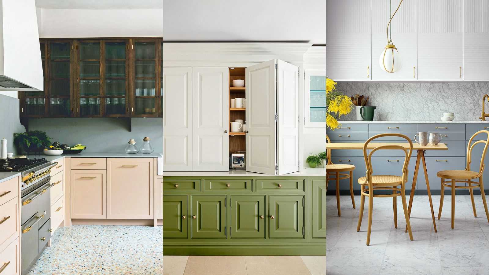

Can kitchen cabinets be two different colors? If you're in the midst of a kitchen remodel or a simple color refresh, this thought may well have crossed your mind.
As anyone who has been through the process of searching for kitchen cabinet colors will attest, choosing the right color for kitchen cabinets can be a minefield with endless choices and subtle nuances to understand and overcome.
'The color palette in your home should flow into your kitchen just as it would in any other room, but that doesn’t mean to say that your kitchen should stay as one color,' says George Miller, home designer at Neptune Fulham.
Naturally, you’ll want to select a kitchen cabinet paint color that you’ll be happy to live with for a while to come. But you might also want to consider the decorative power of a two-tone kitchen – one of the most popular kitchen trends of the moment.
Can kitchen cabinets be two different colors?
Kitchen cabinets can certainly be two different colors, in fact, we encourage you to be playful with your kitchen color ideas.
How should you choose your colors? Begin with one you love and go from there. ‘The color wheel can help you understand what shades sit well together,’ says Darren Watts, design director at Wren Kitchens. ‘Complementary colors opposite each other create a strong statement, while colors near each other give a more tranquil feel.’
‘Using a darker color on your lower cabinets and a lighter color up top will create the illusion of a larger room. That said, a brighter color on your wall cabinets creates a real statement, like art. Stick to two or three colors and complementary shades for cabinets, walls, and floors; too many and it could look chaotic,’ says Darren Watts.
Here, our experts give their insight on how to make a two-tone kitchen work best in your kitchen.
1. Go for natural partners
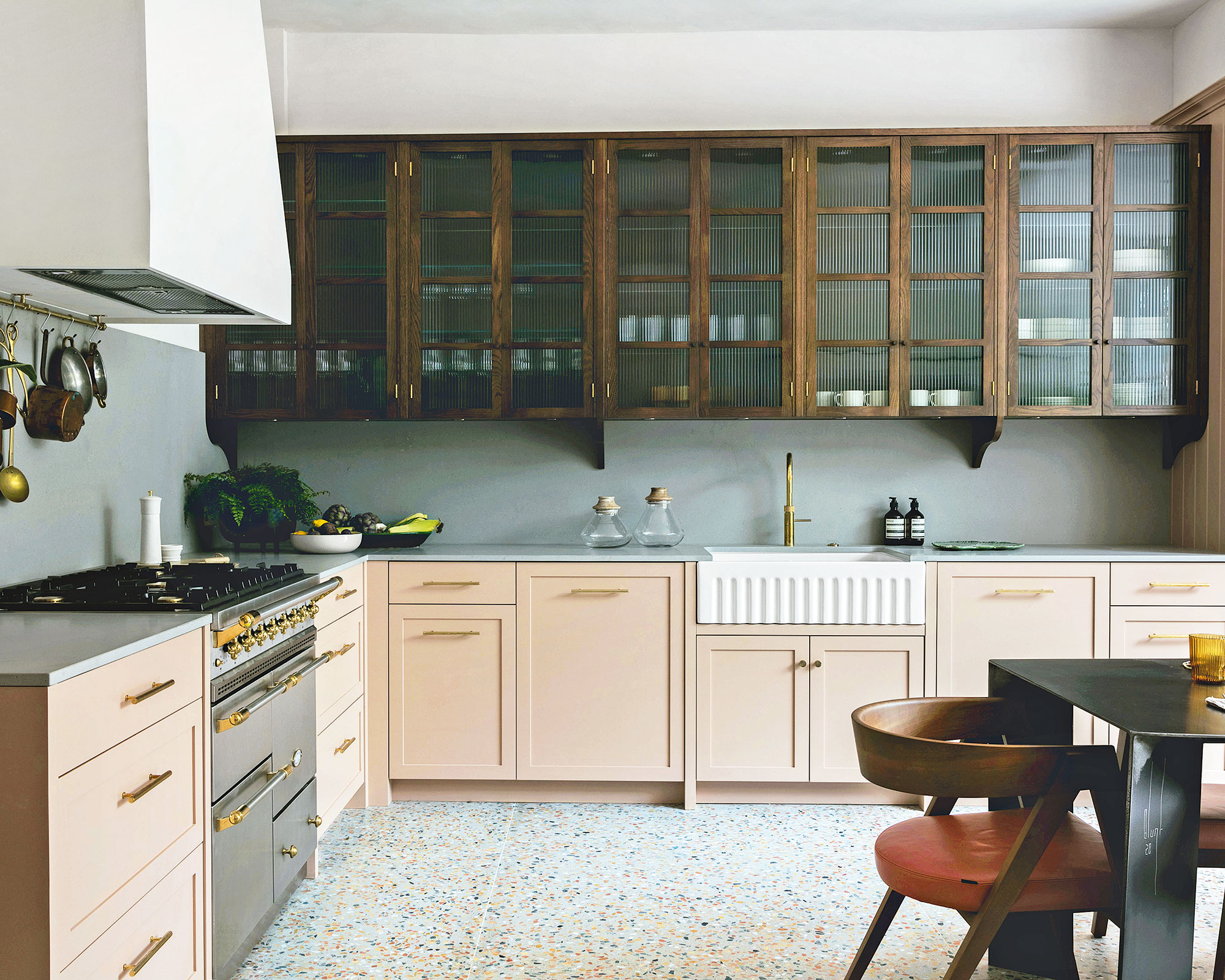
Bespoke kitchen designed and commissioned by Studio Duggan
Use timber for one of your tones and enjoy a dual-color kitchen with natural beauty.
‘In this contemporary kitchen, we loved the warmth of the nude/pink cabinets against the terrazzo floor but wanted to add some masculinity and impact with wood wall cabinets,’ explains Duggan, founder and director of Studio Duggan and TROVE.
‘We chose a rich, warm timber for contrast and texture with fluted glass panels to conceal the contents but kept the look light and airy.’ Tactile cement worktops and splashbacks bridge the top and base units, uniting the two shades with a quiet style.
2. Balance bright colors
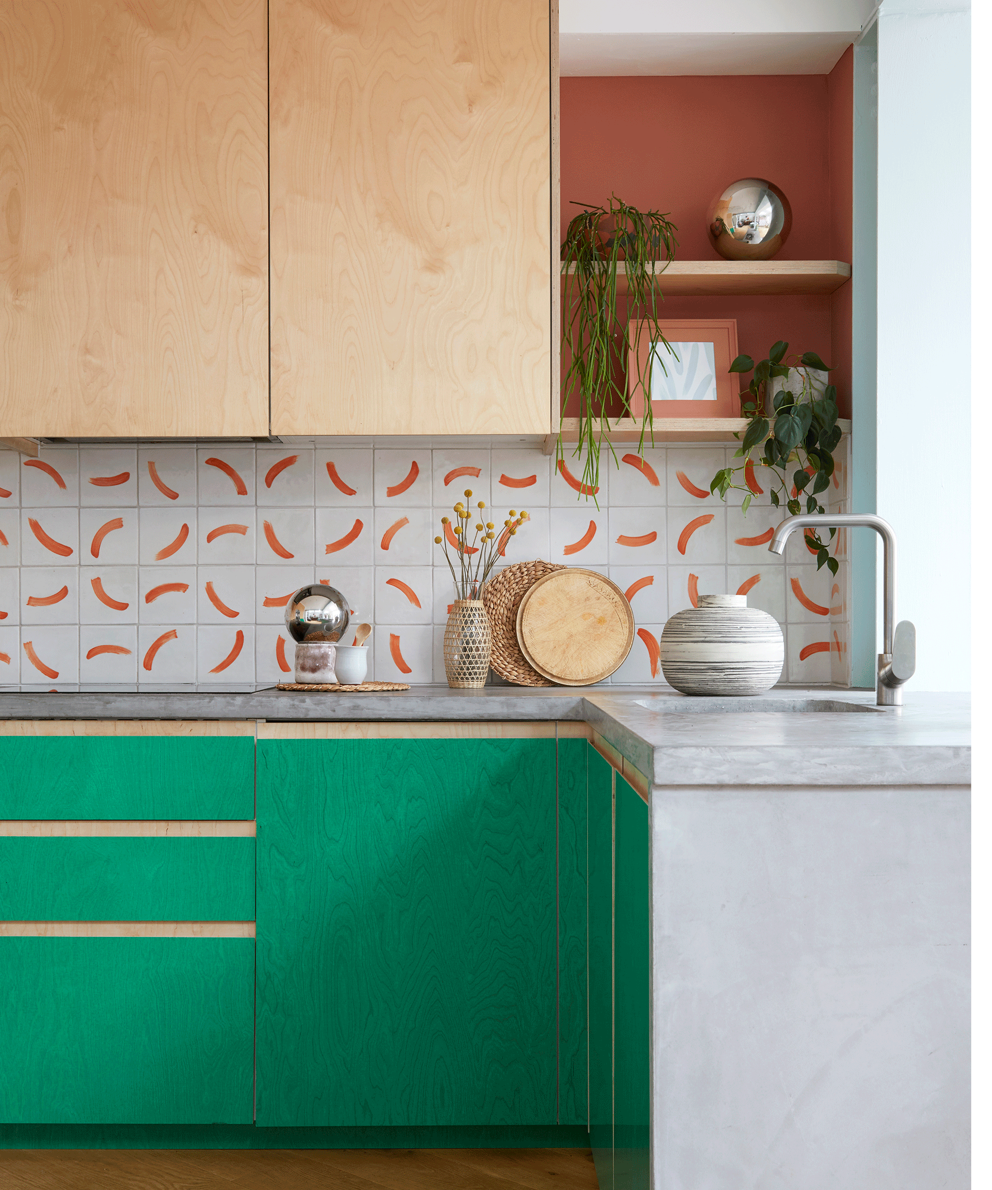
‘Strong, bright colors can energize and illuminate a kitchen, creating an uplifting living space that really boosts your mood,’ says founder of King Celia Studio, Jess Piddock, who designed this colorful kitchen for her own family home. Jess handmade the tiles and has since developed the brush mark pattern, called Pool Party, for textiles and prints.
‘The emerald green is a semi-transparent film that enables the grain of the plywood to shine through while providing a protective coating that’s easy to clean,’ she adds. ‘Bright tones benefit from a grounding shade. In this case, terracotta adds depth and warmth.
3. Pair pale and bold colors
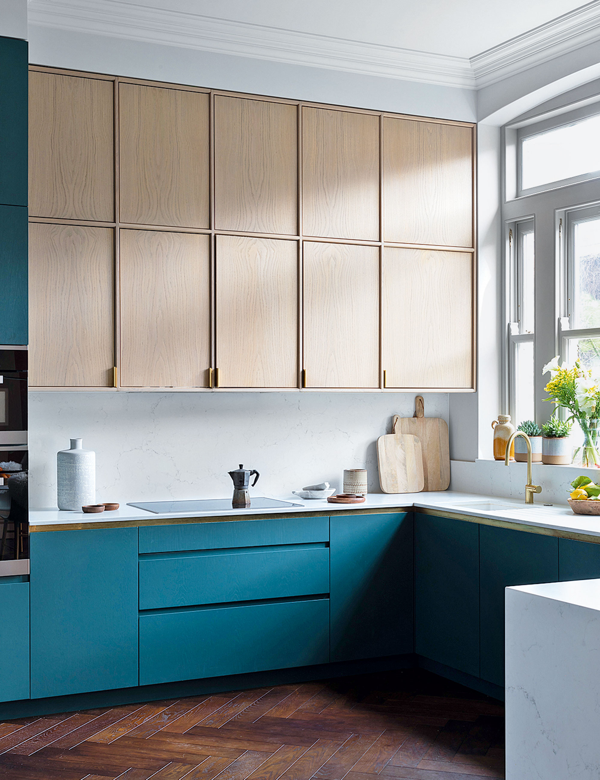
Bespoke kitchen, Frank & Faber
Introducing paler finishes at eye level is a well-known ploy for improving spaciousness and preventing wall units from overpowering, particularly above hard-working areas like the hob or sink.
‘We would generally recommend opting for dark shades at the bottom and lighter tones at the top, especially if the natural light isn’t great or the ceilings are low,’ says Sarah Ellison, founder and creative director at Frank & Faber. ‘In a kitchen that is really dark, we often forgo wall units altogether, if storage needs allow, or paint them in the same light shade as the walls so that they virtually disappear.’
4. Work with whites
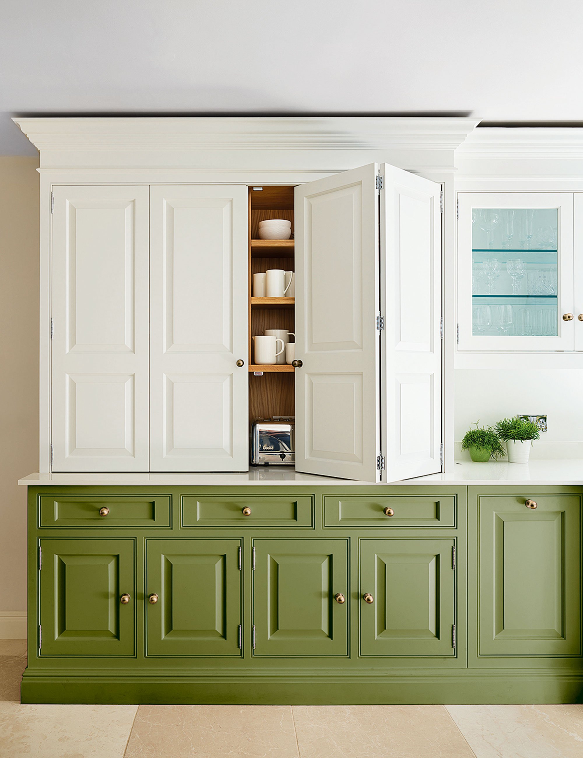
Bespoke Devine kitchen in Serpentine (green) and Sorrel (white), Tom Howley
‘White is a classical kitchen choice that works well on its own but can prove even better when used in a two-tone scheme,’ enthuses Tom Howley, design director of Tom Howley. Bright white is a great choice for creating crisp contrasts that will freshen and lift earthy greens and beachy blues.
‘If you’re considering bright white on cabinetry, you should use warmer shades of white or creams on the walls and floors to ensure the kitchen doesn’t feel too clinical and sparse,’ adds Tom. Do take into account the room’s natural light levels when choosing whites – tester pots are essential.
5. Opt for a close match

Parallels Ashton Grey door fronts (wall units); No Pattern Cloudy Grey door fronts (base units), Superfront
Tone-on-tone color involves using different saturations of one color to achieve contrast and movement. It’s a great option for those who struggle with combining colors but don’t want a flat look. To make life easier, many paint companies graduate popular shades numerically, for example, Paint & Paper Library’s neutrals come in five tones, from light to dark.
In north-facing rooms where the light is cold, it’s wise to use the lighter tone on wall cabinets to help keep any potential gloominess at bay. In this airy kitchen, Superfront’s geographic surface pattern elevates the grey-on-grey combo for a look that’s modern yet refined.
Are two-tone kitchen cabinets still popular?
Two-tone kitchen cabinets are still popular due to their decorative nature, but colored kitchen cabinets can be more than just an attractive design feature.
‘Different shades can help to define specific areas within your kitchen, like the cooking area. So you can choose a specific color for this and another shade for your cooling area with your fridge-freezer,’ says Doug Haswell, furniture manager at Caple.
If you are worried about the color clashing, then look to smaller details that help create harmony.
‘A key way to unify your space is by using the same cabinet handles throughout, and then matching these up with your appliances, sink and tap,’ says Doug Haswell. Alternatively, you could ensure a cohesive scheme by sticking with one specific room style, be it an industrial, Scandinavian, or farmhouse kitchen.
Sign up to the Homes & Gardens newsletter
Design expertise in your inbox – from inspiring decorating ideas and beautiful celebrity homes to practical gardening advice and shopping round-ups.

Jennifer is the Digital Editor at Homes & Gardens. Having worked in the interiors industry for several years in both the US and UK, spanning many publications, she now hones her digital prowess on the 'best interiors website' in the world. Multi-skilled, Jennifer has worked in PR and marketing and occasionally dabbles in the social media, commercial, and the e-commerce space. Over the years, she has written about every area of the home, from compiling houses designed by some of the best interior designers in the world to sourcing celebrity homes, reviewing appliances, and even writing a few news stories or two.
-
 Grace Kelly's former living room set the blueprint for quiet luxury – you can explore her NYC penthouse (listed for $3.25 million)
A unit in the storied Manhattan House, where Grace Kelly, Benny Goodman, and Shirley Jackson have lived, has hit the market – it's a masterclass in neutrals
By Hannah Ziegler Published
-
 I'm 5ft2 and this telescopic scrubber safely and easily banished mold and grime in even the hardest-to-reach areas of my bathroom in less than 15 minutes
My bathroom has never looked better thanks to this handy $16 two-in-one tool from Joseph Joseph
By Ottilie Blackhall Published