Camouflage kitchens are the next big 2025 trend getting designers excited – here's how to design a kitchen that doesn't look like a kitchen
Be inspired to part with kitchen design conventions with these beautiful unique schemes
- 1. Go for a minimalist design with sleek floor to ceiling cabinets
- 2. Keep cabinetry limited to complement architecture
- 3. Go for a statement kitchen island
- 4. Combine luxurious textural materials
- 5. Let views take the lead
- 6. Celebrate natural materials
- 7. Go for a freestanding kitchen
- 8. Integrate vintage pieces of furniture
- 9. Go for a retro kitchen design
- 10. Embrace bold color combinations
- 11. Coordinate your kitchen decor with your living room decor

Kitchens have evolved hugely over the last century. Today’s kitchens with integrated smart appliances, fitted cabinetry, and modern performance materials would be unrecognizable in the mid-20th century.
Once spaces used solely for preparing meals, kitchens in the modern home are often integrated into living areas and serve as multi-functional practical and social spaces.
As well as functionally, kitchens have evolved aesthetically, too, and in recent years we’ve noticed a trend for kitchens that don’t look like kitchens. The kitchen is no longer seen as a purely practical room, but an extension of the living space that should be decorated to be comfortable and reflect personal style. Homeowners are increasingly turning their backs on conventional kitchen design and are becoming more adventurous and confident with their kitchen ideas, introducing a wider range of cabinet designs, materials, colors and textures.
To learn more about the 'kitchens that don’t look like kitchens' trend we asked kitchen and interior designers what’s fueling these changes alongside their advice for creating an unconventional kitchen with wow factor.
What's behind the Camouflage kitchens trend?
As our lifestyles change, so too are kitchen trends constantly evolving. In recent years we’ve noticed a growing trend for kitchens that don’t look like kitchens, with homeowners moving away from off-the-peg fitted kitchens with base and wall cabinets and instead working with interior designers and kitchen designers to embrace more daring and unique kitchen designs. This change in perspective can be attributed to several factors say experts, including the shift towards open-plan living spaces, a growing confidence in design and the fact that we’re spending more time in our homes.
‘The kitchen is no longer just a utilitarian space for cooking; it's becoming a central gathering place for family and friends, where people can connect, relax, and enjoy each other's company,’ says Sabah Mansoor, founder of Sabah Mansoor Design. ‘With more people working from home and spending more time indoors, there is a greater focus on creating comfortable and aesthetically pleasing living spaces. This has led to a willingness to experiment with design choices that prioritize personal well-being and self-expression.’
Robert Burnett, co-founder and director at Kitchens by Holloway agrees, adding that, ‘People are definitely thinking about kitchens as more ‘livable’ spaces. A few years ago this may have been reflected in open plan configurations, this is now being brought into layout and even furniture and material choices, making kitchens less clean-lined and more inviting and full of unique character.
'Homeowners are becoming more confident, in particular with mixing materials – where they used to worry about combining different finishes they are more open to mixing and matching to create a more informal feel.’
If you're designing a kitchen and you're looking to put a twist on traditional design then you're in the right place as we've rounded up an array of striking spaces guaranteed to inspire.
1. Go for a minimalist design with sleek floor to ceiling cabinets
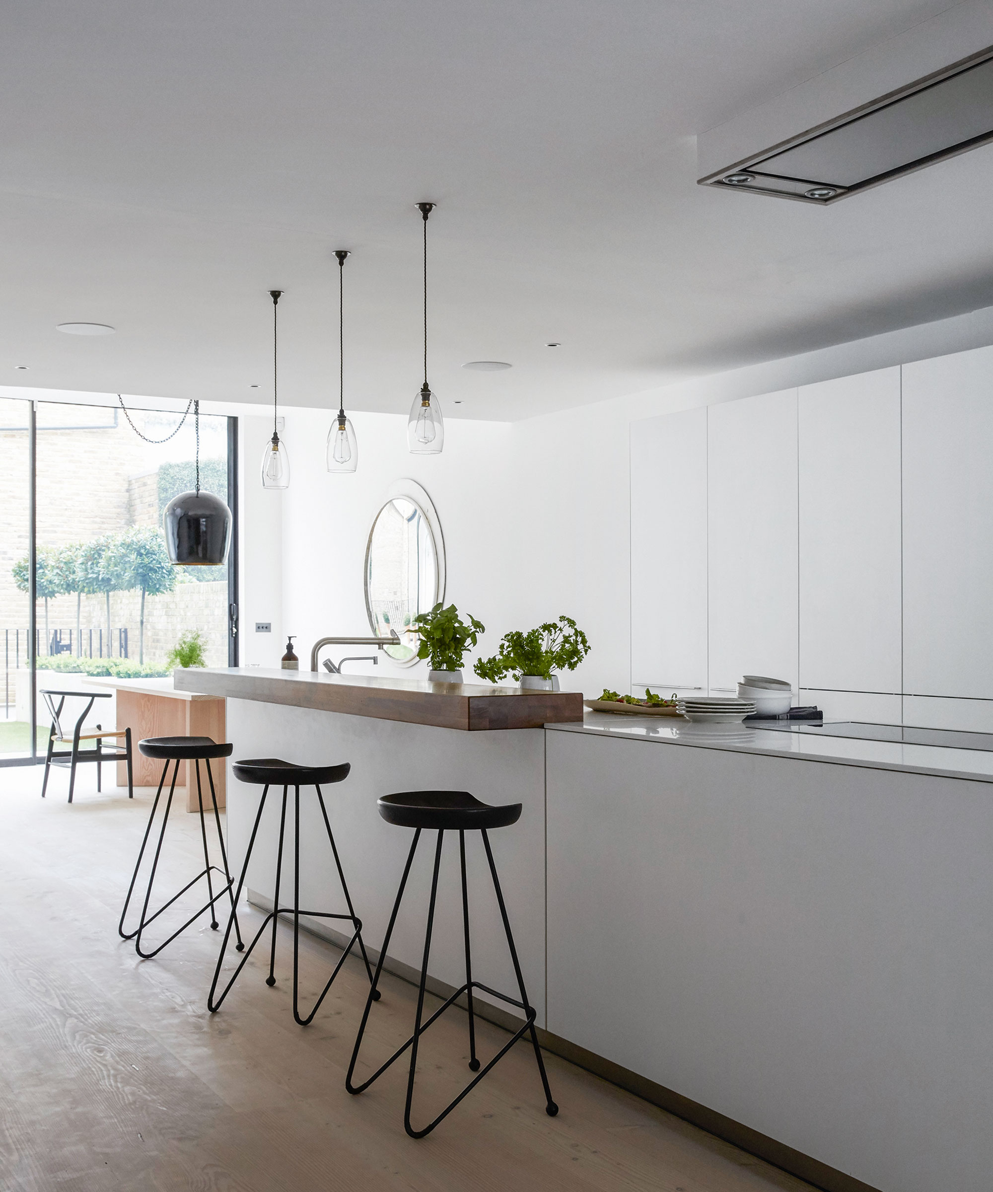
If you're looking to create a kitchen that doesn't look like a kitchen try opting for a minimalist kitchen design. Keeping storage and appliances hidden away in streamlined, handleless floor-to-ceiling cabinets creates a sleek minimalist look free from all the all the wires and countertop appliances of traditional kitchens. The result is clean clutter-free units which seamlessly blend with contemporary architecture.
Embracing invisible kitchen ideas such as a hidden pantry through a secret door is another wonderful storage solution which takes the pressure off the main kitchen area and allows it to remain clean and uncluttered.
‘We regularly create kitchens with what we call “nania doors”, which are doors in a run of kitchen furniture, which lead into another room, usually a pantry or utility room,’ says Craig Matson, MD at Roundhouse.
2. Keep cabinetry limited to complement architecture
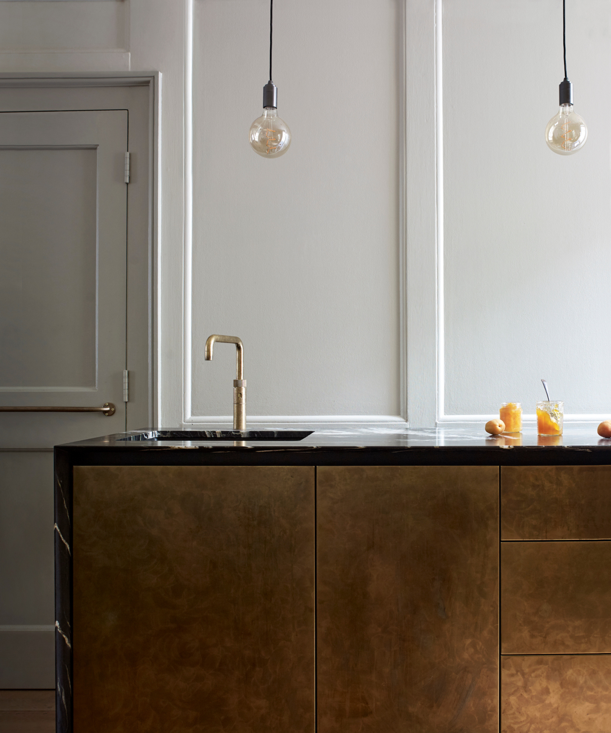
In this 200-year-old, listed building in Soho, London the kitchen needed to be carefully designed around the historic architecture, resulting in a discreet kitchen design you wouldn’t necessarily realize was a kitchen at first glance. The paneling needed to be preserved as a planning requirement, so the kitchen was confined to a sleek run of base cabinets.
‘The brief was to fit a modern kitchen, in terms of technology and current requirements into the existing spaces of a 19th-century terrace house. This consisted of a series of small rooms which could not be altered, the design then needed to keep the look and feel of the period property,’ says Craig Matson, MD at Roundhouse.
‘The main run has a drop-down section to the rear to fully expose the paneling. There are three small spaces which constitute the kitchen, the main run has a sink, hob, and oven, the small room next door, is a storage pantry and also houses the fridge, and freezer. These are all interconnected rooms, and it was important for them to be functional stand-alone spaces which could all join up to include all the necessary functions of a modern kitchen.'
'The main room was a relatively small space and we wanted to exude a level of luxury, so we used patinated metal wrap and a leathered quartz worktop.'
3. Go for a statement kitchen island
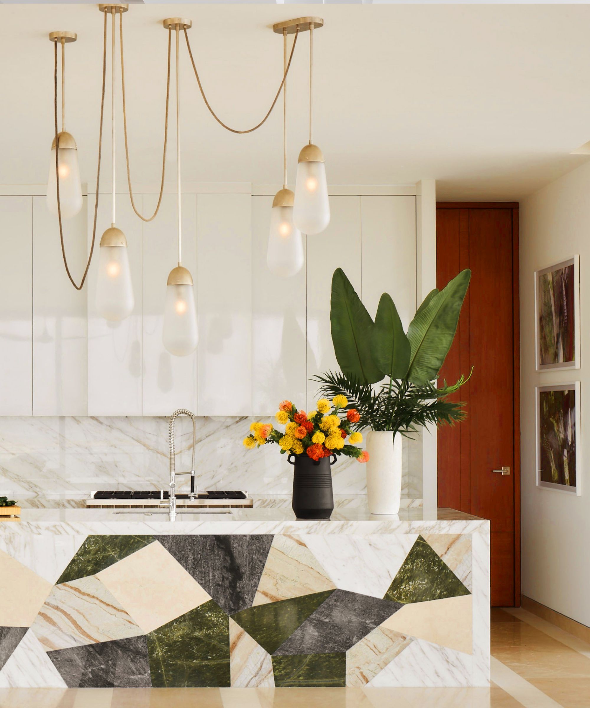
As the room in which guests often congregate, kitchens make wonderful spaces to make a design statement. Increasingly homeowners are working with interior designers and kitchen designers to create kitchen cabinetry and islands that double as ultra-stylish, contemporary pieces of furniture rather than going for off-the-peg fitted cabinetry. In this luxury kitchen interior designer Martyn Lawrence Bullard designed a striking marble kitchen island that doubles as a piece of art.
‘This Los Cabos home, designed for an American business tycoon, was to be an ode to Mexican mid-century design. As the main kitchen is such an integral part of the living space (a functioning service kitchen used by the staff is situated in an adjoining room directly behind this) it had to become part of the decor and be visually beautiful,’ says Martyn Lawrence Bullard.
‘I decided that the island should be the showpiece and used a collection of local marbles that I had patchworked into a design to make a very artistic statement. The lacquered cabinets keep the space bright and modern whilst the light fixtures add a sense of luxury and wonder.’
Discover more ways to incorporate marble into your kitchen with our dedicated feature on marble kitchen ideas.
4. Combine luxurious textural materials
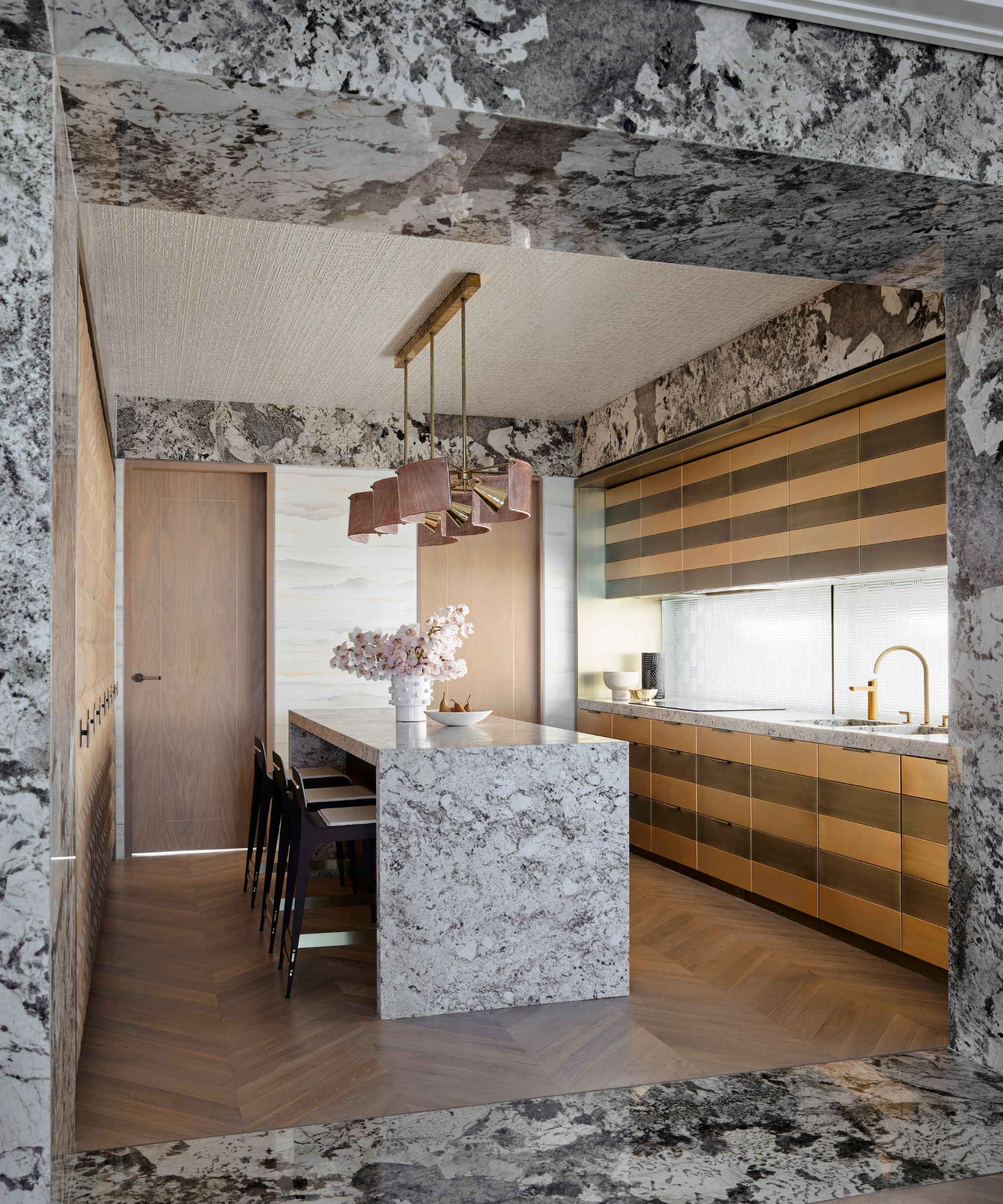
In this Mosmon House project, interior designer Greg Natale has combined statement surfaces with pattern to create a luxurious, maximalist kitchen. 'Two-toned brass joinery brings this kitchen from our Mosmon project to life. Gleaming against the blonde wood floors and granite, this striped effect brings an additional layer of visual interest. Each subtle material ensures that the final look is still clean and tailored,’ says Greg Natale.
‘The key to achieving a kitchen that doesn’t look clunky and appliance-heavy is to integrate everything, from the fridge and storage to the stovetop and range hood. That way you get a sleek space that blends in seamlessly with the overall design of the home,’ adds the interior designer.
5. Let views take the lead
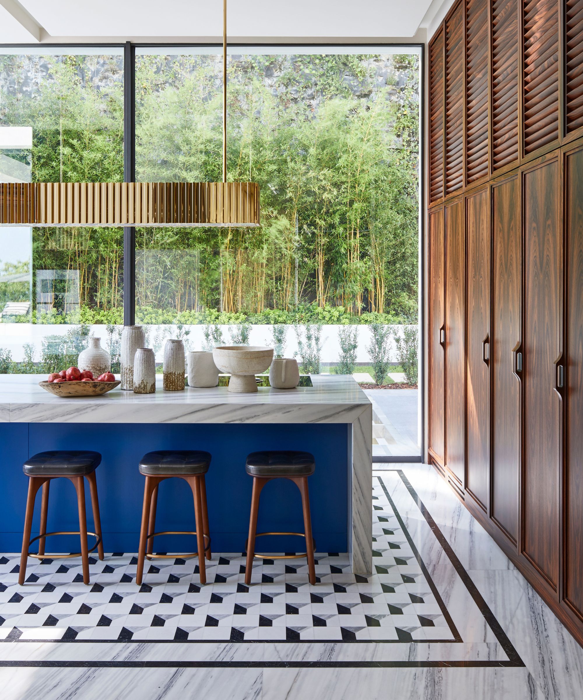
Increasingly kitchens in modern homes are designed with large expanses of glazing to make the most of garden views and this is having an impact on their design, resulting in pared-back, streamlined kitchens which let the landscape take the lead. In this kitchen by Humbert & Poyet, sleek lines complement the contemporary architecture and keep sightlines clear, while an exciting combination of materials brings warmth and interest.
‘The brief for this space was to create a kitchen that feels like an extension of the natural surroundings,’ say Emil Humbert and Christophe Poyet, interior designers, and co-founders of Humbert & Poyet. ‘The allure of hidden kitchens lies in their ability to maintain a harmonious and uninterrupted design flow. In this kitchen, the use of natural wood kitchen cabinets and the strategic concealment of appliances create a serene, uncluttered environment that prioritizes both elegance and functionality. It's about creating a space where the kitchen serves its purpose without dominating the room's aesthetic.'
6. Celebrate natural materials
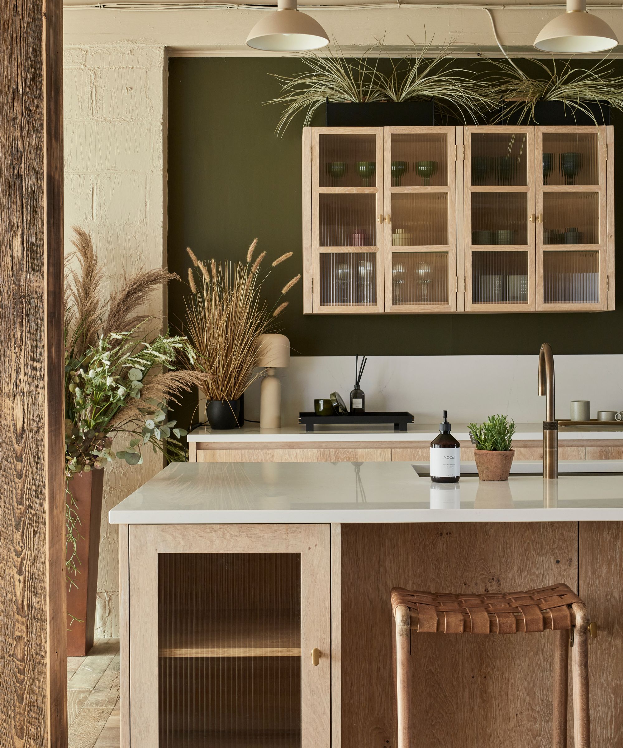
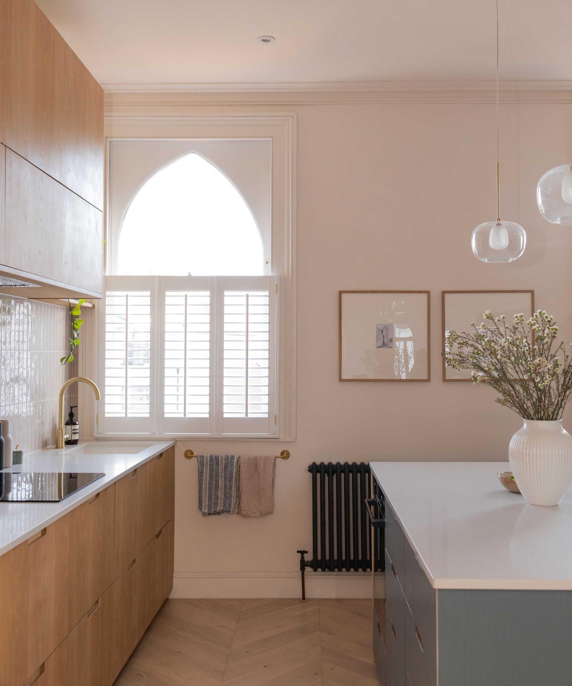
Kitchen cabinets with natural wood finishes have been a growing trend in kitchen design in recent years and is thought it be rooted in our increasing desire to reconnect with nature. This year British brand The Main Company has teamed up with designer and content creator Reena Simon to launch a new wooden kitchen design with Scandinavian décor, natural materials and timeless style at its heart which aims to integrate seamlessly with living spaces. Reena believes this shift towards natural materials in the kitchen is a response to our craving for warm, calming and sensory spaces.
'The inspiration behind this design was to create a collection that can seamlessly blend with the rest of the home, and which embodies the notion of a kitchen that doesn’t look like a kitchen,' says Reena Simon. 'The focus was on a 'less is more approach,' where functionality meets form in an unobtrusive way. We wanted to design a kitchen that can serve as the heart of the home without dominating a space, something that feels as though it’s part of the furniture rather than a typical, functional kitchen.
'The design embraces natural materials, a calming palette, and subtle textures to achieve a look that flows and is in harmony with its surroundings.'
7. Go for a freestanding kitchen
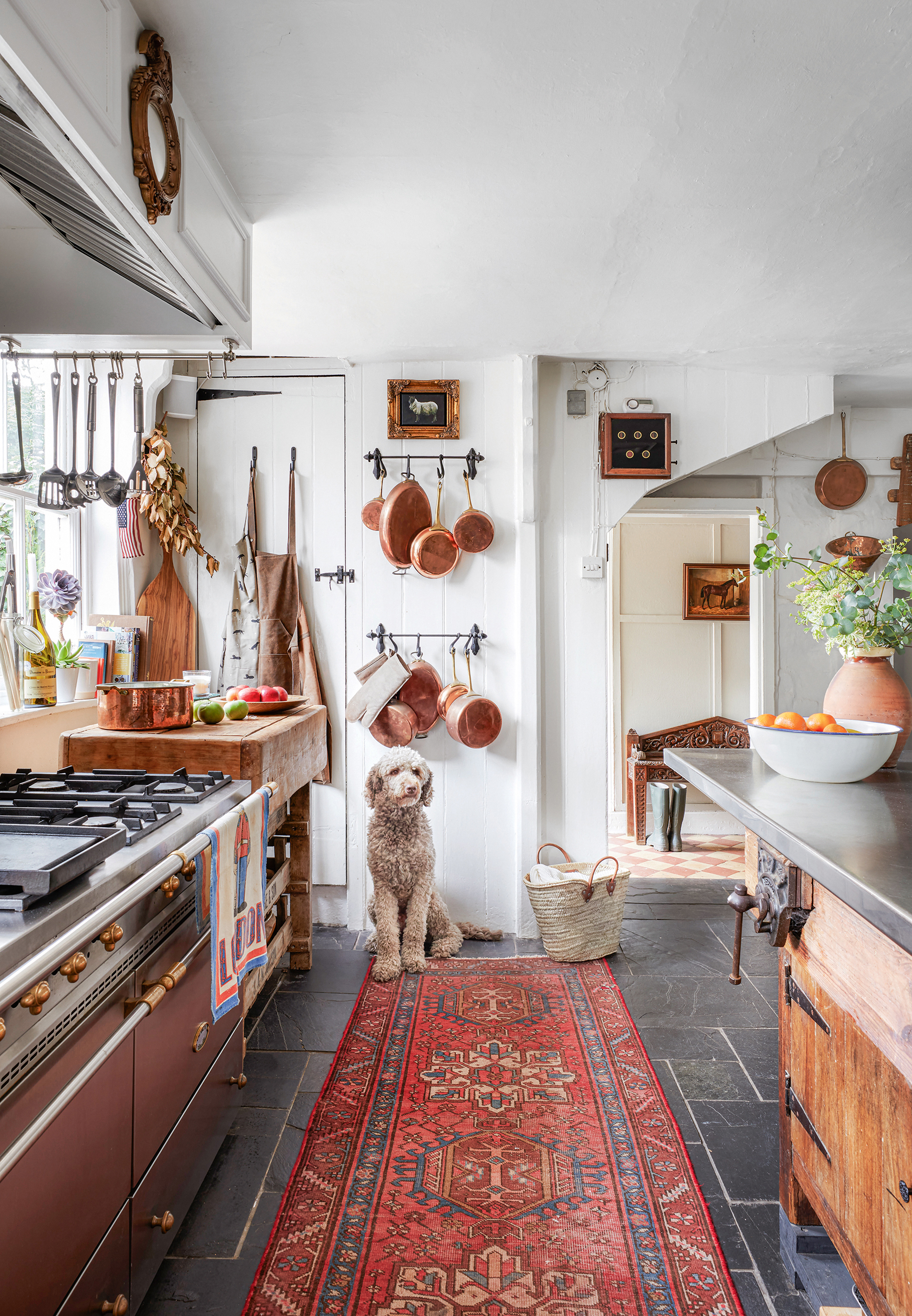
When it comes to kitchens that don’t look like kitchens, sleek, minimalist kitchens often spring to mind, but at the other end of the spectrum, eclectic freestanding kitchens which combine individual pieces of furniture in an assortment of styles can also sit under the 'kitchens that don't look like kitchens' umbrella.
In this 17th century home, Ambrice Miller opted for an array of furniture including a butcher's block and an old carpenter's bench topped with a stainless steel countertop, alongside wall-hing storage solutions. To make the kitchen feel less like a stark practical space and more of a comfortable living space Ambrice decorated with an array of cozy kitchen rugs.
8. Integrate vintage pieces of furniture
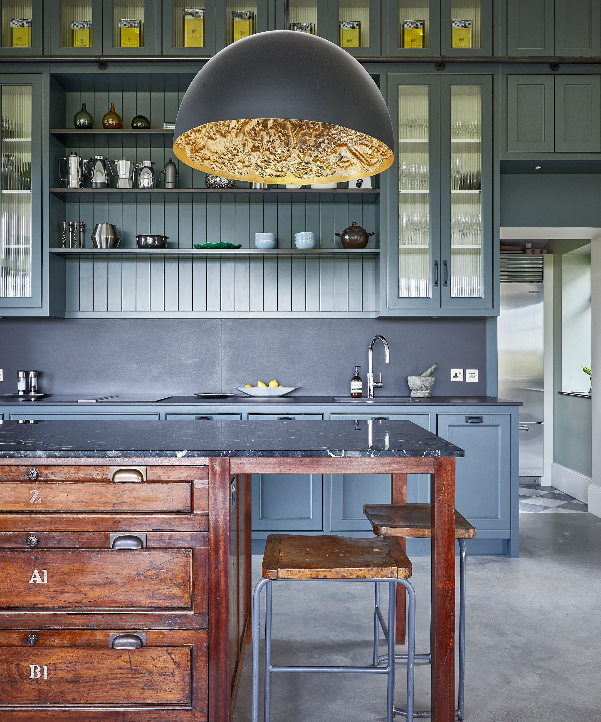
Introducing freestanding furniture into a kitchen is a wonderful way to create a relaxed feel and can help kitchens to blend seamlessly into wider living spaces. With beautiful patinas resulting from years of wear, vintage pieces have unique character that can not only make a design statement but also help bring essential warmth to what can be cold spaces. Increasingly homeowners are working with kitchen designers to incorporate vintage pieces into their kitchen designs, as done in this stylish space by Kitchens by Holloways.
'The brief was to create a kitchen that would work within the large open space, particularly with the ceilings being extremely high. The homeowners wanted plenty of character and for the kitchen to work with the eclectic mix of furniture that would feature within the rest of the room,’ explains Kitchens by Holloways’ co-founder and director, Robert Burnett. ‘It was designed in two sections - the ‘main’ kitchen was focused on prep and cooking whilst the large scullery was designed with cleaning, storage and small appliances in mind. This meant that clutter and mess could be kept to a minimum in the ‘main’ space.
'The freestanding kitchen island was made using two reclaimed mahogany office filing cabinets from English Salvage. These were altered and refurbished by cabinet makers in our workshop.'
9. Go for a retro kitchen design
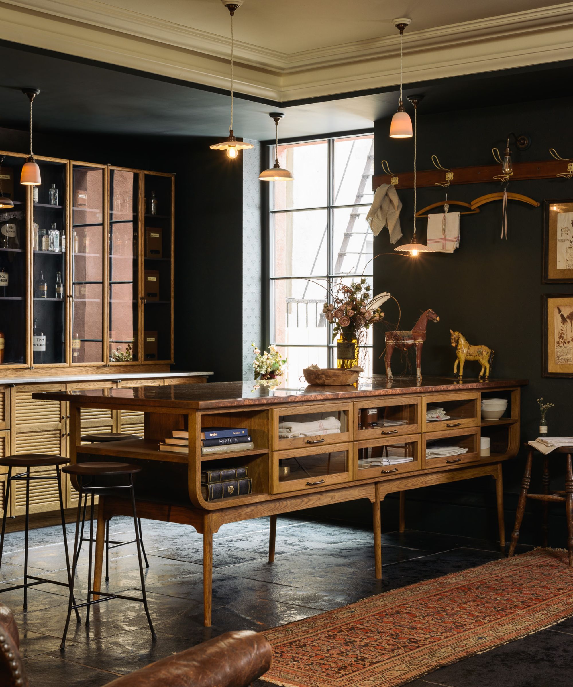
For those that love the freestanding kitchen look but aren’t keen on furnishing with authentic vintage pieces, there are some wonderful new retro kitchen designs that tap into the vintage aesthetic. With its rich warm wood and abundant glazing, Devol’s Haberdasher's kitchen resembles more a gentleman’s outfitter than a modern kitchen.
‘We have a deep and nostalgic admiration for mid-century furniture and the evocative feel of an English gentlemen’s haberdashery. These shops would have floor-to-ceiling cupboards, cubbyholes, sliding glass drawers and racks all neatly filled with high-quality hats, hand-woven cloths and pure silk socks. They often had a rich look to them that was warm and inviting, with plenty of oak cabinetry and dark moody colors,’ says Helen Parker, creative director of deVOL.
‘Our Haberdashery range has brought all those feelings and memories back and turned them into a practical collection of cupboards that are wonderfully atmospheric and incredibly versatile. And it’s not just for lovers of mid-century furniture, it is for anyone who would like to commit to a look that will bring such character and genuine beauty into their home.’
10. Embrace bold color combinations
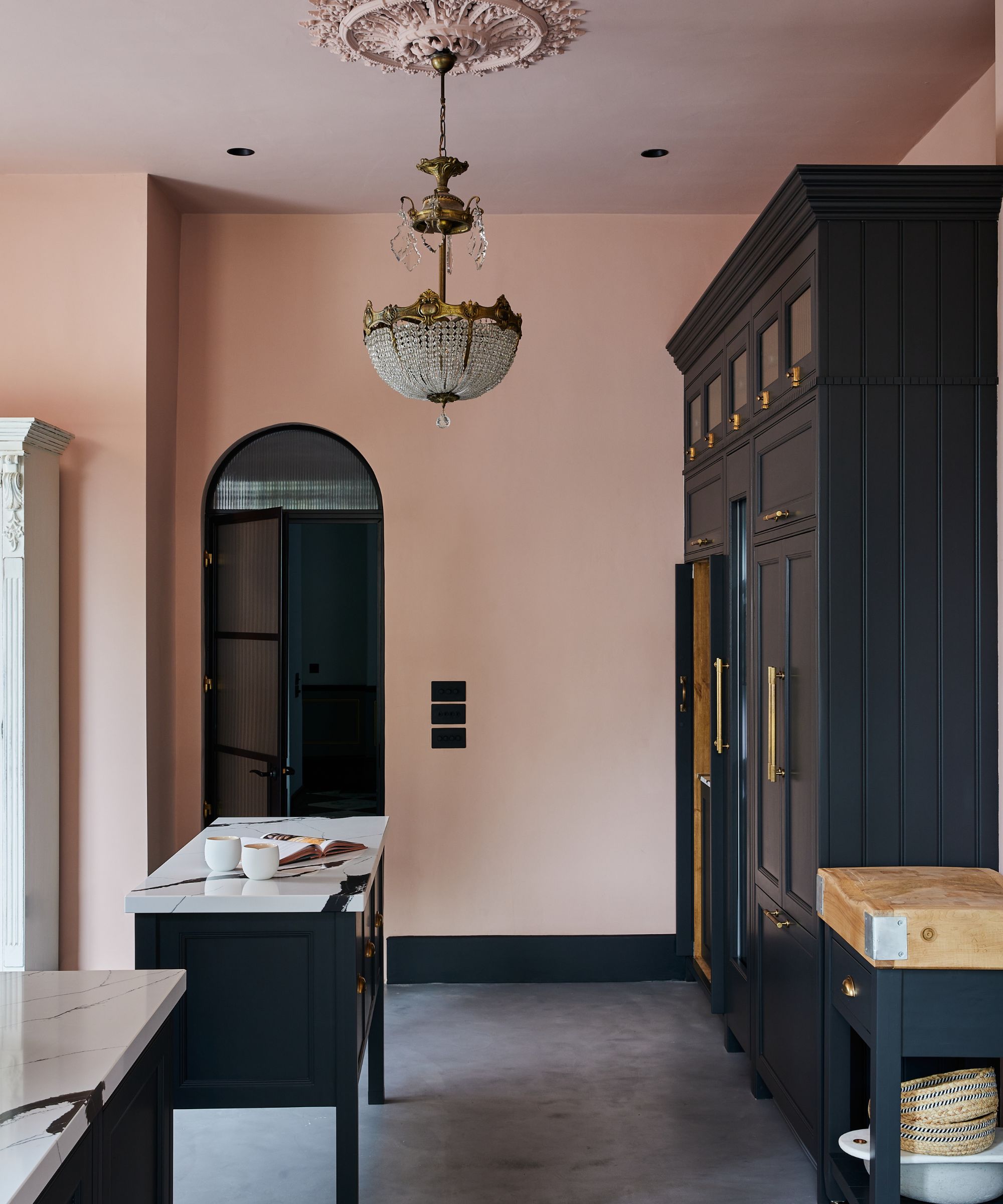
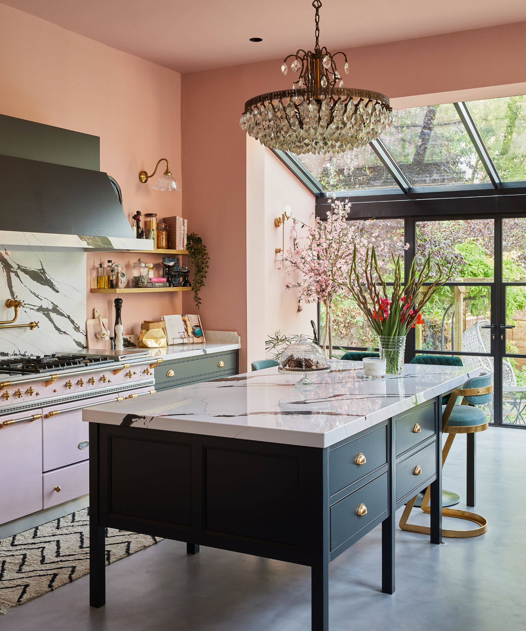
Sometimes kitchens in the past were dismissed as boring, practical spaces, but today people are treating kitchens as they would other living spaces - as canvases on which to stamp their unique style. Introducing fun and daring kitchen cabinet colors and kitchen wall colors is an easy way to instantly bring personality and wow factor as proven in this beautiful scheme by The Main Company.
'Packed with personality, quirkiness and charm, this stunning Victorian townhouse in York combines eclectic style with original features and the homeowner's colorful and adventurous style,' says Alex Main, director of The Main Company. 'The dark tones of the cabinets pair beautifully with the striking Calacutta Black quartz worktops that span throughout the space, whilst also contrasting with the soft pink walls.'
11. Coordinate your kitchen decor with your living room decor
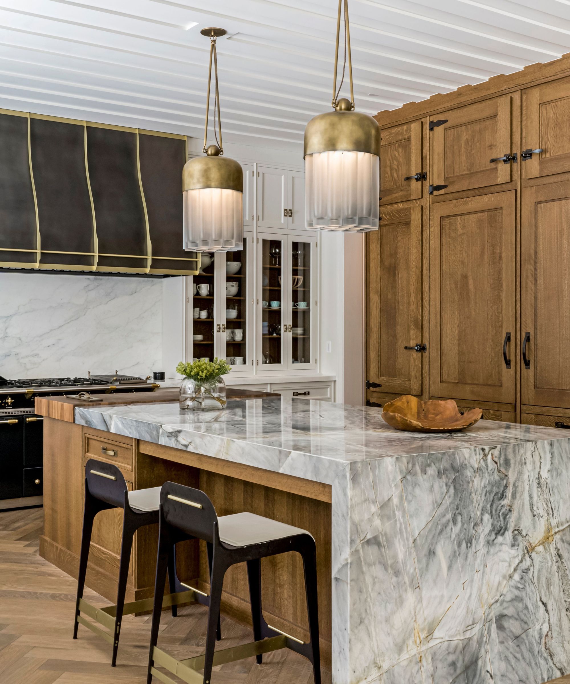
Increasingly kitchens are being integrated into open-plan living spaces and great rooms which is having a big impact on their design. Aesthetically designing kitchens within larger living spaces can be a tricky balancing act - the space needs to complement the decor of the wider room yet equally needs to retain its own unique character.
In this kitchen, Sabah Mansoor used warm, textural materials including wood, marble and brass to create an inviting atmosphere that blended with the wider living area. The floor-to-ceiling wooden doors cleverly conceal the refrigerator, freezer and ample storage. 'The family wanted the kitchen to feel integrated with their great room. They wanted a timeless feel yet wanted it to feel current and fresh,' says Sabah Mansoor.
'The multifunctional island serves as a gathering space and casual dining area. We used warm and inviting finishes that create a cozy atmosphere.'
Kitchens that don't look like kitchens have caught our attention as a growing trend. Kitchens have evolved over the years to become multi-functional living spaces which has caused a shift in decorating perspectives.
Increasingly people are becoming more adventurous and confident with kitchen decor introducing statement materials, colors, layouts and cabinet ideas to create unique, showstopping interiors that have as much personality as other rooms in the home.
Sign up to the Homes & Gardens newsletter
Design expertise in your inbox – from inspiring decorating ideas and beautiful celebrity homes to practical gardening advice and shopping round-ups.

Pippa is a contributor to Homes & Gardens. A graduate of Art History and formerly Style Editor at Period Living, she is passionate about architecture, creating decorating content, interior styling and writing about craft and historic homes. She enjoys searching out beautiful images and the latest trends to share with the Homes & Gardens audience. A keen gardener, when she’s not writing, you’ll find her growing flowers on her yard for styling projects.
-
 Diane Keaton's living room is proof that 'symmetry in interior design' is far from dated – this concept is still ingrained in our philosophy, but there's a twist
Symmetry is a design trick used to create smart-looking spaces
By Jennifer Ebert
-
 How can you make an outdoor kitchen feel more luxurious? Designer tips on making this hardworking space extra opulent
Discover the strategies the experts use to give an outdoor kitchen luxury style
By Sarah Warwick