6 calming kitchen colors that will make this hardworking space instantly more serene
Turn your kitchen into a soothing sanctuary with these on-trend calming kitchen colors picked by experts

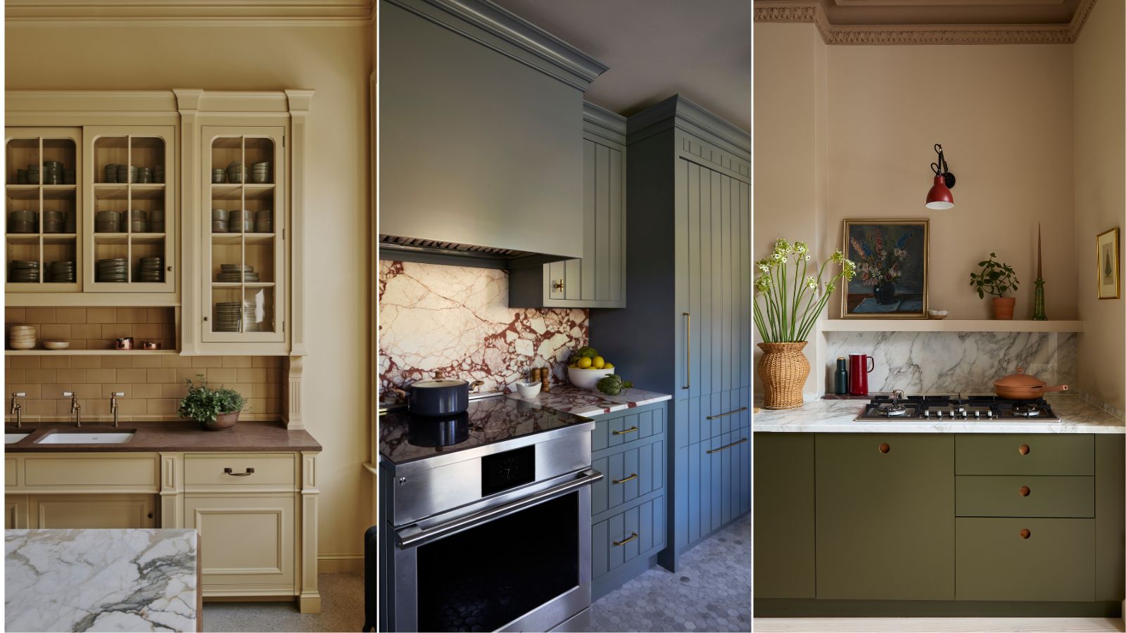
With the world moving at an ever faster pace, it’s no wonder we’re craving calming spaces, and if there’s any space in the home which deserves to be an oasis of calm, it’s the kitchen. When creating a calming kitchen there are many elements to consider, but getting the color right is key as this can play a transformative role in setting the mood.
Whether used on walls or cabinets, the right shade can serve as the perfect soothing backdrop to this busy hub of the home. To find out which kitchen colors are best suited to serene spaces we asked a range of interior designers and color experts for their top picks.
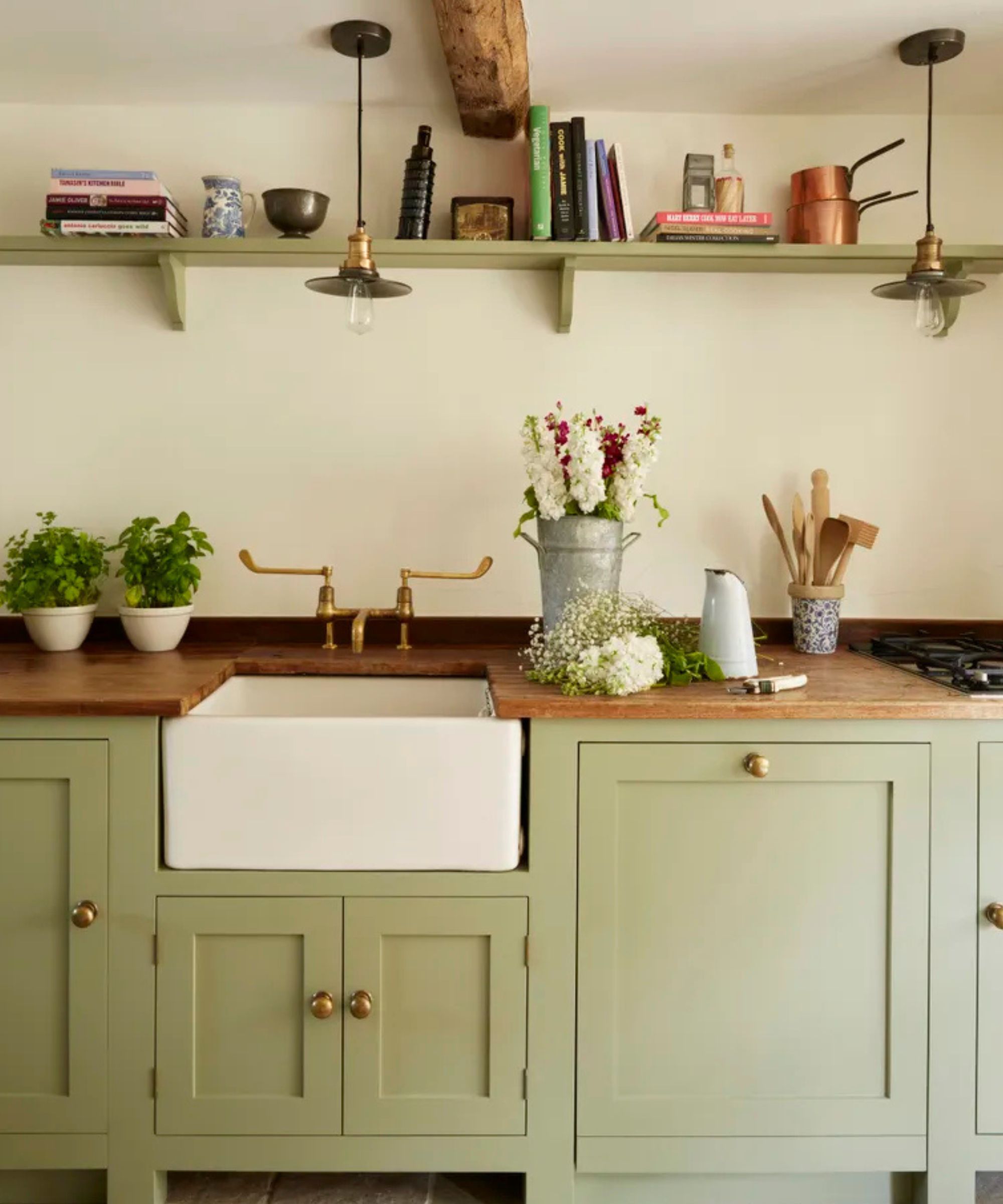
'When creating a calming and soothing kitchen, choosing the right color is essential as it can make or break the ambiance you are trying to create. For a calming feeling soft blues, greens, and grays can be really impactful, along with soft pinks and earthy tones,’ says Anna Hill, brand director and color consultant of Fenwick & Tilbrook.
Whether you’re embarking on a brand-new kitchen design or simply looking to refresh walls or kitchen cabinets with a soothing new shade, these calming colors are guaranteed to inspire.
The most calming kitchen colors
1. Warm off-whites and neutrals
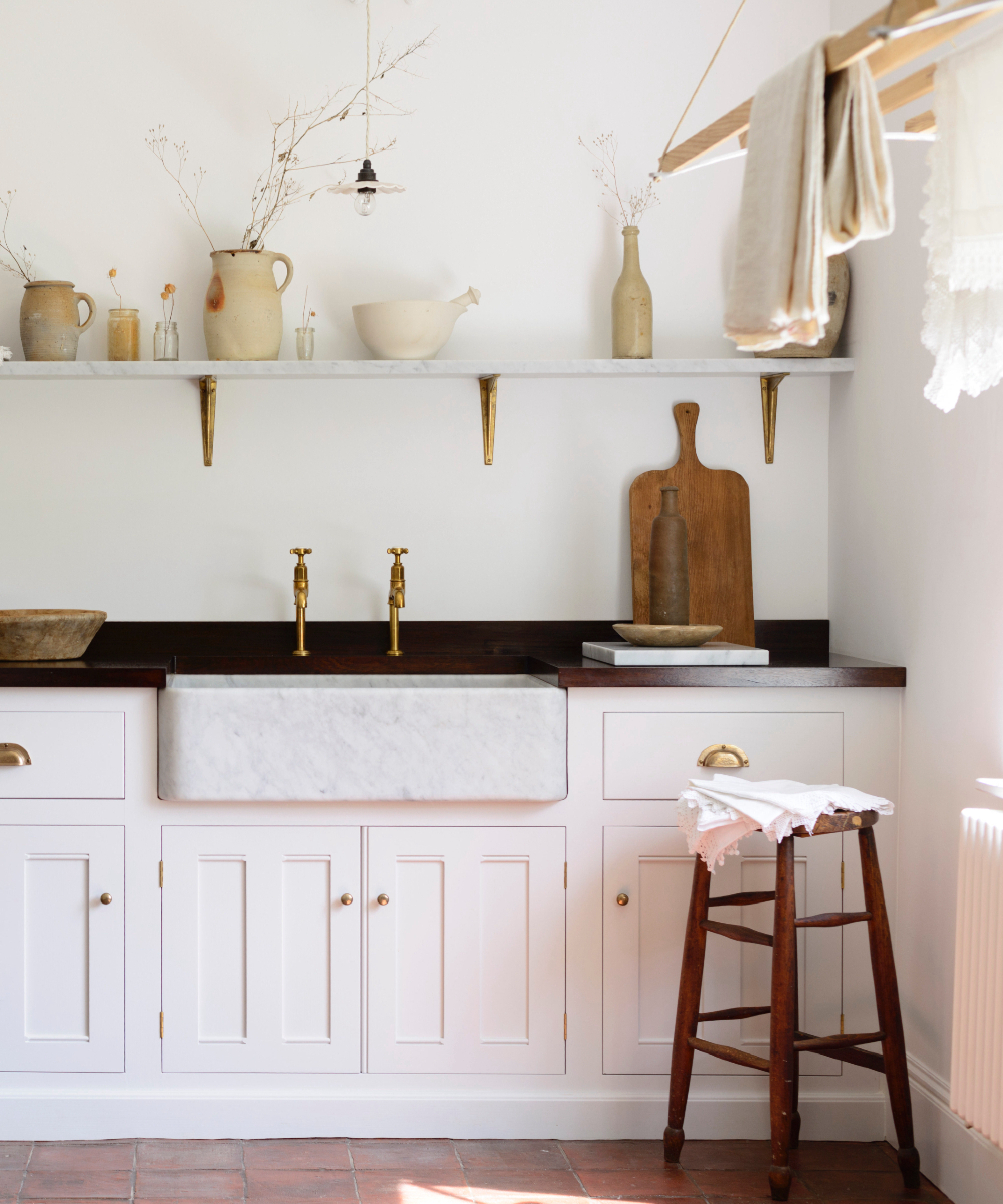
For timeless kitchens which will endure across the years, you can’t go wrong with warm whites. While it may seem like an easy choice, any designer will tell you that When it comes to white, not all shades are equal. Finding the right shade for a white kitchen can take time and will depend on the orientation, light levels and other materials in your room.
‘To many people, white paint is just white paint, but in actuality, the white paint selected can have a profound effect on the room and impact the overall ambiance, says Allison Babcock. ‘My all-time favorite white is Calm by Benjamin Moore because it has just a drop of warm gray giving off a softer and cozier feel especially with an eggshell or satin finish.’
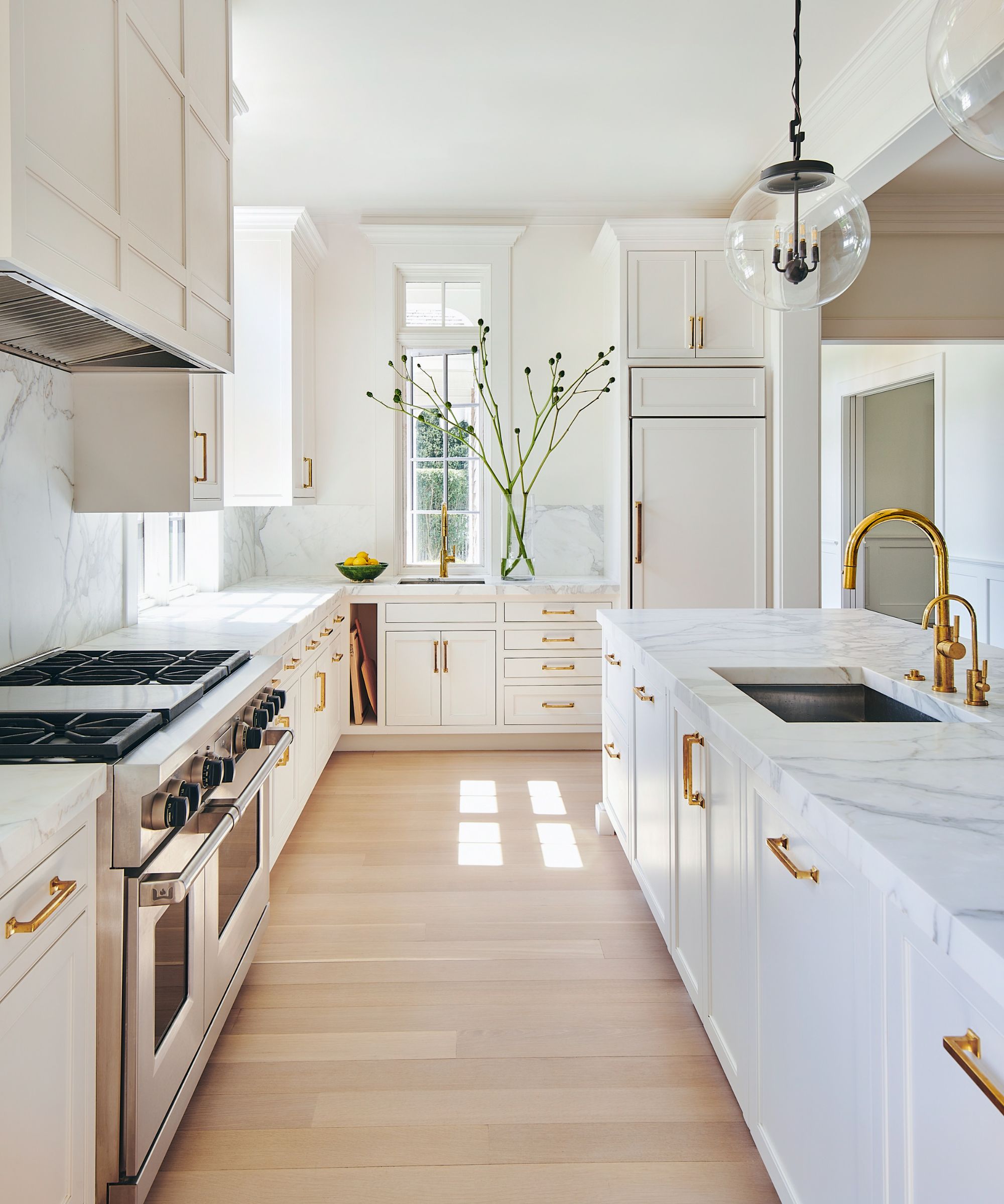
With their abundance of hard surfaces and sharp angles, kitchens can have a tendency to feel cold and unwelcoming, so choosing a warm white is recommended if you’re looking for comfort, but if you have a south-facing room you may want something more neutral.
Design expertise in your inbox – from inspiring decorating ideas and beautiful celebrity homes to practical gardening advice and shopping round-ups.
‘Classic and creamy, Swiss Coffee from Benjamin Moore is the perfect warm white. It doesn’t have obvious yellow or pink undertones.' adds Allison Babcock. 'This paint color is perfect for the kitchen as it’s the heart and hearth of a home.'
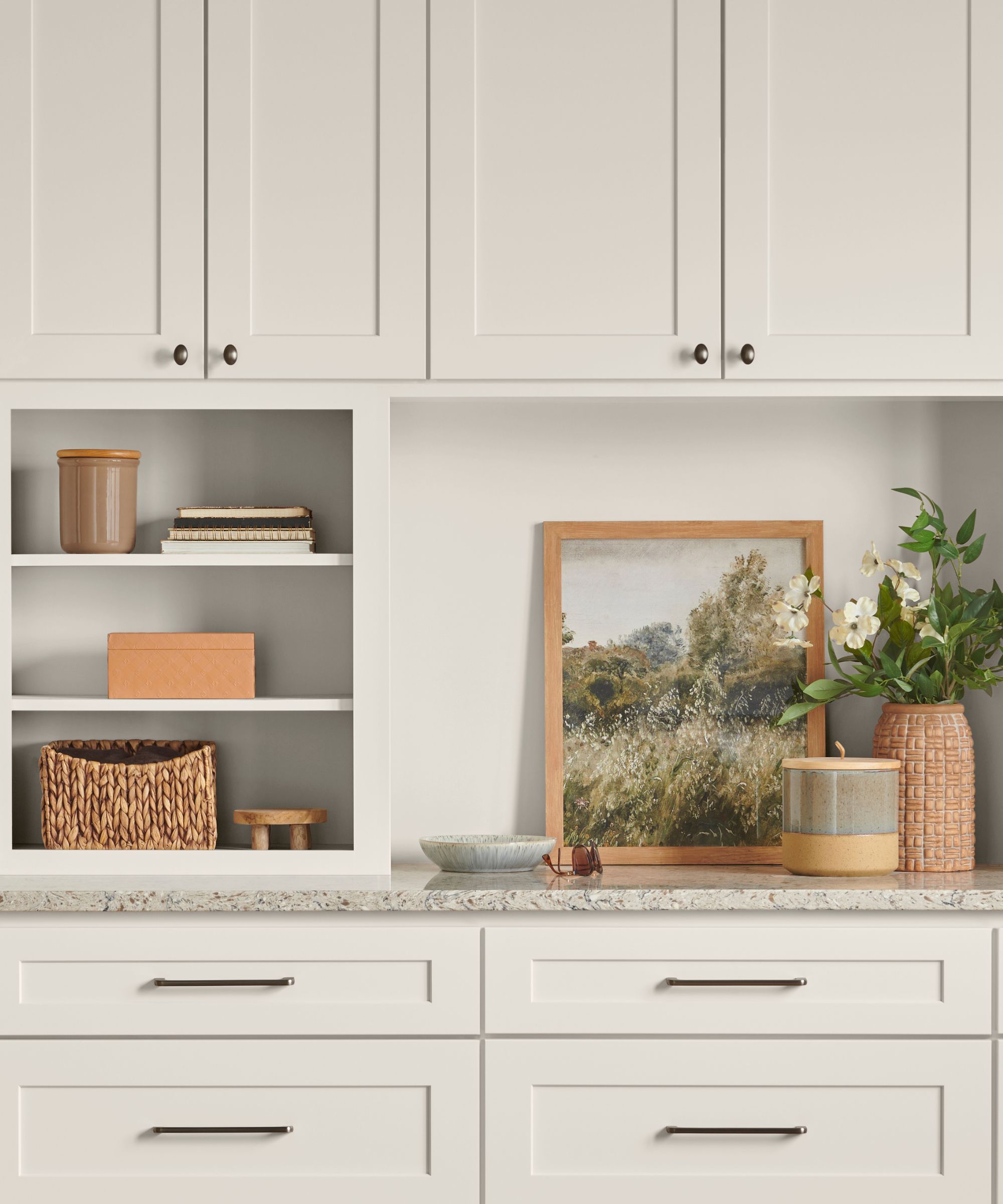
Emily Kantz, Color Marketing Manager at Sherwin Williams also favors warm whites and chose Sunbleached SW 9585 as one of her top four calming kitchen colors.
‘Sunbleached is an ideal color to create that calming and serene environment, especially in a busy area like the kitchen, Sunbleached provides that soothing warmth while also pairing well with the rest of the home’s design style,’ says Emily Kantz.
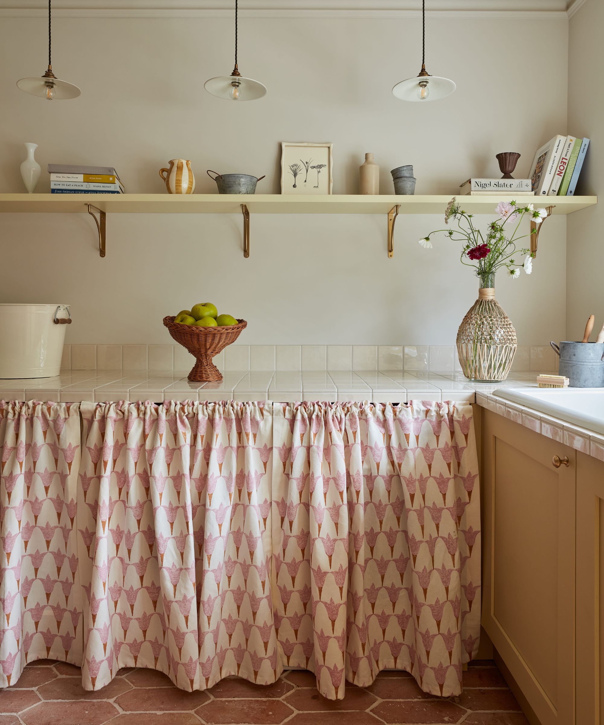
Venture a little further along the spectrum and warm neutrals such as beige, oatmeal and stoney shades are also proving popular for kitchens says Bailey Oates, color expert at Earthborn.
‘Calming colors are essentials to creating a soothing and welcoming kitchen, offering a tranquil escape from the hustle and bustle of daily life. Serene hues, like the timeless neutrals of beige, cream, and grey, act as a strong base for various interior styles,’ says Bailey Oates. ‘Their gentle and understated presence not only grounds a kitchen but also instills a profound sense of tranquility.’
2. Soothing greens
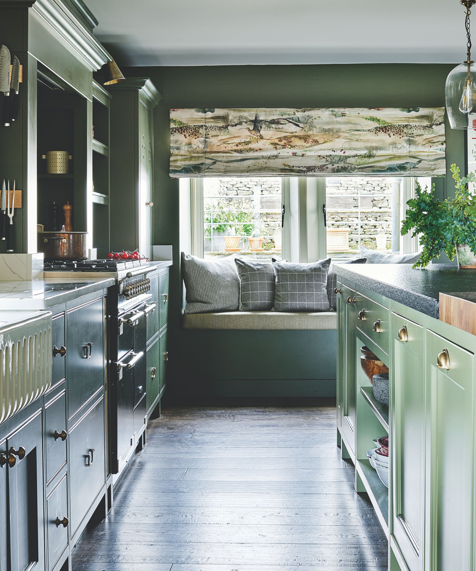
Soft greens synonymous with the soothing and healing powers of nature make a natural choice for calming kitchen schemes and are a perennial favorite with interior designers.
‘Because greens are fairly neutral, (they often contain both blue and red) and come in varying undertones and depths, they are incredibly versatile, working wonderfully in a kitchen, serving as a natural extension of the exterior, with muted, gentle tones creating a calming environment that gives the impression of bringing the outside in,’ says Ruth Mottershead, creative director at Little Greene.
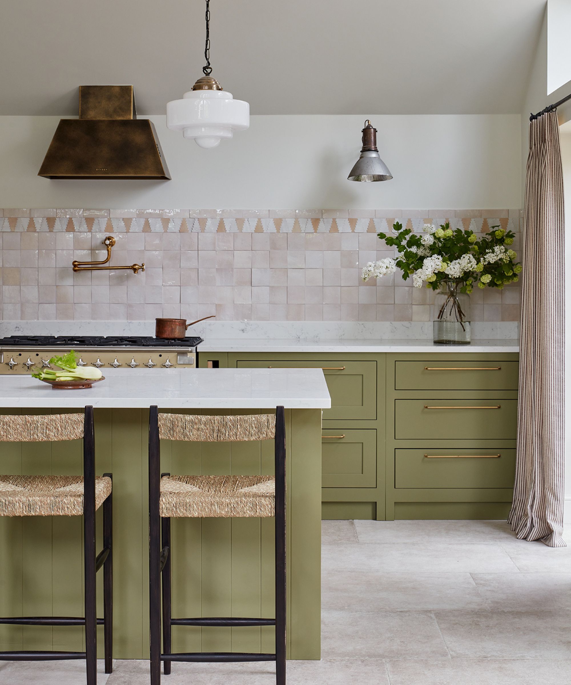
Choosing the right green can be tricky as there are myriad paint tones available, from fresh aquamarine, eucalyptus, and mint tones to the more grubby and earthy greens like on-trend moss and olive greens. Here Holly Vaughan, founder of Vaughan Design & Developments, chose a custom earthy green for this kitchen to blend with the landscape beyond, pairing it with neutral zellige tiles.
‘Our clients wanted to have a real inside-outside feel as the kitchen leads out to a beautiful garden, so we wanted to design it to all be cohesive using mainly earthy tones. In such a big, light modern space a neutral color would have just looked too cold and airy, so we settled on green- and this warm olivey tone of green suited the space perfectly,' says Holly Vaughan.
For the ultimate calming kitchen, consider pairing green kitchen cabinets with organic natural materials like honeyed natural timber worktops and earthy terracotta floors.
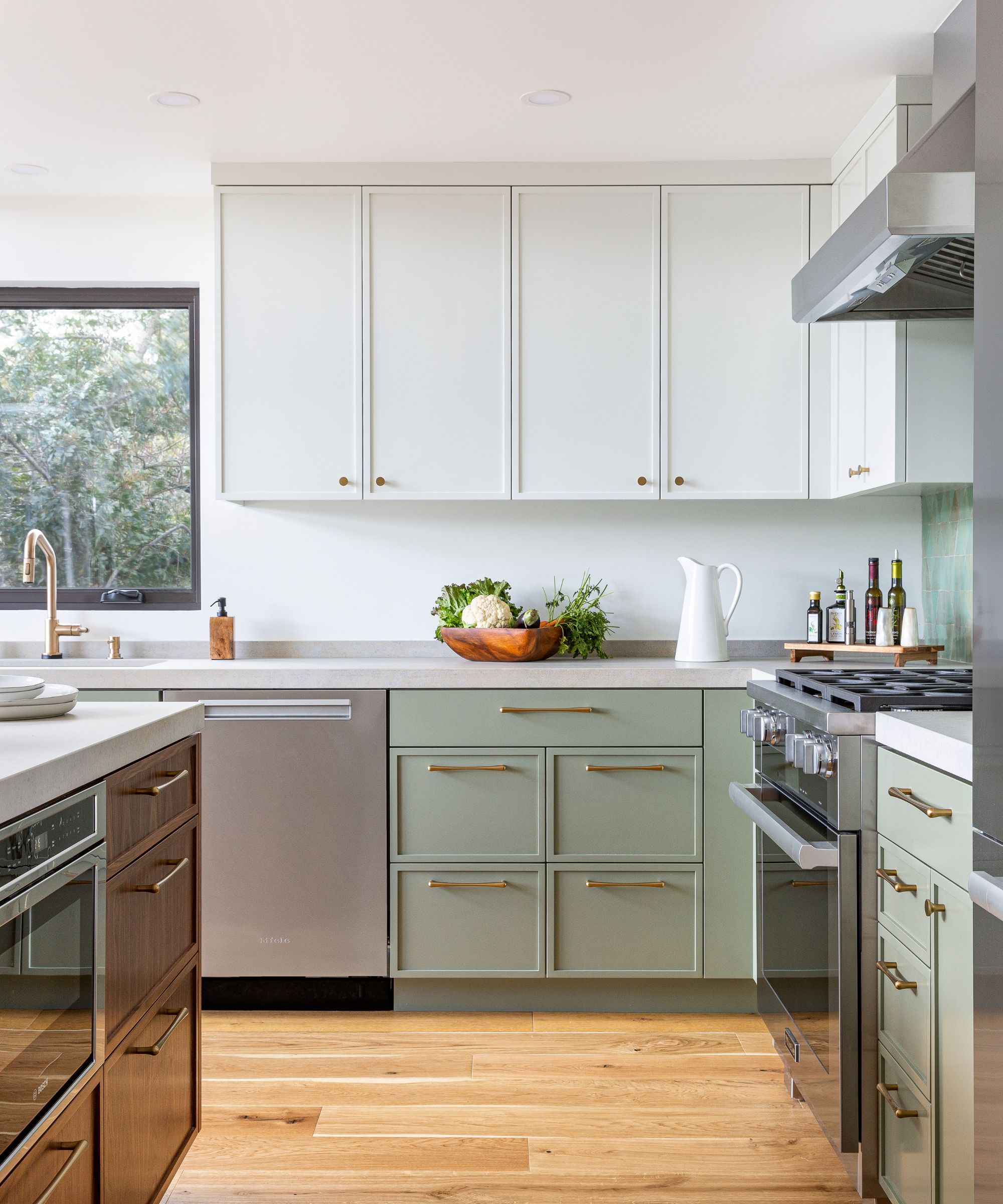
If you like color, but you're cautious about it feeling overwhelming, then why not consider a two-tone scheme? Limiting color to base cabinets and either keeping walls bare, or painting the wall cabinets in a similar neutral shade to the walls can be a fantastic way to introduce subtle color whilst keeping spaces feeling calm and fresh, as done here by Kimberley Harrison Interiors.
'Calming kitchen colors like soft green and warm walnut create a serene atmosphere that transforms this bustling space into a personal oasis, says Kimberley Harrison. 'These hues evoke a sense of tranquility and nurture a connection to nature, enhancing mindfulness in daily culinary activities.'
3. Soft blues
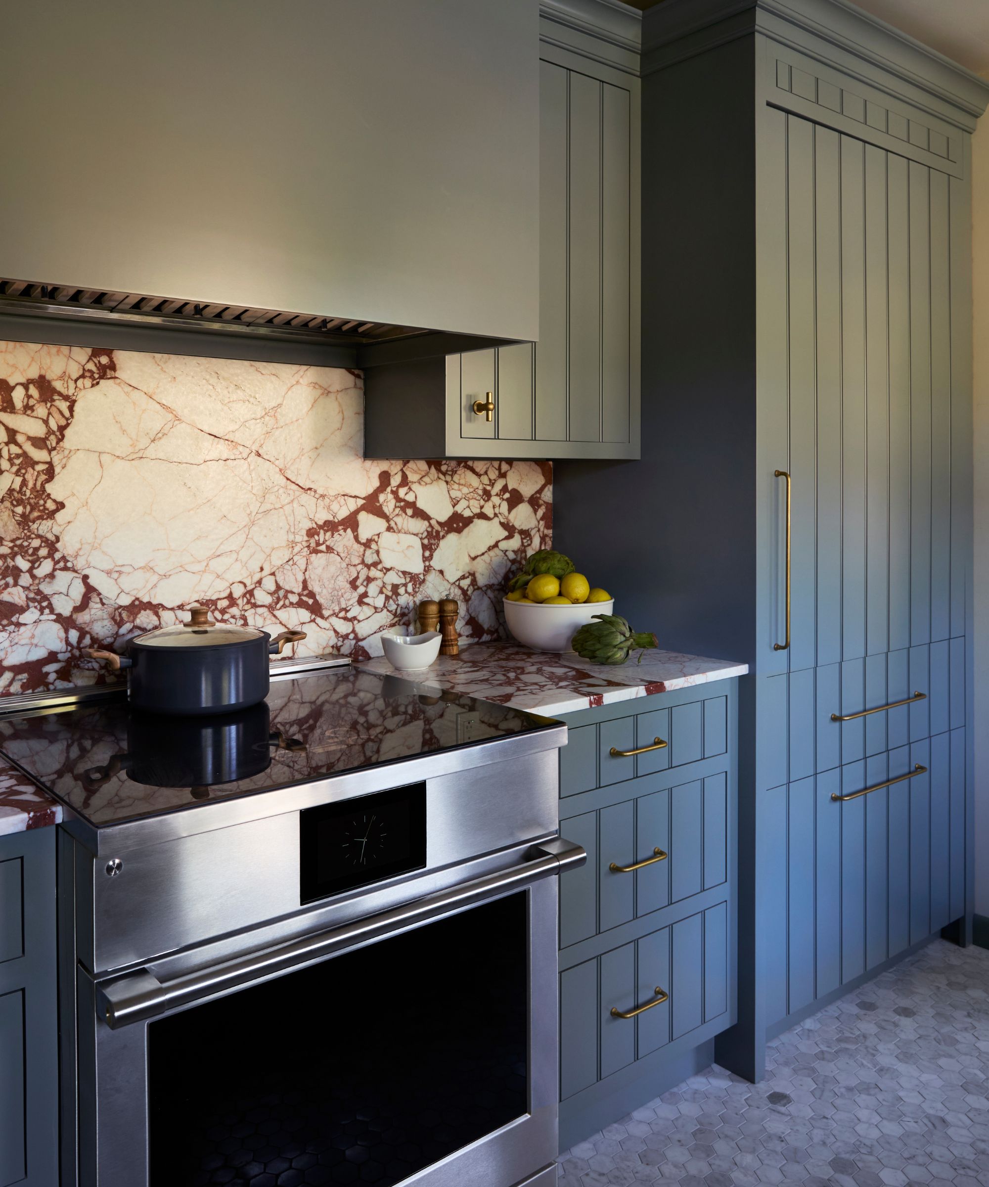
Greens continue to take the lead when it comes to calming kitchen colors, but blues are not far behind. Reminiscent of calming sea views and clear skies, it's no wonder blues are a staple soothing shade.
‘Icy blue or sky blue kitchens may not be super common, but they are the epitome of relaxed luxury. A light blue feels optimistic. It's also a great hue for brightening up a small kitchen or making an expansive kitchen feel even more serene,’ says Emily Arthur, Creative Director of Isla Porter, a female-founded cabinetry company focused on customization. ‘At Isla Porter, we direct clients looking for cool blue kitchens to our custom color palette – Icy and Curio (both pale blues) are great choices.’
'On the flip side, a dark, smoky blue can create a sense of coziness and warmth in kitchens of any size or style. Our color, The Mood, is perfect for this,’ adds Emily Arthur.
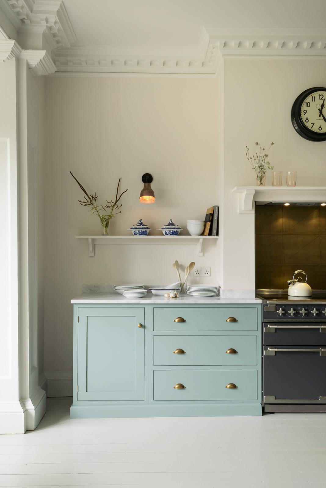
'Shades of blue, especially the softer, more muted tones like pale aqua or powder blues like ‘Temple Linen’ or ‘Great Lake’ can really evoke a feeling of peace and tranquility,' adds Anna Hill, Brand Director and Color Consultant of Fenwick & Tilbrook. 'Blue shades are known to have a calming effect on the mind, making them an excellent choice for a more relaxing and restful space.'
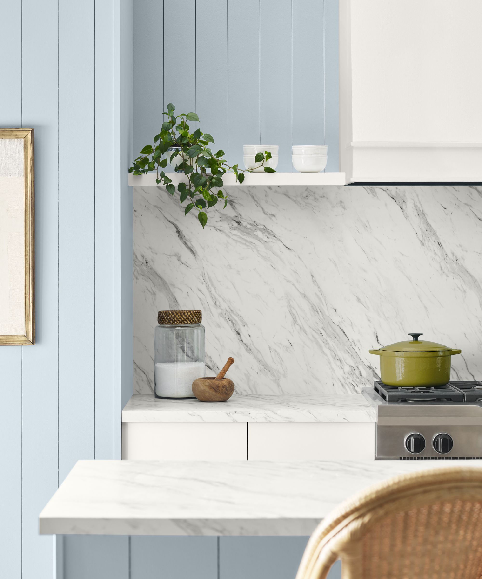
Stuck on which shade of blue to choose? The gentle, light blue shade Upward SW 6239 is one of four calming kitchen colors shortlisted by Sherwin Williams' Color and Marketing Manager, Emily Kantz. 'Its subtle nature enhances a minimalist aesthetic, creating a clean and uncluttered look that fosters mindfulness and simplicity, explains Emily. 'This color pairs beautifully with other neutrals like whites, beiges, and soft grays, and it complements natural materials such as wood and stone. Incorporating these natural elements helps to create a more Zen-like environment.'
4. Pale pink and plaster tones
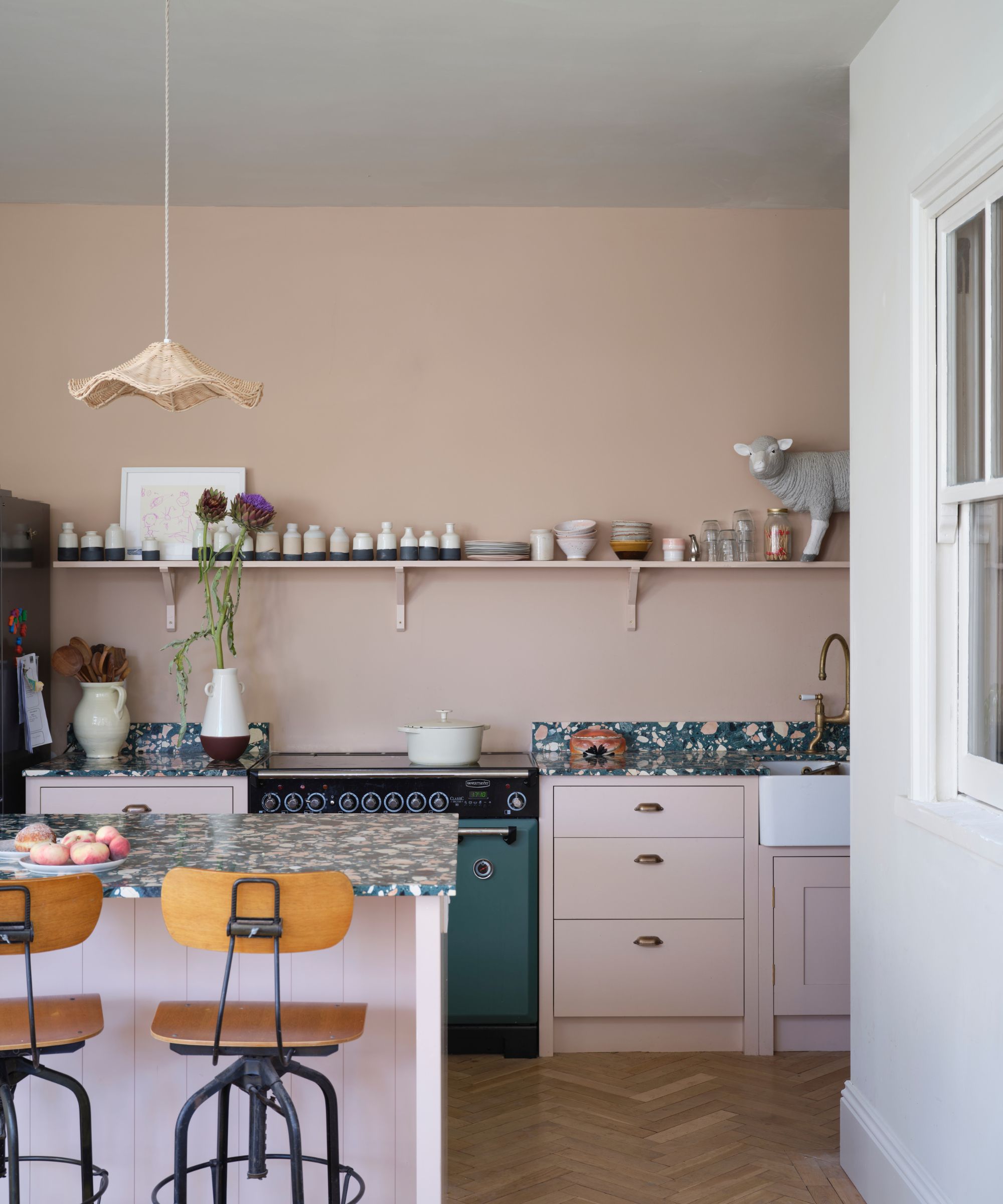
Plaster pinks have been popular for a good few years now and see no sign of abating in 2025 as we continue to favor comforting and nostalgic colors. Soft chalky pinks are popular with interior designers who use them almost as a neutral due to their wonderful versatility. They work particularly well in kitchens as they help soften hard and angular surfaces and bring a comforting feeling to what can be cold spaces.
'Consider them as a neutral and they will layer with almost any color and will work in any room in your home,' says Patrick O’Donnell, brand ambassador for Farrow & Ball. 'They make the most flattering wall color for a bathroom as well as a calming choice for a kitchen scheme.'
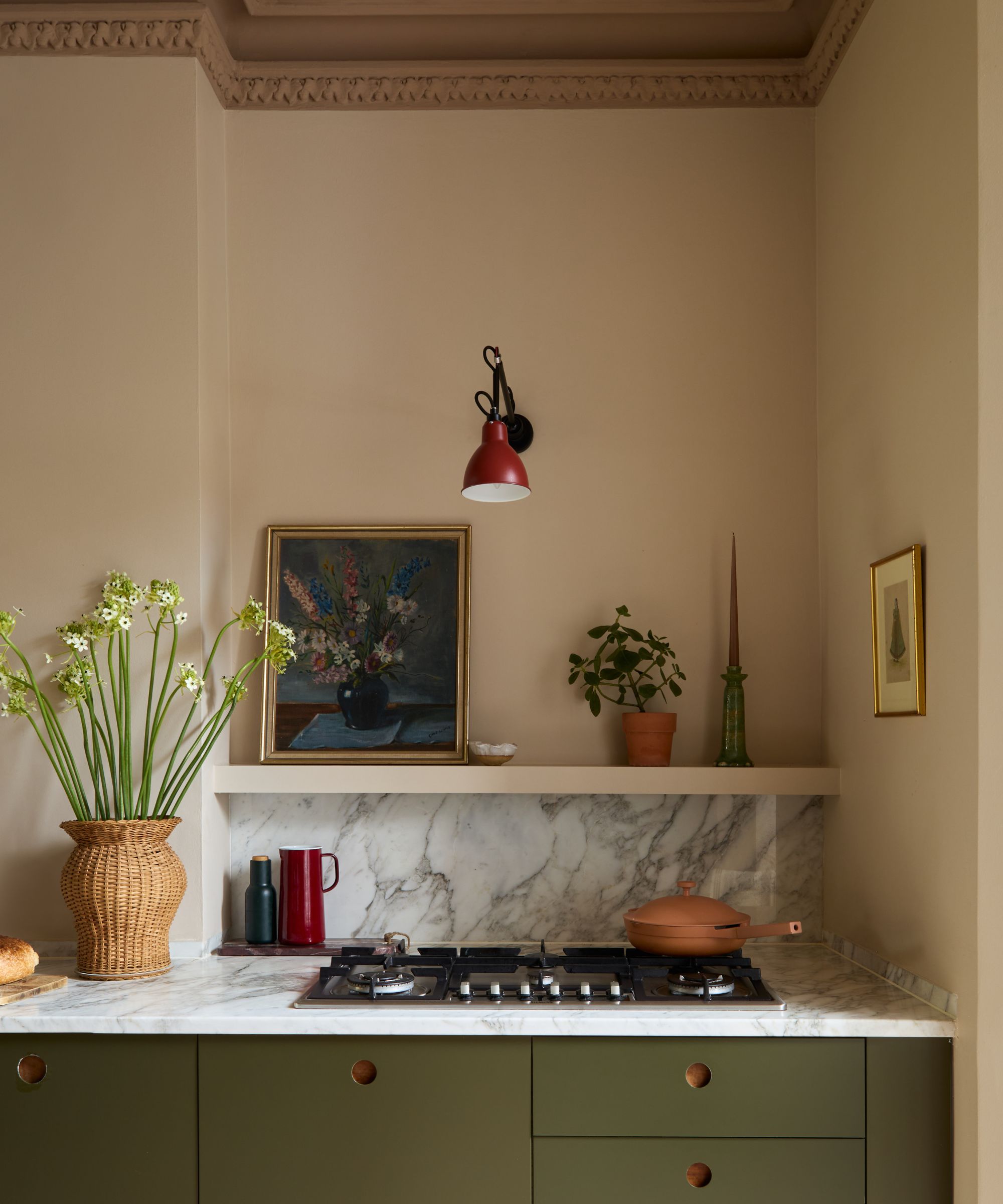
In this London townhouse, interior designer Laura Williams opted for a two-tone scheme to create depth and warmth, pairing these with a deep olive green on cabinets.
'We wanted to transform this space through color and create a warm and inviting mood to counteract the hard surfaces in the kitchen,' explains Laura Stephens. 'This was achieved by using Hammock by Little Greene on the walls and adding a darker, tonal color to the ceiling – Mink by Paint & Paper Library – which helped to draw in the high ceiling and create a feature of the original cornice.'
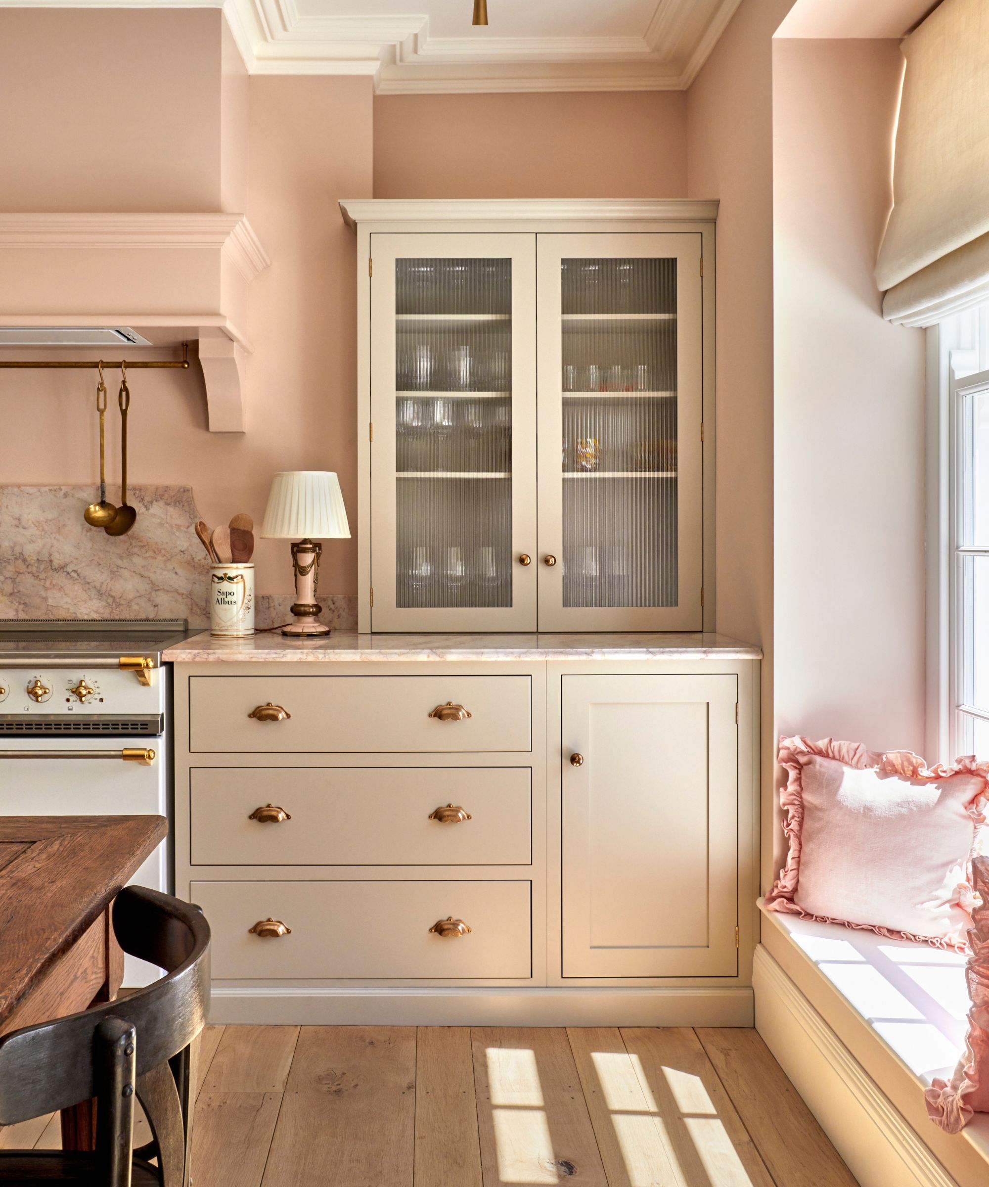
This beautiful kitchen by Penrose Tilbury is a further example of how warm pinks make a wonderful alternative to neutrals when decorating kitchens, as they fill spaces with a warm, comforting glow.
'This kitchen features serene pink walls painted in Edward Bulmer's Jonquil and Devol cabinets in Mushroom. The soft grey units have a warm undertone and complement the pink-toned honed Rosalina marble worktop from Mandarin Stone. It's a calming color scheme which helps make the room feel like a space to relax in as opposed to a solely functional kitchen,' says Rose Hanson and Charlie Tilbury, founders of Penrose Tilbury.
5. Mellow yellows
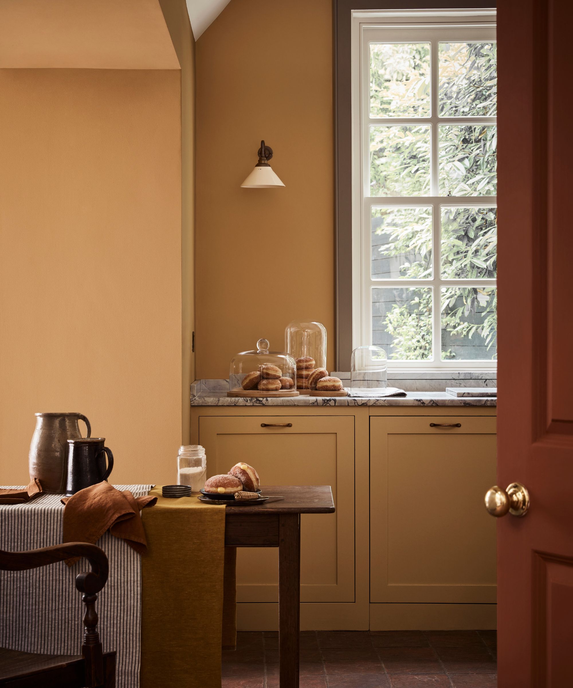
While not traditionally associated with kitchens, mellow yellows have grown hugely in popularity in recent years and we've noticed them regularly popping up in these practical spaces. Warm and buttery, subdued yellows bring an uplifting ray of sunshine whilst also being comforting and grounding.
'We’ve seen that there is a greater desire to surround ourselves with comforting, nurturing colors that are not only easy to scheme but provide serenity and tranquillity in our homes. This has been reflected in the increasing popularity of neutrals and earthier tones that have an inherent warmth,' explains Ruth Mottershead of Little Greene.
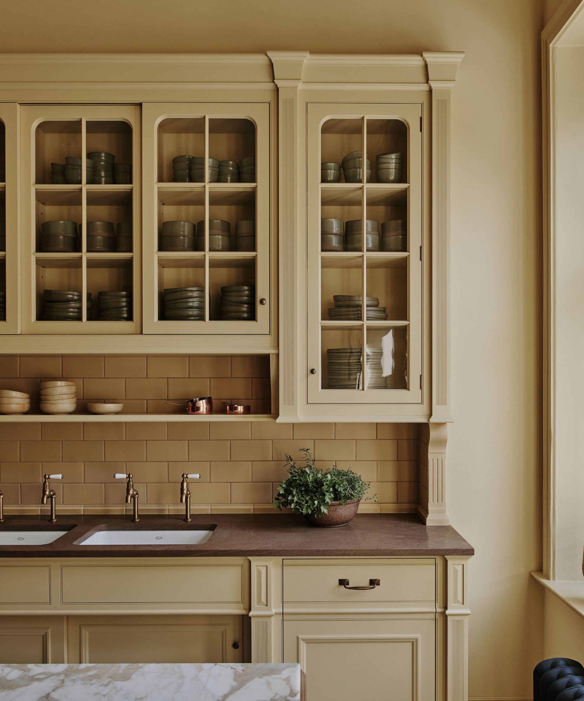
When creating a calming kitchen environment it's not just the color shade that's important, how you use it also plays a part. For the ultimate cozy kitchen, consider painting the cabinets, walls and ceiling in the same color and 'color-drenching' to create a warm and enveloping space.
‘For this yellow kitchen, we chose Farrow & Ball’s lovely Hay shade and color-drenched the room for a warm and dramatic look. We tend to work with the paint houses such as Farrow & Ball, Edward Bulmer, and Benjamin Moore,' says Bruce Hodgson, founder of British kitchen and joinery company, Artichoke.
6. Rich browns
While off-white, light neutrals and muted tones are often the go-to for calming palettes, deep colors can also deliver a restful feel and are on the rise in kitchen design.
Deep browns have found particular favor in recent years and seem to be replacing the once-popular charcoal grays. This can perhaps be attributed to their cocooning warmth and ability to pair beautifully with on-trend green and sought-after natural materials.
'In 2025, we expect homeowners to embrace a more atmospheric color palette, introducing richer hues, including reds, blacks, and deep earth tones such as brown and burgundy,' says Al Bruce, founder of Olive & Barr. 'The rich decadence of these colors adds a sophisticated touch while creating a cosy and inviting atmosphere. Dark shades allow other materials and textures to shine, particularly cabinetry hardware and natural materials such as stone and wood.'
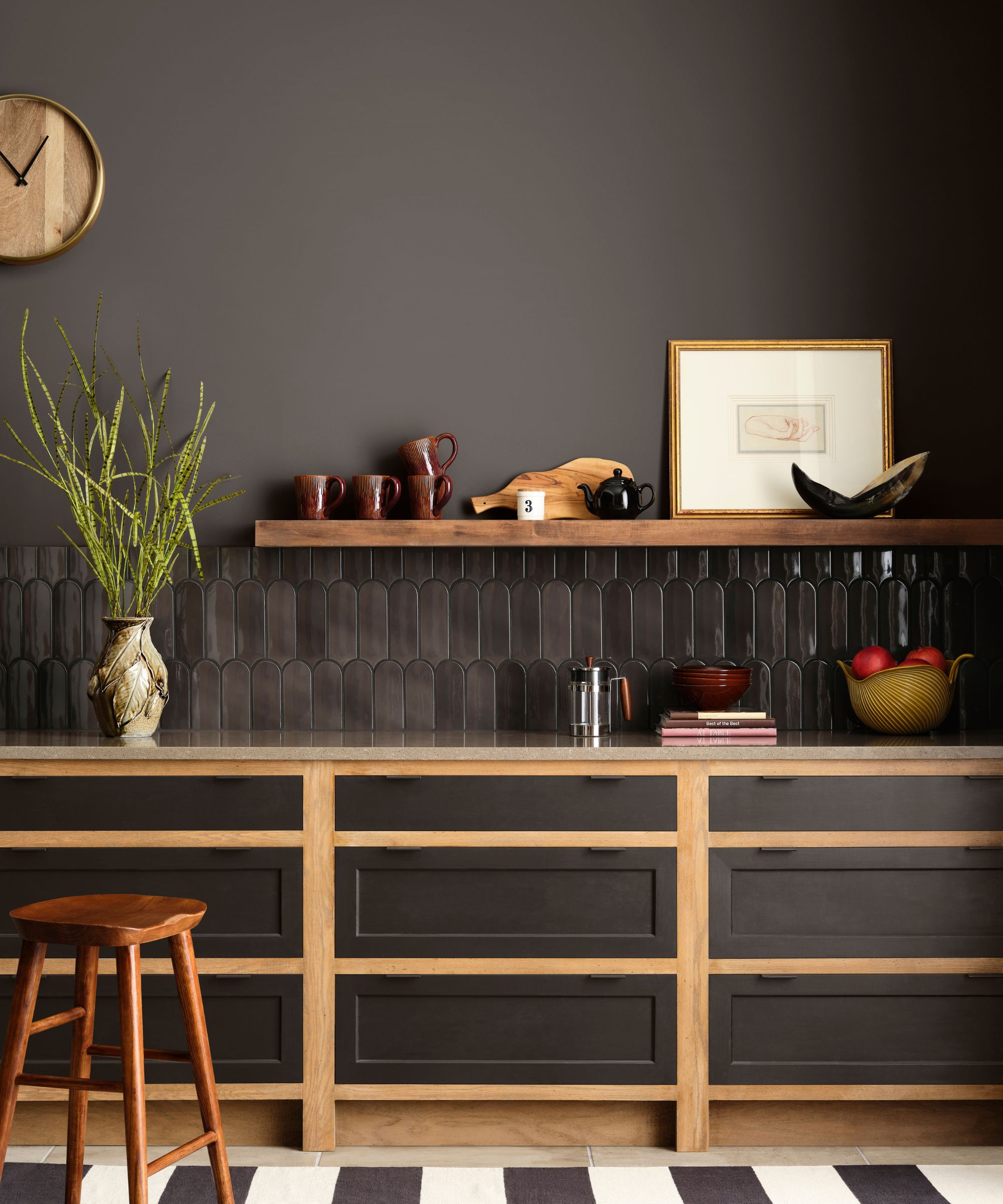
Emily Kantz tipped clove as a perfect shade for a cozy, calming kitchen. 'Clove SW 9605 is a rich, warm brown that creates a grounded and cozy atmosphere in the kitchen, promoting stability and an earthy calm,' she explains. 'Zen design emphasizes harmony with nature, and Clove's deep, natural hue evokes a connection to the earth, which is essential for creating a balanced space.'
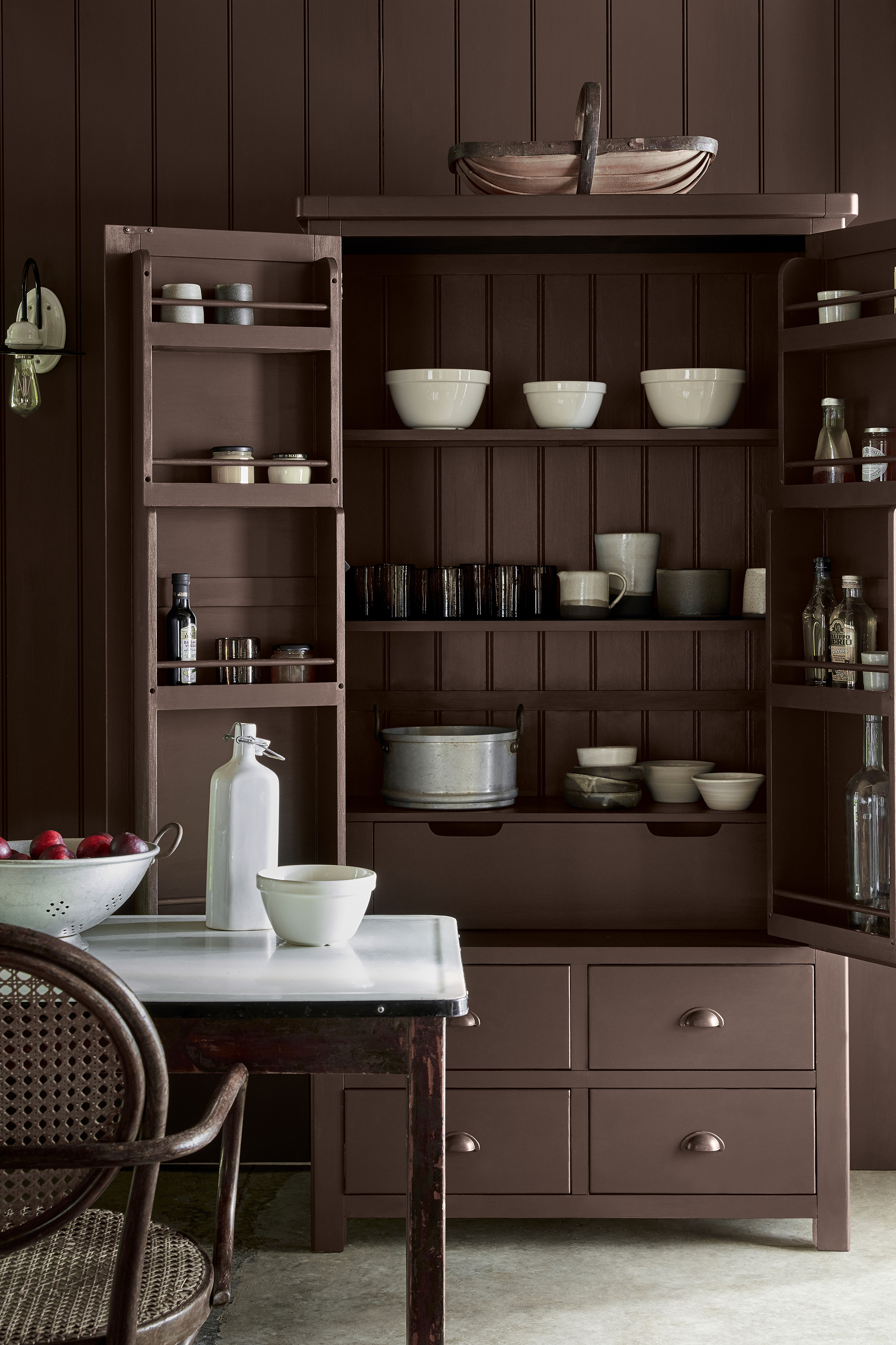
'We love to use earthy browns in our kitchen schemes, as just like green, this is a color which originates from our surroundings in nature,' adds Holly Baughan. 'Browny tones have a real warmth to them, like wood, which not only makes us feel calm and relaxed, it is also a timeless color to use in a space which requires longevity.'
The consensus seems to be if you want to create a calming kitchen, choose a color scheme inspired by nature. Soft greens and blues, warm off-whites, and deep earthy shades all imbue a sense of serenity because they feel familiar and soothing. These colors are timeless, so you don't need to worry about them dating any time soon.

Pippa is a contributor to Homes & Gardens. A graduate of Art History and formerly Style Editor at Period Living, she is passionate about architecture, creating decorating content, interior styling and writing about craft and historic homes. She enjoys searching out beautiful images and the latest trends to share with the Homes & Gardens audience. A keen gardener, when she’s not writing, you’ll find her growing flowers on her yard for styling projects.