6 bold design tips we learnt from this Gucci-inspired kitchen
Do statement kitchens ever go out of fashion? Not here, where the colorful look is just as much haute couture as haute cuisine
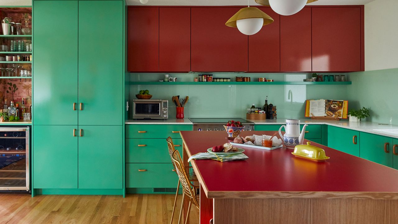
Italian luxury fashion brand Gucci has been inspiring the world of haute couture since 1921, but Gucci haute cuisine? That's a new one on us. This striking kitchen color combination of brick red and vivid mint green was directly inspired by Gucci's Spring 2020 runway show and we think the new-look space could be quite the trendsetter.
We asked the interior design team who came up with the unusual look about their key kitchen ideas for this space, and they explained that the Gucci show had included references to many time periods. 'Almost as if we were looking at a modern-day interpretation of when the 90s referenced the 70s,' says Victoria Sass, principal and design director at Prospect Refuge Studio
The best of all three fashion decades are subtly referenced here in the kitchen of this classic Midwest Mid century modern home in Minneapolis, creating a fun and unique living space with the longevity, style, and comfort of a pair of classic Double-G loafers. Like all good fashion choices, the interior design decisions made by Victoria and her team have worked with the home's existing features, enhancing the good points and overcoming any problems, to create a space that wears its Gucci look with confidence and pride.
Here are the six standout kitchen trend lessons we've learnt from this space.
1. Enhance the room's original features
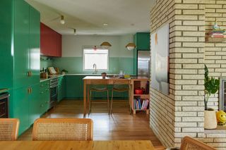
Part of the reason for the kitchen redesign was that the original space was too big. The house had been remodeled over the years in the attempt to create an open floor plan but, says Victoria, 'It was all wrong for the home and left the homeowners at a loss for what to do with their space.' They had even considered moving the kitchen to the other side of the house, but Prospect Refuge Studio were able to keep the kitchen in its original location by making a few minor tweaks to the space.
But there was one beautiful feature that wasn't going anywhere. 'There is a rather lovely and original two-sided fireplace that faces into the kitchen and the living room.' says Victoria. 'It is clad in a chiseled edge stacked limestone which is nicely balanced by the color and smooth qualities of the new kitchen design.' So the fireplace remains at the center of the home's floorplan.
2. Make the island part of the furniture
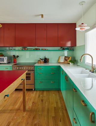
Think you've seen all the kitchen island ideas? Here's an elegant, slim-lined look that works so well in this midcentury modern home and would look just as good in other settings, too. It provides extra workspace and a place to perch on bar stools without dominating the space.
'The design of this custom island piece was inspired by the Alvar Aalto bentwood Artek tables that featured brightly colored linoleum tops and wood edge banding,' explains Victoria. 'It’s meant to be more of a furniture piece and is largely open with very minimal storage – just a bit of shelving for cookbooks and a trash pullout on the opposite side. It also gave us a worksurface that faced the back of the home, which is beautifully situated on a bluff overlooking a reserve.'
3. Create a stylish home bar
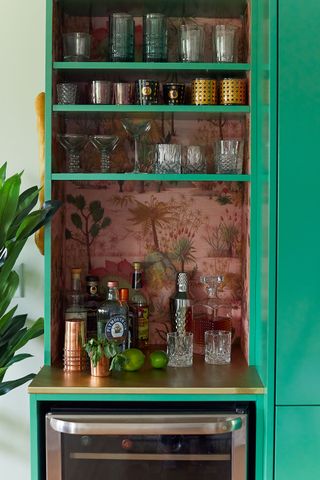
Anyone looking for home bar ideas will find inspiration in this dedicated space at the end of the run of kitchen units. It's perfectly positioned close to the dining room for fuss-free entertaining. With a below-counter wine fridge, it shows that even a small area can be converted into a useful and attractive space for storing glasses and chilling and serving drinks.
'The bar at the end was a specific ask from the homeowners and we outfitted it with a small refrigerator, brass bar tops, and dinosaur wallpaper,' says Victoria.
4. Keep countertops and handles simple
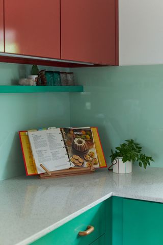
We spy some beautiful kitchen countertop ideas here, too, that complement and calm the vibrant cabinetry, while adding to the whole retro trend scene of the room.
'The perimeter countertop material is kind of a fun little throwback in our industry,' says Victoria. 'It is one of the original quartzes (or engineered stone) products that premiered in the early noughties and is almost terrazzo-like with its chunky pieces of glass embedded in resin. Today, the new quartz designs are all trying so hard to look like real stone, but we enjoyed the sincerity and nostalgia of this material that lead the way for current day trends.'
Another useful lesson learnt from this kitchen is that you don't have to buy expensive accessories to achieve a good look. The solid wood drawer pulls for the base units were budget buys at under five dollars each, but their simple, thoughtful design was just what Victoria had in mind for the look.
5. Choose a glass backsplash
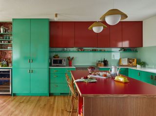
Another unusual design element arose when the design team were considering kitchen backsplash ideas. The backsplash is a pane of back-painted glass that runs the entirety of the kitchen. It is the perfect choice here as its smooth look doesn't detract attention from the showstopping cabinetry, but rather links the green and red base and wall units.
'Americans seem to be preoccupied with tiles as the only acceptable backsplash material – so of course we use every opportunity to use something different,' says Victoria. 'Back painted glass has a unique depth to it and was a great counterpoint to the high-gloss cabinetry.'
6. Put appliances back in the spotlight
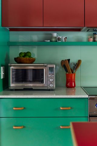
The contertops are not the only act of design rebellion you'll find in this space. Apart from the dishwasher, the appliances are all very much in full view, and the owners and design team had good grounds for doing that.
'Historically speaking, appliances were featured prominently in midcentury homes,' says Victoria. 'People were proud of their appliances and made no attempt to hide them, which I think is a rebellious concept these days as everyone is trying to design kitchens that hide all evidence of the work that occurs in such a space. We did panel the dishwasher – a two drawer model, from Fisher Paykel – so that we could get a nice run of green base cabinets along the one wall of the kitchen, but otherwise we channeled that midcentury appreciation of these hardworking machines.'
Looking back now it's finished, how does designer Victoria feel about the project? 'I think this was the birthplace of our ethos of ‘Timefulness’ – a response to the underwhelming non-commitment of ‘timeless’ design movement we are overexposed to today. The homeowner wasn’t interested in being timeless, but instead we referenced so many time periods that the project came into its own as completely, and assuredly itself.'
Sign up to the Homes & Gardens newsletter
Design expertise in your inbox – from inspiring decorating ideas and beautiful celebrity homes to practical gardening advice and shopping round-ups.
Karen sources beautiful homes to feature on the Homes & Gardens website. She loves visiting historic houses in particular and working with photographers to capture all shapes and sizes of properties. Karen began her career as a sub-editor at Hi-Fi News and Record Review magazine. Her move to women’s magazines came soon after, in the shape of Living magazine, which covered cookery, fashion, beauty, homes and gardening. From Living Karen moved to Ideal Home magazine, where as deputy chief sub, then chief sub, she started to really take an interest in properties, architecture, interior design and gardening.
-
 What does it mean to 'harden off a plant'? Experts explain this gardening term – and why it's important
If you've started seeds indoors, 'hardening off' is a key step when moving them outside
By Holly Crossley Published
-
 7 things you should repair instead of replace in your home – and how to complete the job well yourself in a few simple steps
Easy steps for fixing common household items
By Eve Smallman Published