Explore a transitional kitchen that expertly blends industrial style with the softness of organic modernism
We spoke with designer Becky Shea about how she balances two contrasting styles to create a kitchen that's both practical and warm
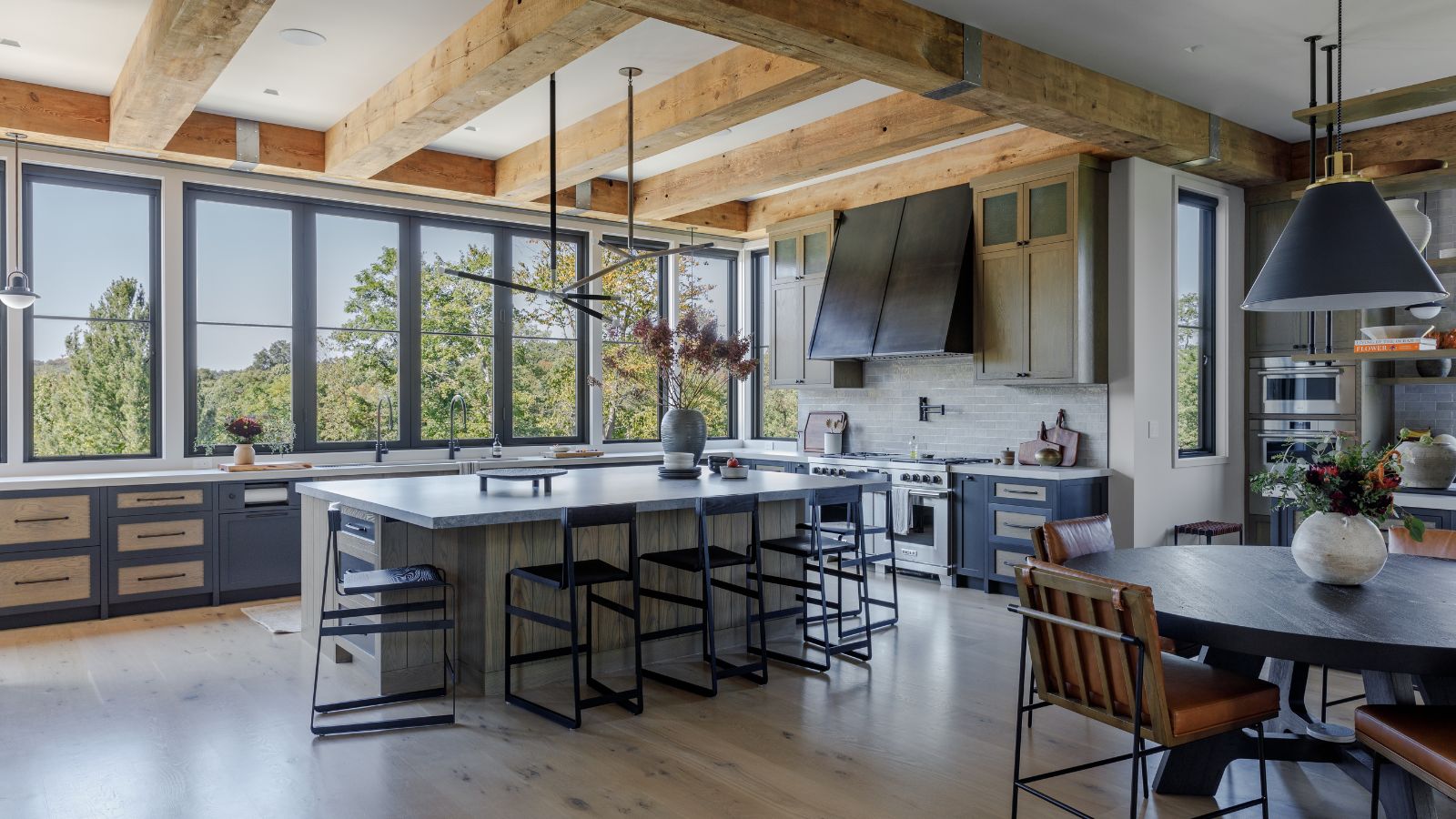

Transitional style has been a huge trend of 2024. The blending of styles to create timeless spaces that don't lean too much into one aesthetic makes so much sense. And it's simple to do in more lived rooms like bedrooms and living rooms that have plenty of opportunity for accessories, but in a more practical space like a kitchen, bringing multiple looks together while still remaining workable is a skill.
A skill designer Becky Shea perfectly demonstrates in this project. Here we asked her to talk us through the space, and how she brought together two contrasting styles to design a kitchen that is both warm and welcoming with a sleek industrial edge.
'Our Deer Ridge project is one of those standout spaces where we embraced the convergence of organic modernism and industrial design, pushing the boundaries of what a transitional kitchen could be.'
'I categorize it as transitional because it allowed us to blur the lines between two aesthetics that have shared commonalities but retain their own distinct qualities. What I love most about this space is how it balances warmth and utility, giving it both heart and grit, something I always aim to capture in my work.'
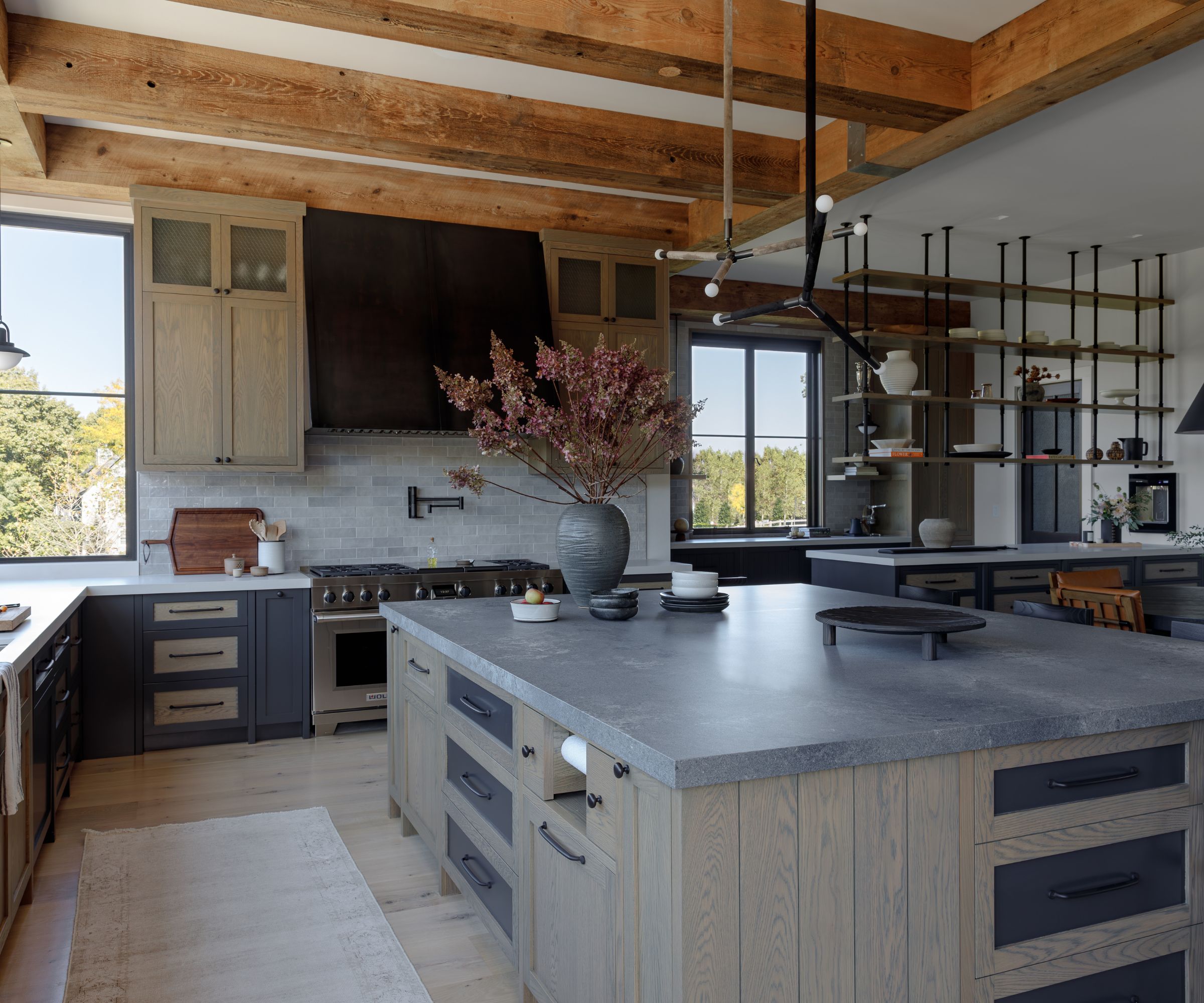
'One of the most striking elements we incorporated was the two-tone cabinetry. We played with a combination of dark paint-grade finishes and flat-sawn oak in a custom stain, which became a focal point.'
'The contrast between the smooth, sleek finish and the organic grain of the wood brought a dynamic energy into the space, creating a sense of depth and movement. The flat-sawn oak, with its exposed dovetail, grounded the design in a natural warmth, while the painted cabinetry kept it modern and streamlined, ensuring that the kitchen felt both accessible and fresh.'
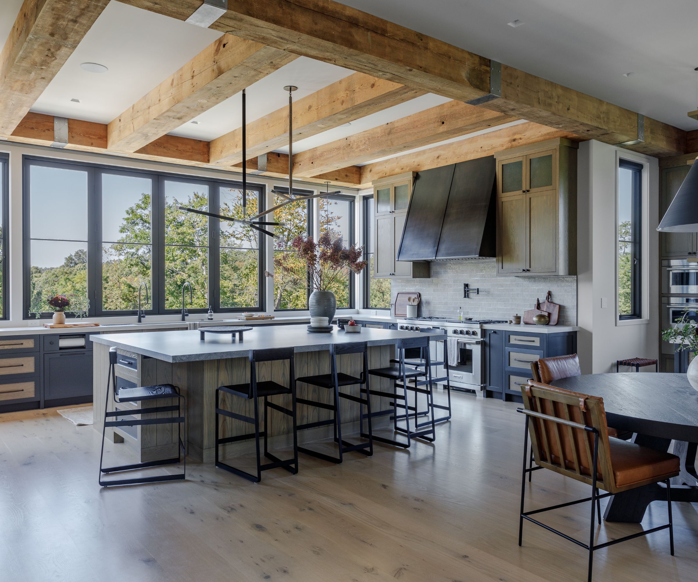
'The industrial elements came through strongly in the steel-clad hood and concrete countertops. The hood, bold and architectural, brought a utilitarian edge, echoing the rugged, functional ethos of industrial design.'
'I love that it became an anchor in the space, drawing the eye and creating a sense of permanence. Paired with concrete countertops, which are equally raw and functional, we leaned into the idea that materials don’t always have to be polished to be beautiful.'
'These elements added a tactile quality to the space, inviting people to interact with the kitchen on a sensory level. You feel the history and integrity in materials like steel and concrete, which is why I find them so compelling in design.'
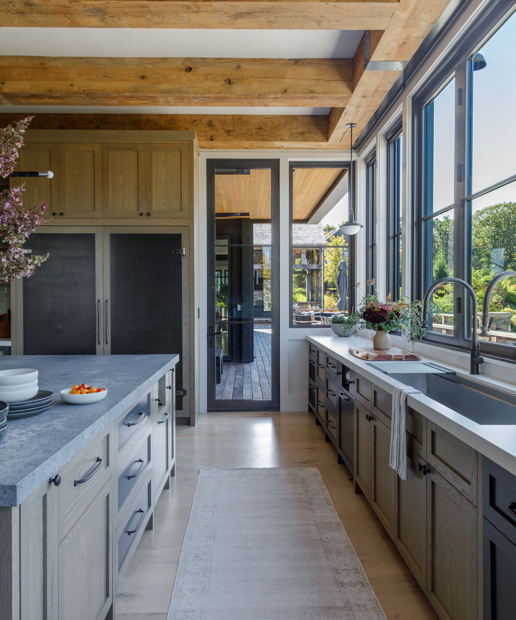
'A major highlight of the project was the set of windows that spanned 21 feet and opened directly to the outdoor deck and barbeque. This feature was integral to the organic modernist side of the design, fully embracing that seamless indoor-outdoor living ethos.'
'Bringing nature into the home is a cornerstone of organic modernism, and these windows acted as a bridge between the kitchen and the surrounding landscape. The natural light pouring in through those expansive panes elevated the entire space, making it feel open, airy, and alive.'
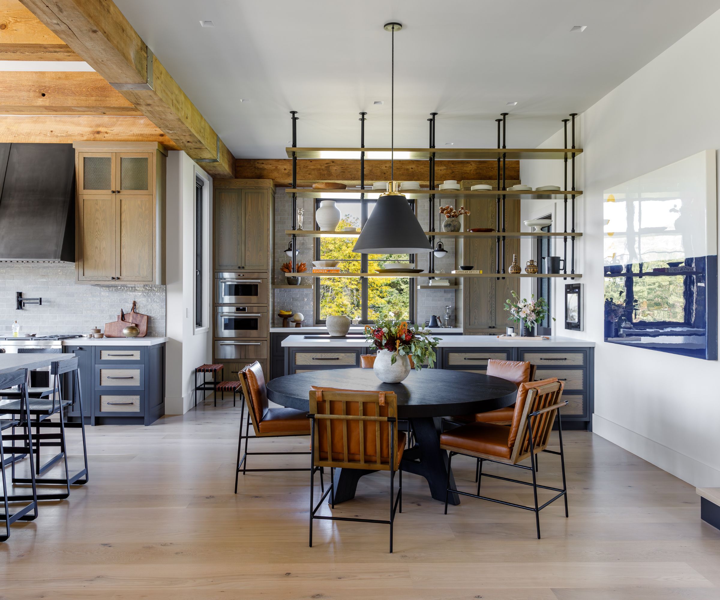
'We wanted to add an element of history and texture, so for the upper cabinets, we chose to incorporate dimpled chicken wire glass. This wasn’t just any glass; it was sourced from an old sewing factory in Detroit, which gave it an added layer of narrative.'
'I love incorporating materials with history because they bring soul into the space. The glass added a sense of openness while still maintaining some visual separation. It’s not just about aesthetics – it’s about creating a sense of connection to the past, making a space feel rooted in time.'
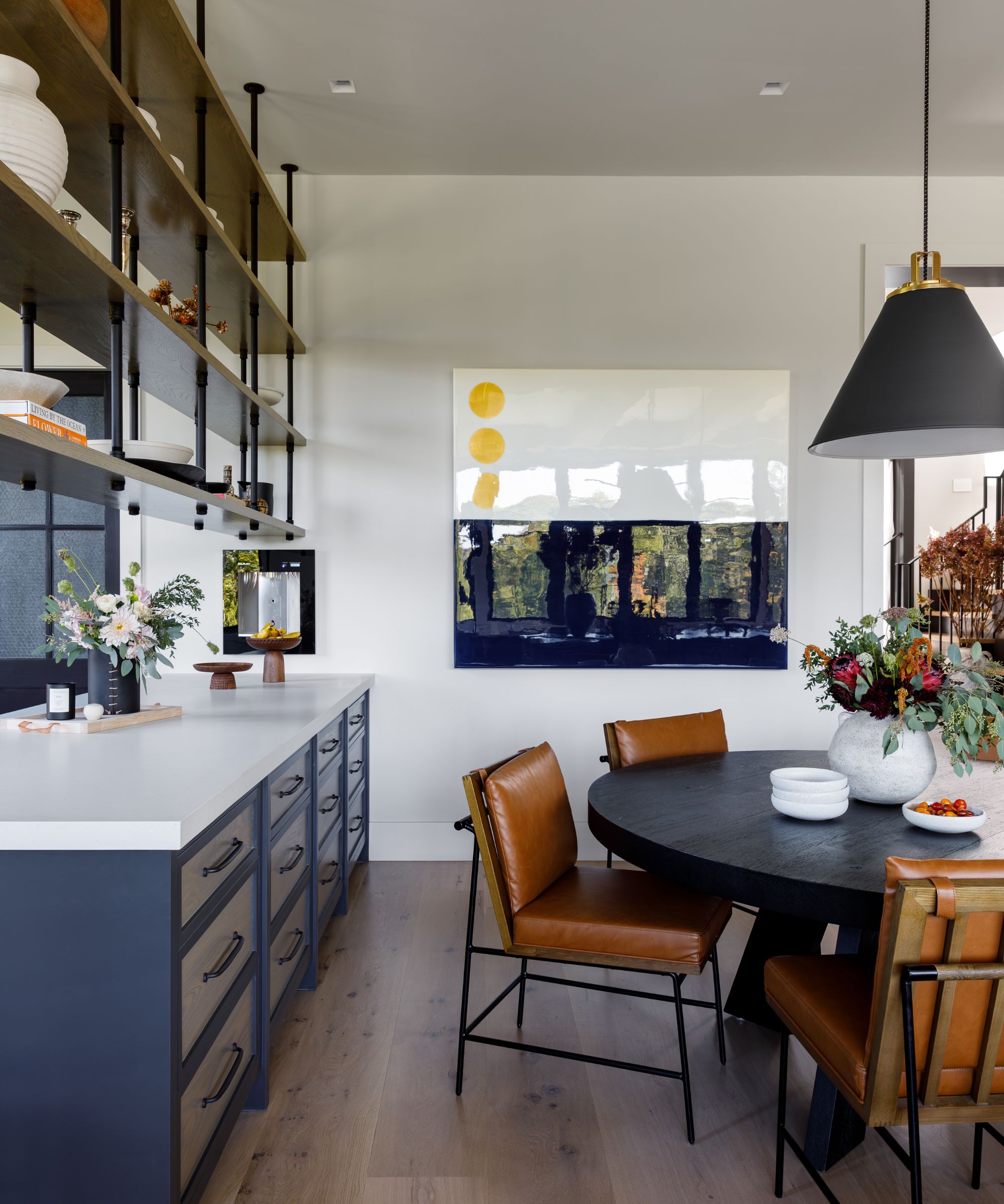
'Blending these two aesthetics – organic modernism and industrial – felt natural to us. Both rely on the integrity of materials and function, but together they create something timeless and edgy. Our life in the Deer Ridge Lane kitchen is a space where utilitarian strength meets organic warmth, and for me, that’s the sweet spot in design. It’s a place that feels lived-in yet striking, functional yet full of soul.'
Sign up to the Homes & Gardens newsletter
Design expertise in your inbox – from inspiring decorating ideas and beautiful celebrity homes to practical gardening advice and shopping round-ups.

I am the Head of Interiors at Homes & Gardens. I started off in the world of journalism in fashion and luxury travel and then landed my first interiors role at Real Homes and have been in the world of interior design ever since. Prior to my role at H&G I was the digital editor at Livingetc, from which I took a sabbatical to travel in my self-converted van (not as glamorous as decorating a home, but very satisfying). A year later, and with lots of technical DIY lessons learned I am back to writing and editing, sometimes even from the comfort of my home on wheels.
-
 Martha Stewart's intelligent cabinets 'take every inch into consideration' – their 'visually light' style will solve your small kitchen storage problems
'Every kitchen can be beautiful and functional, no matter what the size': 9 years since sharing her clever storage, Martha's cabinets are just as beautiful
By Megan Slack Published
-
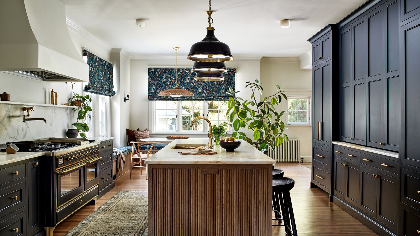 This once-dated kitchen is now a timeless space with the coziest details – and its the classic color palette that's made it a chic, welcoming space
Warming colors and natural materials combine to create this enduringly classic kitchen scheme
By Molly Malsom Published