What are the best accent colors for a white kitchen? 8 fail-safe shades to try
We've asked our experts what the best accent colors for a white kitchen are


Do you love your white kitchen but feel it needs perking up a little this year? The beauty of a white kitchen is that it creates a light and airy feel, it also works for both traditional and contemporary style spaces. But it can feel 'cold' so choosing an accent color will warm it up and give it an update at the same time. Choosing the best accent colors for a white kitchen can feel overwhelming, our experts will give you some top advice to help you decide.
'White kitchens continue to be hugely popular, despite the reputation that they can be too clinical for a home environment. There are many ways to ‘warm up’ the design, one of which is by introducing different colors and materials into the design scheme,' says Richard Atkins, managing director, DesignSpace London.
Live with your white kitchen for a while and see how you feel about it, are there particular corners that need a lift? And how much do you want to use your chosen accent color – a little hint here and there in the form of accessories, or a large statement like a painted custom cabinet?
What accents can I use in my white kitchen?
Most colors will work as an accent in a white room, do consider the light that comes in – a north-facing kitchen might need more warmth than a south-facing room for example.
'Adding an accent color to a white kitchen is a great way to create depth and lift the design scheme. White is very versatile, so you can be creative when choosing an accent color,' suggests Damla Turgut, founder and creative director, Otto Tiles & Design.
1. Black
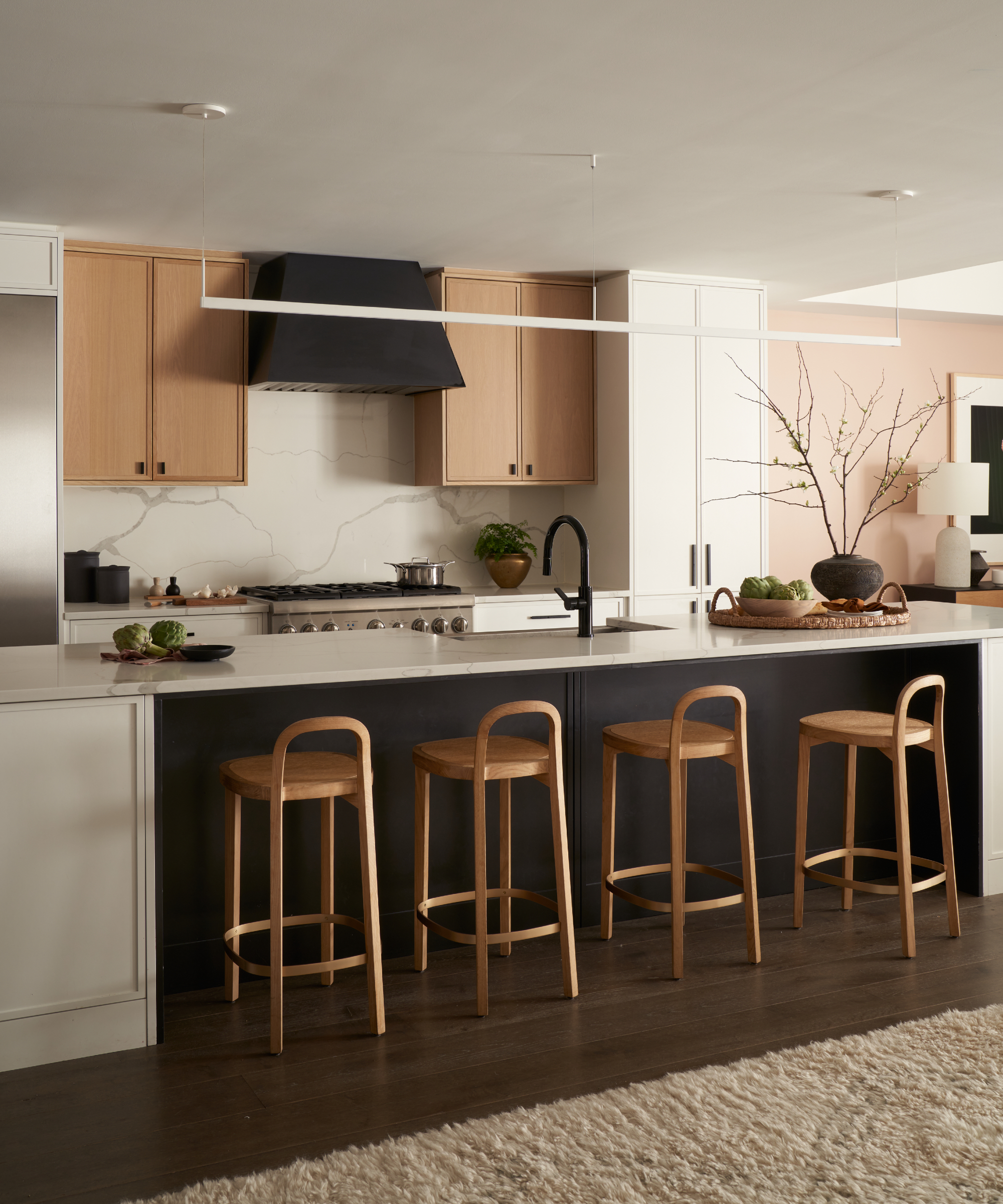
Black is perhaps not your first go-to color when you think of adding an accent, but it can certainly pack a punch when it comes to contrast, and of course, the beauty of white is that it's essentially a blank canvas for you to play with.
Victoria Balson, founder, Victoria Balson Interiors updated this previously all-white kitchen, 'We used the white cabinetry to anchor the space, but wanted some contrast to provide interest. By panelling the back of the island and swapping out the original stainless-steel hood with a custom Amore matte black hood we were able to change the look drastically.
The matte black kitchen cabinet hardware and faucet to black helps move your eye through the space. The white oak upper cabinet and white oak counter stools add the extra layer of material that really balances the space.'
Victoria’s classical design training and several years’ experience in the design industry acted as a launching pad to establish Victoria Balson Interiors in 2010. Victoria’s design vision extends across several styles balancing beauty, comfort, purpose, and inspiration. Each design includes luxurious finishes, thoughtful consideration of functionality, and an effortless refined feel.
2. Turquoise blue
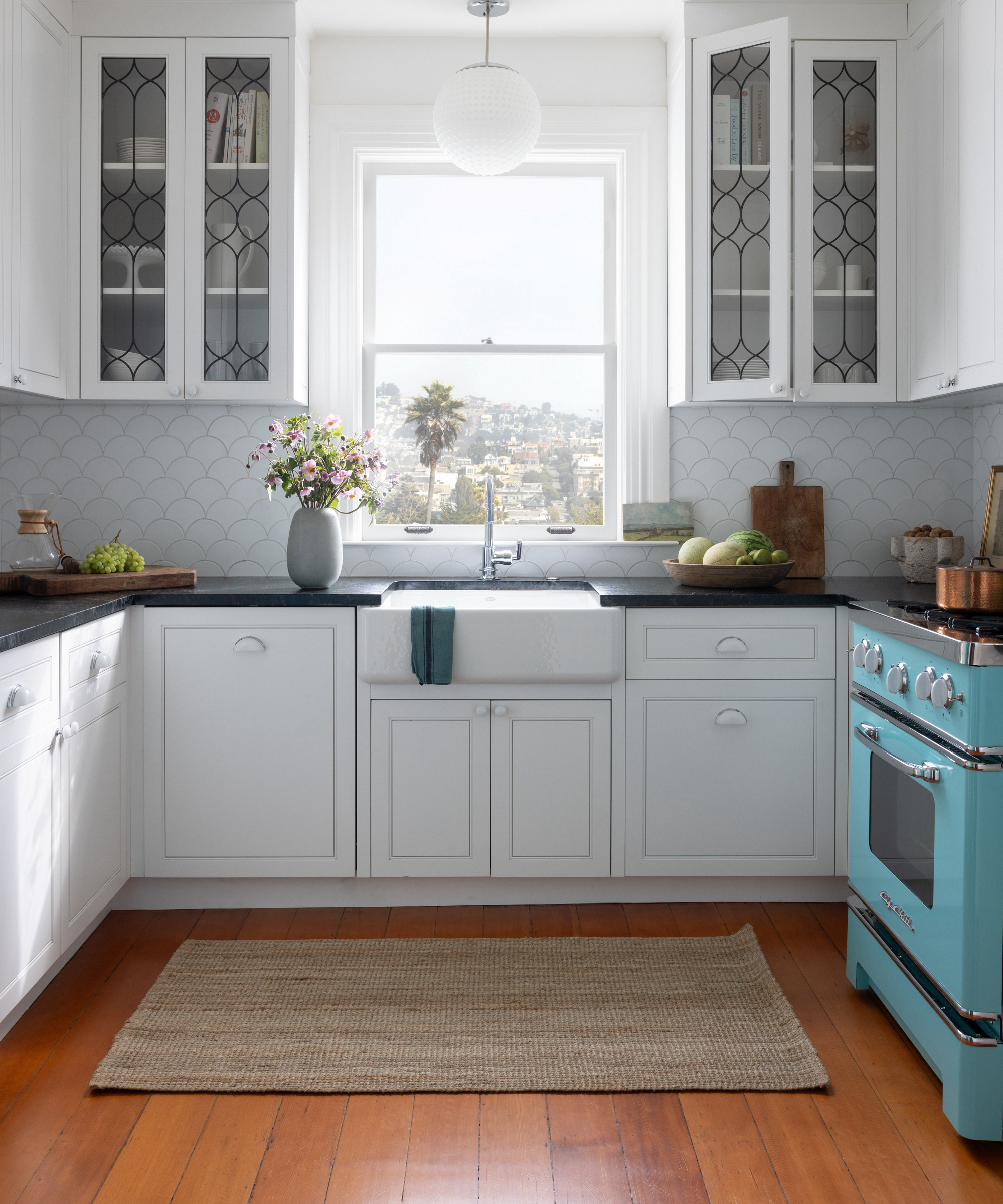
An accent color can be as minimal as one element being in that particular color. In this case, the appliance. Rachel Seldin, principal designer at Seldin Design Studios explains:
'The infusion of turquoise blue was a paramount request from my client, who holds this shade dear to her heart. To seamlessly incorporate her favorite palette into the kitchen, we made a deliberate choice to accentuate with turquoise blue appliances.
This unexpected yet embraced decision not only introduced a vibrant pop of color but also preserved the visual purity of the kitchen. The backdrop of soft whites, complemented by chromes and milk glass, serves as a refined canvas, allowing the turquoise appliances to take center stage, illuminating the space with their distinctive charm.'
This approach works well in small kitchens too, where perhaps you don't want the accent shade to take over the white.

Rachel Seldin is the principal designer at Seldin Design Studios, a high end residential interior design studio in San Francisco, CA. Her firm specializes in designing personalized, custom-curated interiors focusing on everything from architectural details to materials and furniture. She develops her designs by reaching into the past, recreating the existing, and tying together what is beautiful, functional, and timeless. The result is an innovative, bespoke design which tells a story unique to every client.
3. Muddy green
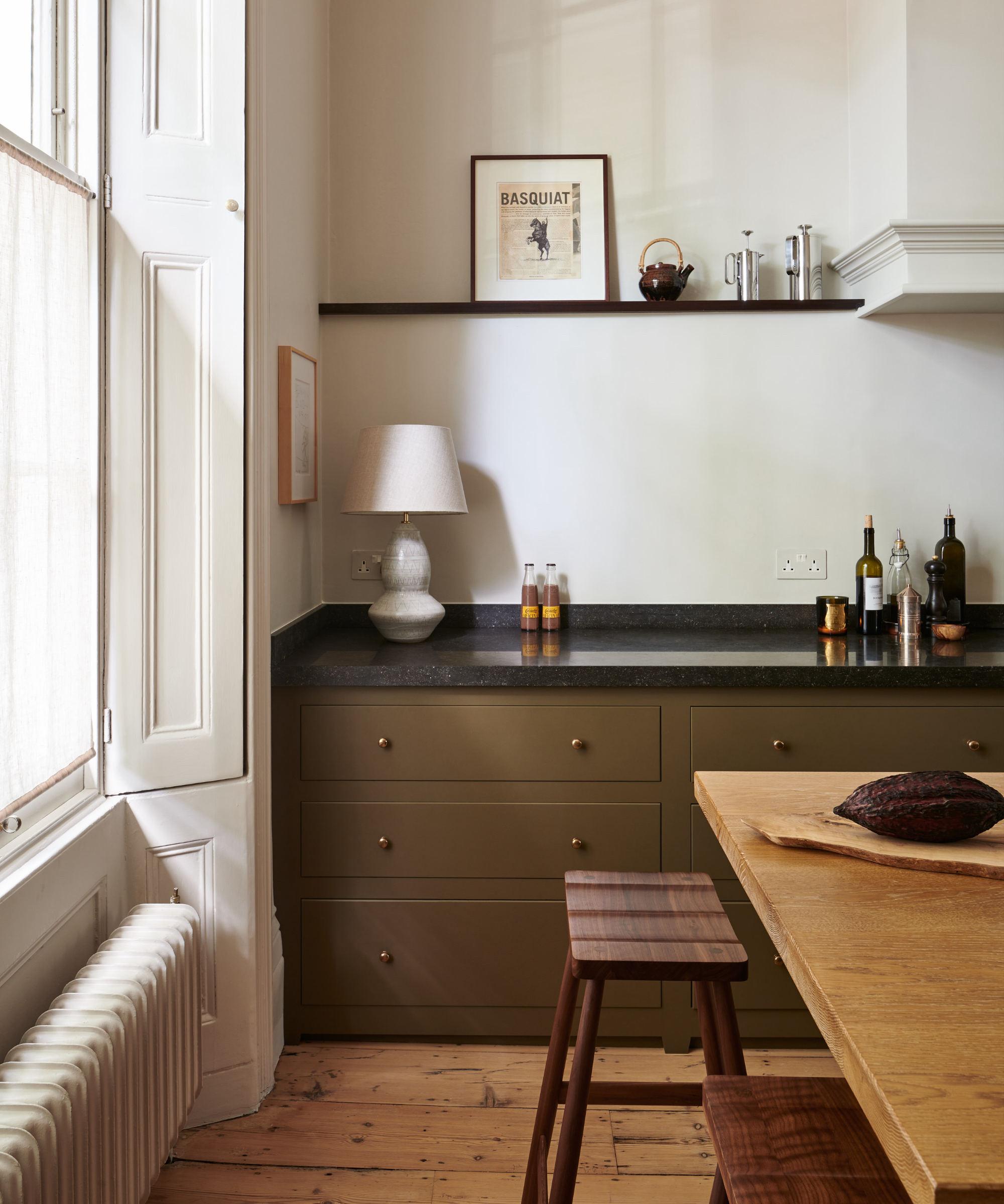
If your white kitchen has tall ceilings or is open plan and quite large, then you can 'ground' it visually by choosing a darker color for your cabinetry. It will draw the eye down and give the room a more balanced feel.
'Muddy greeny brown works really nicely with soft white walls, which creates a brighter interior than in previous years where people were using dark colors on their cupboards and walls,' says Helen Parker, creative director of deVOL Kitchens.
We agree, and it certainly adds a richness to making it ideal for a north-facing kitchen that needs a little warmth and a new look. 'The contrast of light and dark paint is bold and dramatic,' adds Helen.
Helen Parker is deVOL's Creative Director. Joining in 2004 as a kitchen designer, by 2011 she had become responsible for deVOL's style, creating one-of-a-kind showrooms, sourcing antiques and gifts and designing new pieces of furniture and accessories. Over the years, she has developed deVOL's look and voice, styling all their beautiful imagery, writing for their brochures and website, and is often featured in national and international press.
4. Wood (and marble)
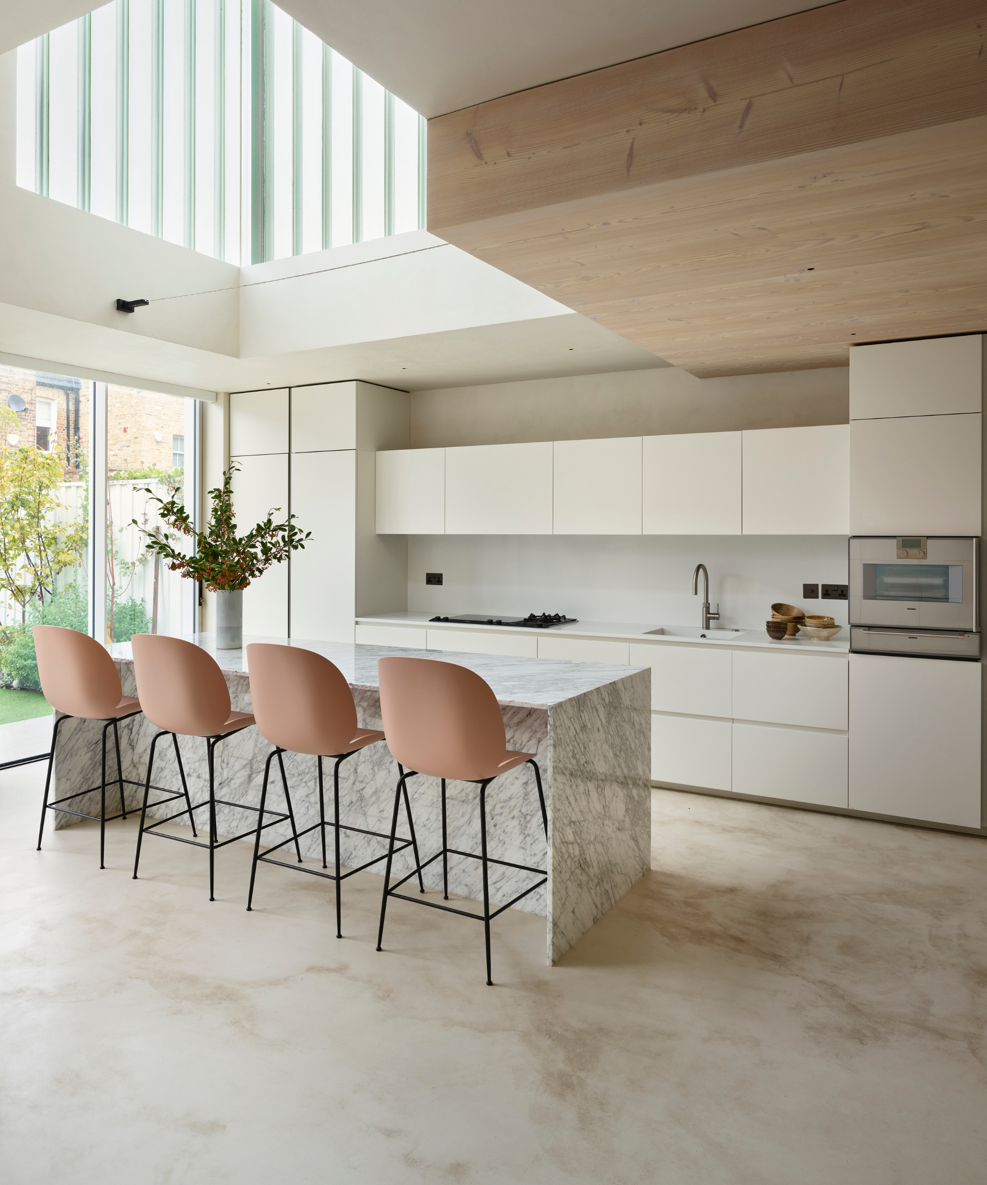
It's not always paint that can be an accent color in a white kitchen, you can introduce one by using a different texture too. Richard Atkins, managing director, DesignSpace London says, 'The union of materials that have different or opposite characteristics can result in an exciting and timeless design schemes. For example, a white kitchen teamed with dark wood units or a marble island with beautiful veins introduces drama and interest to a space.'
So if you don't fancy utilizing a color as such, consider something else instead. Richard adds, 'Natural materials with texture and/or grains such as wood or marble work particularly well.'
5. Emerald green
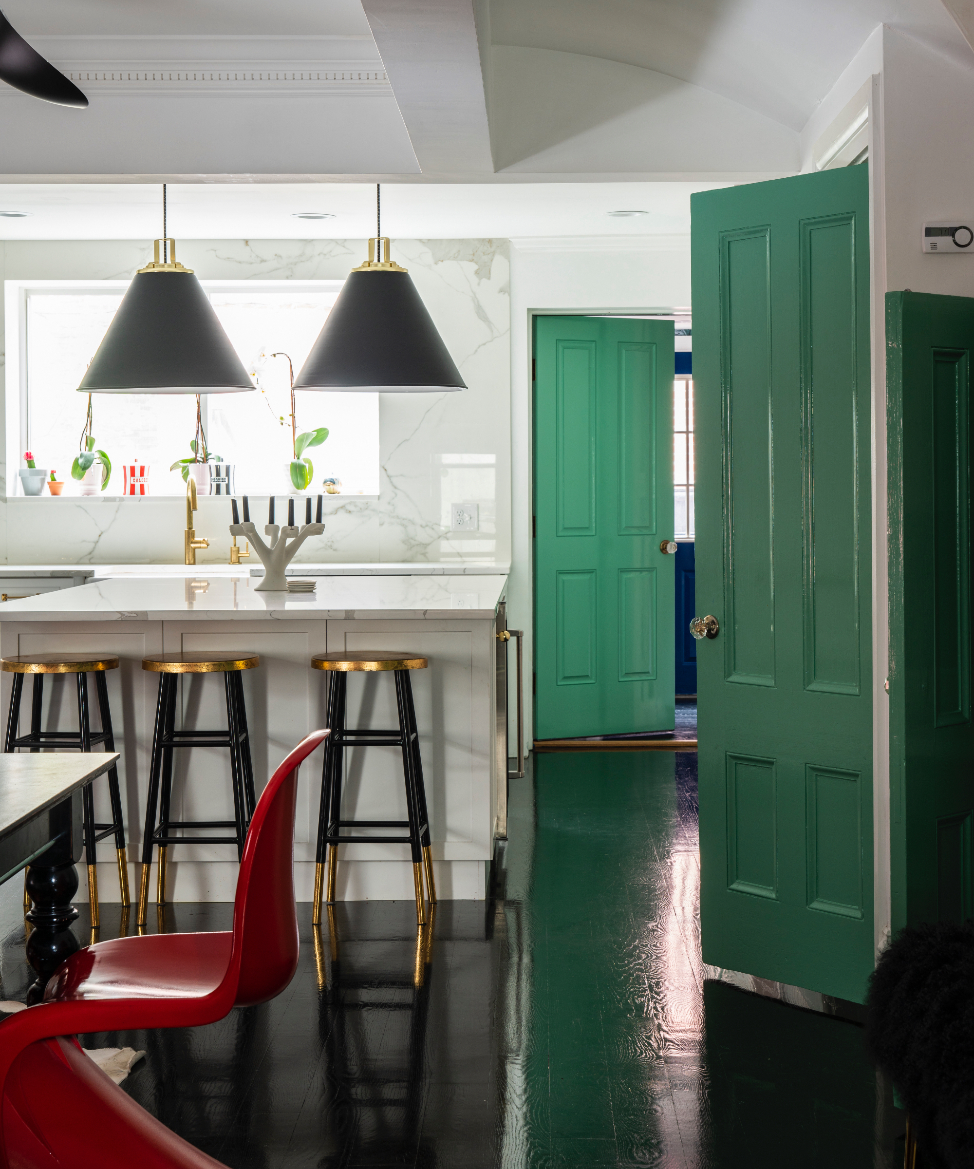
Perk up a white kitchen that's lacking a little in natural light with a bold emerald green – yes, there's also a black accent, but it's the green that elevates this kitchen with its bold shade. What's also interesting about this kitchen is where the accent color used.
'White kitchens will always look beautiful and are utterly timeless. However, by adding a splash of color, either on woodwork or some color blocking to delineate a space, things will feel thoroughly modern,' says Patrick O'Donnell, brand ambassador, Farrow & Ball.
'This stylishly monochromatic kitchen, with walls painted in our clean white shade Wevet in our modern emulsion, has been given a delicious dose of vitality by painting the doors in Arsenic. This creates a sharp design motif that adds wonderful interest whilst never distracting from the clean aesthetic.'

Patrick O’Donnell has been bringing his impeccable eye for colour to Farrow & Ball since 2012. Over that time, he has been a Showroom Manager, Global Colour Consultancy Manager and now Brand Ambassador. However, he is best known as the much-loved face of Farrow & Ball on social media
6. Red
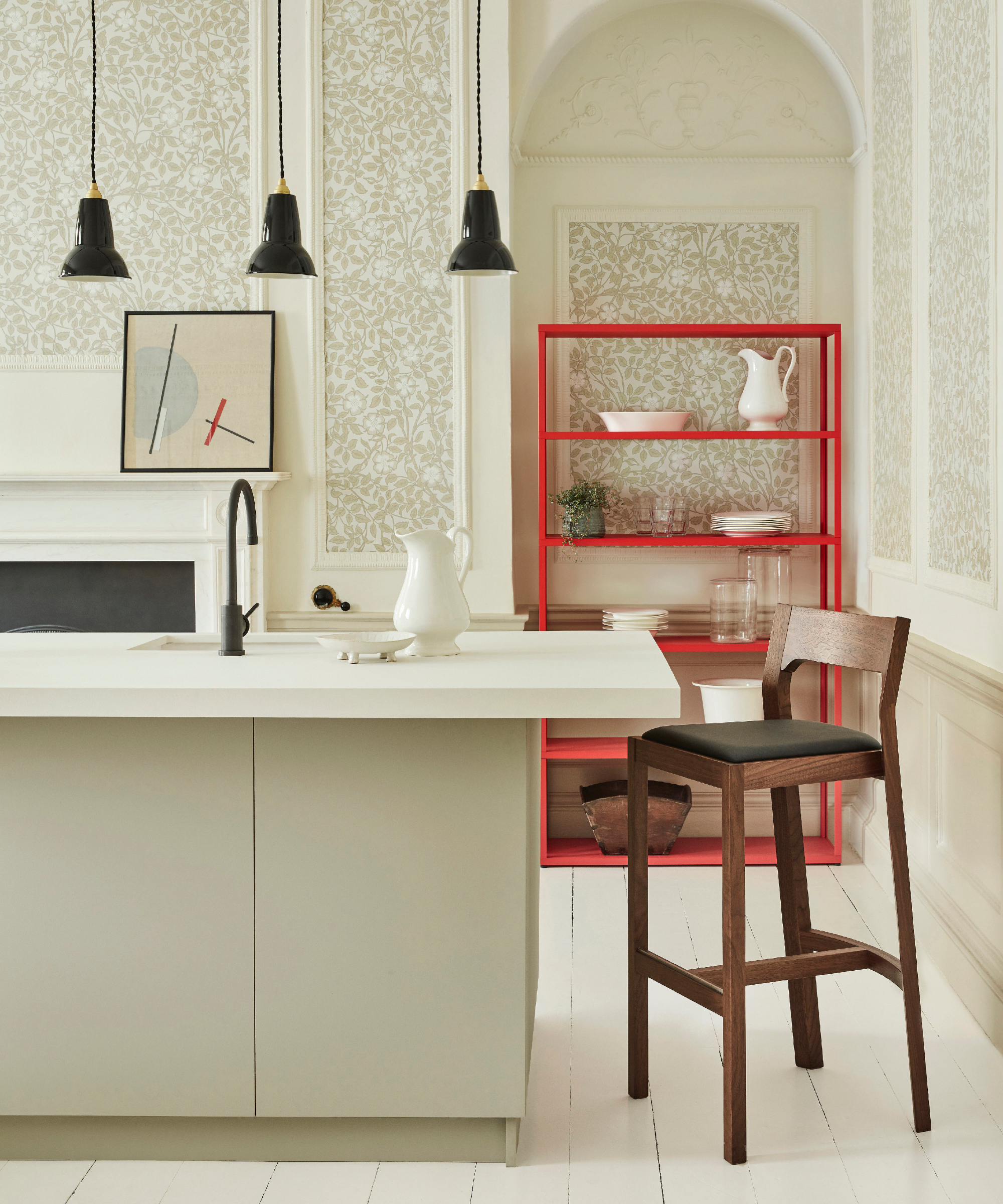
‘Introducing a white and neutral kitchen wallpaper pattern will create additional interest to an all-white kitchen, softening the hard surface finishes and integrating the space into a wider interior scheme,' says Ruth Mottershead, creative director at Little Greene.
This makes it a good option to warm up a colder white space, but for a real color pop go for something fabulous, Ruth suggests adding a 'highlight of bold red or pink for an unexpected and joyful pop of color.'
Red will create a real statement and it can be one large piece like this shelving unit, or small elements like tableware, you can start small and add more as and when.
7. Warm nudes

Peach is a perfect accent color to team with white, and remember you can play with proportions – add a few peach tones, see how you like it, then add more if it gets the result you want.
'Warm nude shades with a dark contrast color such as black can create a sophisticated and timeless look in a white kitchen. Our clients have been creatively incorporating textures and warm neutrals such as peach and shades of pale terracottas in their kitchen designs with our handcrafted tiles,' says Damla Turgut, founder and creative director, Otto Tiles & Design.
8. Sky blue
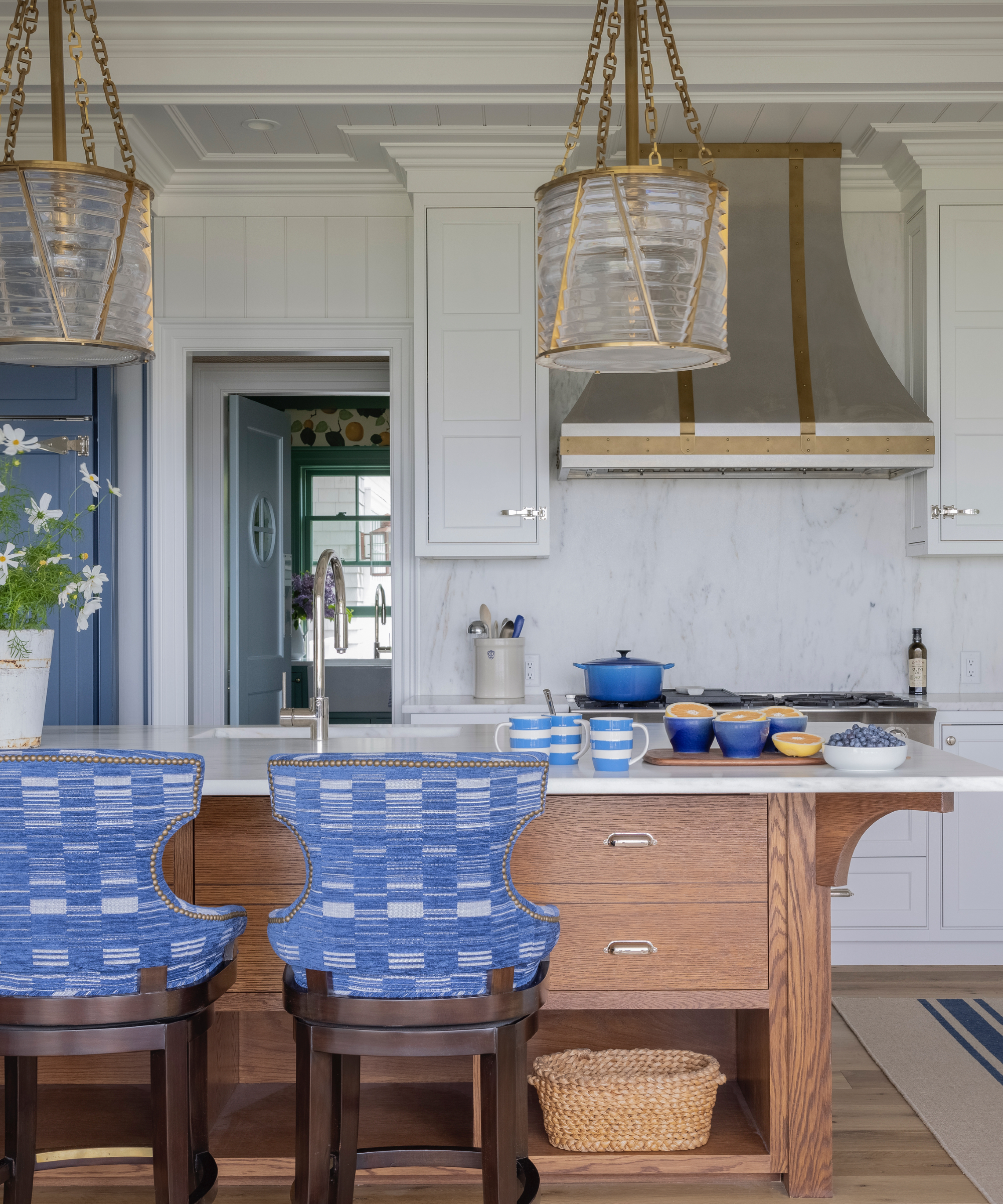
'I love blues with white. It may sound cliché, but it’s classic. You can never go wrong with it. I prefer warm whites to cool whites – they feel less cold,' says Robin Gannon, founder, Robin Gannon Interiors.
There's something so uplifting about sky blue and white, perhaps due to the connotations of summer skies and warm, hazy days. We love how Robin has used the blue accent in a number of ways – the cabinet on the left, upholstered bar stools, and tableware, it's the perfect mix with the white.
You can also add metallics to act as a visual bridge between the chosen color and the white. 'Brass accents work wonders to warm up white. Incorporating wood tones really helps warm up white kitchens, too – think natural wovens or a reclaimed wood bowl on the island. And don’t forget about plants and greenery! Any time you can bring some natural organic elements into a white kitchen, it helps make it feel more homey and less sterile,' adds Robin.
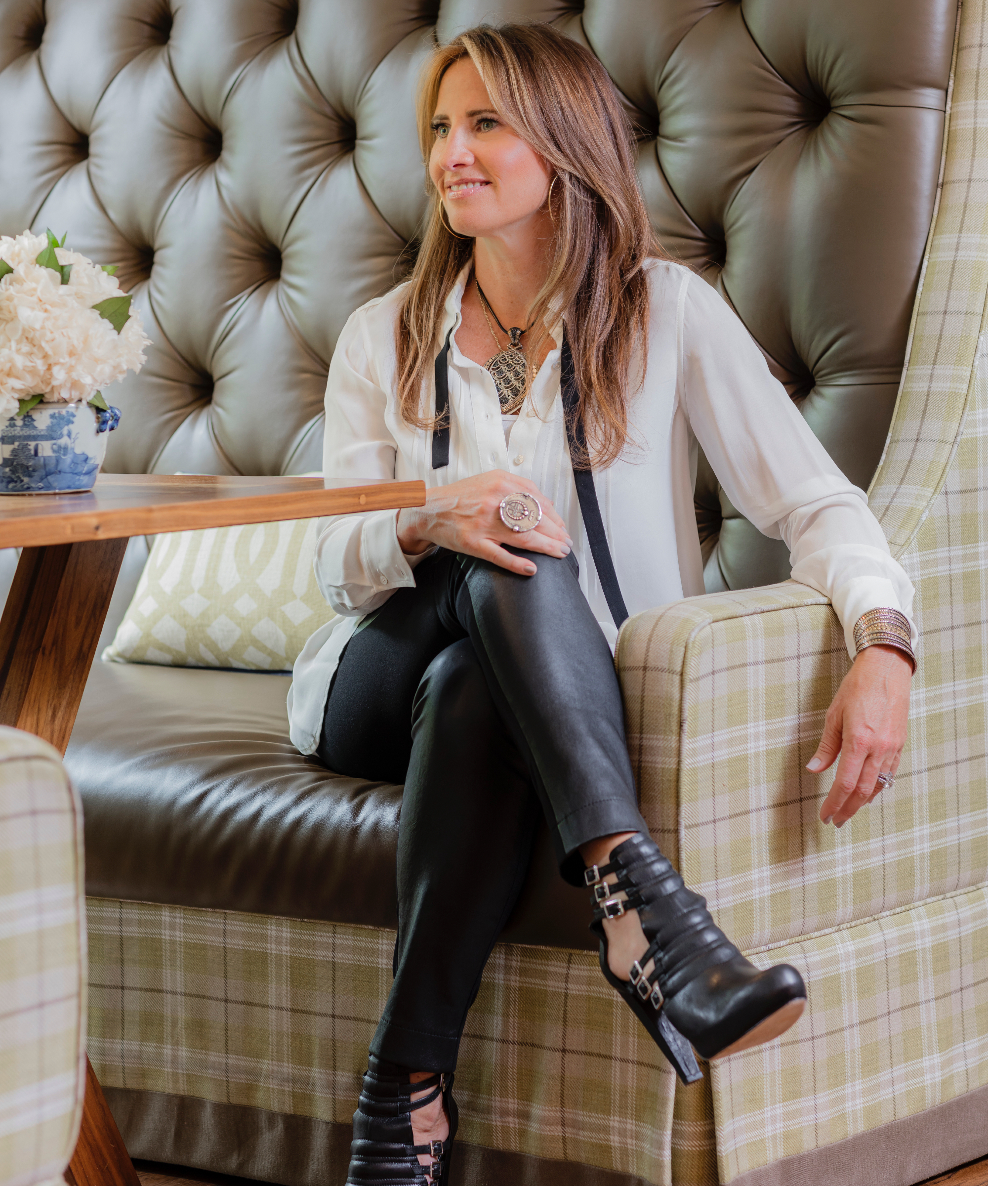
As a former criminal defense attorney, Robin Gannon uses her uncommon skill set to make every client's home as unique as they are. Renowned for their use of color, pattern, and layers, the firm's designs truly reflect each client's distinctive tastes. Their design philosophy involves evaluating rooms as a whole before decoration, often devising architectural changes to elevate a space. Rooms must look beautiful before a stitch of furniture is installed or draperies are hung on the wall. With respect to that approach, Robin Gannon Interiors is a true full-service design firm.
When it comes to choosing the best accent colors for a white kitchen it's a case of whatever color you love the most. Start small and add the shade incrementally, that way if you decide you don't like it you can swap it out for another without it costing a fortune.
Sign up to the Homes & Gardens newsletter
Design expertise in your inbox – from inspiring decorating ideas and beautiful celebrity homes to practical gardening advice and shopping round-ups.

Sophie has been an interior stylist and journalist for over 20 years and has worked for many of the main interior magazines during that time, both in-house and as a freelancer. On the side, as well as being the News Editor for indie magazine, 91, she trained to be a florist in 2019 and launched Flowers Inside My Head where she curates beautiful flowers for modern weddings and events. For Homes & Gardens, she writes features about interior design – and is known for having an eye for a beautiful room.
-
 ‘It leads to more headaches than it's worth’ – 4 reasons you should never store things in your oven, including fire risks and serious illness
Your oven is for cooking, and cooking only, experts urge
By Chiana Dickson
-
 Urban gardening ideas – 7 creative ways to grow in small spaces, balconies, containers, indoors, and more
Make the most of your space with these innovative ways to garden
By Tenielle Jordison