6 lessons in retro style from a smart, smooth kitchen with a hint of 50s glamor
Sleek walnut cabinets and cool soapstone counters – the smart mid-century style notes to bring any kitchen up to date
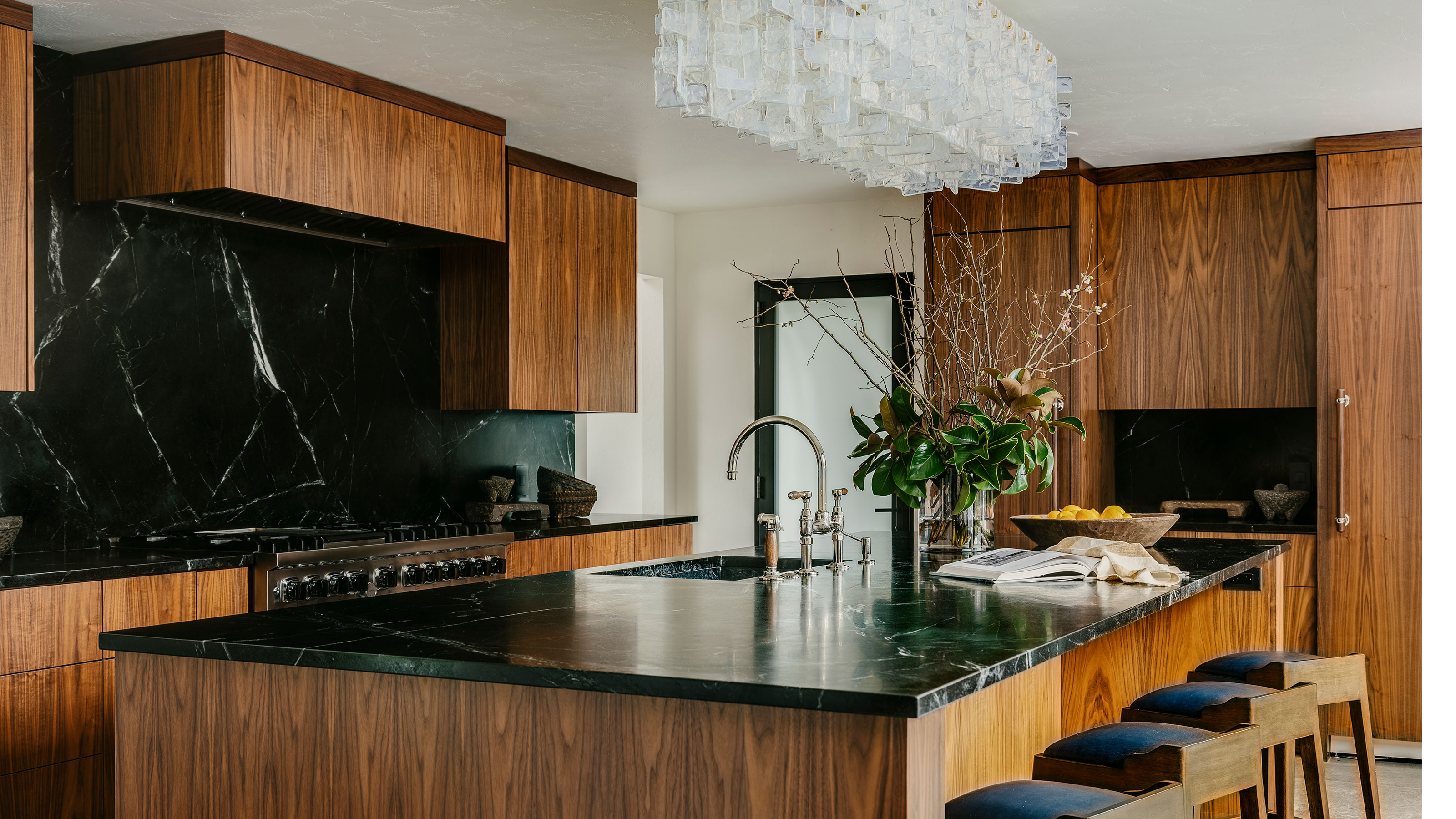
This smart, mid-century-inspired kitchen turned out to be the perfect new look for an awkward and outdated space in a house originally built in 1958. The property in Santa Rosa, California, had been extended in the 1970s, but the kitchen remained, its layout almost as it was first installed in the original 1950s footprint of the house.
Kitchen ideas for the redesign centered on adding space and modernizing the room while preserving the mid-century style of the home. The homeowners shared their initial thoughts with interior designers Tama and Lauren Bell of Tama Bell Design, and before long they were drawing up designs and specification for a dramatic transformation, involving stealing space from a utility room and a spare bedroom as part of the renovation. We asked them about the project's highlights.
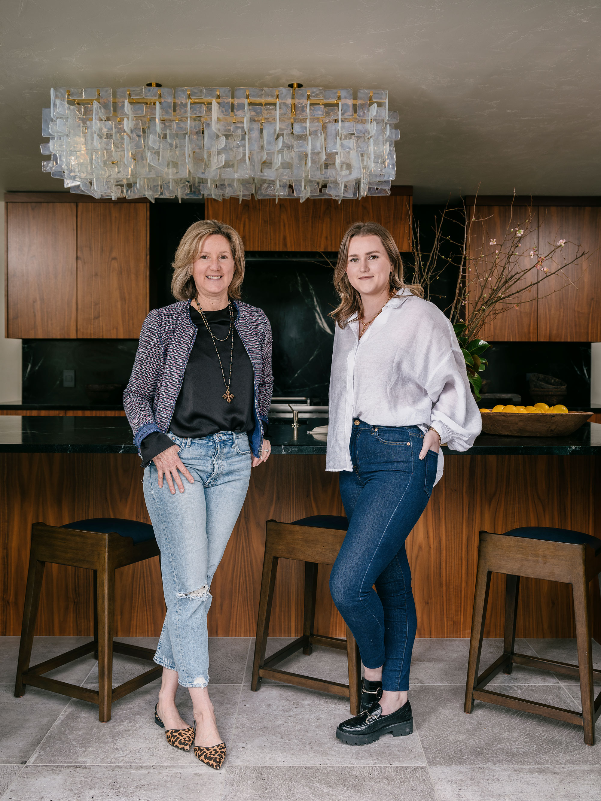
Interior designers Tama and Lauren Bell are the mother and daughter team at Tama Bell Design. The company is based in Sebastapol, California, and specialises in full-service redesign and space planning so it was the perfect choice for this kitchen redesign. The designers completely changed the floor plan of the original kitchen to create a more functional space.
1. A mid-century inspired kitchen
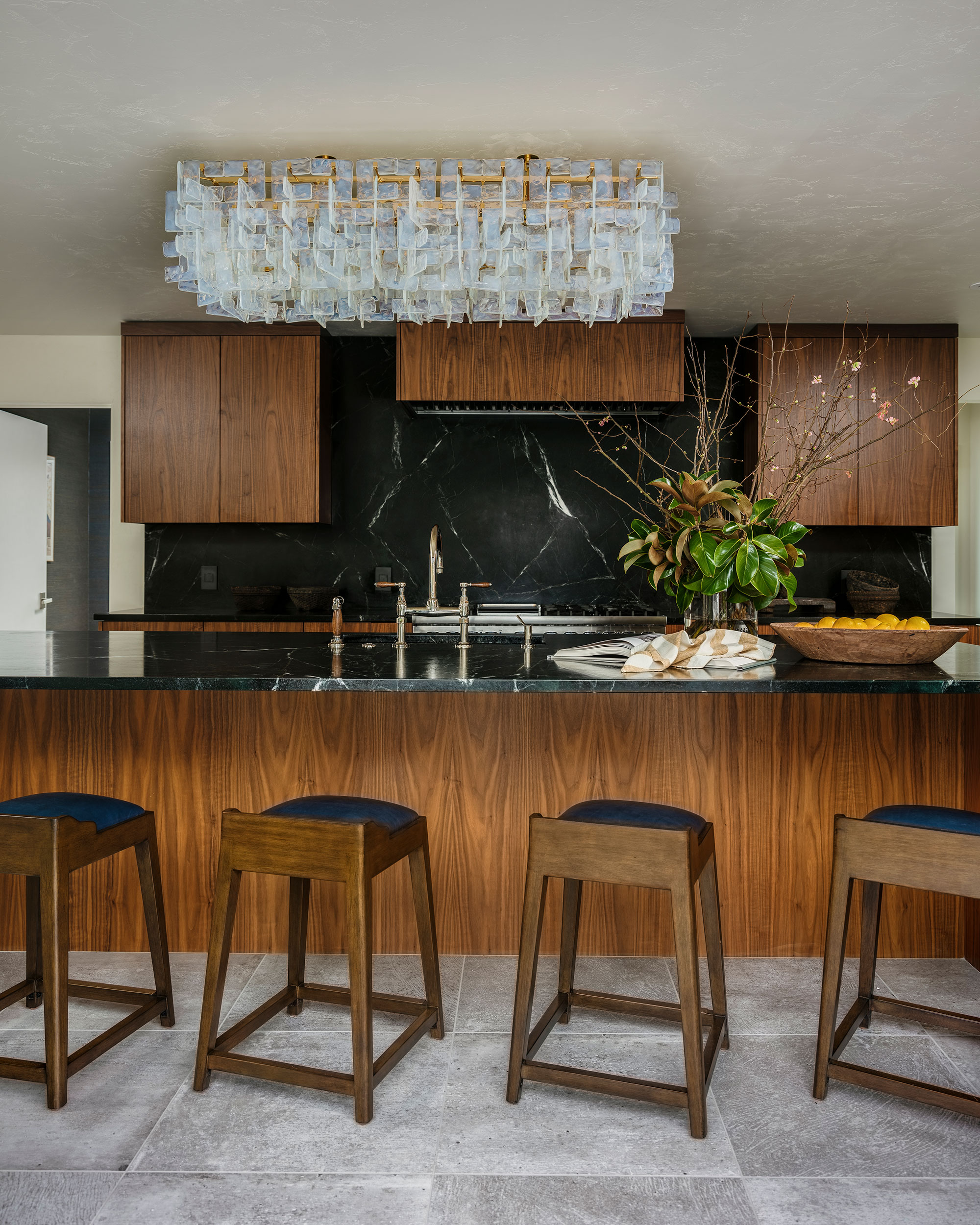
The homeowners were keen to reference their home's mid-century origins, so the designers turned to those stalwart mid-century materials choices – dark wood teamed with smart black details. It's a limited color palette but gives the tailored retro look the owners were looking for, as designer Tama Bell explains: 'We wanted to work with a simplified palette of materials but in a way that read both masculine and dramatic.'
Customized to fit over the island is a spectacular Murano glass chandelier that the homeowners picked up while traveling in Europe. This glamorous finishing touch elevates the space and gives it a retro 1950s hotel vibe.
The cabinets and island base were made bespoke in dark walnut wood, topped with Anastacia soapstone. Coming up with the right kitchen flooring ideas for a mid-century style kitchen was quite a challenge. 'We chose simple porcelain tiles that look like concrete,' says designer Lauren Bell. These were Porcelanosa, Park Acero (23” x 23”) porcelain tile with Custom #542 Graystone grout.
2. Storage and kitchen essentials
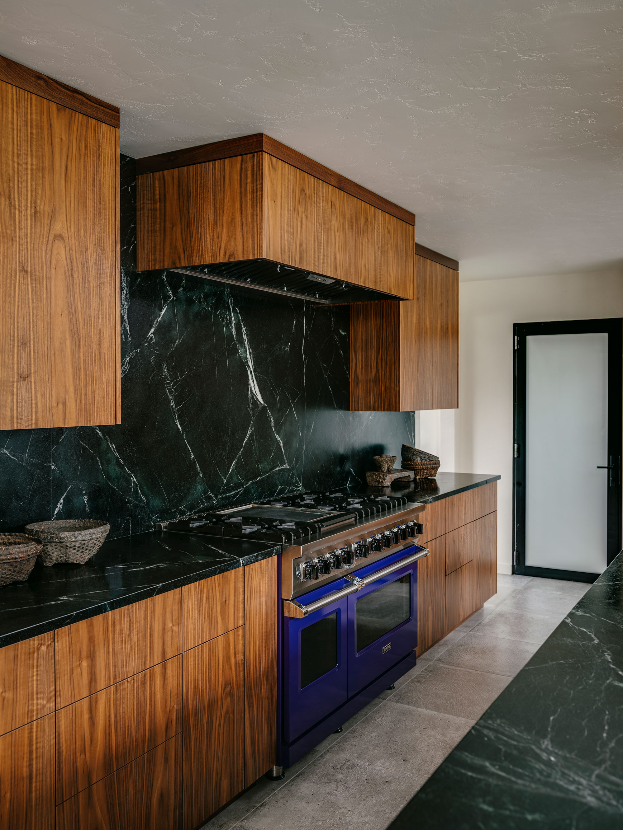
The owners like to entertain and had a very specific wishlist of kitchen essentials, including this Viking range cooker with double ovens. The high-end appliance in the eye-catching Cobalt Blue colorway provides an unexpected burst of strong primary color in the otherwise earthy scheme.
What about finding space for those all important kitchen storage ideas? 'When we opened up the floor plan to create the kitchen area, we had plenty of room for cabinetry in both the kitchen and the butler’s pantry, as well as the island, to add more than sufficient storage,' explains designer Lauren Bell.
3. Long live the work triangle
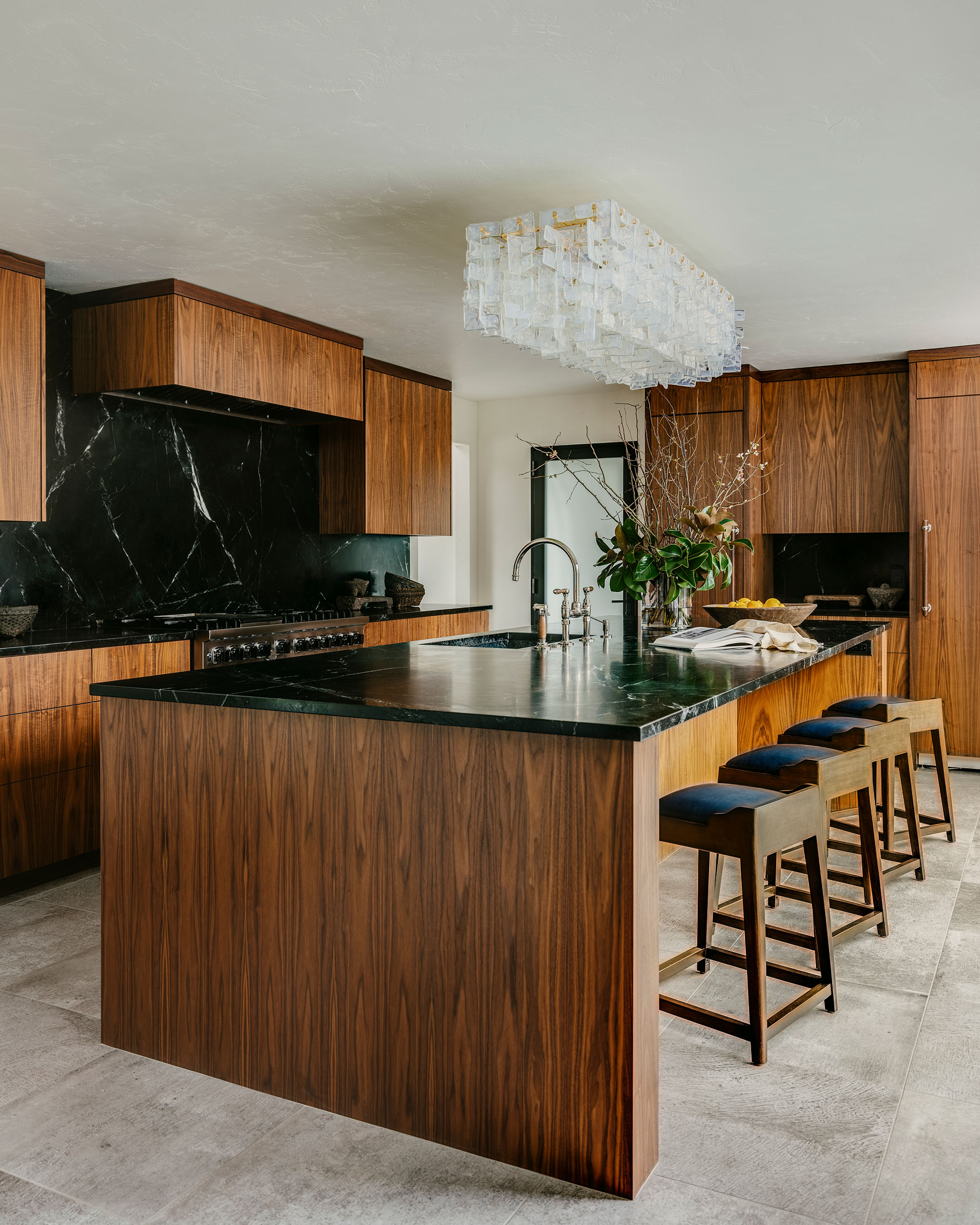
As you might expect, a great deal of thought has gone into the layout of the new kitchen. The practical working area puts the sink, oven, fridge-freezer in the classic work triangle arrangement.
The designers also ensured the new layout included plenty of practical, easy to clean workspace when they were weighing up the kitchen countertop ideas.
Seen here, the built-in Monogram column refrigerator and corresponding freezer, are positioned in a run of tall units at right-angles to the range cooker.
4. Island with integrated sink
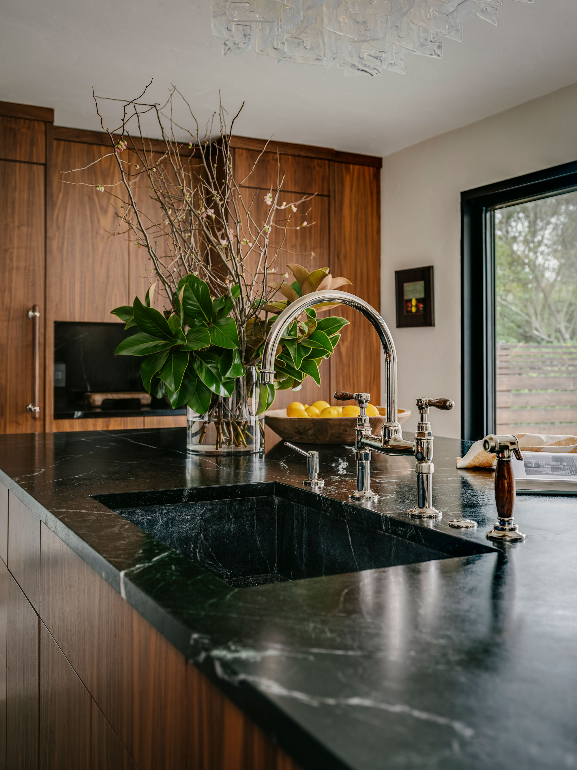
Where kitchen island ideas were concerned, the designers went big and bold. The island cabinetry is dark walnut with a soapstone counter to match the room's cabinetry and kitchen backsplash ideas.
At 5 feet by 11½ feet there's plenty of space in the island for the large integrated soapstone sink. Stowed under the counter are a dishwasher, microwave drawer and specialty 2-port pop-up power boxes for hidden outlets.
In this image, you can see how the working section of the kitchen has been positioned at the back of the room to allow clear access to the back patio through glazed doors.
5. Fabulous faucet
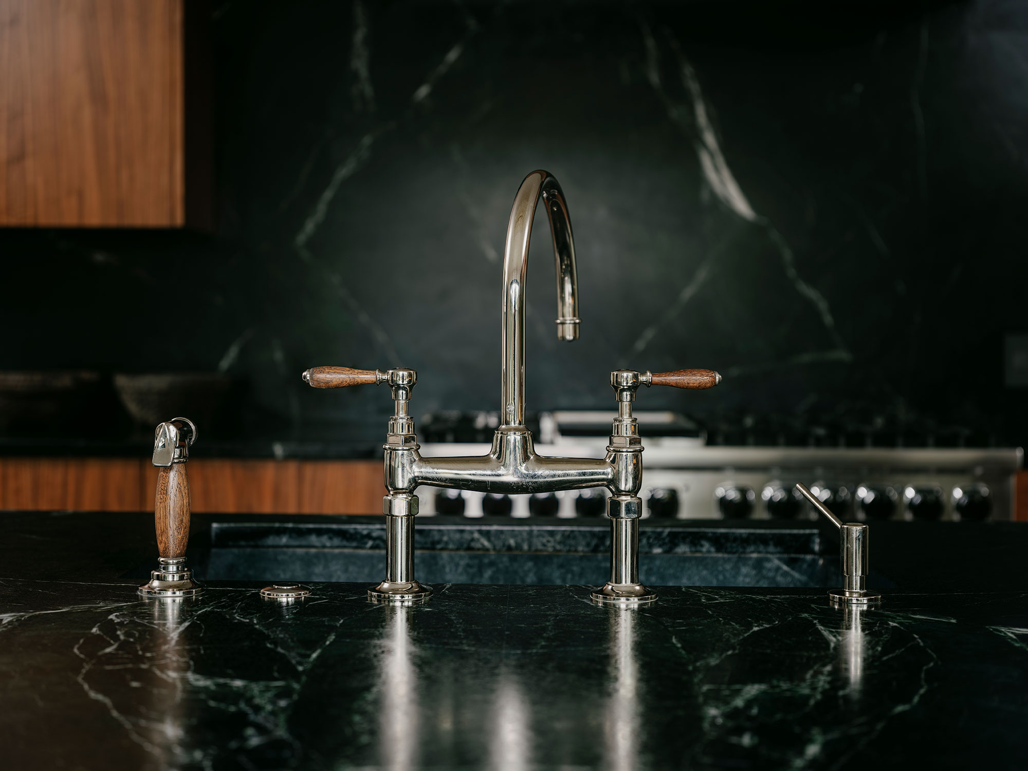
The faucet on the integrated soapstone sink is so stylish it really deserves a closer look. It's the Waterworks’ Easton Vintage Two Hole Bridge Gooseneck faucet in Nickel with oak lever handles – and, says Tama, is 'ridiculously beautiful'!
The synergy of those oak lever handles – such a small detail – with the woodwork in the rest of the kitchen really is special.
6. Bar and butler's pantry
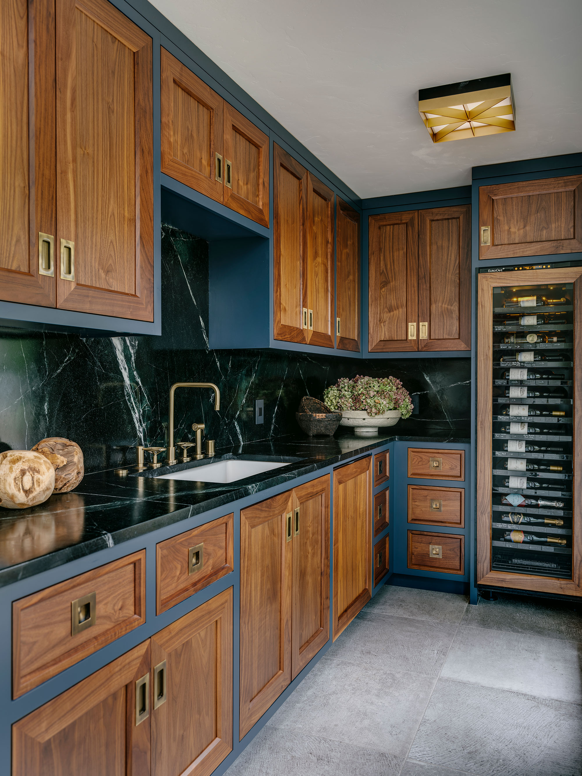
The space behind the kitchen is now a smart butler's pantry. This space features the same countertop, backsplash and flooring. However, to mark the difference, the cabinetry is a series of boxes painted in Benjamin Moore's Hale Navy with doors and drawer fronts in walnut. Other home bar ideas for the new space include a dedicated sink and a tall wine refrigerator.
And what of the finished look of the kitchen as a whole? 'I think that the kitchen feels both comfortable and dramatic,' says Tama. 'It makes a statement and works well with the mid-century lines of the house.'
Sign up to the Homes & Gardens newsletter
Design expertise in your inbox – from inspiring decorating ideas and beautiful celebrity homes to practical gardening advice and shopping round-ups.
Karen sources beautiful homes to feature on the Homes & Gardens website. She loves visiting historic houses in particular and working with photographers to capture all shapes and sizes of properties. Karen began her career as a sub-editor at Hi-Fi News and Record Review magazine. Her move to women’s magazines came soon after, in the shape of Living magazine, which covered cookery, fashion, beauty, homes and gardening. From Living Karen moved to Ideal Home magazine, where as deputy chief sub, then chief sub, she started to really take an interest in properties, architecture, interior design and gardening.
-
 Jeremiah Brent's new NYC-inspired rug collection has got to be the easiest way to bring his modern Manhattan style into your own home
Jeremiah Brent has teamed up with Loloi Rugs to create a contemporary collection of home furnishings inspired by his city
By Eleanor Richardson
-
 I tried this one easy dishwasher trick and made the annoying need for manual drying a thing of the past
If you hate those little pools of water left on your cups and crockery, this towel trick is for you
By Punteha van Terheyden