Inspiration for this 1950s remodel came from an unexpected place – the backyard
Emily Brownell of Gilded Hearth Interiors takes us through how she took this cramped 1950s kitchen and turned it into a modern chef's kitchen with Parisian flair
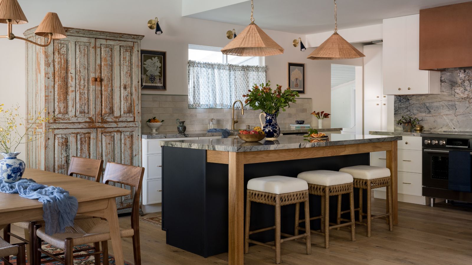

Sometimes a kitchen comes across our desks that makes us stop and stare. And let's be real, we see a lot of kitchens. But there is just something about this transitional, old-meets-new kitchen in Tarzana, California that feels so very welcoming.
The second phase of a full home remodel by vintage-loving designer Emily Brownell, founder of Gilded Hearth interior design firm, this colorful kitchen-diner meets living room is full of charm. Designed to work as a modern chef's kitchen for a vibrant family, it feels decidedly far removed from a functional working kitchen.
Inspired by the colors found in the garden of the home at springtime, Emily wove a strong connection to nature throughout the entire space, drawing from the natural stone countertops to infuse touches of navy and terracotta, with a nod to blooming florals in her styling. Here, Emily takes us through the journey behind the space, and how she worked with the unexpected to create a family-friendly space that is bursting with color and flavor.
Take A Look Inside This Charming Kitchen-Diner Meets Living Room
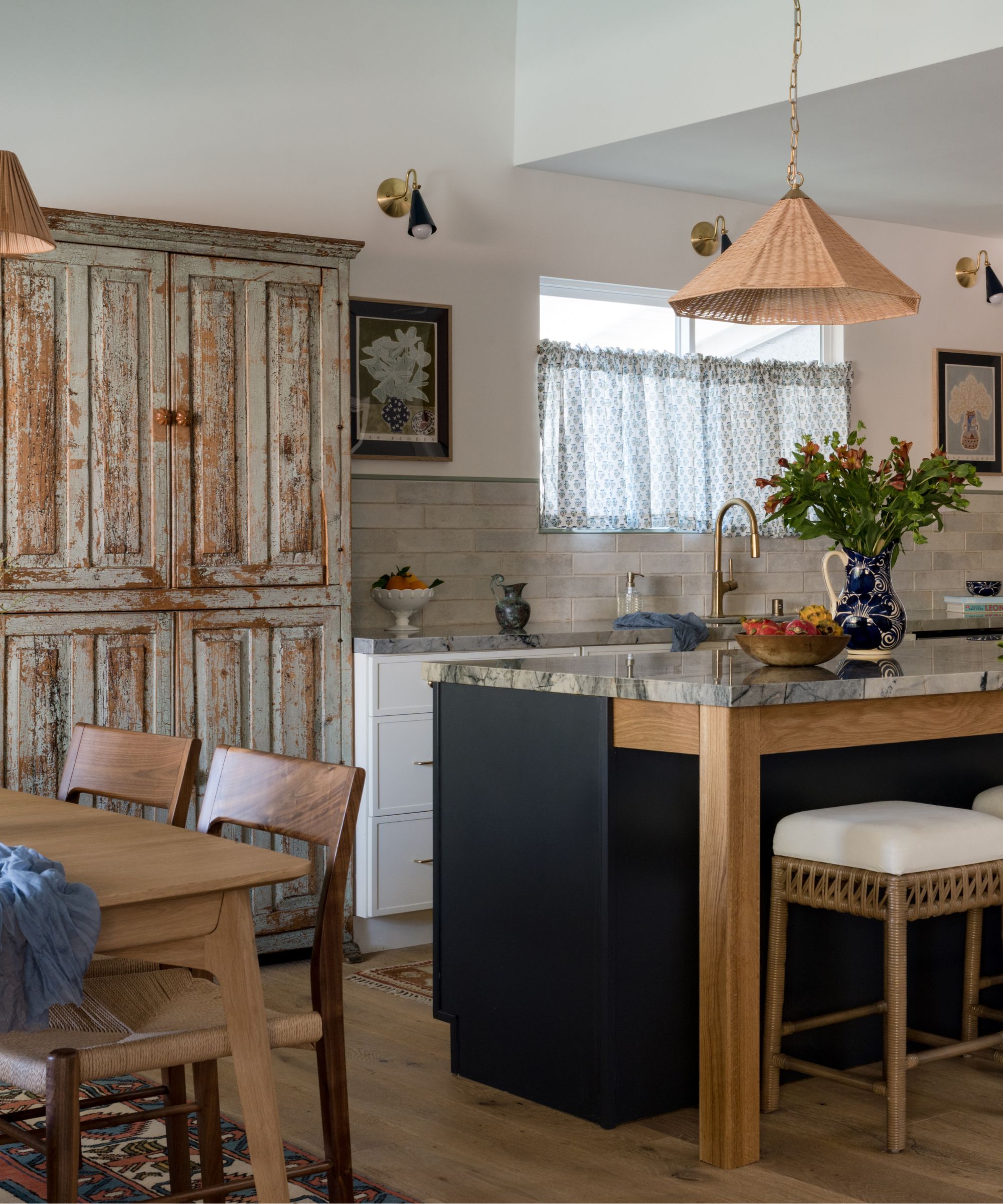
The clients approached Emily knowing this would be a multi-step process, starting with their primary bathroom and primary bedroom revamp. Everything required a total gut. But with a new baby and new-found remote working (thanks to the pandemic) the couple also required the third bedroom to be transformed into a zoom-worthy space.
Phase two, the kitchen space, was set to start in Spring 2024 but thanks to an unforeseen rodent and floor problem that needed addressing, the project was moved up, and the team at Gilded Hearth dove in – albeit with a very tight timeline to work with. Design to finish the kitchen-diner was wrapped up in 4.5 months and was a true labor of love for designer Emily. So let's see how she made it happen.
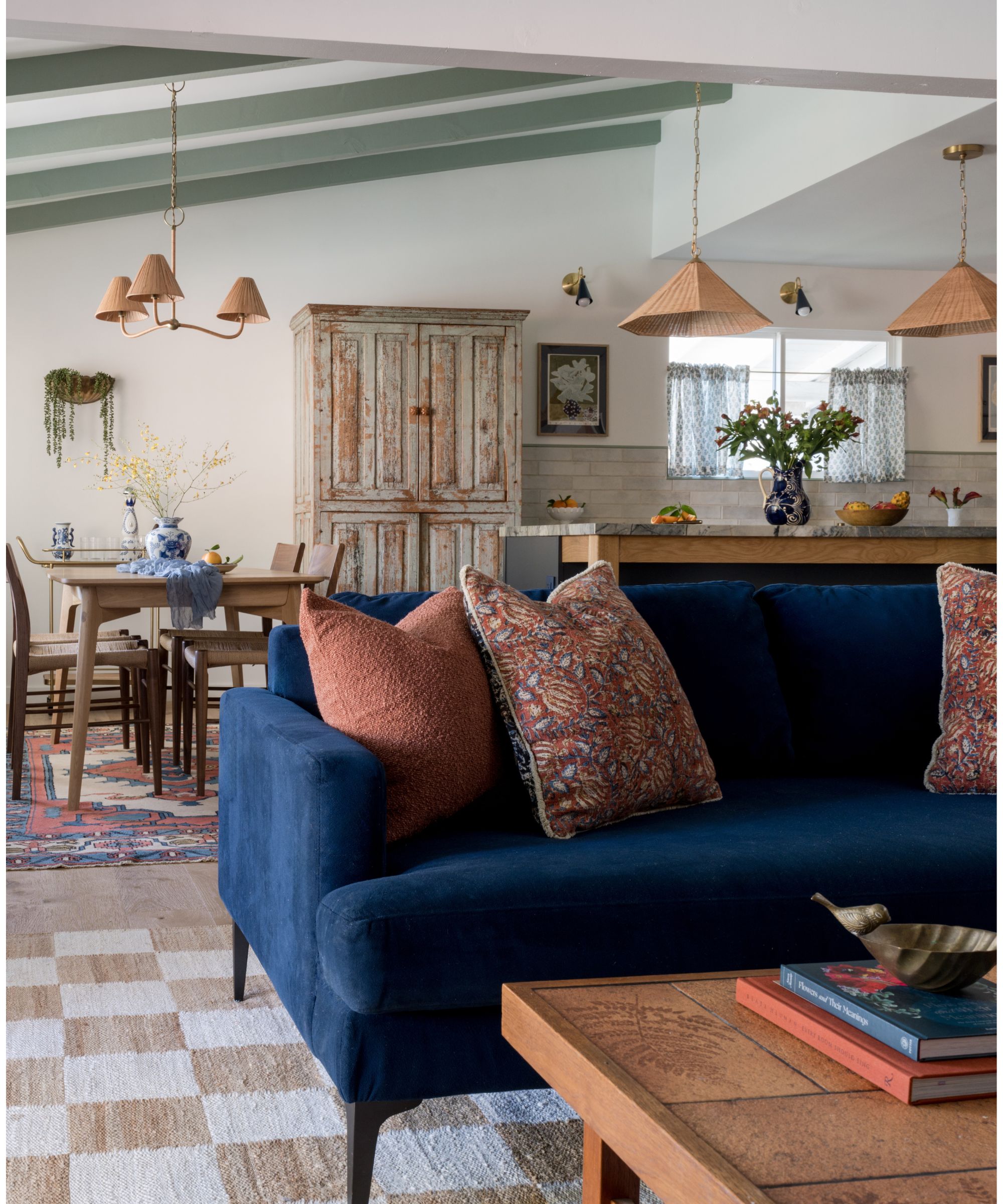
Without a wealth of square footage in the home, Emily chose to work with an open-plan kitchen layout that included a dining room and lounging area for the entire family to enjoy at once. A navy couch mirrors the navy island, while the terracotta coffee table coordinates with the painted plaster hood – all in tones pulled from the natural stone countertop to form the color scheme for the space.
'An entire wall with a non-working chimney and an old indoor grill came down to open up to the living space and allow for an island to be utilized by a family who likes to cook,' she explains. 'The way this space functions is now so drastically different and functions so much better,' she continues. 'The family now has an accessible pantry area and a fridge you can open without crashing into drawers – as well as a stove and island that fits two chefs. And the best part is that it can accommodate plenty of family gatherings.'
Sign up to the Homes & Gardens newsletter
Design expertise in your inbox – from inspiring decorating ideas and beautiful celebrity homes to practical gardening advice and shopping round-ups.
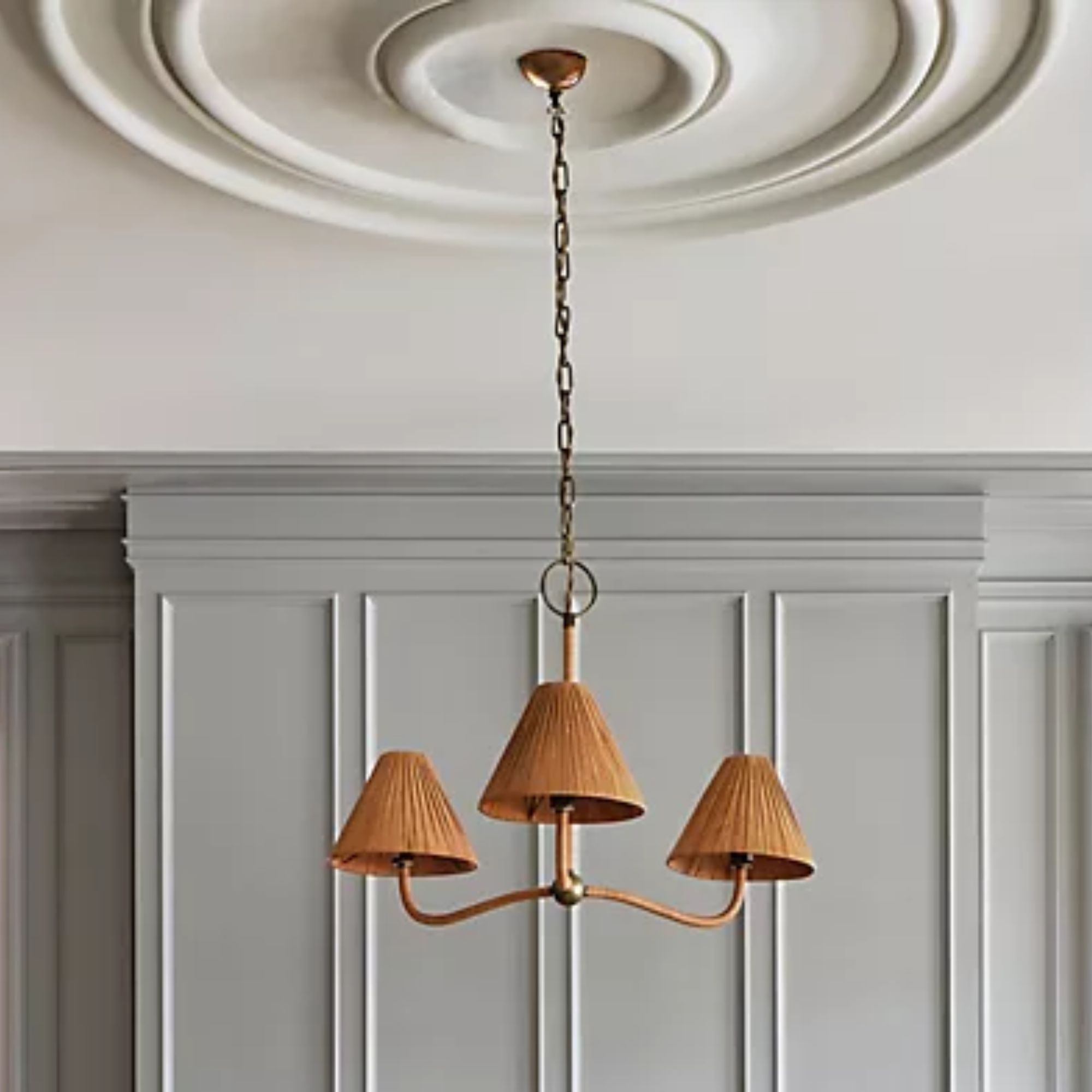
Emily's layering of lighting and rugs helps to zone and define the different areas, while still helping tie the spaces together with a unifying thread. 'I'm a big fan of layered lighting. The sconces were custom powder-coated to match the navy on the island, and everything is on a dimmer. One of our client's favorite stores is Anthropologie, so the dining room chandelier is from there and works great with the island pendants.'
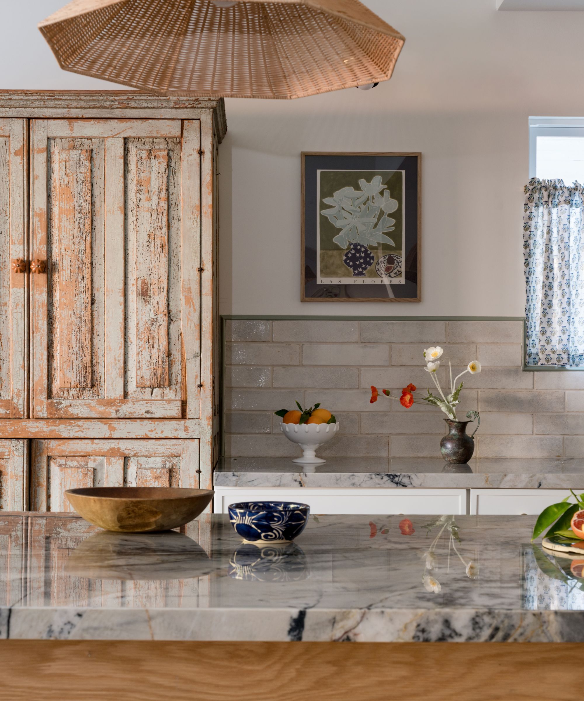
A standout feature in this space is the blue quartzite kitchen countertops. Sitting proudly atop the navy kitchen island, it was designer Emily's starting point for the entire scheme.
'The stone was the first choice made, it’s a stunning quartzite from which many of the colors like the navy and terracotta are pulled from,' explains Emily. 'The stone came across my eyes in an email from a local supplier. It was so stunning and I knew it would be the perfect hardworking stone for this family. The entire space was inspired by the way they prep, cook, and nourish their family, and I love that full-circle moment.'
'Initially, they wanted a more common white-style stone and were hesitant about my slightly bolder vision, but once the client went in person to see the stone they reserved two slabs on the spot and they sat at the fabricators for almost 2 years while we waited to move on to the kitchen.'
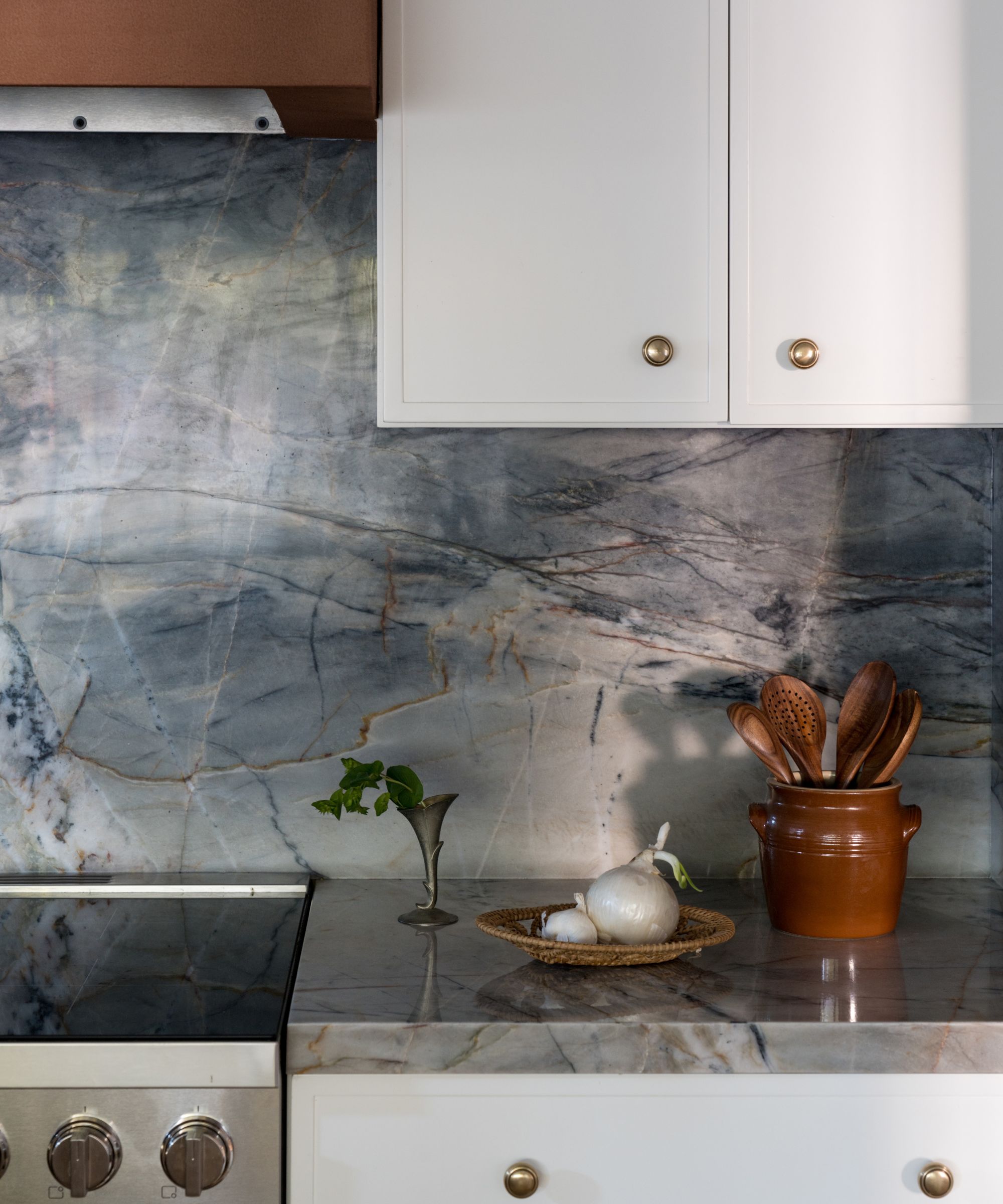
While Emily paired the countertops with a rustic tile underneath the window, behind the cooker she wanted the veining to flow up and over the walls and reach all the way up to the hood. But it wasn't without drama.
'I had pre-templated it out for the fabricator to ensure that big dramatic vein was front and center behind the oven, but when I got their draft they had made it into a book match,' Emily explains, which is a term used to describe when slabs are mirrored to match the pattern and veining, creating a continuous flow. 'I jumped on them to ensure they did not do that, and had them re-template it to ensure that the vein appeared exactly as it did in nature, and it's my favorite element in this space.'
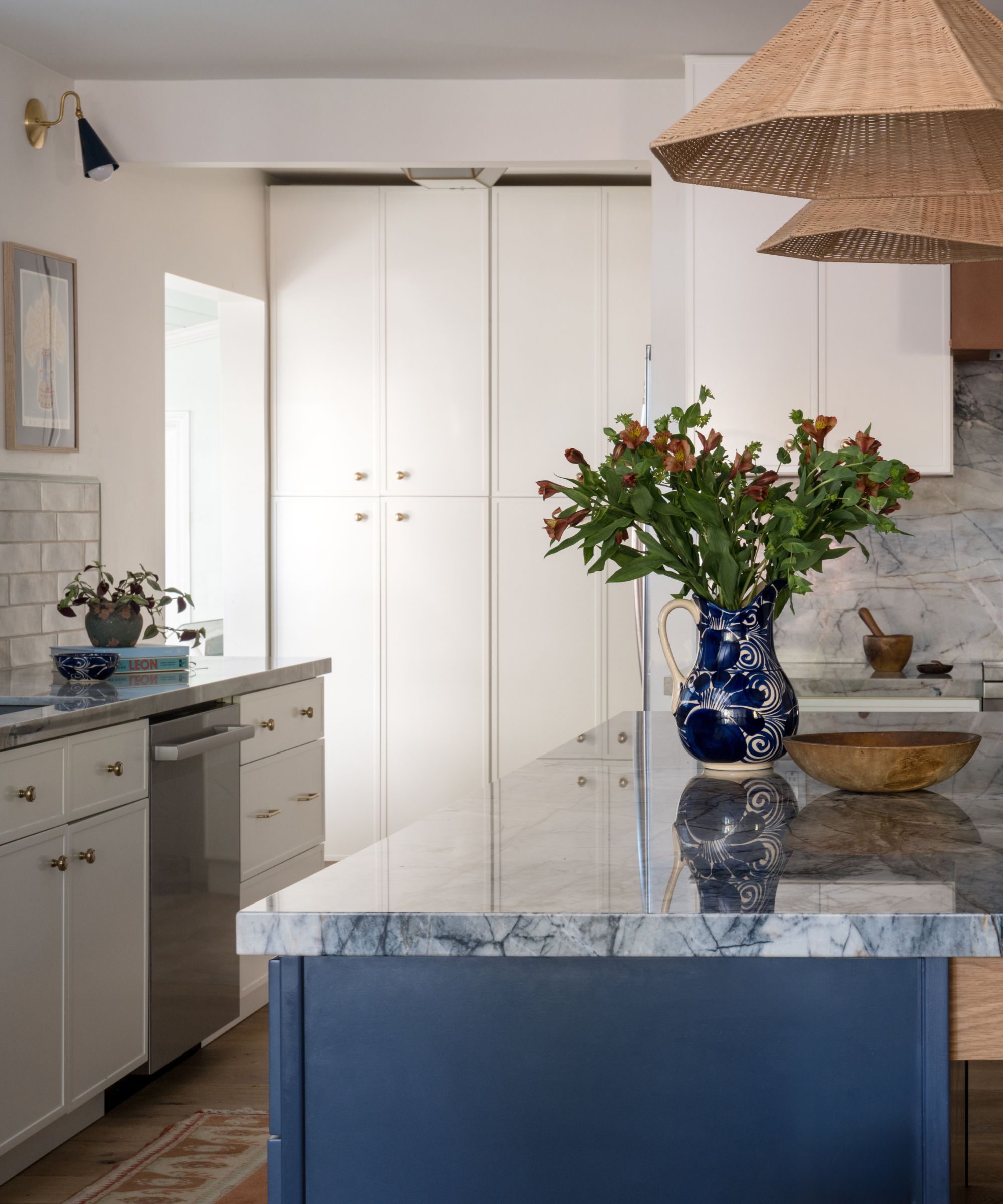
Being on such a tight timeline, the team had to forgo custom cabinetry but that doesn't mean they didn't get creative with their kitchen cabinet ideas.
'We were able to make it feel custom with the smaller details, like the oak apron on the navy blue island, and including a vintage hutch that we had converted into an appliance garage,' explains Emily. Full-height pantry cupboards are tucked neatly in the corner for further, and more practical, storage. 'We skipped the trendy open kitchen shelving idea to keep it airy and moved the pantry to the back wall.'
'Because we didn't get to go full custom on the kitchen cabinets and island – more like semi-custom – we decided to use a vintage piece to include a larger freestanding unit and bring in some personality.'
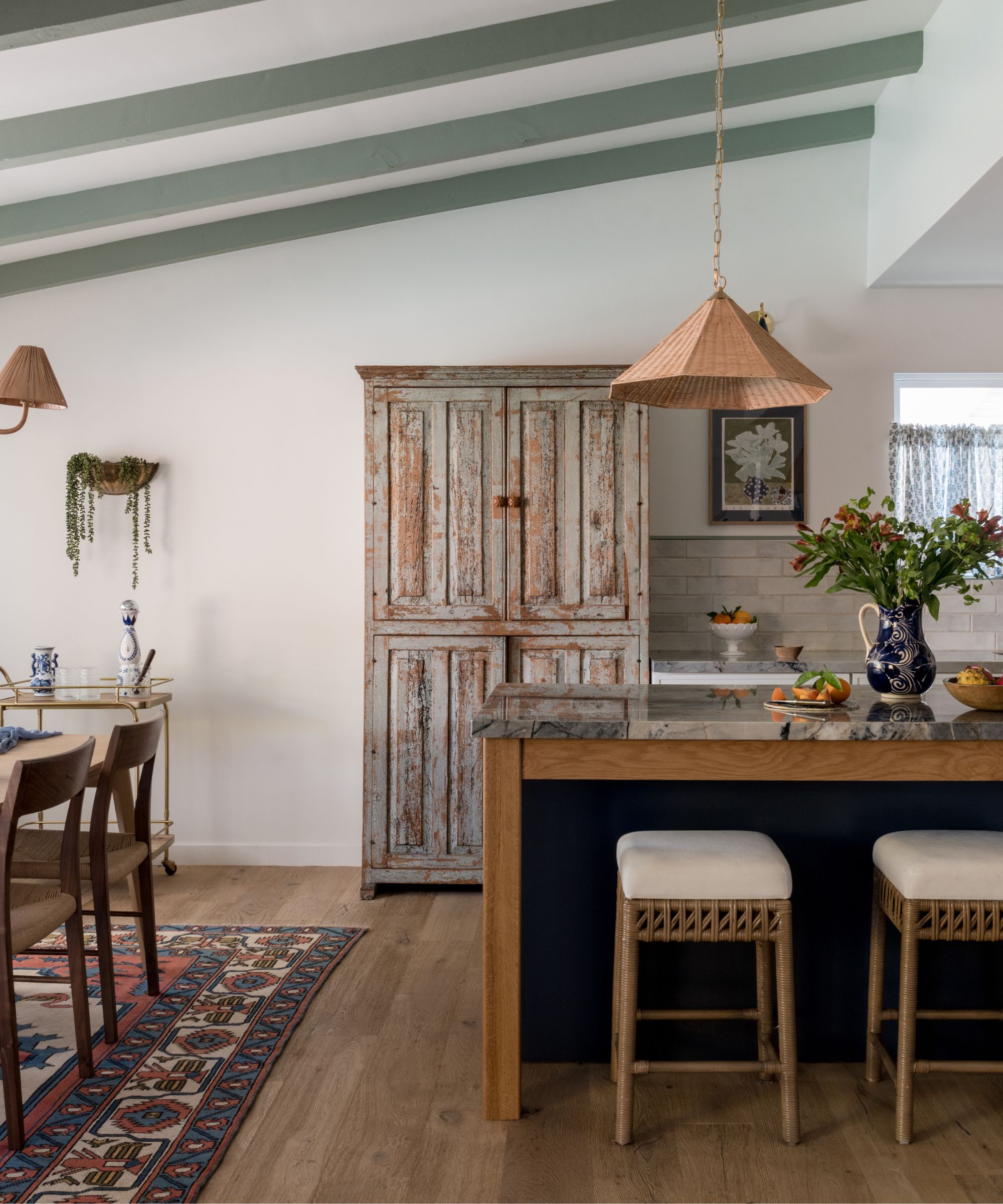
'Our initial idea was to source a vintage oak or pine cabinet but this cabinet popped up from a local vendor and we jumped on it,' says Emily. 'The depth was perfect to line up alongside the cabinets and the color was one we considered in our very original design before custom cabinets were ruled out so it was meant to be.'
If you're wondering how to bring vintage pieces into a kitchen, a freestanding pantry is the perfect way to infuse personality and practicality. 'I think tall vertical cupboards and hutches can be a great use of space even in the most modern kitchens, and bring a layer of warmth,' explains Emily. 'Local antique stores, online sites like 1st Dibs and Chairish, or following smaller antique sellers on Instagram (as was the case here) are great ways to source pieces for decorating with vintage.'
'We changed out the hardware, using ceramic ones that matched the hood, had the contractor add outlets for electrics, and lots of shelves and hooks for things like mugs. Now it houses a coffee station as well as a wine bar, along with some pantry items,' explains Emily.
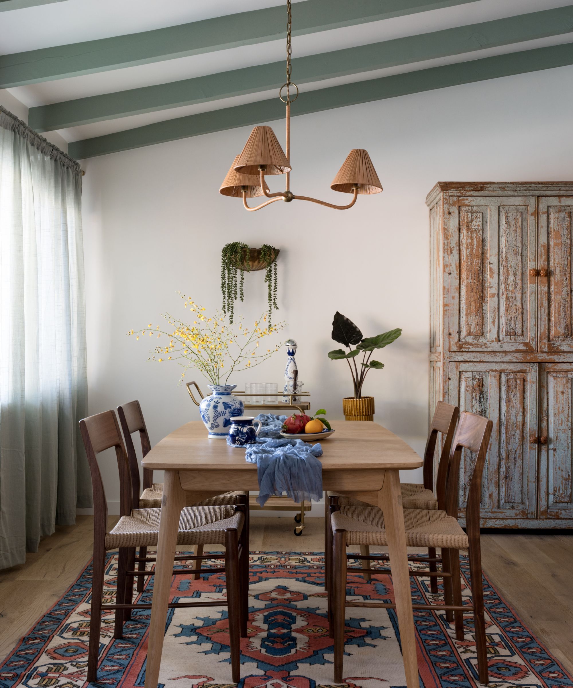
The lucky vintage find inspired that injection of sage green into the space, a hue the client had always gravitated towards. But it was used in a much more unexpected way than your typical green kitchen ideas. Emily elaborates: 'The beams had been painted a few times previously, most recently white by the client, and normally I would take them down to the raw wood but it just wasn't in the cards this project.'
'So instead, pulling the color from the vintage cabinet and taking that into the curtains and across the beams for an accent ceiling worked well to add some interest and cohesiveness to a space that has a lot of different lines going on,' Emily continues. 'Once we placed the cabinet I knew the beams had to be painted a color to match, which was Herb Bouquet from Benjamin Moore.'
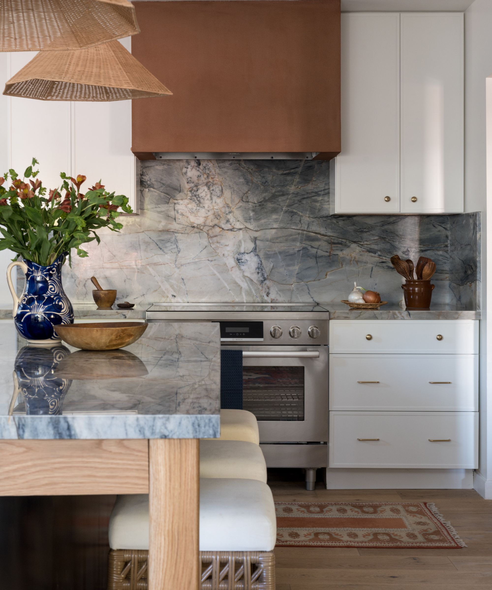
It was a similar color story for the plaster finish on the range hood.
In order to turn their range hood into a stylish feature, Emily looked to the veining in the stone which had tones of terracotta and burgundy running throughout it, so she opted to pick out that thread with a painted hood using Benjamin Moore's Coyote Trail. 'While it looks like copper, up close it is a very textured, warm, and yummy plaster with a sealer on top made specifically for kitchen hoods,' explains Emily.
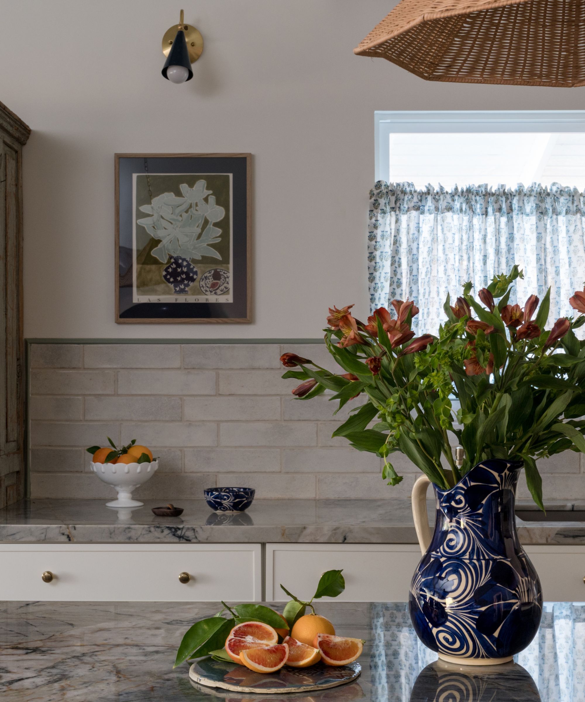
Keen to include that same vibrancy as Emily witnessed in the client's blooming garden, the interior designer looked to nod to their love of flowers in subtle ways with the styling.
'When it came to styling, many of the items are vintage, sourced to add the final touch to the vision,' observes Emily. 'Pieces like Ming vases, a French crock utensil holder, and of course vintage rugs and a runner that lays in front of the oven.'
'I originally pitched some floating shelves, but I knew closed storage was really best for this family so I decided instead to add wall art in the kitchen to make it more playful and homely,' she continues. 'The kitchen art really speaks to the sea of beautiful colors found in their garden.'
'With all these other focal elements, the beams, the hood, the stone... the backsplash needed to be quieter, but not just a typical subway tile,' she explains. 'So we opted for these rustic ceramic tiles from Tilebar and then used a pine molding painted the same color as the beams to create a border. To pull in even more personality, we had the cafe curtains made from an Indian blockprint fabric.'
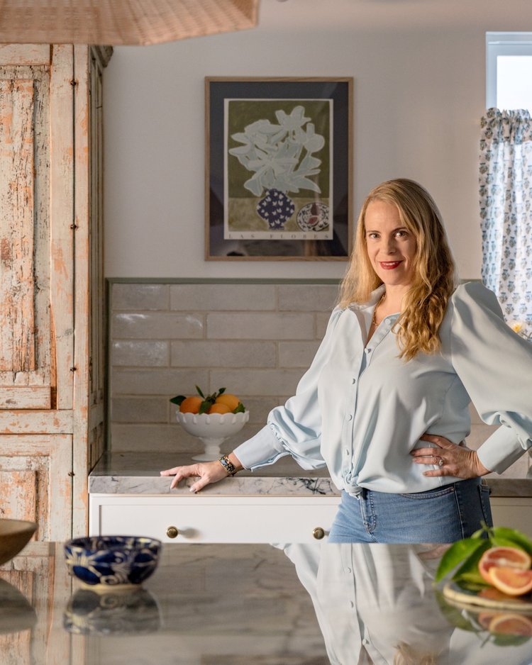
Emily Brownell founded Gilded Hearth in 2018 after working for Homepolish and graduating from Syracuse University. Emily loves the hunt tracking down that perfect piece that fits into your home and your home only. When she’s not creating one of kind interiors Emily can be found enjoying the California sunshine with her husband and two young children.
Thanks to her keen eye for vintage and a love of color, Emily was able to provide this family with a multifunctional, transitional kitchen space that is full of character. The simple cabinetry gives way to the statement blue marbled countertops that brings the room – and color scheme – to life. The star of the show? Those sage green painted beams. A true example of bold design choices absolutely paying off.

Charlotte is the style and trends editor at Homes and Gardens and has been with the team since Christmas 2023. Following a 5 year career in Fashion, she has worked at many women's glossy magazines including Grazia, Stylist, and Hello!, and as Interiors Editor for British heritage department store Liberty. Her role at H&G fuses her love of style with her passion for interior design, and she is currently undergoing her second home renovation - you can follow her journey over on @olbyhome
-
 How to weed a garden quickly – professional gardeners reveal the five-minute weeding jobs to do now and get your yard summer-ready
Short on time? These time-efficient tasks will keep on top of problem plants
By Thomas Rutter
-
 Suddenly, every stylish room has this one simple piece of furniture in common – why designers are loving the versatility of the humble stool
Behold, the humble stool. A welcome addition to any room, stools are a much-loved household essential that interior designers love for these 5 reasons
By Eleanor Richardson
