

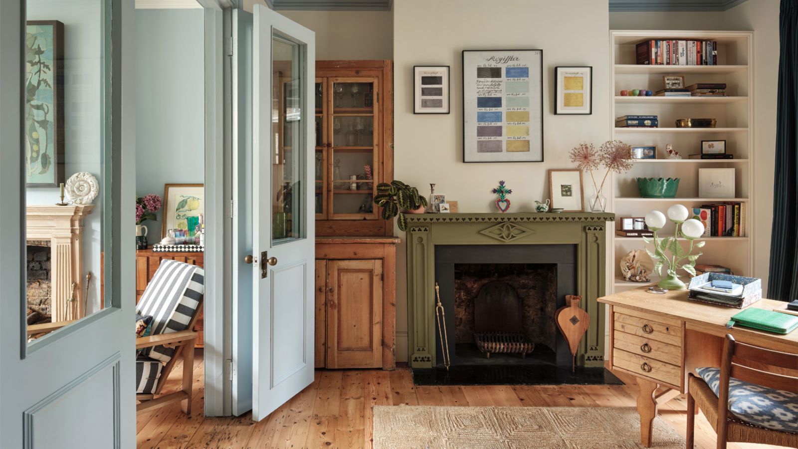
In a bedroom, your choice of colors is an important step in the process. Beyond the aesthetic appeal of your wall colors, color psychology should be carefully considered to ensure your space feels relaxing.
The use of saturated and overly bold bedroom color ideas can negatively affect how easy it is to relax in your space, and so here, we're exploring the worst bedroom colors. While the best bedroom colors for sleep focus on soft neutrals and pale hues, the following shades energize and stimulate.
'When designing a bedroom for rest and relaxation, color psychology plays a crucial role,' explains Tash Bradley, color psychologist and Director of Interior Design at Lick. 'Certain colors can be overstimulating or create an energy that disrupts a peaceful sleep environment. Here are the colors I’d recommend avoiding if you want to create a calming bedroom.'
1. Bright red

'Red is the most physically stimulating color in the spectrum and is associated with energy, passion, and even increased heart rate. While it’s a fantastic choice for social spaces, it can be overstimulating and not right if you want to create a restful bedroom,' explains Tash Bradley. 'Similarly, bold oranges can feel overly energizing and may make it harder for your mind to switch off at night.'

Tash is trained in color psychology and theory, she helps people around the world bring their dream decorating projects to life and utilize color to impact personal spaces, as well as overall lifestyle and wellness. Tash leverages her expertise in color psychology and theory, as well as interior design, to lead Lick’s design studio and curate the brand’s global paint and wallpaper offerings. She has led 2,500+ color consultations for Lick clients, providing customers with the confidence they need to create a home they’ll love.
That said, you may be drawn to the best red paints for a bedroom color scheme for their warming quality. If that's the case, consider going for a much darker, brown-toned red such as Farrow & Ball's Etruscan Red which doesn't feel too lively but muted and cozy.

Swap your bright red paints for Farrow & Ball's Etruscan Red – a warming, brownish red with a subdued quality.
2. Vibrant yellow

Yellow is another saturated color that is known to be lively and stimulating. While it's undeniably cheery, it may not be the best choice if your aim is to create a relaxing bedroom.
'While soft buttery yellows work in bedrooms, bright or neon yellows can feel overstimulating and even anxiety-inducing,' says Tash. 'Yellow is naturally an uplifting and attention-grabbing color, which isn’t ideal for winding down before bed.'
As Tash points out, butter yellows are a better way to go. Reading almost as neutral, soft, buttery yellows such as Farrow & Ball's Dorset Cream feel calming and pared-back – a great way to incorporate this playful hue into your bedroom without overwhelming your sleep space.

Go for a butter yellow on the walls in your bedroom instead of saturated yellows. Dorset Cream reads almost like a neutral with its gentle tones.
3. Pure white

Decorating with white is a classic choice for a bedroom, creating a light and airy look. However, the use of white paints that lack undertones can be the cause of interior design mistakes in a bedroom.
'While white is often seen as a safe and neutral choice, a stark, brilliant white can feel clinical and cold rather than cozy,' shares Tash. 'It lacks the warmth and depth needed to create a cocooning, restful space, so opt for soft, warm-toned whites instead, like yellow-based White 03 or oaty White 05.'

Avoid harsh white paints in your bedroom and instead choose Lick's White 05, a warming off-white that feels much softer.
4. Charcoal or black

While dark paints feel aligned with the latest color trends, you should be careful when using them in a bedroom, especially the darkest of colors such as black or charcoal, warns Tash:
'Although moody, dark shades can be dramatic and sophisticated, an all-black bedroom can sometimes feel too heavy, oppressive, or enclosed, which might not be ideal for relaxation. If you love dark tones, opt for deep, muted blues or greens, which provide warmth and depth without feeling overwhelming.'
To achieve a dramatic look without feeling so intense, consider a shade such as Benjamin Moore's Vintage Vogue, a dark green paint, which offers more softness and warmth.

If you want to create a moody bedroom with a dark color scheme, go for Benjamin Moore's Vintage Vogue which offers more warmth than black.
5. Bright blue

'While soft, muted blues are fantastic for promoting relaxation, overly bright or neon blues can have the opposite effect, feeling cold and overstimulating. Avoid anything too icy or artificial in tone,' recommends Tash.
'If you want the perfect bedroom color, look for shades with muted, earthy undertones – soft blues like Blue 02, sage greens like Green 02, and gentle pinks like Pink 01 all work beautifully to create a soothing, sleep-friendly environment. The goal is to create a space that feels cocooning, comforting, and inviting, helping you to fully relax and unwind at the end of the day,' says Tash.

Create a soothing sleep space with Lick's Blue 02 on the walls – a soft and tranquil shade that adds color without overwhelming.
While these colors are labeled as the worst to use in a bedroom if your aim is to create a relaxing space, you don't need to rule them out completely. If you're drawn to any of these shades, consider going for less intense variations so they won't feel too jarring or lively.

You must confirm your public display name before commenting
Please logout and then login again, you will then be prompted to enter your display name.
-
 5 surprising but brilliant ways to clean with old socks – from perfectly buffing stainless steel to deterring pests naturally and more
Tackle dust in tricky corners, clean your mirrors and even banish bad odors with those rogue single socks
-
 How to grow astilbe – expert advice on cultivating this shade-tolerant flowering perennial
Shade-tolerant and pest-resistant - astilbe are hardy and tough perennials that can thrive in many settings

