

When we neared the moving-in stage of our home reno (I'll just clarify moving in was a totally different stage to finishing) being able to work remotely from 'site' was a crucial step in the house being ready for us.
After adding a dividing wall to a large bedroom upstairs to create a primary bathroom and home office, we splashed some paint on the walls in both rooms and declared them ready. But I'm coming to regret my paint ideas.
Now, a year later, I find myself itching to repaint. What I didn’t anticipate was just how much the shifting natural light would impact the way the color looked and felt throughout the day, and it has left me feeling gloomy. Here's what I've learned from my mistakes with decorating with blue.

As I have learned, during a home renovation the key to success lies in giving yourself time to live in the space. This allows you to really understand how the rooms feel, where you get daylight, and what spaces remain dark and gloomy.
My biggest mistake, very early on, was not getting to grips with the orientation of the space and looking into the best room color ideas for that direction.
West-facing rooms, like my home office, have a unique relationship with light. In the mornings, they can feel cool and shadowy but by late afternoon (in the summer months) they're flooded with low, golden light. And as you can imagine, it means that the color doesn't stay particularly consistent throughout the day.

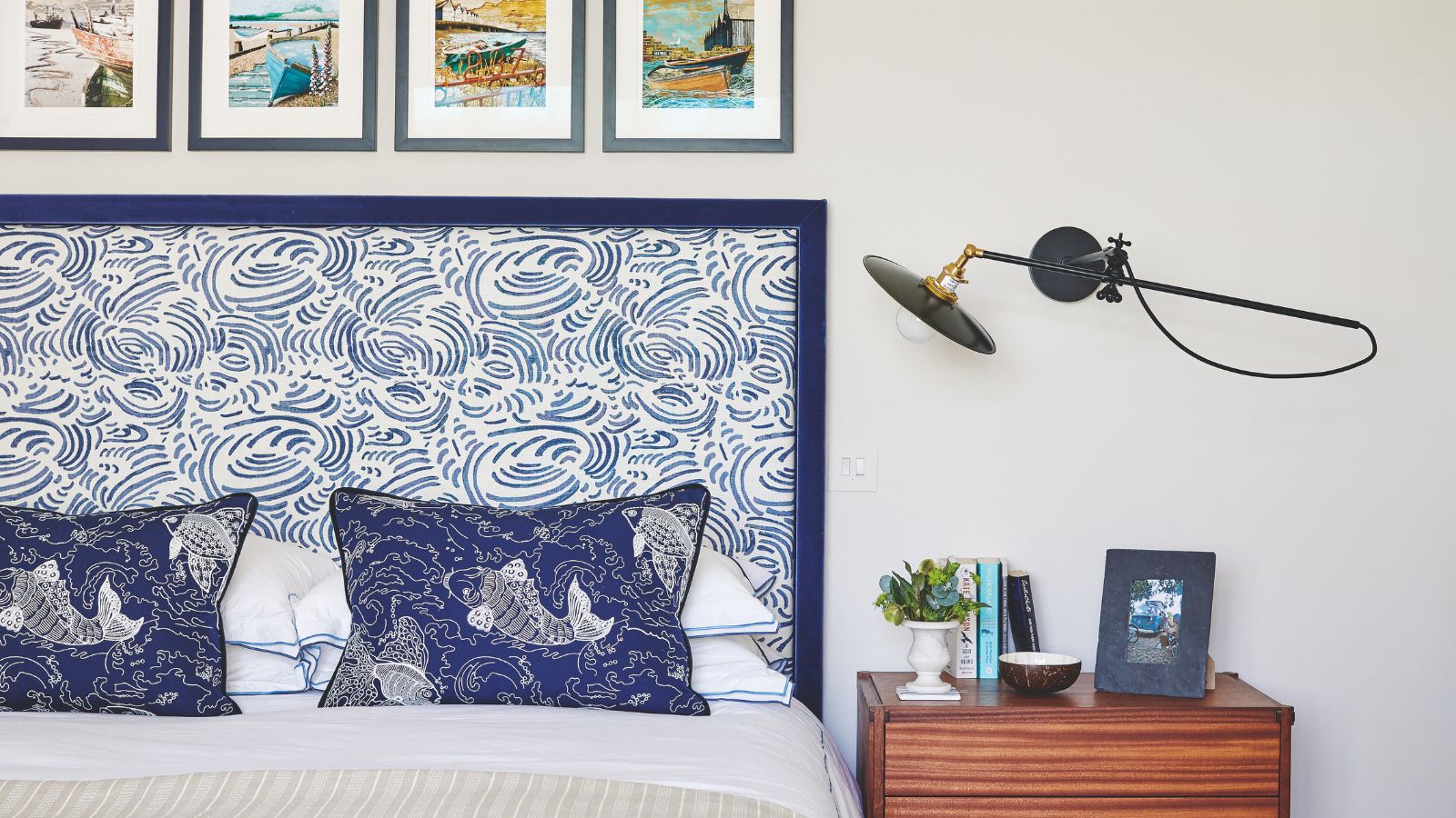
Led by color trends and my love of color drenching, I settled on a shade from COAT Paints called Lie-In which they describe as a 'pretty and serene' shade.
While the sample felt like it does what it says on the tin, after drenching the space and living with it (and the shifting in light and seasons) it suddenly feels cold, sucking the energy out of the space rather than enhancing it.
What I thought would be a cozy, uplifting shade now feels oppressive. This made me learn a big lesson in choosing paint choices: the right paint color isn't just about aesthetics, you must also understand exactly how the light will interact with your chosen color.

A hue that looks perfect on a swatch or even in another room can take on an entirely different personality when exposed to changing daylight.
North-facing rooms, for example, receive cooler, indirect light, which can make colors appear darker and more muted. South-facing rooms, on the other hand, enjoy consistent, warm light throughout the day, allowing for a wider range of colors to shine without drastic changes. While east-facing rooms get bright, crisp morning light they can feel dimmer and cooler in the afternoon. Meanwhile, west-facing rooms – like mine – start the day in shadows and end with intense, golden light.
Understanding these natural light patterns can help you make more informed paint choices, ensuring that your chosen color looks just as good in the morning as it does at night.

But while my office feels cool and gray, that doesn't mean all pale blues will work this way in your home.
In this small home office, designed by Marie Flanigan Interiors, Farrow & Ball's Skylight 'brings a soft, airy elegance to this feminine office,' says Marie. 'A delicate blue-gray that shifts beautifully with the light. It’s subtle yet sophisticated, creating a serene and inspiring space that feels both fresh and timeless.'
South-facing spaces, with their abundant warmth, can handle cooler blues with gray or even violet undertones without feeling too chilly, as the sunlight adds warmth for you. Additionally, the best blue paints for east-facing rooms, which have bright morning light but cooler afternoons, are softer, muted blues that maintain their depth throughout the day.

In north-facing rooms, on the other hand, where light tends to be cooler, warm-toned blues with hints of green can help prevent the space from feeling too cold or stark. While in west-facing rooms, after some research, I learned that the experts say blues with green or taupe undertones can help balance the color.
If you're looking for the best dark blue paint, Marie says: 'Benjamin Moore’s Midnight was the perfect choice for this masculine study [seen above]. It reads as an elegant near-black, but with just a hint of navy that adds depth and richness. It creates a space that feels refined, moody, and endlessly sophisticated.'
So I urge you to try to tailor your blue to the room’s orientation before you make any quick decisions, like me. I'll be looking to take all this new-found blue knowledge straight to the hardware store to choose a little more wisely this time around.
Now that I’ve lived with my moody blue office for over a year, I can confidently say that paint is never just about picking a pretty color – it’s about light, mood, and how a space makes you feel throughout the day. As I consider a repaint, I’ll be taking a more thoughtful approach this time, looking for a shade that adapts and works in harmony with my space rather than against it. And maybe this time, I'll not just fall in love with a color on a swatch...

You must confirm your public display name before commenting
Please logout and then login again, you will then be prompted to enter your display name.
-
 'Big results before you know it' – Experts urge you to use the ‘Take Away 10’ method for simple decluttering with zero decision fatigue
It can cut hundreds of items from your home in just a few weeks
-
 Kevin Bacon and Kyra Sedgwick's rustic kitchen island is stunning, but controversial – designers say you can get the look without the hassle
A popular material finds an unorthodox home in the couple's kitchen, but experts disagree on whether it should be used – here's how to do it instead

