I chose not to follow this key lighting trend – and now get why designers are doing lighting this way
Designers have been turned off by the idea of the big light, yet I've embraced them in every room in my house. Now, I understand why the mood is shifting
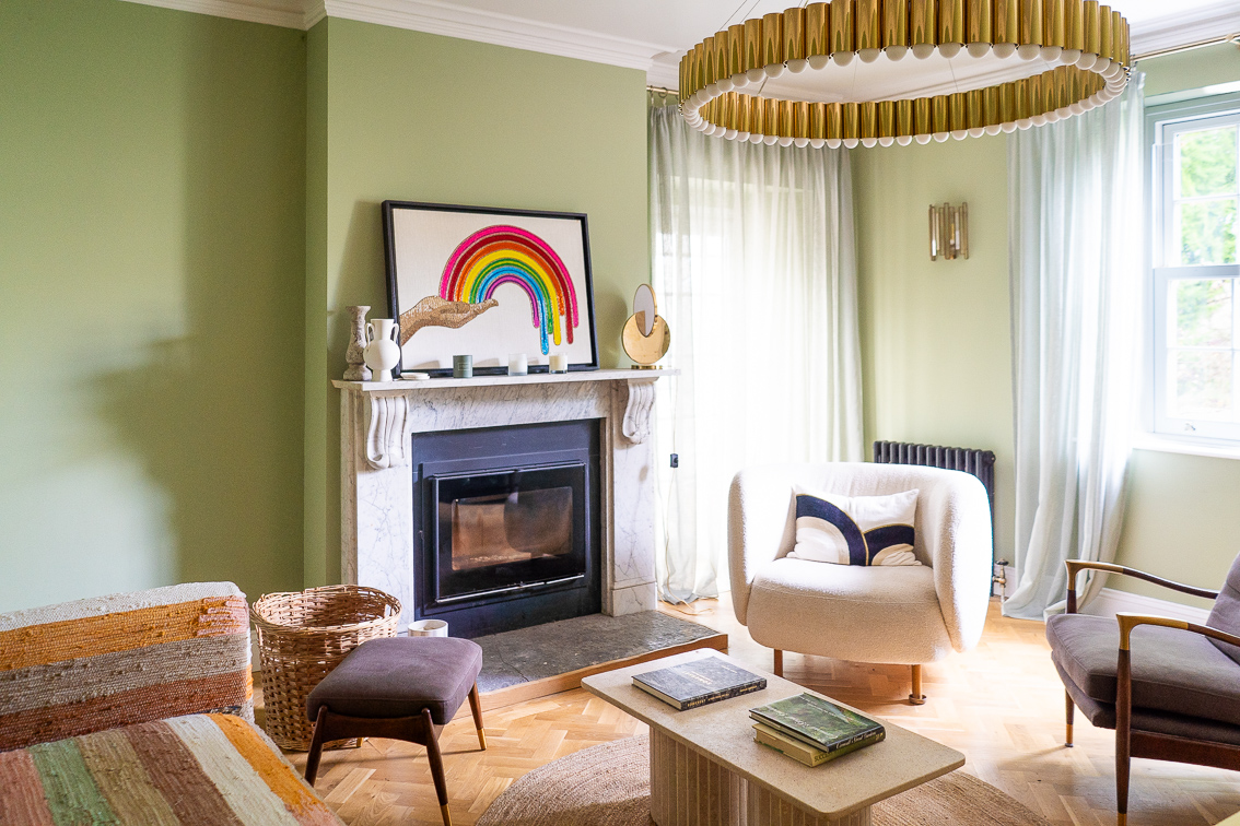
The era of the big light is officially over. It's not that chandeliers and vast central hanging lights aren't beautiful, or show-stopping, or can add a fabulous final flourish to a room, but when was the last time you actually turned one on, except perhaps when you were looking for something? And then turned it off the moment you found that thing? Using big lights for lighting ideas, you see, is now decorative rather than functional.
Of course, I put big lights into every room in my home, vastly arresting pieces like the large, round chandelier, hanging for my living room lighting ideas (as seen at the top of this page.) I don't regret it for an instant – it's a piece of artistry that I love and that never fails to draw gasps when anyone new enters the room. But realistically, I rarely turn it on, favoring instead the glow of the sconces around the edge of the room, and the serene, orb-like glow of the table lamp seen on the fireplace.
And now I'm wondering, if I were to advise someone who was just starting out on a reno and was looking into how they could save costs, would I suggest they don't include any big lights at all?
Why designers aren't using big lights in projects
'I love the ambiance of wall lights,' says Molly Kidd, chief creative and principal designer at the Oregon-based studio Light and Dwell. She recently completed a project in the woods outside Portland, an English-cottage-like home with almost no big lights. 'The ceilings were very low, only 8 feet tall, so it was important that wall lights were the main feature,' she says.
And that ambiance she refers to is what designers are drawn to right now. That feeling of being gently cocooned by light, rather than totally startled by it (a feeling you can sometimes get from an over-zealous ceiling light).
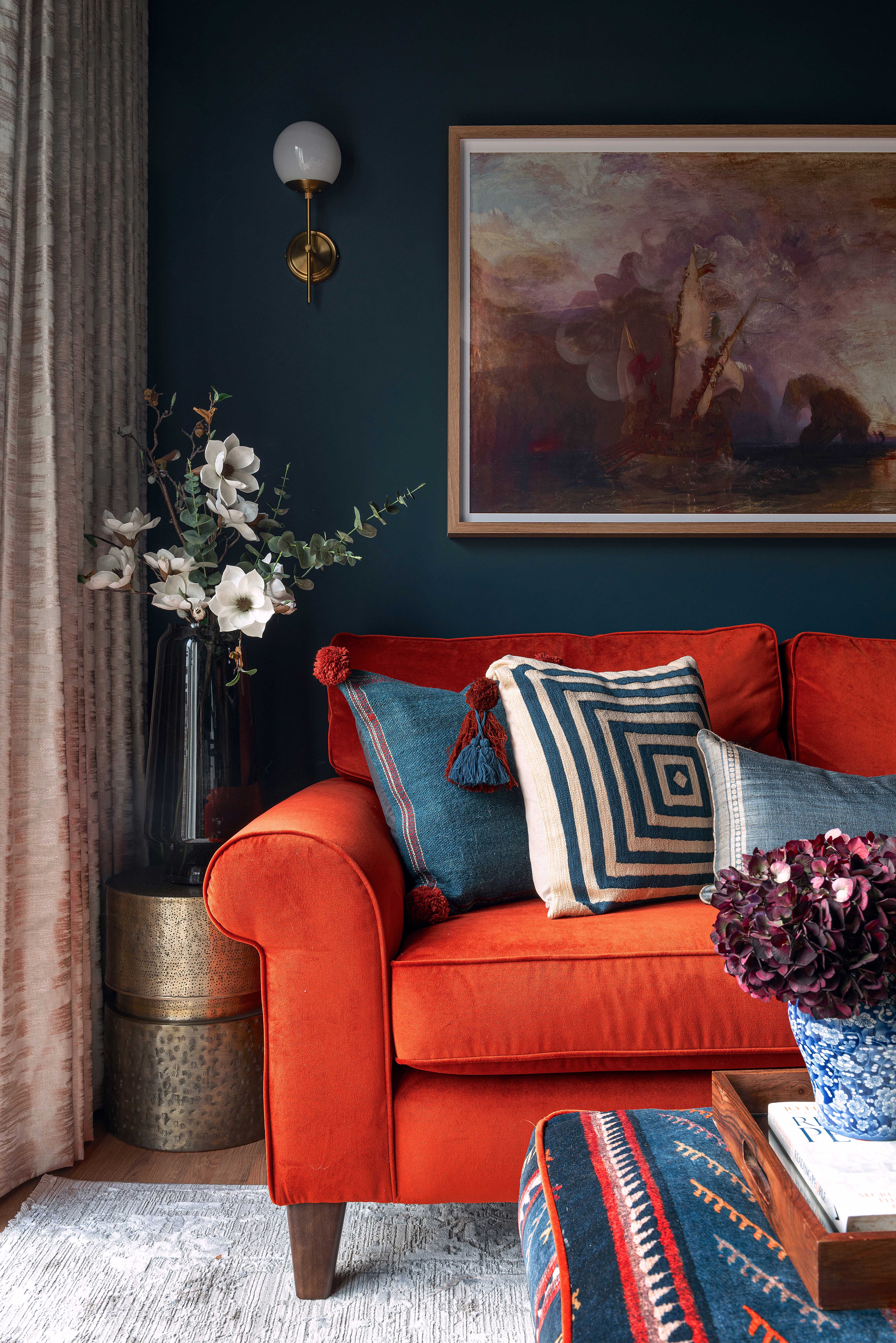
It's an approach the designer Enass Mahmoud of Studio Enass took for this apartment, above. 'Wall lights, paired with Farrow and Ball's Hague Blue on the walls, will bounce light sparklingly around the room, elevating it,' Enass says. She added in some floor and table lamps for good measure, but kept away from a ceiling light. 'Little moments, lit individually, are a great way to give a space character,' she says. 'And they reflect like twinkles off cocooning wall colors. I’m really into Little Greene’s Red Arras and Farrow and Ball’s Deep Reddish Brown at the moment. Both are reddish browns and work amazingly with brass, gold and antique fixtures.'
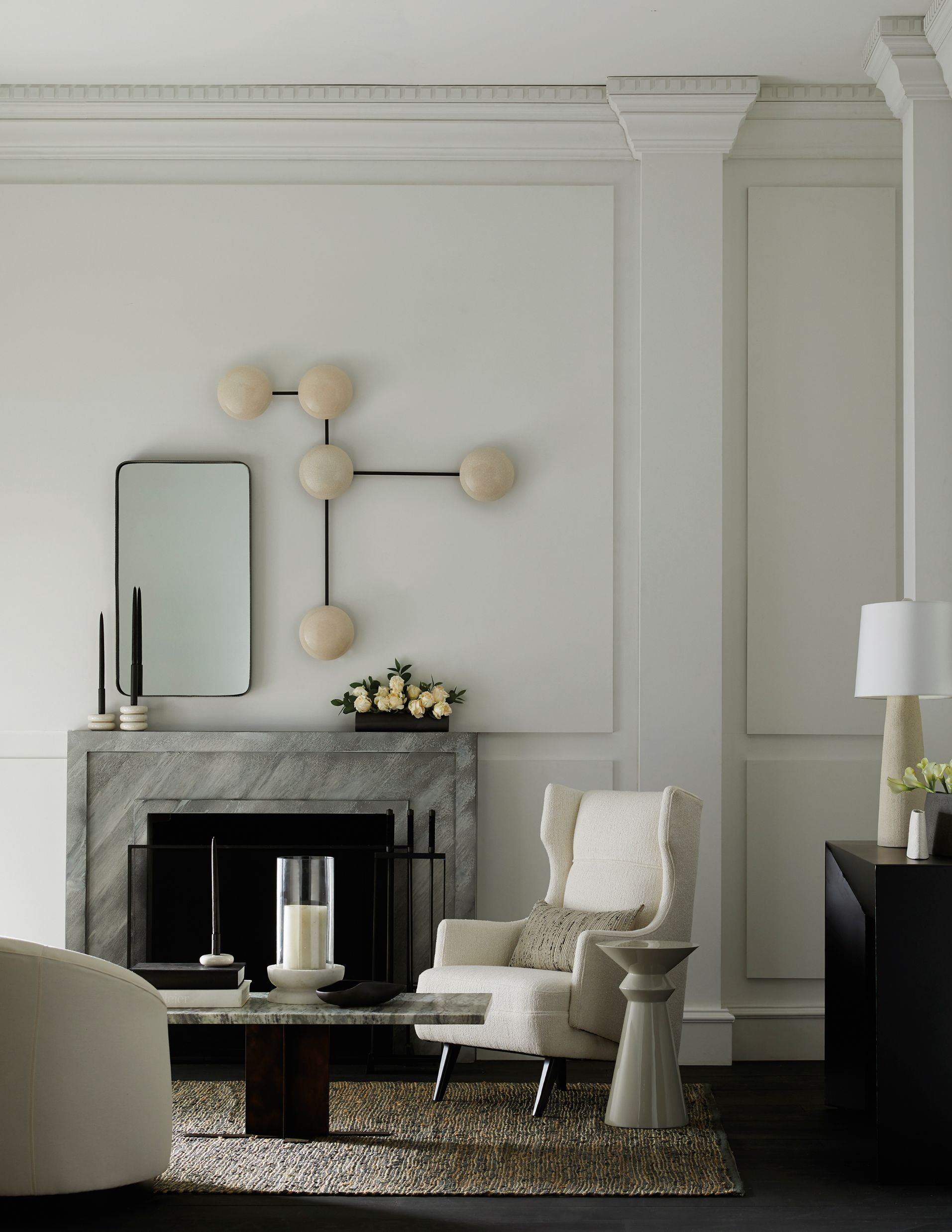
Meanwhile, even famed lighting designers are finding big lights to be a turn off – pun intended. 'I'm not completely against statement pieces,' says Michael Anastassiades, who has been world-renowned for designing lights for decades. 'But the problem is that after the first excitement and impact the wow factor dies, and they start to feel less exciting.'
'I don't find it comfortable to over-light a space,' says the Los Angeles-based interior designer Jake Arnold. 'Too much overhead lighting, other than in the kitchen, just doesn't work for me. In fact, I'd go so far as to say that you shouldn't have an overhead light. To have a ceiling that is unedited is not very luxe.'
How to light homes without a big light
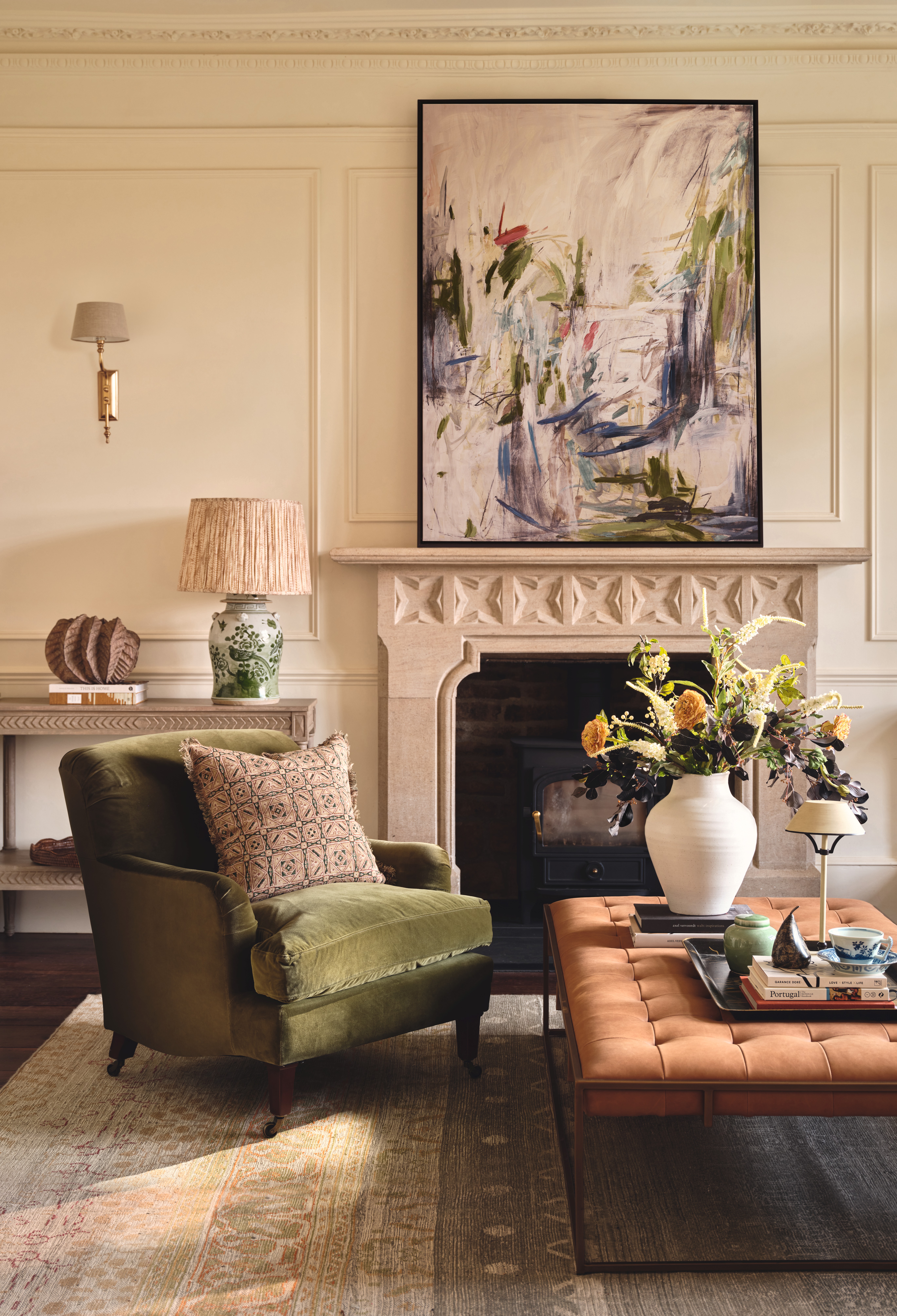
Another world-renowned lighting designer who has turned against the big light is Tom Dixon. 'Of course, I'm not going to say people don't need one of my pendants for their ceiling,' he says. 'But I would advise against a flood of top lighting, which can be really unflattering. Spotlights, particularly, have this effect. Instead, wash rooms in light – place sticky LED strips under counters and behind sofas, spread the lights out and think of the different lights as adding texture rather than just illumination.'
Michael agrees that layering is key. 'The idea that we have one central light in the middle of the room and expect everything to be lit by that, well, it’s impossible,' he says. 'The whole poetry is gone. Instead, it’s nice to be able to scatter light at different heights around the room, and be able to combine different glows depending on what you're trying to do.' A mix of floor lamps, table lamps and wall lights is the most intelligent – and flexible – approach.
He also cautions against the spotlight. 'I am never a big fan of turning a spotlight to highlight a piece of art or an object you've bought,' he says. 'There is a beauty in allowing the light around an object to change rather than being completely constant, a home isn’t a museum. A spotlight forces you to focus on wherever it's trained, and never allows you to experience a piece of art as the dusk is drawing in, say, or from the perspective of candlelight. And those lower levels of illumination can cause such magic!'
Final thoughts
This leads me to understand why designers are no longer favoring the big light. As Michael says, there is a magic to softer pools of illumination, and I so enjoy the feeling of reading under a floor lamp that is positioned just behind my accent chair, angled onto my book. It feels safe, soft, and soothing in a way that a big central light never could.
But that's not to say I don't believe in the ceiling light anymore. In fact, what I'd suggest instead is to still invest in one as a statement piece, an embellishment similar to adding jewelry to an outfit, but instead to hang it in the corner of a room, so it doesn't take over the entire space, and instead illuminates, perhaps, just your reading chair.
A blank ceiling, entirely devoid of lighting, would look very strange, and there are times – of course – where you need the overhead bulbs on. But turn your main focus towards occasional lighting instead, and the art of the mini-pool of light, a key lighting trend that is here to stay.
We explore more elements of the big light debate in our dedicated feature.
Sign up to the Homes & Gardens newsletter
Design expertise in your inbox – from inspiring decorating ideas and beautiful celebrity homes to practical gardening advice and shopping round-ups.
Pip Rich is an interiors journalist and editor with 20 years' experience, having written for all of the UK's biggest titles. Most recently, he was the Global Editor in Chief of our sister brand, Livingetc, where he now continues in a consulting role as Executive Editor. Before that, he was acting editor of Homes & Gardens, and has held staff positions at Sunday Times Style, ELLE Decoration, Red and Grazia. He has written three books – his most recent, A New Leaf, looked at the homes of architects who had decorated with house plants. Over his career, he has interviewed pretty much every interior designer working today, soaking up their knowledge and wisdom so as to become an expert himself.
-
 These are the 6 must-have colors to decorate with in April 2025
What do retro-inspired yellows and beautiful blues all have in common? They're on our hot list for the season ahead
By Sophia Pouget de St Victor Published
-
 Plants never to grow next to fruit trees
Expert advice on which plants to keep away from fruit trees to encourage a healthy harvest
By Jacky Parker Published
-
 Bookshelf trends – 8 stylish ways designers are displaying their books in 2025
Turn your collection of books into a design statement by embracing some of these chic, designer-approved bookshelf trends
By Lilith Hudson Published
-
 Want to introduce a coastal-meets-luxury feel to your home? The experts say it is time to get to know Riviera interior design
With a mix of influences, the eclectic, Mediterranean-inspired nature of Riviera style is popular among interior designers
By Charlotte Olby Published
-
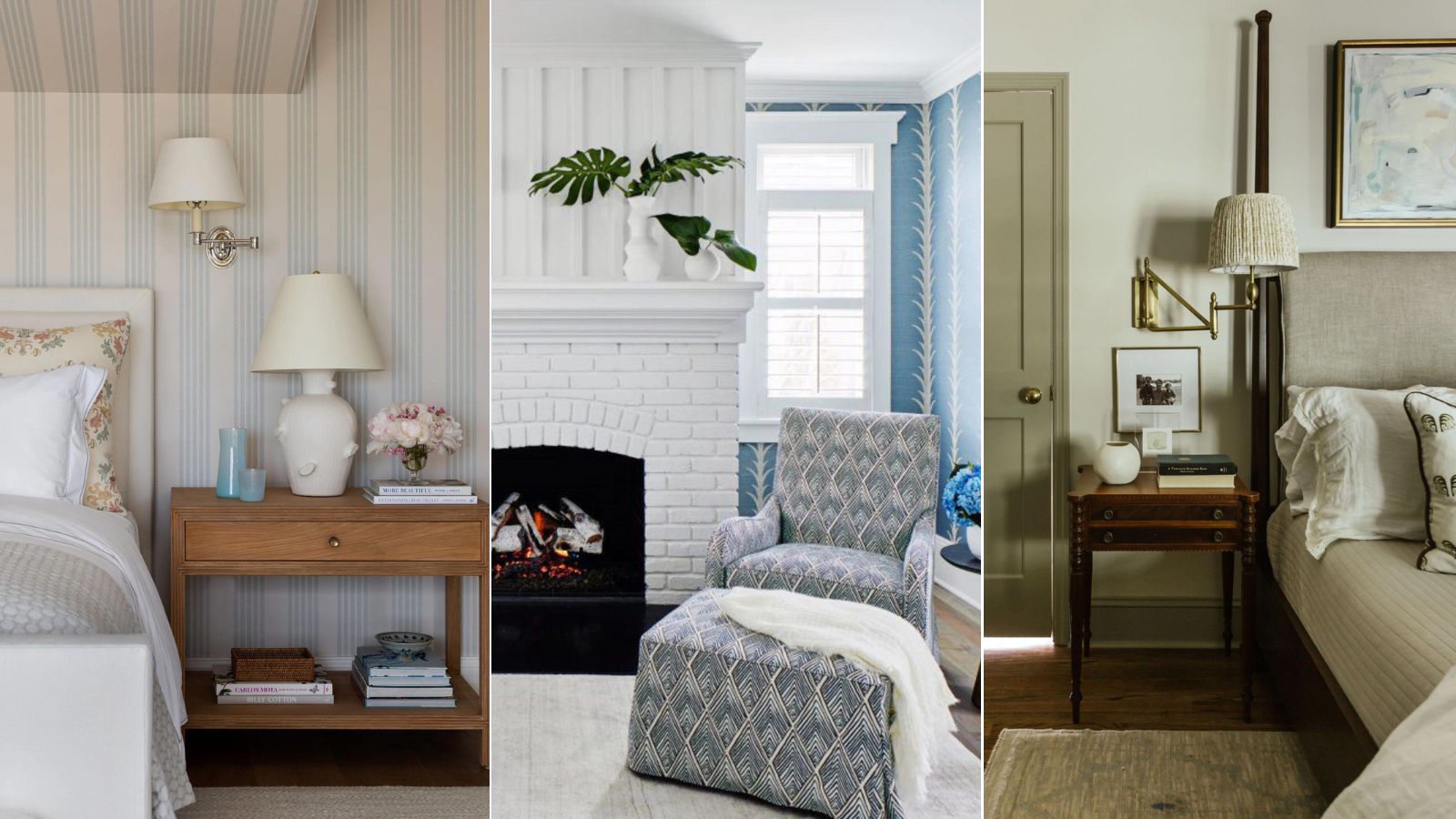 Love the trending Nancy Meyers aesthetic? Take it one step further with these '90s and 2000s rom-com-inspired design tips
Rom-com-inspired interiors are nostalgia-inducing and inviting. This is how to embrace the timeless look
By Abby Wilson Published
-
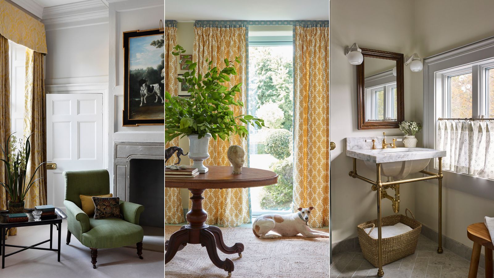 Are curtains out of style? Designers share their thoughts on the timeless window treatment
Designers explain why curtains have enduring appeal and share their tips on how to choose timeless designs
By Pippa Blenkinsop Published
-
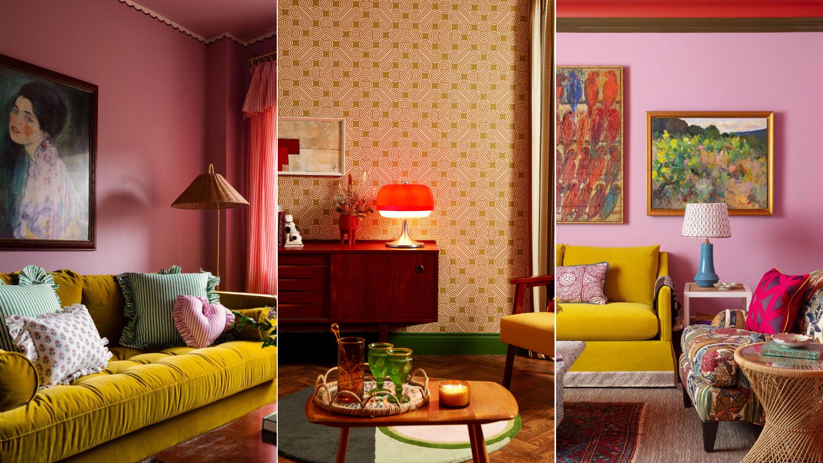 The whimsical decor trend is taking over – how to channel the playful, out-of-the-box style designers can't get enough of
Your home should make you happy, and whimsical decor is here to help. This is how to get the look down in any space
By Abby Wilson Published
-
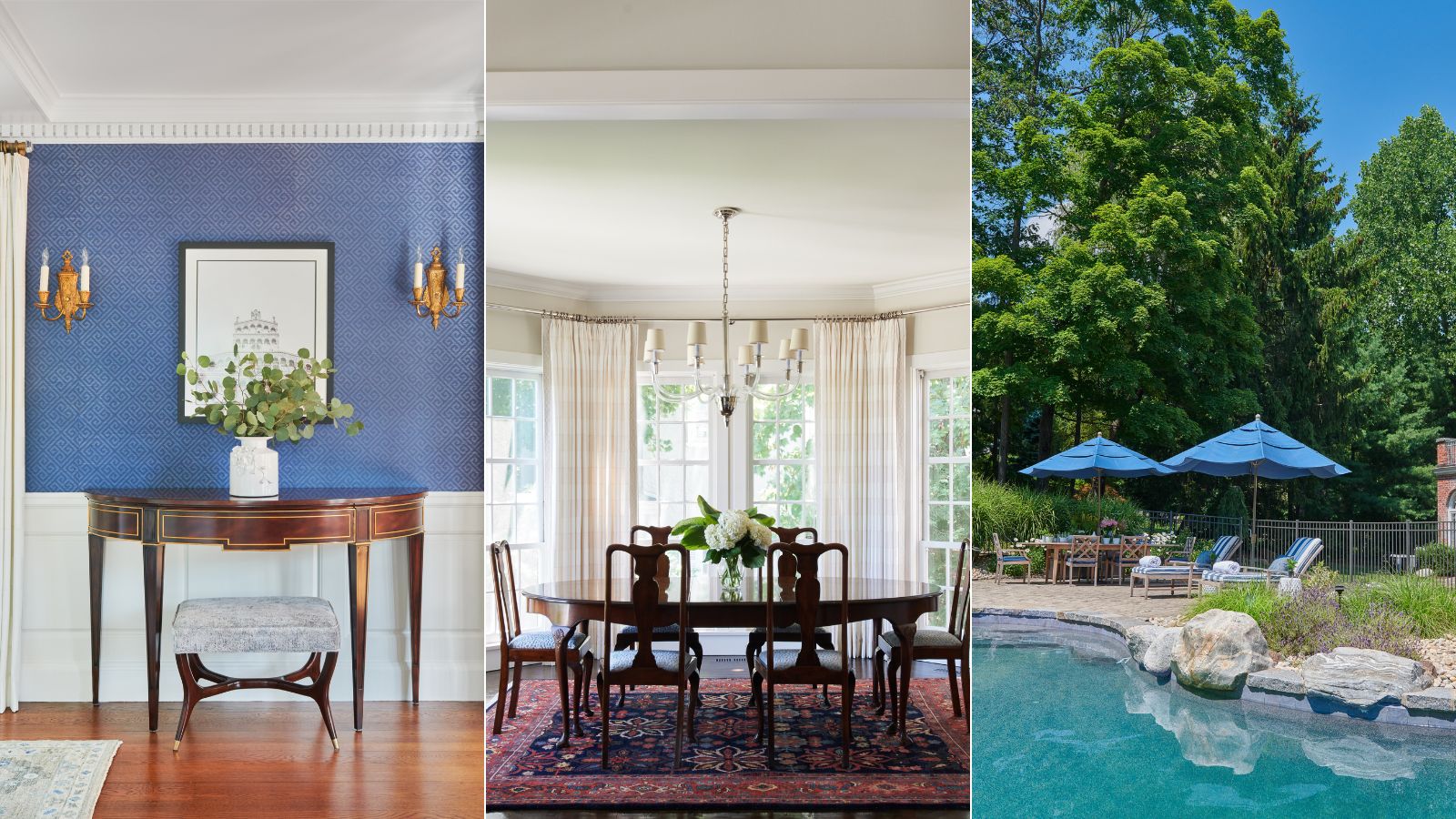 How to create the old money coastal style in your home – one of this year's biggest summer design trends
Understated elegance meets coastal chic – here's how to make it work in any space
By Molly Malsom Published
-
 6 summer decor trends from interior designers – to help you update your home for the season in 2024
Breathe new life into your home this summer with these simple tricks from interior designers
By Charlotte Olby Published
-
 9 transitional style decorating rules – the ultimate checklist to channel the perfect old-meets-new look
Transitional-style spaces blend modern elegance with traditional charm. Here's your step-by-step guide to getting the look down at home
By Abby Wilson Published
