This ever-popular Farrow & Ball paint color is the perfect neutral for just about any space – here's why you need to know about this soft stylish shade
A firm favorite paint color, Setting Plaster makes a stylish neutral for the year ahead
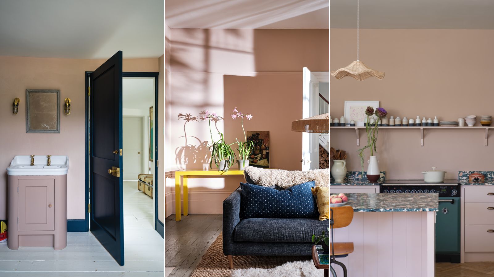

If you're an avid follower of paint trends, then you're no doubt familiar with Farrow & Ball's Setting Plaster. One of the brand's most popular shades, Setting Plaster is a plaster pink paint that's seemingly universally flattering and easy to decorate with.
We'd go as far as to say Farrow & Ball's Setting Plaster is an on-trend neutral paint, allowing us to shift from lighter tones such as whites and beige to provide our homes with more warmth and depth while maintaining a pared-back feel.
If, like us, you're intrigued by this plater pink paint, read on, where we explore its key qualities and the best ways to decorate with Setting Plaster, thanks to the expertise of the brand's Color Curator, Joa Studholme.
A post shared by Farrow & Ball (@farrowandball)
A photo posted by on
While you may not think of pink paints as a neutral color, the subtlety and softness of Setting Plaster give it an incredibly pared-back and liveable feel. In the Instagram video above, Joa explains that Setting Plaster was created to mimic the very tones of bare plaster – hence the name.
'The great thing about Setting Plaster is that any room that’s painted in this color somehow feels like it’s giving you a great big hug. It really embraces you. It’s perfect in north-facing rooms because it warms them up. And because it has a little sort of yellow undertone in the pink, it always feels very, very soft,' Joa says in the video.
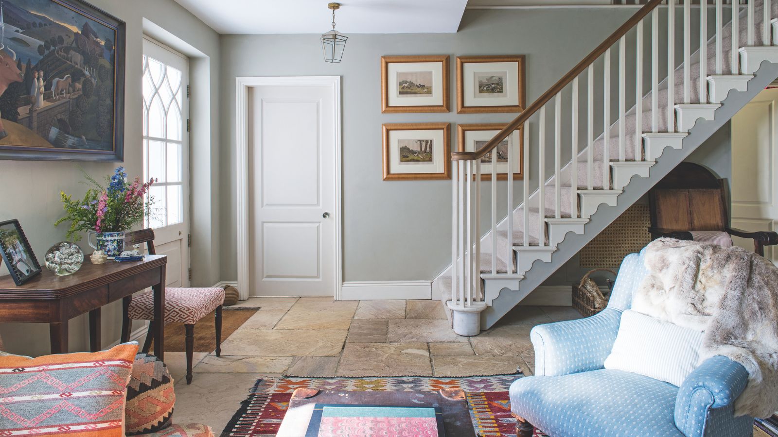
As you'd imagine, Setting Plaster is a versatile paint color that can be used to suit many different room types and decorating styles. That includes hallways, which is one of Joa's favorite rooms to use this plaster pink paint: 'I love using Setting Plaster in hallways because it just feels so welcoming.'
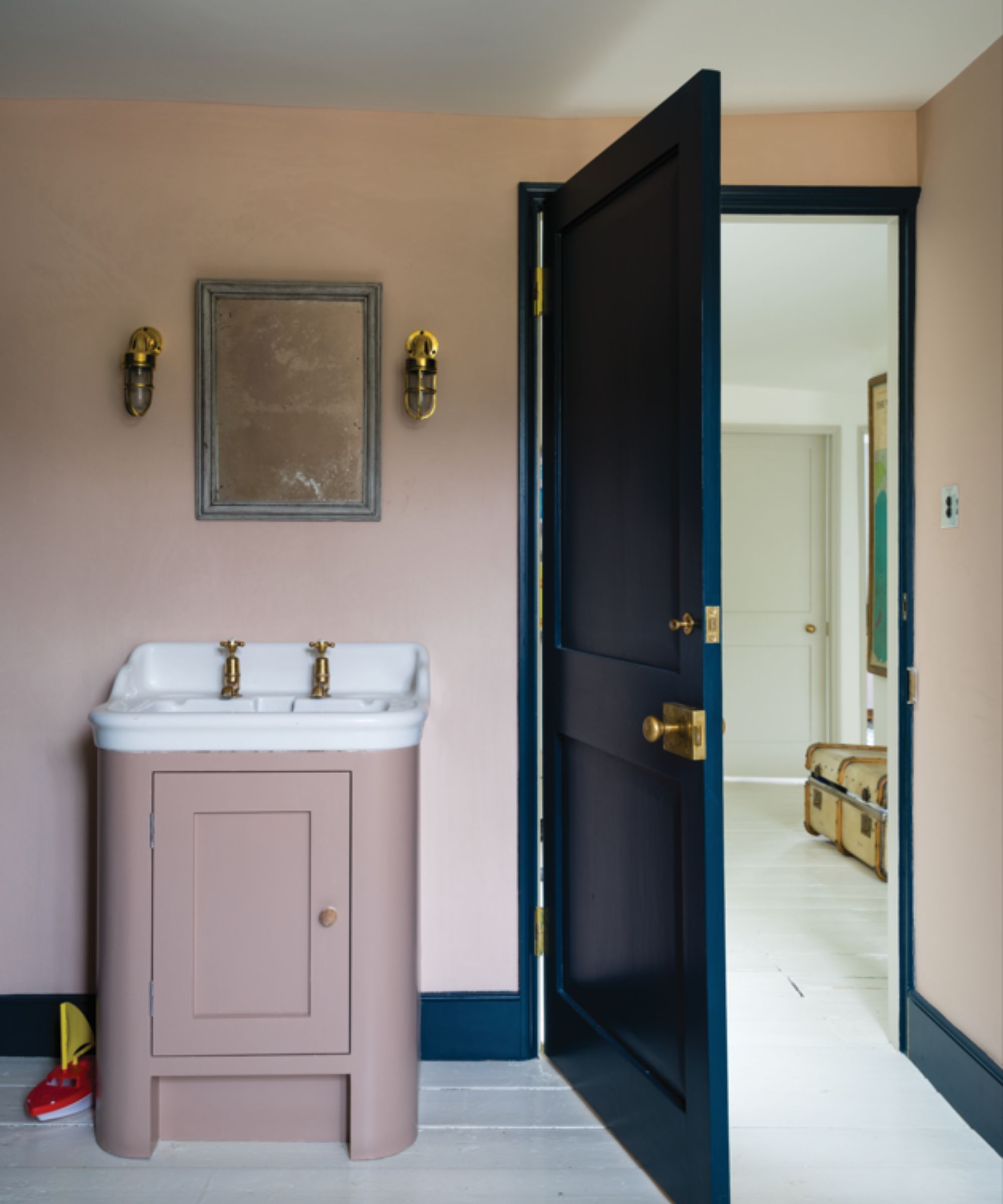
Patrick O'Donnell, brand ambassador at Farrow & Ball is another advocate for Setting Plaster's versatility. He explains: 'For all-round flexibility, you can’t go wrong with Setting Plaster. It makes a wonderfully flattering shade for bathroom walls, a delicate hint of color for a bedroom, or a grown-up warm blush for a living room.'
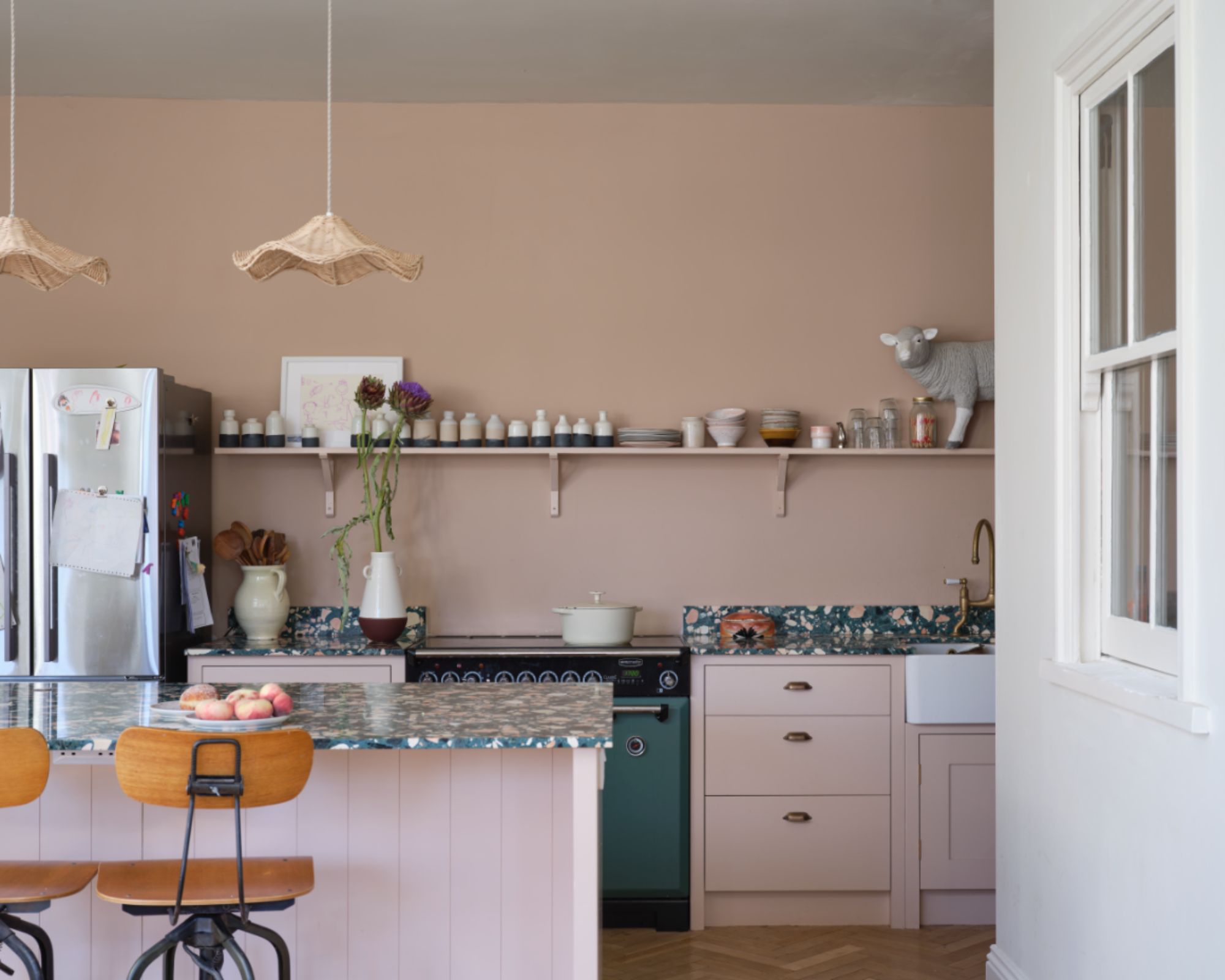
It's well known that natural lighting is an important factor to consider when choosing which paint colors to use for a room, and the beauty of Setting Plaster is that it flatters both darker, north-facing rooms and brighter, south-facing rooms, according to Patrick:
'Setting Plaster will bring warmth to a north-facing space and ‘knock back’ to a gentle neutral in sun-drenched spaces, making it wonderfully adaptable and suited to most decorating needs.'
This makes it a real winner if you're not sure where to start with your neutral paints. While overly warm-toned neutrals can read far too yellow in well-lit rooms and cooler neutrals can make darker rooms feel drab, Setting Plaster seems to provide balance in both settings, making it a good all-rounder.
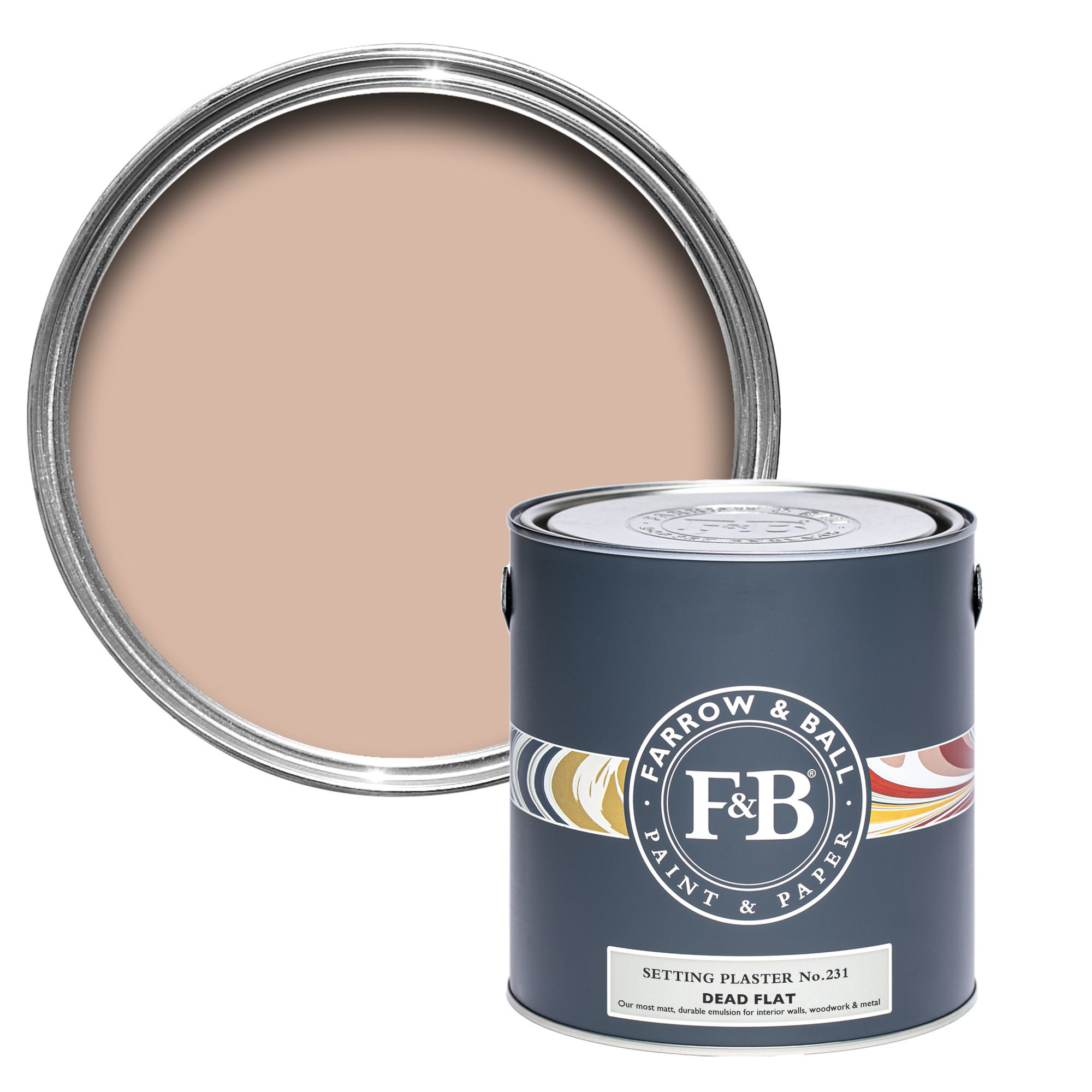
Reminiscent of bare plaster tones, Setting Plaster provides just enough warmth without leaning too far pink.
Looking for the next neutral paint color to decorate with? Setting Plaster is a stylish, timeless choice, adding more coziness than lighter neutrals while not feeling too saturated.
Sign up to the Homes & Gardens newsletter
Design expertise in your inbox – from inspiring decorating ideas and beautiful celebrity homes to practical gardening advice and shopping round-ups.

Emily is a freelance interior design writer based in Scotland. Prior to going freelance in the spring of 2025, Emily was Homes & Gardens’ Paint & Color Editor, covering all things color across interiors and home decor for the Homes & Gardens website. Having gained specific expertise in this area, Emily is well-versed in writing about the latest color trends and is passionate about helping homeowners understand the importance of color psychology in home design. Her own interior design style reflects the simplicity of mid-century design and she loves sourcing vintage furniture finds for her tenement flat.
-
 Best climbers to grow in pots – 5 easy-to-grow vines that will transform small spaces with vibrant color
Make the most of small terraces, patios and balconies by filling pots with colorful climbers
By Thomas Rutter
-
 'It's not something I'm willing to budge on' – shoes on vs. shoes off, what type of household are you?
Our professional cleaners are all in agreement on this one, but would you consider a switch?
By Ottilie Blackhall