Is white or cream more on trend for 2025? Which of these enduring neutrals are designers favoring (and where and when to use them)
Designers weigh in on these two light neutrals and where and when to use each

Design expertise in your inbox – from inspiring decorating ideas and beautiful celebrity homes to practical gardening advice and shopping round-ups.
You are now subscribed
Your newsletter sign-up was successful
Want to add more newsletters?
White and cream are two of the most timeless colors in interior design. Often used as backdrop colors in various rooms, white and cream create a calming, understated backdrop that allows other decor to shine.
But when it comes to decorating with white and decorating with cream, the subtle differences between them are important to consider. White can sometimes feel too stark, while cream can feel too yellow.
And so, we enlisted the expertise of interior designers who share below all you need to know about choosing between white and cream, plus which of the two designers are favoring for 2025.
Article continues belowWhen to use white and when to use cream
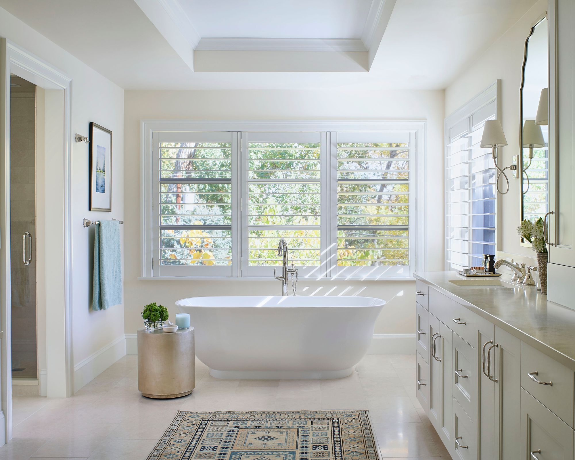
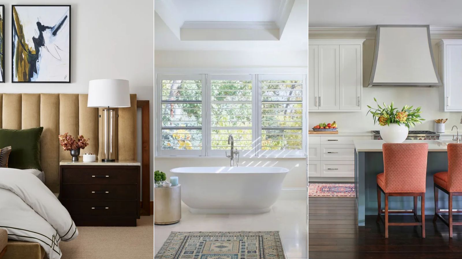
'A crisp white paint is ideal for ceilings and trim and also works well for kitchen cabinets. Choose a white with a touch of cream for more warmth and depth. I love Benjamin Moore's White Dove and Cloud White. White is great for making neutrals pop and works well with gray, whereas cream pairs well with color,' explains Denver-based designer interior designer Nadia Watts.
'I prefer cream for walls and furniture. Cream brings much-needed warmth to stark white and works well as a base for layering in your personal style. It softens the contrast in a room – if you love color cream is a nice way to bridge colors,' Nadia continues.
While you may gravitate towards either white or cream paint, that's not to say you can't use both in your interior schemes, as suggested by Nadia: 'I have always liked cream and white together, and Navajo White works really well with White Dove or Cloud White – the classic color combination of white and cream always looks chic.'
White and cream are two timeless, versatile colors that can be used in endless rooms and design styles. That said, sometimes one of the two can be better placed for a specific room, depending on a few key factors that designers recommend paying attention to below.
Design expertise in your inbox – from inspiring decorating ideas and beautiful celebrity homes to practical gardening advice and shopping round-ups.
Consider a room's natural lighting
'I love using white in homes bathed in abundant sunlight, where it looks stunning from sunrise to sunset. However, in the northeast, where we don't always enjoy the same level of natural light, I often opt for cream. Its warmth makes it a perfect alternative to white, brightening the room without feeling harsh. In the depths of winter, when sunlight is scarce and colder in tone, cream provides a soft, inviting warmth,' says Boston-based designer Kristen Rivoli.
Paint and color expert, and creator of Chalk Paint Annie Sloan also recommends a room's lighting as a good starting point when choosing between white and cream:
'It is important to consider the light when you decide between using white or cream tones in a room. Cooler north-facing rooms have a bluer light so stick to warmer creams to avoid a clinical feel. South-facing rooms have more golden light and can take more blue-grey whites. I recommend testing swatches at different times of the day and, if you are going to be using artificial lighting, choose bulbs that mirror the palette's warm or cool undertones.'
Choose white or cream based on your design style
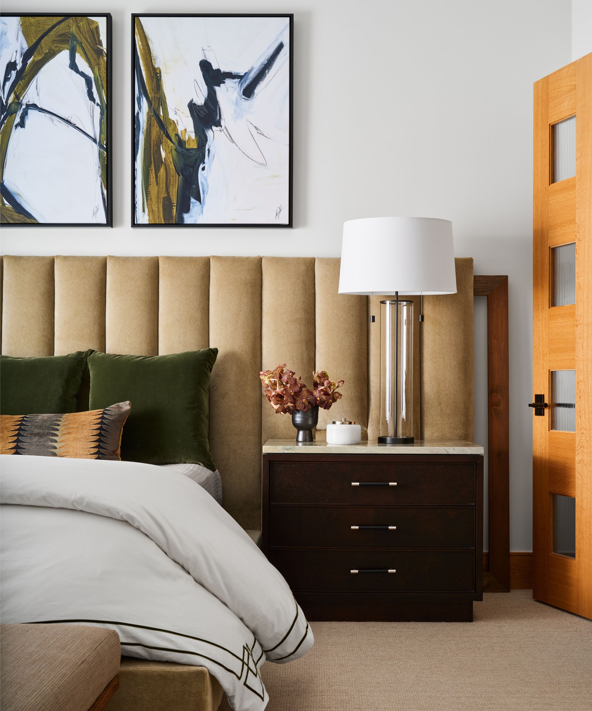
'White makes a beautiful, crisp contrast to materials and often we recommend it for a more contemporary design application. It creates the perfect backdrop for artwork to be a ‘showpiece’ and architectural design elements like stone or trim and molding details to be accentuated,' says Grayson Knight of Dallas-based Layered Dimensions Interior Design.
'Creams maintain a sense of sophistication while also infusing a subtle casual feel to a space. It instantly invokes an inviting feel to any room and often can heighten a cozy expression,' adds Grayson.
Interior designer Soledad Alzaga also suggests that white and cream can create a different feel to suit your chosen interior design style: 'I’d recommend decorating with white when you want a fresh, clean look that brightens up a room, especially in spaces that feel small or need more openness. White is perfect for many styles because it creates a perfect backdrop that lets other design elements stand out.'
'On the other hand, I’d go for cream when you want a softer, warmer vibe – it's perfect for living rooms, bedrooms, or dining areas where comfort is key. Cream creates a cozy, welcoming atmosphere and pairs well with wood tones or rich accents, giving the room a timeless feel,' says Soledad.
Use white in cool color schemes and cream in warm
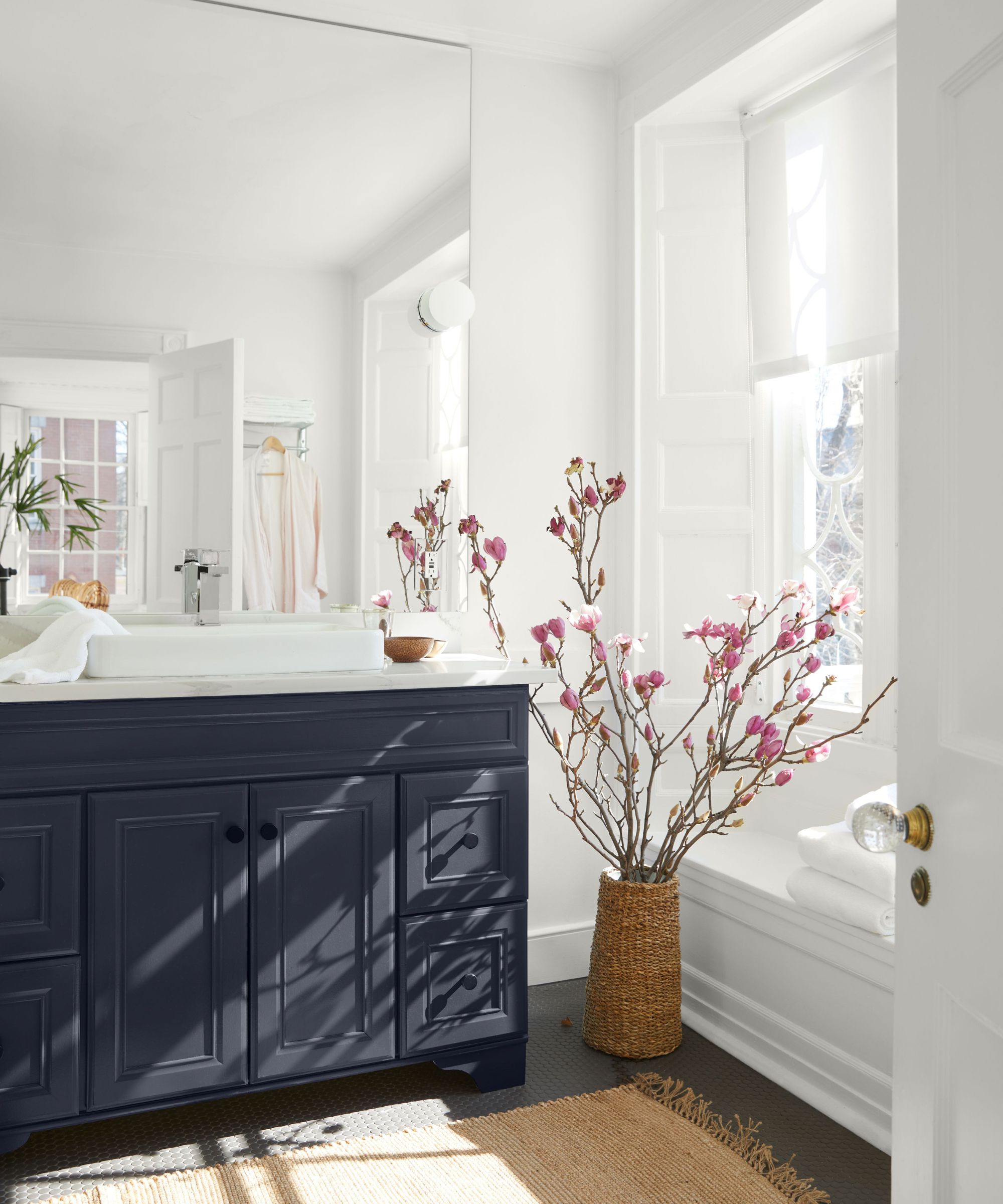
Whether your room follows a warm color scheme or a cool color scheme can be another useful determining factor when choosing between white and cream, as explained below by Susan Hayward and Jillian Hayward Schaible of Hayward Design House:
'Creams and whites can be used in many different ways in almost any room. For cooler palettes (think: blues and grays), a crisp white can be a nice contrast, while a creamier tone works best with warmer palettes (like browns, oranges, and reds).'
'We love Benjamin Moore’s Marble White for a creamier look, and Decorator’s White for a true, crisp white. Another go-to neutral for us in ceilings and trims is Simply White by Benjamin Moore because it has minimal undertones and never feels too harsh,' the design duo adds.
Annie Sloan agrees that cool whites work best in cooler schemes and creams in warmer, adding: 'A bright clean white with blue undertones, like my Pure, works better with colors with similarly cool hues – blues, greens, and grays. It is perfect for creating a crisp and modern look.'
'A darkened dusty cream with yellow undertones, like my Old Ochre, is warmer and has a warm, romantic cast which comes into its own when teamed with other organic colors such as olive or sienna. It is a great neutral for creating a relaxing environment,' adds Annie.
Is white or cream more on trend for 2025?
While white and cream are both timeless colors that don't feel too trend-driven, that's not to say designers don't have their favorites for the year ahead. Decorating with cream seems to be more favored, which comes as no surprise with so much appeal right now for cozy, homey spaces that don't feel too stark.
'I believe cream will be a major color trend in 2025, thanks to its flexibility – it can be as delicate as a white or richer, with a soft yellow undertone, like a pale butter hue,' says Kristen Rivoli.
Christine Vroom of Christine Vroom Interiors is another designer who enjoys decorating with cream. She adds that it works especially well when layered with varying tones: 'Cream is the new white, and we have so many gorgeous ideas on how to use it to enhance your space. I would suggest using a few different tones of cream to add depth – champagne, off-white, alabaster, biscuit, and add in different textures like boucle, velvet, and linen.'
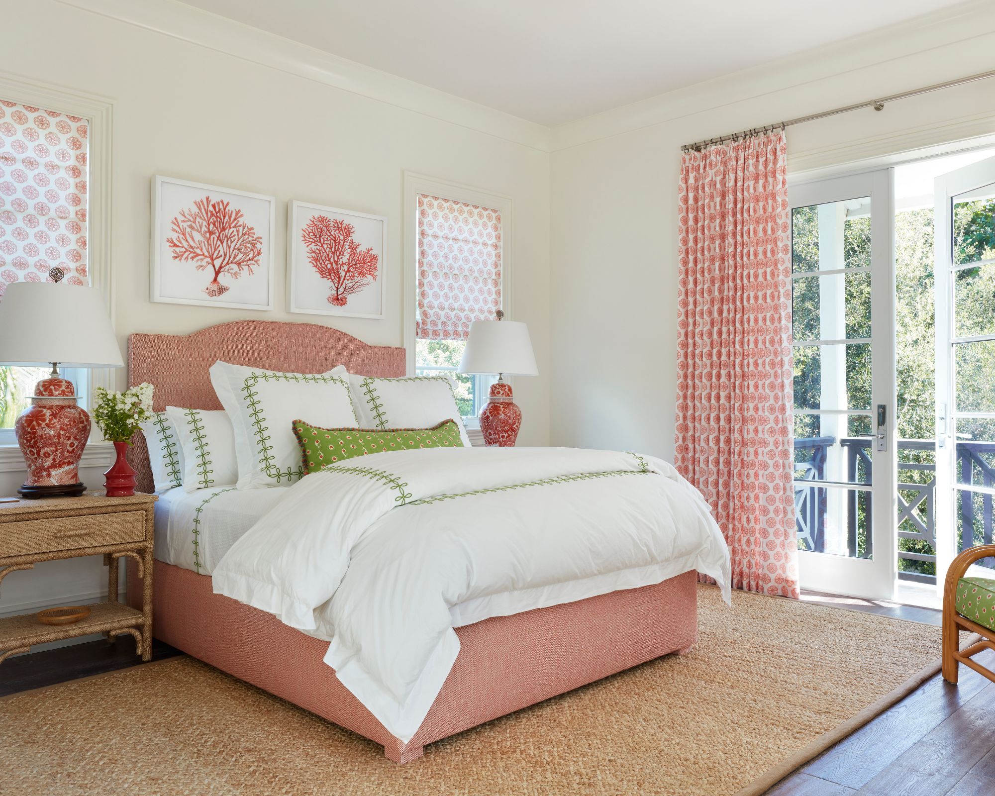
'If you want to add some color rather than a monochromatic scheme, I love pairing cream with earth tones like rich brown, warm terracotta, and deep greens. Cream provides a really beautiful, warm base that you can build off of and layer into your already-designed space,' says Christine.
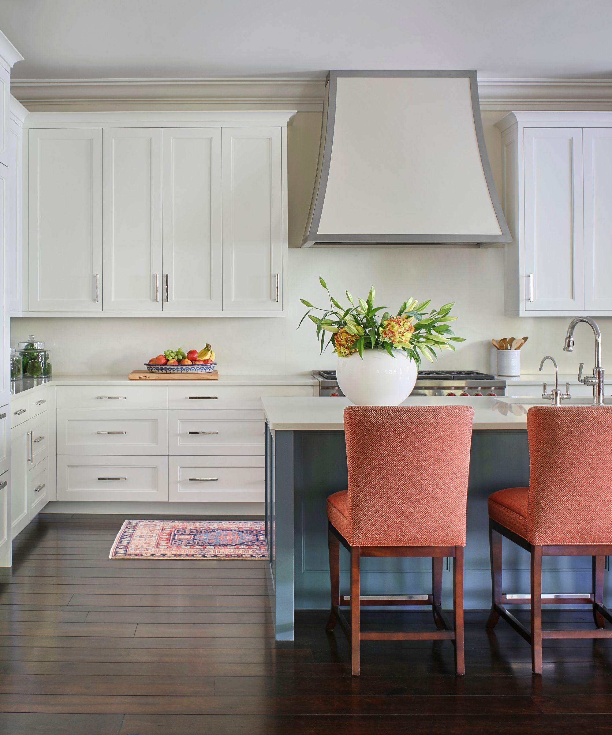
However, the current appeal for cream doesn't mean white is going anywhere for 2025. This timeless shade will continue to create clean and bright backdrops in so many rooms, and designers are specifically drawn to warm white paints that feel slightly more cozy.
'White works when there are a lot of wood tones especially mid to dark stains. It helps the space feel light and contemporary. Creams tend to skew wood tones yellow which isn’t the most appealing. The only thing to caution with white is using a very stark, blue-based white when your light bulb temperature is daylight (3000k). This feels very institutional which is the opposite of comfort,' says designer Sarah Storms.
Interior designer Maren Baker agrees that slightly warmer white can be more flattering, adding: 'I always prefer a white with a little more warmth to it. White is great if you have an incredible art collection and want that gallery feel, otherwise, I would lean towards creamier colors as that compliments more people and interiors. Be careful it doesn't skew too yellow though as that will feel dated and maybe even a little dirty if you aren't careful.'
While current design trends favor warm whites and cream tones, the success of white and cream comes down to how bright or dimly lit your room is, where the right light-neutral paint can balance the abundance or lack of light.

Emily is a freelance interior design writer based in Scotland. Prior to going freelance in the spring of 2025, Emily was Homes & Gardens’ Paint & Color Editor, covering all things color across interiors and home decor for the Homes & Gardens website. Having gained specific expertise in this area, Emily is well-versed in writing about the latest color trends and is passionate about helping homeowners understand the importance of color psychology in home design. Her own interior design style reflects the simplicity of mid-century design and she loves sourcing vintage furniture finds for her tenement flat.