White room ideas – 10 design-led ways to use white in the home
White room ideas are timeless – add color and texture with your decorating choices for a sophisticated scheme
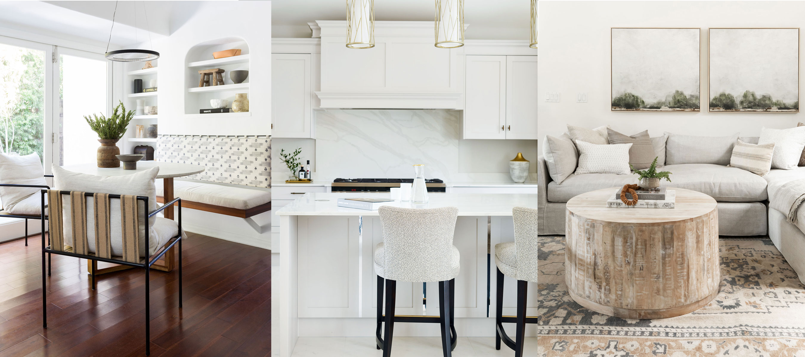

White room ideas are the simplest of colors but, as anyone who has set off on the quest for the perfect white can attest, also one of the trickiest to get right.
Color theory in its entirety can be complicated but there are a few basic principles to help steer you in the right direction, explains Patrick O’Donnell, brand ambassador for Farrow & Ball.
‘White represents purity, innocence and new beginnings, as well as cleanliness and clarity,' he says. 'It can be used everywhere in the home but is very successful in the bathroom and any room where you want to create order and with little distraction. It is also an ideal foil for a well-curated room of art and furniture.’
This versatile neutral is one of the most popular paint ideas for interiors, and it is easy to see why.
White room ideas – 10 ways to work this versatile color into your interior scheme
While some decorators instinctively lean towards pale yellows, and others where green meets grey, many agree that new neutrals and whites are largely inspired by colors emanating from the natural world, which help us to feel grounded in our homes. ‘They also comprise off-white base notes and a scattering of additional tones including beige, eggshell and ivory,’ says Charu Gandhi, founder and director of Elicyon.
Decorating with white offers a blank canvas that illuminates dark spaces and can make even small rooms feel spacious, light and bright. Here are some of our favorite white room ideas to inspire your next decorating scheme.
1. Keep it classical with a white kitchen
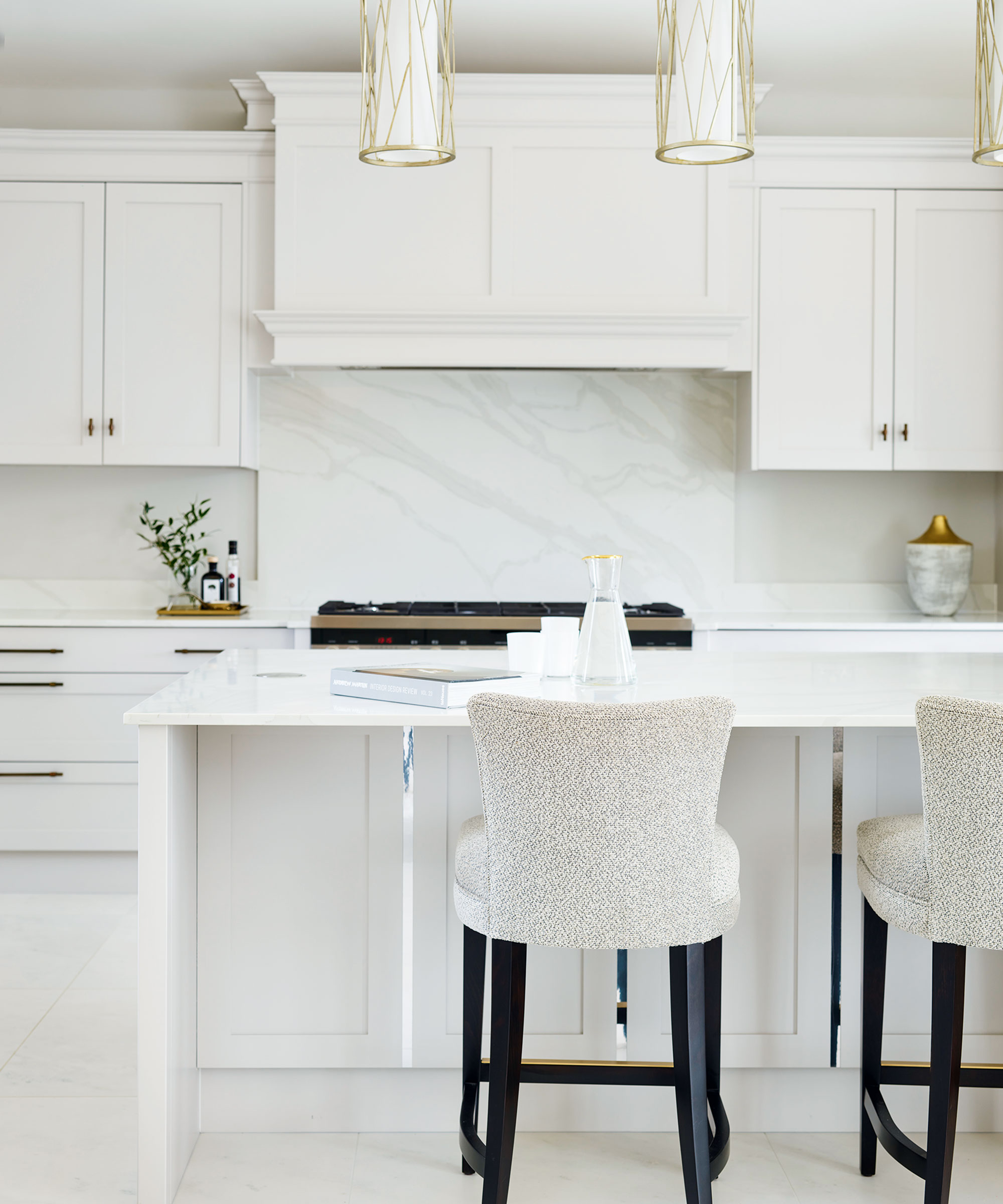
Beautiful craftsmanship and simple lines are the hallmarks of a traditional white kitchen. ‘White has become a popular choice for classical designs. It makes cabinetry look very crisp and sophisticated and the space feels instantly brighter yet also very calming,’ says Stephanie Dedes, design and marketing manager at Charles Yorke’s Pirbright showroom.
The pale tones of this white kitchen, painted in Farrow & Ball’s Cornforth White, are broken up and softened with elegant details such as brushed aged brass handles and warm grey veining in the kitchen countertop and backsplash. Mirrored strips punctuate the panelling for a subtle touch of glamor.
2. Introduce plenty of textural elements
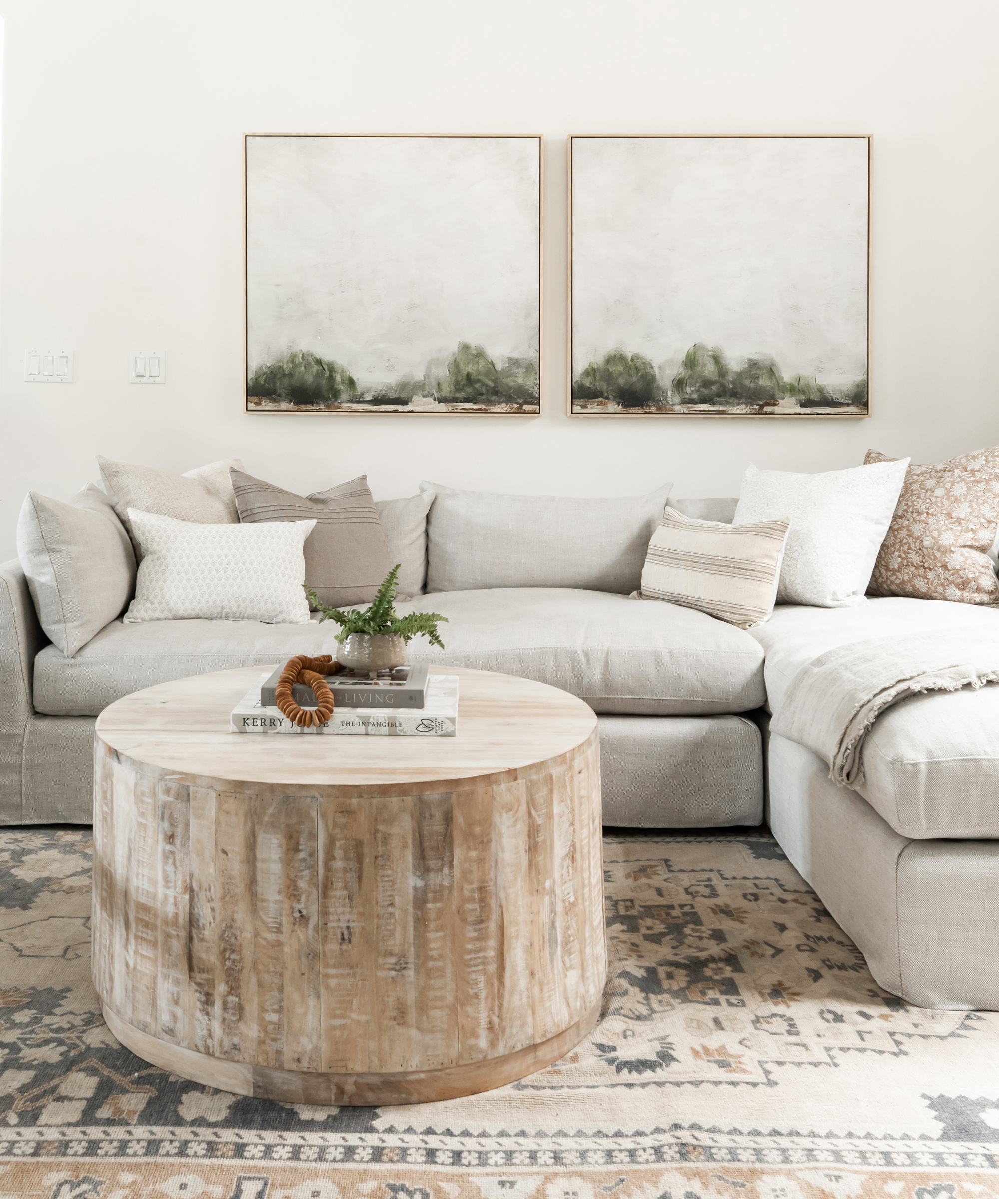
White room ideas can still be inspiring and have depth. It’s important to consider texture, whether it’s a pattern, such as a jacquard fabric, or through mixing finishes, like a matt wall with gloss paint on the ceiling. These elements create interest that will make the monochromatic white room sing.
'If someone wants a room that’s very calming, I would say stay completely in the neutral world with a more monochromatic look,' says interior designer Kelly Wearstler. 'However, if you want a splash of energy, then include one incredible piece of art or a colorful rug to create interest and personality.'
3. Use wall panels to add height or depth
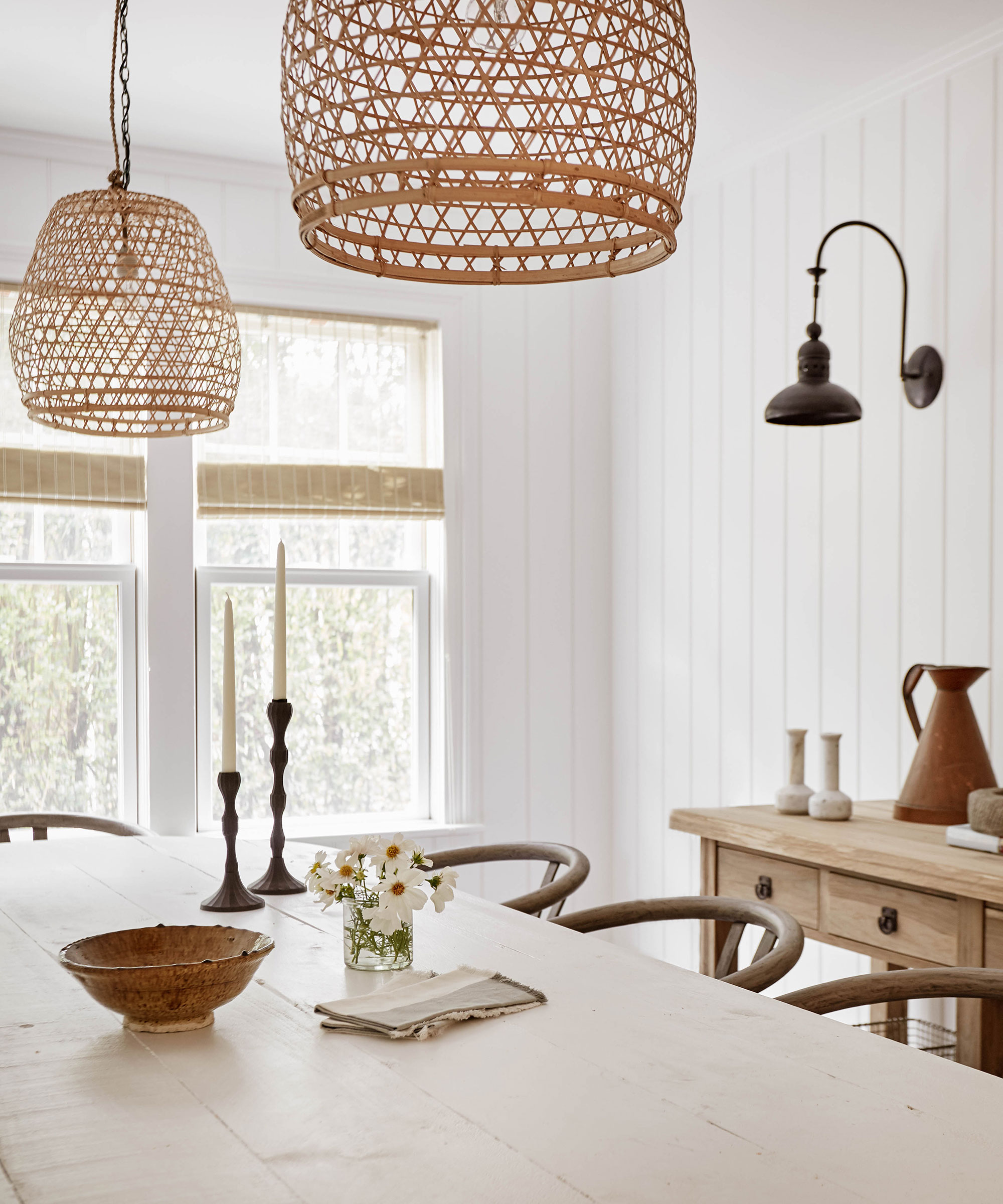
Paneling ideas for walls are a great way to add decorative definition to a white room. This is a good resolution if rooms lack a focal point. ‘It creates a sense of atmosphere and depth,’ says Eamonn Agha of interior design studio Huntsmore. ‘We like to paint the the panels the same color as the ceiling to add to the illusion of height and create a sense of grandness.'
You can also use panels to trick the eye in rooms with lower ceilings by having tall panels which don’t chop the room up horizontally. It can look great in a contemporary environment, too, as a way of framing large flat surfaces.
4. Lay on the pattern
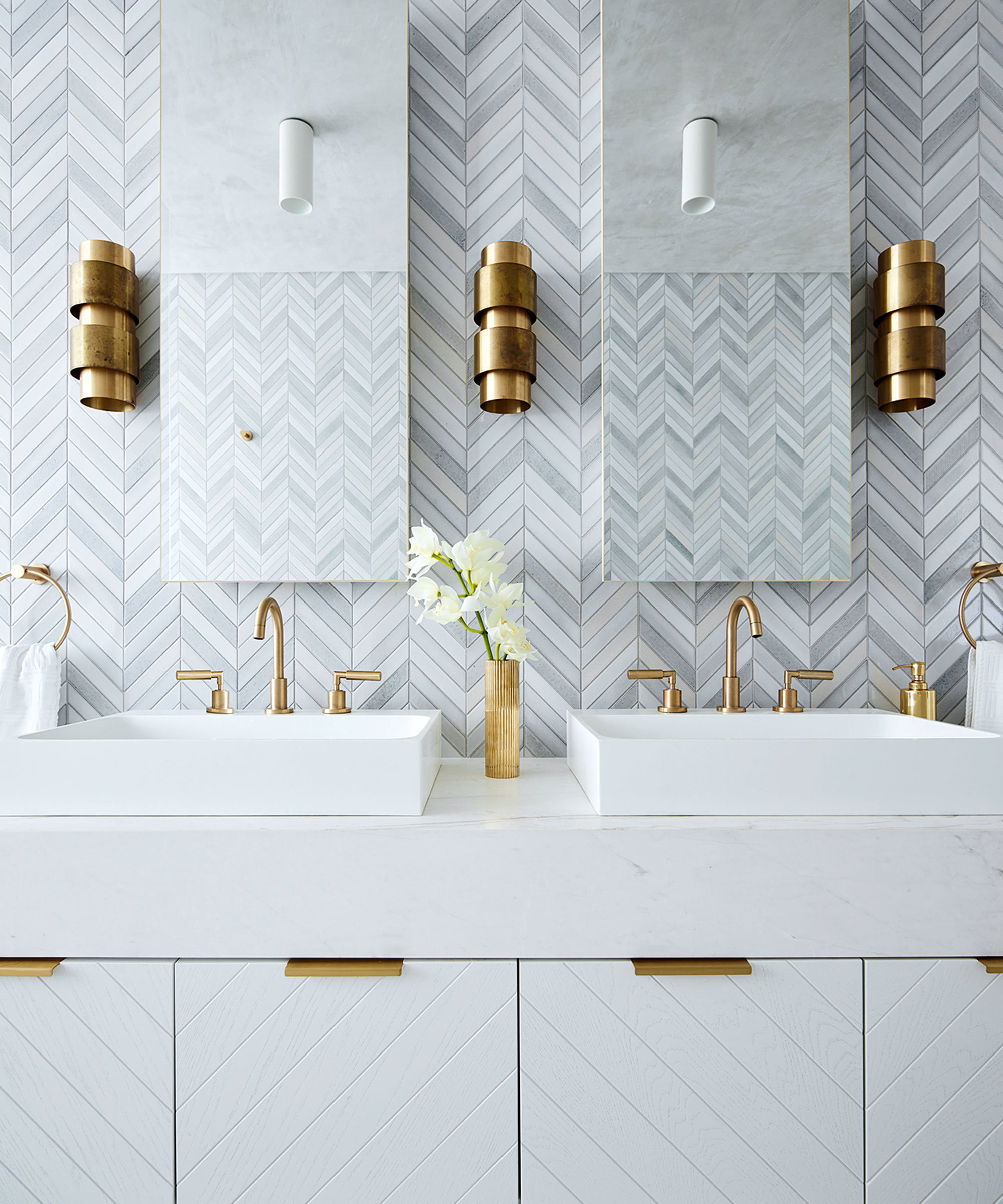
Many homeowners choose a white bathroom due to its timeless appeal. A new built-in bathroom is a huge part of any renovation budget, and so it’s no surprise that many people tend to play it safe when it comes to this important family room. But safe doesn't have to mean boring!
Enliven a white color palette by repeating the same pattern across different materials. Here, Greg Natale has also played with scale, pitching outsized chevron timber doors against miniature chevron mosaics with striking results. Beware, the devil is in the detail when it comes to installation – precise pattern alignment is crucial but adding a break between materials, in this case the countertop, can aid neater connections.
5. Get tactile with a white-on-white scheme
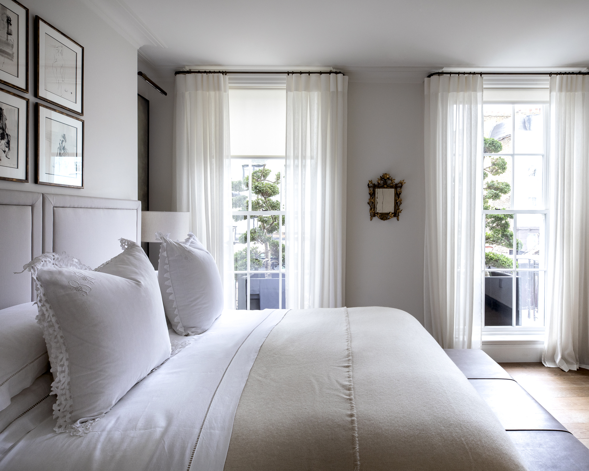
The secret to a stylish, all-white scheme is appreciating that white comes in many forms. Don’t feel like you have to stick to one white – build them up to create a room with depth.
‘The reason people like decorating with white in the bedroom is because it is so versatile,’ says color expert Annie Sloan. ‘There are so many varying shades of white from warm white to cool white and the great thing about decorating with it is that whatever your style of interior – be it modern or rustic – white-on-white is a scheme that is guaranteed to look chic.’
To avoid a white bedroom feeling sterile, get tactile. ‘A good way to warm your whites is through textures,’ says interior designer Claudia Afshar. ‘Also, try choosing a high-pile rug, tailored bedding, or textured wallcovering to make your whites interesting.’
6. Warm up a white room with dark wood flooring
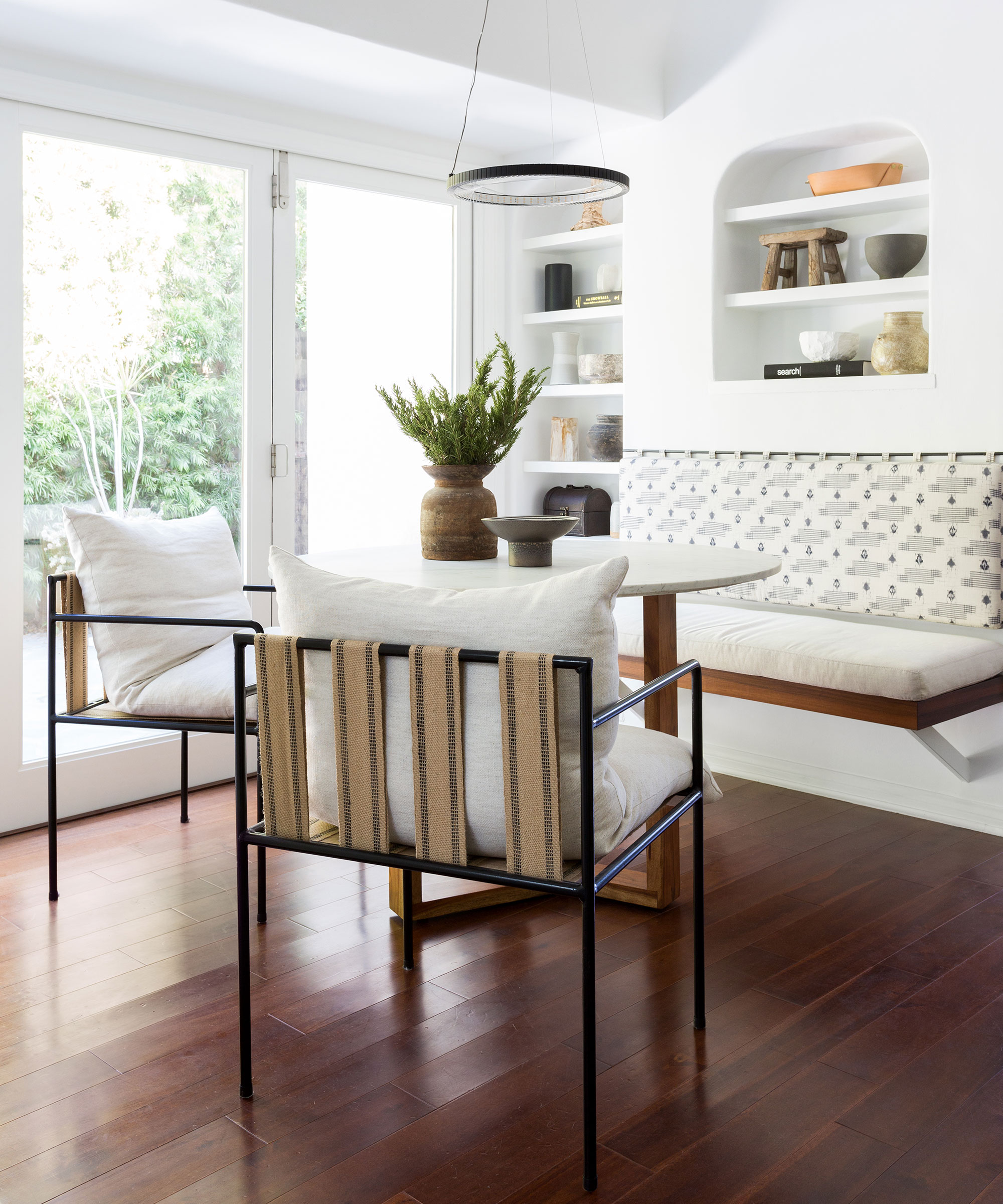
Dining room color ideas define the atmosphere that you'll be providing for your guests – as creating a convivial ambience is at the heart of the room's purpose, color should always be given extra consideration.
For a dining room that will work from dawn to dusk, consider something light and bright. If your dining room or space is likely to host breakfasts and lunches as well, choose something less heavy or go completely minimal with a crisp white. This works well in large, light-filled dining rooms like this one, paired with contrasting black accents and richly pigmented natural materials for a modern look, including wooden floors. Add visual interest through your dining table décor ideas and pops of color through artwork and objects.
7. Keep a pure white space free from clutter
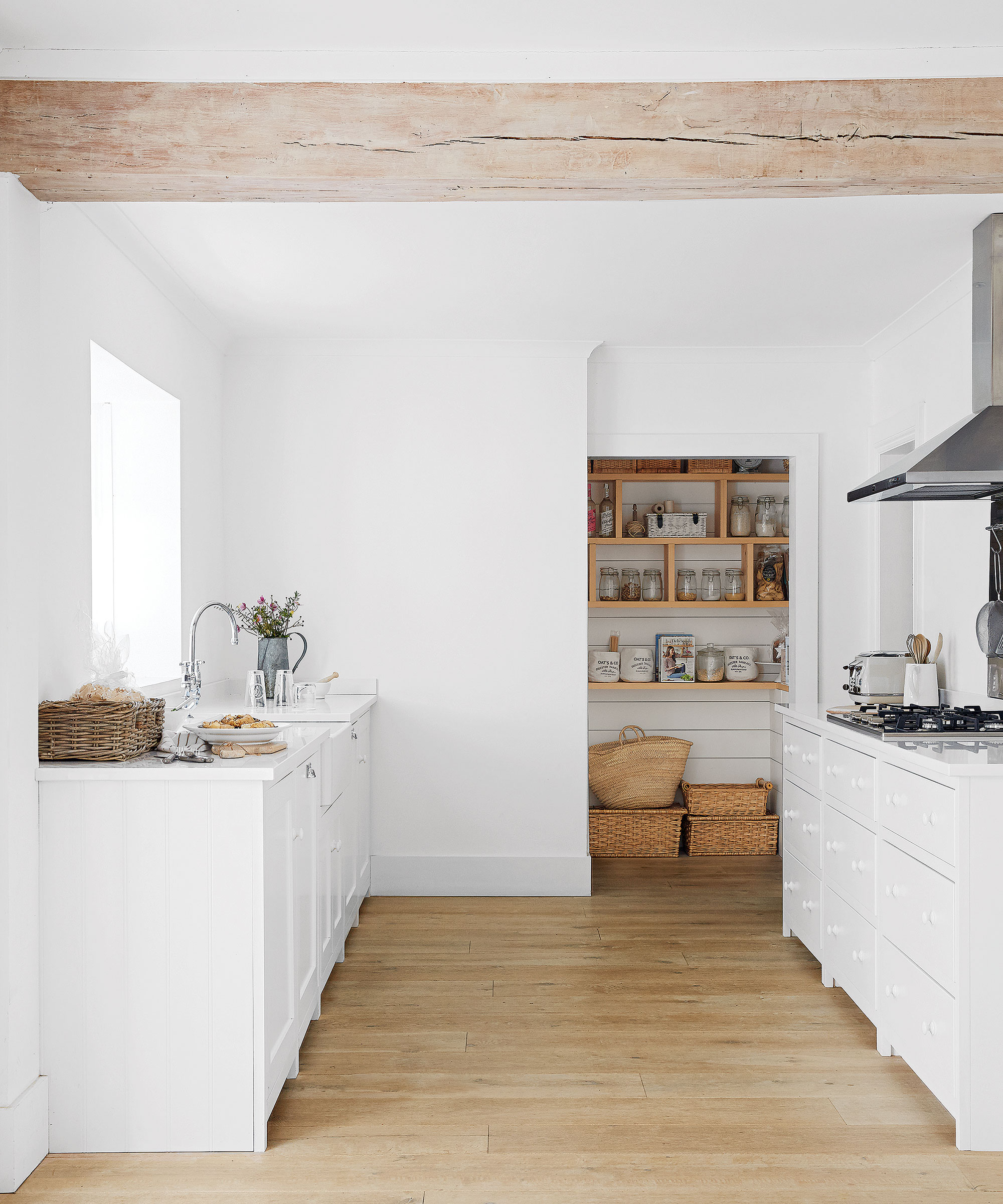
Brilliant white walls and cabinetry enliven this country-style kitchen pantry, softened by the muted grey wash on the wooden beam. To keep a kitchen as pared-back and clutter-free as this, separate storage in the form of a walk-in pantry relieves the need for shelves or wall-hung cupboards. Notice the planked back wall – this subtle decorative change marks out the more functional use of this area, but painted in the same shade as the walls it fits seamlessly into the room’s design.
Leaving the entrance open requires some discipline – the shelves on show are for visually pleasing items or ingredients decanted into Kilner jars, while less attractive appliances and packaging can be tucked around the corner.
8. Instil calm and serenity with white
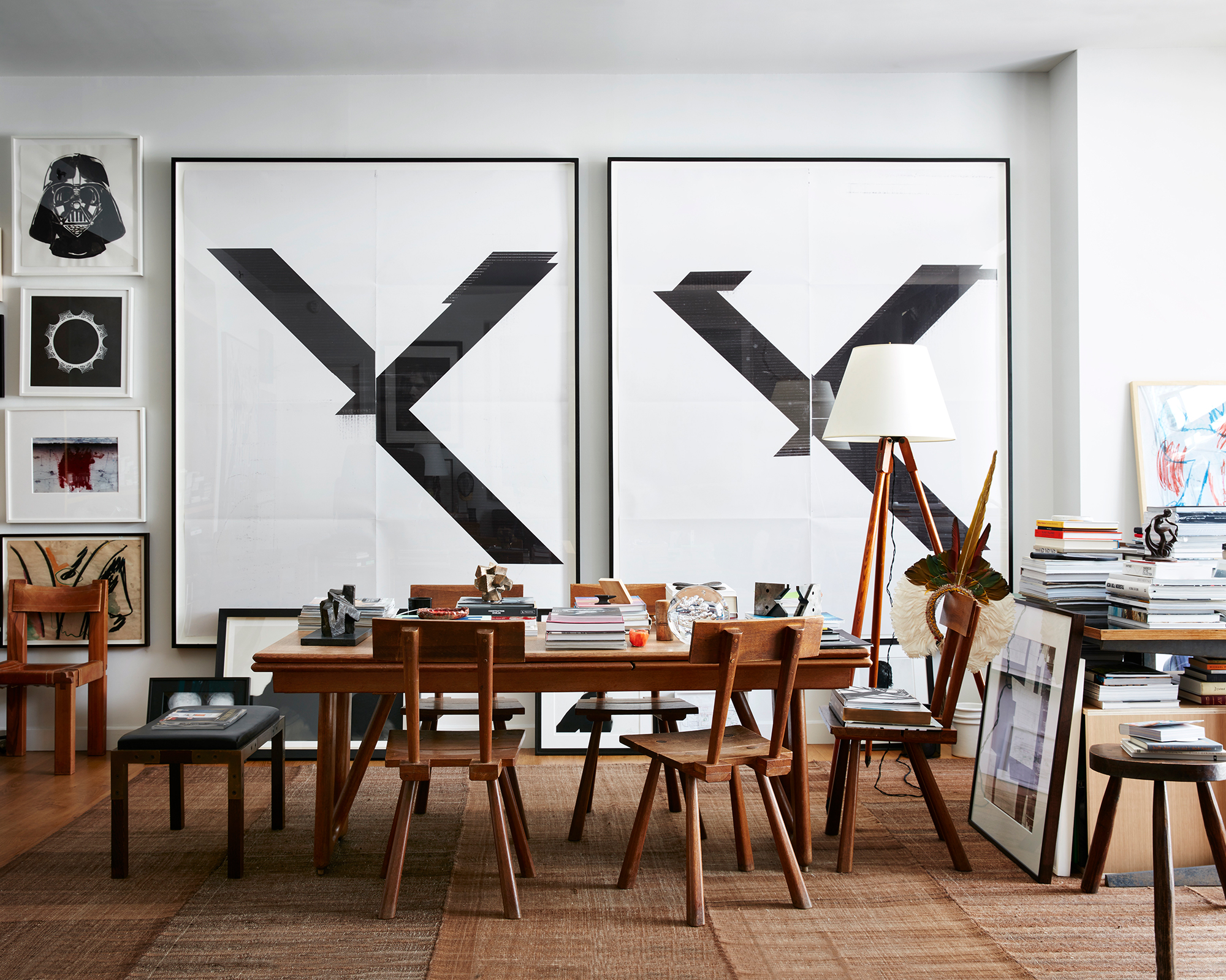
Over the past year, those of us lucky enough to have a dedicated room in which to shut ourselves away have gratefully recognized the peaceful retreat they provide. However, many of us have littered our home office space with a riot of pattern, color and clutter, which could be having a detrimental affect on the way we work from home. Busy home workspaces aren’t suited to overly fussy schemes, but that is not to say they should feel 'cold' either.
There is no doubt that whites have been the most popular tones for home offices post-pandemic, and for good reason. Many people feel most comfortable when surrounded by carefully balanced colors that create an understated environment and make few demands on the eye, so ditch the chaos and opt for an uncluttered study that inspires creativity.
Even a room that’s lacking in bold color can still be bursting with visual appeal. In fact, many designers love working with a white or neutral color palette. The key to doing white successfully is to embrace a variety of elements that will add interest.
‘Your design approach to a home office is not unlike any other room in the house,’ says Athena Calderone, founder, Eye-swoon. ‘It should speak your visual language. Remember it is a delicate dance between aesthetics and utility, designed to motivate you each day but also be grounded in practicality.'
9. Evoke stillness on entry
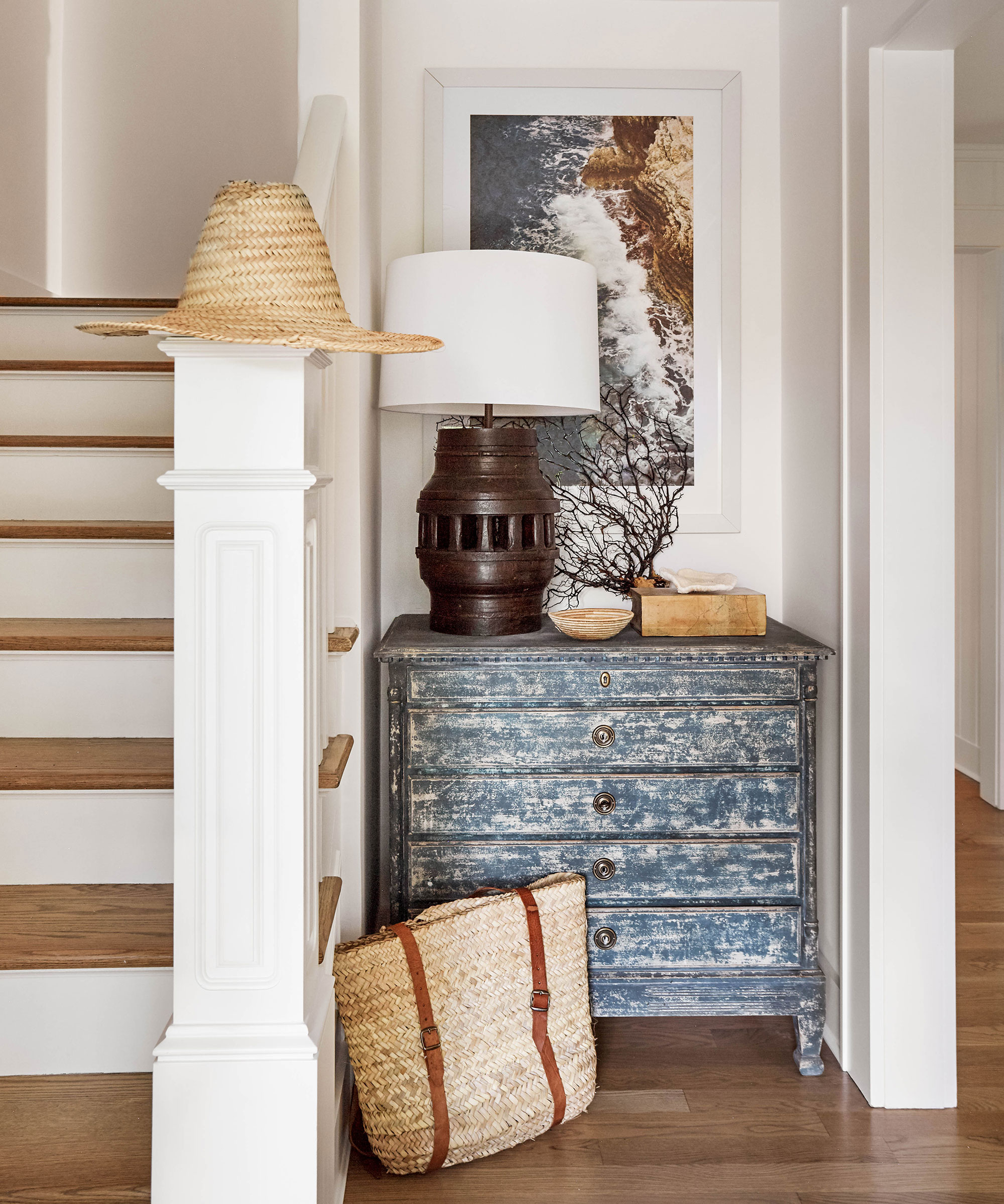
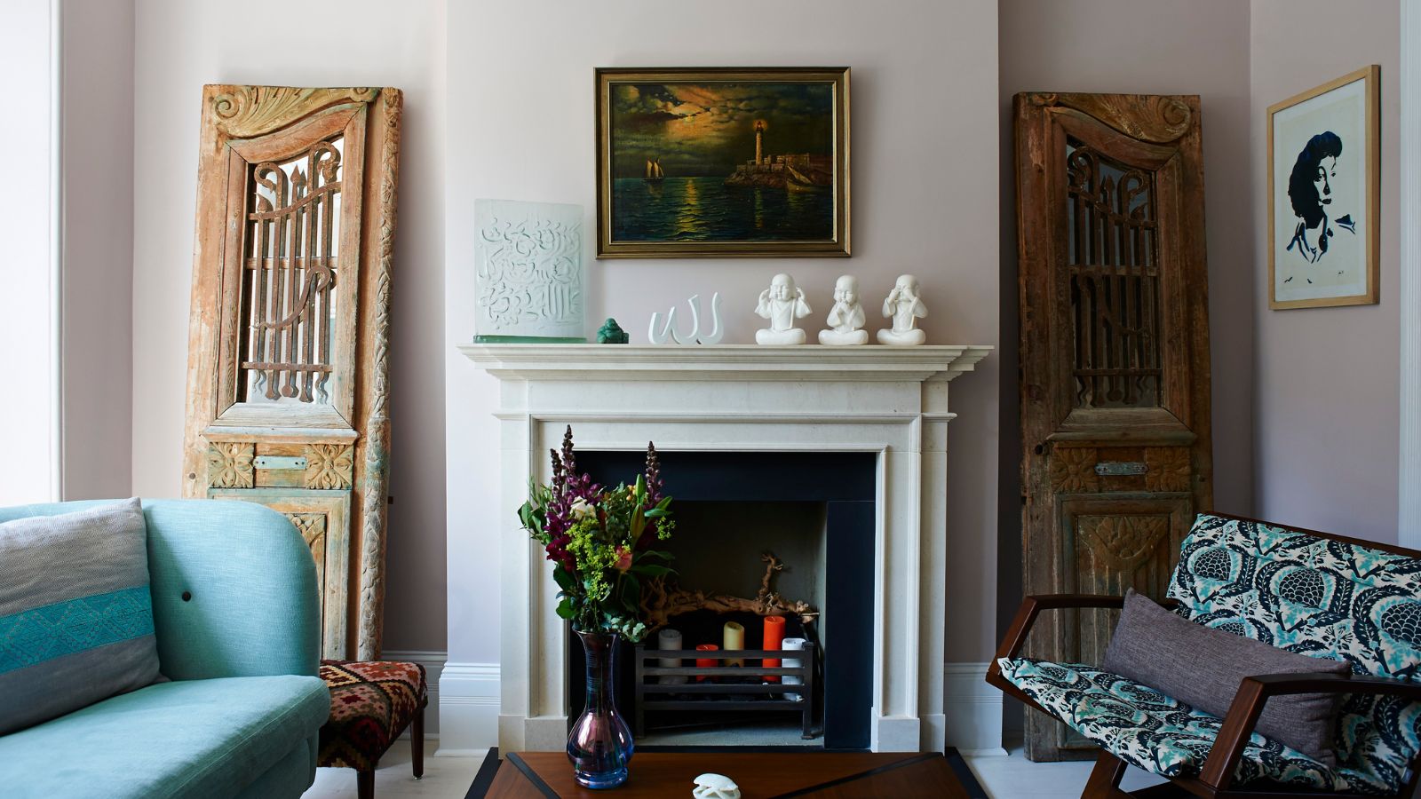
For a calming, relaxed style, opt for a muted, off-white color palette, with shades of cream, grey and brown working well for neutral room ideas. These colors can coordinate with an array of accent colors, so are great if you would rather use brighter colors through accessories and furniture, allowing a subtle introduction to other colors used throughout the rest of the home.
White is a wholly selfless paint shade, providing all the light and energy while reflecting the attention elsewhere – and white decorating ideas are incredibly easy to switch up.
10. Give a white room rustic charm
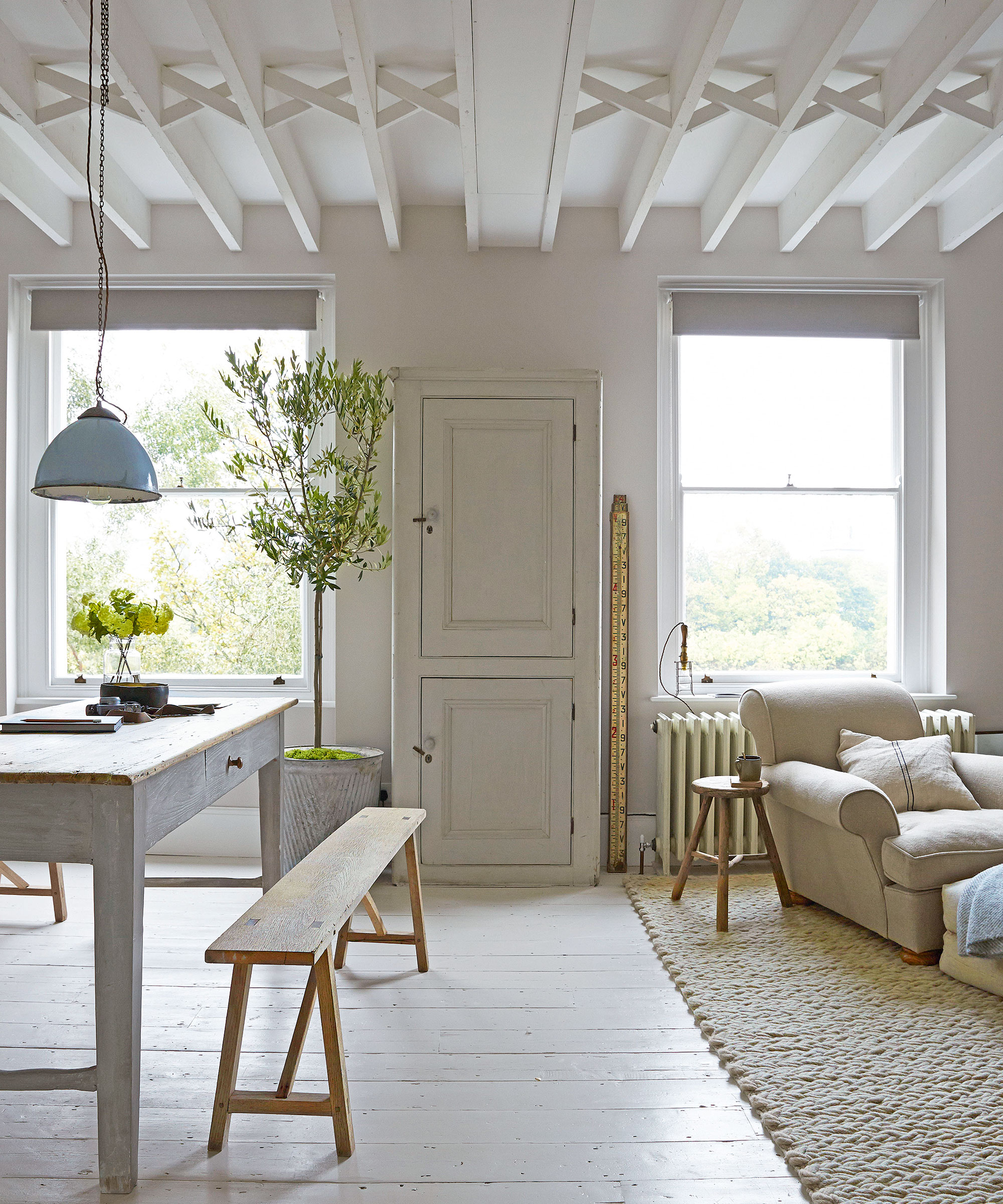
Not just reversed for ultra-modern homes, this versatile neutral is one of the most popular living room paint ideas for country and rustic interiors, and it is easy to see why. White offers a blank canvas that illuminates dark spaces and can make even small living rooms feel spacious, light and bright.
A white room looks elegant and smart decorated in with wood accents, but if you are sticking religiously to a white-on-white living room color scheme, it's really important to ensure that you add plenty of texture into the room to ensure it feels warm and welcoming. Texture in interior design is vital, especially if you want to avoid a stark or clinical aesthetic. Quite simply, without texture, a white living room space will fall flat.
How do you make a white room look good?
Ensuring a white room looks good it imperative, especially when it comes to choosing the right white paint. 'When it comes to selecting white paint shades, it’s important to get the mineral balance right,' believes Tom Cox, co-founder of HÁM interiors.
‘We like to look at the pigment and depth of color in a paint – too often a shade will have too much grey or brown as undertones, which can then be challenging when adding the layers of furniture and finishing touches. We try to make the backdrop subtle so furniture and carpets sit harmoniously. We also like to paint the ceiling, walls and skirting in the same hue – it stops awkward visual breaks and enhances architectural details in an understated way.’
How do I make a white room look cozy?
White room ideas are popular for a reason: White will provide a clean backdrop for a variety of additional decorative room ideas. That being said, the cool, undertones can also look too stark or sterile in some spaces. Off-white, on the other hand, leaves a softer, gentler impression. Think layers of beige, eggshell, ivory and vanilla.
‘Not to be confused with cold and bland palettes, new off-whites are warm by nature,’ adds Charu Gandhi. ‘Typically matt in finish, they have the ability to flex, and so it’s possible for them to suit any type of home, be it traditional or contemporary – in fact, their elasticity is the reason we’re calling them “new”.’ For a warmer, cozier aesthetic, consider a red-based white shade such as Wimborne White or Dimity by Farrow & Ball, recommends Louise Wicksteed, design director at Sims Hilditch.
Sign up to the Homes & Gardens newsletter
Design expertise in your inbox – from inspiring decorating ideas and beautiful celebrity homes to practical gardening advice and shopping round-ups.

Jennifer is the Digital Editor at Homes & Gardens. Having worked in the interiors industry for several years in both the US and UK, spanning many publications, she now hones her digital prowess on the 'best interiors website' in the world. Multi-skilled, Jennifer has worked in PR and marketing and occasionally dabbles in the social media, commercial, and the e-commerce space. Over the years, she has written about every area of the home, from compiling houses designed by some of the best interior designers in the world to sourcing celebrity homes, reviewing appliances, and even writing a few news stories or two.
-
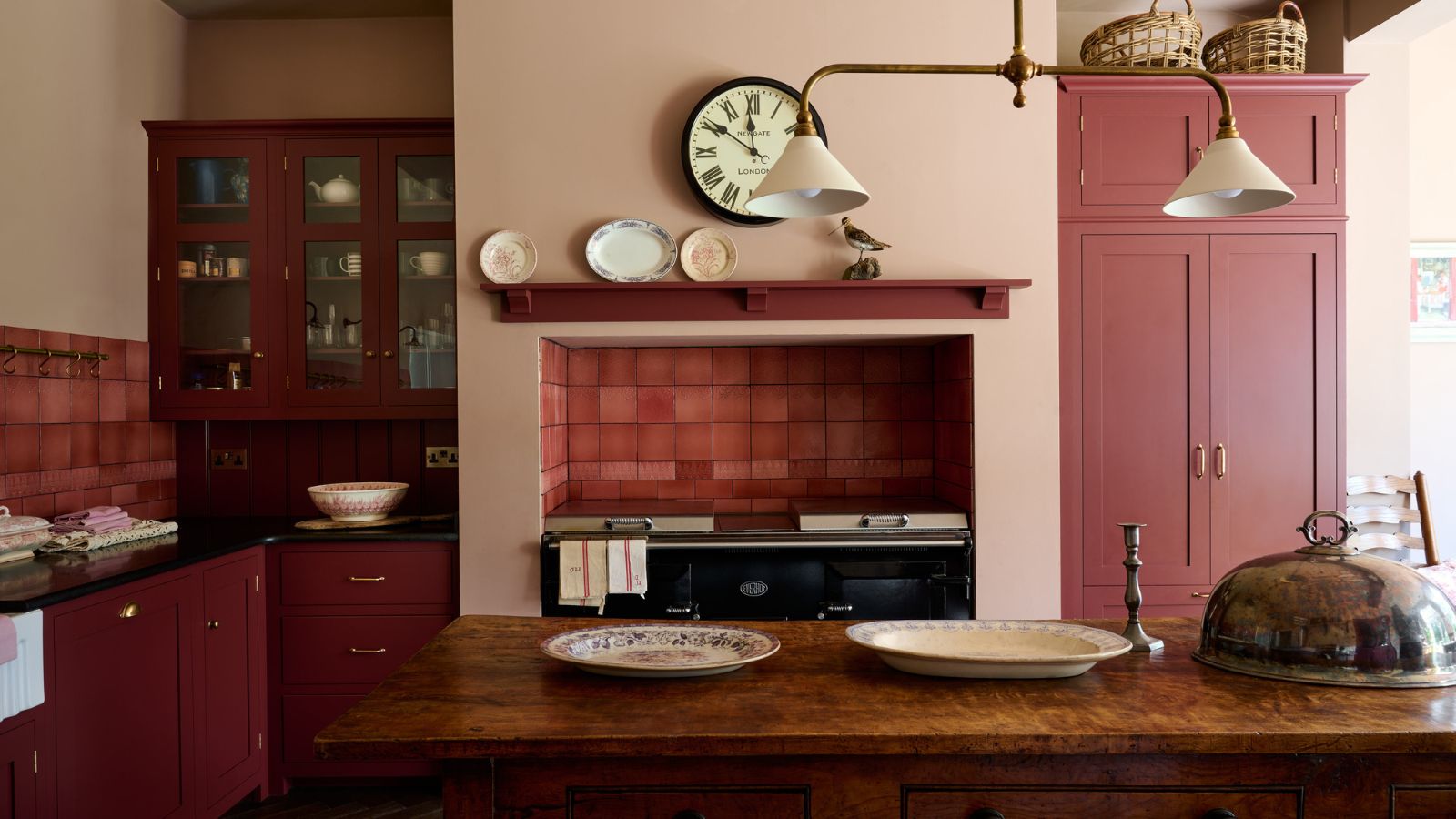 Everyone is obsessed with vintage tiles right now – bring the nostalgic charm of this classic design feature into your home with our 5 design ideas
Honor the past with our favorite ways to decorate with vintage tiles, as suggested by interior design experts
By Eleanor Richardson Published
-
 'It's a fast reset button' – using the 1, 2 ,3 ,4, 5 decluttering method cleared my persistent mess in seconds
It's easy, effective and so quick to do
By Ottilie Blackhall Published