Where to begin with choosing a room's color scheme – 8 simple tips to follow from interior designers
Create a harmonious color scheme in every room of your home with these easy-to-follow tips

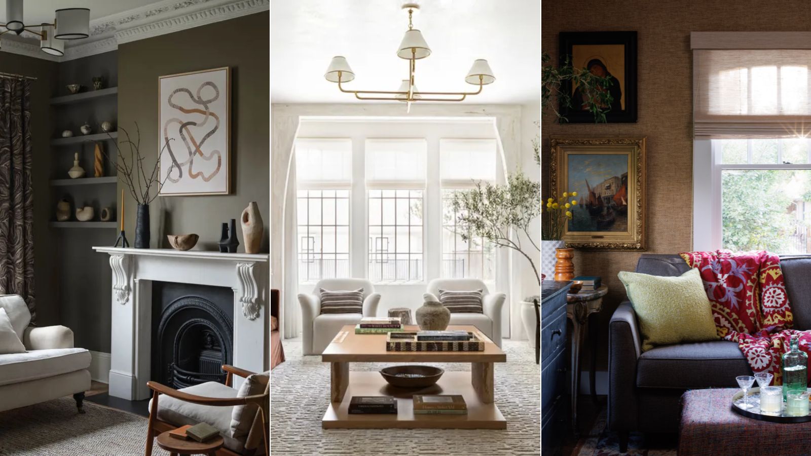
- 1. Consider the existing space and how it's used
- 2. Start with 'global' finishes
- 3. Opt for a monochromatic color scheme
- 4. Base your color scheme around a standout piece
- 5. Consider color psychology
- 6. Go for an analogous color scheme
- 7. Let pattern inform your color scheme
- 8. Sample colors before committing
Design expertise in your inbox – from inspiring decorating ideas and beautiful celebrity homes to practical gardening advice and shopping round-ups.
You are now subscribed
Your newsletter sign-up was successful
Want to add more newsletters?
Choosing a color scheme is one of the most important parts of decorating any room in your home, but it can often be easier said than done.
From painting the walls to adding wallpaper; the color of your furniture to soft furnishings, there are many ways to curate your room color ideas, and the colors you use should reflect your design style while setting the right mood for the space.
To help make the whole process simpler, we enlisted the expertise of interior designers and a paint color specialist, who share their top tips for choosing a room's color scheme below – from kitchen color ideas to bedroom color ideas.
Article continues below8 tips from designers for choosing a room's color scheme
While choosing a color scheme for the whole home is much broader – creating a loose palette to follow throughout – the tips below can be used in every room to create a smaller-scale color scheme that adds personality to each space.
1. Consider the existing space and how it's used
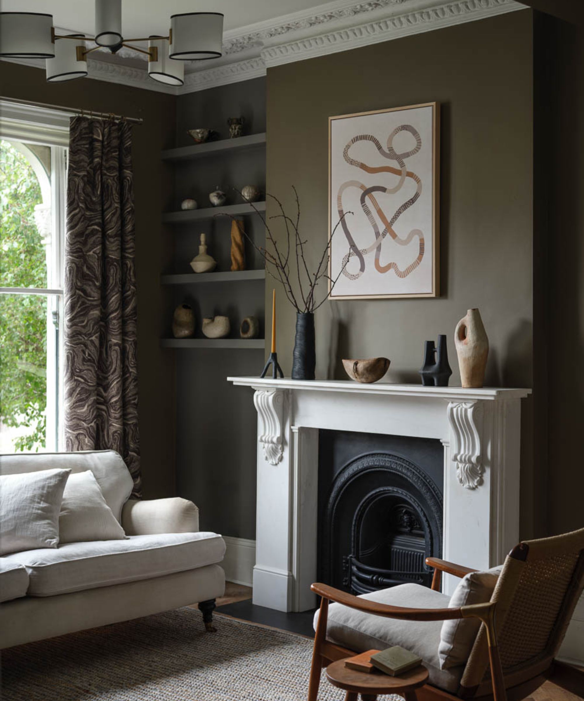
A good place to start when choosing a color scheme for a room is to consider what the room is used for and any existing design elements, suggests Arianna Barone, Color Marketing Manager at Benjamin Moore:
'It is always important to think about the purpose of the room and take a visual inventory of the space. A primary bedroom will inspire a different color palette than a kid’s playroom. Think about when you use the space and how you interact with it. It is also important to understand the existing colors and fixtures that won’t be changing in the room. You need to take those into consideration when choosing a wall color to ensure a cohesive look.'
2. Start with 'global' finishes
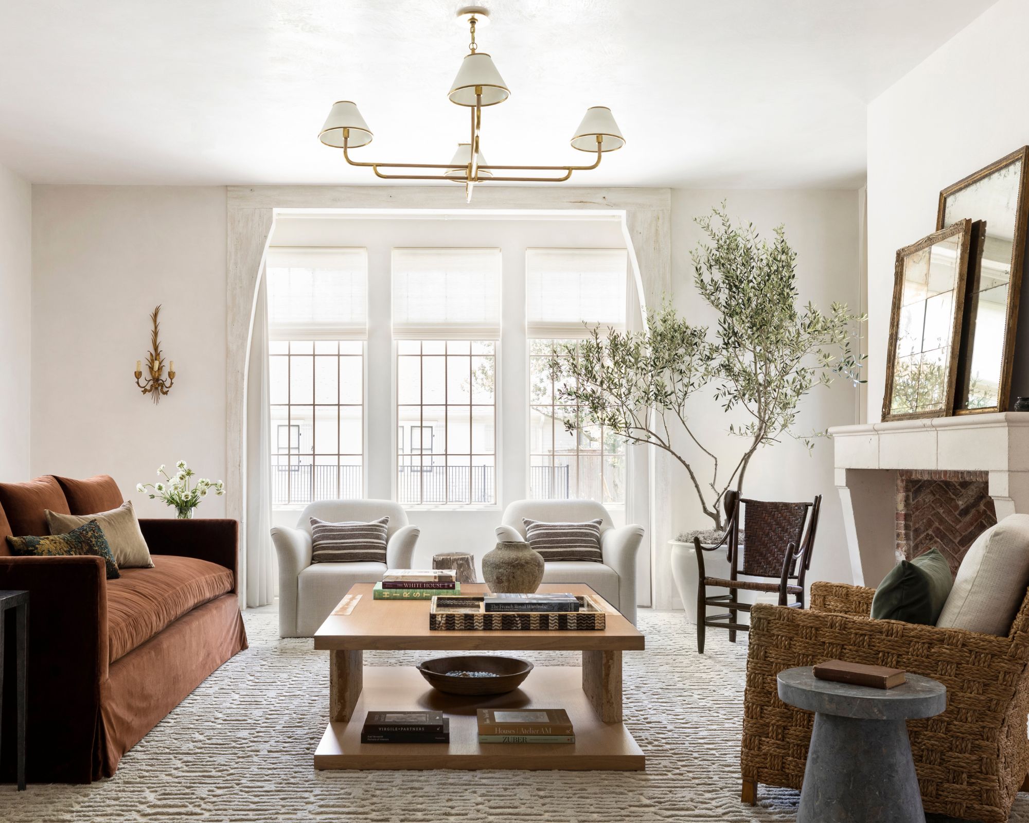
'I always recommend starting with what I call global finishes,' shares Houston-based interior designer Marie Flanigan. 'These are the colors that you thread throughout your entire home to create a sense of cohesion and flow. It could be a signature neutral, a wood tone, or even a finish on your hardware that shows up repeatedly in each space. Once you have that foundation, you can add unexpected pops of color in special areas like powder rooms, dining rooms, or kids' spaces. This gives each room its own personality while still feeling connected to the overall design of the home.'
Design expertise in your inbox – from inspiring decorating ideas and beautiful celebrity homes to practical gardening advice and shopping round-ups.
3. Opt for a monochromatic color scheme
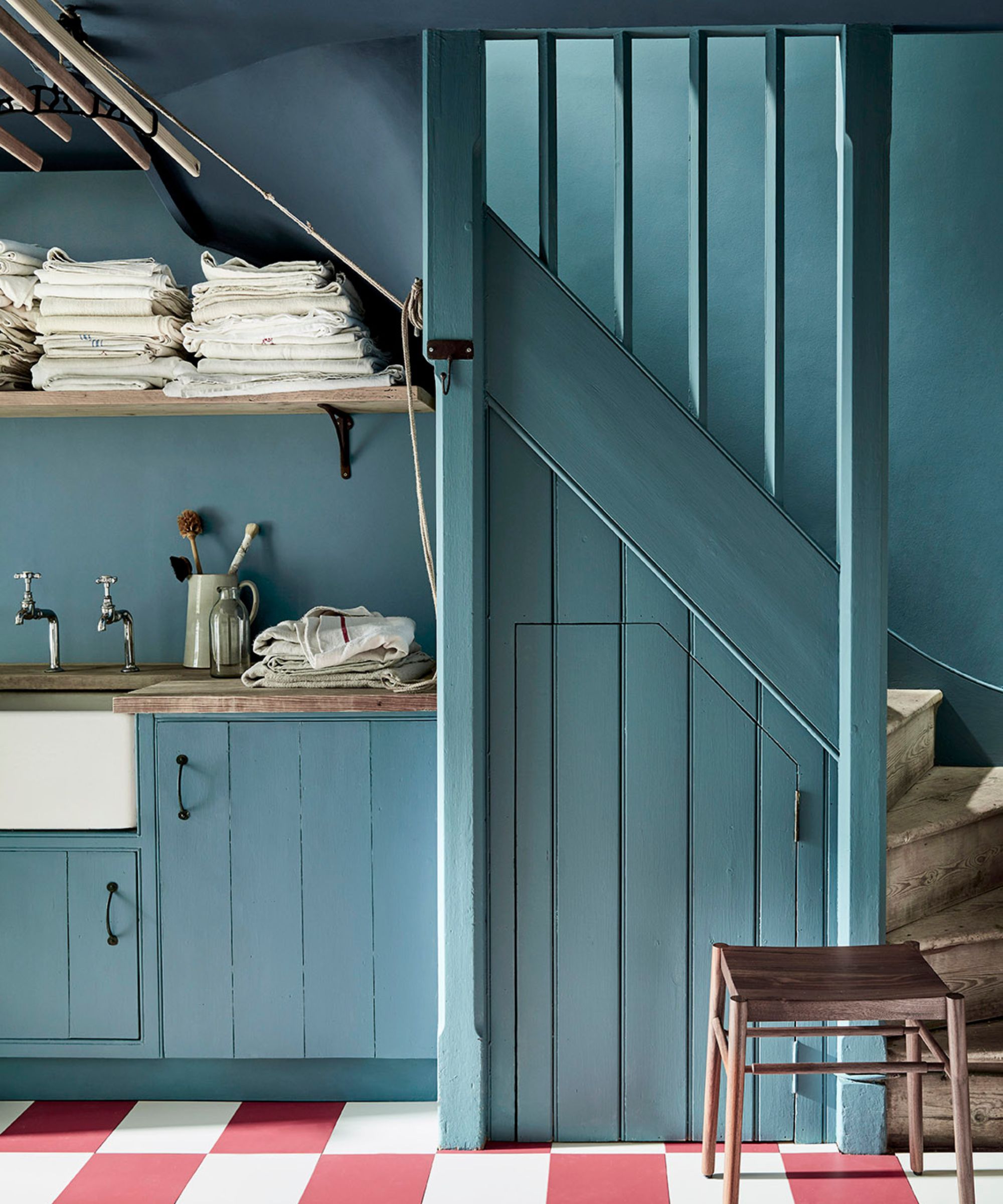
If you're not sure where to start with your paint ideas, opting for a monochromatic color scheme, where one color is used in varying tones throughout a room can simplify the process. Ryan Austin Hagood, principal designer at r.a.d. Interiors says this approach can make the space feel more timeless:
'When it comes to creating a cohesive color scheme, I’m a big believer in the power of a monochromatic palette. Using the same color for walls, trim and ceilings creates more seamless space-to-space transitions and allows the architectural details and textures in a room to really stand out. This approach provides a timeless, elegant backdrop while offering flexibility for introducing different elements like paneling, wallpaper, or plaster in key design areas.'
'I always suggest starting with a color that feels right for the overall mood of the home and then keeping it consistent throughout. It’s a simple but effective way to create harmony and continuity from one space to the next,' adds Ryan.
4. Base your color scheme around a standout piece
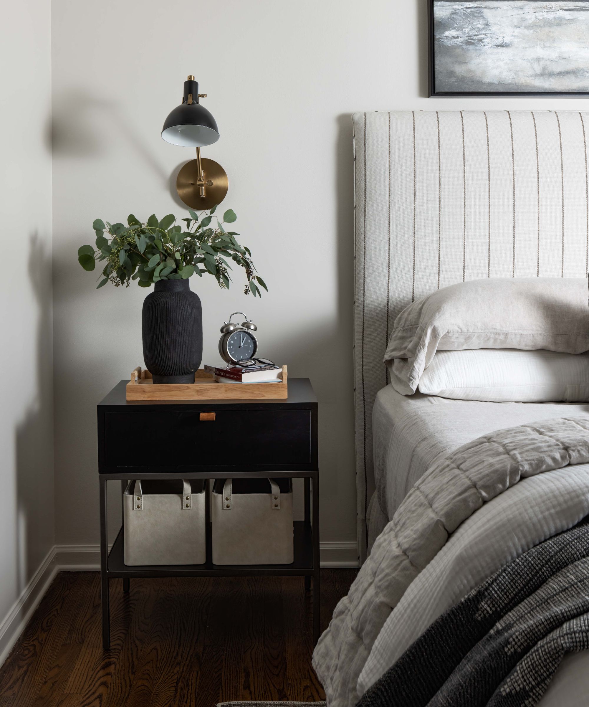
Taking inspiration from a standout design feature can be used to inform the rest of a room's color scheme for a cohesive result, shares designer Tiffany Matthews of Motif Homes:
'Begin with a captivating element, like a beautiful piece of artwork or a chic area rug, and choose three colors to create a foundational color palette. Then, introduce a variety of patterns and textiles that align with the color palette, promoting a cohesive sense of harmony in the overall design.'
The same color rule can apply to more utilitarian rooms such as kitchens and bathrooms, explains designer Thea Bloch-Neal of Curated by Thea: 'Maybe you’ve fallen for a colorful marble countertop – use that as your focal point in your kitchen and choose your paint and accents to complement it. Or if it’s a gorgeous tile for the bathroom you’re excited about, let that lead the way and build the space around it.'
5. Consider color psychology
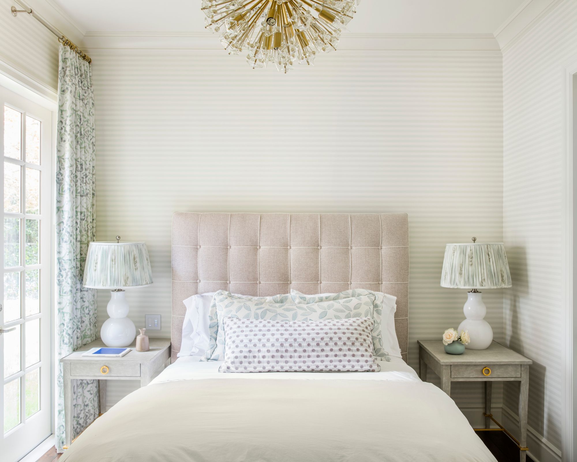
Beyond the aesthetic appeal of your color choice, it's a good idea to reference color psychology – how colors make us feel – when curating your scheme.
'Color is emotional, so when deciding on a color scheme, it’s best to think about how you would like to feel when using a space,' explains Christine Markatos Lowe of Christine Markatos Design. 'As an example, in a bedroom, picking a restful soft color will help enhance one’s mood for relaxation.'
'While the starting point in selecting a color revolves around evoking a mood, to ensure a cohesive story in a room, it is best to look at all the selections together holistically. Bring samples to the space, so you can see both in natural light and evening light, as colors shift throughout the day,' adds Christine.
6. Go for an analogous color scheme

An analogous color scheme is another way to go if you want to keep the look cohesive; where colors that sit next to one another on the color wheel are used in the same scheme.
'I am drawn towards analogous color schemes, keeping the colors bold and bright but also keeping them in the same color family so they feel at home,' says interior designer Nadia Watts. 'I find that color grounds color – I love a saturated palette with rich colors all working together to form a cohesive room. Using patterns and textures in variations of the same color helps bring a room together. There is a reason why monochromatic outfits look chic and expensive when you keep your palette simple; the result is refined and elegant, even when you are working with bold colors.'
7. Let pattern inform your color scheme
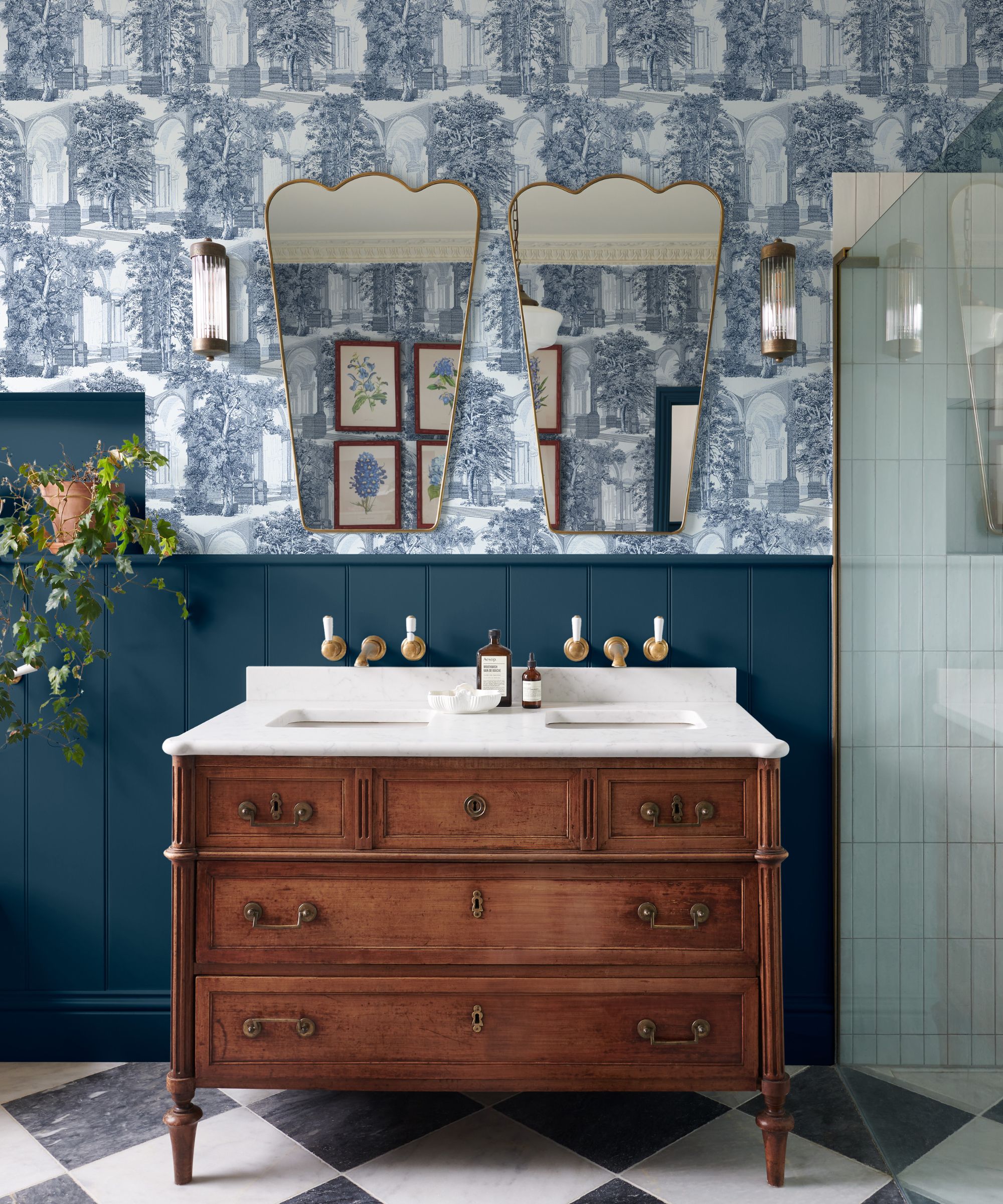
'When choosing a color scheme I start with a pattern – either in a rug, fabric, or wallpaper – that I just can’t get out of my head for that particular client and build the room from there,' shares Kathryn Murphy of Kathryn Murphy Interiors. 'Looking for matches or complementary colors across the color wheel from that piece begins to create the story as the pieces come together.'
Sarah Rhodes, senior interior designer at Inside Stories follows a similar approach, adding: 'When choosing a color scheme for a room, I like to start with a statement fabric that we intend to use or an inspirational image that describes the overall feeling we are trying to achieve. Pulling colors that complement this element will create the base palette which you can then start to build on. Remember, not everything has to match! In fact, a room will fall flat if you don't throw in an unexpected color or pattern here and there!'
8. Sample colors before committing
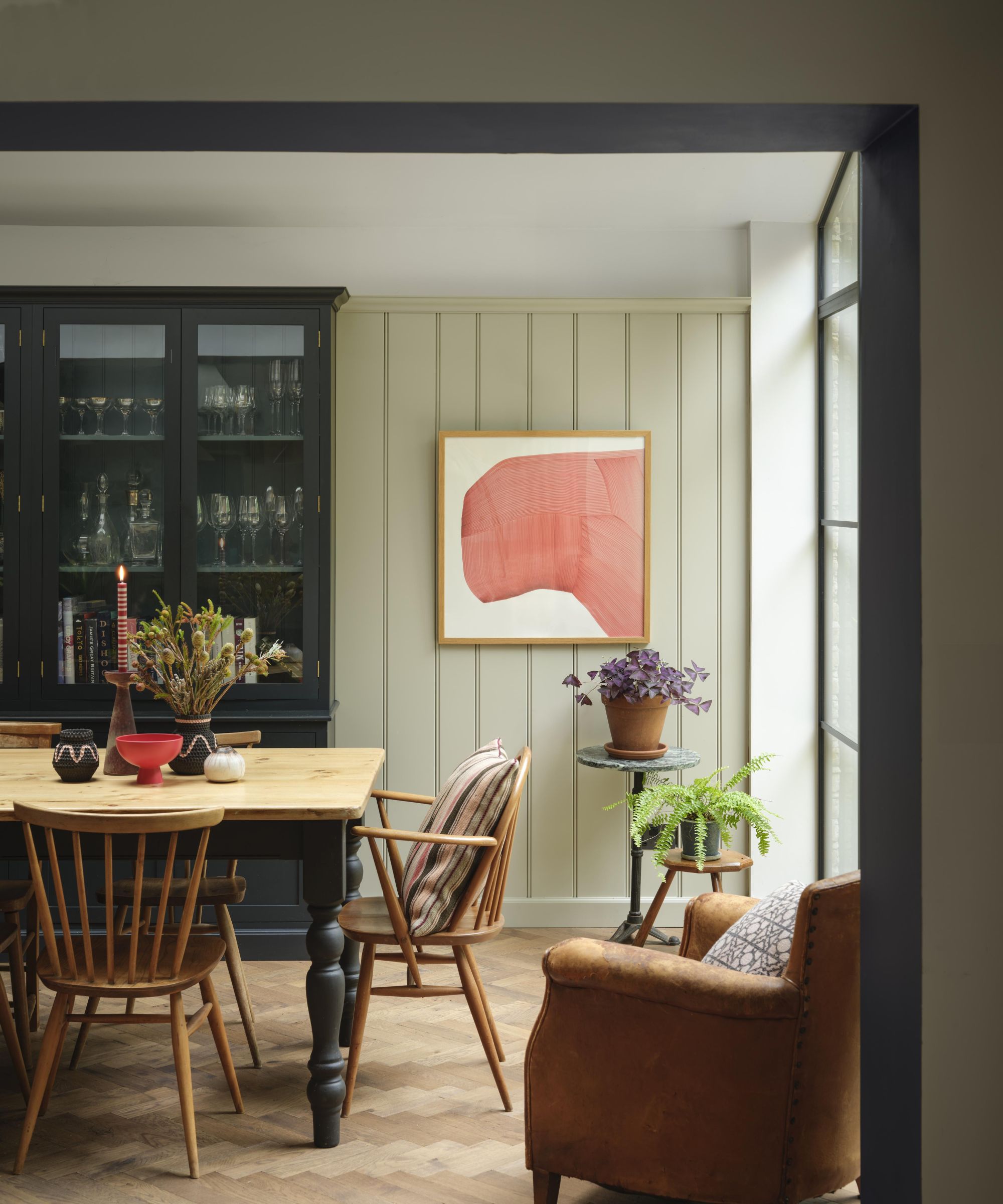
Lastly, with any of the above approaches, it's important to test colors first to ensure you have the right fit for your room, especially when decorating with paint colors that can look different from one room to the next depending on a room's lighting.
'Once you’ve narrowed down to a few colors, it is crucial to sample the color in the space as the light and various design elements are unique in each room,' says Benjamin Moore's Arianna Barone. 'View the color throughout the day and move around from wall to wall when possible. This will help you understand how the color will cast in the space to ensure you get the look you are trying to achieve.'
These tips should give you some steer when starting out with choosing your room's color schemes – helping you create a space that's both personal and harmonious.

Emily is a freelance interior design writer based in Scotland. Prior to going freelance in the spring of 2025, Emily was Homes & Gardens’ Paint & Color Editor, covering all things color across interiors and home decor for the Homes & Gardens website. Having gained specific expertise in this area, Emily is well-versed in writing about the latest color trends and is passionate about helping homeowners understand the importance of color psychology in home design. Her own interior design style reflects the simplicity of mid-century design and she loves sourcing vintage furniture finds for her tenement flat.