

By now, you'll have likely heard of the aptly named 'Unexpected Red Theory'. But while it is still a hot topic among interior fans, we've been thinking: what's next?
Coined on TikTok by interior designer Taylor Simon, this viral decorating hack refers to the idea of placing one pop of red in every space to instantly elevate it. A.k.a. the unexpected red theory.
More than just a passing TikTok interior design trend, we decided to speak with some experts to get an understanding of what could be the new unexpected red theory in 2025. What jaunty new hue could be replacing red as the color du jour, and how are they embracing it within their designs? Here's where we find out.
What is the new unexpected red theory?

So does the unexpected red theory work with other colors? If the goal is to create a unique sense of fun, what better color is there than red to disrupt a perfectly curated scheme where it seemingly doesn't match?
Below, interior designers share the three colors they're choosing to use in surprising and unexpected ways – big or small – in 2025.
1. Unexpected Burgundy

For those who are well and truly sold on the original flash of red idea, designer Kathy Kuo suggests not straying too far away from this tried-and-tested theory – but tweaking it slightly to introduce the biggest color trend for 2025.
'The original unexpected red theory was the idea that, often, adding a pop of red in a space can be that mysterious finishing touch, even when red isn't part of the overall color scheme,' Kathy explains.
She suggests instead adopting wine red as your accent color. 'The newest iteration of that is extending from just 'red' to the darker end of the spectrum of red tones. Unexpected maroon, russet, black cherry, and burgundy. For example, if you have a space primarily decorated in light and airy neutrals, adding a pop of Bordeaux red can be really chic and fitting.'

While it remains a deep and rich hue, decorating with burgundy needn't feel as daunting as it may seem.
As the kitchen makers at deVOL Kitchens have proven, a splash of traditional red on cabinetry such as a larder cupboard can really help to elevate a neutral kitchen or dining space. The same goes for burgundy paint across a wardrobe or built-ins in the living room.
The key is to ensure the rest of the room is decorated with warm tones and pink-based neutrals such as Dimity from Farrow & Ball or the ever-popular Sulking Room Pink. Like in the bedroom, above, designed by Studio Duggan, the velvet wine red headboard is grounded by soft pink tones to make it feel less strong.

A wavy mirror is certainly a popular home decor trend in 2024. Introduce a little fun to a neutral entryway or pale blue bedroom with this modern meets whimsical wall mirror.

H&M Home do such great, budget-friendly lighting. This brick red pleated lampshade is made from linen and metal and will bring a retro feel to a boring lamp base in need of an upgrade.

The subtle striped trim on this deep berry red pillow adds a touch of pattern to an otherwise bold print piece. The soft velvet makes for a perfect addition to fall and holiday decor.
2. Unexpected Yellow

Decorating with yellow has also become increasingly popular of late. From vibrant sunshine shades to more butter-yellow hues, taking a warmer step up from neutrals and beiges into soft yellows is an easy way to bring more color into your home. Especially when done in an unexpected way.
'Like red, yellow has a certain zing that can be overwhelming, or even off-putting to some people in large doses,' says interior designer Bethany Adams, who designed the space above with a large yellow couch.
'A little pop of yellow here or there, however, has the same delightful and "unexpected" quality of that social media darling, red,' she suggests.

'I prefer a sunny yellow shade and have employed it everywhere from a statement sofa, to a pocket-sized powder room (the ultimate surprise!), and everywhere in between in pillows, accessories, and the like,' Bethany continues.
'It really is a versatile color and, just like red, if you're afraid of commitment, starting out with something small like candles or even a bouquet of tulips is a great way to dip your toe in.'
As Bethany suggests, a pop of yellow can be introduced through the smallest of accessories or even fresh flowers, but you can also try out some of the best yellow paints with an accent ceiling or yellow wood trims in a space to really lift it.

A cult buy, Loewe's candles are now instantly recognizable. This bright zesty yellow hue is infused with the scent of the Eutrema Japonica plant for a warm, spicy fragrance that unfolds into uplifting lemongrass notes as it burns.

Babouche is perhaps one of Farrow & Ball's most uplifting and vibrant yellow paint colors. It will feel instantly cheerful, but if it seems just a touch too bright for you, Hay is an alternative that reads buttery and calm.

Contemporary yet retro in design, this occasional stool by Sun at Six is covered in a bright mustard velvet to really pack a punch. The sculpted lines and chunky legs help this stool feel modern.
3. Unexpected Blue

'We’re interpreting the unexpected red theory as the unexpected any-color theory,' says Kristina Khersonsky, founder of STUDIO KEETA. 'Take any color that is a pop or a surprise in the room and let it be the dramatic pull the space needs.'
And it's true, really this theory works with almost any color so long as it feels surprising and almost out-of-place. Blue, however, is one of the more popular variations of this trend we're seeing popping up.
'As of late, we’ve been doing the unexpected blue – gravitating towards cobalt or a Yves Klein blue,' adds Kristina. 'Don’t be afraid to drop the splash of color in a few places throughout your space and let the color travel throughout,' she suggests, referring to the red thread theory (not to be confused with unexpected red).

While Kristina is adopting a bright and bold blue to make her unexpected pops of color, this isn't limited to bold primary colors only.
Similarly, you can make a surprising color choice when decorating with blues by choosing something soft and pale. Try an icy, cool-toned blue in a warm neutral space like the above entryway designed by Carley Summers that features a soft blue mudroom closet to hide away boots and coats.

In a soft bluebell hue, this new-in kitchen and dining chair from Serena & Lily feels like a lovely upgrade on the traditional wooden chair. This will be a welcome addition to a coastal kitchen.

Created by textile designer turned artist, Kate Roebuck, this playful triptych art features a bold cobalt blue backdrop to really offset the abstract floral design. It's sure to make an unexpected impact in your home.

Playful scallops and a fun blue tone really set this decorative tray apart. Set it down on your dresser or layer it up on your coffee table or console to uplift your vignettes with a pop of bright blue.
No matter what color you choose, the unexpected red theory simply means trying something a little out-of-the-box to make the space feel less contrived, more unique, and achieve a burst of dopamine.

-
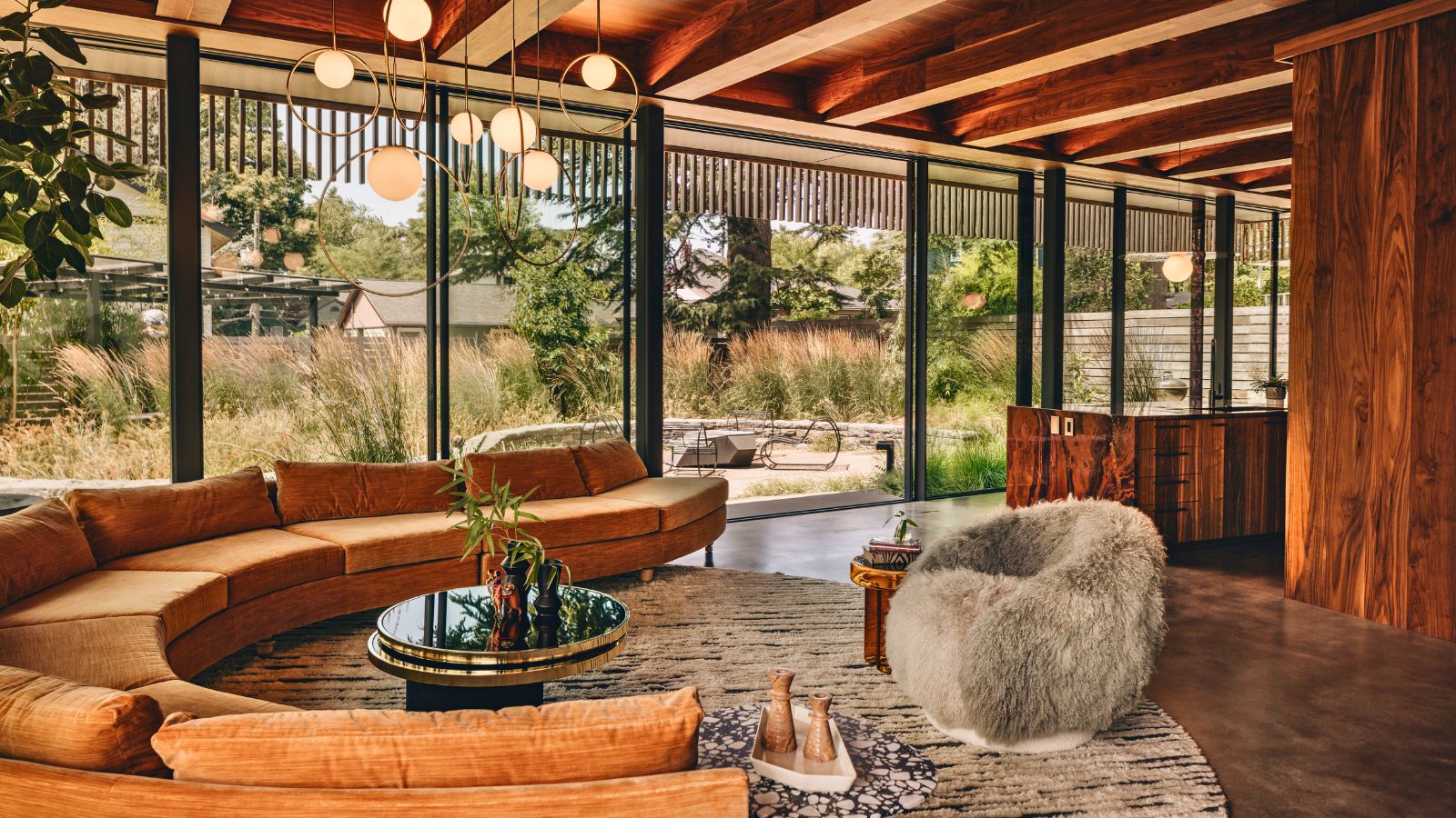 'Sexy disco-era Italy meets Japanese farmhouse in the Brazilian jungle' was the description the interior designer gave this glass-walled modernist home
Offering a warm welcome that defies its stark, modernist lines, this archictectural gem is full of surprises
-
 Are you making the most out of the estate sales in your area? These are the 5 most valuable items you should be shopping for
Vintage lovers and antique experts share the objects you should always look out for when you're exploring an estate sale

