What paint colors do interior designers use in their own homes? 8 shades tried and tested by the pros
Gain some fresh room color inspiration with these paints used by designers – from white to dark and bold shades

Design expertise in your inbox – from inspiring decorating ideas and beautiful celebrity homes to practical gardening advice and shopping round-ups.
You are now subscribed
Your newsletter sign-up was successful
Want to add more newsletters?
Choosing a new paint color can be a much-deliberated part of the decorating process, so taking inspiration from real homes is always a good place to start.
To help you on your way, we asked interior designers what their favorite paint colors are to use in their own homes, which we've rounded up below.
From white paints that serve as neutral backdrops to bolder and richer hues that add depth and excitement, there are so many paint ideas here bound to give you some inspiration for your next decorating project.
Article continues belowPaint colors used by interior designers in their own homes
From bedrooms to living rooms, these room color ideas feature paints from many of the top paint brands, from Benjamin Moore to Farrow & Ball, catering to plenty of interior design styles.
1. Simply White, Benjamin Moore
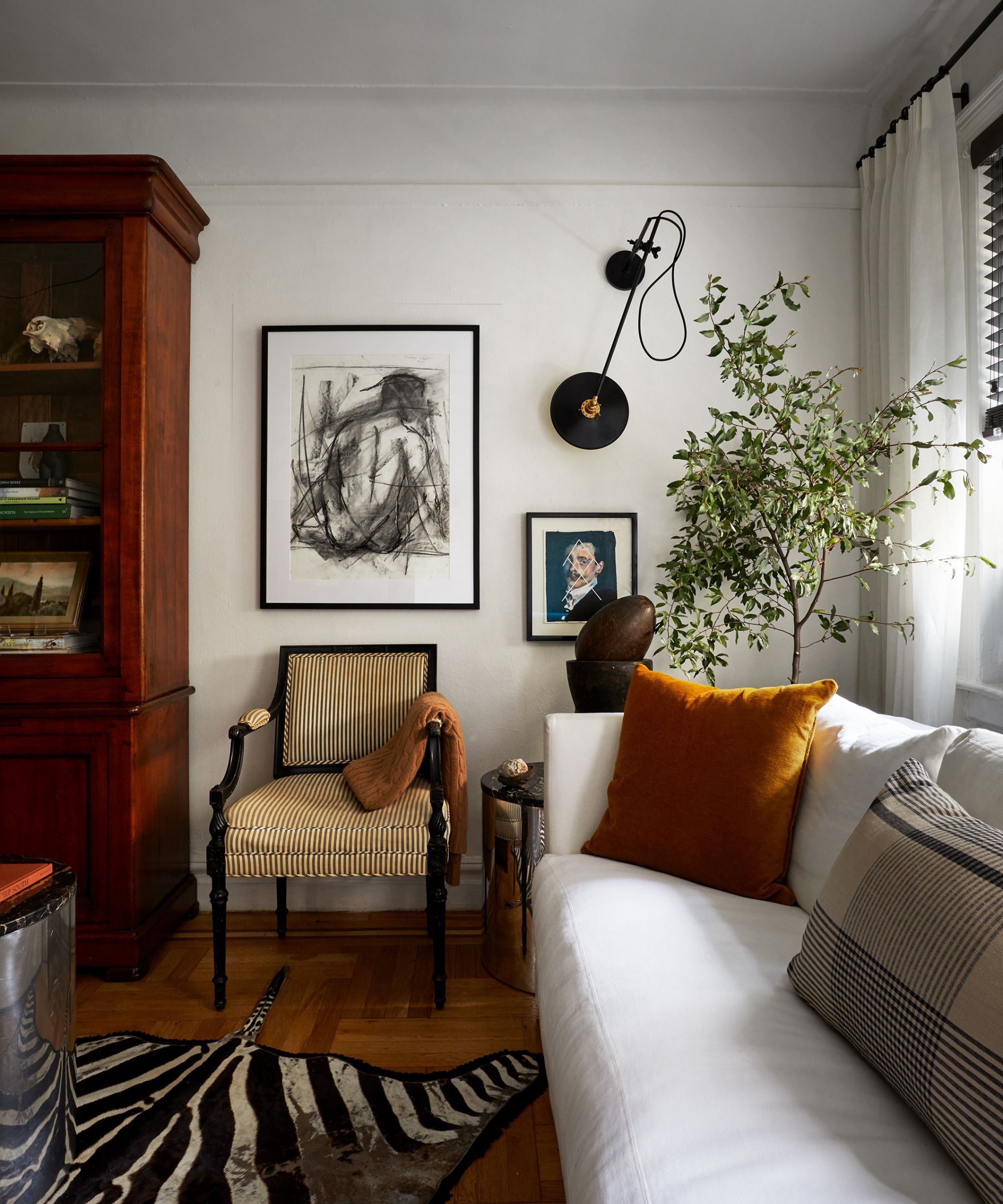
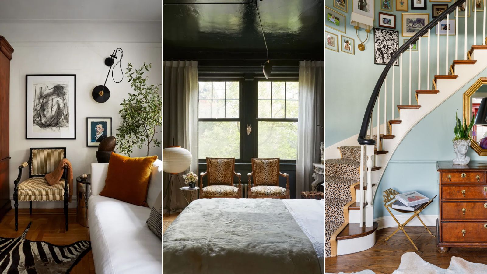
Benjamin Moore's Simply White is a popular warm white paint, a go-to backdrop color in all types of rooms and design styles.
Interior designer David Frazier opted for this timeless paint color for the living room walls, providing the perfect neutral backdrop to the richer furniture and accents. 'Benjamin Moore's Simply White is a perfect warm white,' says David. 'It's a soft white that has yellow undertones but remains crisp.'
2. Studio Green, Farrow & Ball
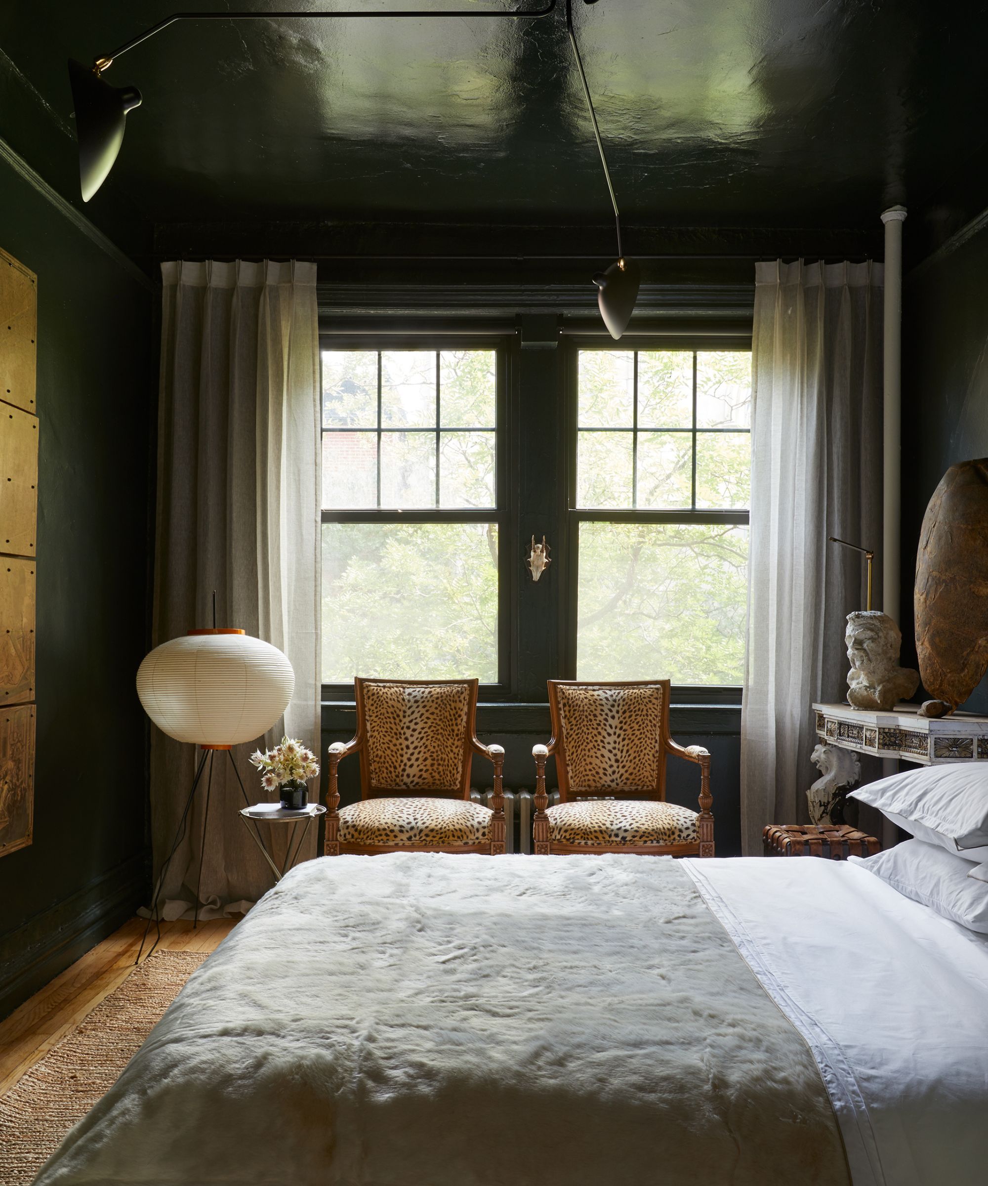
In this bedroom, designer David Frazier turned to color drenching with Farrow & Ball's Studio Green used across the walls and ceiling, creating a statement look yet a cozy and calming space.
Design expertise in your inbox – from inspiring decorating ideas and beautiful celebrity homes to practical gardening advice and shopping round-ups.
'Farrow and Ball's Studio Green is a rich, green black that is a deep hue and full of depth and color,' adds David. 'It provides an instant richness to any space.'
3. Wythe Blue, Benjamin Moore
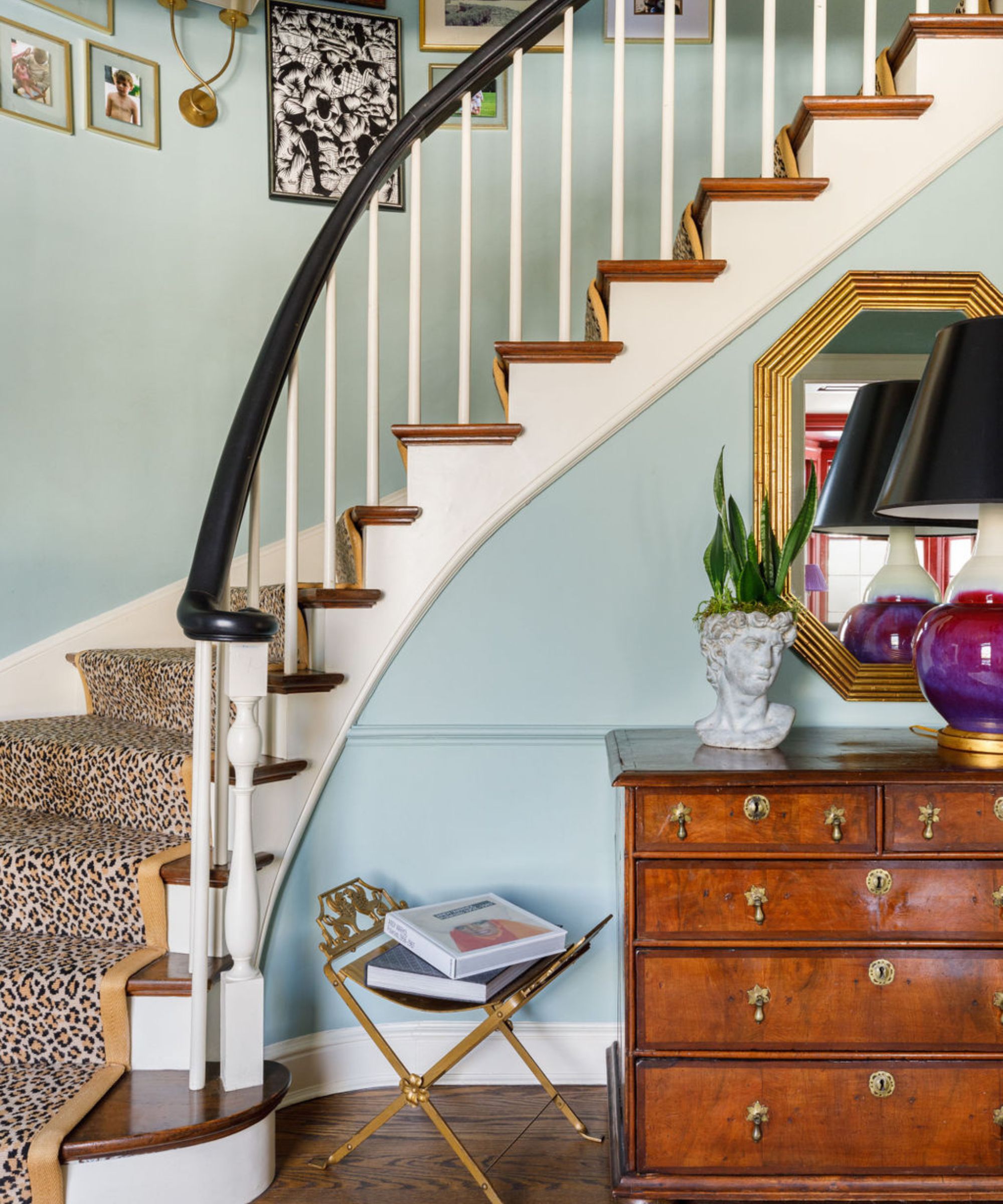
In this home's entryway, Chicago-based interior designer Sarah Vaile used Benjamin Moore's Wythe Blue, a soft, blue-green paint that's a great alternative to decorating with neutrals.
'Benjamin Moore's Wythe Blue is my kind of palette cleanser,' explains Sarah. 'This historical blue is just subtle enough to feel like a neutral but offers more dimension than your basic gray.'
4. Portola Paints
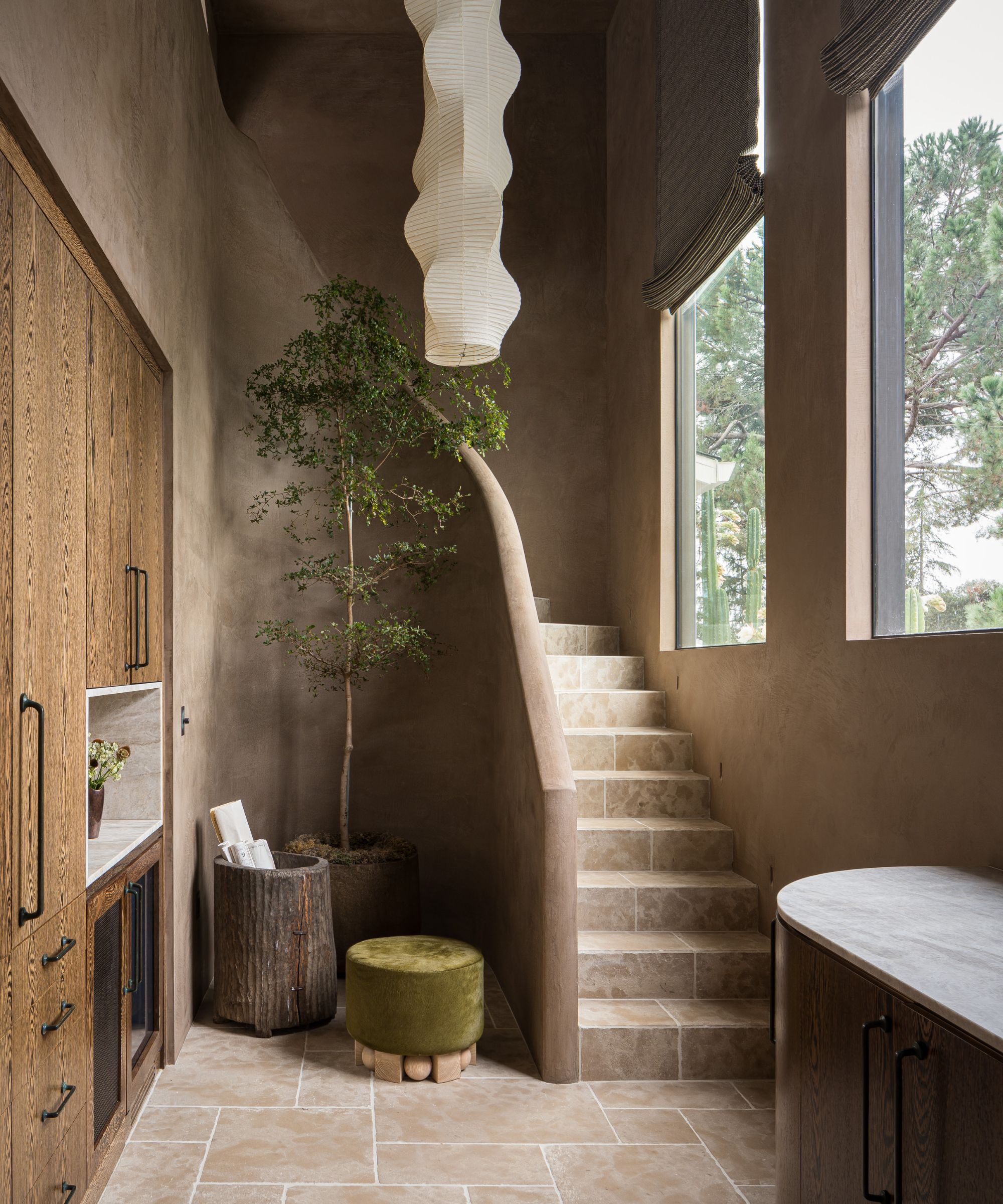
'Our home is a mix of lime wash, Roman clay, and Venetian plaster, all in a custom, deep earthy gray-brown hue,' say designers Austin Carrier and Alex Mutter-Rottmayer at Hommeboys Interiors.
'We love working with Portola Paints on these finishes, as well as our plaster craftsman, to create the perfect custom shades for each space. Limewash is a great DIY option for people at home who want to create more natural movement and an organic quality to their interiors.'
5. Lido Pink, The Pickleson Paint Co.
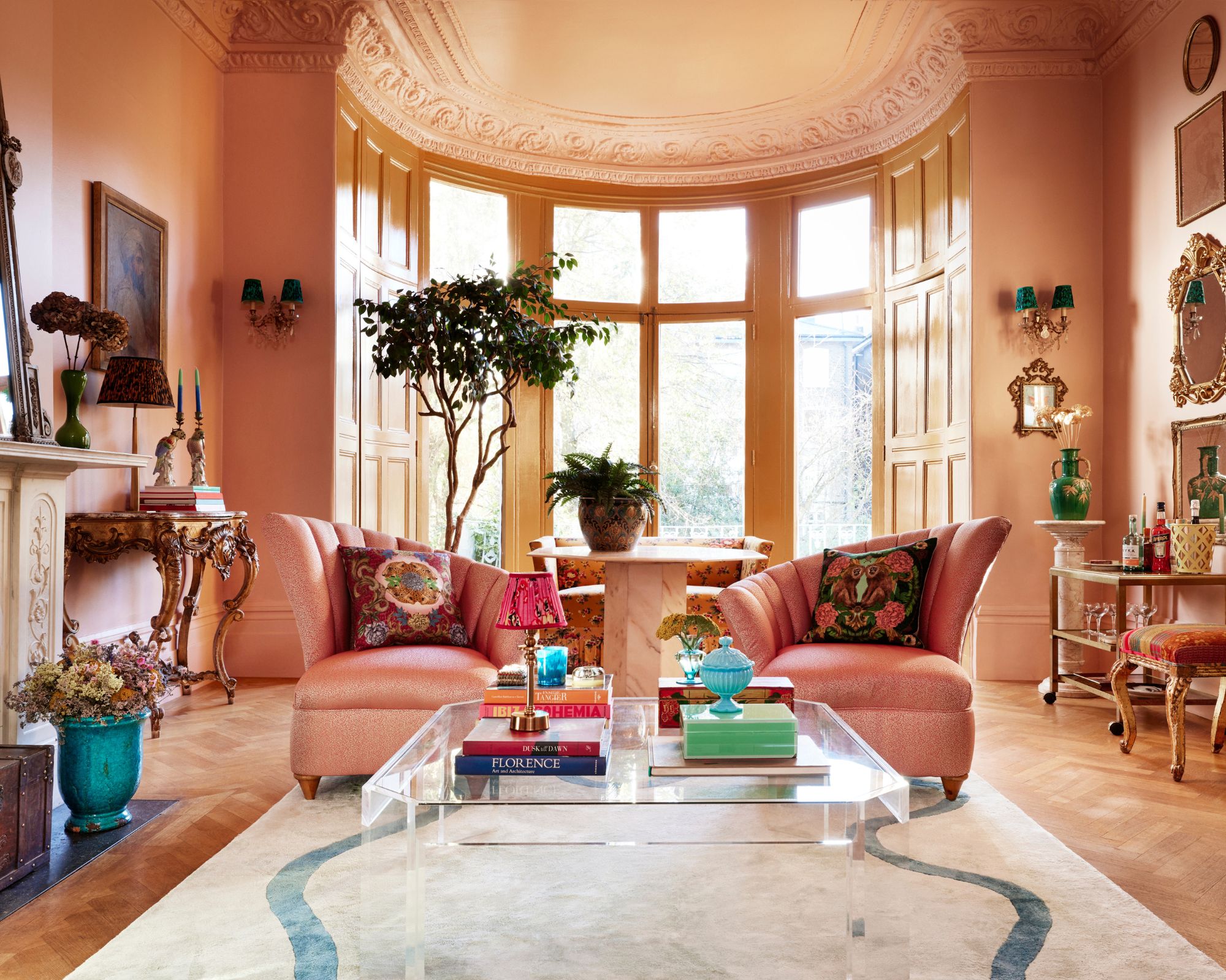
Interior designer Matthew Williamson has used various paint colors by The Pickleson Paint Co. in his home, starting with Lido Pink in this maximalist living room.
'My living room walls are painted in Lido Pink, a soft blush shade,' Matthew explains. 'It contrasts beautifully with the brilliant white ceiling and creates an unexpected, joyful combination with the color of my window frames and woodwork – Hackney Gold, another color by The Pickleson Paint Co.'
'Blush or plaster pink is my go-to neutral, and Lido Pink was just what I was looking for in my living room walls. It’s kinder and more forgiving than white, more fun than beige, and warmer than gray.'
6. Tequila Green, The Pickleson Paint Co.
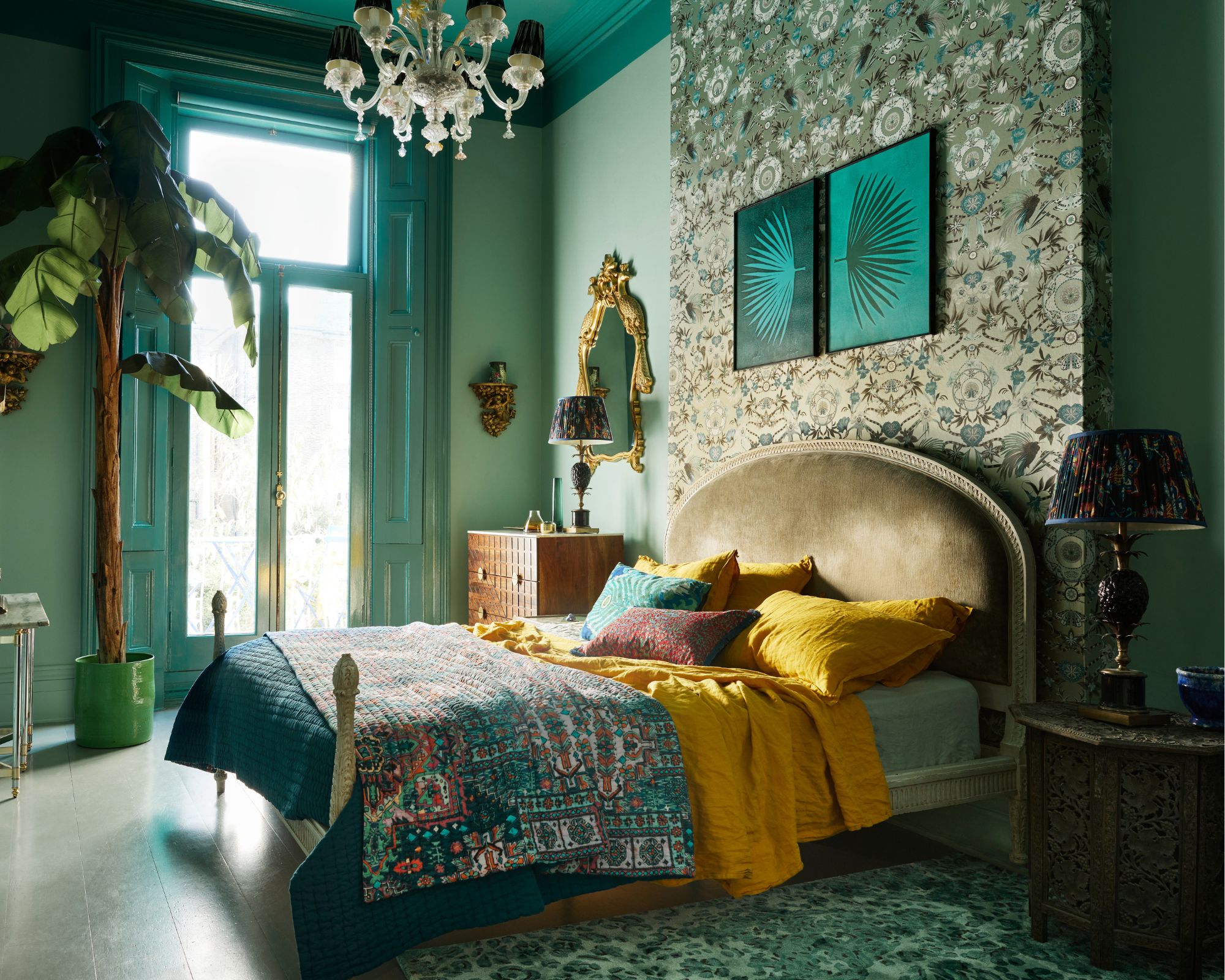
Another shade used by Matthew Williamson in his home is Tequila Green. 'My bedroom walls are painted in Tequila Green, with the ceiling, shutters, and skirting board in a darker gloss – Basilica Green by The Pickleson Paint Co.'
'An eclectic mix of rugs, artworks, bed linens, and plants all work together, connected by the color green. Wherever I live, I use green liberally, as I know my sense of well-being will be all the better for it. Tequila Green is a mid-tone of mint that is at once crisp and striking yet evokes a feeling of calm – perfect for the bedroom.'
7. Hague Blue, Farrow & Ball
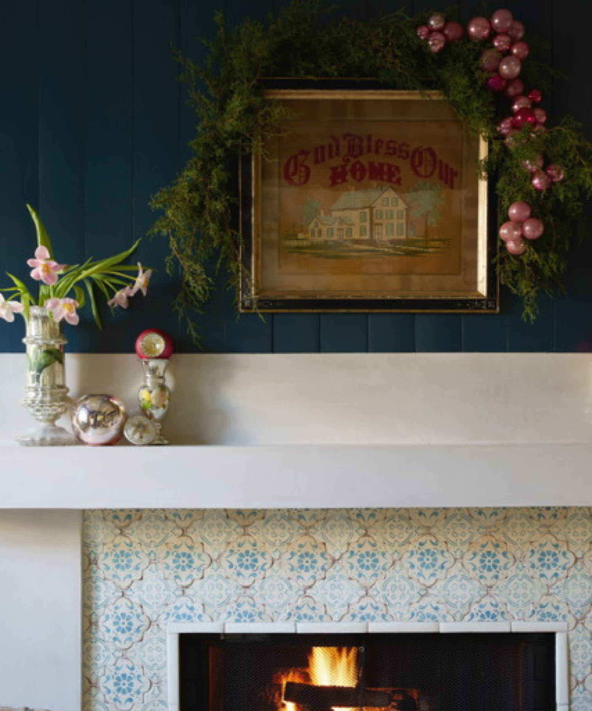
'My favorite paint color that I have used in my own home is Hague Blue by Farrow & Ball,' says interior designer Bambi A’Lynn Bratton of Bambi A’Lynn Interior Design.
'We used this perfect shade of deep teal in our library, and it’s also lovely for studies, doors, bars, and dining room walls because of its deep rich tone.'
As Bambi implies, this is an incredibly versatile paint color, but if you're looking for more specific ideas, take a look at our top ways to decorate with Farrow & Ball's Hague Blue.
8. Love Affair, Benjamin Moore
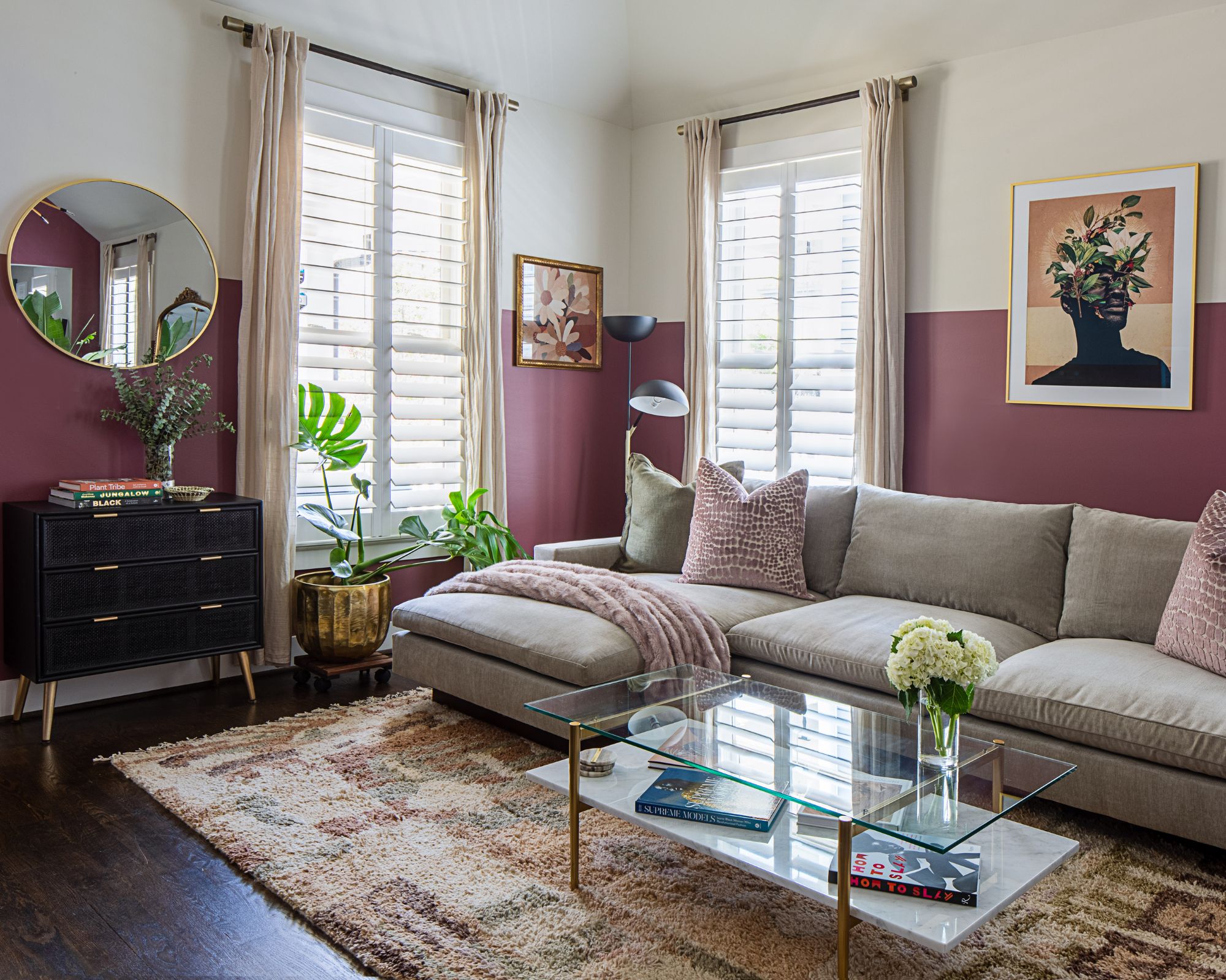
In this cozy living room, designer Amber Guyton at Blessed Little Bungalow chose Benjamin Moore's Love Affair to add interest to the rest of the room's neutral palette.
'My living room is painted about 5 feet up the walls in Benjamin Moore's Love Affair,' Amber tells us. 'The color is a moody, mauvy merlot that is inviting for guests and sets a relaxing mood for me in the room.'
Whether it's a timeless neutral or a bold and energetic shade you're after, these designer homes should inspire you with some color ideas. Before settling on one shade, remember to always test out paint colors in your own home first, as colors will appear differently depending on the lighting of each room.

Emily is a freelance interior design writer based in Scotland. Prior to going freelance in the spring of 2025, Emily was Homes & Gardens’ Paint & Color Editor, covering all things color across interiors and home decor for the Homes & Gardens website. Having gained specific expertise in this area, Emily is well-versed in writing about the latest color trends and is passionate about helping homeowners understand the importance of color psychology in home design. Her own interior design style reflects the simplicity of mid-century design and she loves sourcing vintage furniture finds for her tenement flat.