What looks good in the corner of a room? 7 designer ways to beautify awkward or empty corners
We spoke to the experts to find out how to add intrigue, interest and opulence to the corner of a room
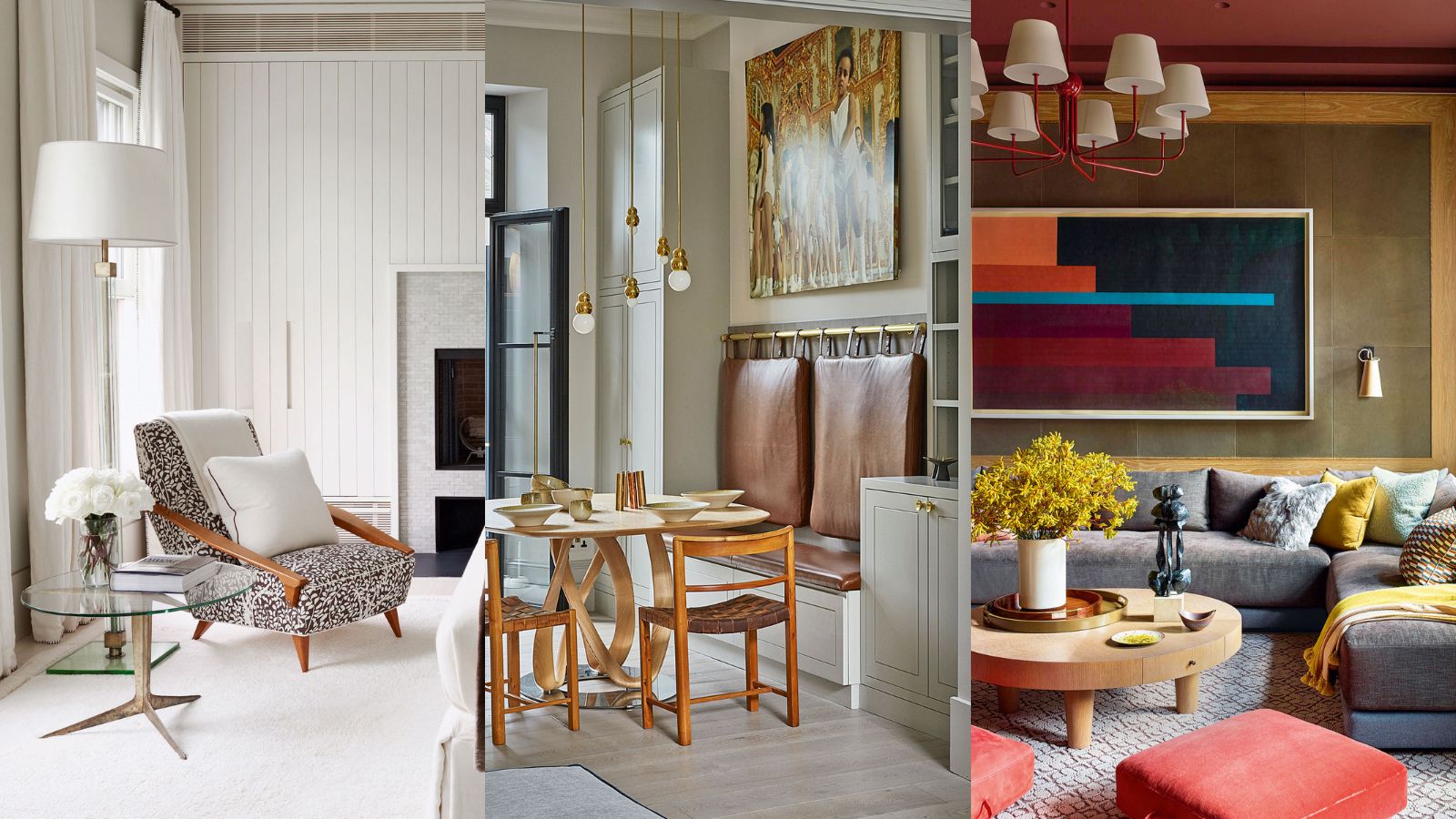

The corners of our homes are rife with design and decorating opportunities. While it can be tempting to leave an empty corner vacant, you would be surprised at how easy it can be to decorate this unloved space in an elegant and interesting way. And the best designs have durability, too, both in terms of style but also because they will stand up to the day to day demands on a room.
Here we spoke to a few of our favorite interior designers on how they've transformed neglected nooks into functional and inviting spots that will make your home decor ideas all the more beautiful.
What looks good in the corner of a room?
When thinking about what looks good in the corner of a room, it pays to think about style as well as functionality. Great interior design allows you to realize your home ideas, delivering when it comes to the practicalities, as well as aesthetically and in a way that caters to your tastes.
We’ve sourced a variety of decorating ideas and interior design tips to help you design your empty corner whether it’s classic or contemporary.
1. An armchair for indulging in your favorite read
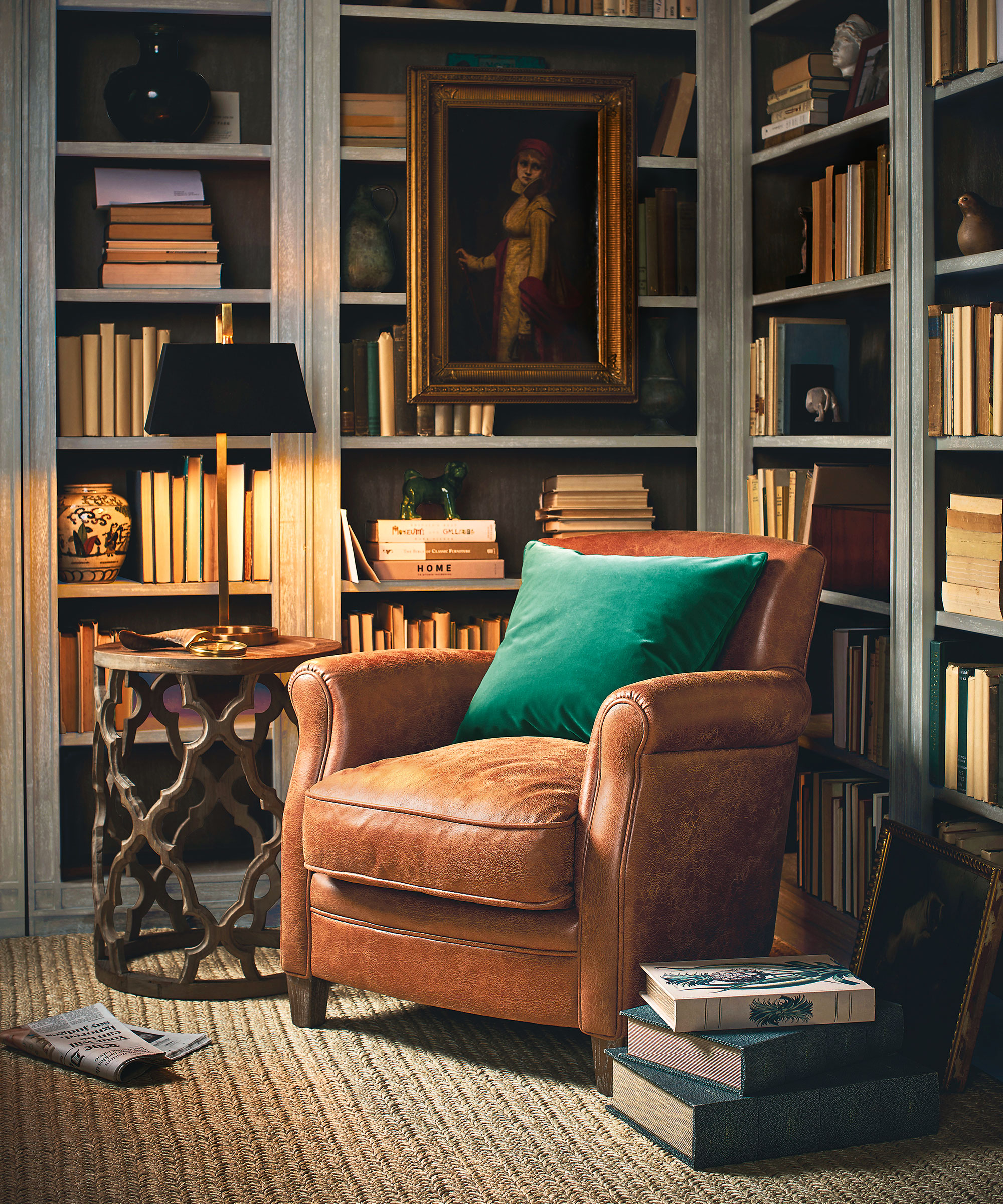
A quiet, cozy corner filled with floor-to-ceiling bookshelves will naturally encourage the peaceful hush of a home library. In fact, densely stacked books actually have sound-dampening properties that will improve the room’s acoustics. ‘A library or living room corner isn’t complete without a comfortable armchair to curl up in while poring over your favorite read,’ says Oka founder, Annabel Astor. ‘Use muted tones throughout the scheme to achieve a reflective space.’
2. Fill a corner with L-shaped or U-shaped seating
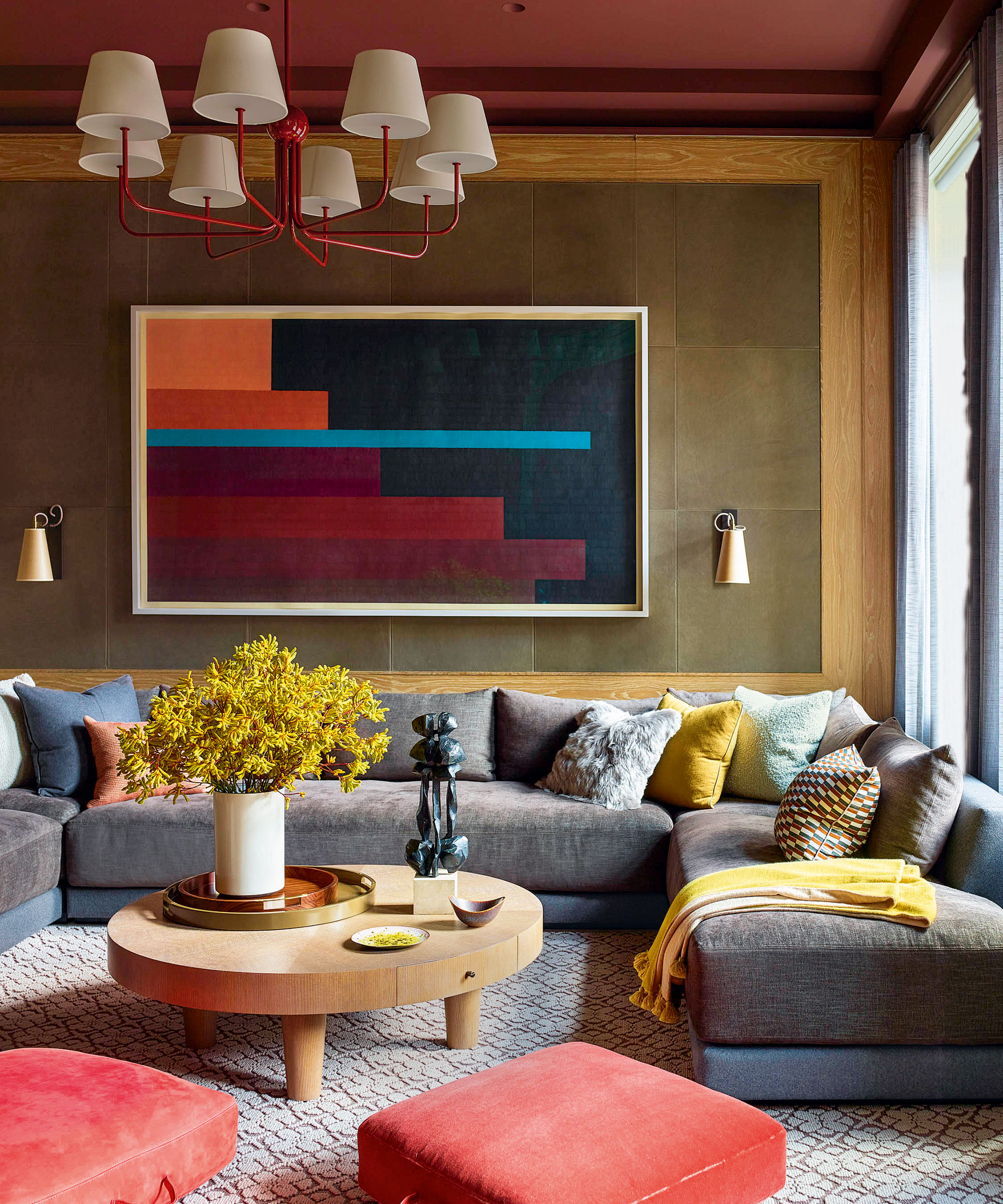
With a modern eye for moody hues, Kevin Dumais has created an intimate sitting room in this apartment living room in a former warehouse in New York City.
'For much of this apartment, we favored pale color schemes, but we wanted a cozier ambience in this family room,' says interior designer Kevin Dumais. 'As it is a corner room with indirect light, it lent itself to a moodier palette.'
'A giant U-shaped sofa was the best way to maximize living room seating in this square space. We used two fabrics to break up its size: a wool flannel for the frame, with seat and back cushions in a chenille with a subtle sheen. I was keen to have salmon pink somewhere in the apartment, so I snuck in these floor cushions. The artwork was sourced last and it brilliantly ties in all the colors – the turquoise stripe was exactly what was needed to complete the room.'
3. A space for a home working station
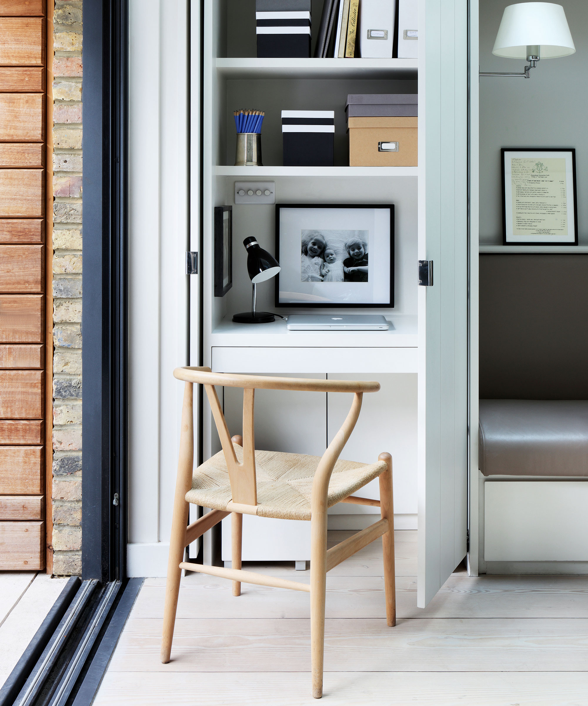
With a bit of creative thinking, even the smallest of rooms can offer clever storage ideas for unloved or empty corners. This wonderfully neat workspace in an open-plan kitchen and dining area was designed by De Rosee Sa. It features a painted timber desk with shelves above for files, while pivot-sliding pocket doors can be used to hide it out of sight when entertaining.
4. Squeeze in a breakfast bar
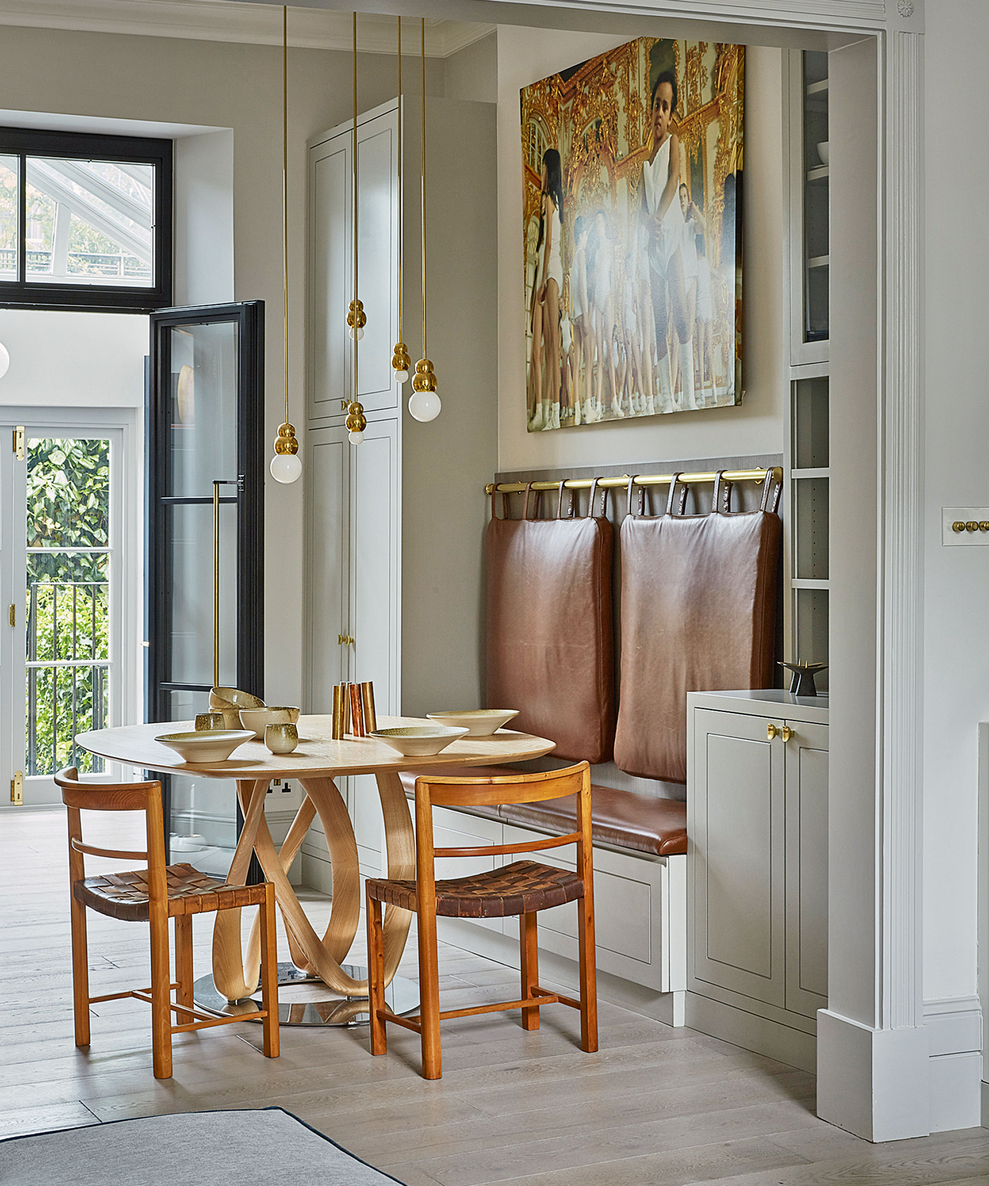
If space allows, turn the corner of a room into a 'room within a room'. Flexibility is key to this area, which needed to accommodate both intimate dinners and stand-up cocktail parties. The joinery includes a built-in bench, which allowed us to set the table to the side leaving plenty of walk-through space, as well as a drinks cabinet, coat cupboard and storage in the bench seat.
Every element has been meticulously considered to maximize the space and style of this small open-plan dining area by Ebba Thott. 'We used a palette of smoothly transitional greys, which enhance the natural light,' says Ebba Thott, interior designer, Sigmar. 'Chic notes of brass were added with pendants, handles and the pole from which the back cushions are hung.'
'In a small corner, everything has to be beautiful and tactile. The saddle leather used for the cushions will only improve with age, while the handles feel wonderful. We sourced a pair of vintage chairs to go with the client’s table: the timbers play off each other to elevate each piece. The elegant pendants provide essential light without blocking views from the sitting area to the garden.'
5. Create a 'happy' corner using art
Photography: Tim Salisbury
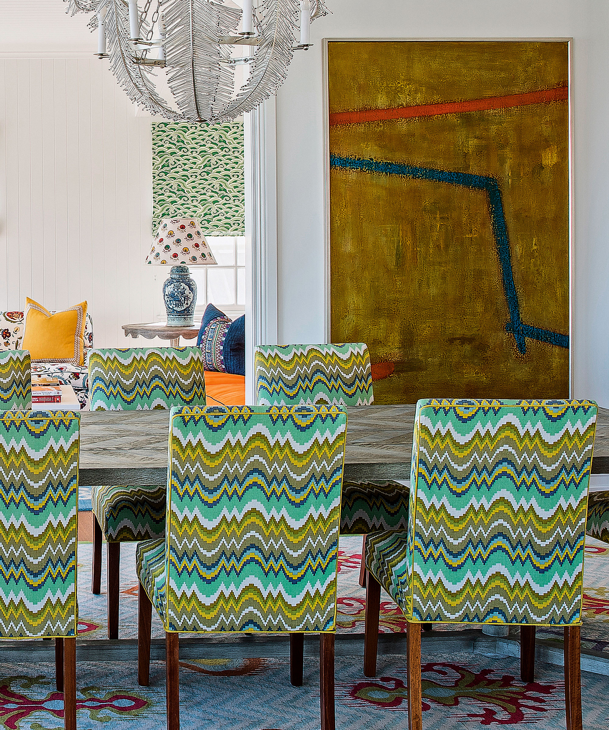
Anna Spiro has used exuberant color and pattern to bring verve and happiness to this home.
This project is an old Queenslander that was extended and completely renovated. 'The clients’ Aboriginal art was the starting point for these rooms,' says interior designer Anna Spiro, founder, Anna Spiro Design. 'I layered lots of color and pattern to create contradiction, but I’ve unified the scheme by linking the colors and also by using a mix of pattern types and scales.'
'Every corner should have a touch of yellow to bring vibrancy and happiness. I used it here with one of my own fabric designs on the wing chairs; the color is picked up in the rugs and carried through to the cushions in the sitting area.'
7. Design a corner that soothes and calms
Photography: Lucas Allen
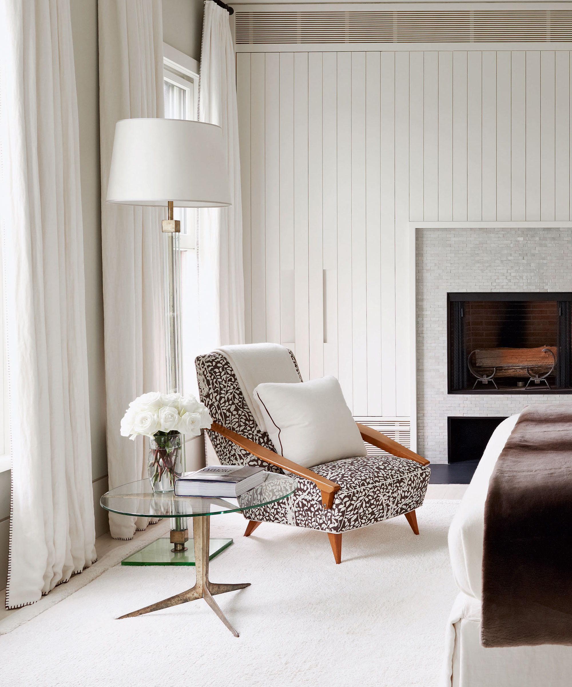
Veere Grenney exercised the art of restraint in the bedroom corner of this sophisticated beach house in the Hamptons.
This Long Beach house was designed by Leroy Street Studio, who referenced the local vernacular with a barn-like structure.
'I wanted the bedroom corner to resemble an elegant living space, so cupboards are concealed behind the wall and the key feature is the fireplace, with a surround made from pale fired bricks. The Fifties armchair, table and floor lamp, all by Gio Ponti, enhance the living room feel,' says interior designer Veere Grenney.
'The knocked-back palette is very soothing, with the main relief provided by the rich chocolate and off-white printed fabric on the armchair. The only other color comes in the form of the green glass of the beautiful Forties Italian lantern.'
'I hung the curtains from simple black poles positioned full height to further lift the high ceiling. I find this much less fussy than poles hung just above the windows, which can cut into the room. The curtains are made from the same off-white linen used for the alcove and we added a blanket stitch trim in chocolate brown.'
What can I put in an empty corner of the room?
There are many things you can put in an empty corner of the room, these unused corners are ripe for decorating opportunities. Transforming a corner is simpler than you may think. While it can be tempting to leave it empty, especially in a small room, it is worth filling up the space to add interest and intrigue. A particular favorite of ours is to introduce plant life, or invest in statement seating. In fact, we believe that no space is finished until all corners are catered for.
Sign up to the Homes & Gardens newsletter
Design expertise in your inbox – from inspiring decorating ideas and beautiful celebrity homes to practical gardening advice and shopping round-ups.

Jennifer is the Digital Editor at Homes & Gardens. Having worked in the interiors industry for several years in both the US and UK, spanning many publications, she now hones her digital prowess on the 'best interiors website' in the world. Multi-skilled, Jennifer has worked in PR and marketing and occasionally dabbles in the social media, commercial, and the e-commerce space. Over the years, she has written about every area of the home, from compiling houses designed by some of the best interior designers in the world to sourcing celebrity homes, reviewing appliances, and even writing a few news stories or two.
-
 How to get rid of bean seed flies – a pest control expert reveals how to keep crops safe from these seed munchers
As their name implies, these insects primarily feed on bean crops
By Tenielle Jordison
-
 Sarah Michelle Gellar's kitchen cabinets are moody yet elevated – I've always used dark paint with caution, but they make bolder tones accessible
The actress's black kitchen cabinets are bold yet palatable, proving that this dark shade is a trendy yet timeless color pick
By Hannah Ziegler