What is retro style? The interior trend where experimentation is oh so welcome
Retro style can be timeless, here is how designers define it in modern-day interiors
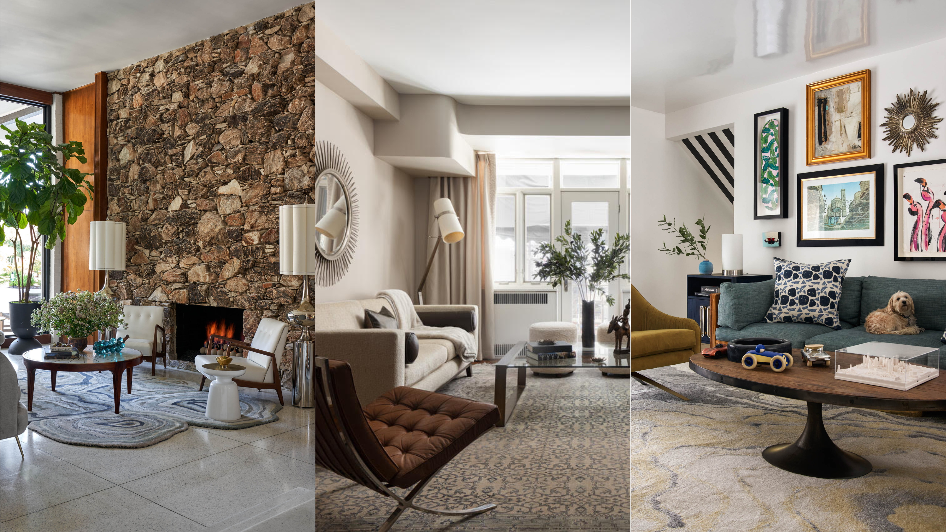

Bold, eclectic, and nostalgic, we are about talking retro decor. Synonymous with the swinging 60s for some, and more mid-century design for others, retro is all about emulating the most iconic of interiors trends past, in a modern setting. And of all the home decor looks to tap into, this is one where experimentation is most welcome.
If you currently have 'mixed feelings' towards retro style, the chances are you have far too often come across retro decor done wrong. Too much of a good thing could not be more applicable here where one geometric print can tip the design scale from vintage chic to a slightly garish diner atmosphere, all a little too quickly.
So who better to define retro decor and lend expertise on how to bring it into our homes than a handful of interior designers?
What defines 'retro'?
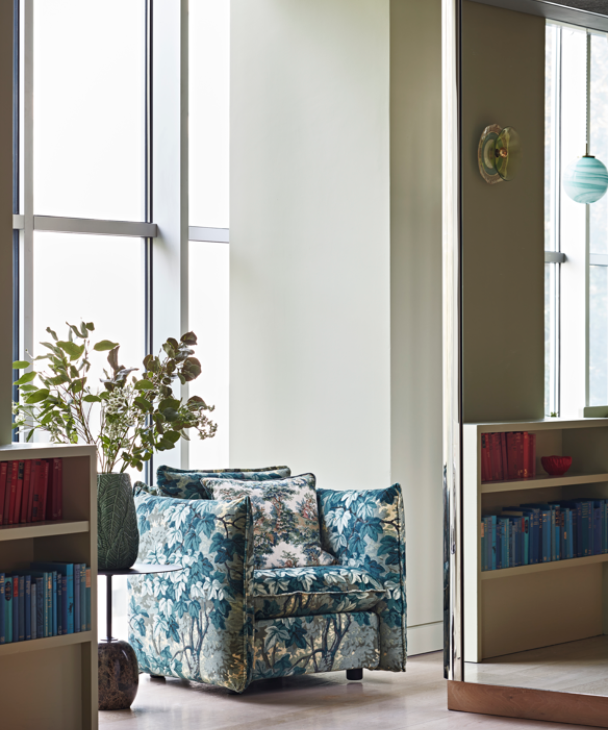
The Design Kitchen, Matthew Williamson, photography by Jon Day
Rather than an interior design style in itself, retro decor aims to reflect looks from around the 1940s to the 1970s in contemporary settings, and it is having a moment. 'The retro look is experiencing a remarkable resurgence,' Matthew Williamson shares with H&G.
Renowned for an iconic use of pattern and an effervescent approach to outfitting rooms, the interior designer is well versed in this time-capsule-esque style: 'Crafting a retro space involves a delicate balance of nostalgia and modernity, where iconic decor elements from bygone eras blend seamlessly with contemporary pieces.'
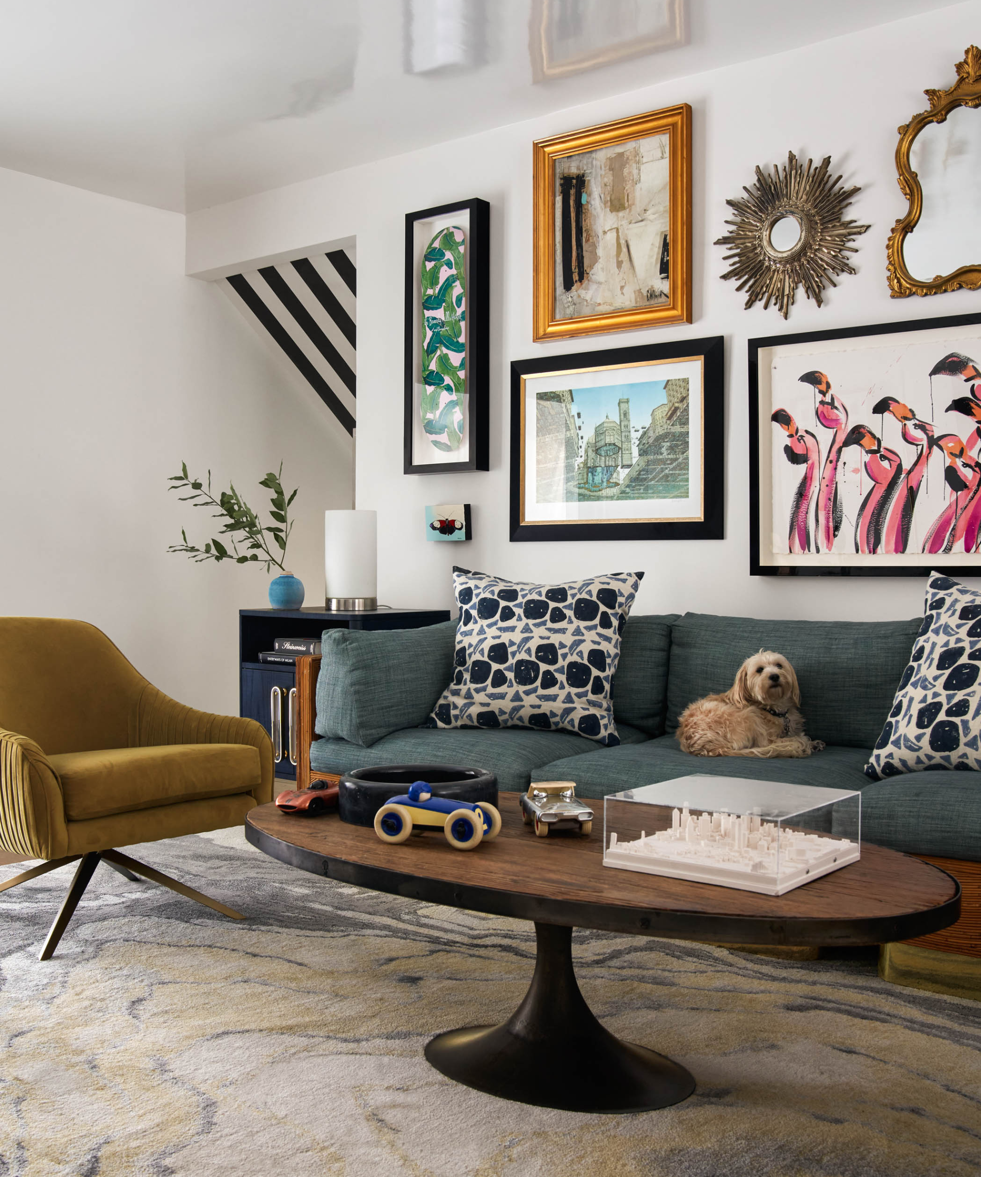
Often blending shapes of the glamourous art deco movement with the more edgy and bold colors typical of Mid-century modern design, when combined with other timeless elements, retro can be part of a home that never dates. From chevron patterns to color pops, here are the most defining design elements of retro decor style:
1. Vibrant retro prints and patterns
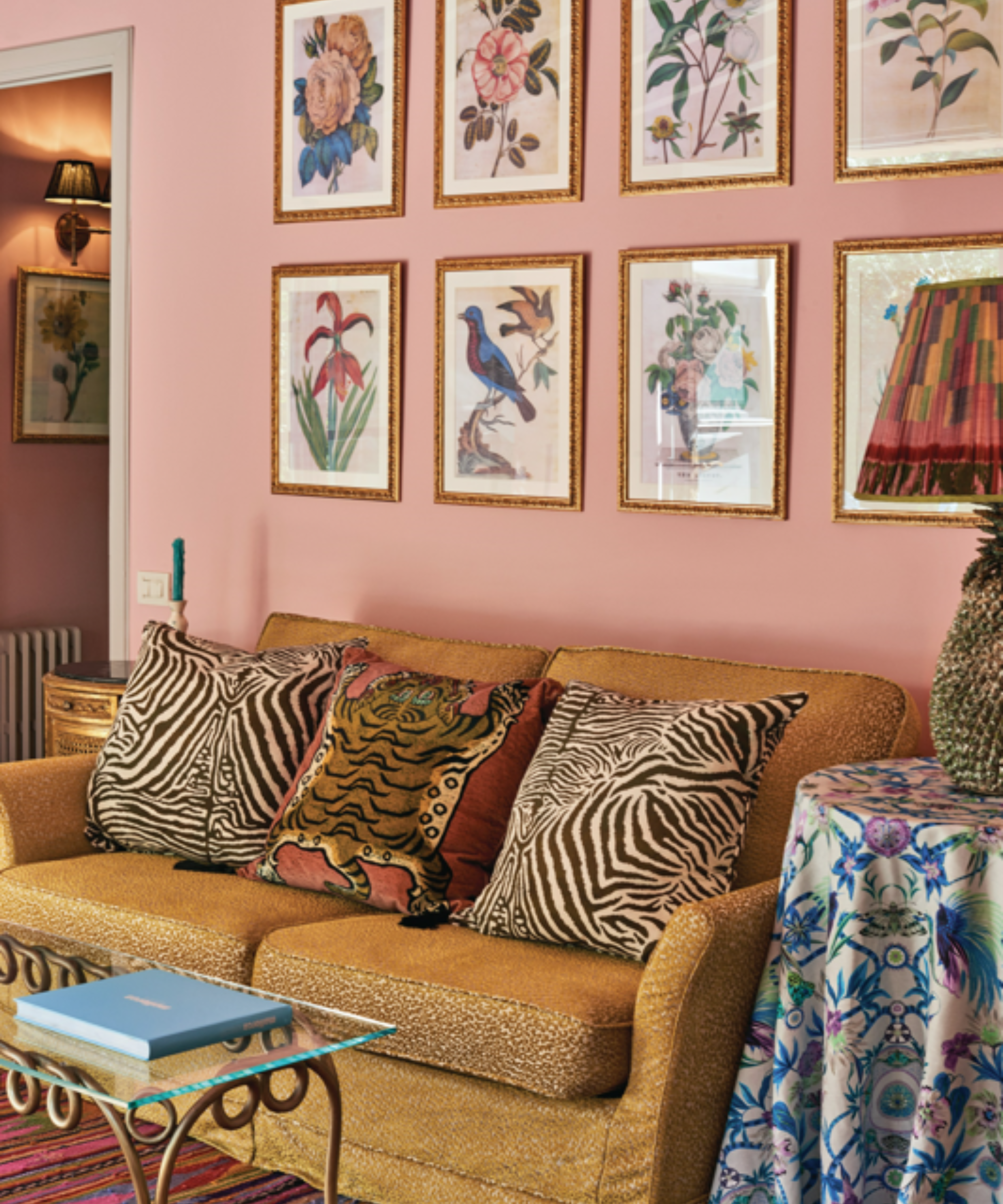
'Embrace bold geometric patterns, vibrant hues, and statement furniture pieces such as mid-century modern sofas or tufted armchairs to evoke the essence of past decades,' continues Matthew. Retro is characterized by statement patterns; from florals to stripes. An animal print can go a long way, especially when juxtaposed with softer colors and finishes in the rest of the scheme as Matthew has done here.
'Complement these with a carefully curated color palette featuring earthy tones like terracotta, mustard yellow and emerald green, while incorporating statement lighting fixtures to enhance the ambiance.'
With retro decor, it is about making the room your own, and working with the modernity of the space for balance. 'Infuse your personal style into the mix, whether minimalist or maximalist, to create a space that not only honors the past but also reflects your individuality.' Think of a brown living room scheme, with more maximalist chevron print, and a clean-lined coffee table. A look that is done so well in Kate Hudson's retro living room color scheme.

Matthew Williamson is an award-winning British interior designer, known predominantly for his unique and unrivaled use of pattern and color. Having begun his illustrious career in fashion under his namesake brand over 20 years ago, Matthew has drawn on his decades of experience and pivoted seamlessly into the world of interior design. He now develops several homeware collections to sit his growing residential and commercial interior design portfolio. His latest achievements are the launch of his first interiors book, Living Bright, a personal guide to embracing color, and the Design Kitchen, a newly designed space for the Design Museum in Kensington, London.
2. Rich and bold juxtaposition
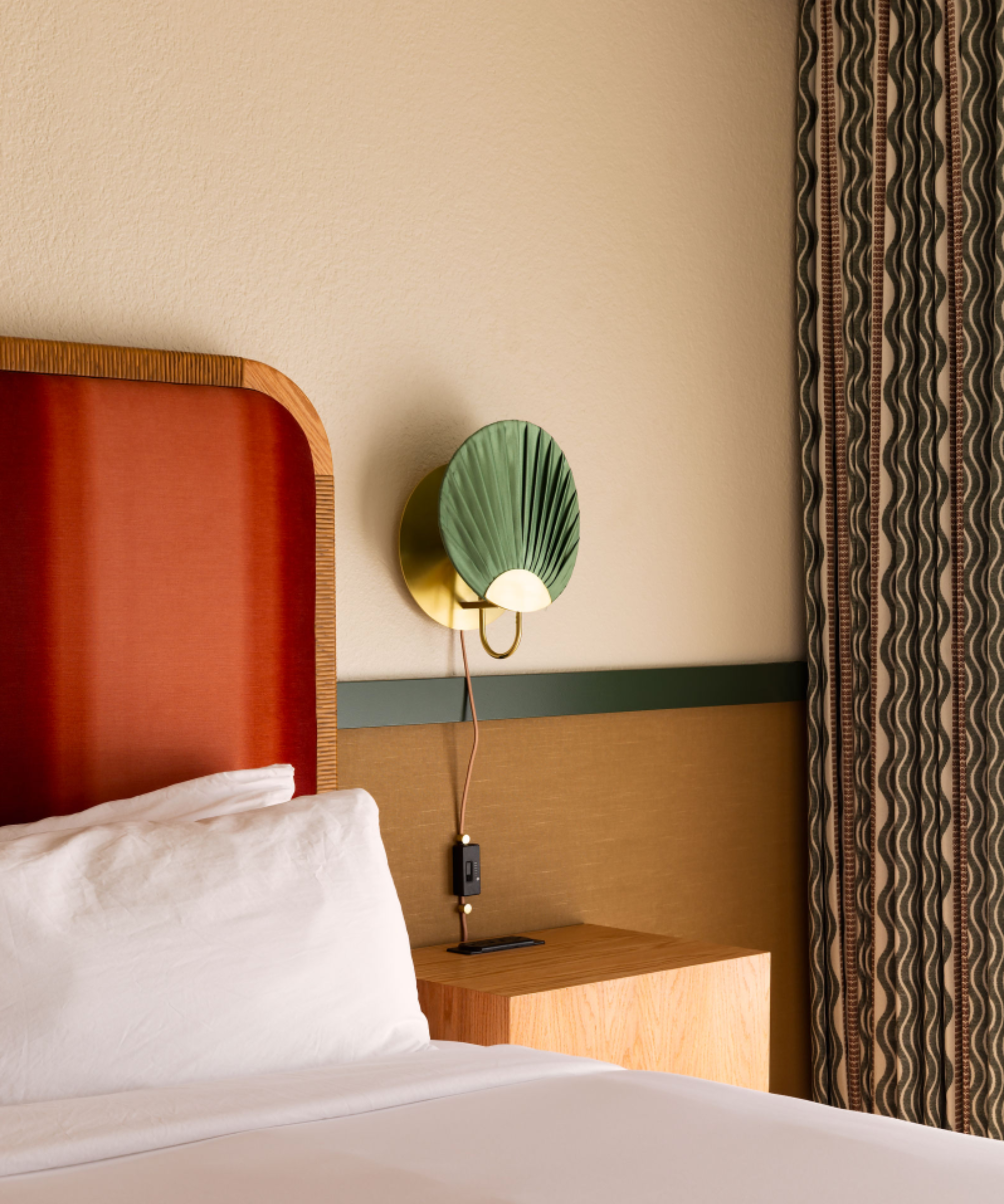
Life House Hotel, Palm Springs space designed by Henriette Kockum, photo courtesy Mickkail Cain
Geometric forms and shapes as you might see in Art Deco design emulate a gorgeous retro feel. Interior designer Henriette Kockum who recently renovated the old 1960s Life House Hotel in Palm Springs, gave the motel a new boutique finish, incorporating retro elements into the design to bring the perfect dose of 'Old Hollywood' glamour, back to the space. Circular and rectangular forms feature highly; as do earthy, warm tones. 'Repeated circles or even just random shapes merged together that are geometric,' says Henriette.
The designer highlights how repeat patterns and juxtaposition of color can be aligned with a retro look, nodding to key design eras of the past in all the right ways. 'They weren't scared to be bold and do high contrast.'

Introducing Henriette, a seasoned professional with a rich background in the arts and a keen eye for design. With a B.A. in Art History from Paris, she began her journey at the Royal Court of Sweden before transitioning into the world of interior design. Having lent her talents to renowned firms like Selldorf Architects, Soho House, and WeWork, Henriette seamlessly blends her love for art history with her design expertise. Her approach is characterized by a dedication to contextual relevance, ensuring that each project tells a story that is both authentic and captivating.
3. Weaving in retro furniture
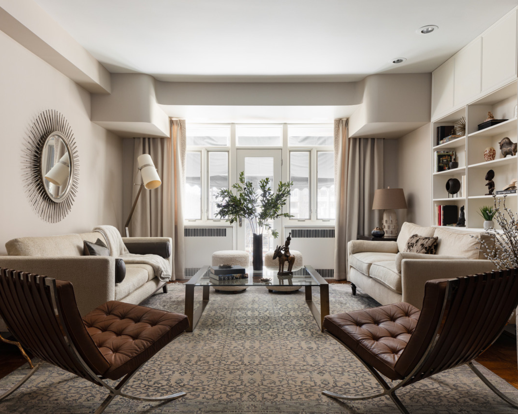
Furniture-wise, with a retro design you will aim to balance 'vintage flair' with modern and grounding elements for a cohesive space that feels energetic and inviting without being loud or too much.
'Retro decor is timeless and always makes a lasting statement,' says Amy Youngblood, principal designer of Amy Youngblood Interiors. 'When mixing these types of pieces into your place I highly recommend selecting other pieces that complement them with simple more clean-lined furniture so as to not take away from nor compete with the retro piece(s).'
As Amy has done in this living room space, combining two Knoll Barcelona chairs with a neutral and simple sofa taps into a more classic take on retro.
4. Accenting retro decor
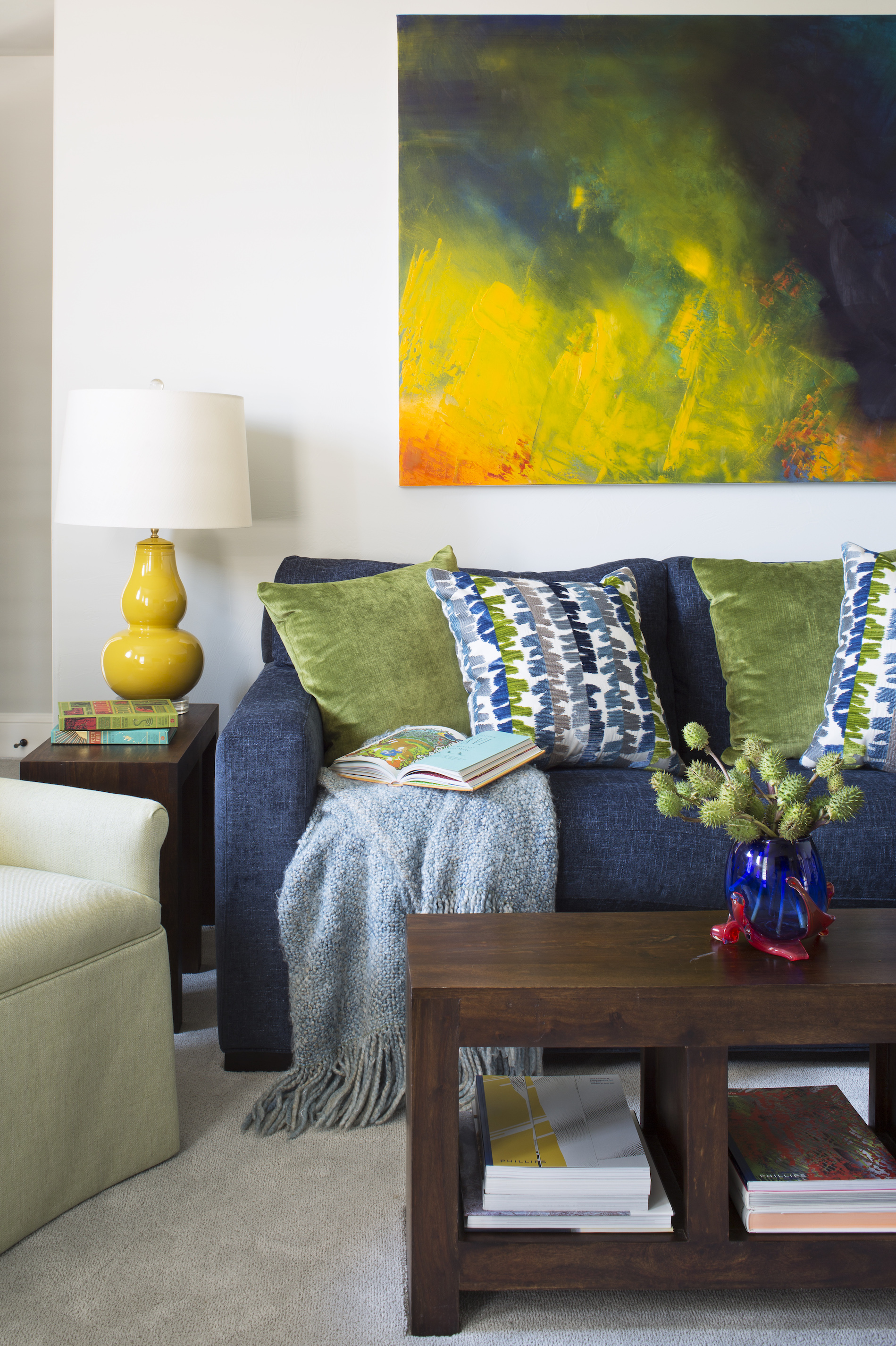
Design by Nadia Watts Interiors, photography by Emily Minton-Redfield
Like in Bauhaus design, decorating with primary colors features highly. A great way of adding a pop of retro into your existing design scheme is to shake up wall decor, lighting, and accessories to a more lively look, with a healthy dose of brights in iconic shapes.
'Color is a big part of getting the “retro” look, think pops of mustard yellow, green apple, burnt orange and pale pink,' says interior designer Nadia Watts. 'Art is a great way to bring in retro style without having to swap out furniture. Reproductions of pop art from the 40s and 50s are often bold and colorful, bringing an eye-catching pop of color to your space and creating that perfect retro vibe.'
We love the curved canary yellow lamp base in this setting too, the hourglass shape is just enough to accent the painting with a touch of retro chic.
Nadia lends another suggestion: 'Kartell lamps and stools bring are great for bringing a retro vibe, and pair perfectly with items both old and new.'
5. Retro textures and materials
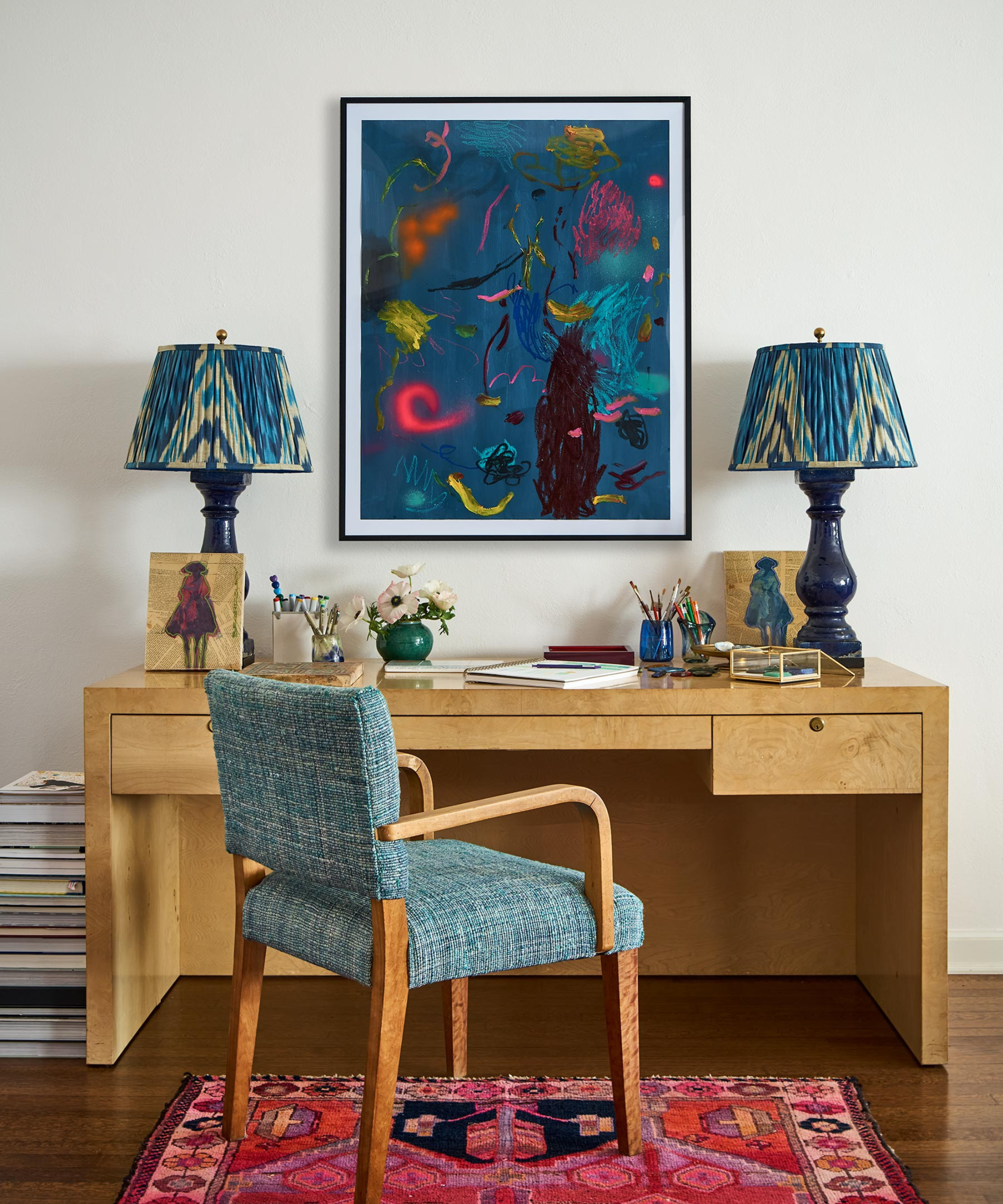
Design by Nadia Watts Interiors, photography by Emily Minton-Redfield
We think of pattern and color when it comes to retro design, both of which translate seamlessly into rugs and upholstery. Even textural choices can be retro in style.
'Textiles with a retro feel are the perfect way to incorporate this look,' continues Nadia. 'Nubby tactile fabrics with color and punch are a great place to start. Think boucle, chenille and velvet.'
In terms of hard materials, retro often lands on dark, rich woods that counteract more prominent design features oh so well. Teak and rosewood you will often find in retro kitchen designs, and Nadia is a fan of a Burl grain in particular. 'I have always loved Burlwood, it reminds me of years past and has beautiful movement. Burlwood is bold, it almost feels alive. Burlwood gained popularity in the 60s and 70s when artisans realized how special it was. Because of its popularity in years past, burlwood brings a pop of retro wherever it lands.'
FAQs
How can I add a retro design element into my home?
With retro, a little goes a long way. This is the fun of it, and it makes shopping for retro pieces easier if anything. Instead of a full house, should you stumble upon something that speaks to you, and of the past, it will work.
'You don’t have to completely saturate your space in all things retro, a few perfectly placed items give you that retro feel without overwhelming your space and making you feel like you are living in the 50s,' says interior designer, Nadia Watts. Smaller but impactful accessories, including rugs, and other soft furnishings are a good way to lean into this style. 'Bold patterns like a checkerboard, decorating with stripes and fish scales bring a retro look no matter the color. If you lean more towards solids, try a shag rug for the retro look.'
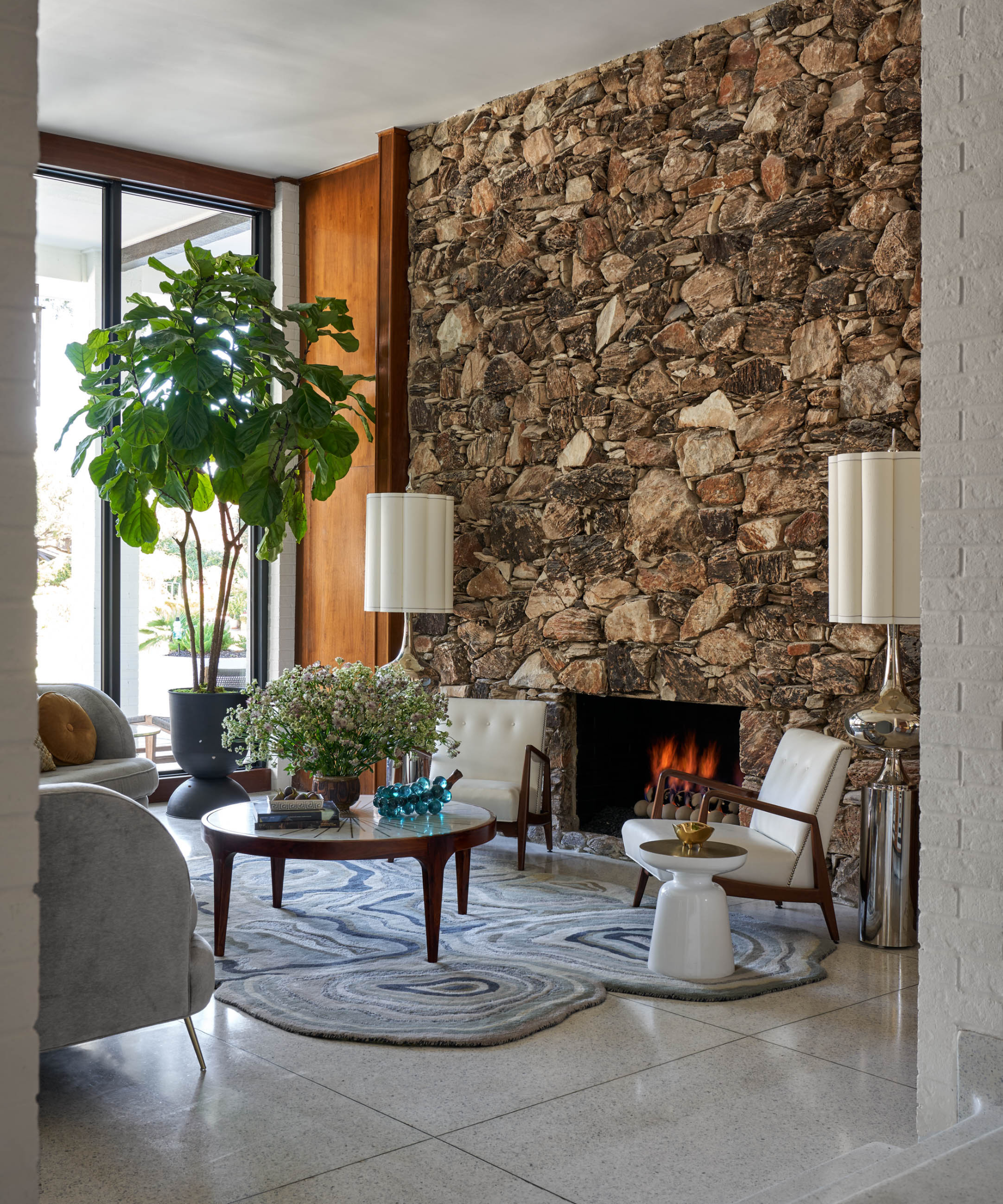
Look for colors, textures, and tones, that can be combined in different areas of your home if you want an air of continuity. Jewel-colored throw pillows in the lounge, or a chevron-printed throw in the bedroom. It is all about balance. 'If you really want to go with a more colorful, trendy look, it is okay to mix the retro items up a bit as long as they aren’t competing or are too similar in style. Also, if these pieces are colorful, try to balance them out with the same color in other areas of the space without overloading the entire space,' says Amy Youngblood, principal designer of Amy Youngblood Interiors. 'When in doubt, less is more!'
See our retro River house tour for a little inspiration and nod to retro in all the right ways at home.
Sign up to the Homes & Gardens newsletter
Design expertise in your inbox – from inspiring decorating ideas and beautiful celebrity homes to practical gardening advice and shopping round-ups.

Camille is the former deputy editor of Real Homes where she covered a broad range of topics, including house tours, small space design, and gardens. She studied English language and Italian at the University of Manchester and during a year abroad studying linguistics and history of art in Bologna, Italy she started documenting her adventures and observations in a blog. Camille is always creating and spends her downtime painting, taking photos, traveling, and writing short stories.
-
 Ina Garten's storage pantry is an insightful window into all of the best cookware used by the chef – and it's easy to recreate on your kitchen shelves from $48
The beautiful dishware in The Barefoot Contessa's Hamptons pantry showcases the tools she uses most often to cook – this is exactly how you replicate it
By Sophie Edwards Published
-
 Extend the lifespan of your appliance with 5 simple but crucial washing machine maintenance tips
From cleaning the filters to keeping the door open, experts reveal the washer tips they swear by
By Andy van Terheyden Published