What is an analogous color scheme? Designers share the rules on how to bring this on-trend approach into your home
Because blue and green should always be seen
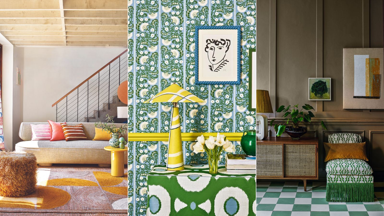

In the world of interior design, analogous color schemes have often been second to monochrome schemes. In fact, in the past they have been downright shunned – the phrase 'blue and green should never be seen'? Well, that (now very outdated) term refers directly to an analogous color scheme.
These schemes are made up of two or three colors that sit next to each other on the color wheel – blues and greens, greens and yellows, pinks and oranges. And despite how the old saying goes, these palettes are favorites amongst designers, they create gorgeous, harmonious rooms that have layers and depth and a ton of interest.
'Analogous colors are shades that sit next to one another on a traditional color wheel, so they're alike but still distinct,' explains designer Kathy Kuo. 'When I think of an analogous color scheme in the interior design sense, I think of beautiful, bold color combinations like navy blue, forest green, and teal; or russet, sienna, and goldenrod.'
But it's an adaptable scheme too. Obviously, you have the whole color wheel to take from and you can go as bold or as subtle as you like. We spoke with designers and color experts on the best ways to use the color wheel for your room color ideas and how to approach these on-trend analogous color combinations.
What is an analogous color scheme?
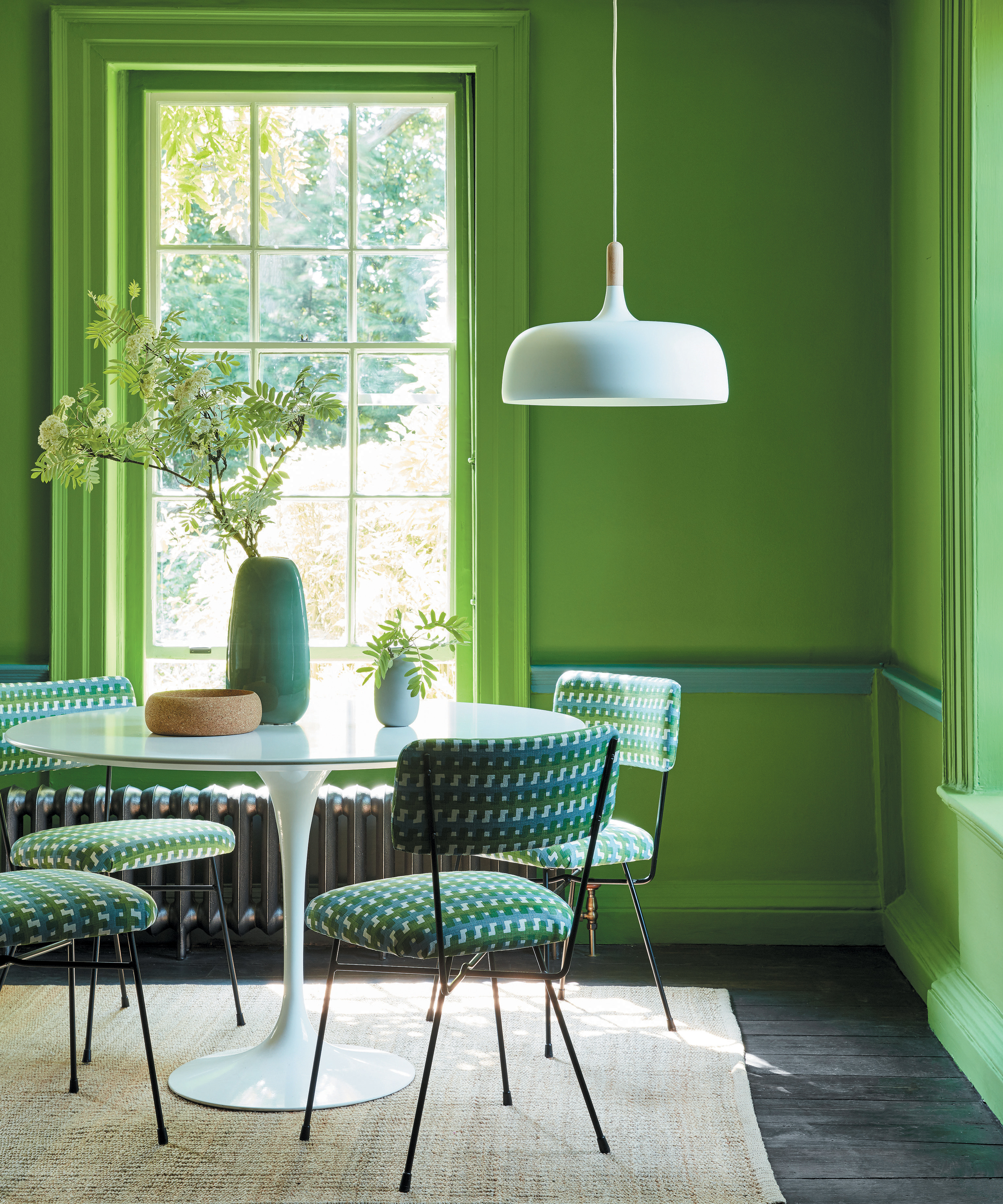
'An analogous scheme, a less common coining, is a color scheme which contains colors which are adjacent on the color wheel' explains Charlotte Cosby, Creative Director at Farrow & Ball. 'These shades have a natural affinity for pairing together, as each will contain small quantities of the same pigment (such as orange, terracotta and red). Using this technique when decorating will create a soothing collection of shades that effortlessly transition from one to another!'
'These colors typically share similar undertones and create a cohesive look when used together. For example, a common analogous color scheme might include shades of blue, green, and teal or variations of yellow, orange, and red. Many people opt for a color scheme like this to make a room feel relaxing while adding a touch of color variety to keep things from getting too boring.' adds designer Jennifer Davis.
'Personally, I think analogous color schemes are the most powerful color theory to learn because complimentary obviously always works and we see that a lot. And monochrome color schemes are chic but they can feel a bit two-dimensional if not done right. Analogous color schemes, just have something more exciting about them, and I notice this is usually where a lot of interior designers pull their color schemes from,' explains Tash Bradley, director of interior design at Lick.

Jennifer fell in love with design at a young age and has been working in the industry for over 25 years. She has developed an eye for detail and a talent for creating timeless designs. Jennifer offers a balance of creativity and forward-thinking with a structured, organized, and detailed mentality. Jennifer is driven by her deep passion for design while curating an exceptional client journey, ensuring pure delight from the very beginning to the end.
How can you use an analogous color scheme?
So how can we bring these super simple, super chic color schemes into our rooms? Using the color wheel to help you decide on your schemes is a great place to start, but there are a few 'rules' to follow and ways to approach this palette that will ensure it always works.
Pick your three hues and stick to them
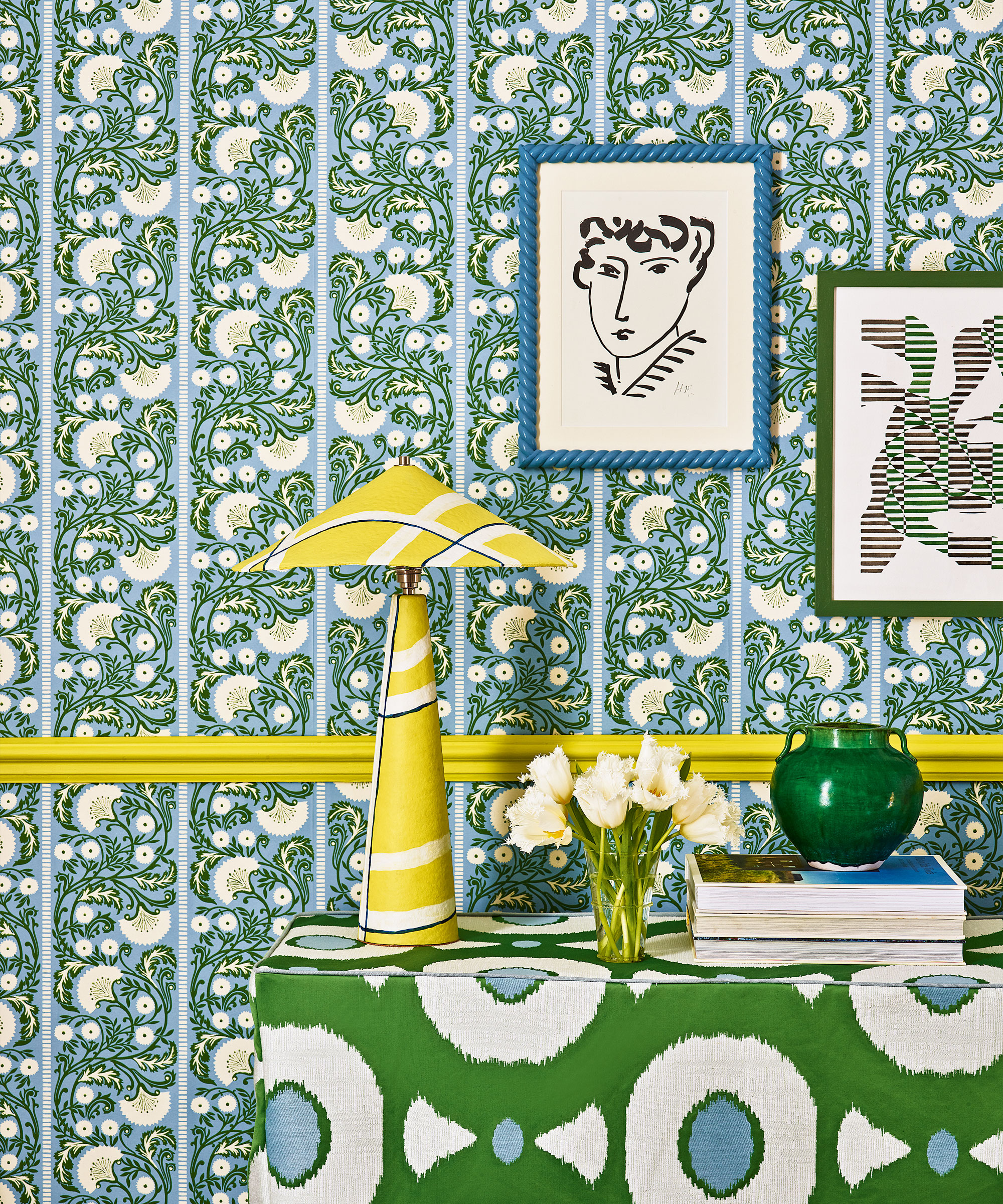
Don't overdo it. The best analogous color schemes are ones that feel very curated and purposeful, and if you start bringing in too many colors the analogous scheme just gets a bit lost. So pick two or three shades that sit together on the color wheel and stick with those.
'With analogous schemes, I recommend sticking to just three colors per room,' suggests Tash. 'You can go up and down within those hues, adding white or black to create darker or lighting versions, but don't bring in any more than three key colors, otherwise, it will start to feel a bit much.'
'And be sure to look at the whole space when taking this approach to color. Consider your furniture, your wall color, your ceiling your flooring, this is a really easy color scheme to throw off. You want to avoid that. For example, you don't want to go blue and green and then add in an orange. You want to stick to just your three main colors to get the real effects of this scheme.' she adds.

Tash is trained in color psychology and theory, she helps people around the world bring their dream decorating projects to life and utilize color to impact personal spaces, as well as overall lifestyle and wellness. Tash leverages her expertise in color psychology and theory, as well as interior design, to lead Lick’s design studio and curate the brand’s global paint and wallpaper offerings. To date, she has led 1,000+ color consultations for Lick clients, providing customers the confidence they need to create a home they’ll love.
Consider the aspect of your rooms – and the mood you want to create

Analogous color schemes are either warm or cool. You take shades from the same side of the color wheel, which means that if you are really committing to the look, there's no blue to cool down a pink bedroom or no pops of terracotta to warm up a blue kitchen. So really consider the look and feel you want your rooms to have.
Warm analogous palettes (pinks, reds, oranges, and yellows) are going to create spaces that feel cozy and welcoming and well, warm. Personally, we think these palettes work better in softer spaces like living rooms where you want all those inviting, uplifting, sunny vibes. And this all-warm scheme can be far less intense than it sounds, see how in this living room the mix of yellows, oranges, and pinks works with the touches of beige and white to create a scheme that's fresh and fun but also really liveable.
Over on the other side of the wheel, you have cooler analogous palettes (blues, greens, and again vivid, green-toned yellows can come in here too). These are obviously going to create much cooler spaces, hence why we think they are better suited to more practical spaces like kitchens and home offices, or if you want a really relaxing bedroom scheme, a pale blue and green analogous scheme would be perfect.
Really consider the aspect of your room and the tone of the light it gets when deciding on your color scheme too. If your room gets cooler light, going down the route of blues and greens could end up looking uninviting, so instead look to pinks, reds, and oranges to balance out that cool light. If you have a sunny space, filled with warm light you could lean into that, or take the opportunity to embrace the cooler side of the color wheel.
Layer an analogous scheme with a neutral back drop
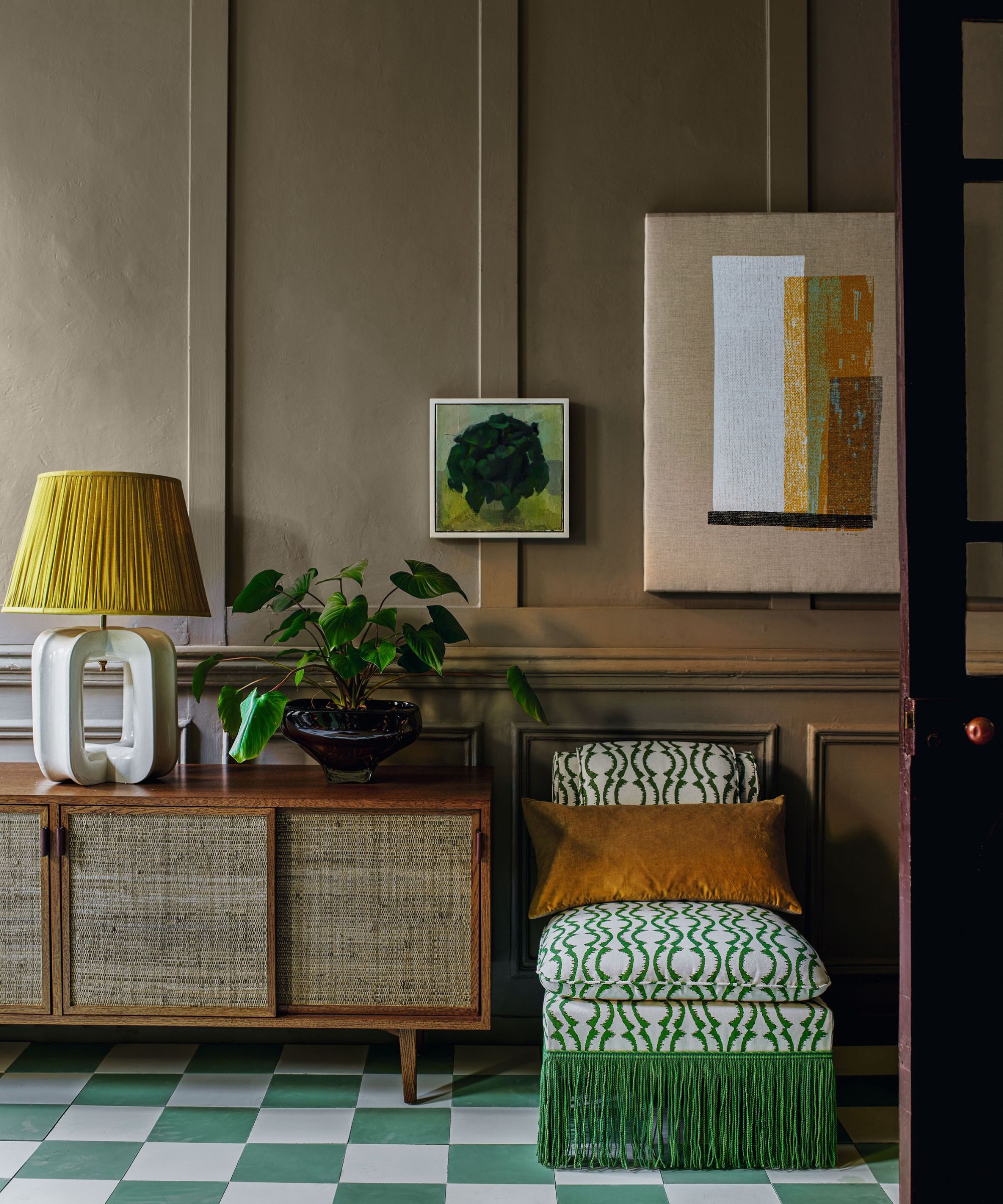
If you are after a more subtle approach to an analogous scheme and prefer to decorate with neutrals, this is how it's done. Rather than commit your whole room to the look, bring in those analogous colors with your accessories and pick a neutral color as your backdrop.
Just ensure the neutral you choose has the same undertones as the other shades, you want it to feel like part of the color scheme rather than create contrast. See here how the dark beige walls have that muddy, green undertone to them that works perfectly with the bolder greens and yellows.
'As a studio, we really emphasize timeless interiors that are elegant and joyful so I would keep the base of the room neutral and use an analogous color scheme as accents for soft furnishings and home accessories such as cushions, rugs, curtains etc.' suggests Tom Rutt, founder of TR Studios.
'Using an analogous scheme in this way with subtle and muted colors will result in a really sophisticated and curated space. If you do want to go bold and use an analogous scheme across an entire interior, I would recommend choosing a smaller space such as a powder room so that impact has a real wow factor.'

Tom Rutt has worked in the offices of Norman Foster and Michaelis Boyd before founding TR Studios in 2015.
FAQs
What does an analogous color scheme do to a room?
An analogous color scheme is a harmonious one, meaning it's often used to make rooms feel calm and relaxed. Since there are no high-contrasts they are very easy on the eye. But that's not to say they can't create bold spaces too, an analogous scheme can be as statement as a complimentary one, it just depends on the colors and shades you want to bring together.
What colors can you use in an analogous color scheme?
You can use any color in an analogous scheme. Or more specifically you can use any group of colors. For this kind of palette, you want to pick two or three main colors, each should be next to one another on the color wheel. For example, blue and green or pink and red or yellow and orange. You can also bring in different tones and tints of those main hues if you want a softer, more tonal look.
Tempted by an analogous scheme? They do create beautiful spaces, and out of all the color theories, this one gets the most attention in design trends too. Designers have loved it for years, and thankfully we are seeing more and more of these tonal schemes. Just follow a few rules and be sure to order loads of swatches and test out different combinations before you commit.
Sign up to the Homes & Gardens newsletter
Design expertise in your inbox – from inspiring decorating ideas and beautiful celebrity homes to practical gardening advice and shopping round-ups.

I am the Head of Interiors at Homes & Gardens. I started off in the world of journalism in fashion and luxury travel and then landed my first interiors role at Real Homes and have been in the world of interior design ever since. Prior to my role at H&G I was the digital editor at Livingetc, from which I took a sabbatical to travel in my self-converted van (not as glamorous as decorating a home, but very satisfying). A year later, and with lots of technical DIY lessons learned I am back to writing and editing, sometimes even from the comfort of my home on wheels.
-
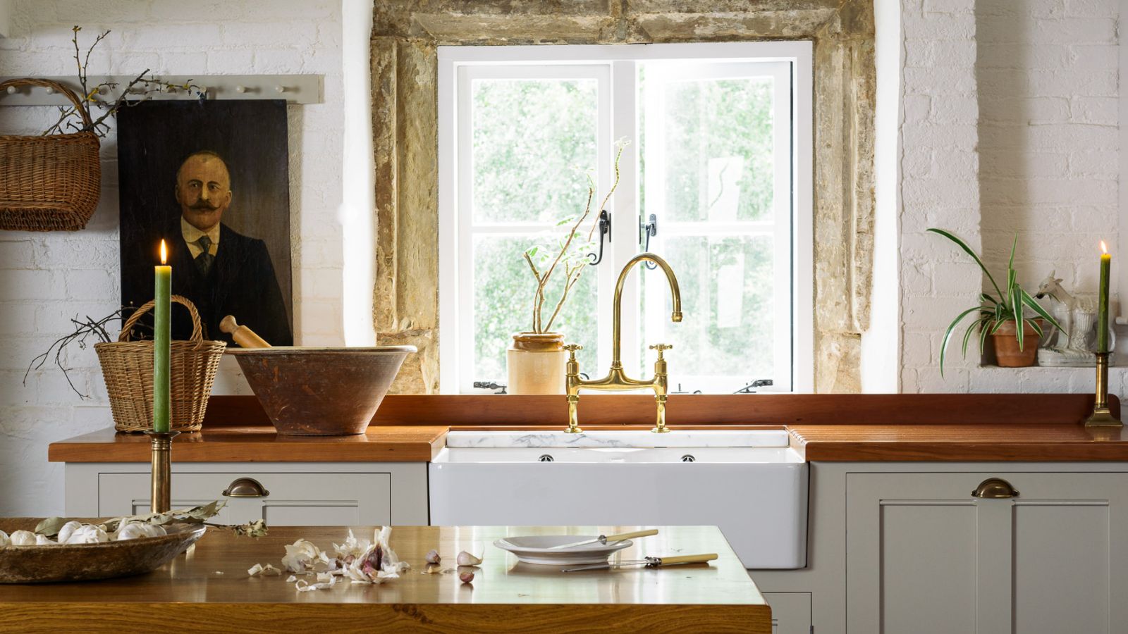 This simple marble hack elevates my budget-friendly wooden kitchen countertops and prevents the dreaded water damage for way less than you’d think
This design trick looks expensive, solves a problem, and was the easiest decision I made during my kitchen reno
By Charlotte Olby Published
-
 Emily Blunt gifted Cillian Murphy this $545 pillow – she's 'obsessed' with these luxury pillows, and frankly, so are we
The Oppenheimer stars sleep on this ultra-luxe goose down pillow – here's why we love it – plus our affordable alternatives from $35
By Sophie Edwards Published