What is a complementary color scheme? Designers explain how to create beautiful spaces with bold pairings
The most contrasting of all the color schemes, complementary colors are often shied away from, but designers believe it's these bolder combinations that create the most chic spaces
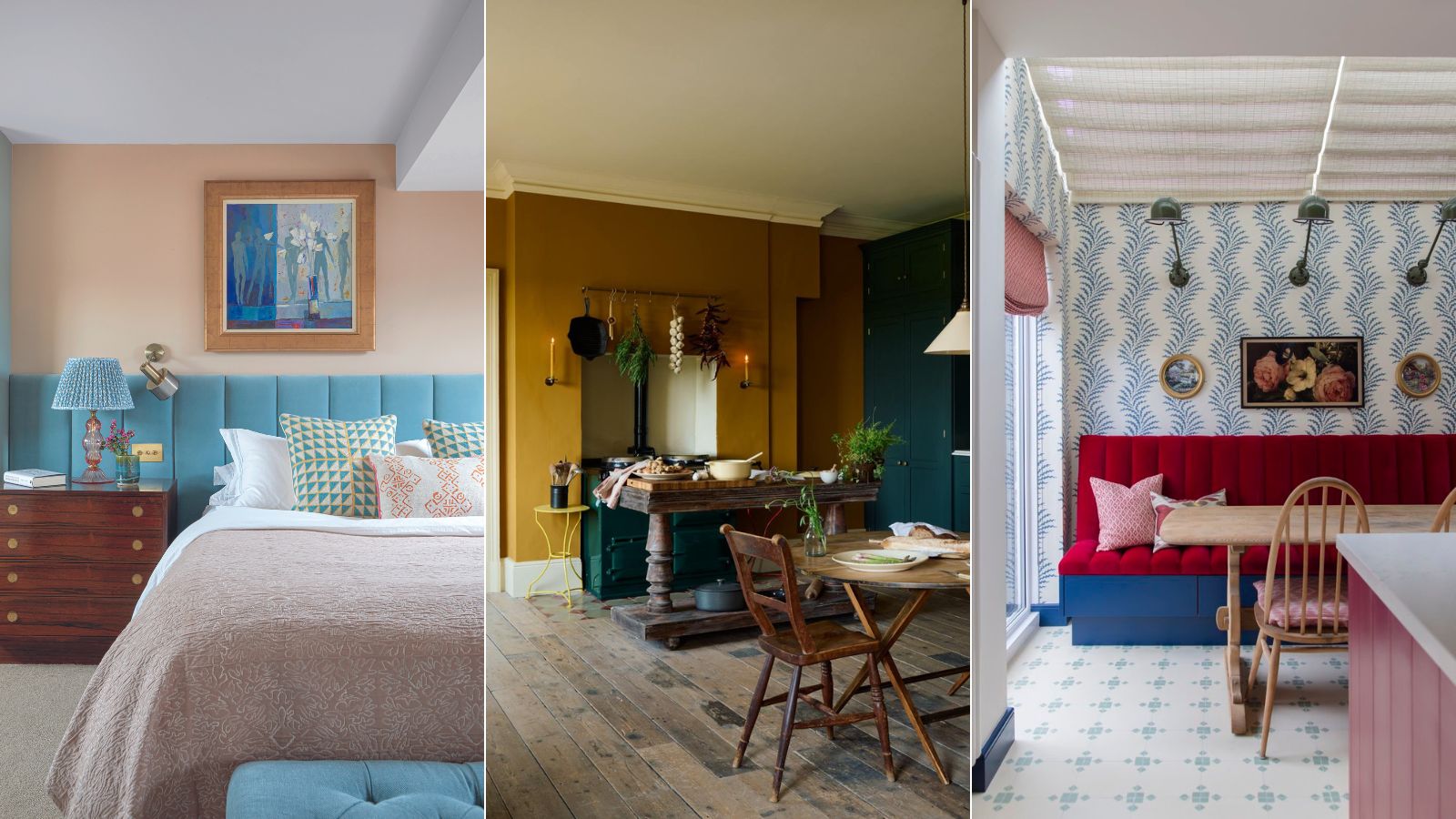

The term complementary often throws people off because, in the world of color theory, a complementary scheme actually means a contrasting scheme – bringing together colors from opposite sides of the color wheel. For example, red and green, blue and orange, yellow and purple.
Sounds bold. And complementary color scheme can be a pretty statement. But they are adaptable too, you can go as brave or as safe as you like depending on what shades you combine.
Using the color wheel in interior design is a great place to start, but things can go wrong when bringing together opposing colors. So we spoke with the interior designers and color experts about how to make a complementary color scheme work. What rules should you follow, how many colors should you use, and what colors do they involve?
What is a complementary color scheme?
'Complementary color schemes consist of groups of colors which greatly contrast, but when used together emphasize the other,' explains Charlotte Cosby, Creative Director Farrow & Ball. 'These tend to be colors found on the opposite side of the color wheel, like red and green, or blue and orange.'
'A complementary color scheme is all about bold contrast,' adds designer Kathy Kuo. 'These color combs are made up of hues that sit across from one another on a traditional color wheel. Think navy blue and goldenrod or sienna and olive green.'
To get specific, traditionally in the R-Y-B color model, there are three pairs of complementary colors – green and red, blue and orange, and yellow and magenta. But in interiors, you can get more experimental. Basically, pick a color on the wheel, look to the color opposite, and check out what going on around it too, and those are your complementary pairings.
'I love these schemes because you can be super playful. For example, if you were to paint your walls blue and then get a bright orange sofa, I'm pretty sure people would think, in theory, that was really bold,' explains Tash Bradley, director of interior design at Lick. 'However, because it's a complementary color scheme, it will always work and will always look chic. Have some faith in the color wheel.'

Tash is trained in color psychology and theory, she helps people around the world bring their dream decorating projects to life and utilize color to impact personal spaces, as well as overall lifestyle and wellness. Tash leverages her expertise in color psychology and theory, as well as interior design, to lead Lick’s design studio and curate the brand’s global paint and wallpaper offerings. To date, she has led 1,000+ color consultations for Lick clients, providing customers the confidence they need to create a home they’ll love.
Get the combinations right for how you want the room to feel
The first step to creating this scheme is to pick the right colors. Picking two colors from the opposite side of the wheel sounds simple, but there's slightly more to it because in interior design it's not as easy as picking a blue and pairing it with an orange, because there are so many variations of blue and so many variations of orange.
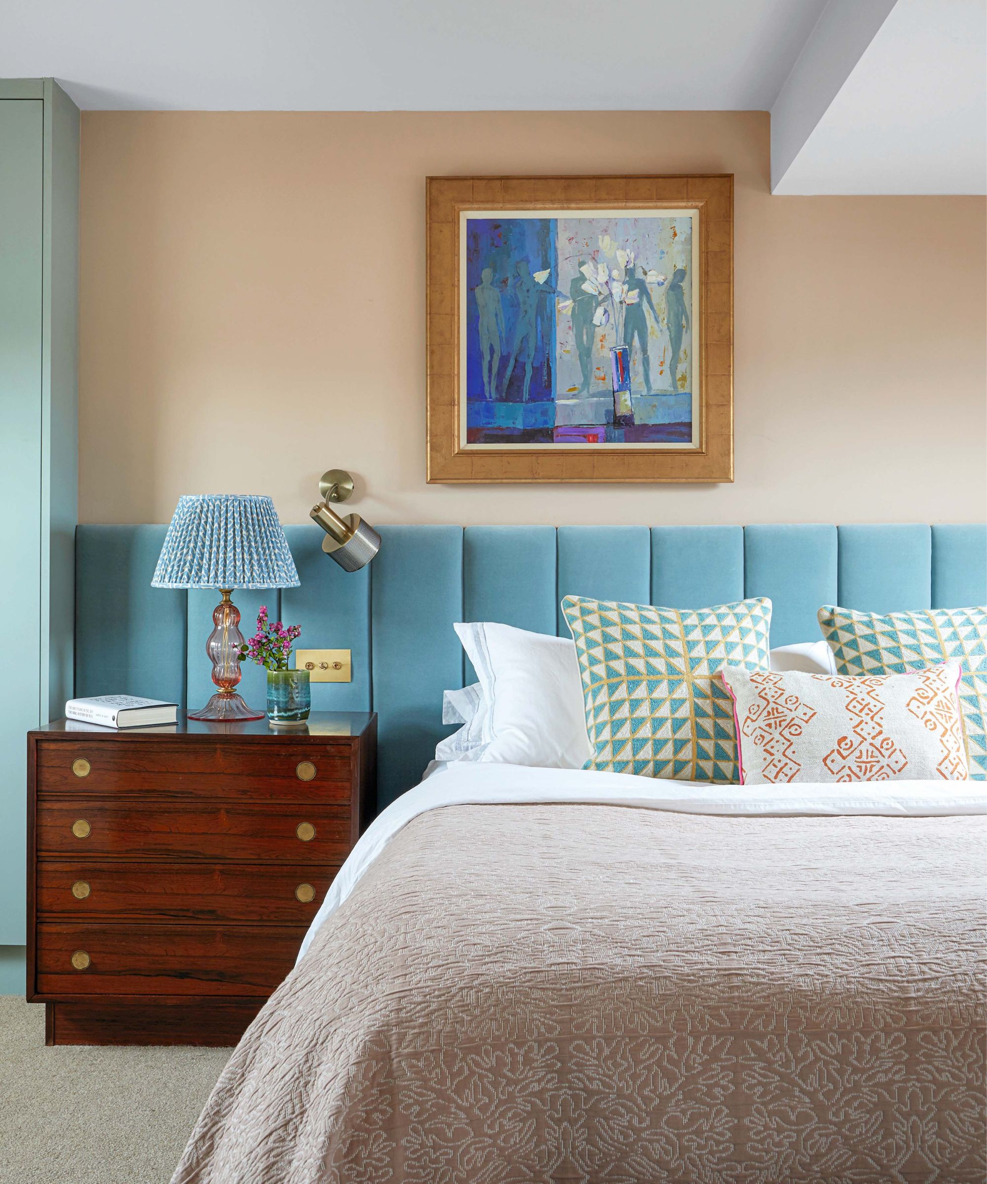
The opposing shades you choose depend on the look you want to achieve. If you are a brave decorator, going bold in both shades will have maximum impact, but the more approachable way to do the look is one bold shade and one softer shade. To use the blue and orange example again, a deep cobalt blue with a soft pale orange or (a favorite of ours) a deep terracotta with a light soft blue. Or for a really calming look, go pale on pale, as you can see in this bedroom, with a peach and a pale blue.
Helen Shaw, Director of Benjamin Moore, suggests the combination of bold and soft if you want to make the look more liveable. 'Two colors that sit opposite one another can add a dash of invigoration and is a sure-fire way to create a beautifully vibrant look. Although for an easier look try a paler shade of one and a darker hue of another which will still instill energy into your room without being too overpowering.' she advises.
Pick a dominant color
No color scheme should ever be a 50/50 split. For a space to feel easy on the eye, you need to pick a shade that will dominate and a shade that will be the accent. You don't want your colors to be competing for attention.
'In interior design, there's the 60/30/10 rule,' explains Tash Bradley. '60% is the dominant color, 30% is the sub-dominant color and 10% is the accent color. So as an example for a complementary color scheme, you could do a light blue on your ceilings, walls, and woodwork, then bring in a darker blue with your biggest piece of furniture (a couch, or a headboard), and then add a bright orange with your accessories. This is how you are going to get the most harmonizing color scheme with a complementary palette.'
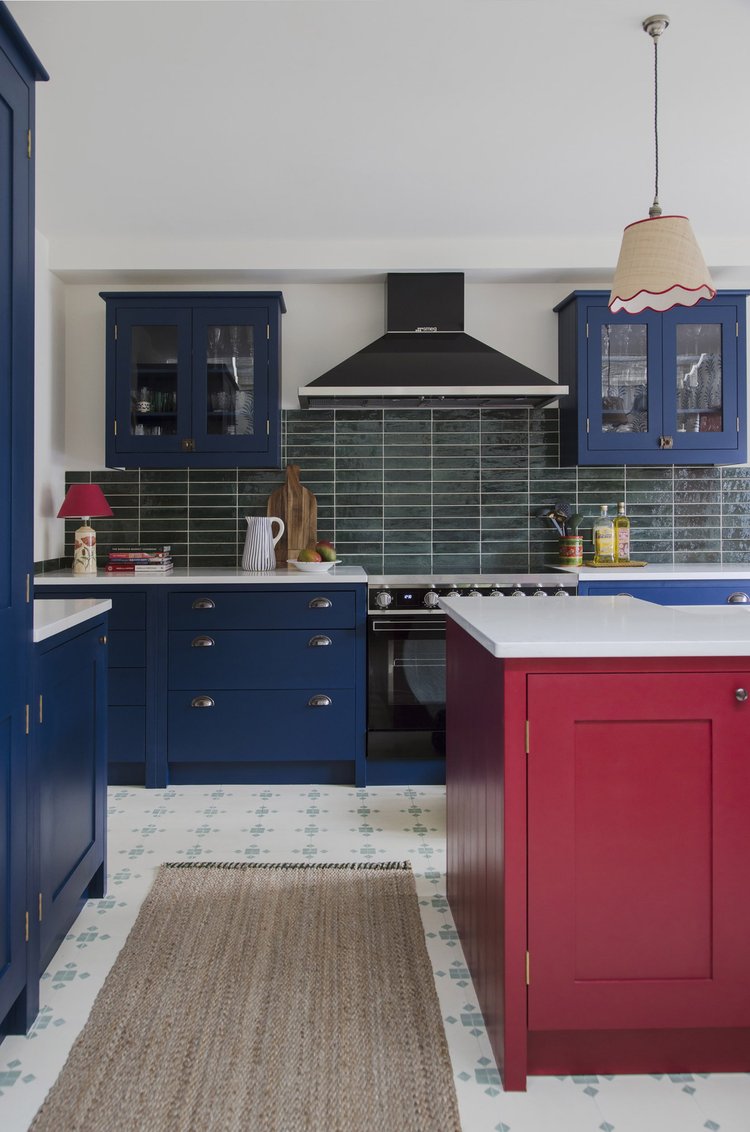
See how in this blue kitchen, that lovely deep cobalt blue is the dominant color. It's the cabinet color and then blue tones are also picked up again more subtly in the kitchen flooring and the backsplash tiles. The complementary color, the raspberry red, just comes in the island. The result is a bold and balanced scheme.
'By complementary colors, we mean the colors that sit directly across from one another on the color wheel. The colors can be shades and hues such as teal and apricot. The result, whatever the combination, is a high-contrast color pairing.' explains Tom Rutt, founder of TR Studios.
'Introducing a complementary color scheme into an interior can be tricky but one way to keep it from overwhelming a space is to take one color, let’s say a darky inky blue, and introduce the complimentary shade in smaller elements like decor or artwork or a statement piece of furniture.'

Tom Rutt has worked in the offices of Norman Foster and Michaelis Boyd before founding TR Studios in 2015.
Go for a more tonal layered approach
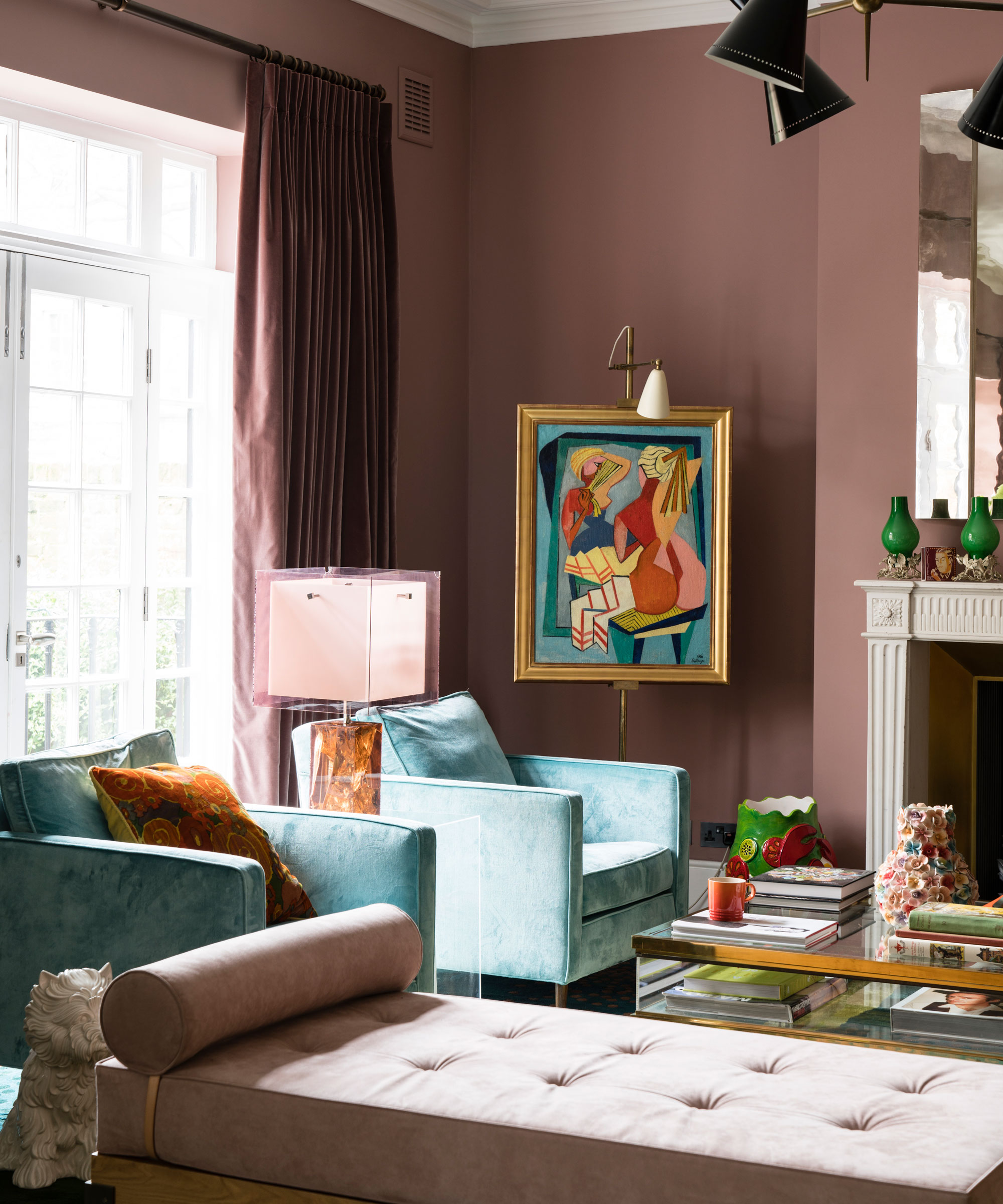
A complementary color scheme doesn't have to be about paring the boldest versions of the colors possible. You can create a soft, subtle complementary color scheme by using tints of that main hue – say instead of red and blue, switch to pink and a pastel blue.
And up that tonal effect by rather than just using two colors, using multiple shades of those two colors, bringing in lighter and darker versions of both shades to create a layered complementary scheme.
This is an easy approach in a room where you have lots of opportunities to bring in different shades – so bedroom and living rooms. In this pink living room, there are layers of that ever-on-trend plaster pink, some slightly darker, some lighter. And there are different shades of blue in there too. This can be a bit of a safer approach to this color scheme, but as this space proves, the result is still full of interest and depth.
Balance a bold contrast with calming neautrals
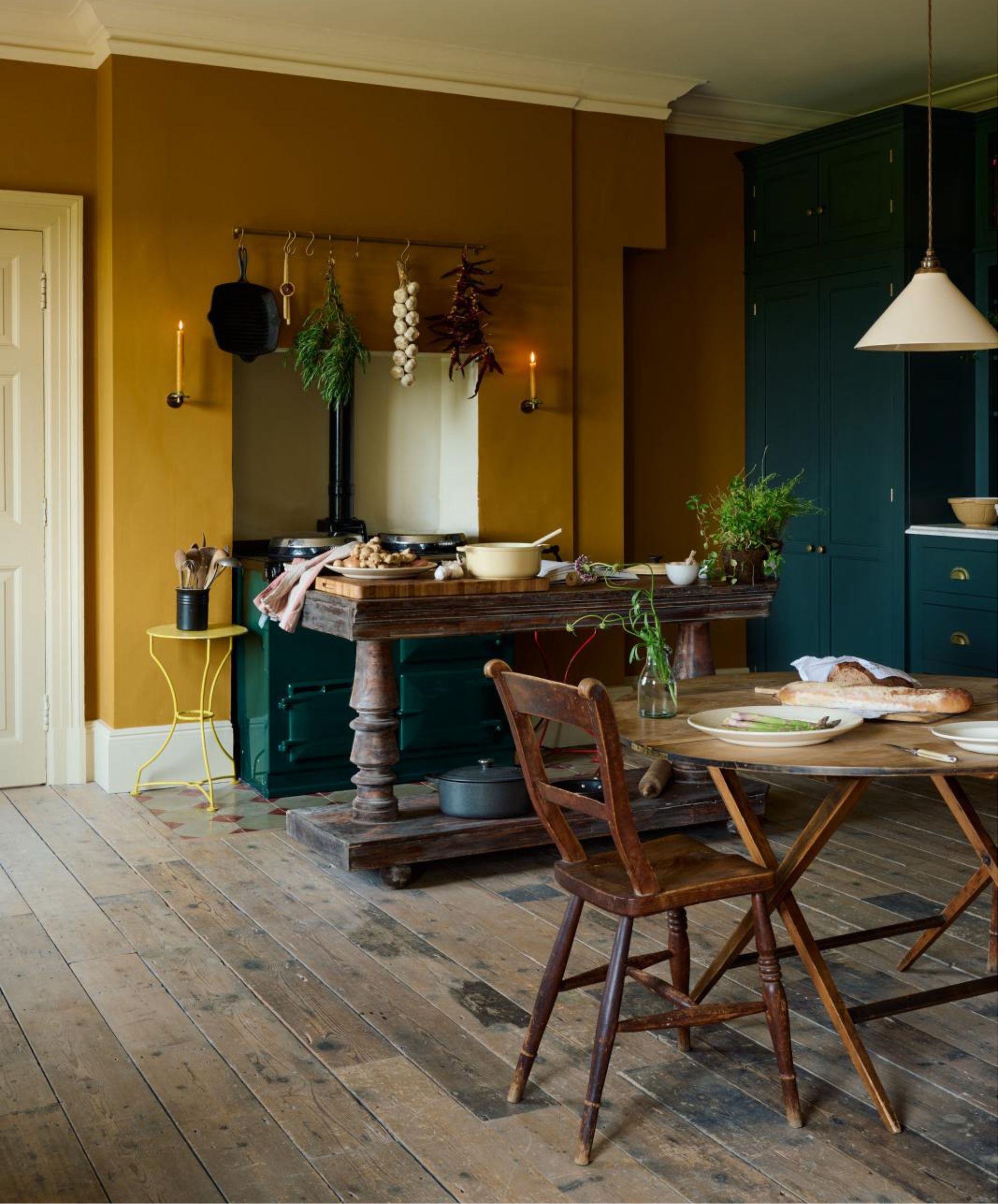
For a more liveable approach to the scheme, introducing a heavy dose of neutrals will break up those bolder hues and create some softer contrasts. In this two-tone kitchen designed by deVOL the intensity of these two dramatic shades is toned down the the warm cream accents in the ceiling, woodwork, and the alcove. You still get the impact of a complementary scheme, but the space doesn't feel overwhelmed by dark colors.
'A complementary color scheme in interior design is a color scheme that involves using colors that are directly opposite each other on the color wheel. These pairs of colors create a high contrast when used together.' explains designer Jennifer Davis.
'Common complementary color pairs include red and green, blue and orange, and yellow and purple. The strong contrast between the complementary colors can add energy and vibrancy to a room. However, it's important to use complementary colors carefully and balance them with neutral tones to prevent overwhelming the space.' she suggests.

Jennifer fell in love with design at a young age and has been working in the industry for over 25 years. She has developed an eye for detail and a talent for creating timeless designs. Jennifer offers a balance of creativity and forward-thinking with a structured, organized, and detailed mentality. Jennifer is driven by her deep passion for design while curating an exceptional client journey, ensuring pure delight from the very beginning to the end.
FAQs
How do you know if colors are complementary?
Easy. Pick your color, look to the opposite side of the color wheel and that is the complementary palette. You can look at either side too, for example, the opposite color to blue, is orange but yellow or red or any tone of orange also works in a complementary scheme. The best way to know if colors work together is to always order swatches and samples. Test out complementary color combinations in your space before you commit.
Complementary schemes are one of the core color theories. These combinations are tried and tested and in terms of being pleasing to look at, they always work. Things perhaps aren't that straightforward in interior design, and working with contrasting colors does have its challenges. But get these pairings right, and you create rooms that feel brave and beautiful.
Sign up to the Homes & Gardens newsletter
Design expertise in your inbox – from inspiring decorating ideas and beautiful celebrity homes to practical gardening advice and shopping round-ups.

I am the Head of Interiors at Homes & Gardens. I started off in the world of journalism in fashion and luxury travel and then landed my first interiors role at Real Homes and have been in the world of interior design ever since. Prior to my role at H&G I was the digital editor at Livingetc, from which I took a sabbatical to travel in my self-converted van (not as glamorous as decorating a home, but very satisfying). A year later, and with lots of technical DIY lessons learned I am back to writing and editing, sometimes even from the comfort of my home on wheels.
-
 This simple marble hack elevates my budget-friendly wooden kitchen countertops and prevents the dreaded water damage for way less than you’d think
This design trick looks expensive, solves a problem, and was the easiest decision I made during my kitchen reno
By Charlotte Olby Published
-
 Emily Blunt gifted Cillian Murphy this $545 pillow – she's 'obsessed' with these luxury pillows, and frankly, so are we
The Oppenheimer stars sleep on this ultra-luxe goose down pillow – here's why we love it – plus our affordable alternatives from $35
By Sophie Edwards Published