What colors go with cream? 8 complementary colors for this neutral favorite
From rich reds to beautiful blues, explore the best accent colors to use with this soothing and enduring neutral
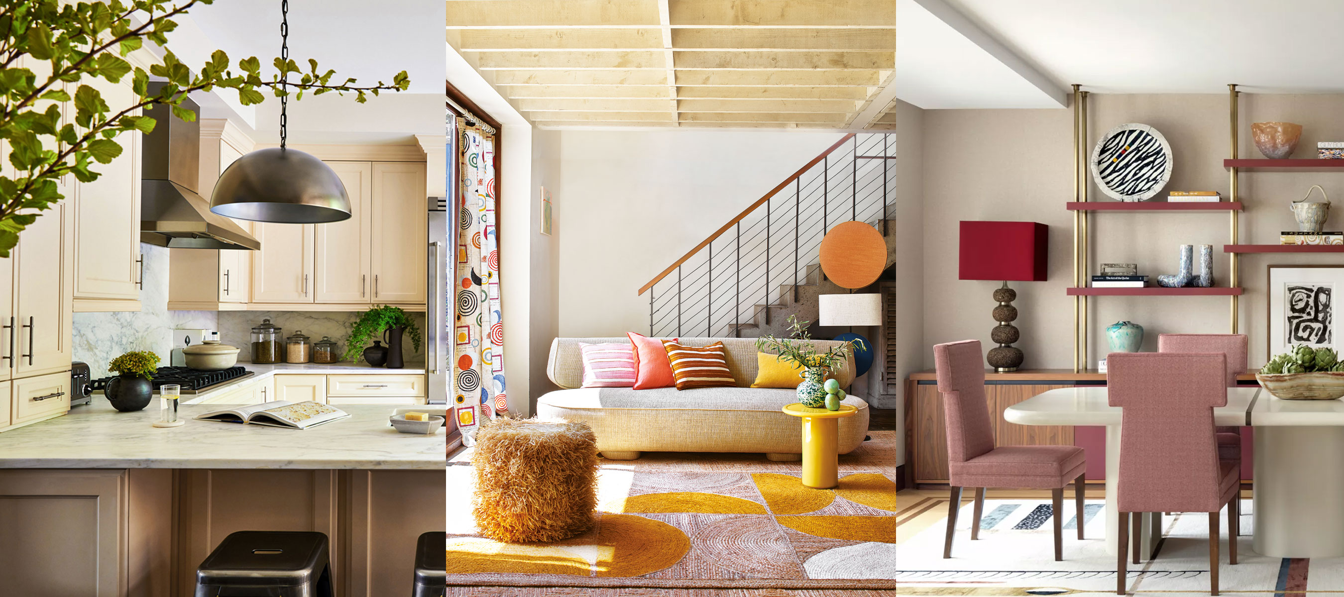

Timeless, sophisticated and wonderfully versatile, there is no denying the popularity of embracing a classic cream scheme in interior design.
The beauty of decorating with cream is that it has a whole host of varied accent colors that can suit room color ideas of all styles; from coordinating neutrals such as brown and beige, to bold brights and moodier, darker tones such as gray and blue.
So, if you're considering cream for the neutral room ideas in your home, it pays to know which colors can be perfectly paired with this much-loved neutral shade.
The 8 best colors that work with cream
'Elegant and serene, cream is an utterly versatile color that is a joy to decorate with. It is a wonderful way to bring a calming feel into a space and can also add real vibrancy.
Pairing beautifully with more subtle shades such as tan, taupe and nudes, it also makes a wonderful backdrop for other brighter colors, materials and textures to shine. A great way to bring an organic, earthy feel into the home, it connects us to our surroundings and makes us feel grounded' says interior designer Naomi Astley Clarke.
To uplift a calming cream design with further depth and beautiful complementary color, explore our eight favorite accent colors for cream.

London-based interior designer Naomi Astley Clarke has worked in the interior design industry for more than 20 years and has a client base of movie stars, producers, music moguls, professionals, and entrepreneurs. She creates uplifting and exciting renovations and refurbishments of both residential and commercial properties.
1. A fellow neutral shade
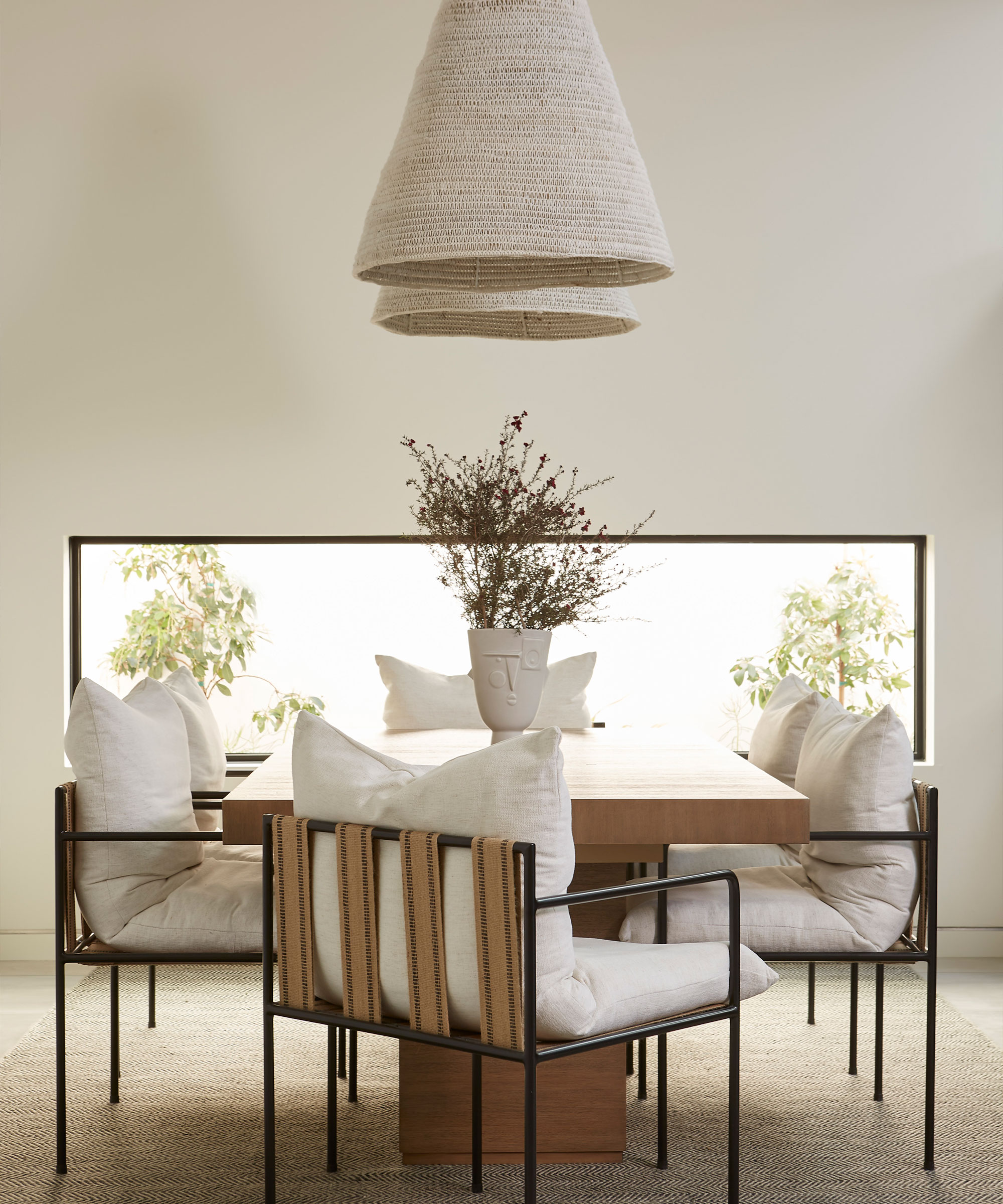
For a soothing and relaxed space that embodies an earthy and grounding feel, unite cream with a fellow neutral shade.
As Sherwin-Williams color expert, Sue Wadden says, 'a great way to accent a cream-colored space is by including another neutral hue. A beige shade like Touch of Sand [from Sherwin Williams] when paired with another cream color will bring a calming and laid back vibe to any room.'
In this cozy cream dining room, designed by Lucie Ayres of 22 Interiors, the minimalist design celebrates a simple, neutral palette. The darker brown and beige tones of the seating and rug, along with the warming wooden dining table, establish a soft, subtle contrast with the cream dining room paint ideas.
The use of cream throughout the space really allows for the sense of texture to take center stage, establishing a relaxing and inviting space to sit comfortably, dine and socialize.

With a strong background in design and color leadership, Sue Wadden was appointed director of color marketing at Sherwin-Williams in 2016, and has been with the paint brand since 1998.
2. A beautiful blue
The color wheel should always be explored when understanding what colors go together. Complementary colors are usually opposites, and sit directly across each other on the wheel, with cream positioned across from blue.
'Blue married with cream can create a sophisticated, classic scheme that is great for a kitchen or "thought heavy" areas such as a home office or library,' advises Helen Shaw, color expert at Benjamin Moore.
If you're exploring coastal decor ideas, swap out white for cream, as this will offer more warmth and a greater sense of balance with cooling blue tones.
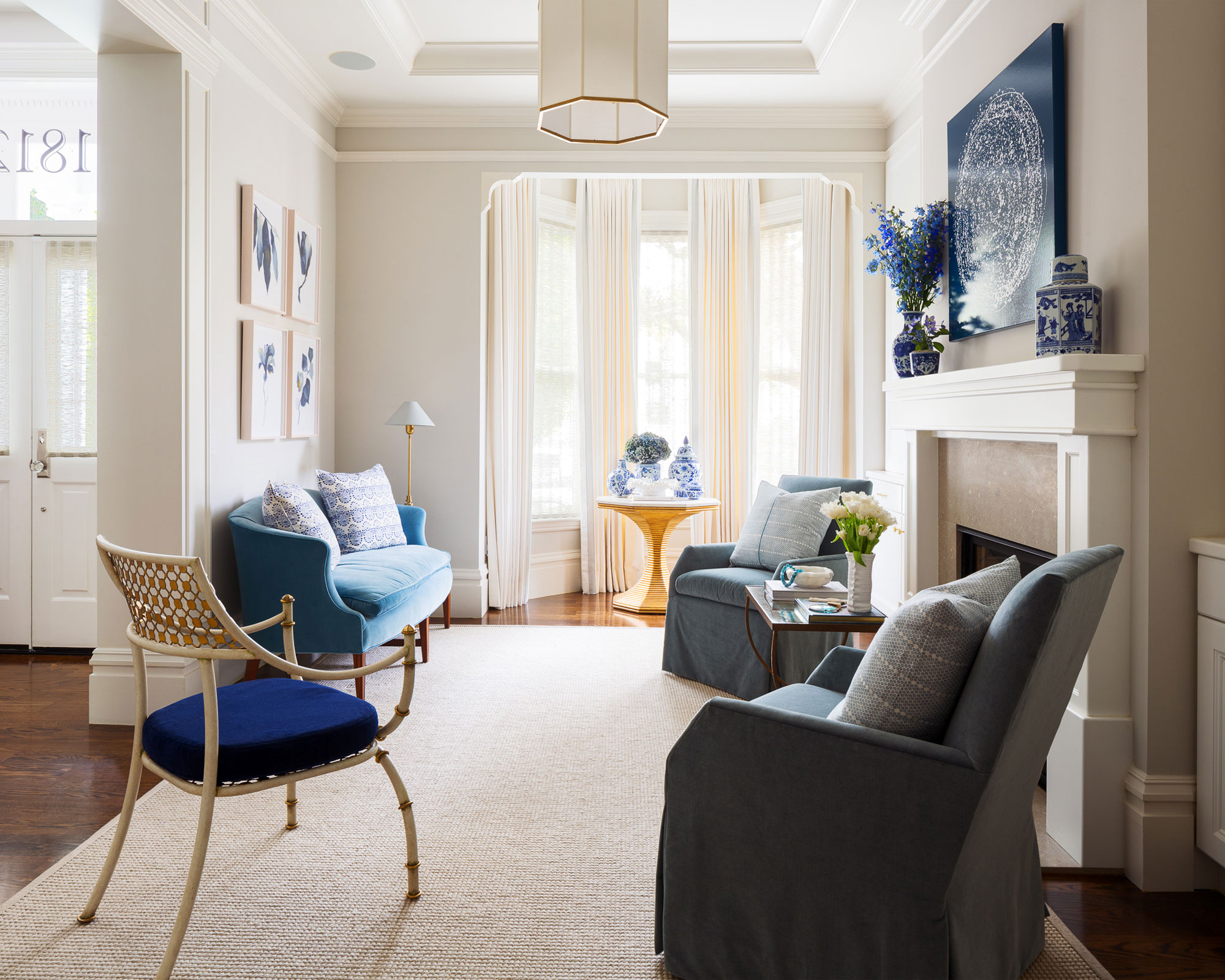
Various shades of blue have been used in this elegant parlor, designed by Margaret Ash Design, with the cream-painted walls and soft rug allowing for the colorful artwork and blue upholstery to capture the focus in the space.
She says of the design, 'in this modern-day parlor room, we used harmonious tones of blue and cream to evoke an ambiance of formality while still being inviting and comfortable.'

Helen Shaw is part of Benjamin Moore's UK division. Color expert and international marketing director, Helen and her husband Craig are founders of Shaw Paints, acquired by Benjamin Moore in 2020.

Margaret Ash Design is a contemporary interior design firm specializing in full-scale residential and commercial projects. Margaret and her team specialize in designs that reflect diverse influences, modern interiors, and tailored color palettes.
3. Opt for a glorious green
Over the last few years, green has become one of the most popular colors to decorate with, ideal for use in pretty much any room of the home – as we explore in our list of favorite green room ideas.
Decorating with green can enhance our connection with the outside world and establish a welcoming indoor-outdoor feel in the home. These colors of nature often make us feel more relaxed and at ease – and it doesn't get more soothing than a cream and green scheme.
For accent paint ideas, Patrick O'Donnell, color expert from Farrow & Ball advises, 'for a contemporary color scheme, try teaming cream with muddy sage greens, such as French Gray at the paler end or Green Smoke at the moodier end of the scale, both from Farrow & Ball.'
Sofas can also be another great way to bring a beautiful accent color into a scheme, and they provide a great opportunity to really make an eye-catching design statement – especially if you're using a lighter neutral on the walls, such as cream.
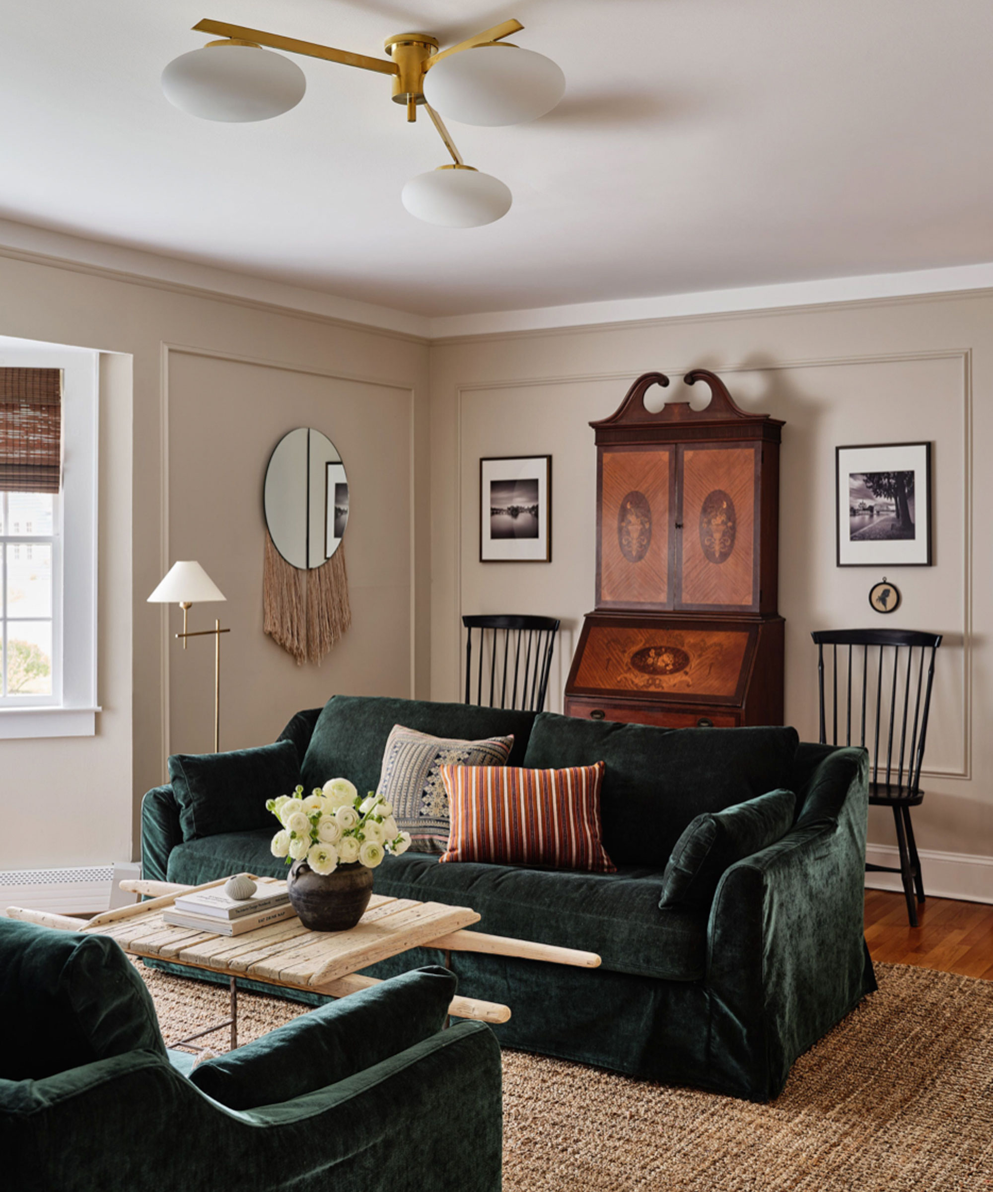
As shown in this living room by Ryann Swan Design, the plush, green velvet sofa establishes a wonderful contrast with the neutral palette used across the rest of the room, with the overall look creating an eclectic mix of contrasting textures, styles of furniture and colors – a beautiful blend of the old and the new.
There are plenty of other colors that go with green too if you want to introduce another shade into your scheme.

Patrick O’Donnell is Farrow & Ball's color consultant & brand ambassador and has been with the brand since 2012. Patrick works with designers in the UK and North America, helping to bring their projects alive with the iconic, F&B color palette.
4. Embrace a warming, bright shade
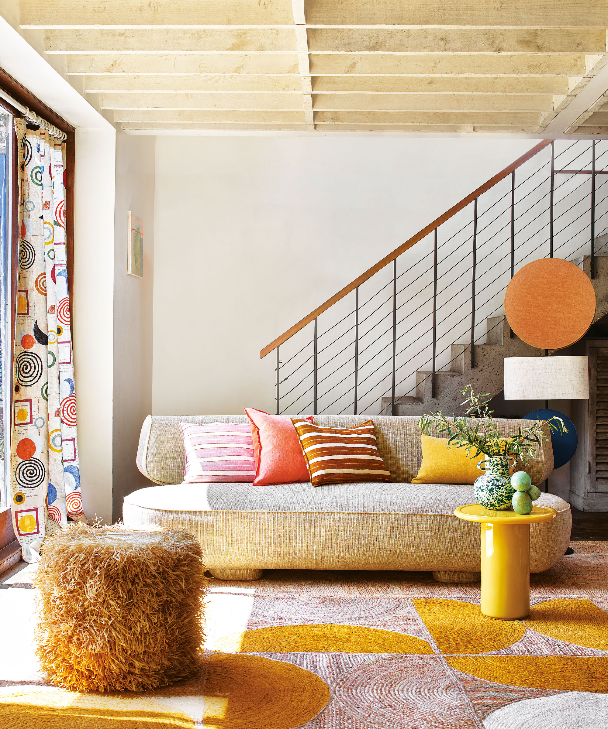
'Since most cream colors tend to bring a subtle warmth into a room, I recommend pairing with other warm hues, like Reynard [from Sherwin-Williams]. This clay-like color pairs amazingly well with cream to create a comforting and mellow space – but it is still a little adventurous,' says Sue Wadden from Sherwin-Williams.
This years' color trends are all about taking risks and being brave and bold with color, with a shift away from cooler palettes in favor of more welcoming, warming shades.
NYC-based interior designer, Artem Kropovinsky says, 'a bright coral or sunshine yellow is a great choice for creating a more playful and inviting atmosphere in the home.' Whether you choose to mix both of these sunny shades into a cream scheme, as shown in the artful modern living room above, or just opt for the one, both will be sure to uplift your design with joyful character – perfect for colorful room ideas.
Living In Color – published by Phaidon | $39.95 at Design Within Reach
From the purest white to the deepest black, explore 200 interiors from 130 designers organized by color.

Founder of NYC-based interior design firm, Arsight, Artem Kropovinsky has a decade of extensive global design experience, connecting a cohesive, collaborative team of passionate professionals, who work on interior projects in the US and worldwide.
5. Choose a rich red
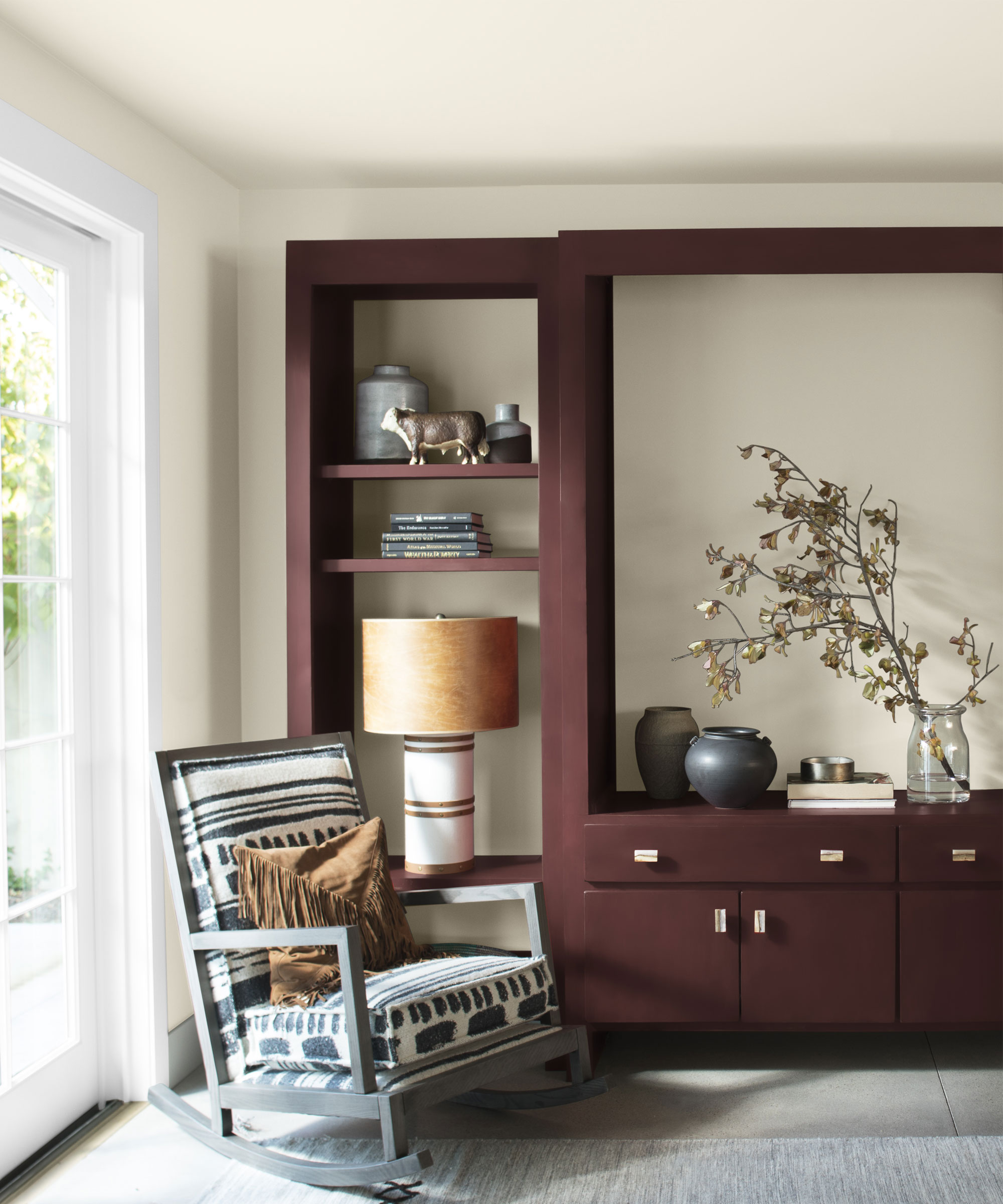
'Given that cream has a brown undertone in it, we suggest pairing creams with earth tones such as dusty mauve, plum and burgundy,' advises Texas-based interior designer Audrey Scheck.
Red room ideas certainly are not for everyone, but a rich, deep red such as a beautiful burgundy can create a sophisticated color scheme when paired with a brighter, calming neutral such as cream.
As shown in this living room, the colorful storage and display unit has been painted in Benjamin Moore New London Burgundy, a distinguished, deep red with violet undertones, with the walls painted in a complementary Sea Pearl cream, also from Benjamin Moore.
'As cream is a neutral shade, it makes the perfect backdrop for a strong accent color, such as rich, jewel-inspired color like burgundy,' says Helen Shaw.

With more than a half-dozen years of experience in remodels and renovations, Audrey Scheck leads Audrey Scheck Design, a full-service interior design firm based in Austin, Texas.
6. A pretty pink
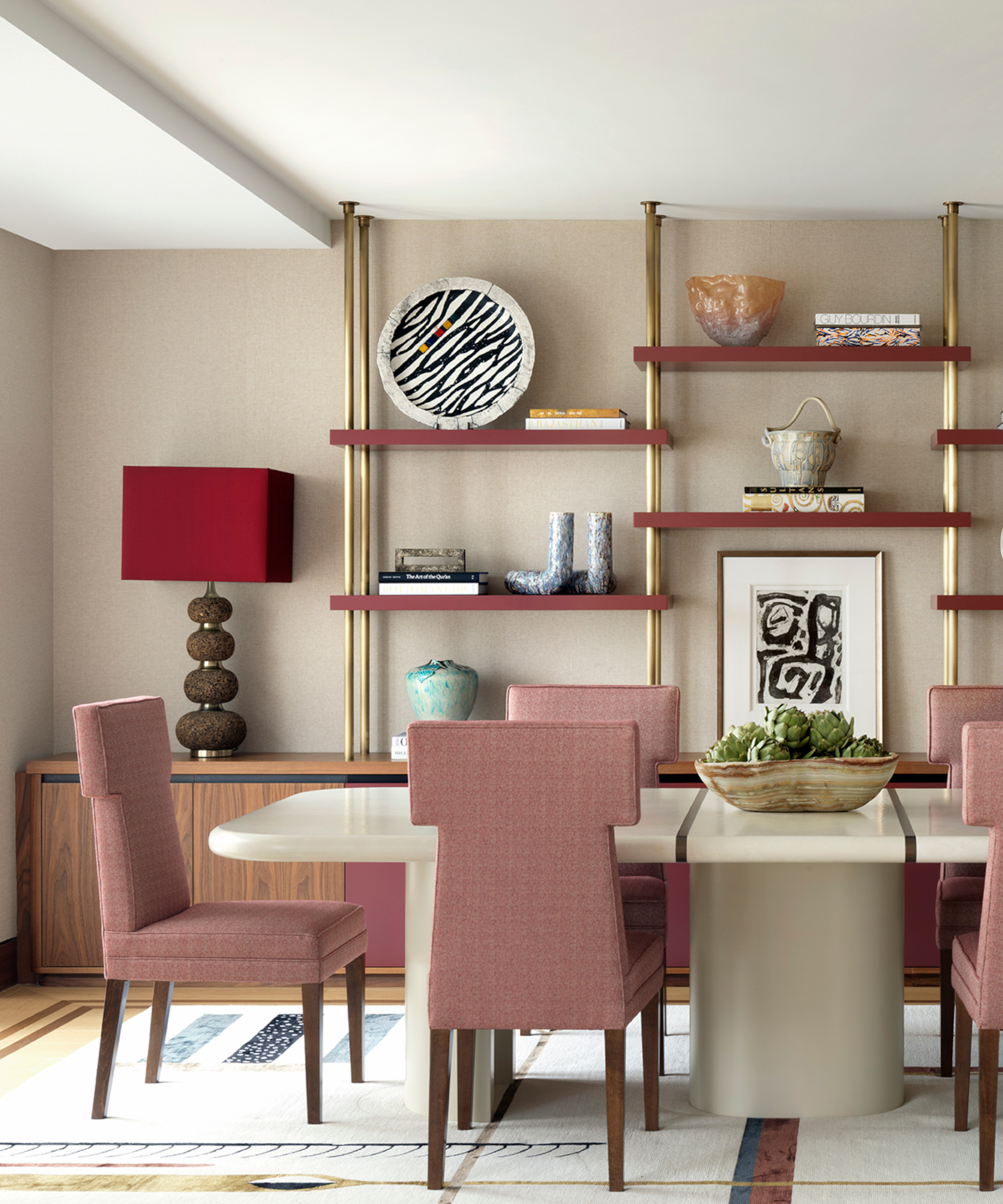
Similar to red, a pretty pink and cream palette can establish a truly elegant design – and as both have similar cozy undertones, they can work well to add a feeling of warmth to a room.
'Working exclusively with earth tones, such as cream, is an easy way for your home to feel cohesive. While it may be intimidating to add color, as long as the undertone of your accents remain consistent, the whole scheme will work wonderfully as one,' advises Audrey Scheck.
For a tonal look, pair cream with a soft, pale pink, or for something more bright and impactful, let cream provide the perfect backdrop for a bolder accent shade, such as magenta.
7. Go for black or gray for a classic look
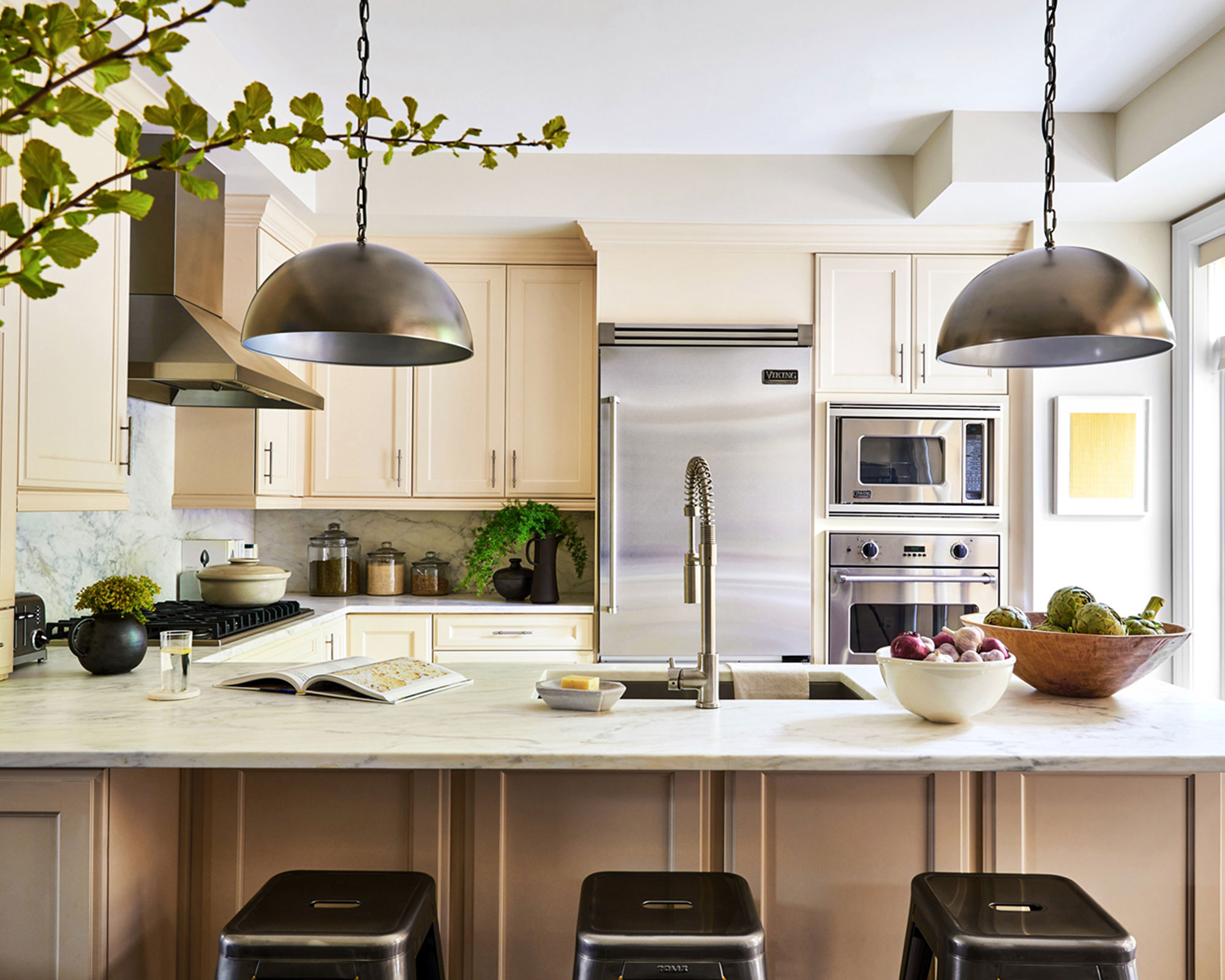
As we have explored, creams provide the perfect complement to darker colors, so are ideal for balancing out some of the darkest shades on the color spectrum, such as black and gray. As the popular saying goes, opposites always attract – especially when it comes to color!
In this sophisticated, contemporary cream kitchen, designed by J Patryce Design, an elegant contrast is formed between the traditional cream cabinetry and a collection of black and gray accents. The two industrial dark gray rounded pendants work cohesively with the gray appliances, with the sleek black bar stools drawing your focus to the kitchen island area.
The darker colors and metal finishes add a stylish, modern edge to the kitchen space, with the use of cream helping to ensure the space remains warm and inviting.
8. Pair cream with cream
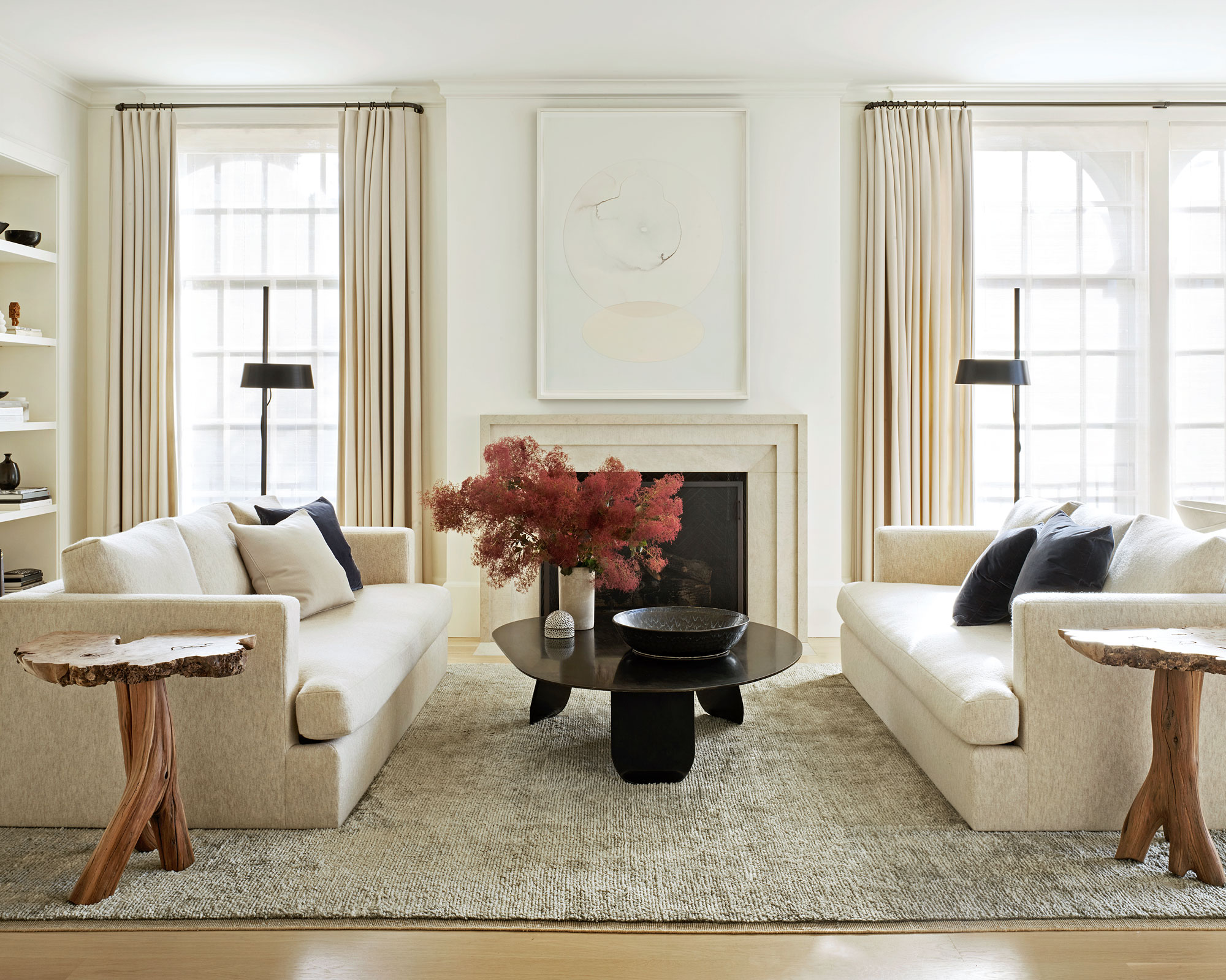
If you cannot get enough of a calming cream color palette, then fear not, pairing cream with cream can make for the ultimate soothing sanctuary.
Patrick O'Donnell advises, 'try two creams together, such as Farrow & Ball's palest New White on your walls which will deliver a soft glow in a brightly lit south-facing room, but use a stronger cream on your trim to frame the paler sibling. Something like Double Cream from our archive would be beautiful.'
FAQs
Do gray and white go with cream?
A gray, white and cream scheme can create a calming, neutral space that will feel utterly timeless.
Whether you opt for a light or dark gray, the use of brighter, lighter neutrals such as cream and white will make for an elegant contrast and color pairing.
For example, a warm white on the walls paired with cream curtains and a gray sofa will work wonderfully.
'We all seem to have preconceptions of decorating with cream as a hangover from the 1980s and 90s, but remember, used as a woodwork color it creates softness over generic whites, and as a wall color can deliver gentle warmth if a clean white room is what you’re after,' says Patrick O'Donnell from Farrow & Ball.
'Cream can also make a great option for ceiling paint if you are using yellows, gentle pinks or earthy reds on your walls.'
Sign up to the Homes & Gardens newsletter
Design expertise in your inbox – from inspiring decorating ideas and beautiful celebrity homes to practical gardening advice and shopping round-ups.

Zara joined Homes & Gardens in February 2022 as a Content Editor. After studying English Literature at University, she worked as an Ecommerce Website Editor, Content Writer and Buying Intern at multiple independent businesses within the luxury retail and lifestyle sectors. Her role at Homes & Gardens unites her love, experience and passion for the world of design and desire to create inspiring written content. She enjoys nothing more than discovering new trends, brands and products, whether that be in fashion, interior design or lifestyle.
-
 Jeremiah Brent's new NYC-inspired rug collection has got to be the easiest way to bring his modern Manhattan style into your own home
Jeremiah Brent has teamed up with Loloi Rugs to create a contemporary collection of home furnishings inspired by his city
By Eleanor Richardson
-
 I tried this one easy dishwasher trick and made the annoying need for manual drying a thing of the past
If you hate those little pools of water left on your cups and crockery, this towel trick is for you
By Punteha van Terheyden
