

Pale blue is a delicate, calming color that can be used essentially as a neutral shade across your home's color schemes. But when decorating with this soft tone, it's important to know which colors to pair best with blue.
Whether you're using pale blue paints in a relaxing bedroom or elegant living space, creating stylish color combinations is sure to add interest and depth to your scheme, whether you want to enhance its softness or create some contrast.
Below, we've rounded up seven of the best colors to pair with pale blue, from brown tones to lighter neutrals, as recommended by interior designers and color experts.
The best colors to pair with pale blue

'I absolutely adore pale blue! It’s such a versatile and chameleon-like paint color, effortlessly shifting between elegant, sophisticated, fun, childlike, and calming, depending on how it’s used. The key is selecting the right shade – which, admittedly, can be challenging – to achieve the exact look you’re envisioning,' says interior designer Prudence Bailey of Prudence Home & Design.
'Pale blue requires intentionality, as the wrong shade can veer into a babyish or unsophisticated territory. However, when chosen thoughtfully, it’s incredibly adaptable and pairs beautifully with a variety of colors. Its compatibility largely depends on the saturation levels of the accompanying hues,' adds Prudence.
1. Pastels

For a soft interior scheme, pale blue works well with delicate pastel tones such as mint green and lilac. 'I love pairing pale blue with mint green, soft pinks, yellows, and lavender,' shares designer Prudence Bailey.
'It creates the perfect backdrop for these tones, bringing out their subtle vibrancy. In fact, I recently designed a sitting room drenched entirely in pale blue, layering it with a pretty pastel palette inspired by a stunning painting by Yvonne Claveloux. The result was a serene and visually captivating space,' says Prudence.
2. Brown

'The best color to go with pale blue are different shades of brown,' says interior designer Miranda Cullen of Inside Stories. 'The reason for this is that blue and orange are on opposite sides of this color wheel, which means they contrast strongly but complement each other as they do it. Whether it’s a rich wood or a relaxed brown leather, brown is a beautiful complement to blue as it adds warmth, contrast, and depth.'
If your room features lots of warm wood tones throughout the furniture and you're wondering what color to paint the walls, pale blue paints such as Farrow & Ball's Lulworth Blue and Benjamin Moore's Winter Lake can make a stylish choice.
3. Soft, light neutrals

'Pale blue is such a calming, serene color, and it works wonderfully with soft neutrals and warm natural materials,' explains designer Glenna Stone of Glenna Stone Interiors.
'Pairing it with whites or creams creates a light, airy feel that’s perfect for spaces where you want to unwind. One of our favorites is Benjamin Moore’s Gray Lake. It has a tranquil, soothing vibe that makes it ideal for bedrooms or other relaxation spaces. When you combine pale blue with natural wood tones and soft neutrals, it strikes the perfect balance – serene yet elegant, with just the right touch of sophistication,' Glenna adds.
4. Darker blues and a pop of red

‘Pale blue is an evocative color that pairs well with shades of green; a combination that is a true evocation of nature delivered indoors,' says Little Greene's creative director Ruth Mottershead. 'To create a layered look, take inspiration from the double-drenching approach, which combines varying tones of the same color. Combine the fresh and inviting Sky Blue with the delicate blue-green Brighton and muted Etruria to add depth and dimension to a room for a dynamic finish.'
'Pale blues also contrast well with warmer accents such as Heat, which will add vibrancy and balance with the cooler tone of the blue, it is also a brilliant color to pair with soft, earthy tones such as Silt and Slaked Lime, where the gentle hint of blue will evoke a calming, serene ambiance that feels grounded by the neutral shades, creating a restful and restorative space,' says Ruth.
5. Charcoal

If your interior design style leans toward modern decorating ideas, then charcoal can make a welcomed color pairing for pale blue.
'For contemporary spaces, pale blue pairs beautifully with charcoal,' shares London-based interior designer Melissa Read, creative director at Studio Burntwood. 'For example, Paint and Paper Library's Cotton II, part of their architectural collection. The key is in contrast – whether soft or striking, they make pale blue feel dynamic and fresh.'
6. White

You can't go wrong with the classic pairing of blue and white, which feels reminiscent of coastal decor ideas. Designer Sabah Mansoor of Sabah Mansoor Design explains that this pairing works especially well with cool-toned blues:
'When the blue has a cool undertone, it can easily be paired with white or off-white. With this simple color combination, I like to layer various shades of blue in the same tone, and add in textures for additional depth.'
7. Orange

Lastly, since blue and orange are opposite one another on the color wheel, they make a stylish pairing. But it doesn't need to be with vibrant orange tones, take inspiration from this calming bedroom that uses muted, soft orange hues.
'I love pairing pale blue with orange and soft oatmeal tones as seen in this bedroom,' says interior designer Cindy McKay of Cindy McKay Interiors. 'I think they complement each other so well. The orange brings the soft blue to life while the blue helps calm the orange down.'
Pale blue is a versatile color that looks good with so many other shades, whether you want to create contrast with much richer shades or create a lighter look with complementary neutrals.

You must confirm your public display name before commenting
Please logout and then login again, you will then be prompted to enter your display name.
-
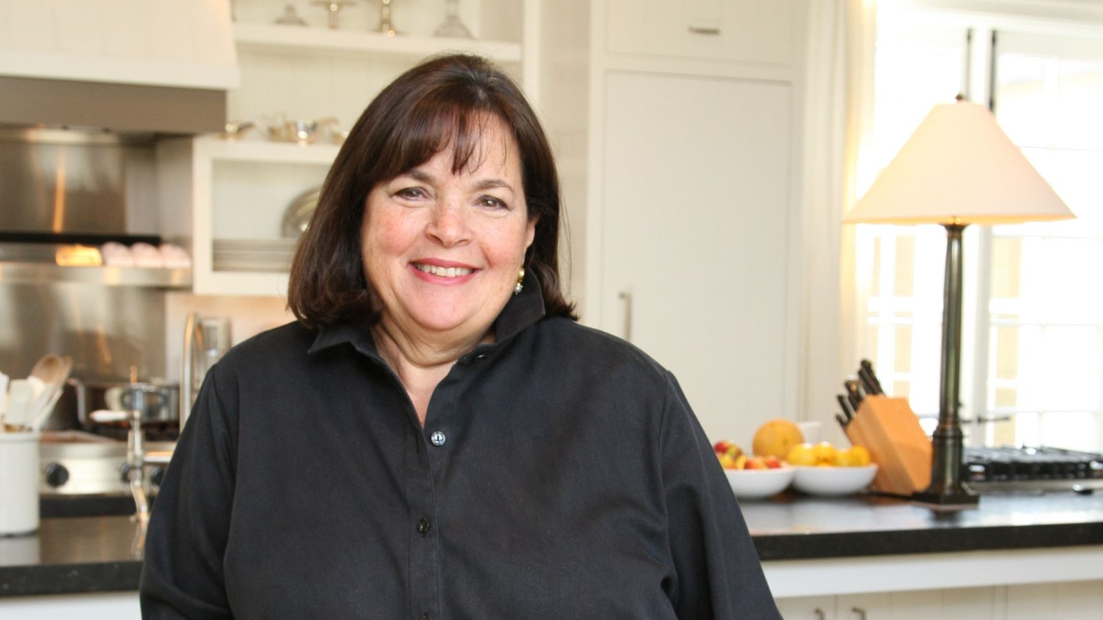 Ina Garten's storage pantry is an insightful window into all of the best cookware used by the chef – and it's easy to recreate on your kitchen shelves from $48
The beautiful dishware in The Barefoot Contessa's Hamptons pantry showcases the tools she uses most often to cook – this is exactly how you replicate it
-
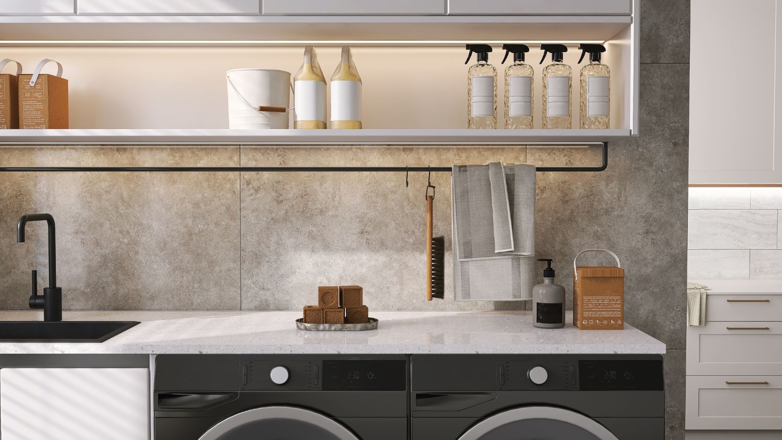 Extend the lifespan of your appliance with 5 simple but crucial washing machine maintenance tips
From cleaning the filters to keeping the door open, experts reveal the washer tips they swear by

