What color is slate? A popular choice for the modern home
A beautiful gray shade with references to the natural world, we explore the question, what color is slate?
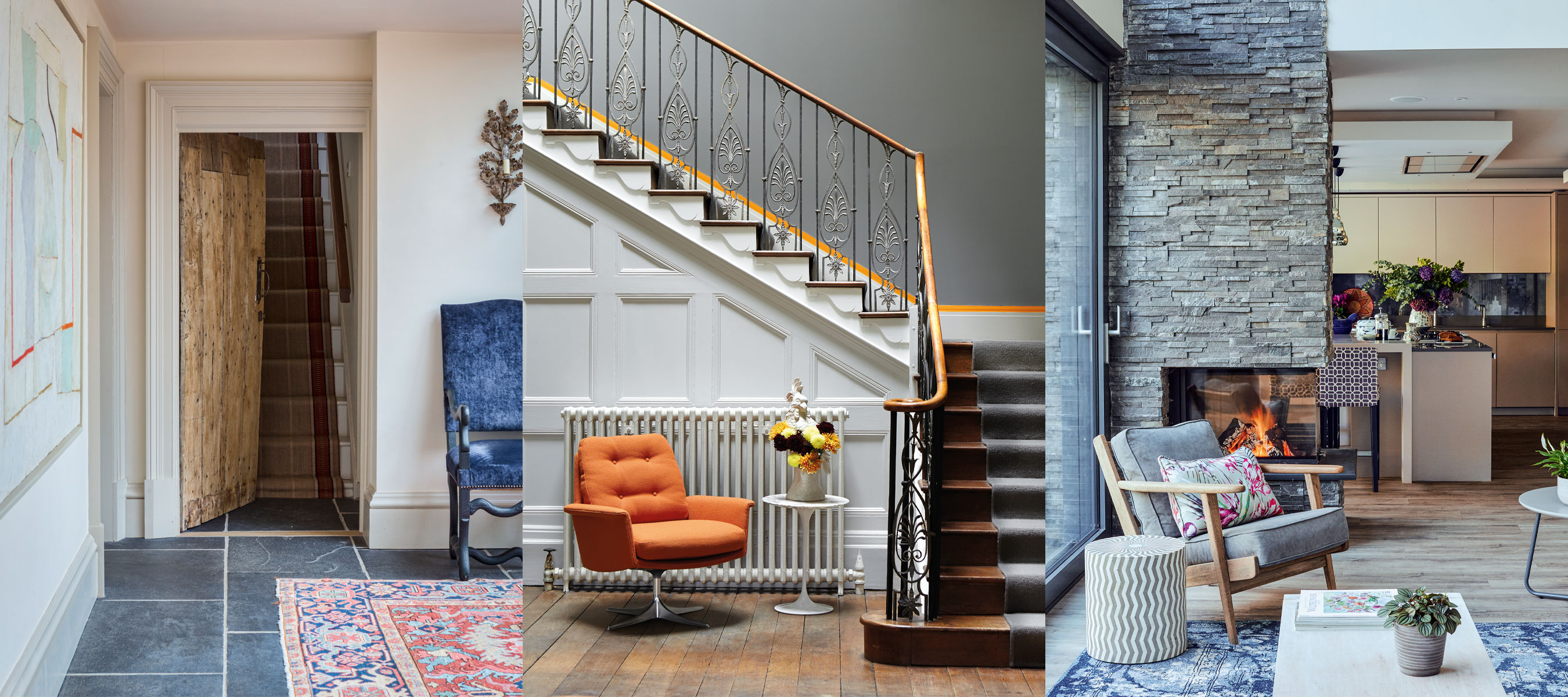

As there are a spectrum of different gray shades out there, with gray being an enduringly popular color for decoration in the home, we ask the question, what color is slate?
Named after the metamorphic rock of the same color, known for being used as a building material for flooring and roof tile designs, slate is considered to be a gray shade with beautiful blue undertones.
When planning room color ideas, slate can bring a sense of the outdoors into the home, as well as create a sophisticated, modern scheme, working well for both classic and contemporary interiors. A versatile neutral, when decorating with gray, working with the color slate can bring a timeless appeal to your chosen environment.
What color is slate? We explore how to decorate with slate
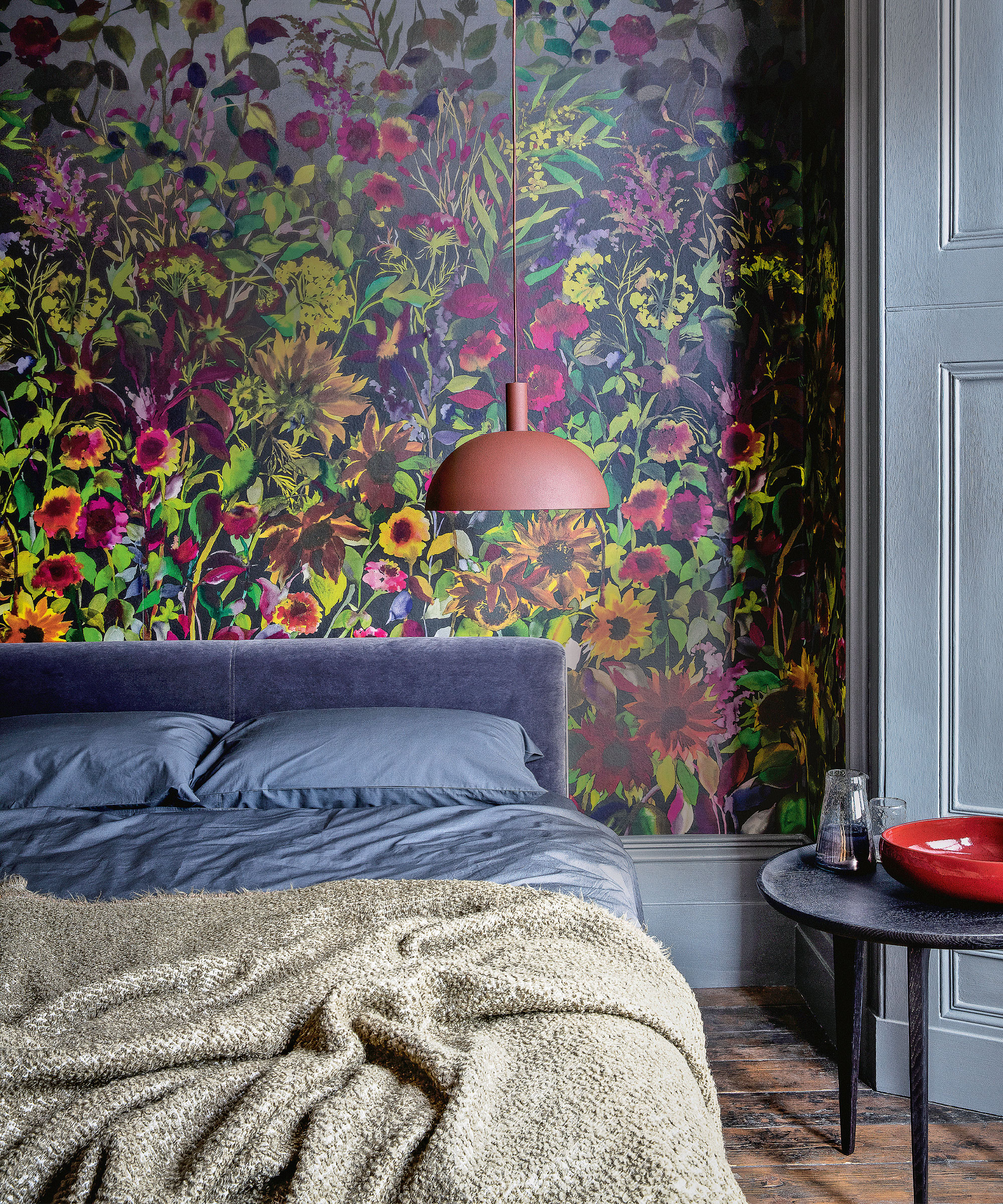
On the color wheel, slate is a tertiary color that is created through a mix of purple and green - a tertiary color is made when combining equal amounts of a primary and secondary color.
As slate is a mixed color, there are many different shades available, with some closer to dark gray and some closer to blue, however typically, slate is regarded as a gray shade.
Sue Wadden, director of color marketing at Sherwin-Williams states, 'slate, based on the rock material of the same name, is an earthy shade of gray that can range from deep to light.'
When using the color slate in interior design, whether through paint, soft furnishings, or the actual stone itself, the color offers an array of possibilities. Ideal for neutral room ideas, as well as for being bold with paint ideas, slate can be used to create both a subtle and striking effect in a space.
Justyna Korczynska, senior designer at Crown Paints states, 'different shades of gray are hugely versatile – they have more color and texture within them than straight black – a monochrome scheme of black and white is much more unforgiving than one of shades of slate and clay, which will change subtlety with the light throughout the day, giving them personality and character.'
What color is close to slate?
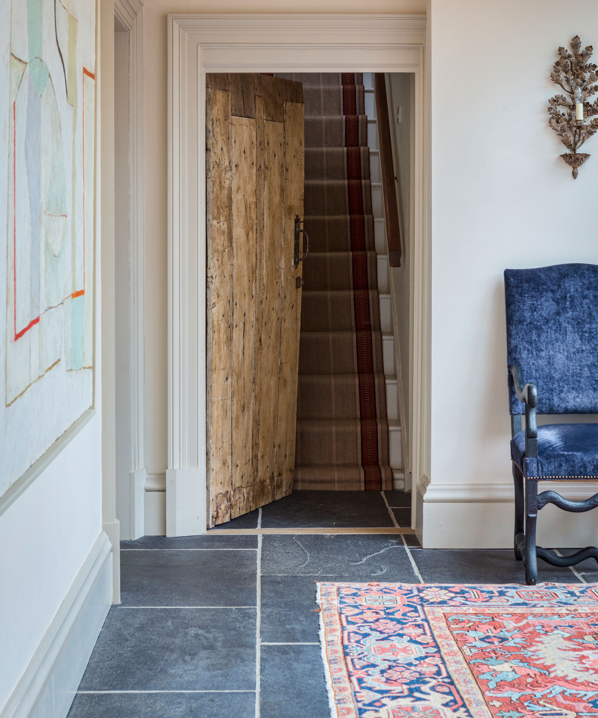
Slate is popularly known to be a shade of gray, inspired by the natural colors and varieties of slate rock. As the color stems from a mix of purple and green, there are many slate shades with these subtle undertones, as well as others that are similar to different shades of gray.
As slate is a mixed, tertiary color, there are always going to be a variety of options to choose from when planning your slate décor ideas.
Is slate more blue or gray?
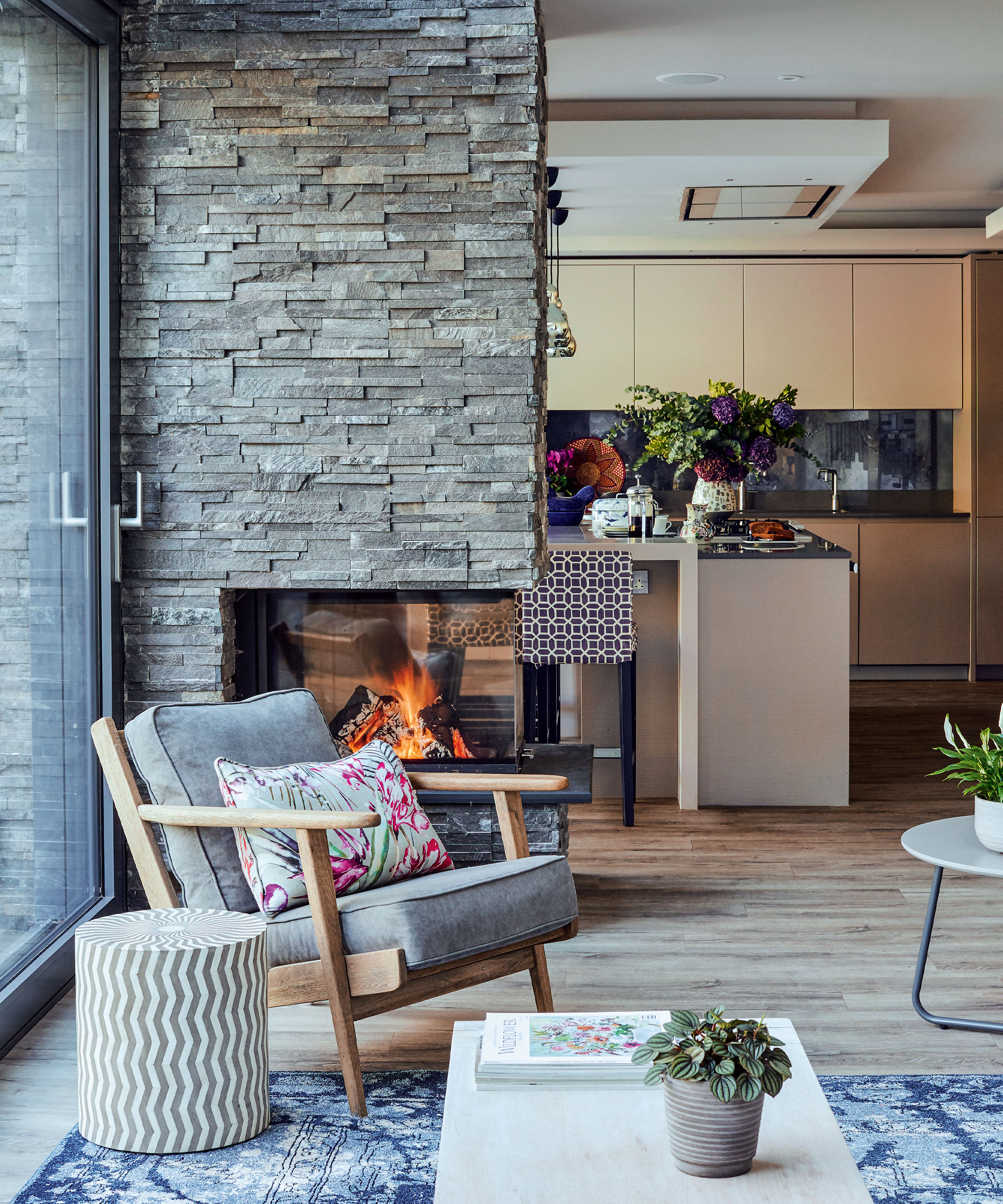
When looking at the color slate, there are often two main categories of slate shades to choose from, slate gray and slate blue.
As slate is a mixed color with blue undertones, there are many shades that are more blue or purple in appearance, however traditionally, and especially in reference to the color of slate rock, slate is considered a gray shade.
Patrick O’Donnell, Farrow & Ball brand ambassador states, 'slate is often perceived as a dark blue / gray – our perennially popular Railings would fit into this category at the darker end of the slate spectrum.'
There are a variety of shades to choose from, so when planning your slate décor ideas, deciding on a light or dark shade with blue or dark gray undertones is a good place to start.
What colors go with slate?
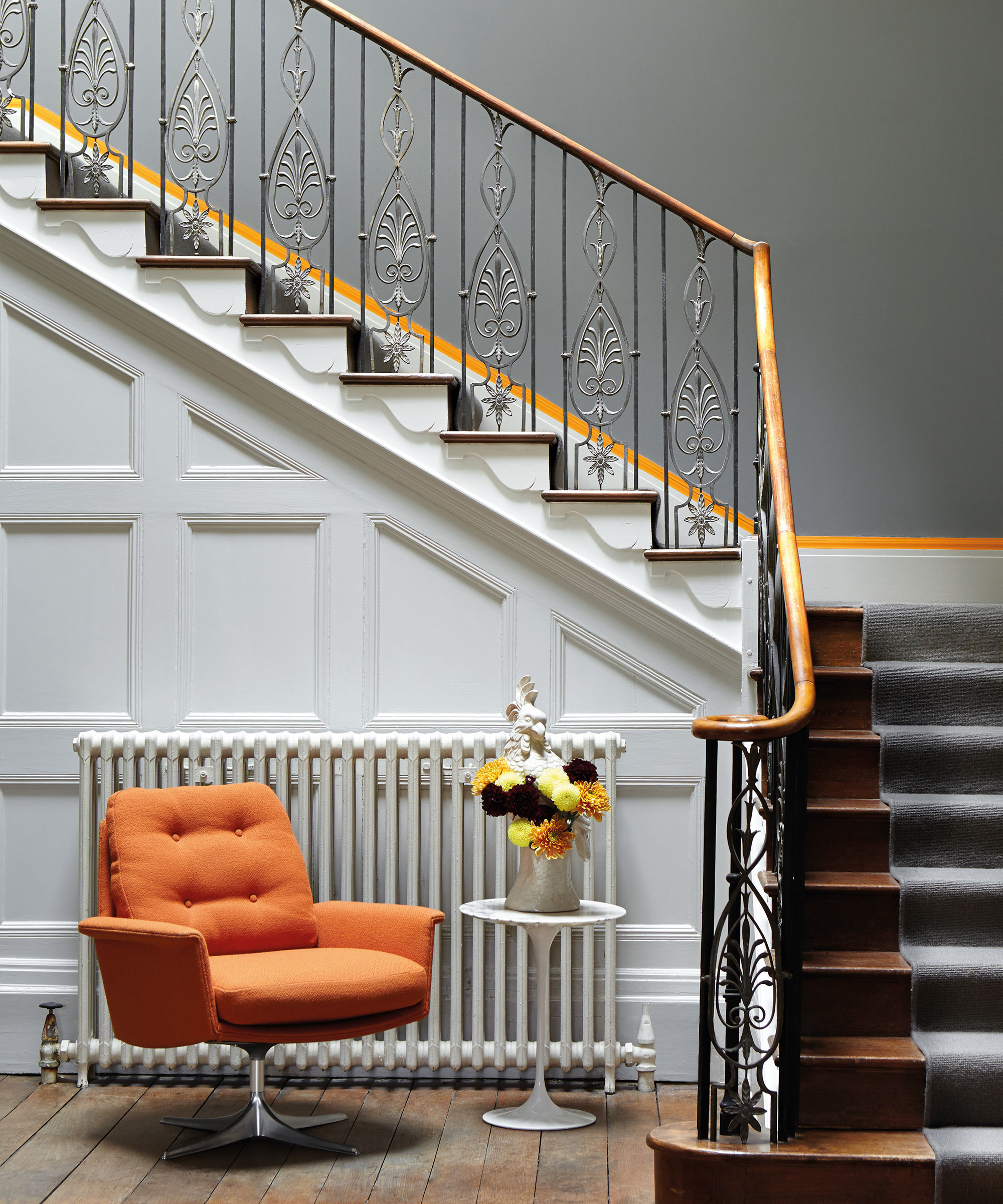
When slate is paired with vibrant, bold accent colors, this color contrast can create a dynamic and elegant color palette for the home. In this hallway space, the bright orange chair and painted feature stripe work beautifully with the slate painted walls and white painted paneling - a great choice for accent colors for gray.
Justyna Korczynska states, 'I love gray in the bedroom – either a really watery tone for a bright and clean look, or a deep slate or charcoal for more drama. Really anything goes with either – a shocking pink, a touch of metallic, a deep mustard – you need to choose the atmosphere that you want to create, and decide whether that means you want to use deep and dramatic tones, or light and reflective ones'.
Slate can also create a grounding, relaxed environment when united with other, adaptable neutral shades, forming a calming environment with a reference to the outside world.
Sue Wadden states, 'over the past few years, we’ve begun to see popular tones of gray shift from cooler, modern tones to warmer hues inspired by nature. The earthy undertones in Slate Tile make for a grounding hue that pairs well with warm neutrals like Shoji White.'
Sign up to the Homes & Gardens newsletter
Design expertise in your inbox – from inspiring decorating ideas and beautiful celebrity homes to practical gardening advice and shopping round-ups.

Zara joined Homes & Gardens in February 2022 as a Content Editor. After studying English Literature at University, she worked as an Ecommerce Website Editor, Content Writer and Buying Intern at multiple independent businesses within the luxury retail and lifestyle sectors. Her role at Homes & Gardens unites her love, experience and passion for the world of design and desire to create inspiring written content. She enjoys nothing more than discovering new trends, brands and products, whether that be in fashion, interior design or lifestyle.
-
 The biggest curtain trends to follow in 2025 – 8 key looks to shop that will instantly elevate your rooms
These are the colors, styles, and materials to embrace in your windows this year if you want desirable drapes, plus our favorite places to shop the trends
By Lilith Hudson
-
 Reese Witherspoon upgraded a small corner into a cozy reading nook – designers say you can replicate her 'ultimate little escape' (from $18)
'It’s all about comfort, calm, and just the right amount of cozy': You only need three things to follow Reese's example – and it's not only for book lovers
By Megan Slack
-
 7 dorm room organizing rules for less clutter and more space
Experts offer their top tips for creating a well-organized dorm room, no matter the size, space, or layout.
By Ashley Chalmers
-
 How to maximize storage in a small or shared dorm room, according to pro organizers
Find out all the hidden storage zones you might never have noticed
By Ashley Chalmers