What color is replacing red? Discover the new trending accent colors designers are favoring for 2024 and beyond
Move over red – bold greens and blues are taking the lead as the go-to shades for an unexpected pop of color
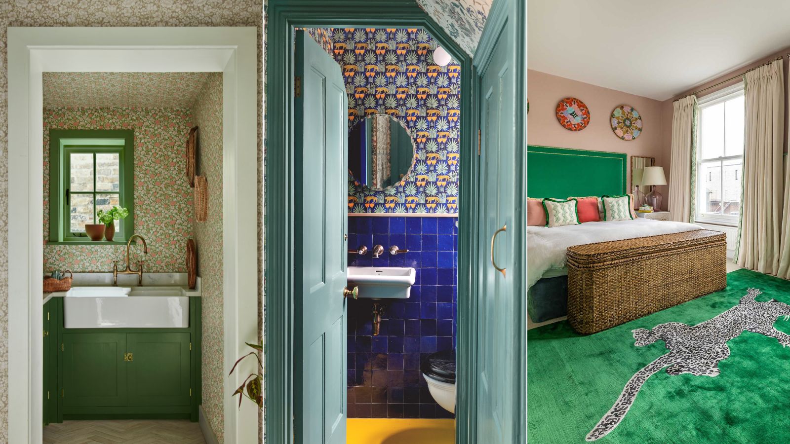
- 1. Highlight architectural features in botanical green
- 2. Paint furniture in fresh apple shades
- 3. Use bold blues and greens to enliven a home office
- 4. Choose a citrus green wallcovering
- 5. Wallpaper the ceiling
- 6. Highlight woodwork with electric blue
- 7. Introduce bold emerald headboard
- 8. Introduce a pop of green in the bathroom
- 9. Brighten a shower room with vibrant green and blue tiles
- 10. Bring wow-factor to a powder room with cobalt blue

Decorating with bold accent shades is a look that has grown in popularity over recent years, as homeowners become more confident with color.
Indeed, the recent frenzy for this year's color trends around the unexpected red theory proves that homeowners are drawn to vibrant accent colors to make their interiors come to life. While red continues to be a hugely popular shade, lately, we’ve noticed other hues coming to the fore, particularly botanical greens and captivating blues.
Uplifting yet calming, wonderfully versatile and evocative of the restorative powers of nature, it’s no wonder we’re increasingly turning to these colors of nature as the go-to accent colors for interiors. However, don’t just take our word for it; we spoke to the experts to get their insight into what color is replacing red and have gathered up their tips for introducing fabulously fresh greens and blues into the home.
What color is replacing red?
Vibrant greens and blues are fast becoming the go-to accent colors for creating head-turning interiors. Of course, decorating with red will always be popular with those looking to bring drama and warmth, but for now, we’re seeing these cooler tones giving red a run for its money.
'More and more, I’ve seen clients leaning towards these fresher blues and greens due to their uplifting, contemporary feel. They make a room feel bigger, brighter and will leave you feeling refreshed when you’re around them,' explains Tash Bradley, director of interior design and color psychologist at Lick.
'The emergence of green being used as a striking accent color in interiors can be attributed to its strong association with nature, as people seek to reconnect with the great outdoors. Green is an extremely versatile color that pairs seamlessly with a wide variety of colors, but especially earth tones such as brown, pink, red, and orange, as we move towards warmer, more vibrant color and paint trends in interior design. This versatility allows green to create many "unexpected" yet harmonious color palettes across different design styles.'

Director of Interior Design and Color Psychologist at home décor brand Lick, Tash Bradley uses her expertise in color psychology and theory to help people around the world find the colors that will positively impact their spaces, lifestyle and wellbeing. As well as being the curator of Lick’s distinctive colour collection, Tash holds color consultations with decorators across the UK, EU, and US, giving them the color confidence they need to transform their homes into spaces that they love.
10 ways to introduce unexpected green and blue tones
1. Highlight architectural features in botanical green
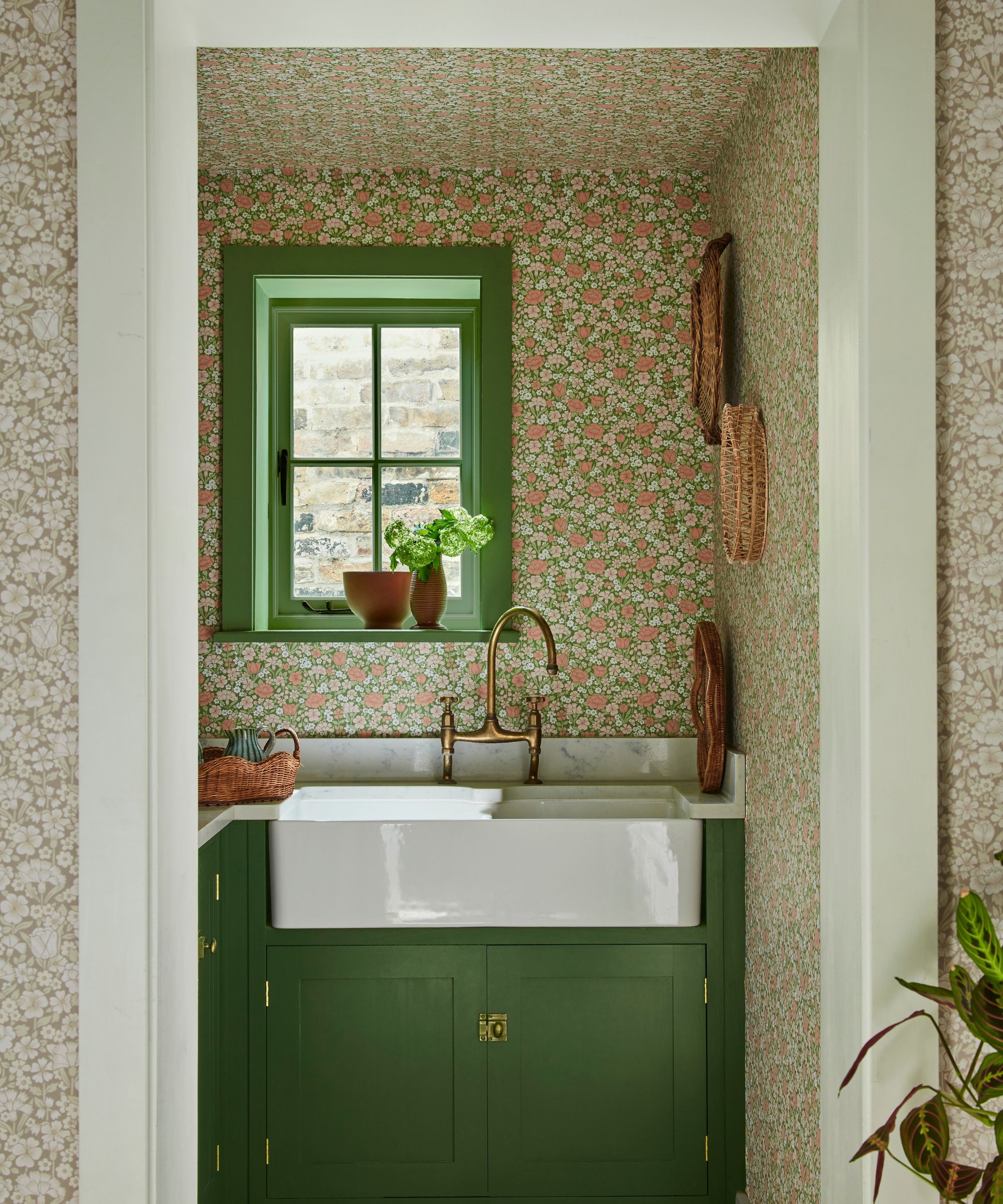
Punchy greens are a wonderful way to liven up practical spaces such as utility and laundry rooms, whether used on window frames, cabinetry or even a sink skirt. For a playful accent of 'unexpected green' pair it with a contrasting color that sits opposite on the color wheel such as plaster pink or pops of coral. The beauty of using green is that while it can still have an impact, it is also a neutral, calming color.
‘Greens are often relatively neutral. They are neither too warm nor too cool and this makes them a very versatile choice; they can be used in lots of different spaces regardless of the tone of light,' explains Ruth Mottershead, creative director and marketing director at Little Greene.
'There are so many interesting ways to use green paint for your green room ideas, it doesn’t have to be a focus on the walls, but can be used to highlight architectural features, such as painting above or below a dado rail, the ceiling trim ideas and cornices, or if those details aren’t present in the home, you can embrace ceiling paint ideas, which will draw the eye upwards and give the illusion of height.'
2. Paint furniture in fresh apple shades
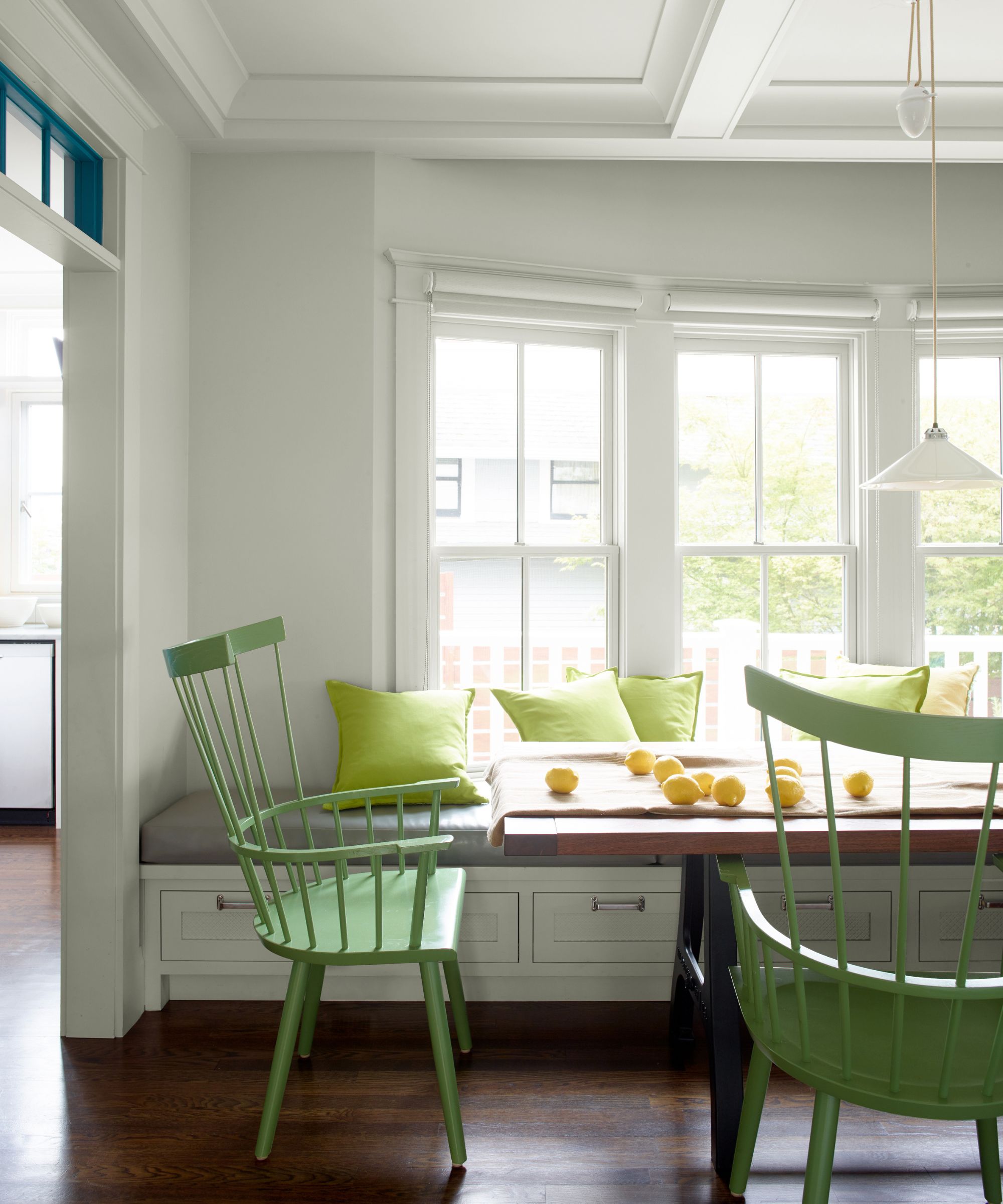
Why not give an old piece of furniture a new lease of life with fresh green paint? Not only will this bring unique character, painted furniture ideas will also prevent good quality pieces from going to landfill – you could say it's going green in more ways than one!
‘As seen with the unexpected red theory, decorating with primary colors is a great way to add visual interest to any scheme. If you’re a little color-shy, featuring a few bright accents will create a fun and uplifting space without being overwhelming. Green is fresh and down-to-earth so makes for the perfect accent color,' says Helen Shaw, Director of Marketing (International), Benjamin Moore.
‘Painting a single wall, ceiling or furniture is a good way to use such color so it doesn’t overpower. If you are lucky enough to have architectural features such as picture rails and cornices in your home, adding a burst of green to create highlights is guaranteed to boost your space.'
3. Use bold blues and greens to enliven a home office
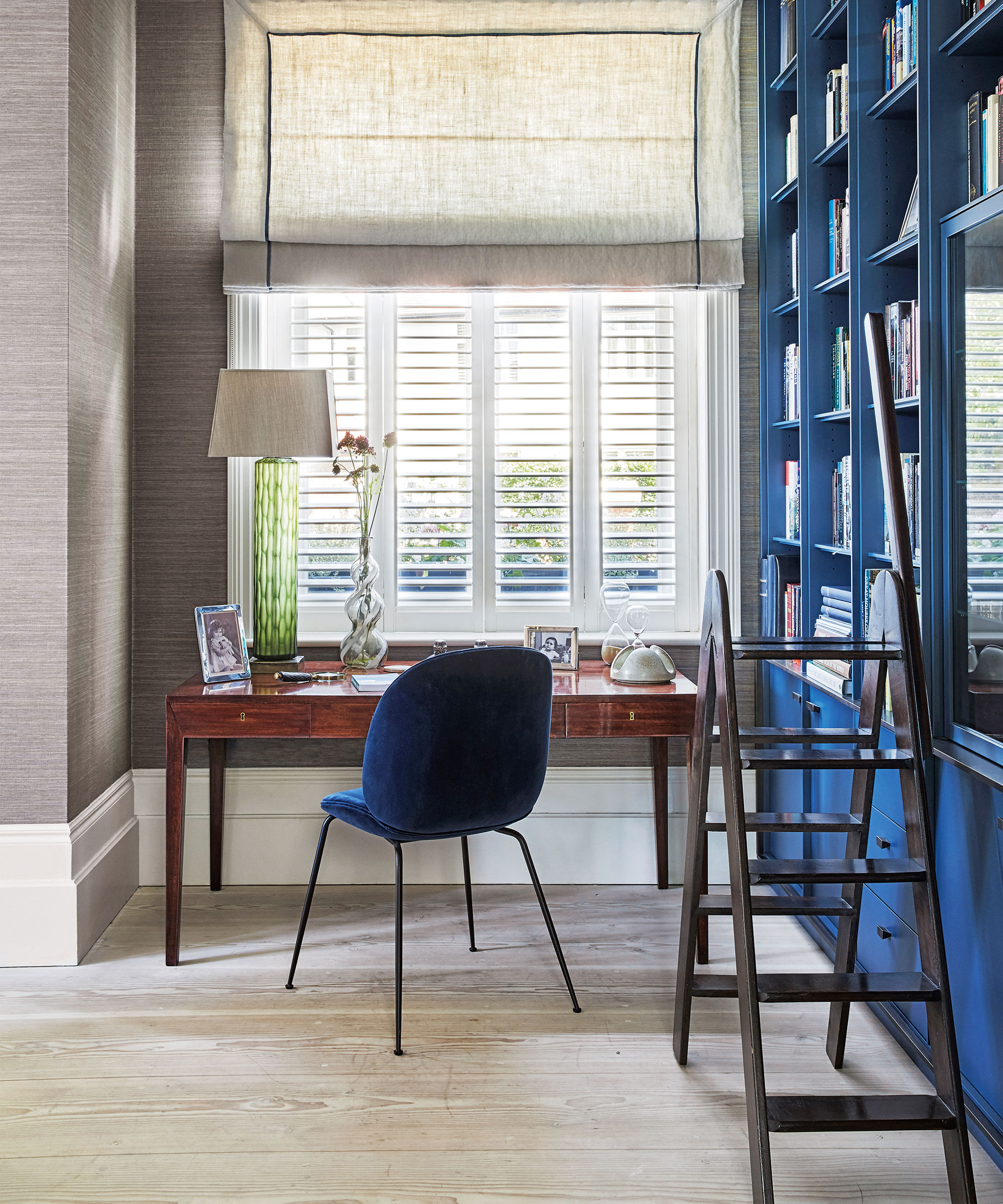
Energizing and fun, ultramarine blues are a wonderful way to liven up home offices – spaces which can so easily be bland and boring.
'From electric blues to cerulean and deep navy hues, these refreshing colors are gaining popularity for their ability to add a striking feel to living spaces,' says Cathryn Sanders, head of creative at Earthborn. 'Whether used as a subtle backdrop or as an accent color for furniture and skirting, it brings an intriguing sense of style and security into the home.'
Why not enhance your bookshelf ideas or your cupboard doors with a cobalt blue to transform them into a striking design feature?
4. Choose a citrus green wallcovering
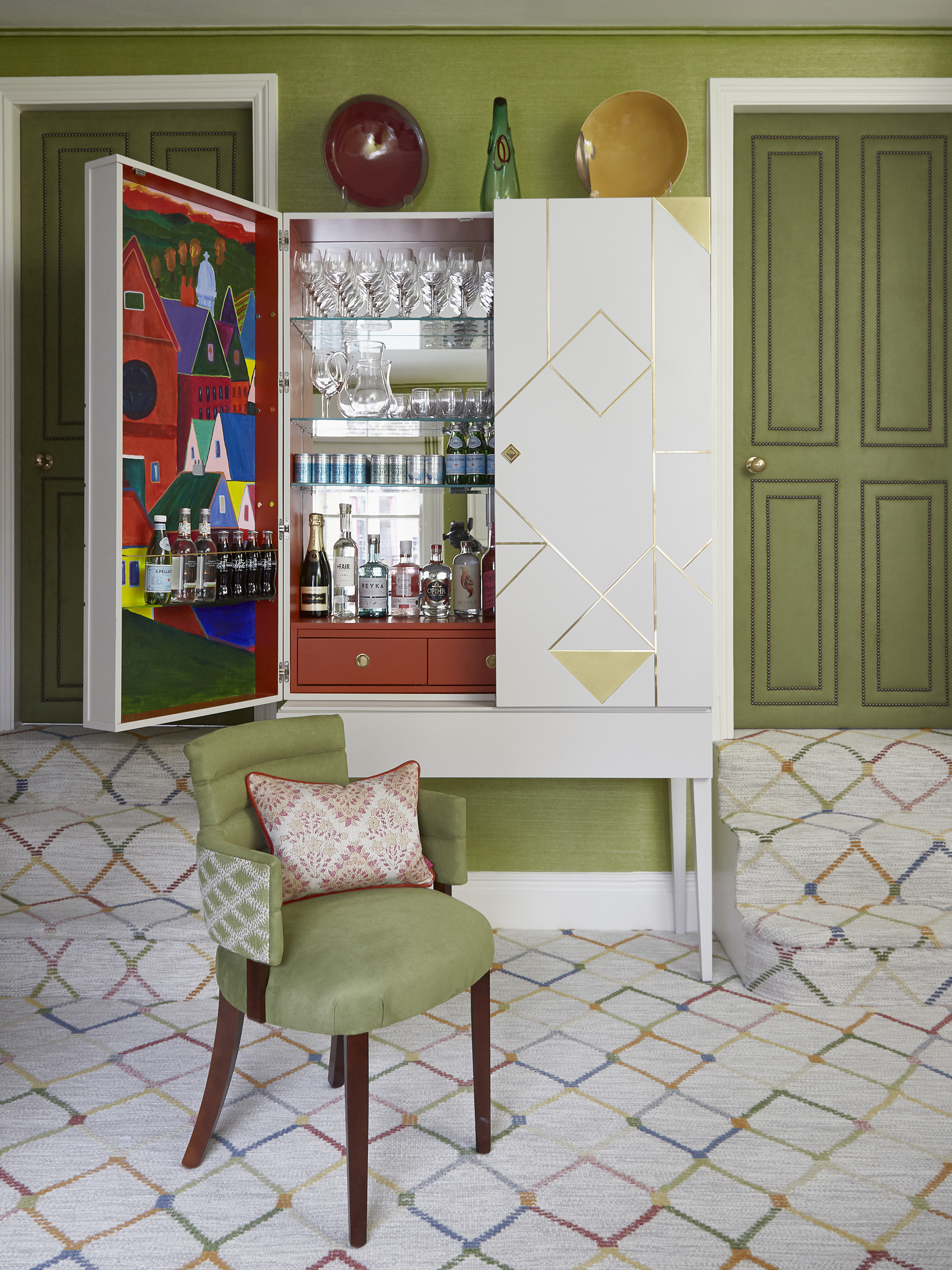
British interior designer Emma Deterding, founder of Kelling Designs is renowned for her use of bold colors and has noticed a leaning towards greens in recent years.
'I think post-covid, green has come to be a lot more important to people. Especially those who were living indoors for so long without access to green spaces,’ she says.
'For myself, I find that we have tended to use it a lot more, especially in urban settings and I am wondering if that is an unconscious desire to bring the great outdoors in. Rather unsurprisingly, I like the bold shades and the more citrusy ones,' she adds.
'We used a beautiful, citrus-green wallpaper in the dining room in our London studio and showroom which I love. It's Phillip Jefferies' Green Grass 5268 Grass Cloth and is the perfect color for displaying artwork, plus every other color sings with it. We also covered our doors and added studding detail with a faux suede from Wemyss which is another zesty, but beautiful green that reminds me of being in a garden.'
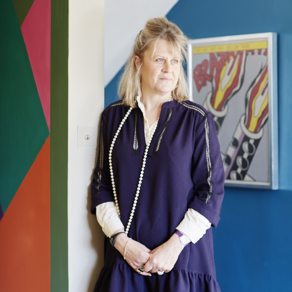
British interior designer Emma Deterding is the founder and creative director of interior design studio Kelling Designs as well as the home brand Kelling Home. She is renowned for her masterful use of color and pattern and has worked on numerous domestic and commercial projects in London and overseas.
5. Wallpaper the ceiling
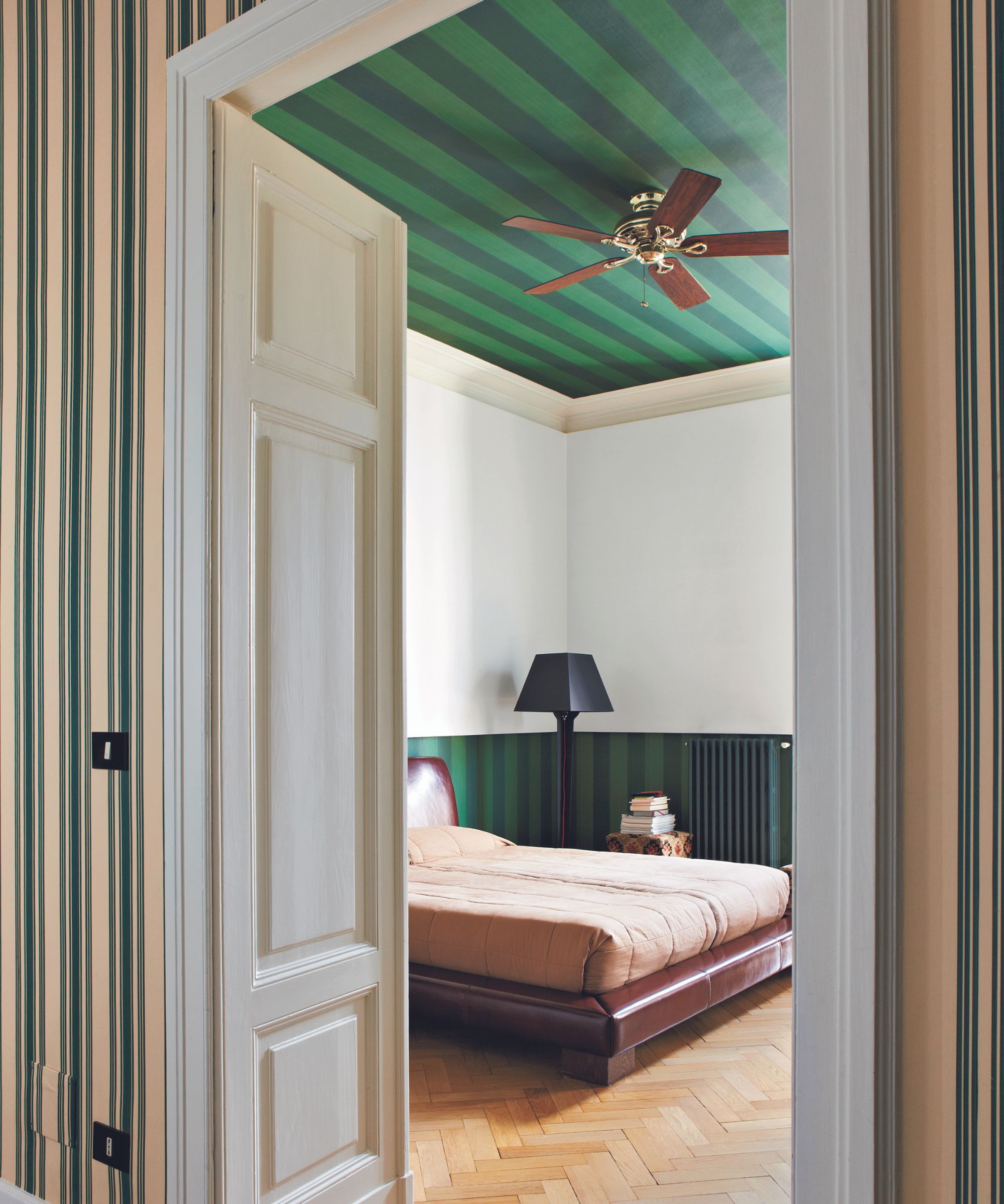
Playful ceiling wallpaper ideas are an increasingly popular way of introducing an element of surprise to a space. Why not try a bold green stripe? A decorating staple, stripes will never go out of style.
'A ceiling is a fantastic place to get creative. Stripes have a natural affinity with ceilings, as they are both playful and a motif a la mode. Whilst not necessarily a decorating task for the timid, creating tented stripes or something more simplistically linear can add a wonderful, unexpected design note,' explains Patrick O'Donnell, brand ambassador at Farrow & Ball.
6. Highlight woodwork with electric blue
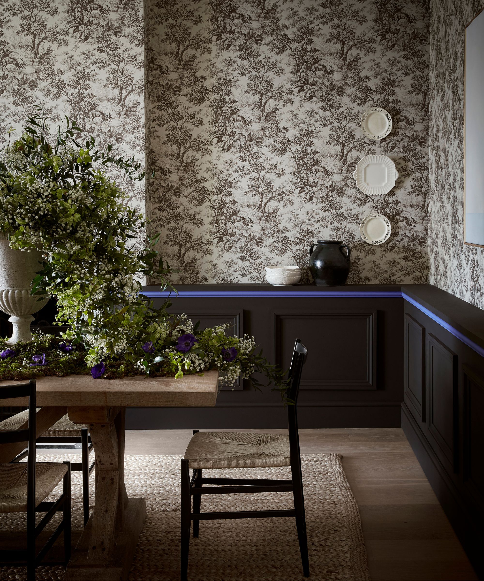
Bold blues work wonderfully with the on-trend earthy browns to bring a touch of the unexpected to sophisticated, dark schemes.
'For an unexpected, contemporary twist on a neutral scheme, add a surprising highlight color, for example pair pale taupe ‘Joanna’ with touch of vibrant blue or use a highlight of bold and vibrant ‘Mambo’ with rich ‘Chocolate Color’, suggests Ruth Mottershead, creative director at Little Greene. 'The deep neutral, earthy brown works as a wonderful, sophisticated backdrop to this burst of joyful and intense blue.'
We explore what color should you paint woodwork in our separate feature.
7. Introduce bold emerald headboard
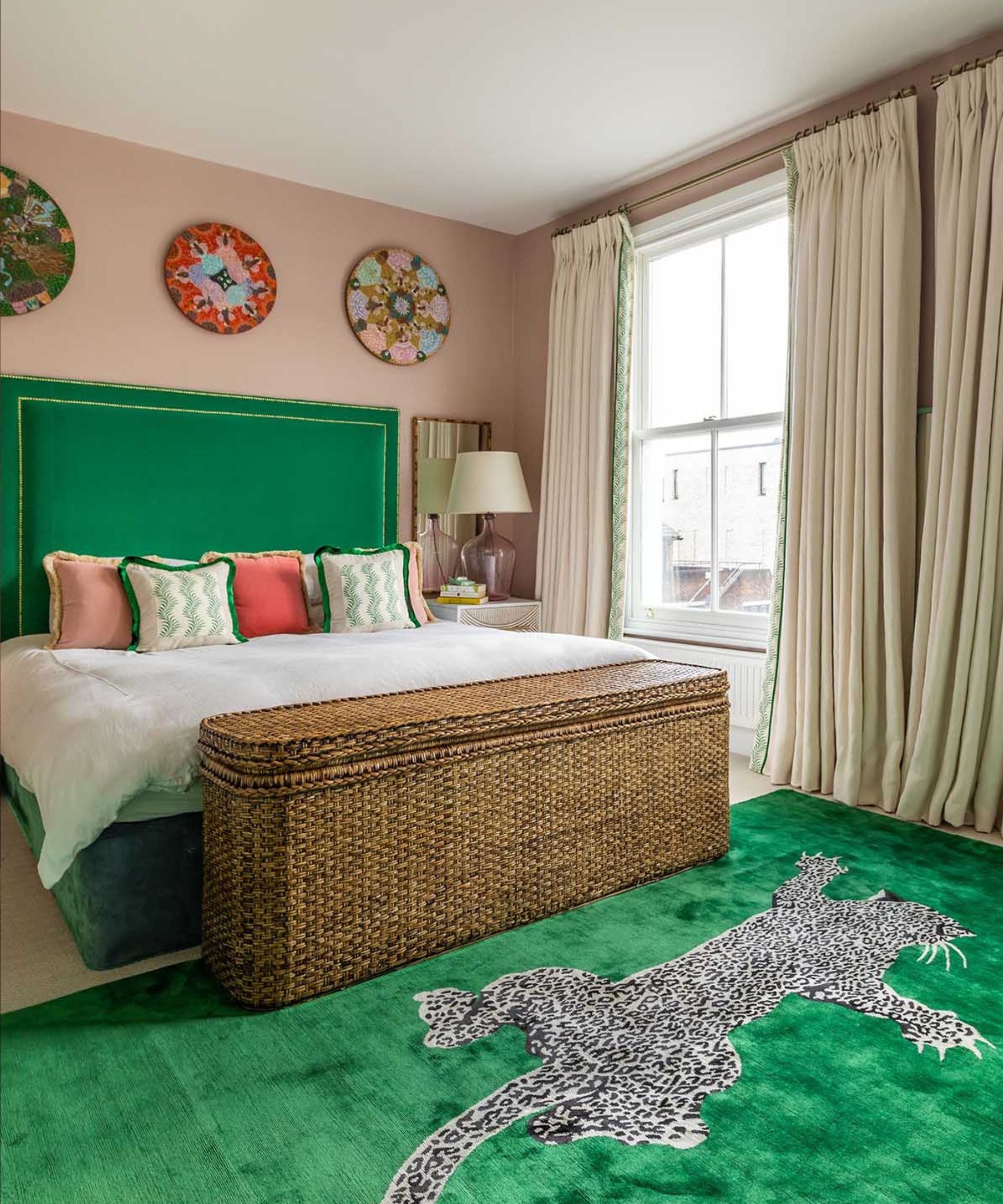
Decorating with neutrals in a bedroom is a timeless choice, plus it makes a great base for layering with bold pops of color and unique artwork as demonstrated in this head-turning scheme by Barlow & Barlow.
'Green is a hugely versatile color, with beautiful tones to suit all moods and uses. Here we have used a rich emerald green for the headboard ideas and bedroom rug ideas to focus the eye and tie together the green accents which is both playful and sophisticated,' says Lucy Barlow, co-founder of Barlow & Barlow.
8. Introduce a pop of green in the bathroom
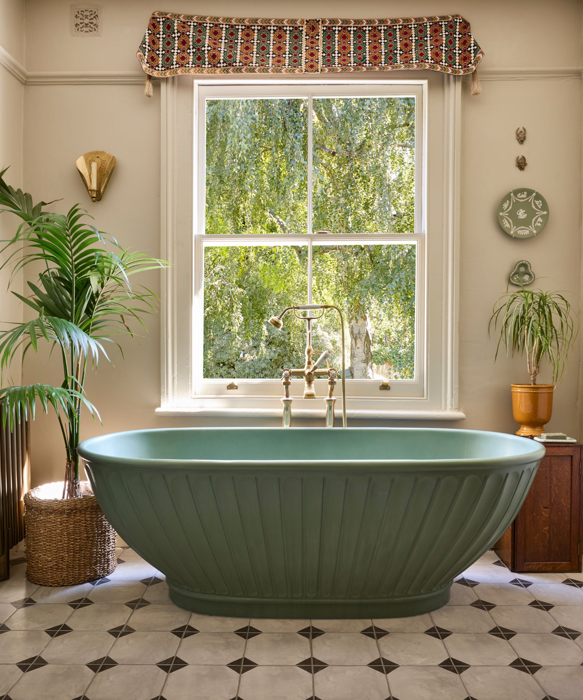
Restful yet uplifting and evocative of the nourishing powers of nature, green makes a fitting choice for bathroom ideas and rooms that are centered around self-care and well-being. Green tiles or paint are a popular way to introduce the color, but if space allows, why not make a statement with a green freestanding bathtub?
'The unexpected use of green can come in many different formats, but one way to add it in a bathroom is through the use of colored ceramics,' says Barrie Cutchie, design director at BC Designs. 'Freestanding baths have featured on many a wish list and these imposing bathtubs, resembling true works of art, stand out from the crowd – choosing a green version only adds to the impact.'
9. Brighten a shower room with vibrant green and blue tiles
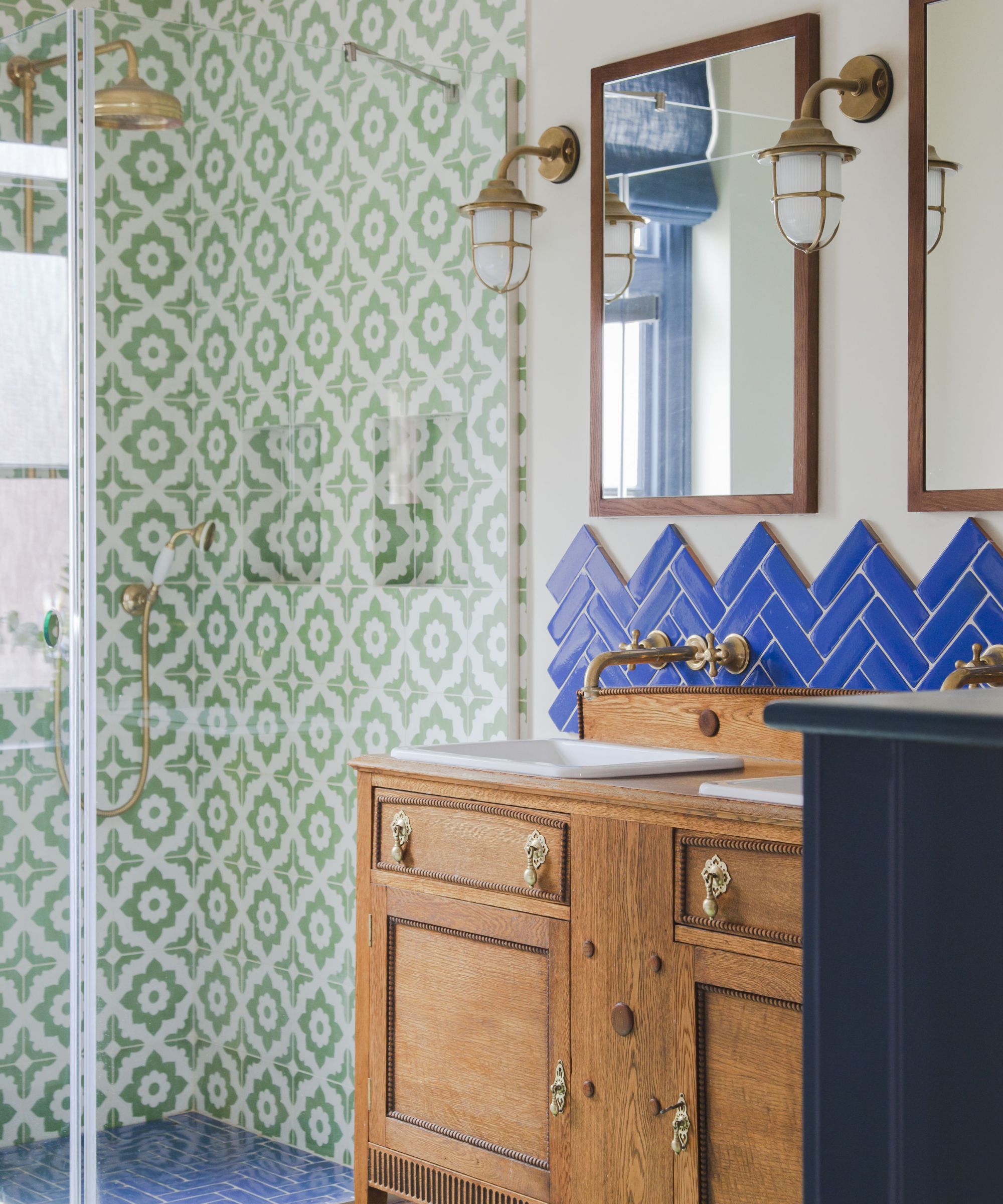
Introducing personality and fun into small bathrooms and shower rooms can be a challenge, but opting for bold green and blue tiles is guaranteed to add instant zing. For extra fun choose a patterned bathroom tile or try laying tiles in playful configurations to prevent the space feeling flat and cold, as done here by interior designer Brooke Copp-Barton.
While the saying may go 'blue and green should never be seen', the two colors do in fact work wonderfully together and are a popular pairing with interior designers. After all, we are constantly surrounded by the pairing in the natural world.
‘The electric blue of these splashback tiles has a wonderful vibrancy to it which is the perfect pick-me-up first thing in the morning. Pairing these with the green Santana tiles from Bert & May in the shower further energizes the space – it just so happens to be one of my favorite color combinations,' says Brooke Copp-Barton.
10. Bring wow-factor to a powder room with cobalt blue
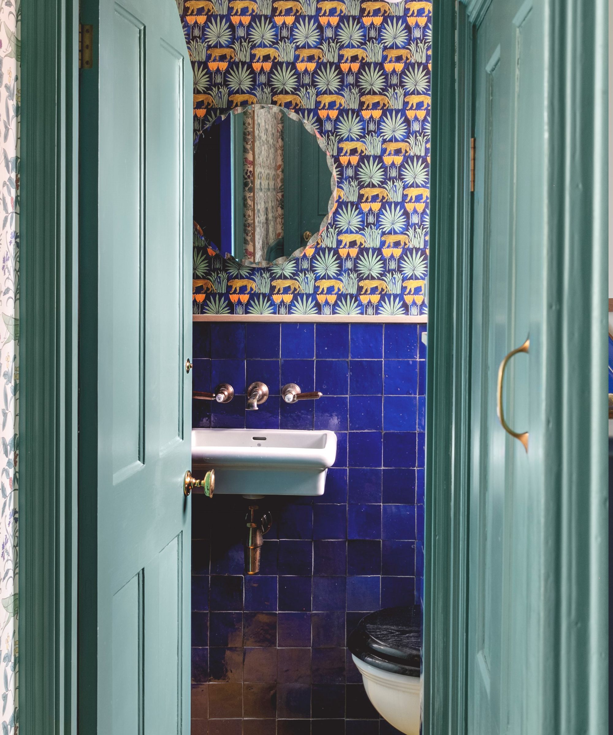
Vibrant cobalt blues are set to be a big trend in the interiors world as we move into from 2024 into 2025. Why not use it wall-to wall in a powder room to create a fun talking point with guests?
In this beautiful scheme by Emil Eve Architects, zellige tiles with unique glazes bring shimmering texture while the playful Lioness & Palms wallpaper from Common Room brings a sense of curiosity and adventure. Classic fittings from Drummonds complete the look.
For more glorious green and beautiful blue decorating inspiration, we explore the forest green trend and how to decorate with ocean blue in our separate features; two of the biggest shades set to dominate color trends in 2025.
Sign up to the Homes & Gardens newsletter
Design expertise in your inbox – from inspiring decorating ideas and beautiful celebrity homes to practical gardening advice and shopping round-ups.

Pippa is a contributor to Homes & Gardens. A graduate of Art History and formerly Style Editor at Period Living, she is passionate about architecture, creating decorating content, interior styling and writing about craft and historic homes. She enjoys searching out beautiful images and the latest trends to share with the Homes & Gardens audience. A keen gardener, when she’s not writing, you’ll find her growing flowers on her yard for styling projects.
-
 5 plants that are illegal to grow in California – how to control these invasive species in your yard, plus the native alternatives to use instead
These troublesome, invasive species will outcompete native plants and you could face a fine for growing them
By Thomas Rutter
-
 An architectural birdhouse is the most charming backyard trend I've ever seen – and there are lots on sale for Way Day
Will you treat your garden birds to a Victorian manor, or perhaps a Cape Cod cottage?
By Tenielle Jordison