What color is replacing dark green? This is the palette we prefer to use instead, say designers
Designers and decorators are ditching dark green in favor of paler and brighter hues – here's why
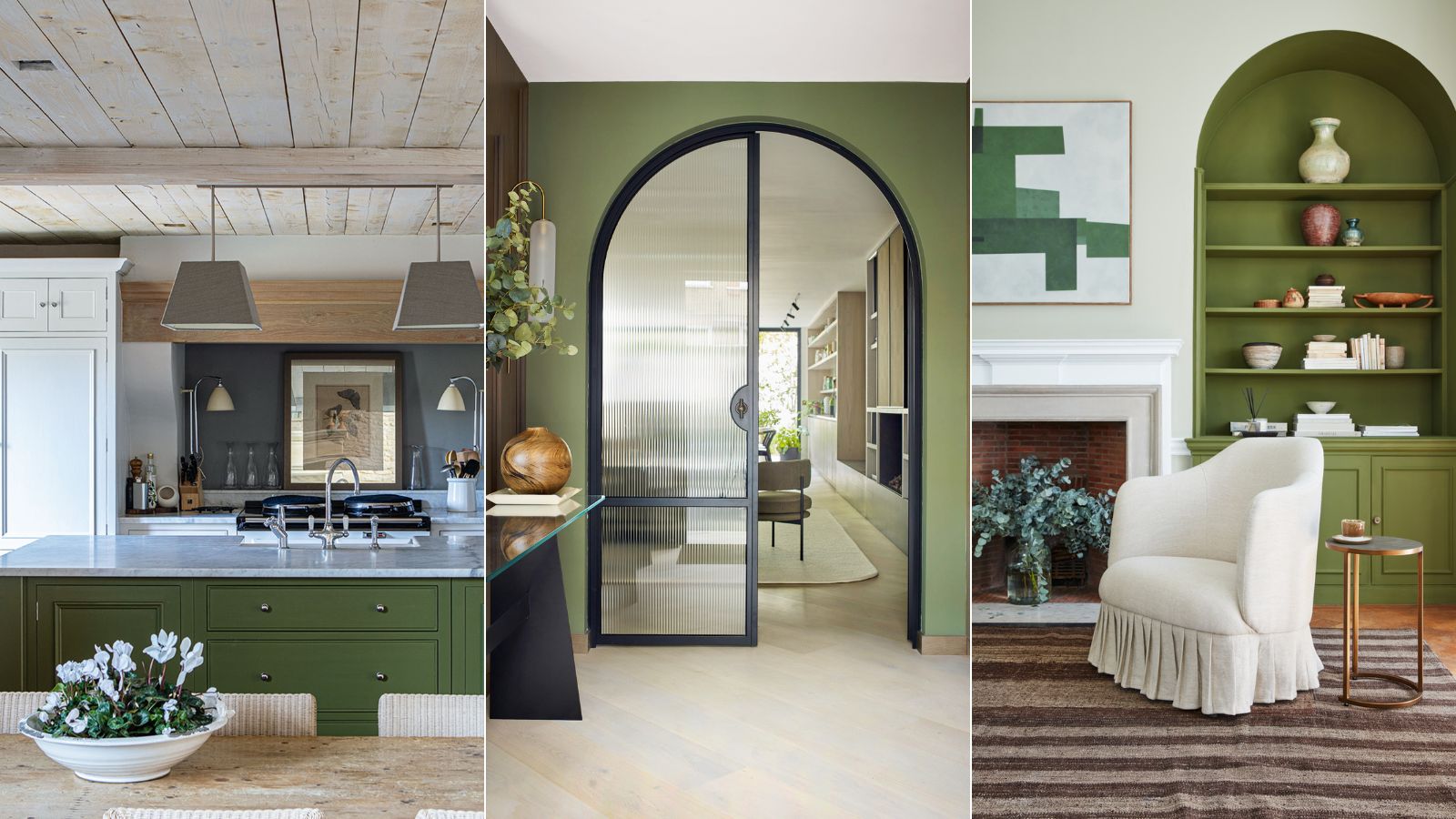

Green is in general a calming and relaxing color. Being the color that represents nature, it’s one that makes us feel good and positive, so it is no wonder that it held such a significant appeal for so long.
But now that dark green has fallen out of favor, you may be wondering what color is replacing dark green. Of all the variations of green, dark green is the one that always held the most gravitas with designers and decorators, however, this dark and foreboding color trend is steadily being replaced by its paler – and brighter – cousins.
‘Dark green was often used in traditional gentlemen’s clubs and libraries to stimulate concentration and deep thinking, but we are now seeing light green as the perfect tone for our homes, as it is calming and relaxing and helps us to truly unwind,' explains Francesca Wezel, founder of Francesca’s Paints.
Uplifting and timeless in their simplicity, nature-inspired room color ideas have become a stalwart in the world of interiors. Botanical tones, the ones found in nature, work with most shades to create rooms that are harmonious and easy to live with.
What is the new dark green in interior design?
Green room ideas aren't going anywhere anytime soon, but our love affair with darker greens is shifting to paler variations. Think teal, sage, turquoise, and light olive in lieu of rich, forest greens.
'Green is the color of balance and harmony,' says Karen Haller, color psychologist, and best-selling author of The Little Book of Color. 'It sits between the physicality of red, the intellect of blue, and the emotion of yellow. In essence, green is the balance between the mind, body, and emotional self.'
Karen suggests that one of the main reasons we are switching from dark green to light green is down to how it affects our mood and well-being. 'Whether a color is stimulating or soothing to us depends on its chromatic intensity,' she says. 'If it is a deeply saturated color, it is likely to be stimulating, and, if it has low saturation, it is likely to be soothing.'

Is dark green out of style for 2023?
Some of the best interior designers believe that dark green is out of style for 2023, but that is not to say that you should do away with green altogether.
While dark green will never be entirely out of style, we are seeing a resurgence of brighter tones of green. The return of the seventies has been influencing interior trends for 2023; with a palette of teals, turquoise, and sage tones seeing a sharp renewal.
What can I paint walls with instead of dark green?
'Now the summer is on the horizon, I love to decorate with turquoise,' says Tobie Lewis, senior brand manager at Valspar Paint. 'Turquoise, with its biophilic nature and blue-green undertone, helps to keep us grounded and encourages stress-relieving effects on the mind and body.'
‘Spending more time in our homes these past two years has led to prioritizing comfort and relaxation, leading to trends in natural and organic shades in our interiors, as well as houseplants and windowsill gardens.’
Alice Hood, senior design consultant at Roundhouse is using sage green instead of forest green. ‘Sage green is a comforting color,' she says. 'Even by name alone, it evokes the thought of foraging and nourishment in the natural world, growth, renewal, and life as a whole.'
'It brings the outside in, even in the most urban setting, and studies have been conducted to show that being surrounded by green can relax our nervous system and help us to feel calm, and in some cases, even live longer.’
Teal is another color having its moment in the spotlight this year. It is currently riding a renaissance, according to Charlotte Cosby, head of creative at Farrow & Ball. ‘Teal is a very balanced, versatile shade that can be used to create a subtle or dramatic space, as it shifts between blue and green in varying levels of light. Its green undertone brings a sense of calm to a room, perfect for spaces of relaxation, such as living rooms and bedrooms.’
How do you decorate with pale or bright green
When it comes to the best color trends, green will always be a popular choice. Its versatility means you can use it just about anywhere. Here's how the experts get it right...
1. Turquoise
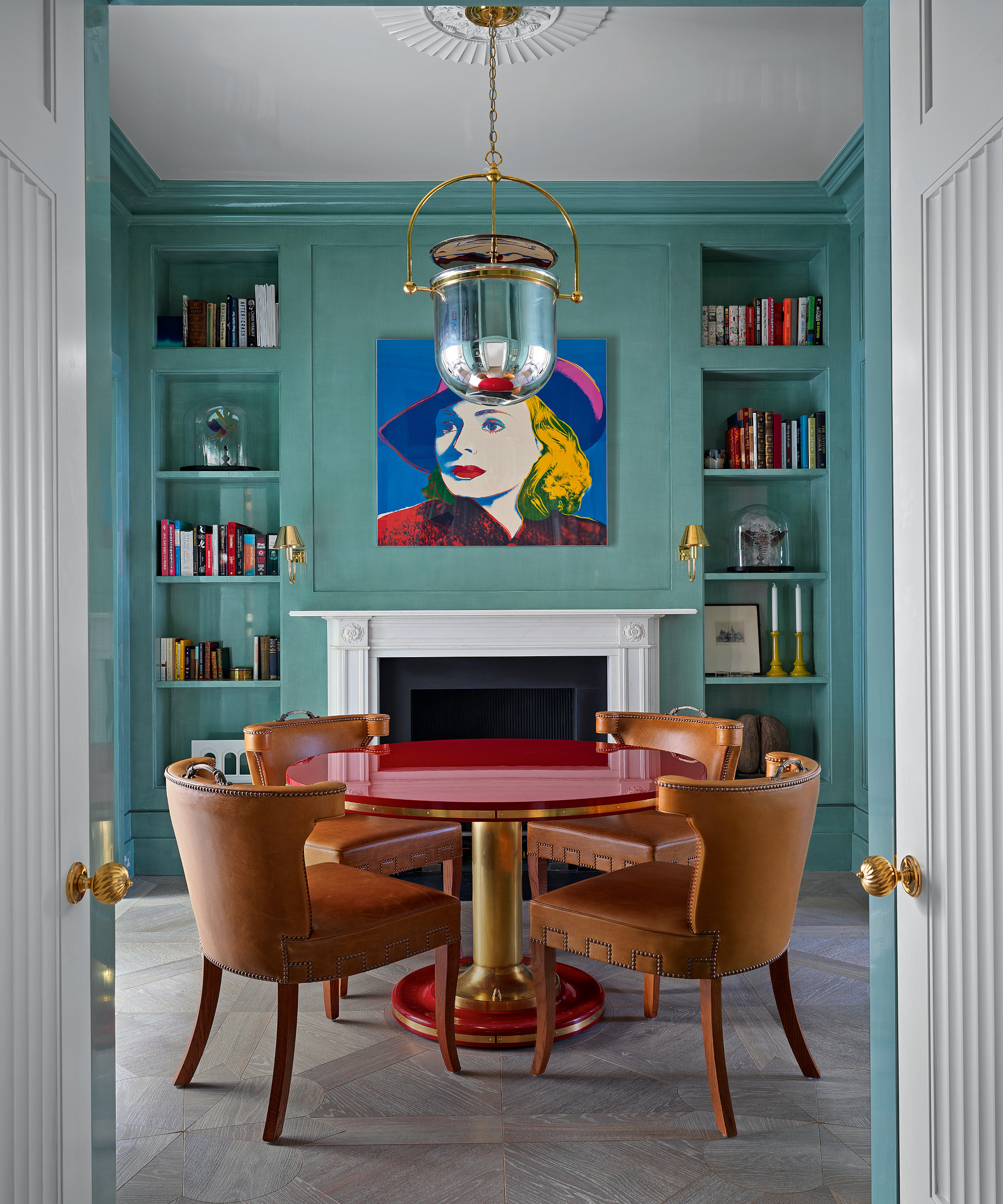
A beguiling hue that reminds us of warmer climes, turquoise has the ability to be invigorating and calming.
Turquoise is a blue-green color that is never cold. Evocative of warm tropical seas, paradise islands and luxurious infinity pools, it is a color that brings calm and happiness to every surface. With its associations of the ebb and flow of a gently lapping sea, it promotes a sense of calm and relaxation. Ancient Egyptian, Aztec and South American civilizations believed turquoise to be a protector and bringer of good fortune.
Sarah Fortescue, founder, of Sarah Fortescue Design loves to use turquoise in her decorating schemes: ‘I am a big advocate for color and a rich blue-green on the walls paired with strong red tones creates the perfect harmony in my view. It’s particularly suitable in a north-facing room where the strength of the color can replace the lack of natural light and sunshine.’
When it comes to color combinations for rooms, turquoise works well when punctuated with contrasting colors. Consider a palette of bold reds, yellow and exuberant pinks, along with more pastel shades of blue and green. Also, look out for turquoise paints and wallpapers that offer tactile chalky finishes.
2. Sage green

Uplifting and tranquil, this nature-inspired shade of green has its herbal origins to thank for its soothing properties, making it the perfect choice for a restful room scheme.
With their graceful hues, sage greens can be the perfect color for many rooms in the home but work best in spaces with certain orientations. Bluer-tinged tones can feel chilly in north-facing rooms, while south-facing areas make the greener traces appear more yellow. Sage has an enormous scope as a mindful décor mainstay and is also seen as an effective backdrop for other organic shades.
‘We are noticing a change to the use of softer hues, such as sage, being used all over as a base color, just how neutrals have been used traditionally,’ says Ruth Mottershead, creative director at Little Greene. ‘These are very calming, positive shades with a timeless quality, that are muted but not enough that they fade into the background, so they work beautifully as a foil for similar earthy tones and richer colors such as browns and ochre, which can give a more dynamic effect.’
Ruth Mottershead is the creative director of the family-run paint and wallpaper businesses Little Greene and Paint & Paper Library, which specialize in creating luxurious paint and wallpaper that represent 300 years of decorative history.
3. Teal
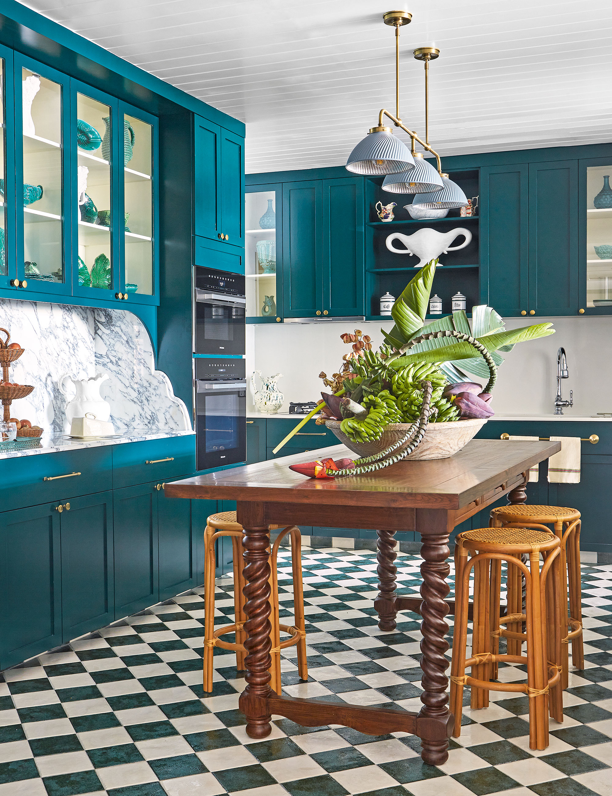
The uplifting yet serene teal is an interesting contradiction, blurring the boundaries between blue and green, and equally between fun and sophisticated when added to an interior scheme.
Teal appears on the color wheel between blue and green, so its boundaries are blurred, and numerous interpretations of it exist, from light to dark. ‘Teal is a member of the cyan, or green-blue group, and is widely associated with positivity, happiness, and stability,’ explains Helen Shaw, director of marketing at Benjamin Moore.
But why does teal uplift and calm in equal measure? Tobias Lewis, head of brand at Valspar, has a theory that links to the shades found in the natural world and the recent global pandemic.
Ultimately, we embrace this neither too blue, nor too green shade into our homes and our hearts because of the way it makes us feel. Character and warmth are the key goals in creating an inviting home. ‘Teal is perfectly balanced; it is neither too warm nor too cool, meaning it is the ideal color to create an enveloping and intimate feel,’ sums up Ruth Mottershead, Little Greene’s creative director.
4. Olive
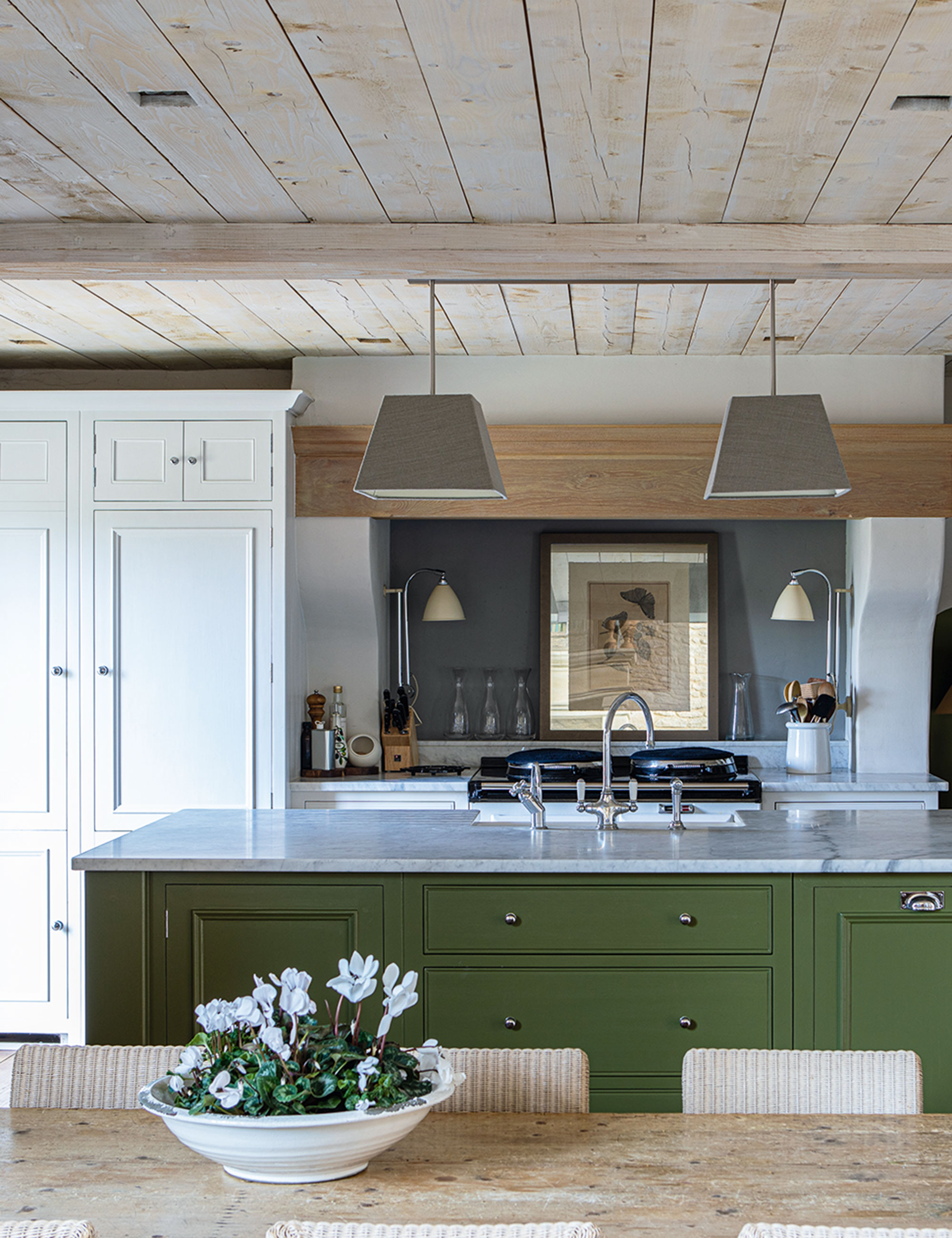
Inspired by the natural world, olive is restful with a touch of heritage. Strong yet soothing, it brings an enveloping feel but can also sit quietly and allow bold furniture to shine.
While dark green is the most majestic of colors, it’s not for everyone. Olive green, however, is a much more subtle, somewhat safer option for your walls, and its yellow undertones still provide those sought-after mood-boosting vibes.
‘A gentle shade usually made with yellow ochre, raw and burnt umber, olive is fresh but inviting, especially when compared to greens made with blue,' says Francesca Wezel, founder, of Francesca’s Paints. 'It’s one of the most neutral shades of green there is and, as such, it’s very versatile and can be used in almost every room of the house. It looks great with a dusky pink, red, off-white, or a soft blue.’
Interior designer, Emma Sims-Hilditch agrees: ‘This is a wonderful color that works well all through the year and is ideal if you are trying to bring an element of nature or a heritage feel into a more contemporary city home. It’s a restful and calming shade which not only works well on cabinetry but also looks great on walls.’
After years working as a colorist and manager of various Porter’s Paints shops throughout Sydney, Francesca Wezel returned to London and founded Francesca's Paints in 1996, an artisan paint studio based in Battersea.
As nature begins to spring into life, be inspired to decorate with the season’s fresh botanical shades of green to create refreshing and restorative spaces. Linked inextricably with the enduring beauty of nature, green is a timeless and versatile hue, so opt for paler variations, like our experts, for a contemporary aesthetic.
Sign up to the Homes & Gardens newsletter
Design expertise in your inbox – from inspiring decorating ideas and beautiful celebrity homes to practical gardening advice and shopping round-ups.

Jennifer is the Digital Editor at Homes & Gardens. Having worked in the interiors industry for several years in both the US and UK, spanning many publications, she now hones her digital prowess on the 'best interiors website' in the world. Multi-skilled, Jennifer has worked in PR and marketing and occasionally dabbles in the social media, commercial, and the e-commerce space. Over the years, she has written about every area of the home, from compiling houses designed by some of the best interior designers in the world to sourcing celebrity homes, reviewing appliances, and even writing a few news stories or two.
-
 How to weed a garden quickly – professional gardeners reveal the five-minute weeding jobs to do now and get your yard summer-ready
Short on time? These time-efficient tasks will keep on top of problem plants
By Thomas Rutter
-
 Suddenly, every stylish room has this one simple piece of furniture in common – why designers are loving the versatility of the humble stool
Behold, the humble stool. A welcome addition to any room, stools are a much-loved household essential that interior designers love for these 5 reasons
By Eleanor Richardson