What color is replacing beige? This is the one color we prefer to use instead of beige in 2024, say designers
Beige is still a firm favorite, but this warm neutral palette is taking over
- What is the new beige in interior design?
- Is beige out of style for 2024?
- What can I paint walls with instead of beige?
- How do you decorate with brown
- 1. How to use brown in a kitchen
- 2. How to use brown in a living room
- 3. How to use brown in a bedroom
- 4. How to use brown in a bathroom
- Shop the look

Thanks to the trend for quiet luxury, beige has been at the forefront of our decorating agenda for the past few years but, these days, designers and decorators alike are now reaching for a warmer, more flattering color palette instead. So what color is replacing beige? What is the 'new' beige in the world of interior design?
Well, interior designers say it's another neutral that's had its time but is now back in vogue. Before you recoil in horror at the thought of decorating with brown, throw out any preconceived notions of the brown rooms you may have seen in the past. This once-detested color is back, and better than ever. This versatile and surprisingly elegant hue is making a comeback in color trends and is now replacing beige as the go-to neutral.
Here, designers, decorators, and color experts reveal why brown is replacing beige for 2024, and how to decorate with a beautiful brown color palette for a sublime scheme every time.
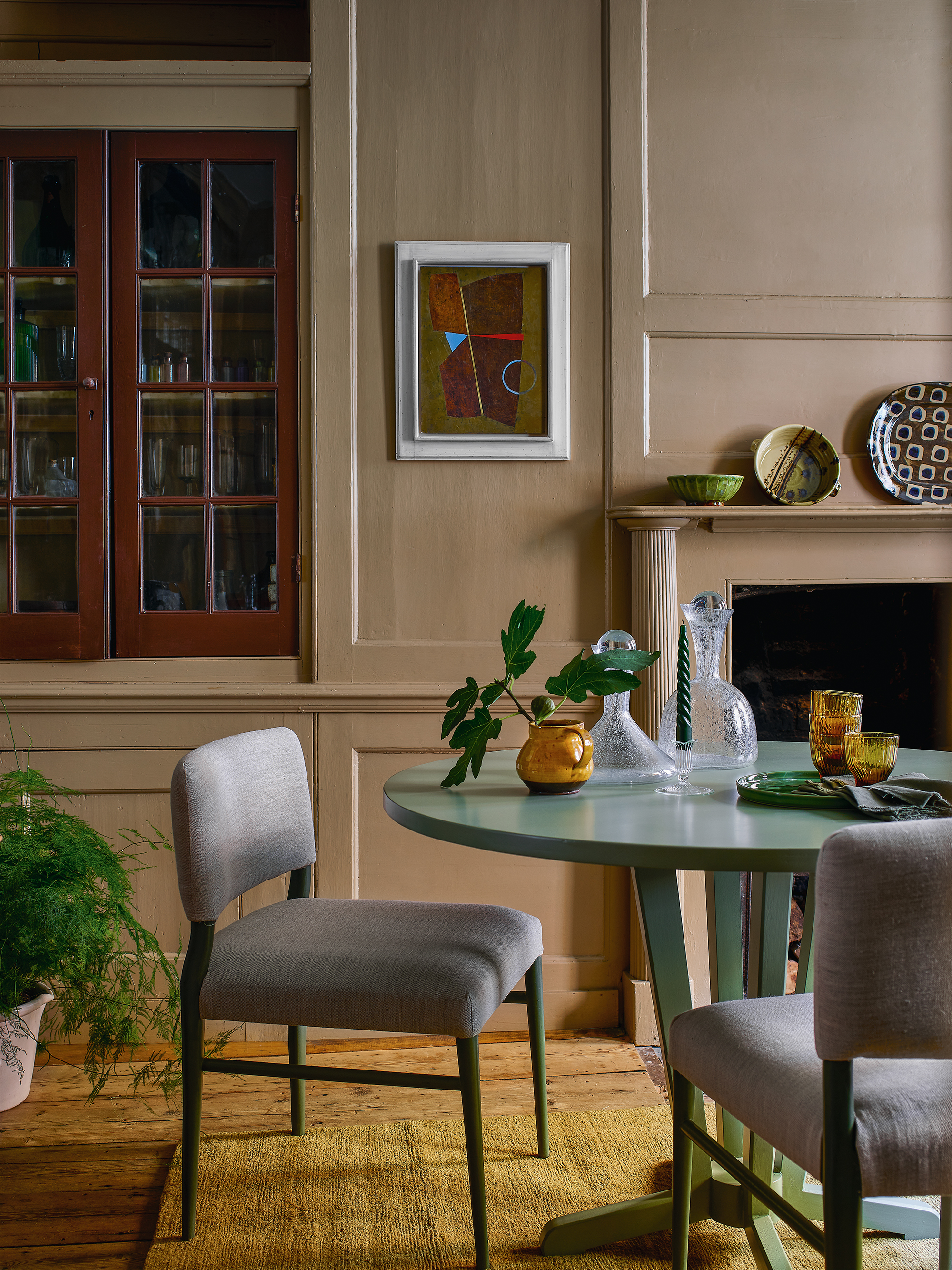
What is the new beige in interior design?
Brown, especially taupe, is the new beige in interior design, and it is easy to see why. Reminiscent of velvety cocoa, a mid-brown taupe is a striking color for any room. Depending on the furniture and accent colors introduced alongside, it has the flexibility to range from looking neat and tailored to soft and welcoming.
‘Taupe is a beautiful color and a wonderful starting point, but it can err on the side of boring so I always recommend introducing a contrast,' says Paolo Moschino, Paolo Moschino for Nicholas Haslam.
Interior designer Henriette Von Stockhausen, creative director, of VSP Interiors shares Haslam's penchant for taupe.
‘For me, neutrals such as taupe are grounding wall colors,' she says. 'It’s important to remember that sometimes a classic interior is just the ticket: calm colors, gentle schemes, traditional furniture and antiques – no pattern clashes, no huge color pops, just comfort and a quiet space to relax in.'
Is beige out of style for 2024?
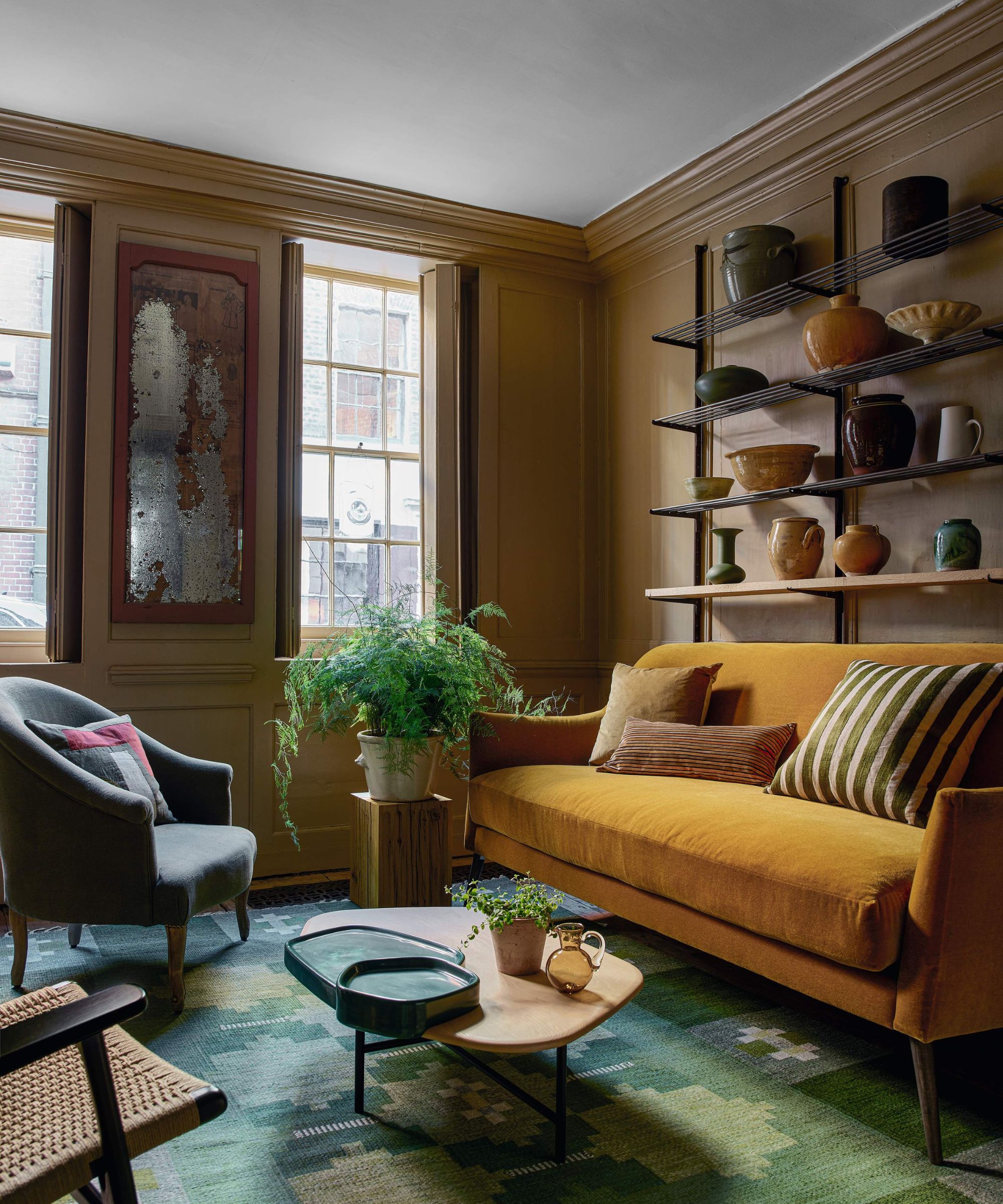
Beige isn't disappearing from our color consciousness completely, instead, it is being warmed up with earth-toned brown color accents.
This season's decorating is inspired by the global traveler's expeditions, with a rich palette of nutmeg, cinnamon, ginger, and ochre adding warmth and depth to interiors. Considered a dark neutral, earthy brown is grounding but also has a truly sophisticated elegance. Versatile, it can be striking on its own or allow other hues to stand proud.
If you need any more convincing, brown is also surprisingly versatile and could act as the perfect foil to existing furnishings and accessories. Edward Bulmer, interior designer and founder of Edward Bulmer Natural Paint agrees: ‘Being polychromatic, brown goes with everything, but in deeper, very rich hues it is particularly good at flattering beautiful, well-drawn patterns.’
What can I paint walls with instead of beige?
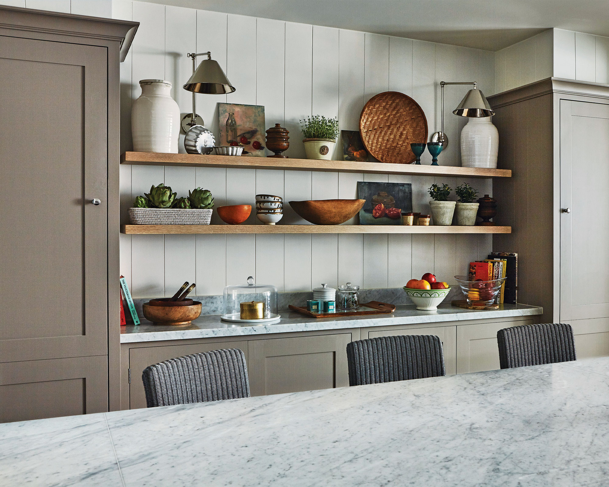
Take inspiration from nature's seasonal spectrum of earthy tones to create a warm and welcoming space. Offering myriad warm hues that sit harmoniously together, the brown color palette is loved by designers for its ability to create relaxed, grounding spaces with enduring appeal.
‘Timeless neutrals lend themselves to historic properties, creating warm backgrounds for original features,' explains Louise Wicksteed, design director, Sims Hilditch. 'When opting for a neutral shade on the walls and ceiling, be playful with your soft furnishings and consider threading splashes of color and pattern through the fabric used for your scatter cushions.’
There are so many exciting ways to use taupe paint, says Doris Lee, founder, of Doris Lee Design Studio. ‘Paint the entire room including walls, ceiling and woodwork in this warm color to create a neutral backdrop. Then add an extra-large linen sofa, rustic wooden coffee table and wool throw to create the ultimate winter retreat.’
Another way to decorate with taupe, according to Patrick O'Donnell, brand ambassador, of Farrow & Ball is to balance brown and green, or any other two colors found in nature.
‘Taupe is a fantastic color for a dining room, especially in a higher sheen such as eggshell or full gloss,' he says. 'Think of it as a mid-neutral rather than a color as it will complement a plethora of contrasting hues from burnt orange to verdant greens and inky blues.’
How do you decorate with brown
A brown room doesn't have to mean dull – let your room sing out with a tonal color palette. Here's how the experts get it right...
1. How to use brown in a kitchen
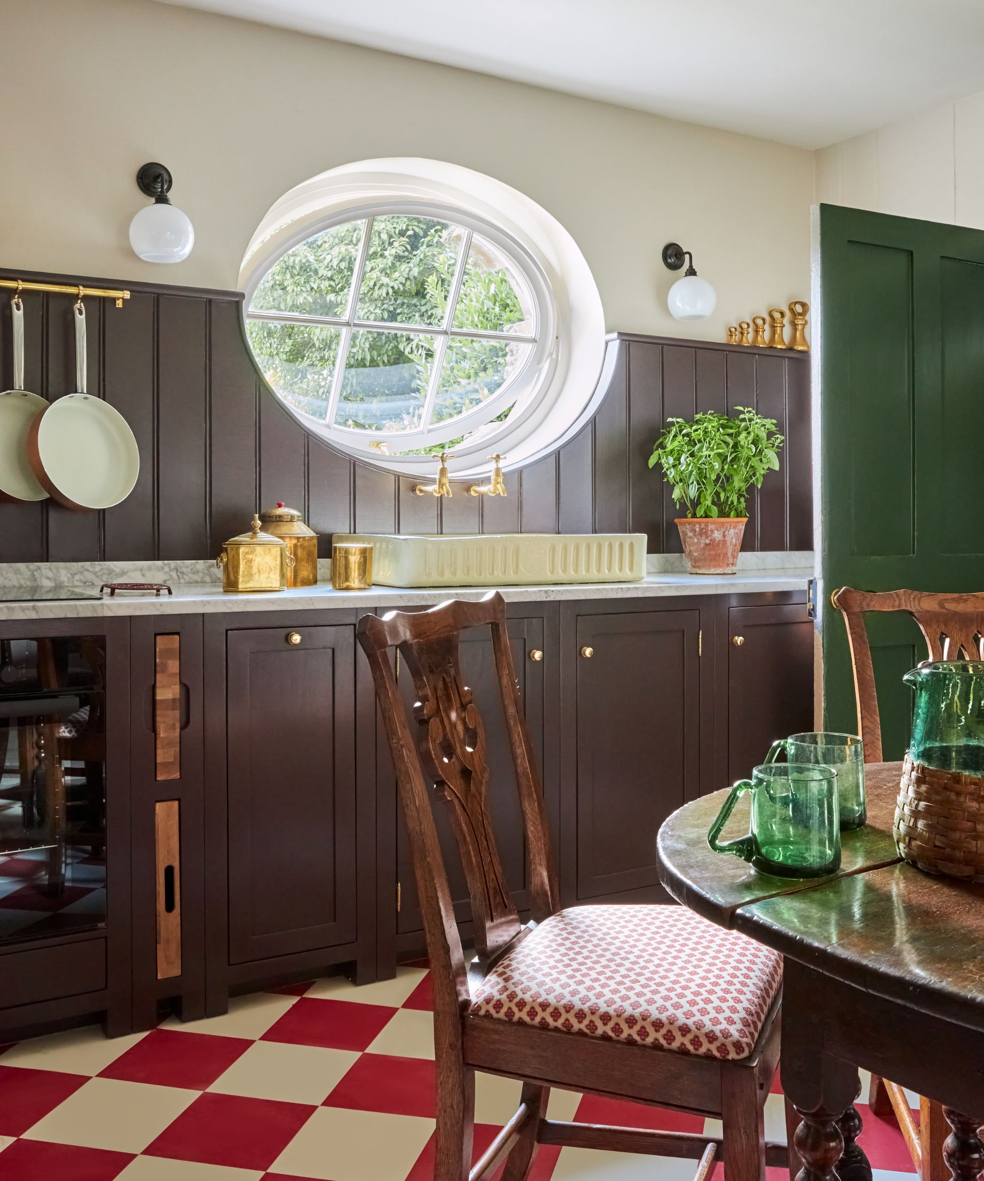
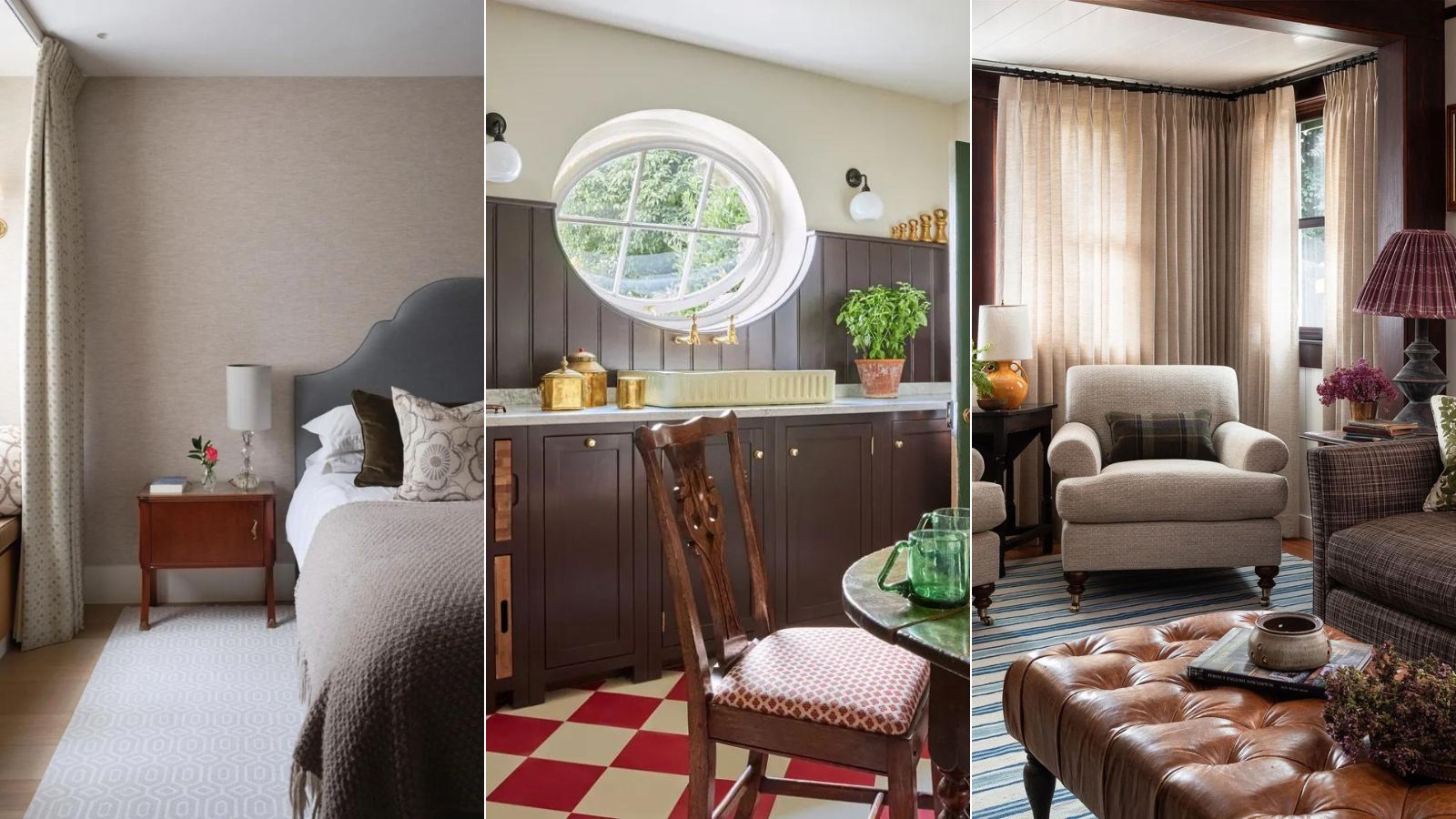
Choosing complementary colors is an art form, and brown goes beautifully with green.
‘People feel nervous about teaming brown and green, but I believe it’s a quintessential pairing,' says Tricia Guild, founder and creative director, of Designers Guild. 'Just imagine the landscape – the rich, earthy ground against a green and pleasant land. It’s a classic combination that evokes familiarity and comfort. Make it more dynamic by introducing an unexpected color.'
Red has the power to lift any room. It is a wonderful way to make a kitchen look expensive and luxurious.
2. How to use brown in a living room
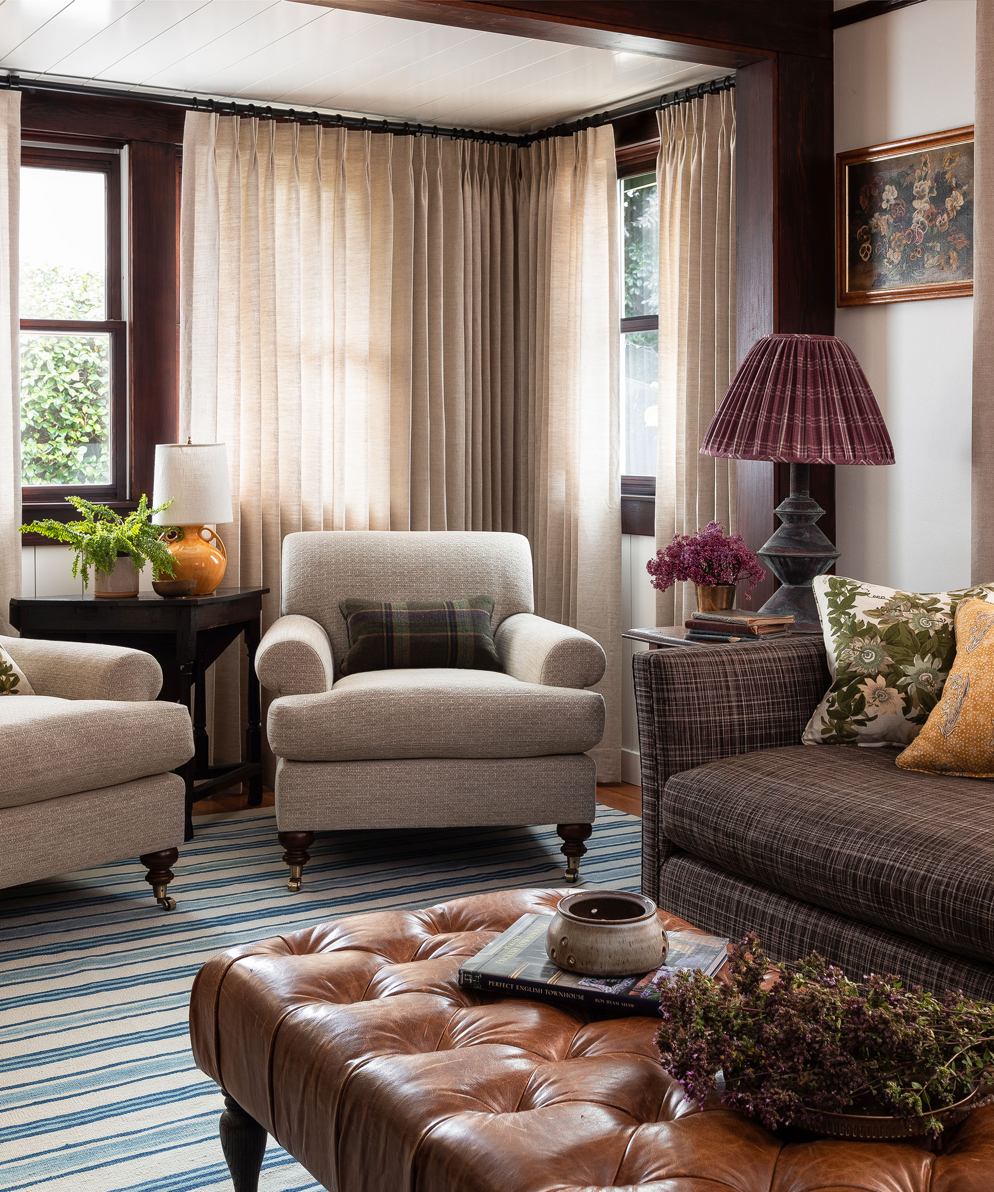
Cocooning and surprisingly versatile, browns, in particular, are growing in popularity, and none more so than in the living room.
‘Browns and honey-hued colors are re-taking their rightful place in our interiors. Shades of honey, caramel and chocolate will bring warmth and comfort into our homes, creating cozy enveloping spaces,’ says Ruth Mottershead.
For this intimate small living room, designer Heidi Caillier took inspiration from a bygone era. This timeless yet eclectic-styled living area could have been plucked from any decade in the last 50 years. The soothing brown, taupe, and sand tones have been chosen for their grounding and relaxation qualities.
3. How to use brown in a bedroom
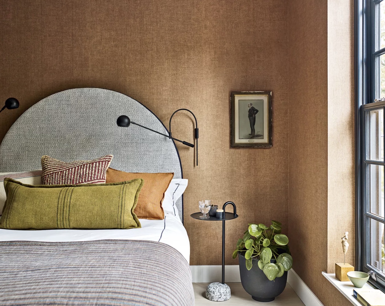
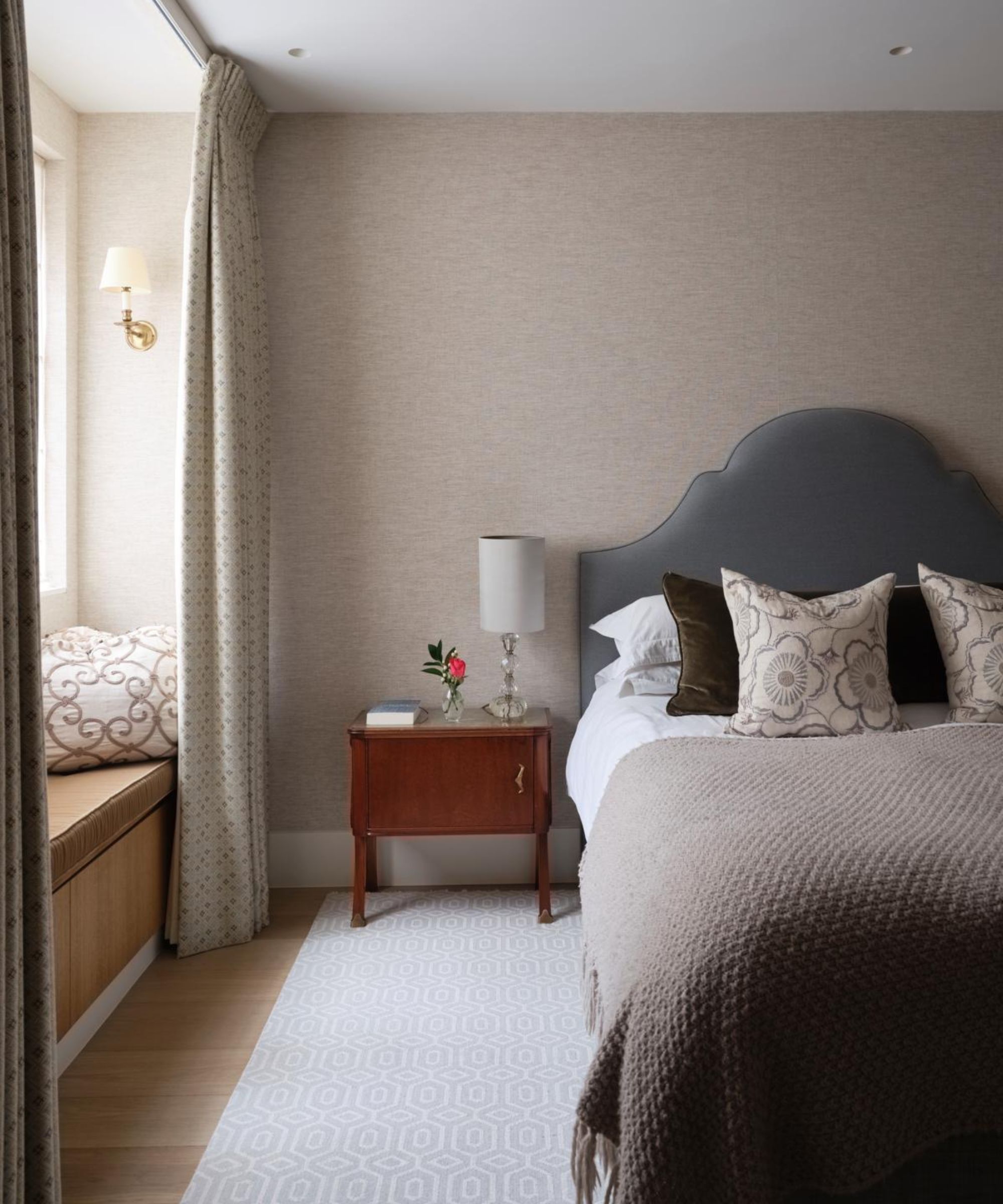
This is a contemporary bedroom but the use of rich tones, shapes, and details creates a connection with nature that makes it appear almost timeless. Strong and warm, the sophisticated brown in this scheme is respectful to other colors in the room, managing not to overpower the fine furniture and accents.
‘For this Chelsea house project we worked to a selection of nature-inspired finishes with a strong preference for earthy terracotta and green and blue hues, which are offset against sleek black details,’ says Irene Gunter of design practice Gunter & Co. Irene describes this room as having ‘a lovely, cozy shape’, which was enhanced by the ‘warm, enveloping’ hand-woven texture of the wallcovering – Casablanca from Altfield.
4. How to use brown in a bathroom
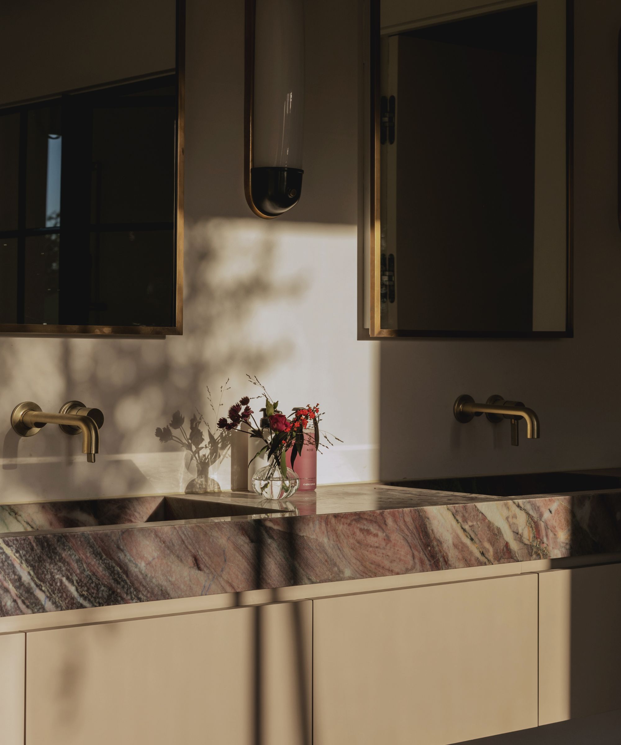
The beauty of the fall palette is that the tones work wonderfully layered together, but also naturally complement the timber and stone prevalent in the home. When decorating for warmth and comfort, color is a transformative tool, but be sure to introduce plenty of texture and lighting, too.
Bathrooms are somewhere you can indulge in deep, dark colors without upsetting the flow of your overall interior design. For a luxurious haven to unwind in, consider investing in brown-veined marble and taupe cabinets and vanities.
Shop the look
Paint is not the only way to introduce glorious taupe, chestnut and umber tones to your home. Instead, a few key furniture, furnishings and accessories can set the mood.
Sign up to the Homes & Gardens newsletter
Design expertise in your inbox – from inspiring decorating ideas and beautiful celebrity homes to practical gardening advice and shopping round-ups.

Jennifer is the Digital Editor at Homes & Gardens. Having worked in the interiors industry for several years in both the US and UK, spanning many publications, she now hones her digital prowess on the 'best interiors website' in the world. Multi-skilled, Jennifer has worked in PR and marketing and occasionally dabbles in the social media, commercial, and the e-commerce space. Over the years, she has written about every area of the home, from compiling houses designed by some of the best interior designers in the world to sourcing celebrity homes, reviewing appliances, and even writing a few news stories or two.
-
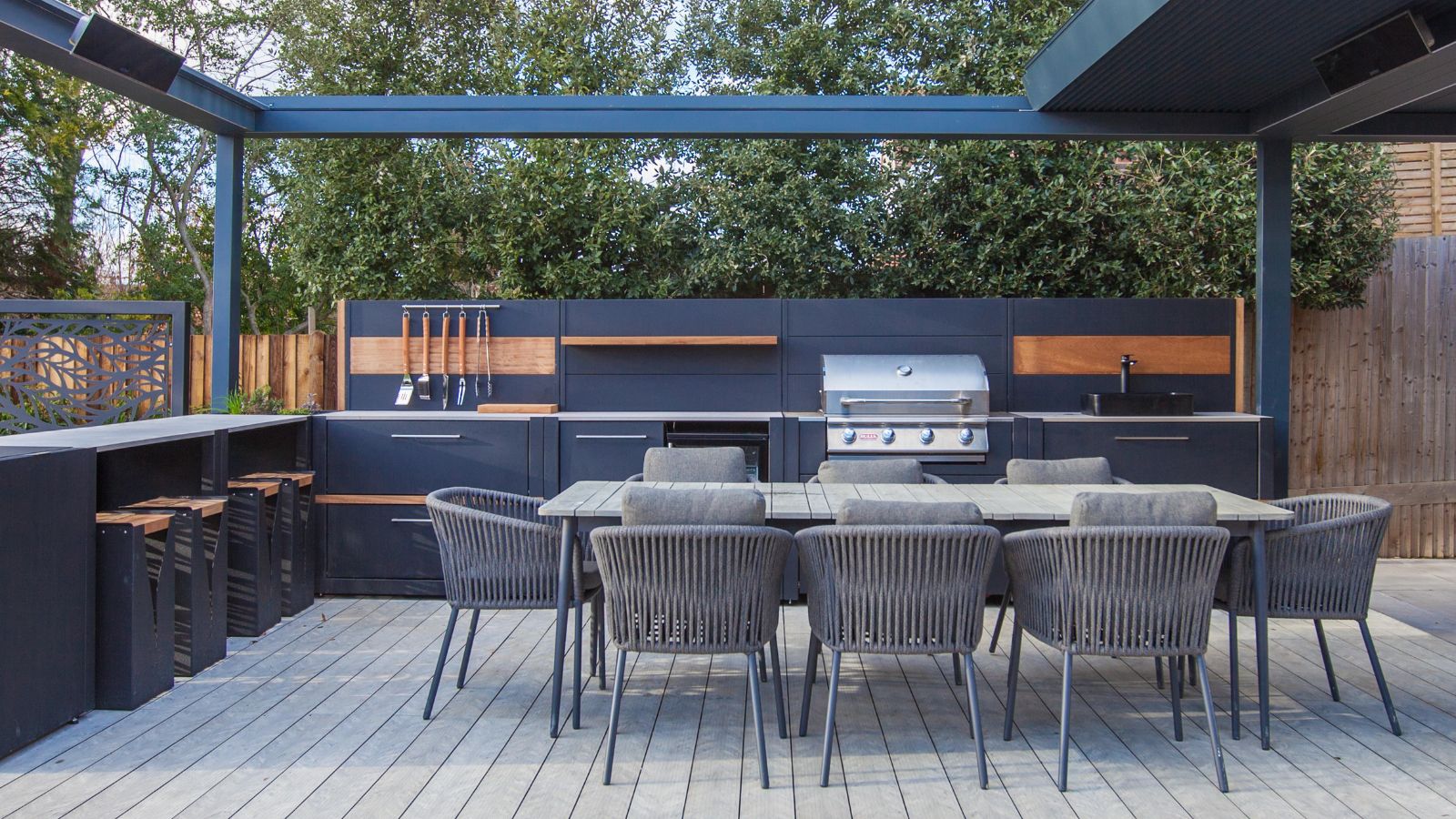 How can you make an outdoor kitchen feel more luxurious? Designer tips on making this hardworking space extra opulent
Discover the strategies the experts use to give an outdoor kitchen luxury style
By Sarah Warwick
-
 Kyle Richards' unconventional styling encourages you to use shelves for more than books – it's a fresh twist on 'bookshelf wealth' for 2025
The Real Housewife of Beverly Hills intentionally decorated her shelf with ceramics and accessories that have enough room to breathe, and designers love her look
By Hannah Ziegler
