What color is Farrow & Ball's Pigeon? Designers weigh in on this 'chameleon' paint color and share their favorite ways to decorate with it
With hints of blue, gray, and green, this popular paint color is an elevated take on classic neutrals
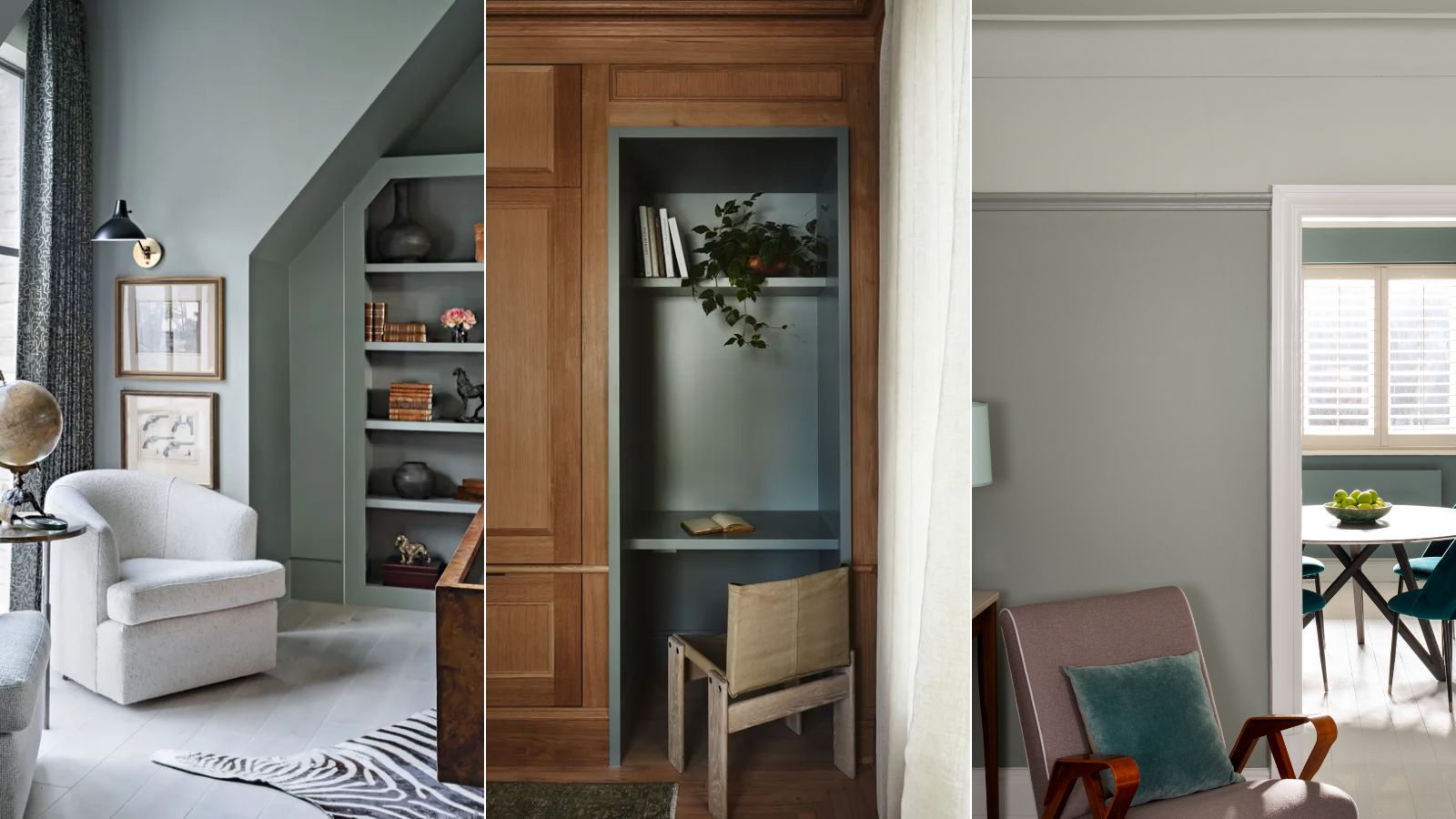

Farrow & Ball's Pigeon is a popular paint color amongst designers, used across various projects for its timeless quality and ability to create cozy spaces.
Described by experts as an alternative to classic neutrals with more depth and interest, it's for good reason we're seeing more and more of this intriguing hue.
We talked to interior designers and Farrow & Ball in-house color specialists to learn more about this calming and nuanced paint color, providing you with all you need to know before trying it out for yourself.
What color is Farrow & Ball's Pigeon?
Pigeon is a nuanced paint color. It's made up of blue and gray hues, but in some lights, it also appears green, meaning it doesn't read as one specific shade. It also has a muted quality to it, with no tones too saturated. Because of this, it appears soft as a wall color that's versatile to use, pairing well with many other paint ideas.
'Pigeon is such a versatile paint choice,' says interior designer Hannah Hampton of Ottosam Designs. 'Its pigmentation, inspired by nature, provides a depth of color without dominating any space.'
'We find it works really well in small, darker spaces and it is an elegant paint choice for those who are scared to go too bold with color, and some would argue it could be considered neutral,' continues Hannah.
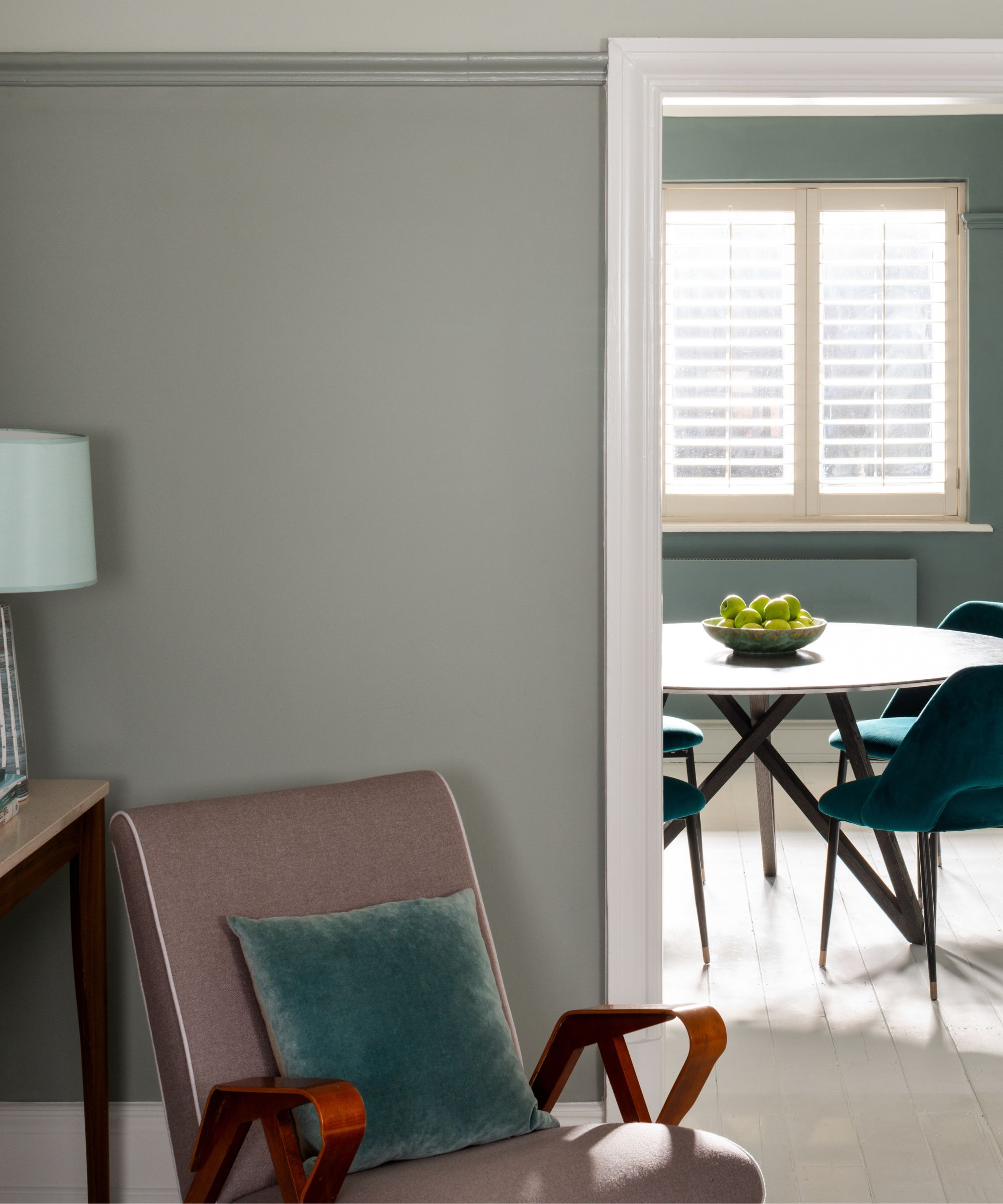
Pigeon also works well as an accent color if you favor a more subtle approach to your room color ideas, according to Farrow & Ball's Creative Director Charlotte Cosby.
'Pigeon is a great color to introduce on your woodwork, such as skirting, stairs, or door frames when you use a neutral on all your surrounding walls,' says Charlotte. 'This technique highlights accents within the room without being too overpowering and provides a step into color blocking for anyone venturing into using color for the first time.'
When it comes to deciding on the right color combinations for Pigeon, white paints make some of the best choices. 'We highly recommend pairing Pigeon with Farrow & Ball's Slipper Satin or School House White to create a harmonious space,' says interior designer Melissa Read, Creative Director at Studio Burntwood.
Additionally, Pigeon 'complements natural woods and brass ironmongery, adding a touch of warmth and character to a space,' says Melissa.
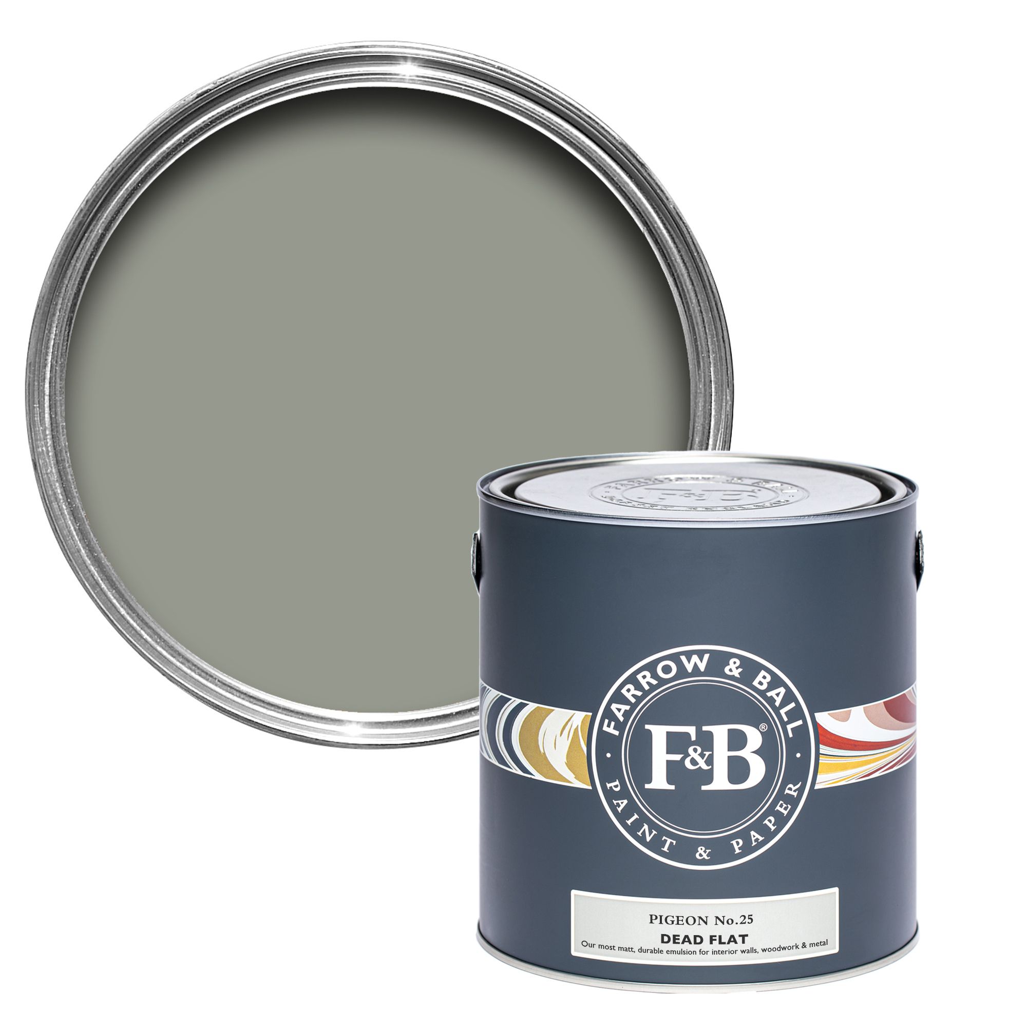
Described by Farrow & Ball as a 'strong blue-gray', Pigeon is a warmer alternative to classic gray with a subtle warmth that gives it a cozy look.
3 ways to decorate with Farrow & Ball's Pigeon
Looking to incorporate this versatile paint color into your home decor ideas? Read on to see three ways designers decorate with it, from living rooms to home offices.
1. Color drench rooms for an on-trend look
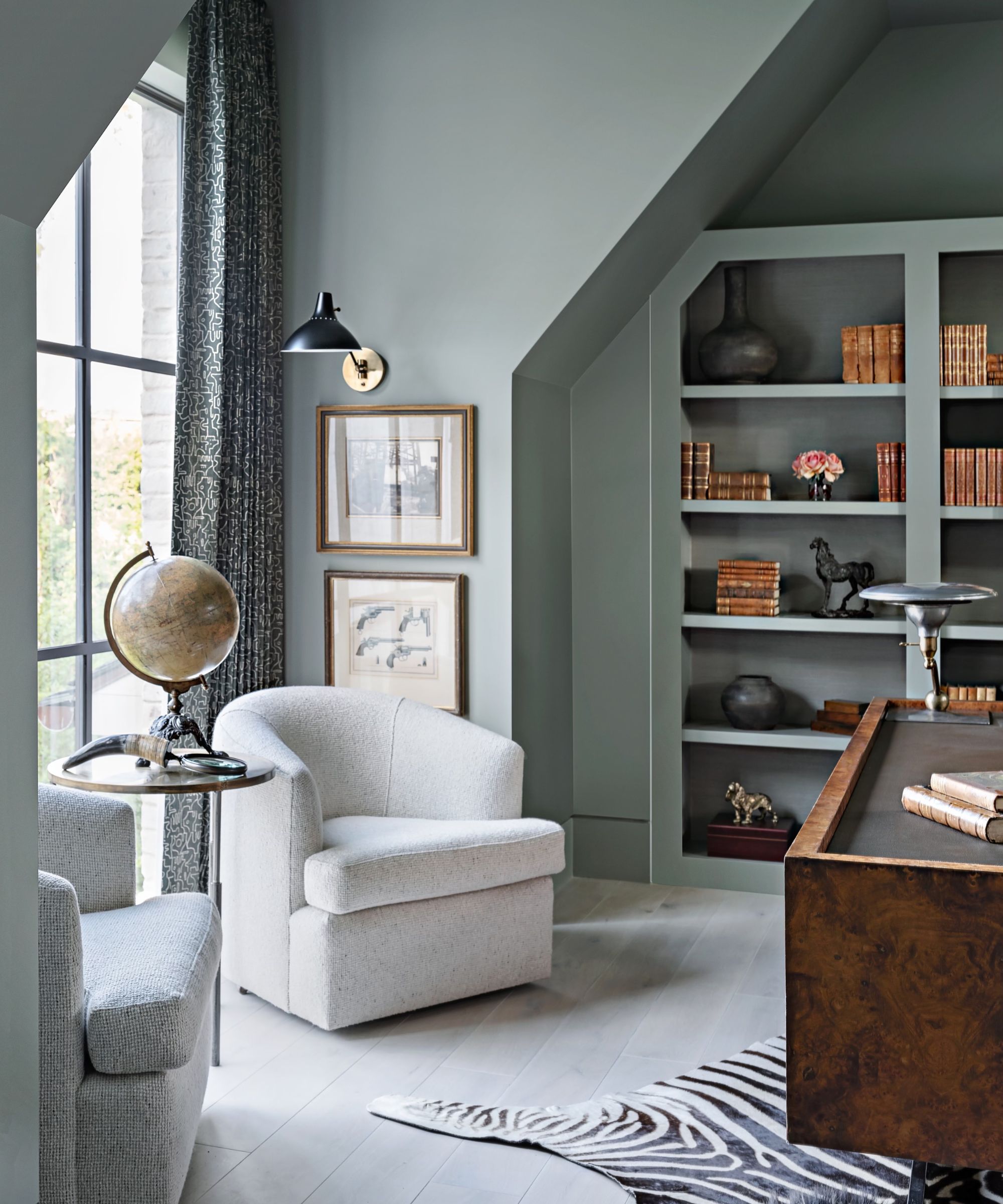
Rather than using Pigeon as an accent color, it works just as well with color-drenching ideas, as demonstrated in this home office designed by Houston-based design studio Meg Lonergan.
'Farrow & Ball's Pigeon was chosen as the backdrop for this study due to its soothing and inspiring nature,' says Senior Project Designer Becky Duca.
By using the paint color across the whole room, including the ceiling ideas in addition to all four walls, a cohesive and on-trend look is created.
'This organic color will create rooms that feel both cozy and calming, especially in a low-contrast scheme,' says Farrow & Ball's Charlotte Cosby, who adds that Pigeon will read differently as the light changes throughout the day: 'It has an extraordinary ability to shift in the changing light, reading, blue, gray, or even green.'
2. Use Pigeon on cabinetry
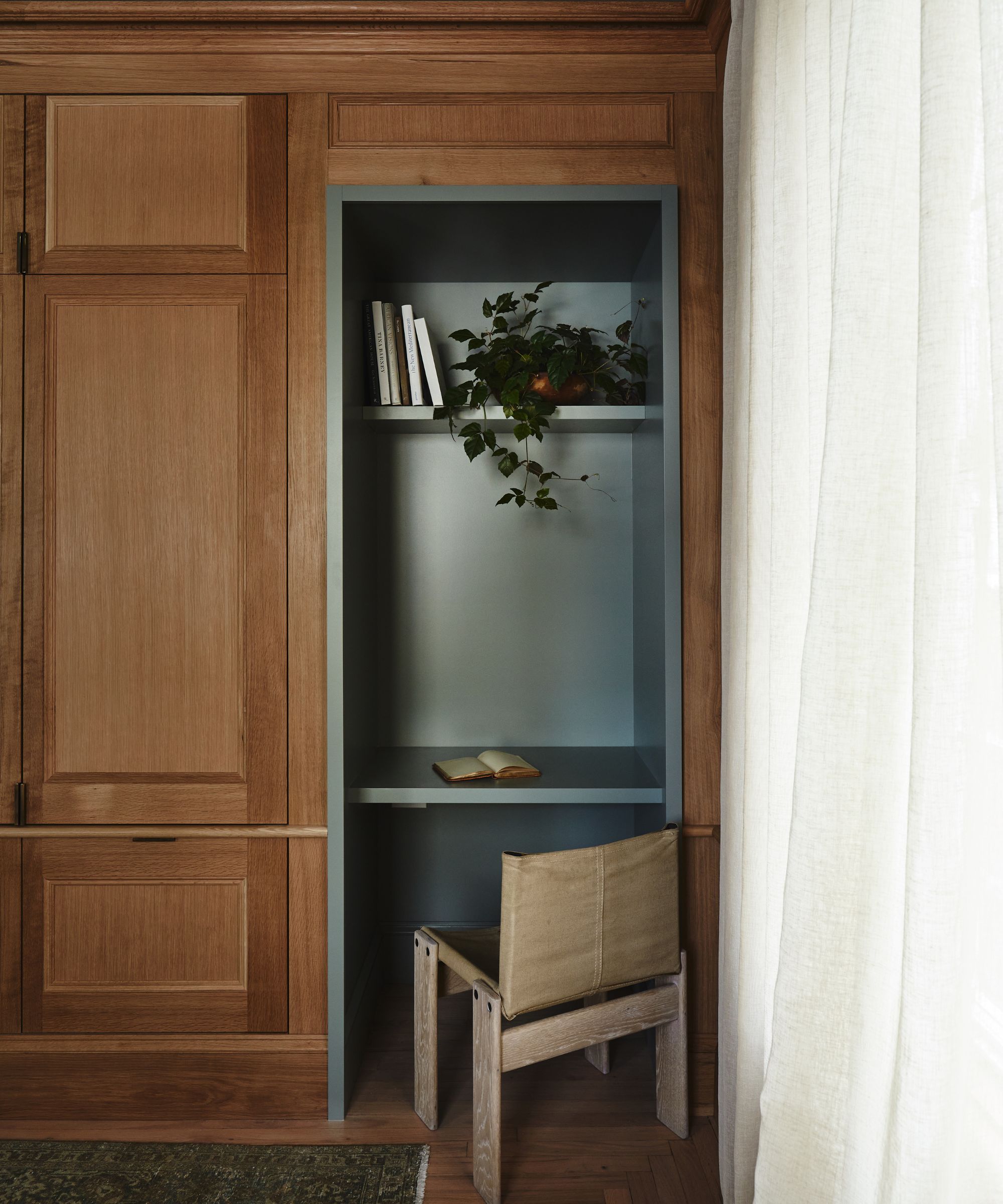
Pigeon is a popular paint choice for cabinetry in various rooms of the home, from kitchen cabinet ideas to living room shelving ideas.
In this home library designed by Moore House Design, Pigeon is used across the built-in shelving, adding interest to the room's warm wood tones.
'In our Newport Victorian Project, we utilized Farrow & Ball’s Pigeon to create a distinctive and impactful milled library in downtown Newport,' explains Blair Moore, Creative Director & Principal at Moore House Design.
'This color, with its enchanting blue-green undertones, perfectly embodies the essence of New England while adding a historic, nuanced touch. Our client’s appreciation for blue and white oak inspired us to infuse the space with a Newport coastal aesthetic, enhanced by the unique character of Pigeon, which aligns seamlessly with our Moore House Design approach.'
3. Create a calming living space
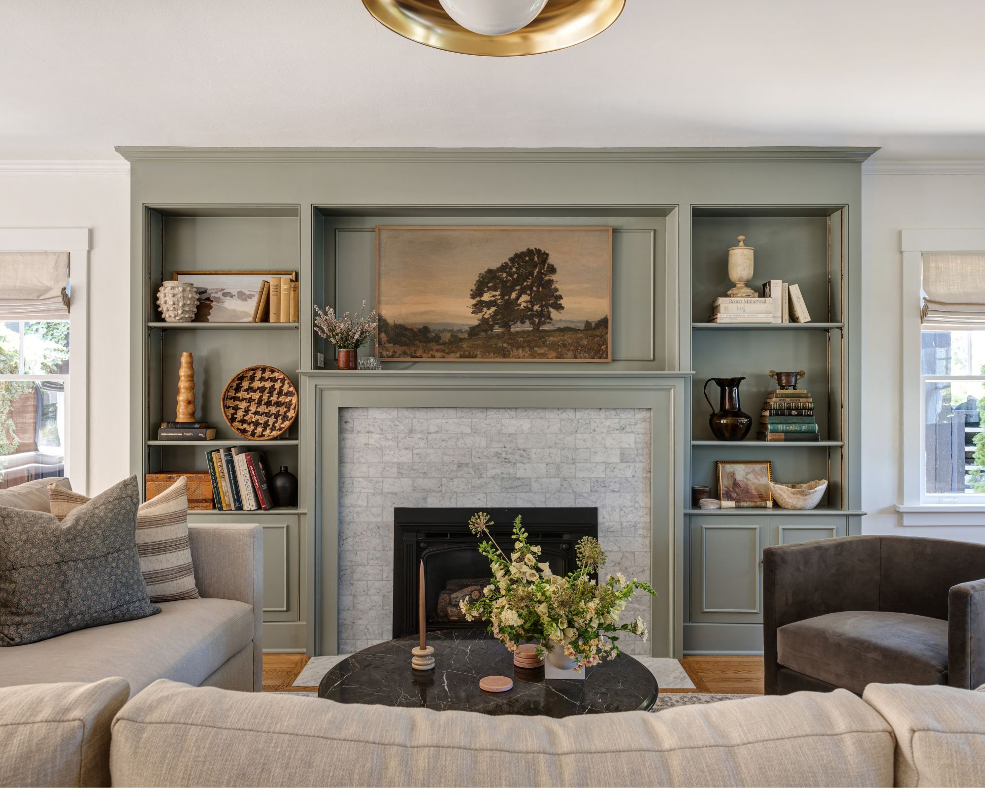
If you're looking for living room color ideas, Pigeon makes a timeless choice. With more interest and depth than classic neutrals such as gray, Pigeon adds character while maintaining a pared-back look.
In this modern living room, Cohesively Curated Interiors painted the built-in cabinetry with Pigeon, balanced with the rest of the room's classic white walls.
'We love Farrow & Ball's Pigeon because it is one of those chameleon colors that have some green, some gray, and a hint of blue,' explains Emily Ruff, owner and principal designer at the Seattle-based design studio.
'It plays nicely with both cool and warm tones and feels like a neutral even though it does have a hint of color. We love using it on cabinetry to create a focal point in a space that has light or white walls.'
Pigeon is an in-between paint color that makes it versatile and easy to decorate with. Whether you use it as a backdrop color to create a cozy living room or use it more sparingly across woodwork teamed with white walls, this color brings warmth and interest to spaces – a refreshing change from gray or beige.
Sign up to the Homes & Gardens newsletter
Design expertise in your inbox – from inspiring decorating ideas and beautiful celebrity homes to practical gardening advice and shopping round-ups.

Emily is a freelance interior design writer based in Scotland. Prior to going freelance in the spring of 2025, Emily was Homes & Gardens’ Paint & Color Editor, covering all things color across interiors and home decor for the Homes & Gardens website. Having gained specific expertise in this area, Emily is well-versed in writing about the latest color trends and is passionate about helping homeowners understand the importance of color psychology in home design. Her own interior design style reflects the simplicity of mid-century design and she loves sourcing vintage furniture finds for her tenement flat.
-
 Bethenny Frankel says this affordable but 'expensive-looking' silverware set is the perfect stand-in for an iconic $2,050 version – recreate the look for under $60
Store your flatware in style with the RHONY's flashy (but affordable) egg-shaped flatware recommendation – and get the look no matter your budget
By Sophie Edwards
-
 Easily harness the decluttering power of the Category Consolidation Approach – if you constantly try and fail to 'eat the elephant whole', experts say this one's for you
Take the stress out of streamlining with this tried-and-tested method that home organizing pros love
By Andy van Terheyden