What color is ecru? How to use it in your decor
A wonderfully adaptable neutral shade that can integrate into homes of all styles, we explore the question, what color is ecru?
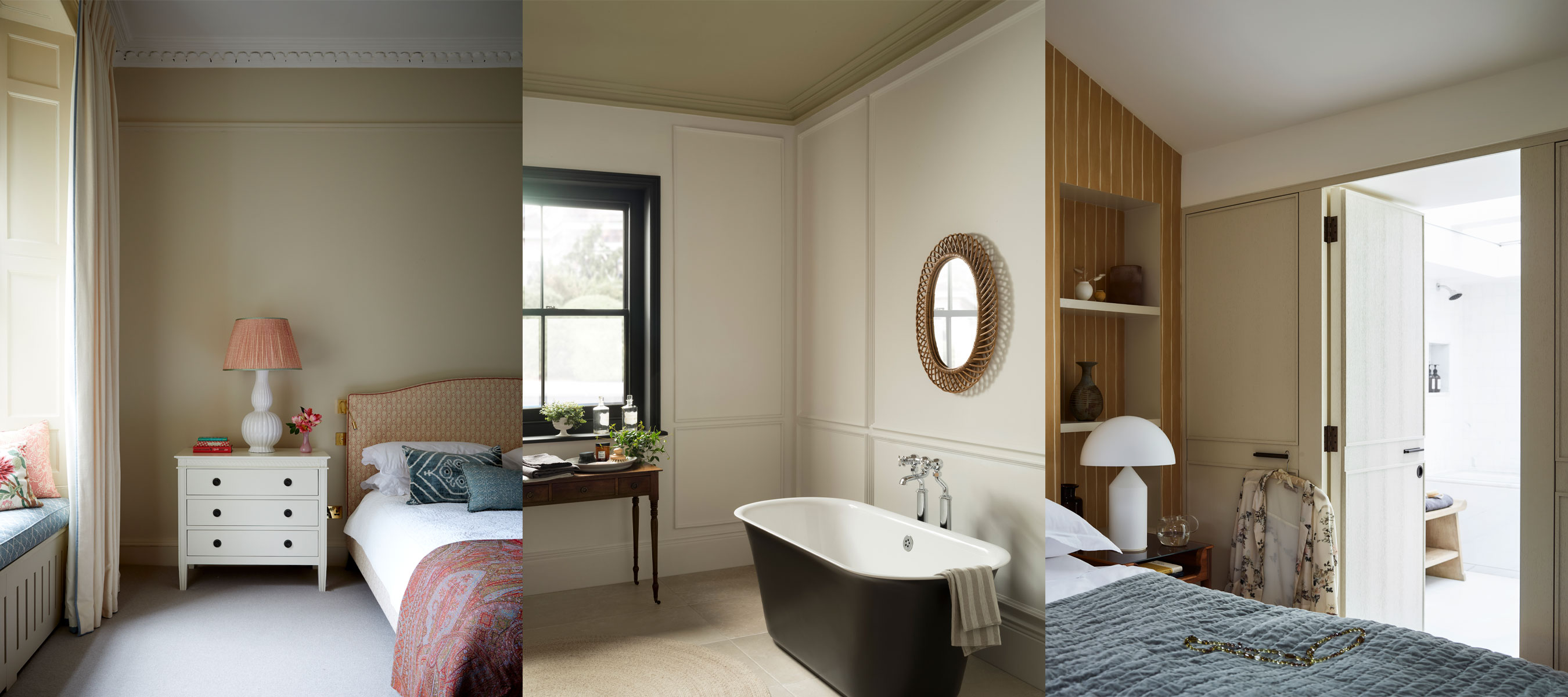

A color close to beige, cream, ivory and in some cases, gray and yellow, there can often be confusion over the 'right' answer for the question, what color is ecru?
Used across interiors and fashion, ecru is a color that does not sit on the traditional color wheel, with there being many ecru shades out there to choose from. This popular neutral can be presented as a bright off-white, as well as a more warming, earthy yellow, so there is much to think about when choosing the perfect ecru shade for your home.
Ecru was for many years seen as a shade of beige, however, the color now stands alone, with more yellow and gray undertones. Typically, the color ecru is described as the color of unbleached linen, stemming from the French word, 'ecru', meaning 'unbleached' in English.
If one thing is for certain, ecru belongs to a family of versatile neutral shades, and has a warming, relaxing and soft quality. From Boho and Scandi-inspired looks, to modern and minimalist designs, ecru is a timeless choice suited to schemes of all characters.
What color is ecru?
When planning on how to use ecru for your room color ideas, the color provides a whole host of creative possibilities. Whether you're searching for a grounding base color for your paint ideas, or are decorating with neutrals throughout a room and are in need of a palette of varied colors, there are options for all.
Farrow & Ball brand ambassador Patrick O'Donnell states, 'a joy to use on walls or woodwork, ecru can create an effortless calm in any room - but just to add a note of caution, it can read a little cool in east-facing rooms if erring on the gray side too much, so look for a little more yellow through it, great examples in the F&B palette are Lime White, Off White & Shaded White.'
Proving a popular color for paint ideas in homes both classic and contemporary, with its relaxing, seamless qualities perfect for integrating into almost any design, ecru is also an attractive color choice for furniture and accessories. With brands such as Ferm Living using ecru and cashmere as staple color finishes across their furniture, lighting and accessory lines, these calming, natural neutrals not only perfectly represent the Danish design houses' refined, organic and comforting aesthetic, but the enduring popularity and versatility of neutral room ideas.
From paint, to cushions, curtains and upholstery, ecru can bring a timeless elegance to your home.
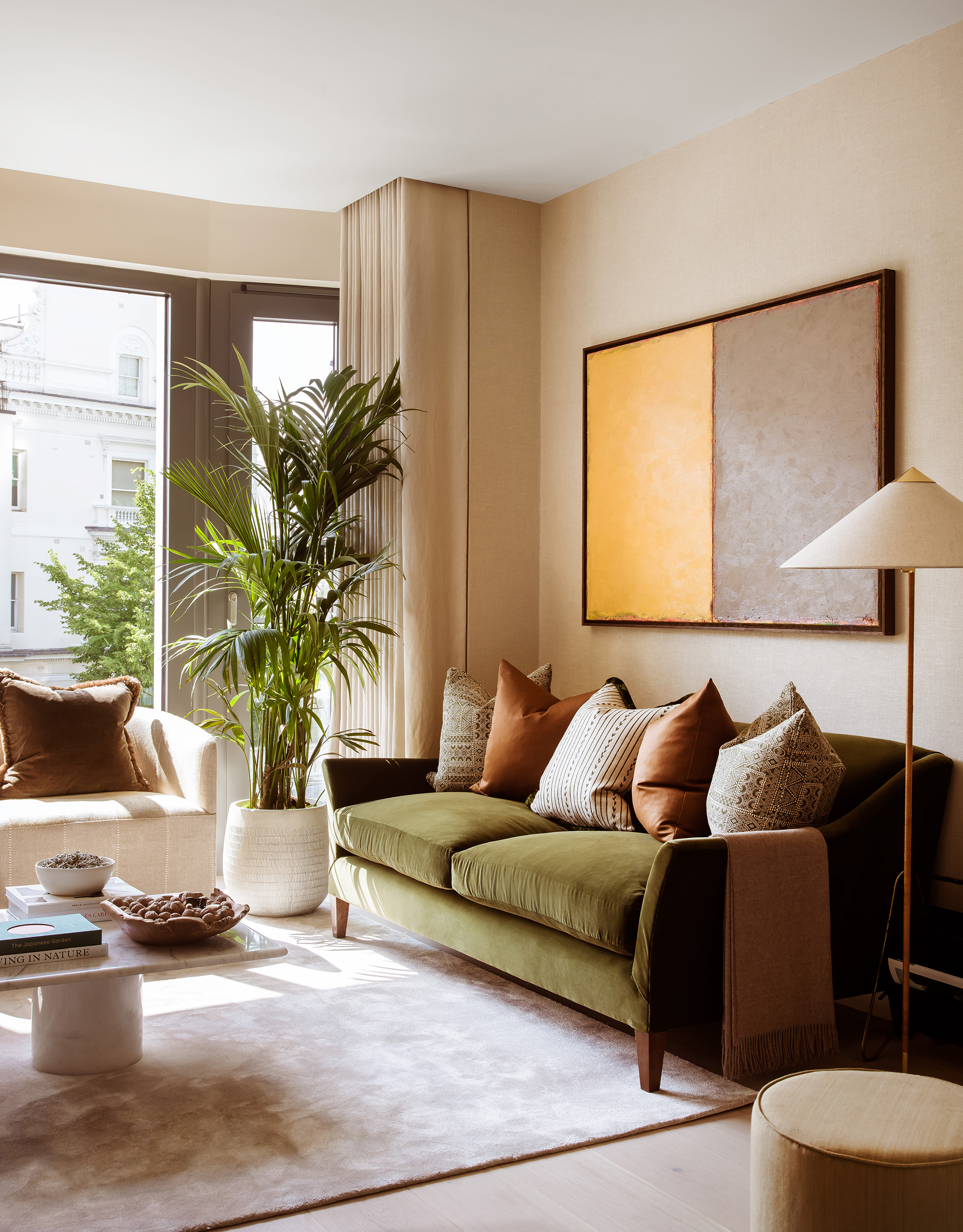
What does the color ecru look like?
Very similar to the color beige, ecru is a relaxing, neutral color, some shades are closer to a light, off-white, with others more earthy, with hints of yellow making them closer to a tan or khaki.
What are the undertones of ecru?
Justyna Korczynska, senior designer at Crown Paints says, 'ecru is a warm neutral that includes hints of brown and gray and is from the beige family. Ecru connotes an earthy vibe that is very easy going and calming.'
Patrick O'Donnell also states, 'ecru is the color of unbleached linen, and has gentle gray, green and yellow notes.'
A truly unique neutral, ecru has both cool and warm undertones, making it a remarkably universal shade that can be used with an array of color combinations.
What colors go with ecru?
As we have discussed, ecru is an incredibly adaptable color to use in interior design, and can be paired with many other shades.
Whether you use ecru with other calming neutrals, such as beige and gray, or combine with more dramatic and strong shades, such as blue and orange, no matter your style, from soft to striking, ecru can be effortlessly integrated into your design scheme.
Is ecru cream or white?
Ecru is closer to cream rather than white, however, its yellow and gray undertones make it darker than cream, ultimately making it resemble a shade much like beige.
The color ecru can be a great off-white alternative to use if you want to add a subtle feeling of color and depth to a space, ideal for helping make a room feel more warm and cozy but still light and bright. As Patrick O'Donnell says, 'ecru is an amazingly versatile shade to use when pure white feels too clean.'
Sign up to the Homes & Gardens newsletter
Design expertise in your inbox – from inspiring decorating ideas and beautiful celebrity homes to practical gardening advice and shopping round-ups.

Zara joined Homes & Gardens in February 2022 as a Content Editor. After studying English Literature at University, she worked as an Ecommerce Website Editor, Content Writer and Buying Intern at multiple independent businesses within the luxury retail and lifestyle sectors. Her role at Homes & Gardens unites her love, experience and passion for the world of design and desire to create inspiring written content. She enjoys nothing more than discovering new trends, brands and products, whether that be in fashion, interior design or lifestyle.
-
 Your hydrangeas will flourish with bigger blooms and healthier growth thanks to this natural material
Discover why you should be using leaf mold to mulch hydrangeas
By Drew Swainston
-
 Charred little gem with saffron dressing
This recipe with charred little gem is both easy to make and sure to impress guests. It's the perfect side for fresh spring menus
By Alice Hart