What are the most timeless exterior paint colors? Experts pick out their favorite classic shades
Looking for the perfect exterior paint shade? Design experts share their tried and tested colors for a timeless finish
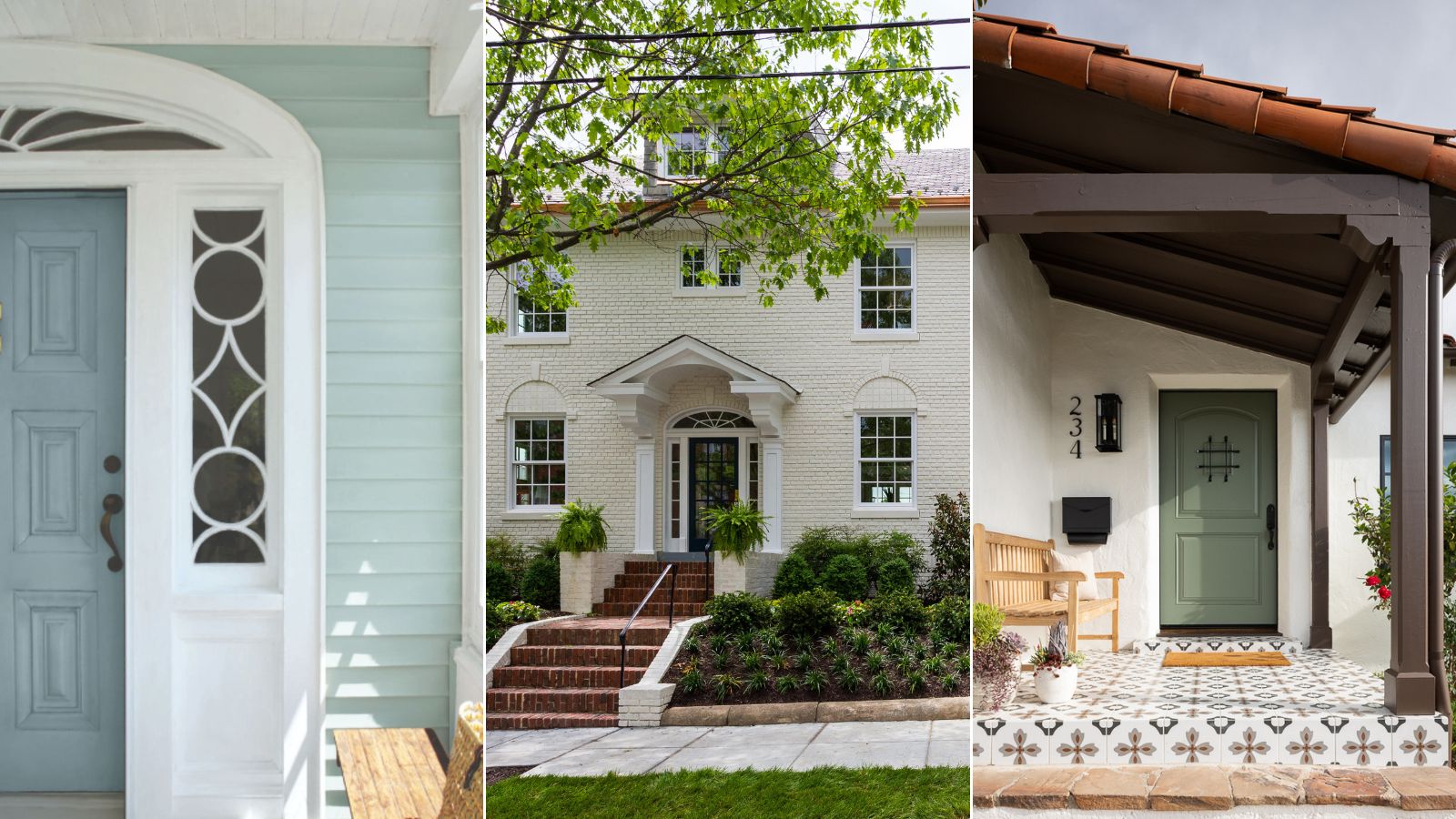
If you're thinking about paint colors for the exterior of a house to give it a classic look, you've got some decisions to make. The main one being, what paint color to choose? There are a number of important factors to take into account when you're considering the most timeless exterior paint colors.
First off, what style of house are you dealing with? Is it a new construction, or a period property? A townhouse or farmhouse style?
Next up, are you looking for one timeless shade to paint window frames, doors, shutters etc. or are you planning on using different paints for each element?
Lastly, if you're choosing a color for the whole of the house exterior, for instance if the home has a stucco finish or clapboard cladding, then you really will be looking for a timeless look that's easy to live with.
Once you've taken these initial considerations into account, you'll be closer to selecting the right shade. To give you a steer, we've asked interior designers and paint and color specialists to share their expertise on what are the most timeless exterior paint colors; between them they've come up with 21 different shades. Check out their recommendations below.
What are the most timeless exterior paint colors?
The experts we've been speaking to all have their own ideas about what are the most timeless exterior paint colors, so we've rounded up the best exterior paint colors according to designers below. However, as with any color conundrum, there's always an element of personal preference at play. So when you're choosing, make sure above all else that it's a color you like, and do try it out first using paint samples correctly to ensure you get the results you're hoping for.
1. Choose timeless white
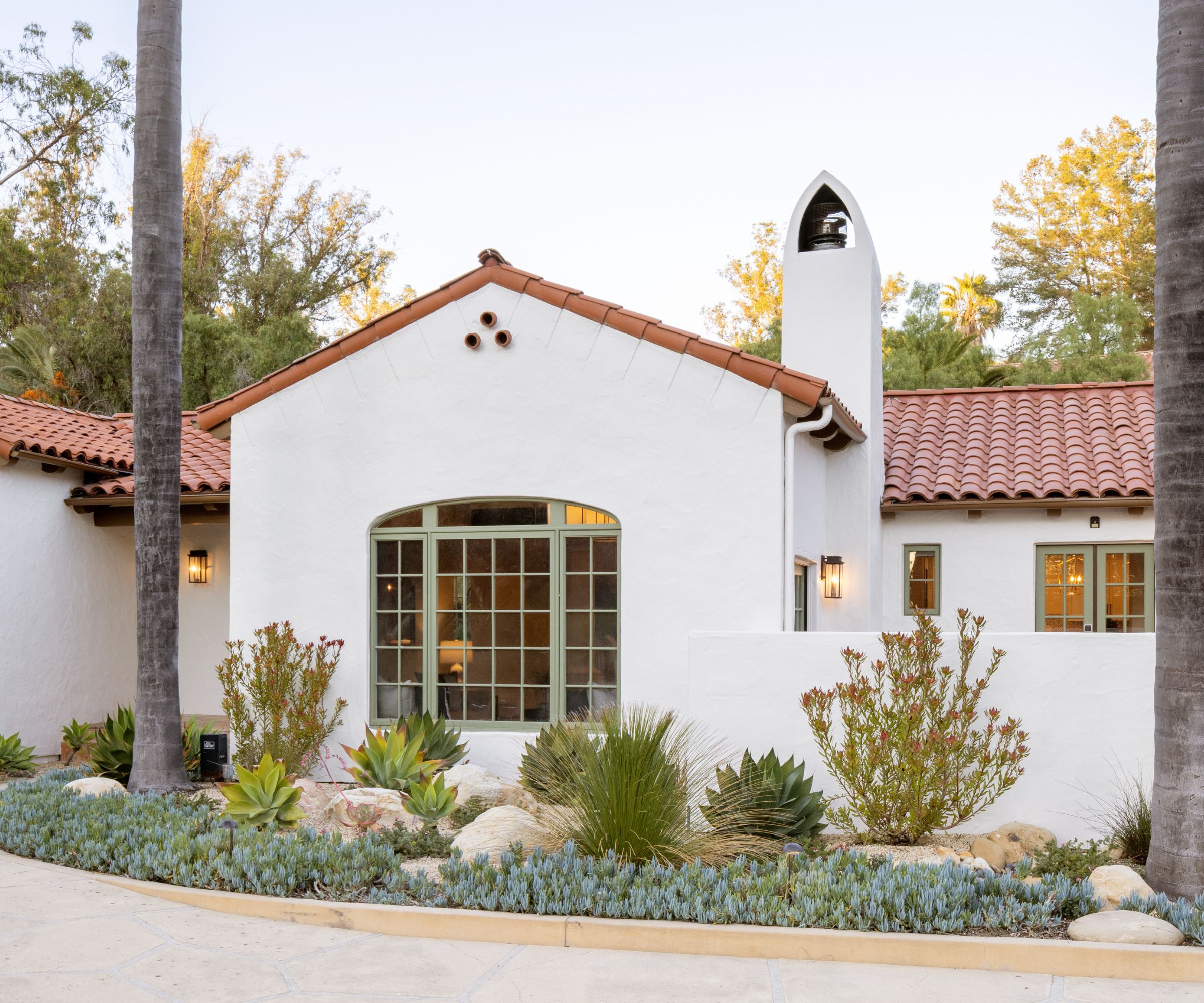
Exterior paint trends come and go, but if your house is a classic stone built, stucco, or brick home, you're probably looking for a more enduring, timeless option in keeping with the style of your house. May we suggest white? It might not be a daring or groundbreaking choice, but surely that's the point with timeless choices – they will stand the test of time.
California-based interior designer Mollie Ranize of Dmar Interiors says soft whites remain a timeless choice and for the Spanish-style home, above, she chose Sherwin Williams' White Duck, which she says is a cool white that is creamy and bright. 'In California, we work with a lot of stucco exteriors, but depending on the location, the orientation with sun patterns and amount of landscaping and hardscaping, getting the perfect, timeless exterior paint color can be tricky,' says Mollie. 'We don't take this decision lightly and we make sure to test various colors to be sure the home gets the perfect color. Some of our most successful exterior paint colors are soft whites that have a bit of depth.'
Ellen Hatton, principal of the Washington DC based firm BarnesVanze Architects (BVA), agrees, saying: 'You cannot go wrong with white! Benjamin Moore's Simply White works for everything from quieting down red brick to brightening wood siding. It gives a clean backdrop to the lush greens of landscaping, and is a classic contrast to a dark roof and maybe even a red barn or garage in a rural setting.'
2. Try a natural wood or a neutral paint finish
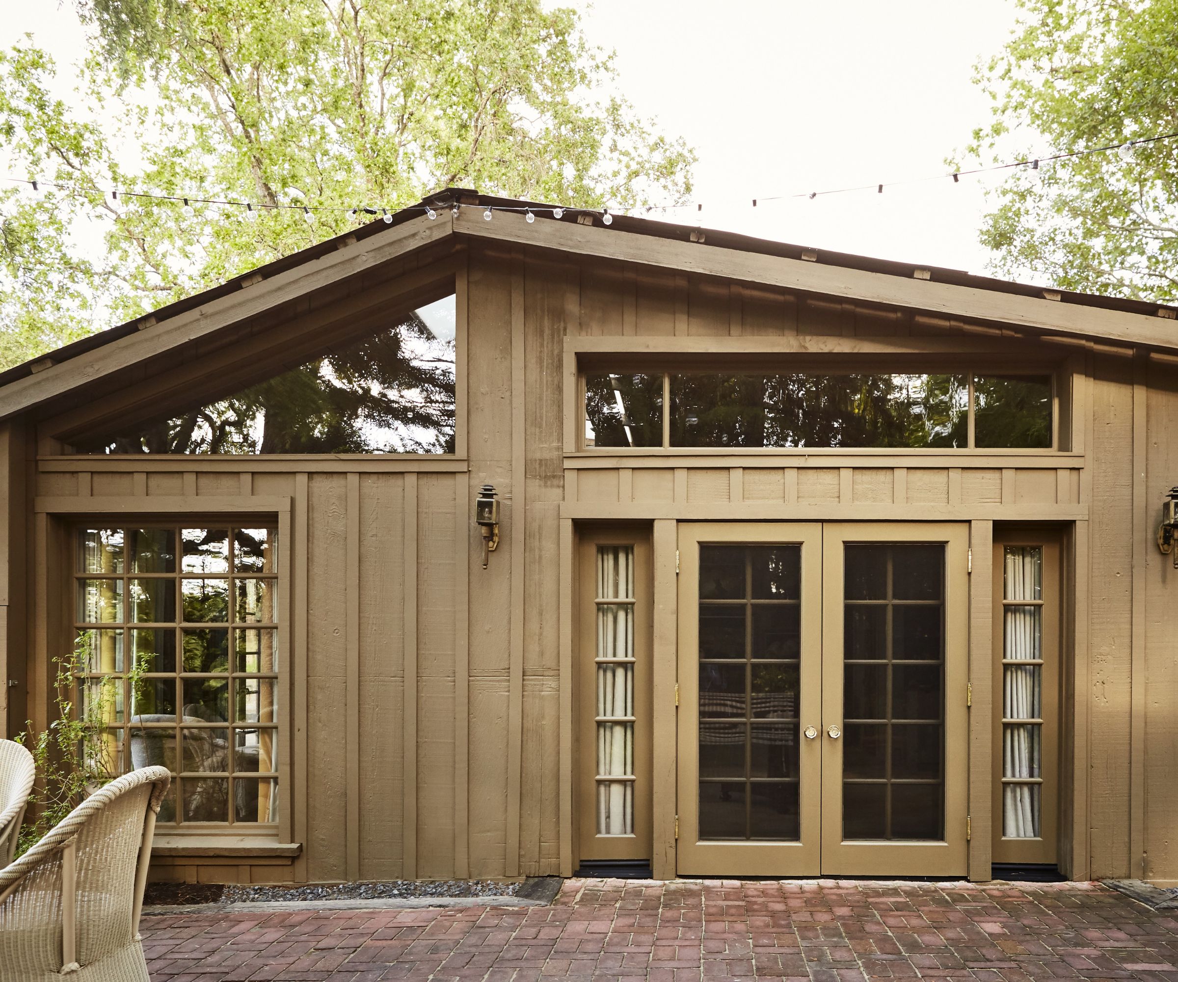
Natural wood or natural wood shades are another classic choice for exterior finishes to create a timeless look. These work well with cabin style homes, such as the California barn, pictured above, the home of textile designer Sandra Jordan. Natural wood is also a classic choice for the exterior trim on a modern farmhouse. If the exterior finish is white painted stucco, as in a Mediterranean or colonial revival home, then the contrast with natural or dark wood doors or window frames will give a smart finish.
'It's important to consider the exterior material the house is designed with,' adds Wayne Adams, 'such as the roof material or the overall aesthetics of the home. For instance, a house designed with cedar shingles might opt for a natural or stained look, while a brick house may retain its brick color, but it's always beneficial to take the house's surroundings into account.'
3. Make the right choice for a historic home
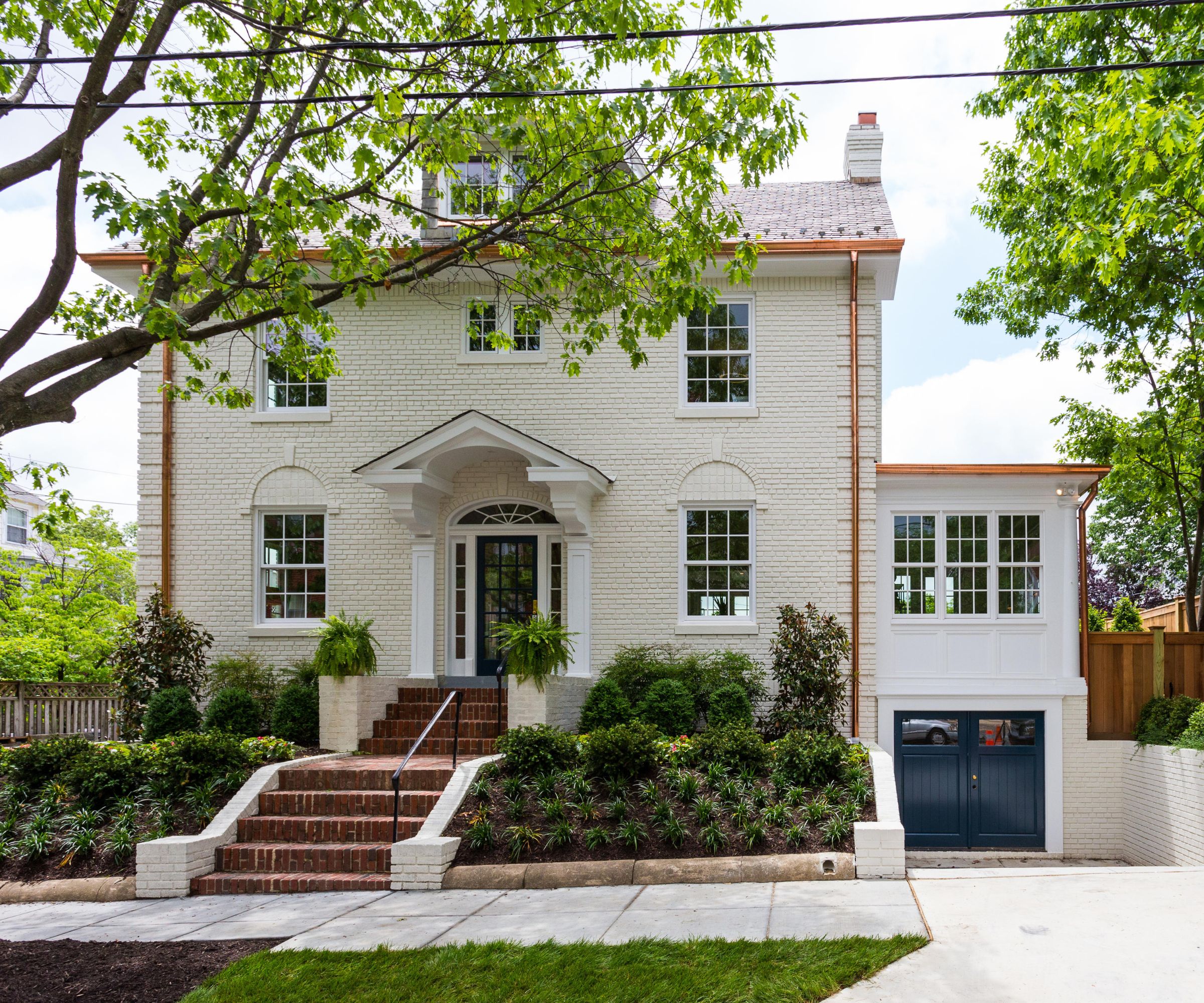
With a historic or heritage home as your backdrop, steer clear of the shock of the new. In other words, consider paint colors that have already stood the test of time rather than picking a contemporary shade that might look incongruous in a historic setting.
'Our Historical Color Collection and Williamsburg Collection are great places to start when choosing colors for historic homes,' says Arianna Barone at Benjamin Moore. 'Popular hues from the Historical Color Collection are Revere Pewter HC-172, Shaker Beige HC-45, Weston Flax HC-5 and, for those who prefer a darker shade, Hale Navy HC-154.' While from the Williamsburg Collection, Arianna recommends Tyler Gray CW-50, Geddy Gray CW-720 and Williamsburg Wythe Blue CW-590.
Architects Ballard +Mensua Architecture, who renovated and extended the historic Washington DC home pictured above, chose Benjamin Moore's Revere Pewter for the brickwork, having toured the neighborhood for color inspiration. Seth Ballard, the firm's principal says the color was chosen 'to give it a patinaed look that still ties into everything'.
4. Play it cool with coastal blues
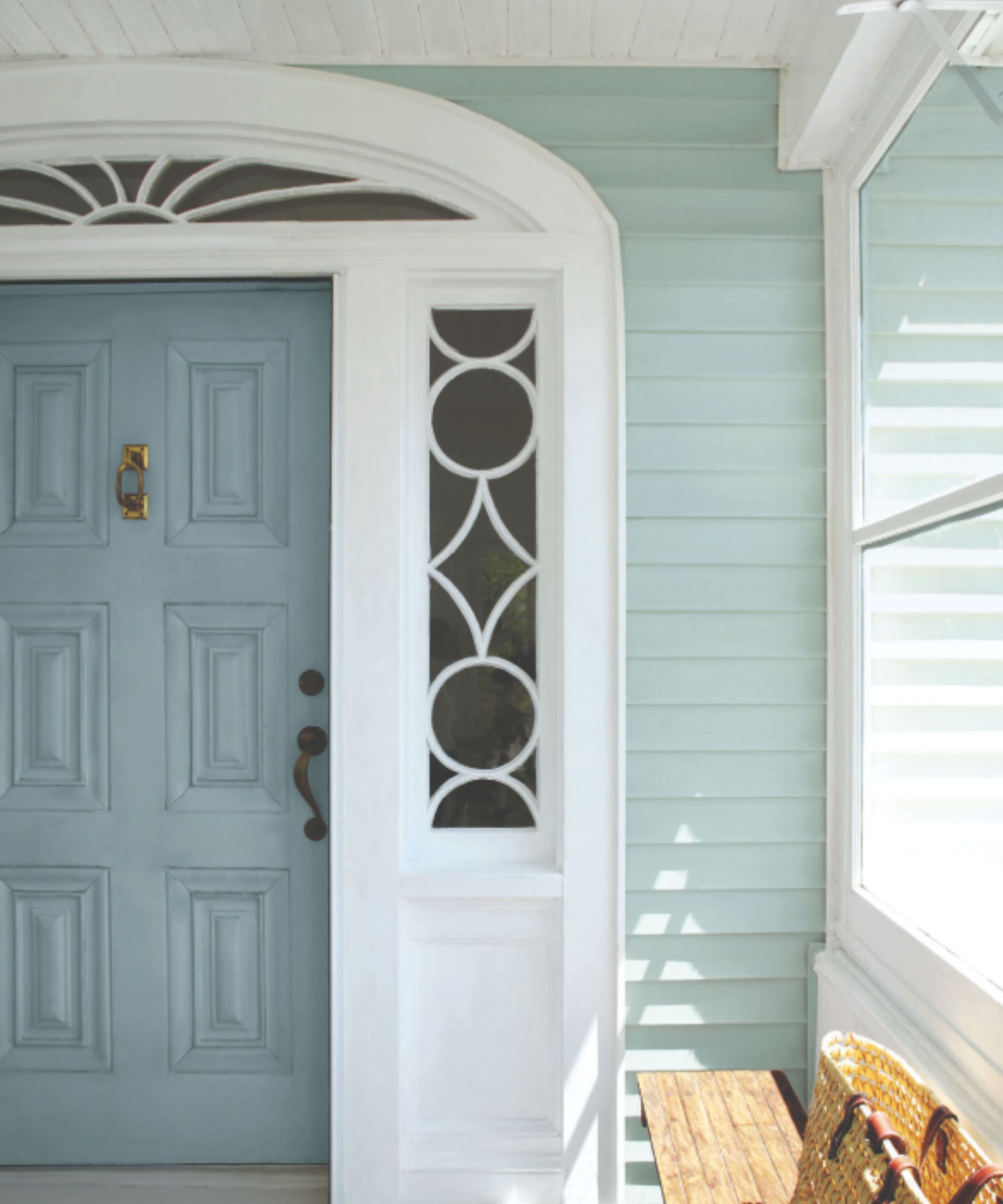
Interior designer Vani Sayeed of Vani Sayeed Studios agrees with her fellow experts that our paint choices should be guided by other external factors. 'The ideal choice for the exterior color depends on the style, location and materials of the house,' says Vani. 'For example, a classic New England colonial home will look wonderful in a combination of Puritan Gray HC-164 with the trim in White Dove OC-17, both by Benjamin Moore.'
We're a big fan of cool blues for all kinds of homes, since these cool, calming shades will give a timeless look whether you're by the ocean, in the heart of a city, or out in the countryside.
Arianna Barone has some additional Benjamin Moore blues to add to the list: Van Courtland Blue HC-145 and Wedgewood Gray HC-146, pictured above, on the front door and clapboard respectively. These soft blues work well in any setting, but look particularly good for a coastal home.
5. Consider the many shades of gray
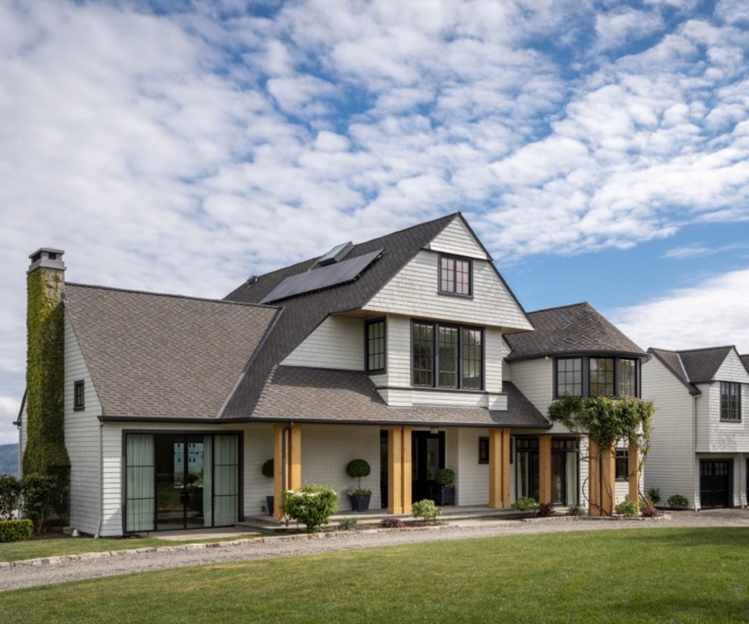
Gray enjoyed its time in the limelight around 10 years ago or so, and is still a serious contender in the popularity stakes, particularly where homeowners are looking to lend a more contemporary look to exteriors. But with so many shades of gray around, which are the best gray paints to choose for a timeless look?
The color experts we spoke to all have their favorites, but for interior designer Corine Maggio of CM Natural Designs, who led the design scheme for the Mill Valley, CA, home pictured above, there is one shade that stands out. 'Benjamin Moore Moonshine OC 56 is a versatile exterior paint color that works with nearly any home style,' she says. 'Though it reads white, it has a warm gray undertone that prevents it from being too sterile. It can be matched with a color or neutral trim and nearly any door color. It's a great timeless basic to consider when selecting an exterior color.'
Meanwhile, for Bay Area-based designer Lissette Fernandez-Hilson, who co-founded Together Home Design Studio, the right shade of gray can conjure up a whole ambience and lifestyle, particularly with historic homes.
'We absolutely cannot get enough of a weathered gray wood shingle home that uses a light soft white on the windows and doors, and accents the roof and gutters with copper,' says Lissette. 'It's the quintessential Nancy Meyers Cape Cod aesthetic. If you don't have wood shingles, but still want to bring the Hamptons to you, get the look by painting the body of the house Light French Gray by Sherwin Williams or Tranquil Retreat by Dulux and then pour yourself a glass of sav blanc!'
You had us at Nancy Meyers!
6. Refresh the look with the new classic greens
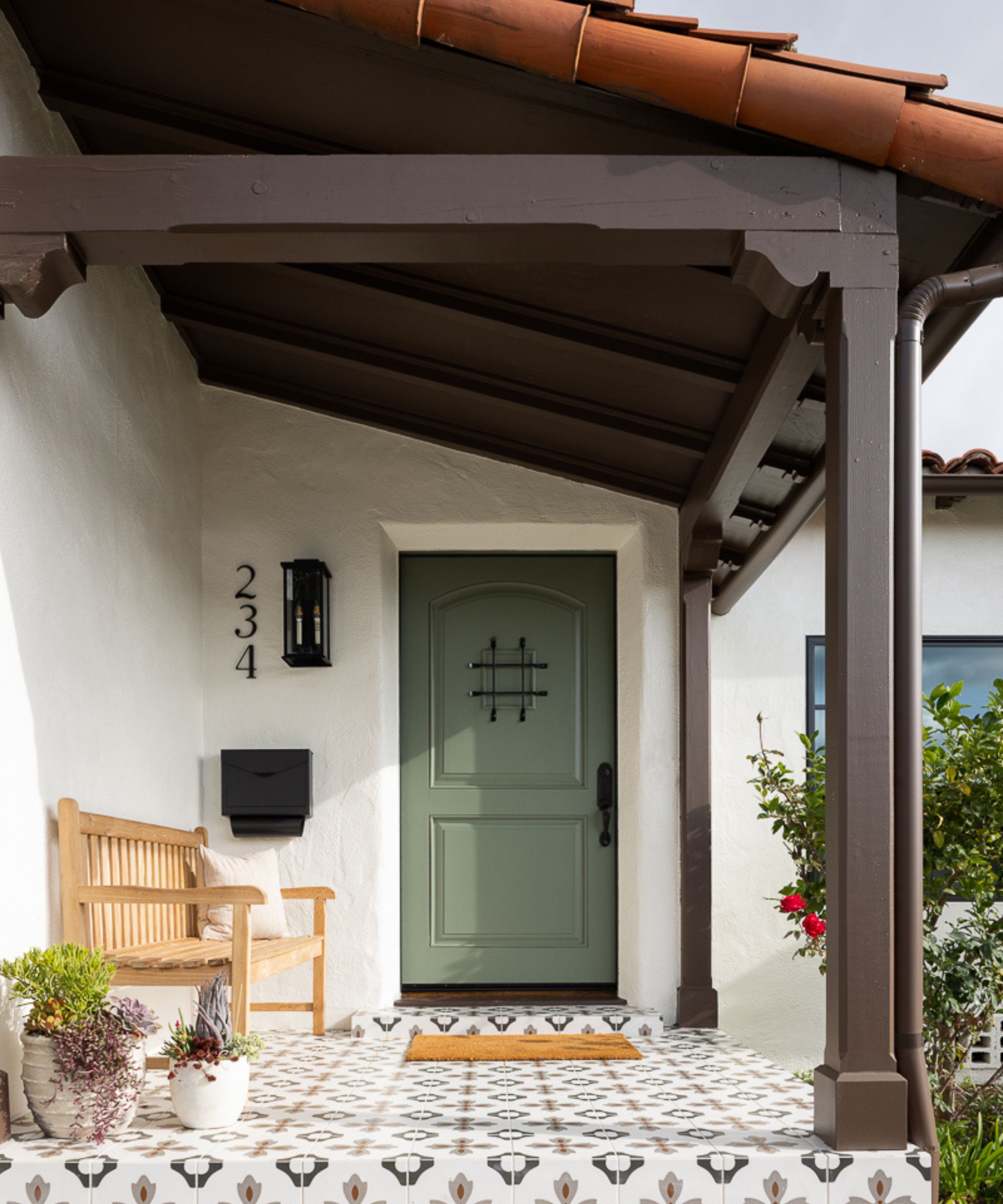
Green in all its guises is a relative newcomer to exterior paint finishes but as more of us seek out nature-inspired shades, it's a color that's rapidly establishing itself as a timeless classic. Pale greens and soft sage shades are popular choices for front doors and window trims, particularly on older properties but there's no reason why they can't bring a gentle hint of color to more contemporary settings, and exterior walls too.
Mollie Ranize specified a strong gray-green front door to partner with the light white walls for her California home renovation, above. 'The way this home sits on its property, the front of the home gets most of its sunlight in the afternoon and evenings, making it the perfect place for a lighter, sunnier white. We chose Sherwin Williams, Dover White, which brightened up the whole structure, with the green front door in Sherwin Williams' Dried Thyme linking up beautifully to the colors in the surrounding landscape.'
Sage green front door and bright white walls – it's a match made in heaven and is surely one of the ultimate color combinations for a timeless and stylish exterior.
Here's hoping that our color experts' favorite paint shades, listed above, will inspire some timeless looks for all kinds of exteriors.
Don't just take their word for it, however. There's no substitute for actually testing a color on the surface you want to paint. Time spent trying out and comparing sample paints is never wasted and it's definitely the quickest way to ensure the best results for timeless exterior paint colors.
Sign up to the Homes & Gardens newsletter
Design expertise in your inbox – from inspiring decorating ideas and beautiful celebrity homes to practical gardening advice and shopping round-ups.
Karen sources beautiful homes to feature on the Homes & Gardens website. She loves visiting historic houses in particular and working with photographers to capture all shapes and sizes of properties. Karen began her career as a sub-editor at Hi-Fi News and Record Review magazine. Her move to women’s magazines came soon after, in the shape of Living magazine, which covered cookery, fashion, beauty, homes and gardening. From Living Karen moved to Ideal Home magazine, where as deputy chief sub, then chief sub, she started to really take an interest in properties, architecture, interior design and gardening.
-
 I tried this one easy dishwasher trick and made the annoying need for manual drying a thing of the past
If you hate those little pools of water left on your cups and crockery, this towel trick is for you
By Punteha van Terheyden
-
 Renovation Aloha's Tristyn and Kamohai Kalama share the front color you need to sell your home – they explain, 'it's one of the areas you can go a little bolder'
In Homes & Gardens' exclusive interview with the Kalamas, they explain the renovations to make to the front of your home for property value
By Sophie Edwards