6 ways to use Setting Plaster, Farrow & Ball's iconic pink(ish) paint
Farrow & Ball's Setting Plaster has become one of the brand's best sellers, here designers talk us through how they use this not-quite-pink, not-quite-beige shade
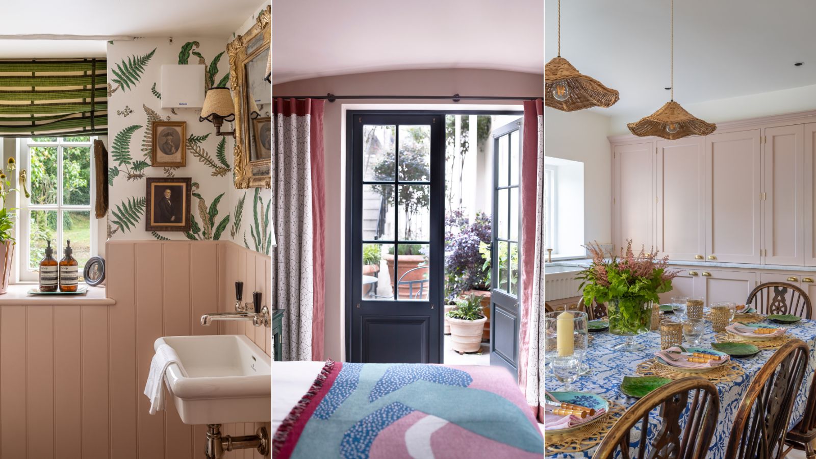

Farrow & Ball's Setting Plaster paint is iconic. It's one of the brand's best sellers yes, but it's also been a huge trendsetter, perhaps more so than any other paint I can think of.
It came well before the now hardly new interior design trend for bare plaster walls, and limewash effects, but how genius to create a shade that perfectly recreated that unique hue of freshly dried plaster. And slowly a flurry of paint colors trying to achieve that bare plaster look has come along since. But it was Setting Plaster that started it all and set the color trend.
I recently had my kitchen walls replastered (a very boring job that has had zero aesthetic impact on the space but needed doing for practical reasons) and before the white paint and the new tiles went on, I had a few glorious days where I had a plaster-toned kitchen. It felt almost sinful to paint back over it, it's such a gorgeous color that felt warm and welcoming and rustic but also very chic and considered.
So naturally, I ordered a sample pot of Setting Plaster, because I need to find a home for this shade in my apartment.
What color is Setting Plaster?
Farrow & Ball Setting Plaster has all the description you need in the name. It's the color of setting plaster. Not too pink, not too brown but somewhere in between that feels both warm and sophisticated. Farrow & Ball describe it as 'It is definitely a pink in historic terms, but has a certain softness to it due to the inclusion of yellow pigment.'
6 ways to decorate with Farrow & Ball Setting Plaster
Setting Plaster is one of Farrow & Ball's best sellers, and it's hardly a surprise, it's perhaps one of the most versatile pink paints available. As designer Bethany Adams says, 'There is nowhere that this hue doesn't work! Appropriate for sophisticated living rooms, and children's rooms alike, this pink is incredibly versatile.'
'For all-round flexibility, you can’t go wrong with Setting Plaster, a wonderfully flattering shade for bathroom walls, a delicate hint of color for a bedroom, or a grown-up warm blush for a living room. With its earthy undertone, Setting Plaster will bring warmth to a north-facing space and ‘knock back’ to a gentle neutral in sun-drenched spaces.' adds Patrick O'Donnell of Farrow & Ball.
Here's how designers recommend using it in your home.
1. Ground Setting Plaster with a bold burgundy
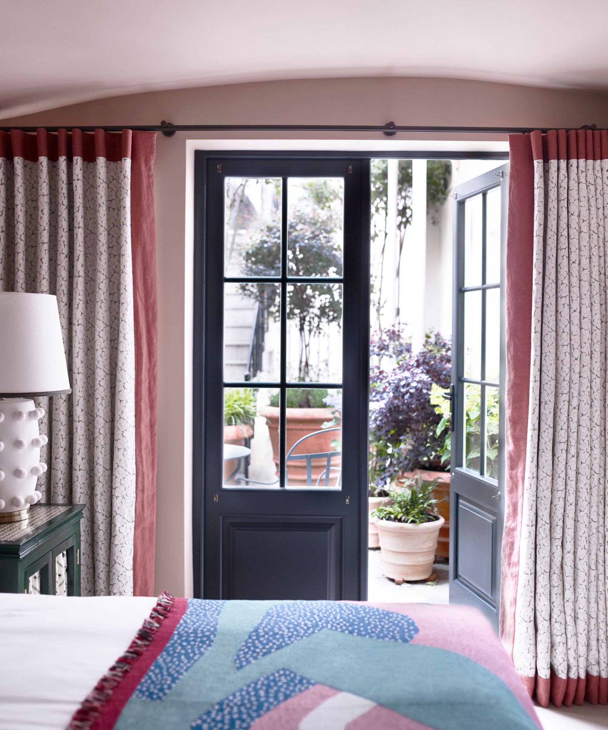
I think Setting Plaster is as grown up as pink paints get, but if you want to really tone down the sweetness, pair it with dark hues. Black is too harsh, a soft brown works, as does a really deep blue, but the color combination that feels most on trend right now is pink with a deep red or burgundy.
'Partner with Deep Reddish Brown for a scheme that exudes warmth, or mix with moody greens such as Green Smoke or an unexpected pairing with Hague Blue, for a thoroughly modern feel.' explains Patrick.
This guest bedroom designed by Gunter & Co. shows how it's done, bringing in just touches of deeper shades to ground the Setting Plaster walls. 'If you appreciate the appearance of freshly plastered walls, Setting Plaster by Farrow & Ball offers a more polished and easily maintainable version of that finish.' explains Irene Gunter.
'It creates a warm atmosphere, especially in rooms with limited natural light, such as those with small windows, facing north or located on lower ground floors such as this basement bedroom. I highly recommend this color as it instantly creates a feeling of safety and coziness, like receiving a comforting hug!'
2. Freshen the warmer tones with cooler shades
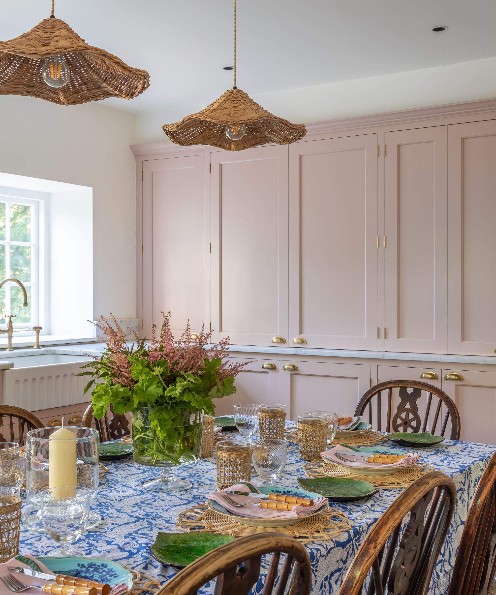
Pink is one of those chameleon colors that can work with both warm shades and cooler tones. Setting Plaster can be a really earthy color if you pair it with other warm shades like browns, creams, and beige and in this kind of set up it becomes far closer to a neutral itself rather than a pink. But pair with fresher cooler tones like blues and greens and it also becomes far fresher and cooler.
The tonal layered neutral look I think works best in those softer more lived-in rooms like a living room or a bedroom, but in rooms that you want to be a bit more invigorating opt for cooler pairings. Setting Plaster also appears far pinker when there's lots of natural light so it might be a better option to go for a complementary color scheme in this case. And Setting Plaster is so adaptable you can always switch between the two depending on the season.
3.Use Setting Plaster as a backdrop for mixing styles
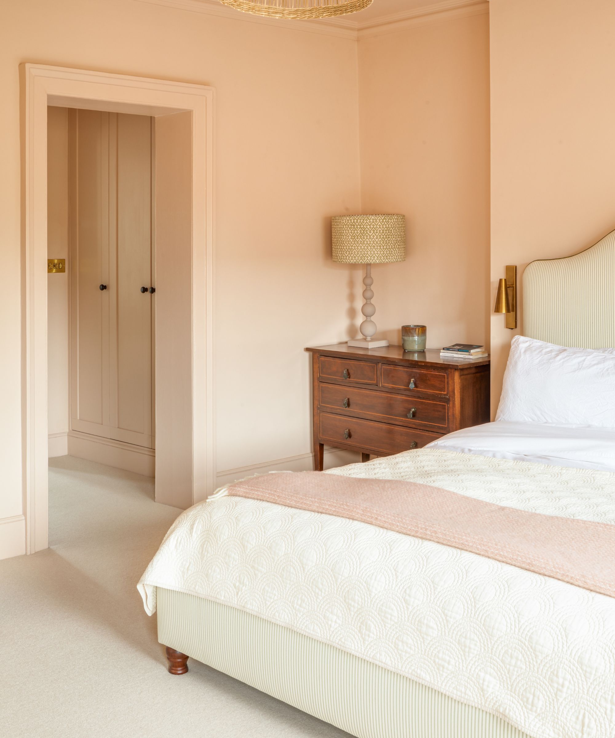
Not only is Setting Plaster versatile in that it happily sits alongside most other colors, it also works with many styles. Its more muted tones mean it works perfectly with softer more rustic and traditional styles, but it's also ideal for warming up more modern or minimalist spaces.
This also means it's an ideal backdrop for blending styles. In this bedroom designed by Berkeley Place, Setting Plaster works perfectly with the vintage furniture, but by color drenching the room there's a modern feel here too.
The studio's founder Nick Cryer explains, 'The master bedroom and dressing room featured Farrow & Ball's Setting Plaster colour on the walls, skirting, and windows. It was chosen for its soft, blush-like hues which create a calming and sophisticated atmosphere. It works well in various interior spaces, and its warm undertones complement both traditional and contemporary design styles. In this particular case, Setting Plaster provided an excellent backdrop for the client's antique furniture, whilst creating a contemporary feel within a modern home.'
4. Soften a bathroom color scheme
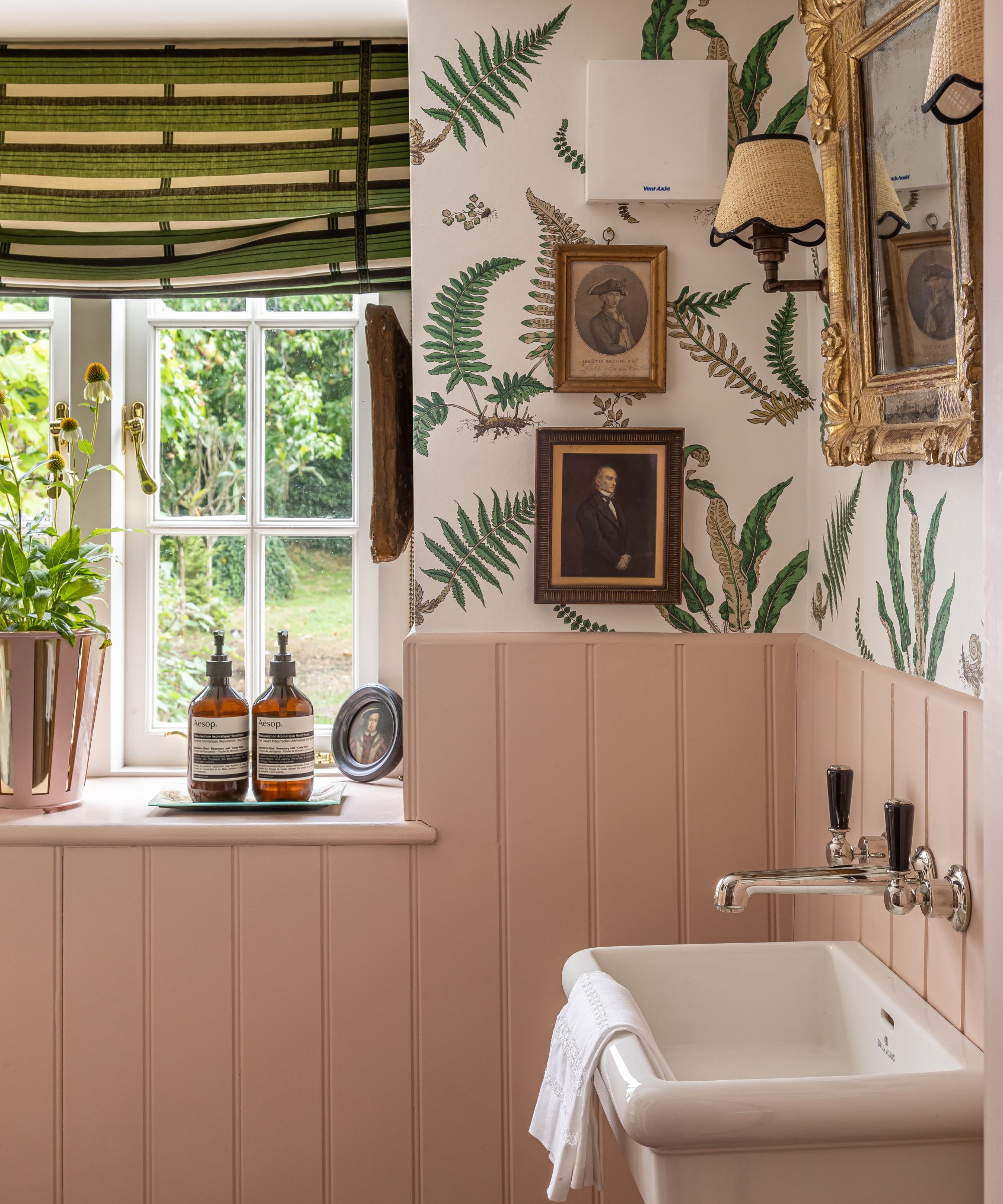
Not so long ago a bathroom color scheme was all about white. White fixtures often dictated that the go-to colors were whites, greys, chromes, very cool and clean. However, bathroom trends have been shifting and we are starting to approach bathrooms far more like living rooms, bringing in colors, textures, depth. Bathrooms are no longer sterile, but soft and Setting Plaster is the perfect shade to make even a practical space feel warmer and more welcoming.
This bathroom, designed by Samatha Todhunter is the perfect example. There's color, pattern, character, the fixtures are so far from the focus. 'Farrow and Ball’s Setting Plaster is just the right amount of pink - a divine and dirty not quite pink, that sets a soft and elegant tone that melts in your mouth but is not overtly feminine. It works so well with a scrubbed beam, creamy white wall/ceiling, or black and white tiled floors.' she explains.
5. Lighten a dark room with Setting Plaster
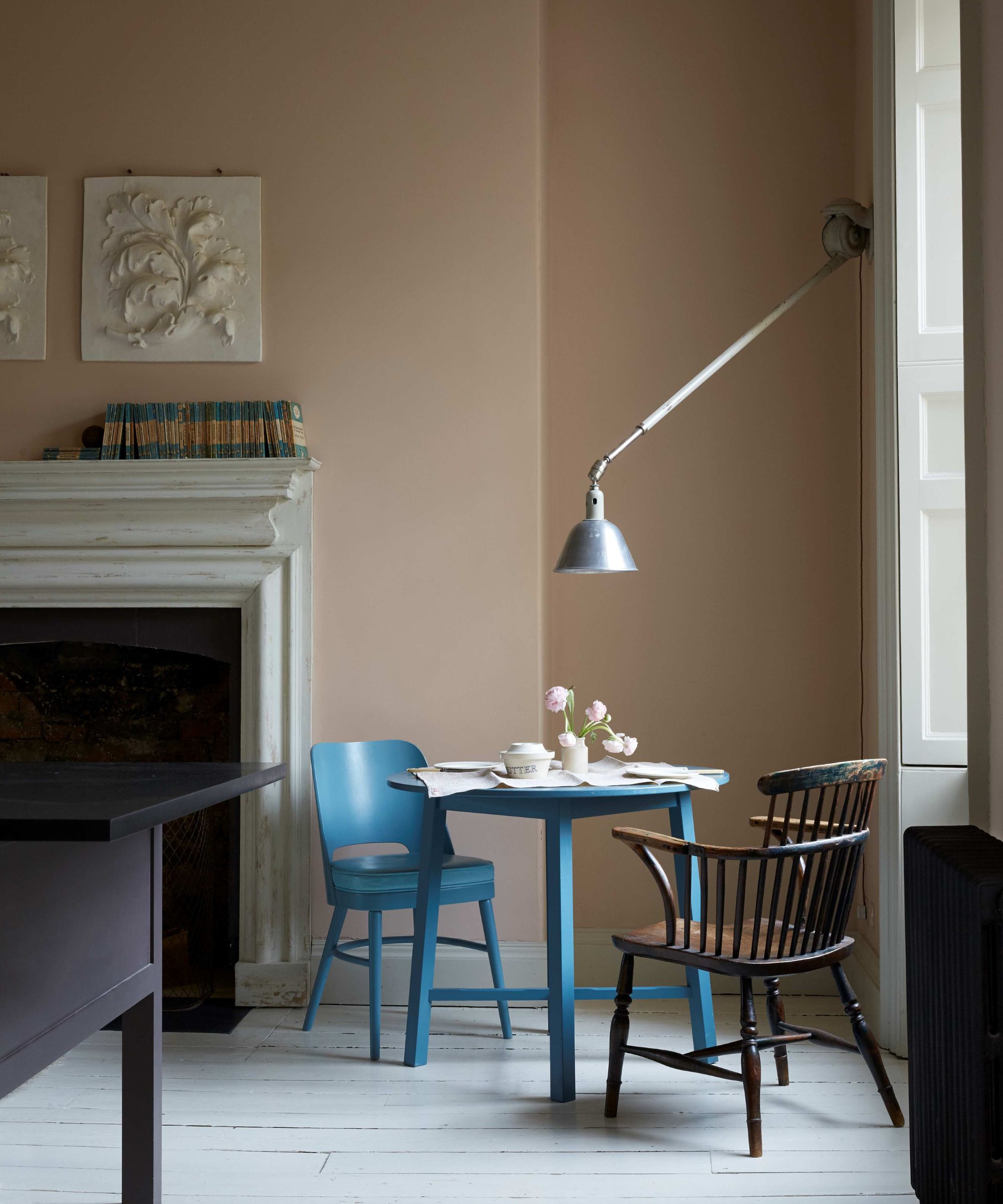
It has been mentioned already that Setting Plaster is great for rooms of any aspect, but works particularly well in spaces that don't get a lot of natural light or if you want to warm up cooler light. In a light-starved room is when you will see my favorite version of Setting Plaster, I think this is when it most represents its name. It's barely pink, almost pale brown in fact and it works so nicely to make darker rooms feel really elegant.
'The walls in this beautiful Georgian townhouse have been painted in Farrow & Ball’s Setting Plaster, a pale pink that is one of my favorite colors to use,' says designer Nicola Harding. 'It works for any light level, any time of day, and any time of year. The color is calm, warm, fresh, and comforting. To bounce more light into this scheme the original wooden floors throughout were painted in Farrow & Ball’s Slipper White to complement the Setting Plaster walls.'
6. Try Setting Plaster on kitchen cabinets
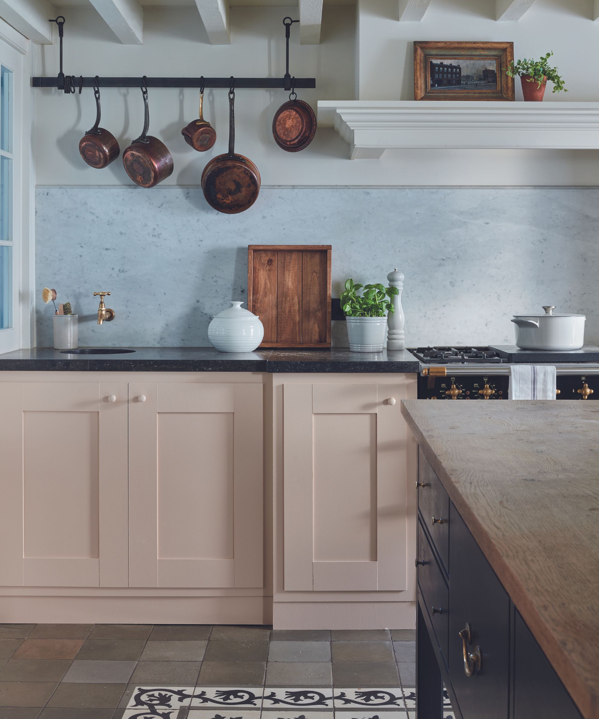
Pink kitchens have become as classic as gray kitchens. Choosing Setting Plaster for your kitchen, whether it's on the cabinets or on the walls, leans into that ever-growing kitchen trend to make these feel like softer and more welcoming spaces.
I've seen this muted pink paint work with so many different kitchen styles too. Pair it with wooden worktops and Shaker cabinets for a country, farmhouse kitchen, or go with a more minimalist design and combine with marble for a really luxurious look.
Setting Plaster is such a classic, long-loved Farrow & Ball shade that will never date. You can decorate with the confidence that even as trends and personal taste change, Setting Plaster can adapt and work with new styles and new colors.
Sign up to the Homes & Gardens newsletter
Design expertise in your inbox – from inspiring decorating ideas and beautiful celebrity homes to practical gardening advice and shopping round-ups.

I am the Head of Interiors at Homes & Gardens. I started off in the world of journalism in fashion and luxury travel and then landed my first interiors role at Real Homes and have been in the world of interior design ever since. Prior to my role at H&G I was the digital editor at Livingetc, from which I took a sabbatical to travel in my self-converted van (not as glamorous as decorating a home, but very satisfying). A year later, and with lots of technical DIY lessons learned I am back to writing and editing, sometimes even from the comfort of my home on wheels.
-
 10 of the best plants for clay soil – experts recommend the flowers, shrubs and trees that can thrive in challenging conditions
Discover what varieties to grow if you want the best plants for clay soil
By Sarah Wilson
-
 The biggest curtain trends to follow in 2025 – 8 key looks to shop that will instantly elevate your rooms
These are the colors, styles, and materials to embrace in your windows this year if you want desirable drapes, plus our favorite places to shop the trends
By Lilith Hudson