5 ways to decorate with Edgecomb Gray, Benjamin Moore's softest gray paint
Edgecomb Gray is one of Benjamin Moore's best sellers - soft, warm but still decidedly gray it's easy to see why this is a much-loved paint
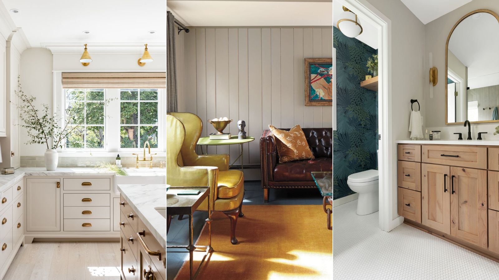

Gray is not exactly top of the color charts right now. It's a once loved shade that seems to be on the out as interior design trends all point toward softer, warmer, more welcoming interiors. However, to be more specific, grays in their coolest forms are increasingly less popular, but shades like Edgecomb Gray by Benjamin Moore are quickly becoming best sellers and dominate color trends. Not quite gray, not quite beige, Edgecomb Gray has a growing following because it's the perfect balance of warm and cool.
It's a greige paint, and one of Benjamin Moore's best-selling neutrals. It's also, like many of Benjamin Moore's white and grays, become a go-to among interior designers, so we asked them how best to use this versatile shade. What rooms and lights does it work best with, what styles does it complement and what colors are you best to pair it with?
What color is Edgecomb Gray?
Edgecomb Gray makes it sound far more cool than it in fact is, the color has also been previously marketed as Baby Fawn, which might give you a better idea of the color. It's soft warm, more of a griege than a gray. But it does still work with both warm and cool colors which also makes it super versatile.
Why is Edgecomb Gray so popular?
A lot of Benjamin Moore's neutrals are super popular, iconic even. So many of the best warm neutral paints come from Benjamin Moore. And Edgecomb Gray is up there, we think, for its versatility. Warm enough to be considered a beige but still cool enough to also call itself a gray, it's that perfect shade that works with so many styles and, although it does drastically change in different lights, it works in all of them.
'Edgecomb Gray is a great color to choose if you're considering beige but aren't quite sure where to start. Depending on what you pair with it, it can read warmer or cooler so the commitment isn't as huge as, say, Bleeker Beige.' explains designer Bethany Adams.
'Edgecomb Gray on different surfaces can deliver distinct effects. Painting walls in this hue creates a calming atmosphere, while using it on cabinetry or trim it gives a subtle yet striking contrast with lighter surroundings. Benjamin Moore's Edgecomb Gray offers a pretty blank canvas for creativity, making a designer favorite! adds Jennifer Davis.
Bethany Adams is an interior designer, a member of ASID (American society of Interior Designers), AIA (American Institute of Architects), and a certified interior designer with the Kentucky Board of Architecture. Bethany holds a B.F.A.. in interior design from Harrington College of Design in addition to a B.A. she earned from Georgetown University.
How to decorate with Edgecomb Gray
1. Layer with both warm and color coolers
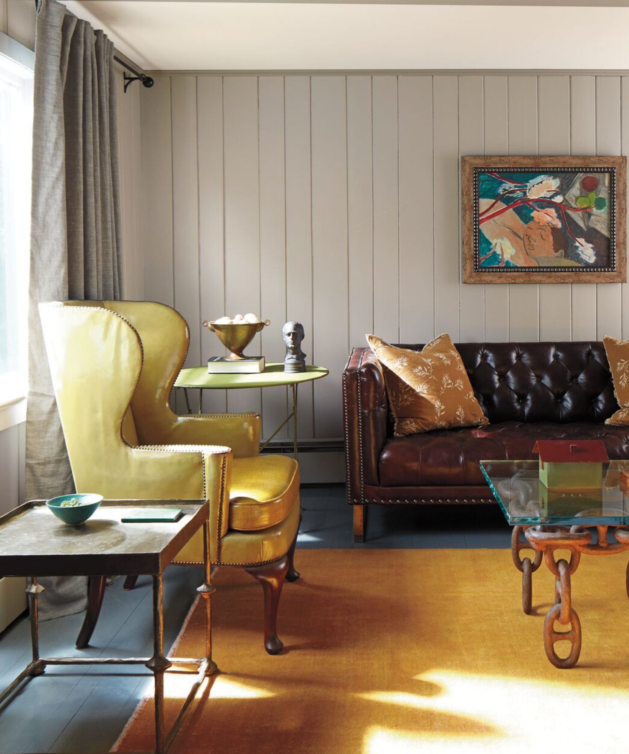
'Edgecomb Gray is a go-to neutral that can refresh a space, while providing a warm, welcoming feeling. Like other popular gray paints, it is not just simply gradients of black and white, instead is comprised of other pigments that add to the complexity and appeal such as the yellow undertone.' explains Helen Shaw, Director of Marketing at Benjamin Moore.
'This means Edgecomb Gray harmonizes well with almost every other hue, making it an adaptable neutral and giving good reason for its popularity. However, it is important to make sure you opt for a harmonizing undertone to ensure a cohesive look to your neutral scheme. This is why it pairs particularly well with other warm-toned colors such as taupe, blush pink, pale yellow, and terracotta.
'Alternatively, consider pairing it with a deep grey for a slick design element that doesn't overwhelm the room.'
2. Lean into both the light and moody sides of Edgecomb Gray
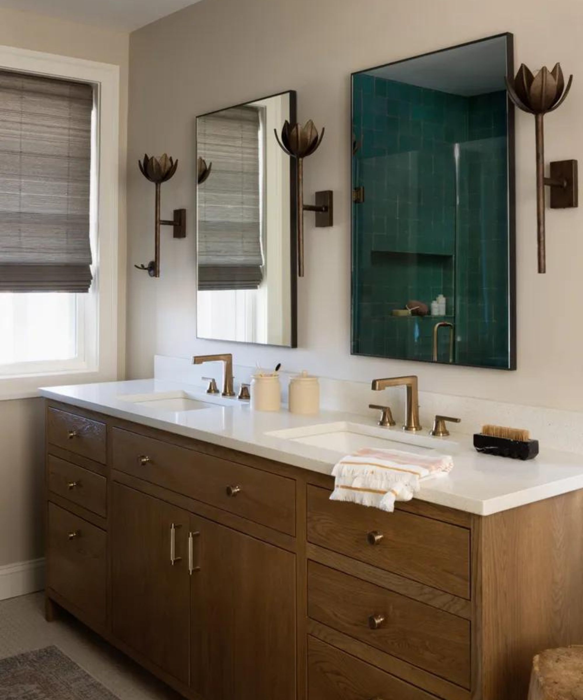
One thing that makes Edgecomb Gray such a lovely shade is that it can be both dark and light depending on the aspect of the room. It can be a really light slightly warm gray under plenty of direct light, but tone that light down and you get this still very warm but deeper beige shade that's really on trend.
This beige bathroom designed by Folding Chair Design displays the paint's chameleon ways perfectly.
'This bathroom gets the most amazing afternoon sun and we wanted to capitalize on that with a quiet white oak vanity custom designed and stained for this client' explains Jennifer Walter, founder of Folding Chair Design. 'We opted for a neutral paint on the walls and ceiling (Benjamin Moore Edgecomb Gray HC-173) and kept the overall look pretty moody with these bronze sconces.'
'This bathroom had a huge punch of color in the zellige shower tile, so we really wanted the rest of the rooms to carry a deeper neutral palette. Edgecomb Gray fit the bill for its rich undertones of both brown and white, making it the perfect tempered beige! We also love that it catches the light and feels uplifting, and in darker spots very moody.'
3. Try it on your kitchen cabinets
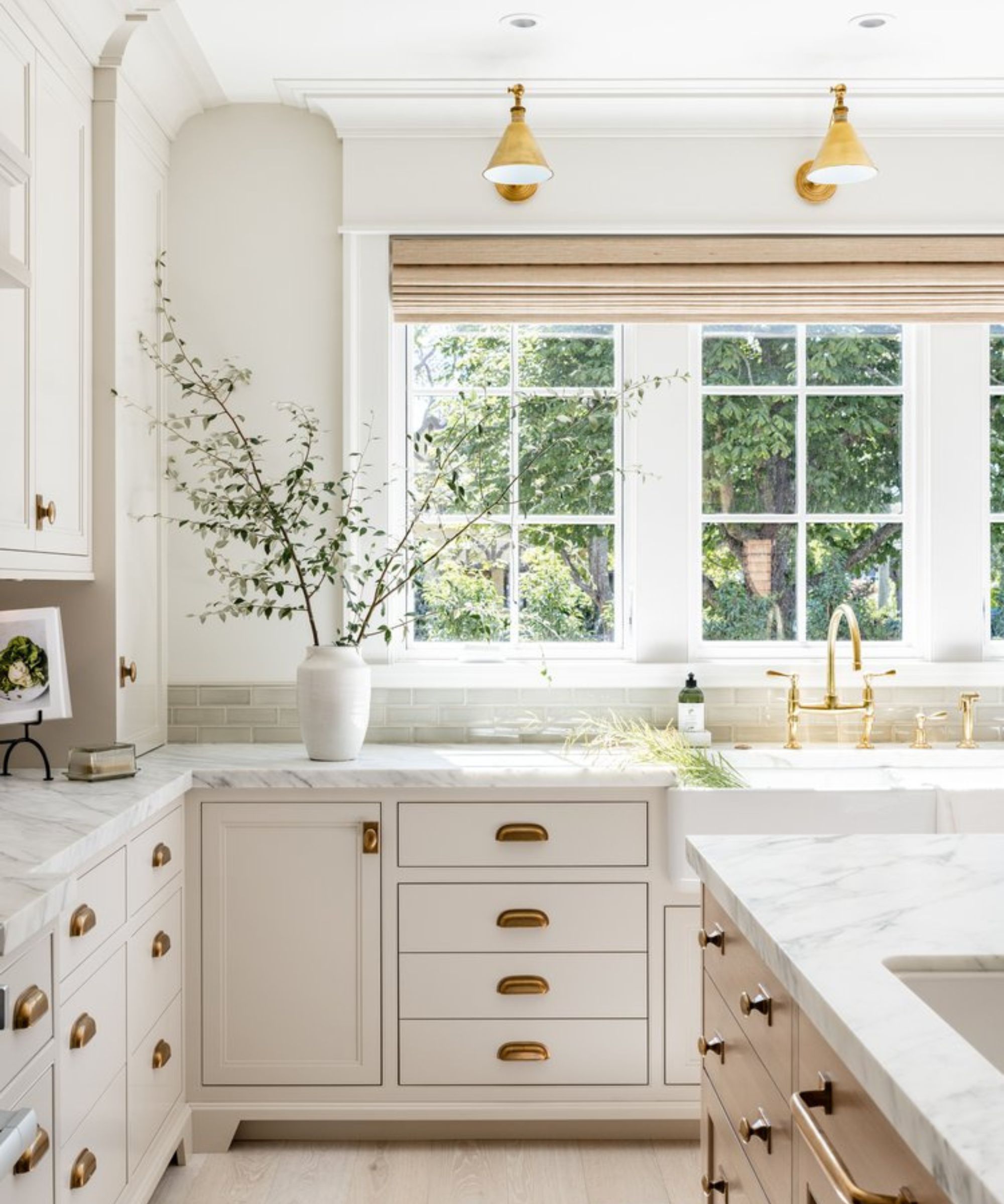
If you are considering a white kitchen, but want it to feel warm and welcoming as well as light and fresh, Edgecomb Gray is the perfect kitchen cabinet color. Not so warm it's a cream and not so cool it's a gray, this is a really timeless shade that can cope with changing tastes and interior design trends, and that's just what you want in a kitchen color.
As interior designer Jenny Martin explains, 'We wanted to pick a color that had depth to it. Designed to tell a tale of the past, we integrated finishes with an aged vintage quality, and wanted the cabinetry to capture the richness of its surrounding finishes. I think this shade is so popular because it's so versatile. With a layered warmth to it, it ties in beautifully with any palette.'
4. Create contrast with darker shades
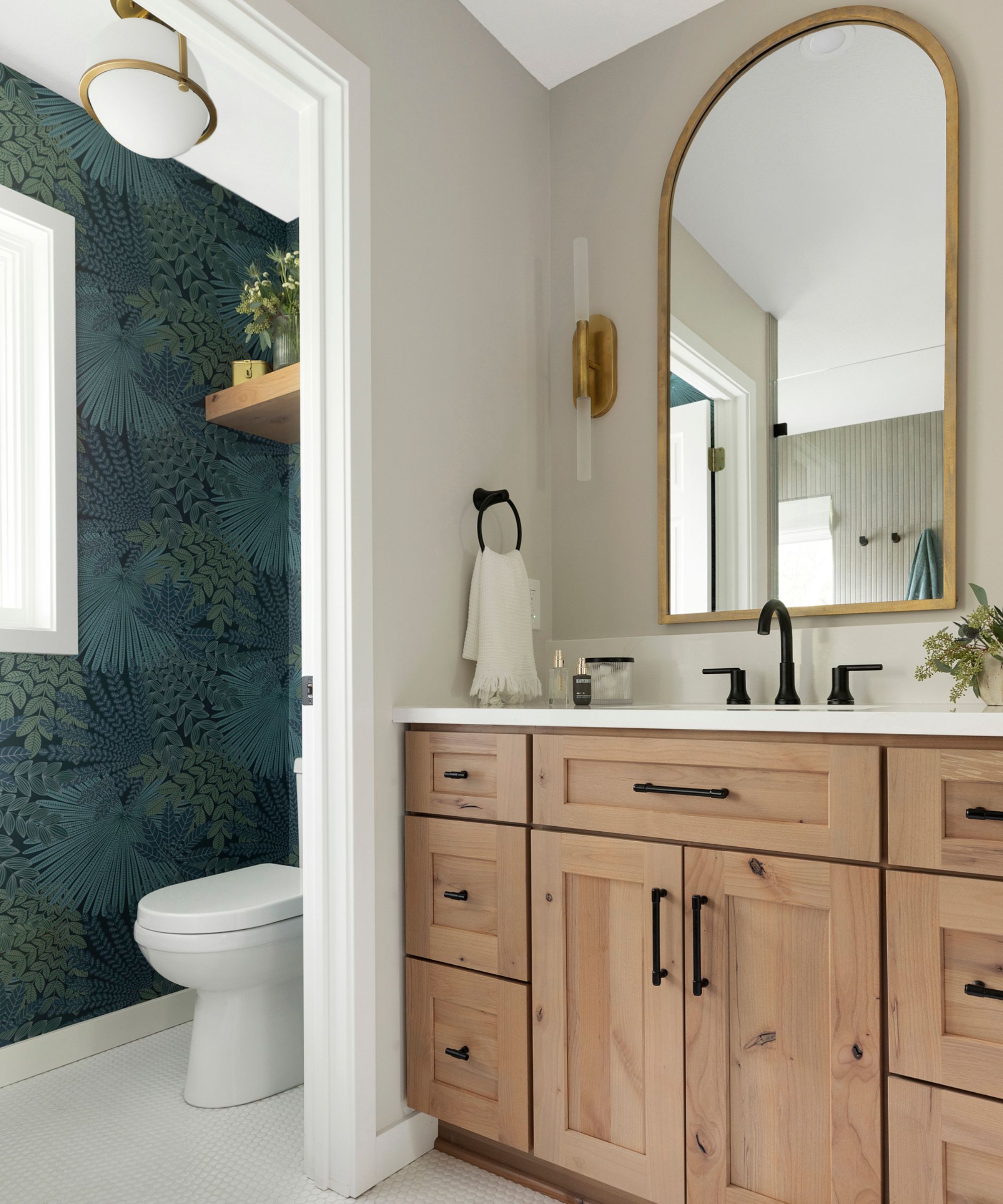
'Benjamin Moore's Edgecomb Gray is a versatile and sophisticated color that can be utilized in various ways to enhance the aesthetic of a space. Edgecomb Gray adapts beautifully to different lighting conditions, appearing warmer in natural light and cooler in artificial settings.' explains Jennifer Davis.
'Pairing it with complementary colors is key. Its neutral tone allows for diverse color combinations. For a calming environment, we combine it with soft pastels, like blush pink or sagey greens. If we are aiming for a more dramatic contrast, we love mixing it with a deep navy or charcoal. This creates a sophisticated, high-contrast look- our personal favorite!'
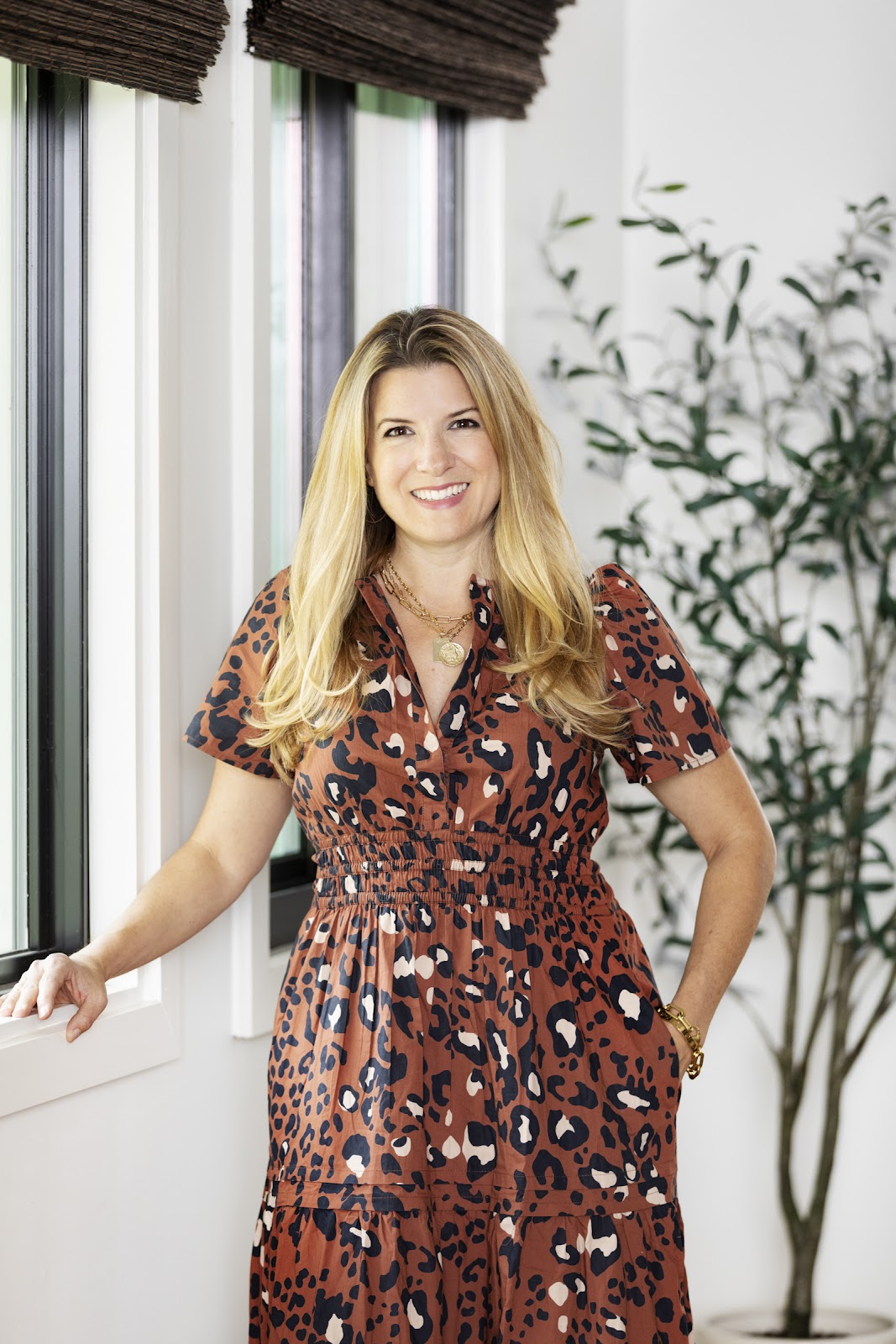
Jennifer fell in love with design at a young age and has been working in the industry for over 25 years. She has developed an eye for detail and a talent for creating timeless designs. Jennifer offers a balance of creativity and forward-thinking with a structured, organized, and detailed mentality. Jennifer is driven by her deep passion for design while curating an exceptional client journey, ensuring pure delight from the very beginning to the end.
5. Bring in plenty of tones and texures

As with all neutrals, the interest comes with the other shades and textures you pair it with. You want to bring in plenty of tactile finishes and tones to give this paint some depth, so whatever room you are using Edgecomb Gray in, layer up different materials and finishes, and be sure to bring in other neutral shades too.
'Benjamin Moore's Edgecomb Gray is such a versatile shade. It's warm and welcoming, while also feeling effortlessly sophisticated. I love the idea of using this color in a living room filled with modern organic furniture in warm earth tones like sienna, umber, and goldenrod, aligned with plenty of nature-inspired decorative accents like reclaimed wood end tables, natural stone vases and bowls, and sprigs of fresh, seasonal greenery and foliage.' suggests designer Kathy Kuo.

Kathy Kuo is a celebrated interior designer and international guru within the home and lifestyle space. She has 20+ years of experience in the design industry.
If you are looking for the perfect greige, 100% order a swatch of Edgecomb Gray. Test out how it looks in your rooms, but as so many of the designers have pointed out here, what makes the paint so easy and versatile is that it works with all different lights and styles.
Sign up to the Homes & Gardens newsletter
Design expertise in your inbox – from inspiring decorating ideas and beautiful celebrity homes to practical gardening advice and shopping round-ups.

I am the Head of Interiors at Homes & Gardens. I started off in the world of journalism in fashion and luxury travel and then landed my first interiors role at Real Homes and have been in the world of interior design ever since. Prior to my role at H&G I was the digital editor at Livingetc, from which I took a sabbatical to travel in my self-converted van (not as glamorous as decorating a home, but very satisfying). A year later, and with lots of technical DIY lessons learned I am back to writing and editing, sometimes even from the comfort of my home on wheels.
-
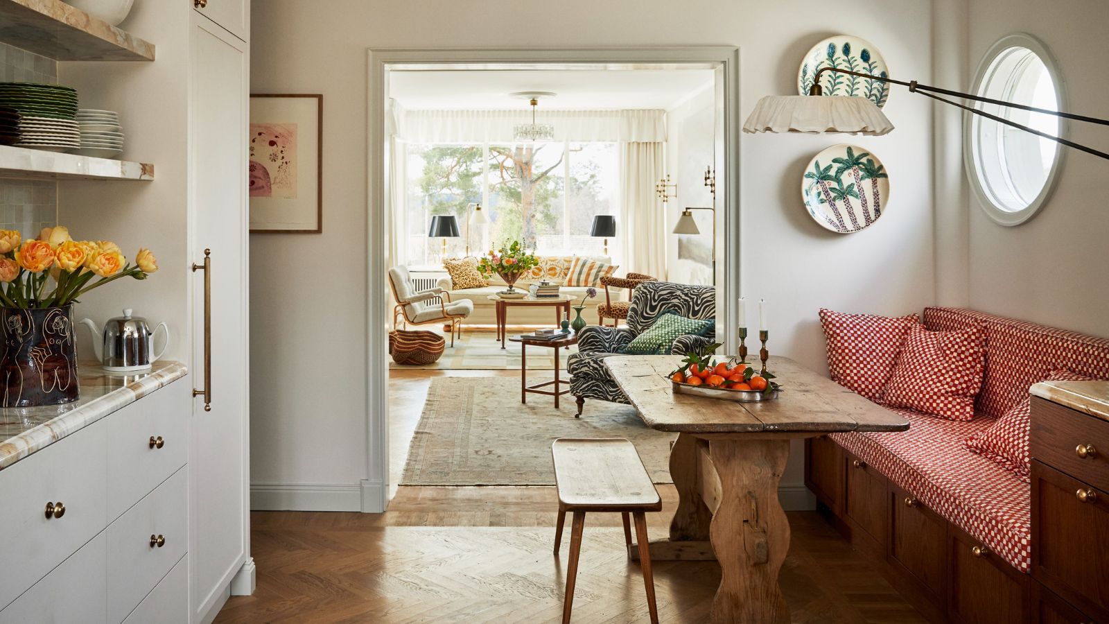 I swear by the ‘ETC’ method to prevent clutter and save money – my expert-backed checklist is transformative
Now I Edit The Cart and save time, money, and energy
By Chiana Dickson
-
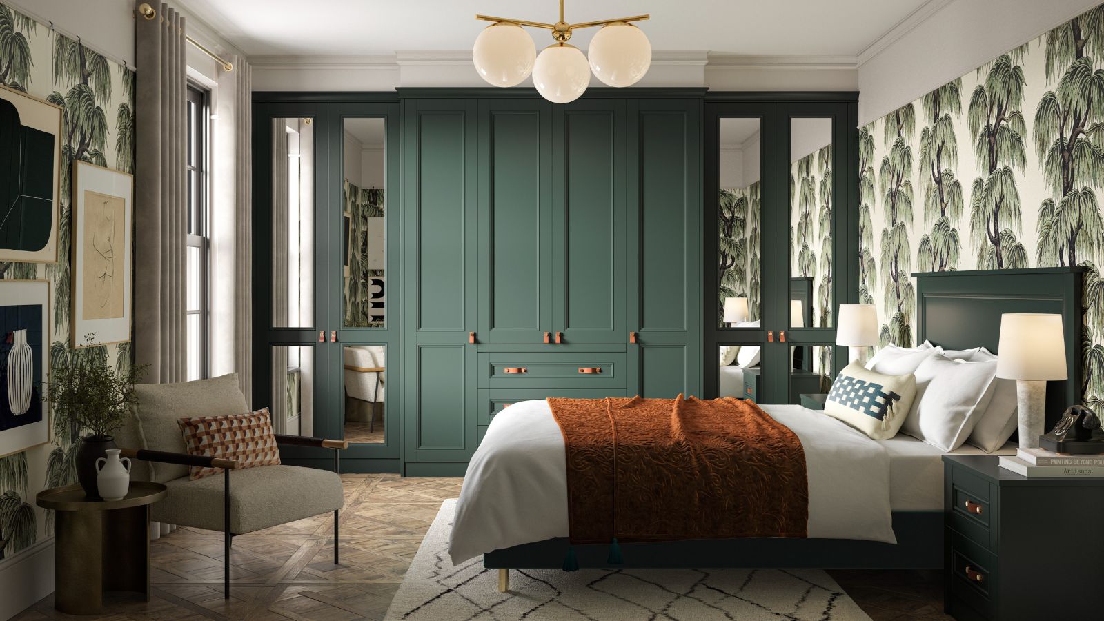 Is this the end of built-in bedroom furniture? Designers decide if this once-loved feature will in fact date your space
Will we be saying goodbye to built-in wardrobes, shelves, and drawers this year? We spoke with interior designers to see if this classic carpentry style will continue to be featured in bedrooms
By Eleanor Richardson