Warm color schemes – how and when to use color for cozy spaces, according to design experts
These tips for designing a warm color scheme for a cozy, welcoming space are designer-approved
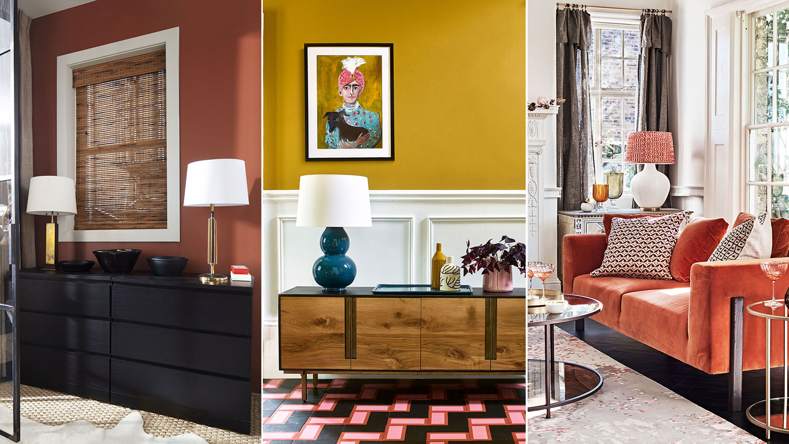
If you're planning a revamp and thinking about redecorating, take a little time to think about warm color schemes. It makes good sense to not only think about your choice of colors, but also the effects those colors might have on the room and its occupants.
Warm color schemes can bring a cozy, enveloping sense of well being and energy to your home décor ideas, with the result that anyone who spends time there will feel all the better for it.
Not a fan of reds and oranges? Not a problem. There's so much more to warm color schemes than those flame-grilled options, although they do play an important and striking part and can transform a room.
What is a warm color scheme?
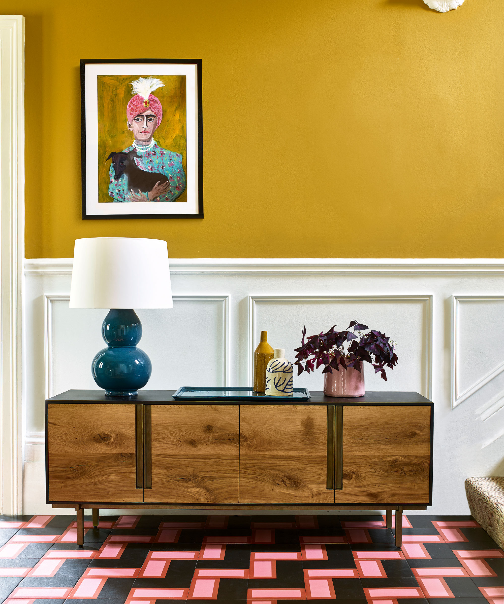
So how do we define warm color schemes? The term encompasses any color or combination of colors that create an impression of warmth in a space. As already touched on, there's the obvious red and orange shades, but in addition to the fiery colors, there are a wealth of other, perhaps subtler options ready to go.
We'll also look at what rooms suit a warm color scheme, and learn from the experts how to combine warm colors.
A good starting point, when considering room color ideas, as many design experts suggest, is to learn how to use a color wheel so you can choose a mix of complementary tones for your space.
What are the best colors for a warm color scheme?
What colors make a room look warmer? The answer lies in the color wheel, as interior designer Amanda Barnes explains: 'A warm color scheme refers to using shades that all carry the same undertones. Tying in colors that bring warmth into our everyday spaces, like yellow, orange, and red, act similarly to the way the sun heats up a room. On a color wheel, these shades pull out the most energy, or highest temperature.'
Kristen Fiore of Kristen Elizabeth Design adds another color to the mix, saying, 'Warm color schemes consist of oranges, reds and yellows, and even browns. Colors that reflect the sun and make you feel warm. These colors make a room feel more cozy and are often used when painting larger spaces to bring in warmth.'
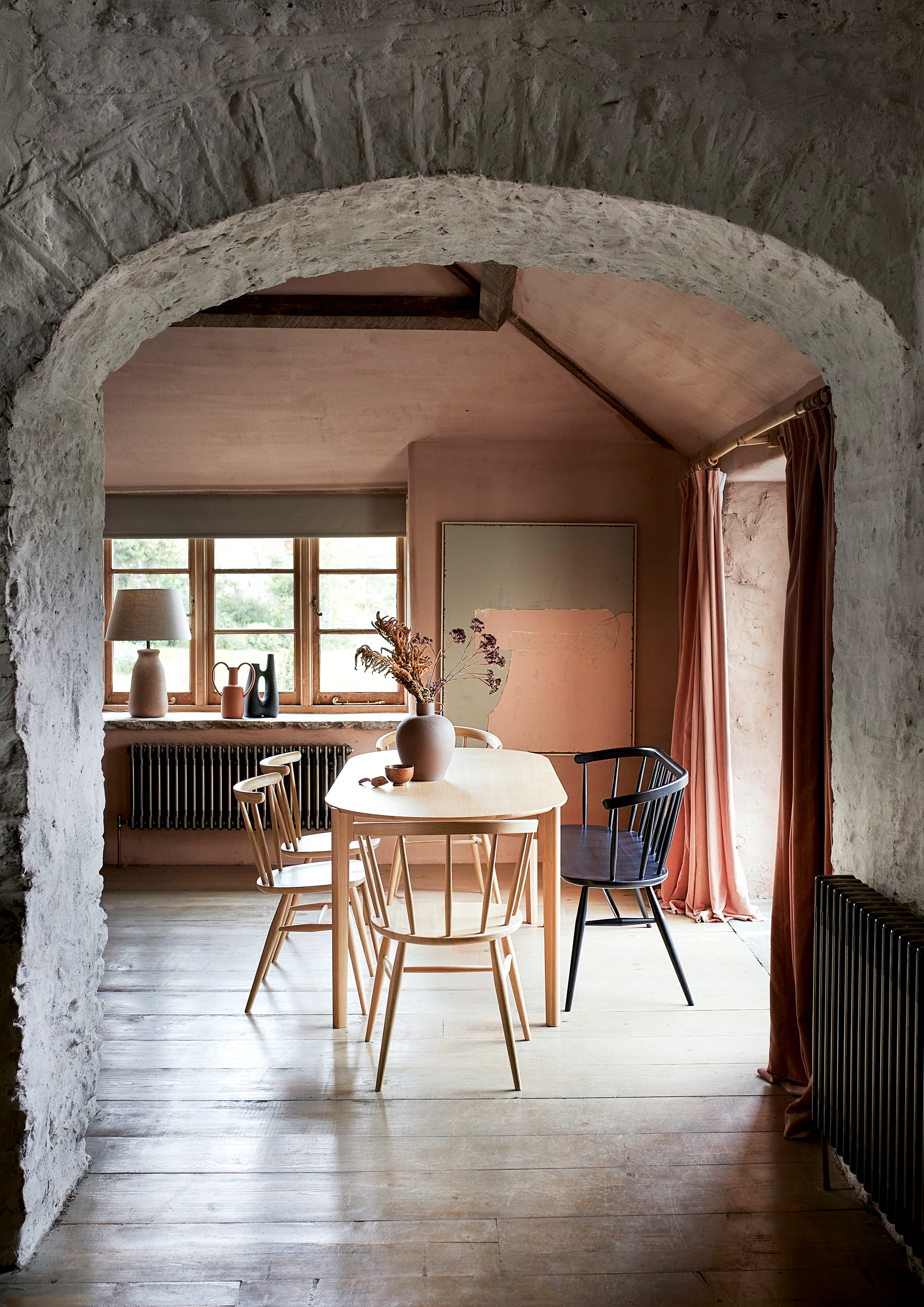
If you're looking to take the room temperature up a notch, try decorating with red, or go for an orange decorating scheme for an instant impression of warmth. Be aware, however, that it will be exactly that – just an impression of warmth. Warm colors don't physically change a room's temperature, just our feelings and perceptions about the coziness of the space.
The science of light tells us that black absorbs all wavelengths of light and converts them to heat, while white does the opposite – reflecting all wavelengths of light with no temperature increase. So anyone who's looking for a real measurable increase in a room's temperature might consider painting it black, or at least in a very dark color, but measuring temperature is not what we're doing here, so back to that color wheel.
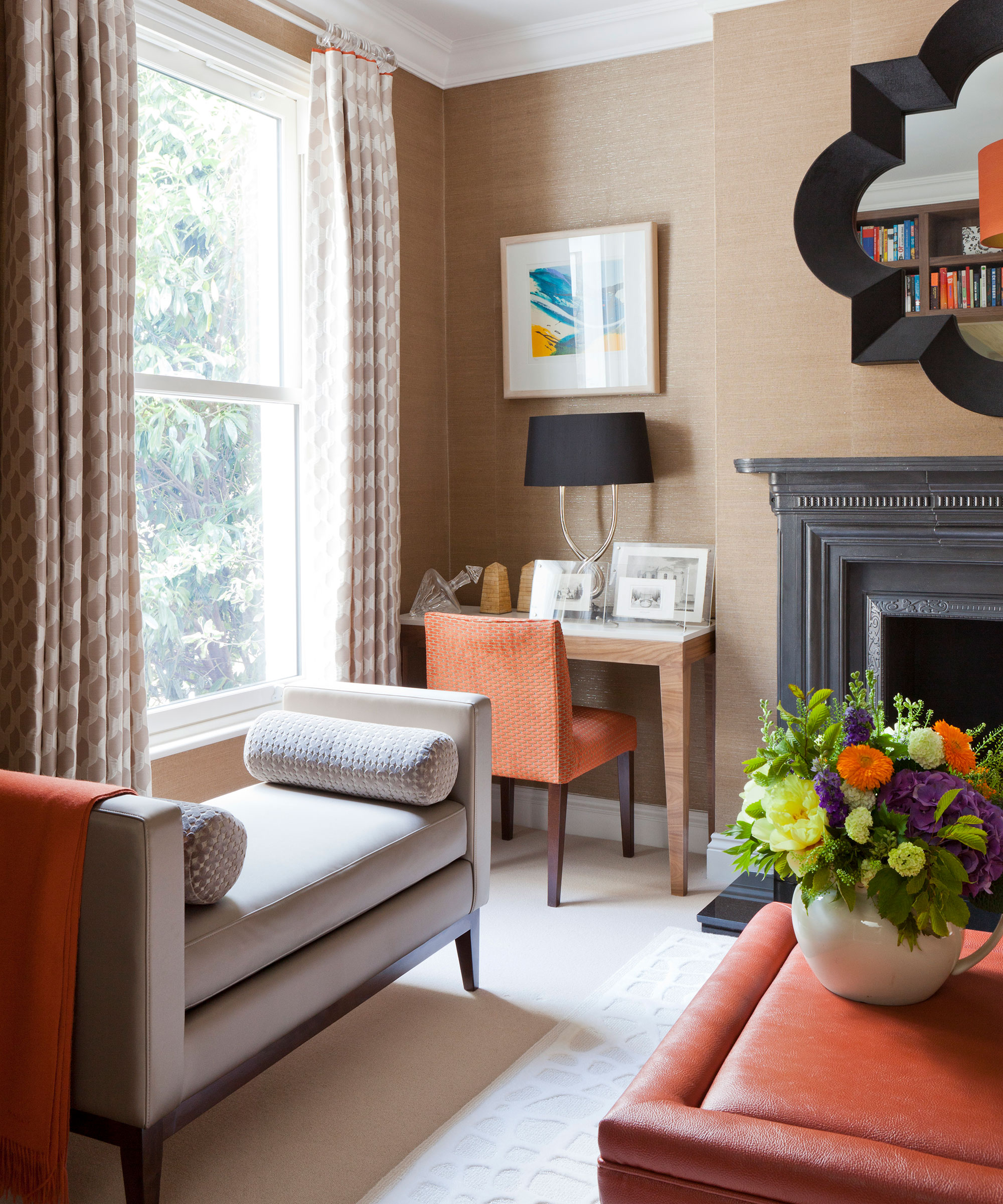
'When looking at the standard color wheel, warm colors include: red-violet, red, red-orange, orange, yellow-orange, yellow, and yellow-green. A warm color scheme includes any variations of these colors,' says Melinda Trembly of Rincon Rd Design Studio.
The scientists might disagree, but our design experts are all in accord, warm colors are the 'earthy tones such as orange, reds, yellows, browns, beiges/warm whites,' as Devika Kanadé, founder of The Itihāas Company puts it.
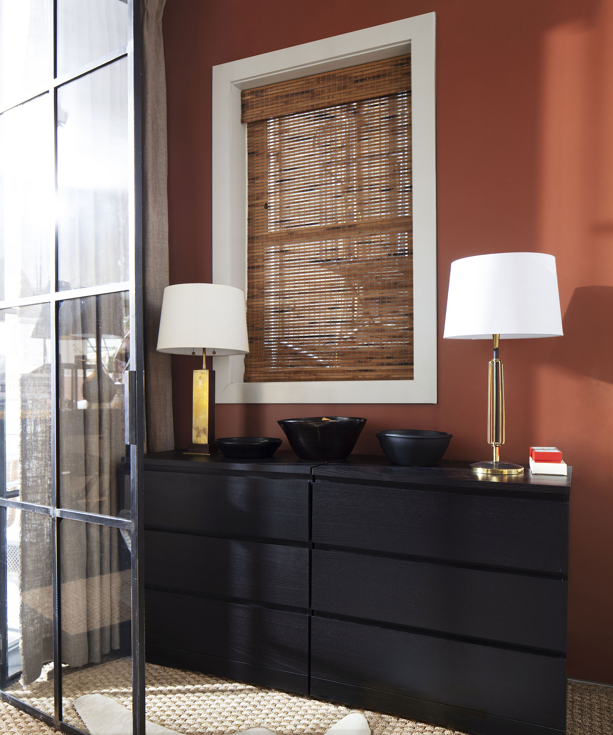
While interior designer Brittney Ferguson adds: 'Think fall! Browns, tans, creamy whites, reds and oranges.'
'Decorating with yellow, browns and off-white beige are my go-to to make a room look warmer,' adds Devika Kanadé. 'Mustard yellows and rich browns are earthy colors that help in grounding a space and that in turn mutes the natural and artificial light to give the room a warmer, cocooned feeling and atmosphere. Balancing these colors with warm whites can add lightness to the space and balance out the colors well.'
Where to use a warm color scheme

Any room can be given a warm color scheme, but it's often about assessing the natural light quality in a room to decide what will work best for the space first.
For instance, a north-facing room with colder light will really benefit from a warm color scheme. Consider the room's purpose too. In a study or home office, decorating with green, which is associated with creativity, or blue, for inspiration, may seem a better choice.
Melinda Trembly says: 'There are many things to consider when choosing colors for a room, one of them being how they make you feel. Traditionally warm colors are known to make the temperature of a room feel warmer, can be used to increase appetite, boost moods, and give a cozier, more intimate feeling,' she says.
'We all interpret colors differently, so my first question would be how you want to feel in a room rather than the type of room it is. The next thing to consider would be the natural lighting in the room. This can change dramatically depending on your location, the Pacific NorthWest is going to read colors quite differently than Arizona's high desert.'
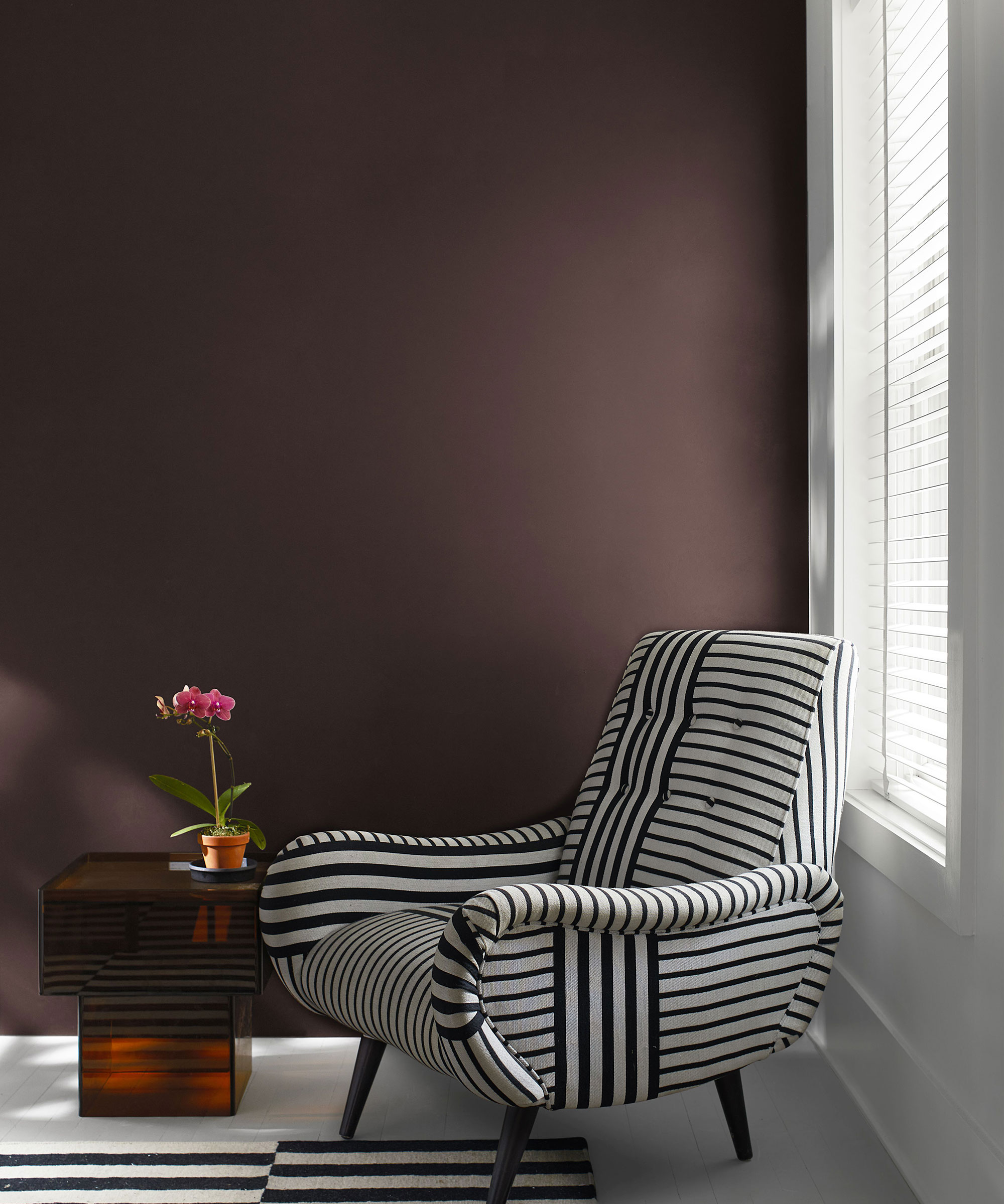
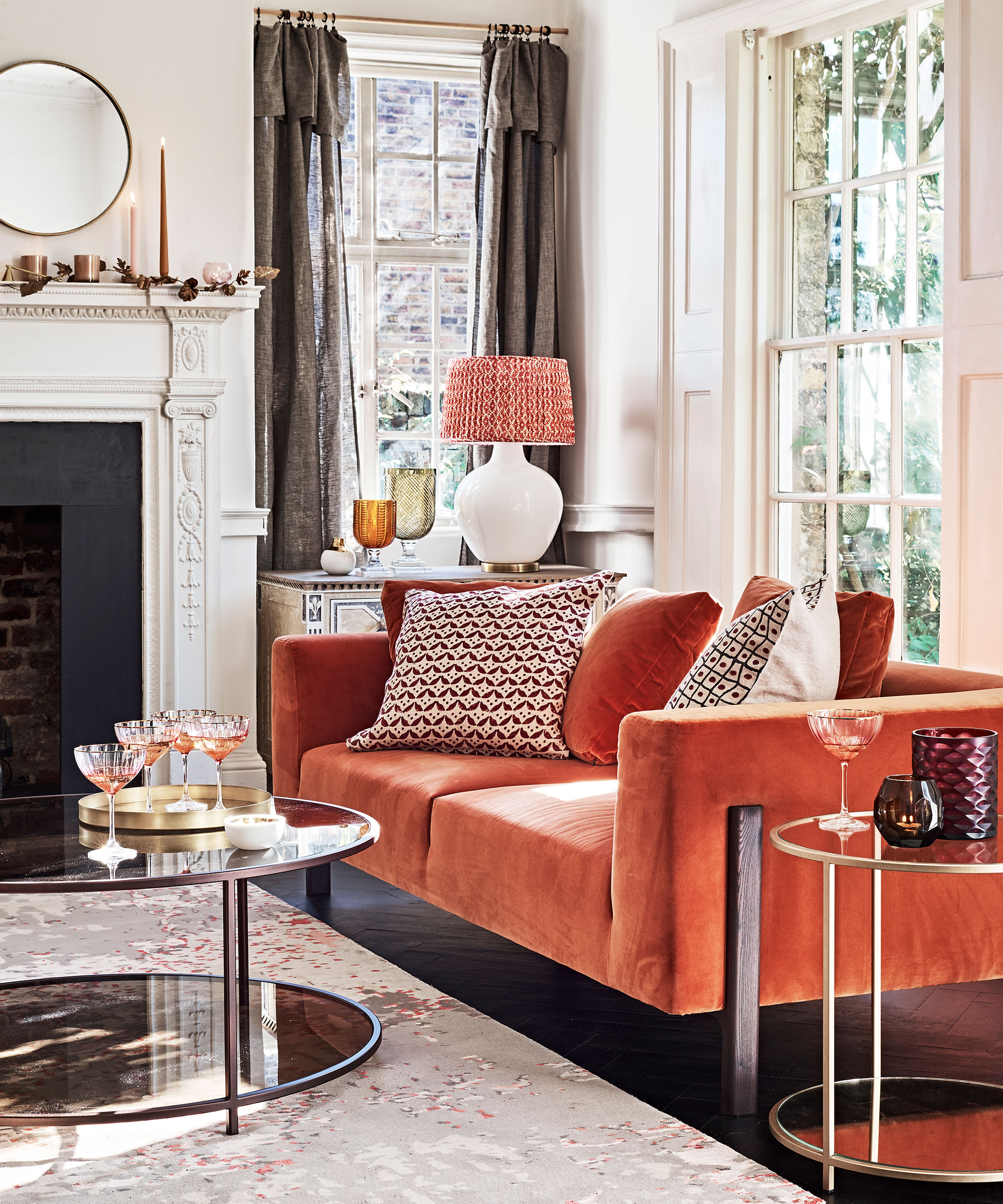
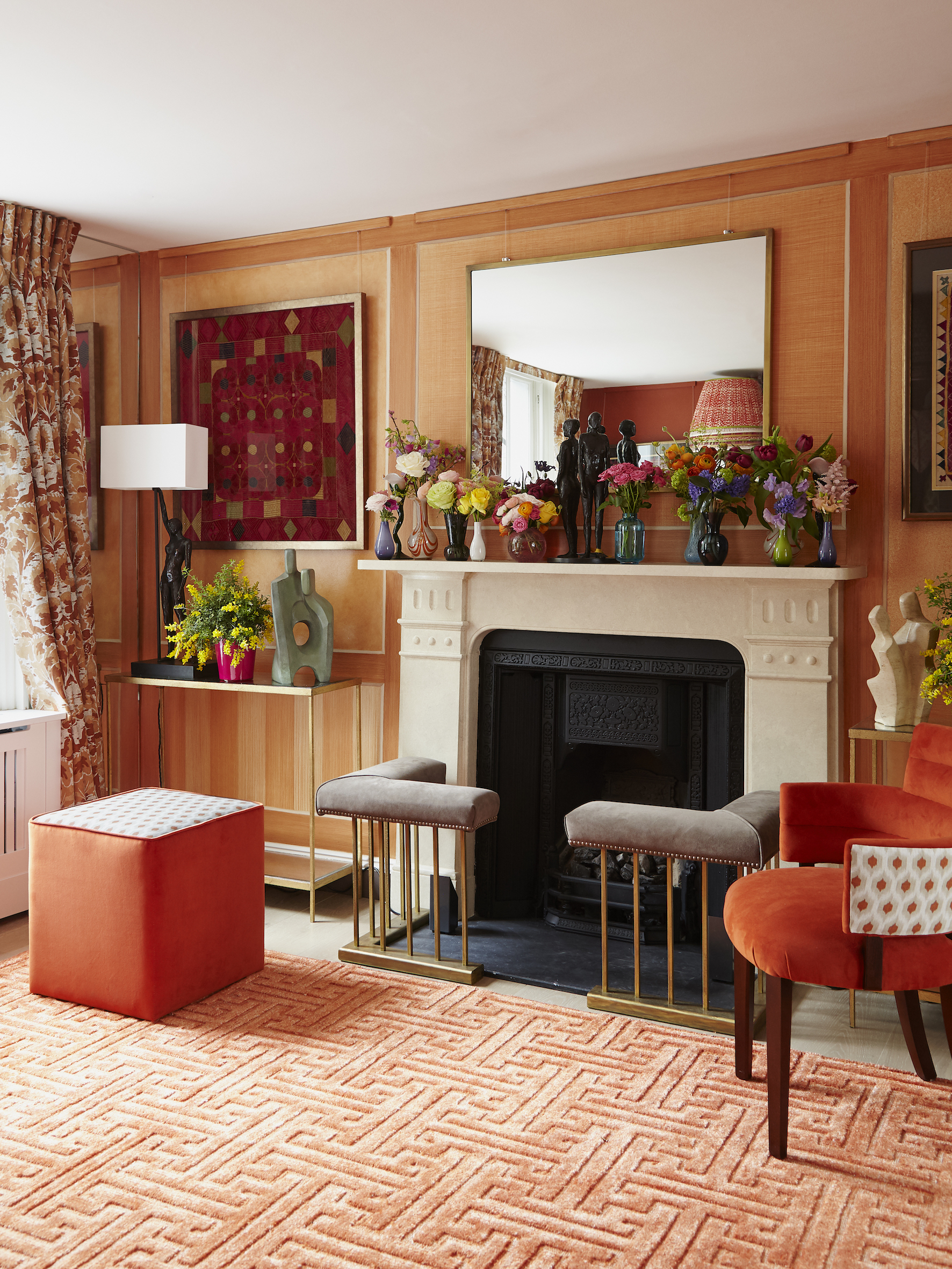
Any room where you want to create the feeling of cocooning safety, like a warm hug, is a good candidate for a warm color scheme, so a cozy living room color scheme like the one pictured gives all the right warm color vibes. 'Master bedrooms and dining rooms are where I like to add a significant amount of warmth too,' says Brittney Ferguson, and that makes perfect sense to us.
'Living rooms and family rooms are often rooms that go more neutral with brown room ideas and beiges,' says Kristen Fiore. 'But to bring in color with depth and appetite, consider burnt oranges and deep magentas for a dining room color scheme.' Indeed, you can't beat a touch of drama in a dining room or living room, and it's those hotter, deeper shades that create a more theatrical setting for lively entertaining.
Mixing warm and cool colors
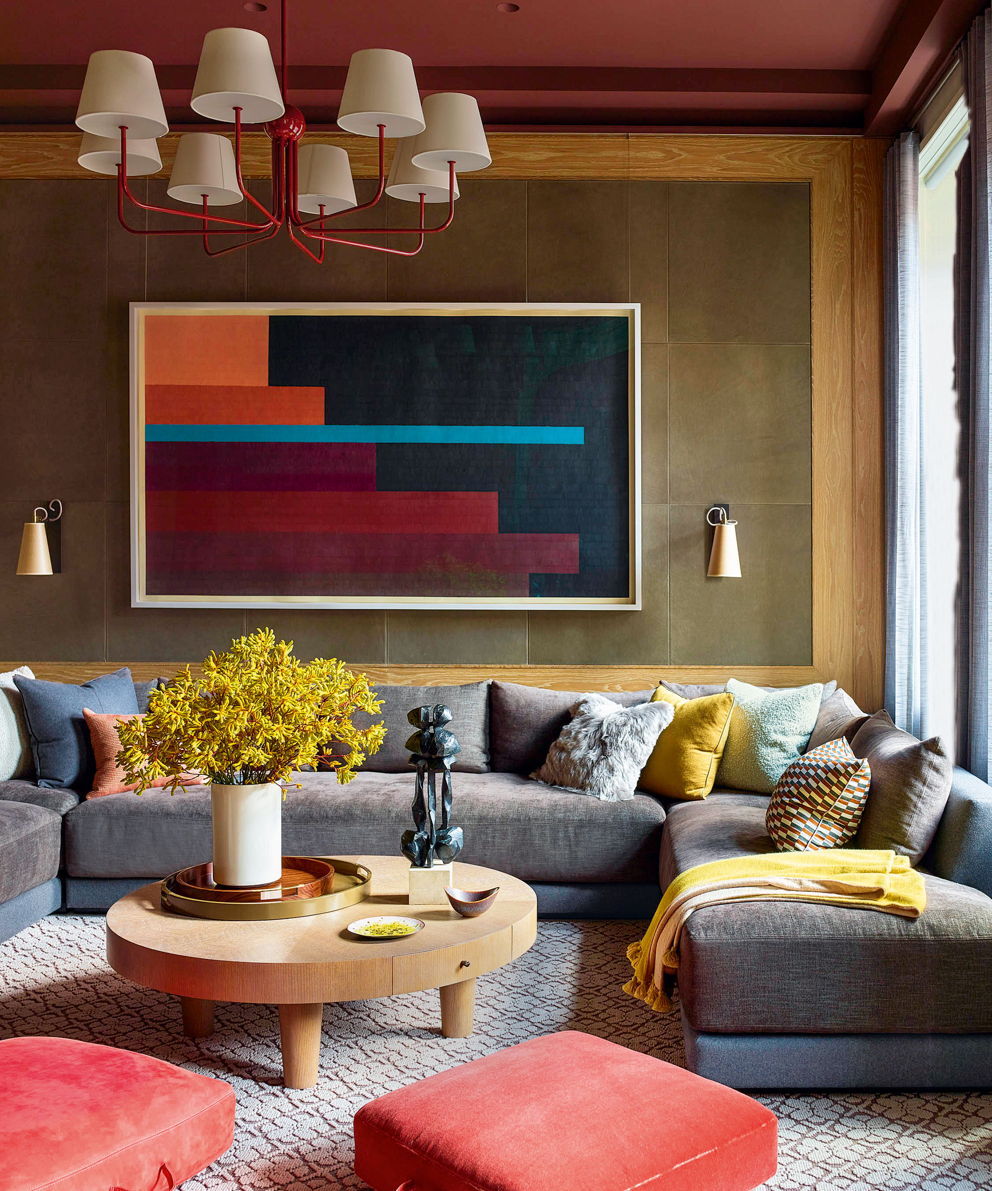
Can you mix warm and cool colors when decorating? Our design experts' opinions are divided on this point.
In the yes camp is Devika Kanadé: 'I am an absolute advocate of mixing warm and cool colors. It makes a space unique and full of interest when done right. I love introducing accents of brown when mixing cools and warms as I feel it acts as a great bridge to bring the two tones together.'
Melinda Trembly agrees: On the color wheel, for every warm color there is a cool color directly across the wheel known as it's complementary color. That's the most basic, but other variations of that theory work as well. For example if your warm color is red, its complementary color is green. A variation to that would be a split complementary theme of red, yellow-green, and blue-green.'
Brittney Ferguson strongly agrees: 'Not only can you, but you absolutely should mix warm and cool colors. Using all warm tones can make the space appear dark and muddy. Mixing in some cool colors and tones can add layers, make the space feel more curated and give character.'
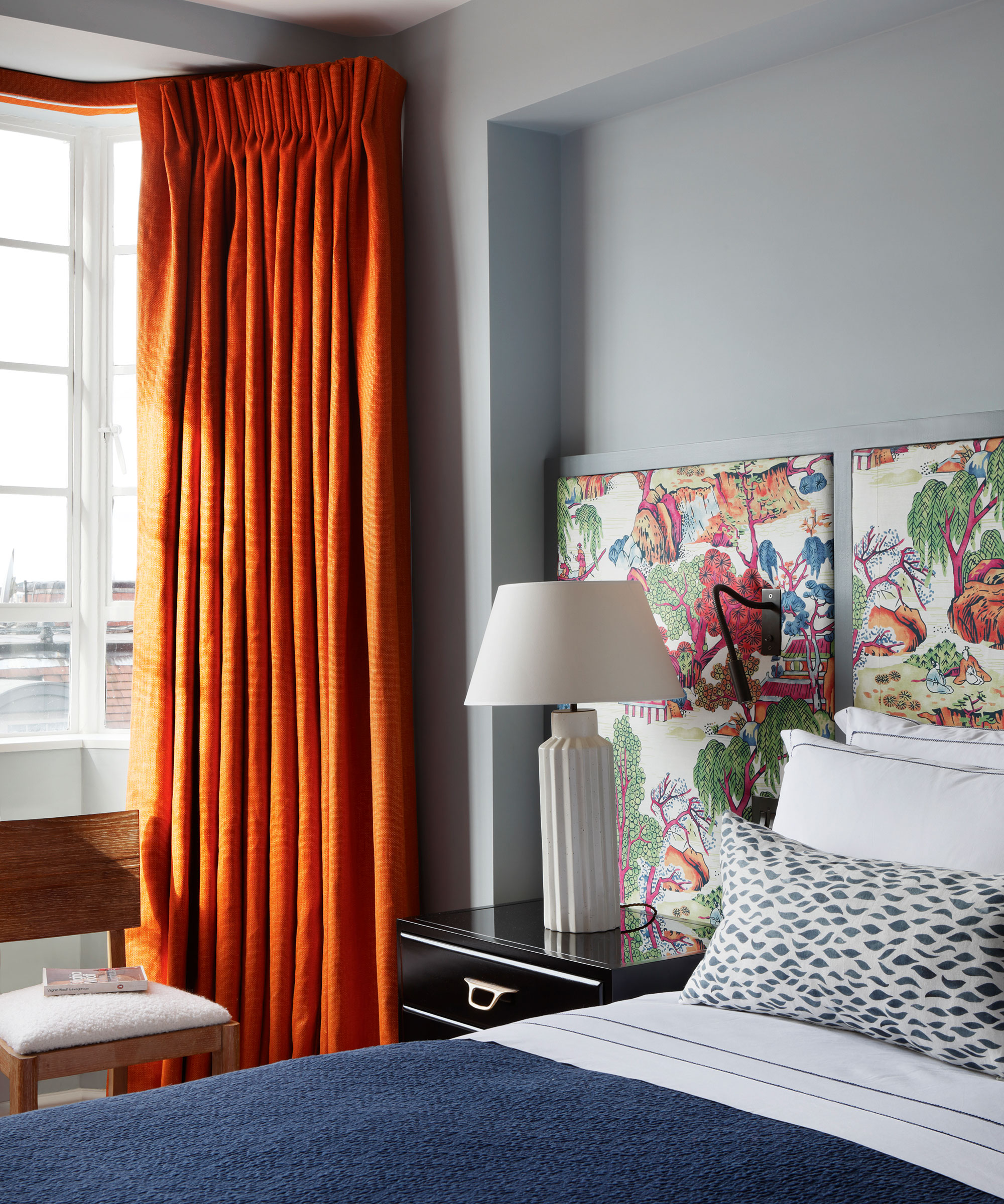
Kristen Fiore, meanwhile, doesn't advocate mixing warm and cool colors, advising: 'It is best to be consistent in the tone of the room. Stay with warmer colors for groupings versus mixing in the cooler tones. It will create a more harmonious environment. You can pair cooler tones in another room next to a warmer room, but within a space keep the tones the same.'
Amanda Barnes also urges caution: 'Blending warm and cool color schemes adds interest and joy to a room but it must be done so the shades work together instead of competing with each other. Pairing a color palette with the bigger pieces all pulling warmer tones works well if you bring in smaller accent pieces in cool tones.'
FAQs
What makes a color warm?
'Anything with a red, orange or yellow undertone can make a color appear warm,' says interior designer Brittney Ferguson, who has some good advice to share with decorators. 'Keep in mind what the color is being paired with to avoid a mismatched nightmare. A warm color with a yellow undertone can significantly change when paired with a color with a contrasting undertone, making the color appear nothing like it did in the paint store. It is important to always sample paint colors in your space.'
Melinda Trembly of Rincon Rd Design Studio favors what she calls 'muddy' colors, or colors that aren't pure, but warns they aren't always what they seem. 'It can get a little trickier to determine the temperature of some of these colors, that's where undertones come into play,' she says. 'For example you can have a cool color like green with undertones of yellow that are traditionally warm. Neutrals can feel warm or cool as well, depending on their undertones.'
A room is only ever the sum of its parts so you should pay as much attention to your choices around the color as you do to the key shade itself, as designer Kendra Nash explains: 'We have a lot of clients looking for warmer colors like taupes, tans, mauve pinks, and rich browns. We find that when they're attracted to those tones, having a soft white base color really brings out the warmer hues.'
Whatever color you choose to make your house look cozy, it's how you blend, contrast and accessorize that will complete the scheme.
Sign up to the Homes & Gardens newsletter
Design expertise in your inbox – from inspiring decorating ideas and beautiful celebrity homes to practical gardening advice and shopping round-ups.
Karen sources beautiful homes to feature on the Homes & Gardens website. She loves visiting historic houses in particular and working with photographers to capture all shapes and sizes of properties. Karen began her career as a sub-editor at Hi-Fi News and Record Review magazine. Her move to women’s magazines came soon after, in the shape of Living magazine, which covered cookery, fashion, beauty, homes and gardening. From Living Karen moved to Ideal Home magazine, where as deputy chief sub, then chief sub, she started to really take an interest in properties, architecture, interior design and gardening.
-
 5 surprising but brilliant ways to clean with old socks – from perfectly buffing stainless steel to deterring pests naturally and more
Tackle dust in tricky corners, clean your mirrors and even banish bad odors with those rogue single socks
By Andy van Terheyden Published
-
 How to grow astilbe – expert advice on cultivating this shade-tolerant flowering perennial
Shade-tolerant and pest-resistant - astilbe are hardy and tough perennials that can thrive in many settings
By Ellen Wells Published