7 decisions I make when choosing wallpaper
An expert at conjuring up quintessential British country house style, Henriette von Stockhausen of VSP Interiors reveals her top tips on choosing wallpaper
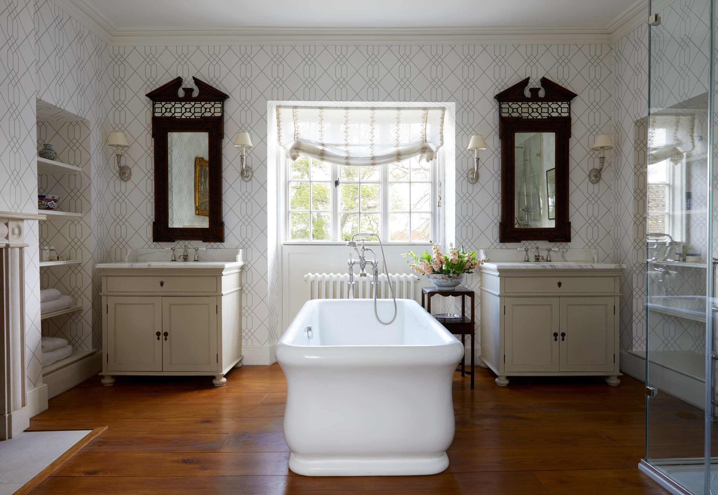

I adore wallpaper and find reasons to use it all over the house, including in kitchens and bathrooms. There are so many choices and its impact is so utterly varied that it can be overwhelming knowing where to start when it comes to choosing a wallpaper design. In the right space, wallpaper ideas shouldn’t dominate a room but rather form part of its overall impact.

Henriette studied at City & Guild of London Art Schools and gained a master’s degree at Sotheby’s Institute where she honed her appreciation and love for antique furniture and decorative design from 17th Century through to 20th Century. She was also very much involved in country house sales which fed her appetite for beautiful architecture of historical interest. Deciding to move into interior design, Henriette studied at the prestigious Inchbald School of Design. On graduating she gained experience with leading interior designers including Stephen Ryan who had been head of David Hicks Design. She also had a spell in theatre design which enabled her to indulge her more flamboyant side and made her realise just how much she relishes any challenge.
1. I use wallpaper in unexpected places
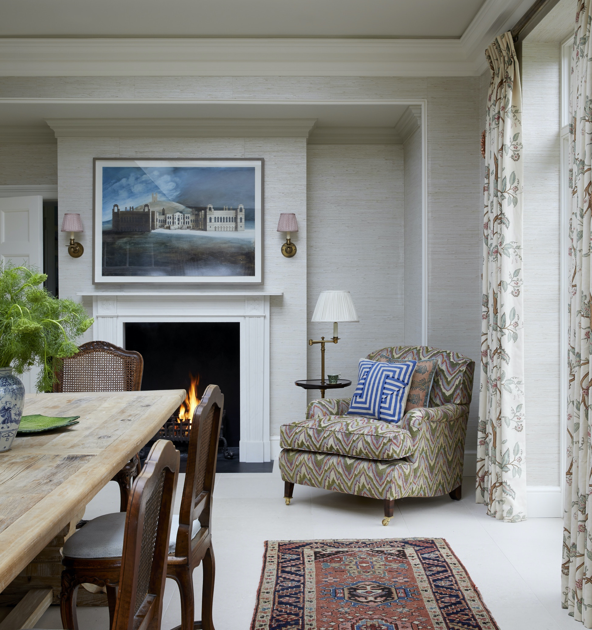
Many people are understandably nervous about using wallpapers in kitchens, but I love doing this – kitchen wallpaper ideas immediately take the edge off all the hard finishes in the room and helps to absorb sound.
Some kitchens suit a textured finish such as a grass-cloth wallpaper (above), but I’ve also used Marthe Armitage’s wonderful Pagodas for a kitchen (below).
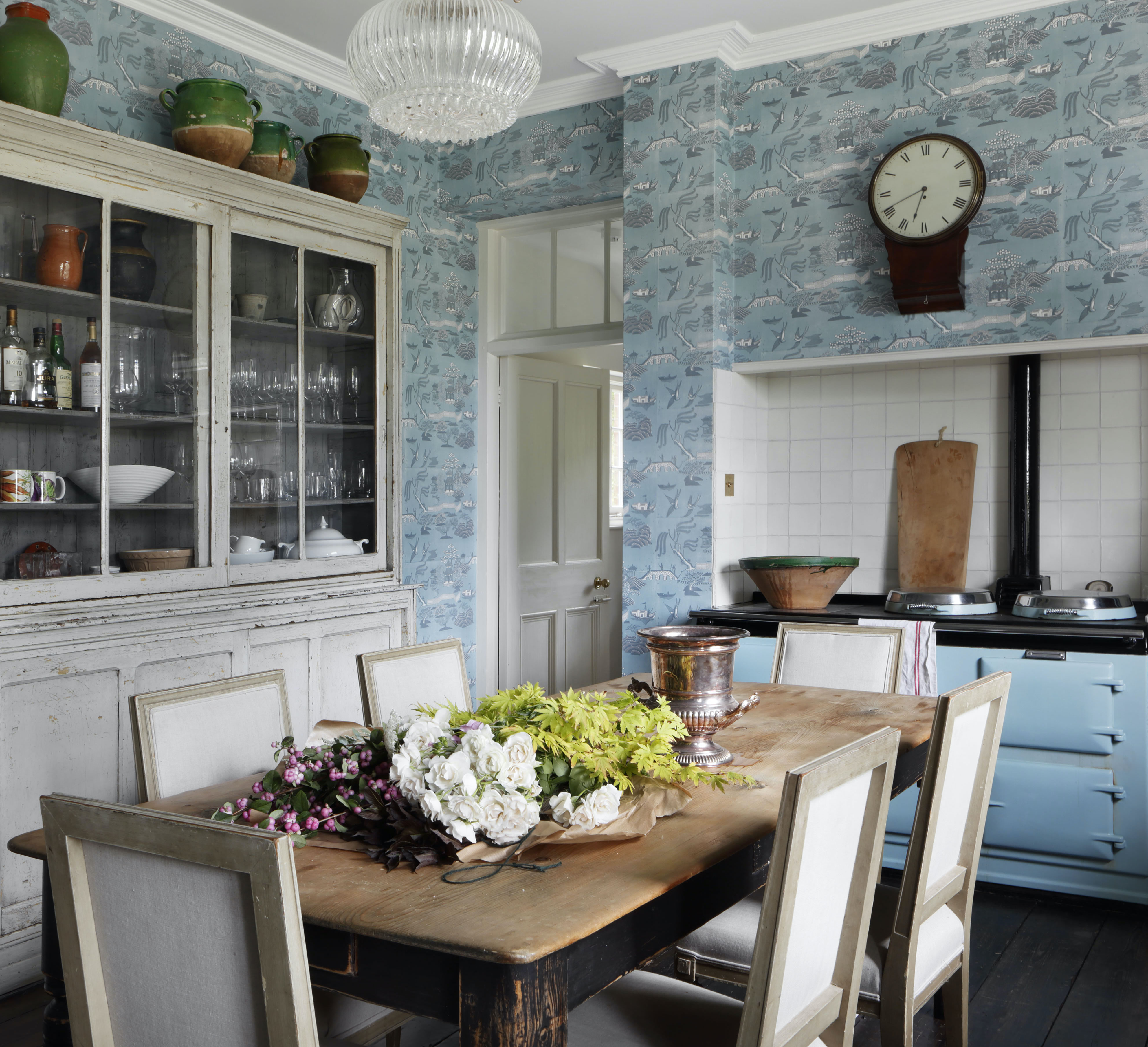
Marthe Armitage wallpaper
Bathrooms are another favorite space to wallpaper for the same reason: bathroom wallpaper ideas act as a foil for all the solid elements.
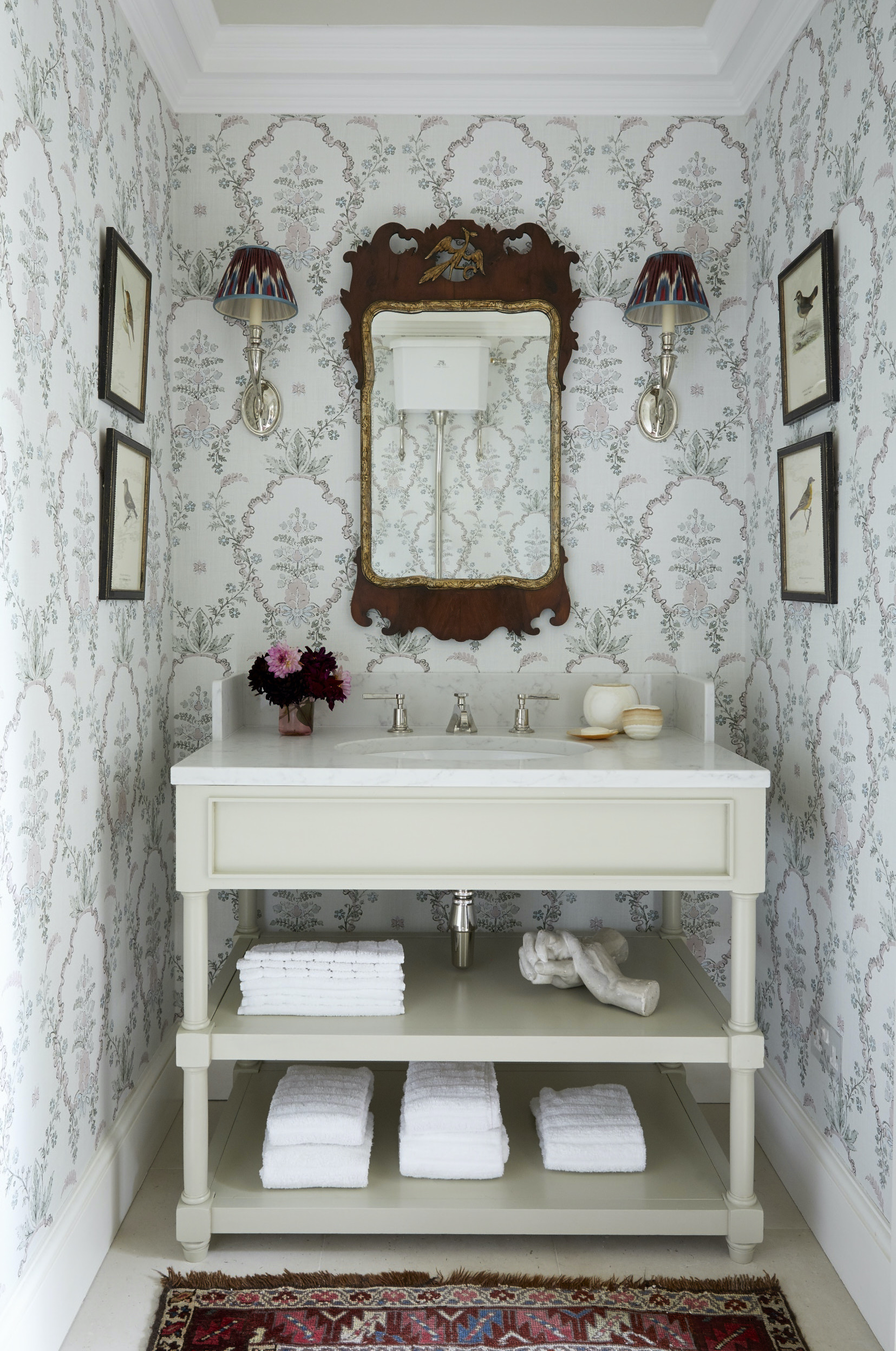
Lewis & Wood
It’s worth bearing in mind, too, that many wallpapers today are printed on much more durable papers than ever before so check the suitability before drawing any conclusions.
Obviously, I wouldn’t recommend using a silk paper in an area of high traffic, but many designs can be wiped down which means they can work really well for hallways, for instance. This is an area where I’m particularly fond of using wallpaper – especially in the case of large country-house hallways. If there isn’t lots of art to hang, patterned hallway wallpaper ideas work really well instead.
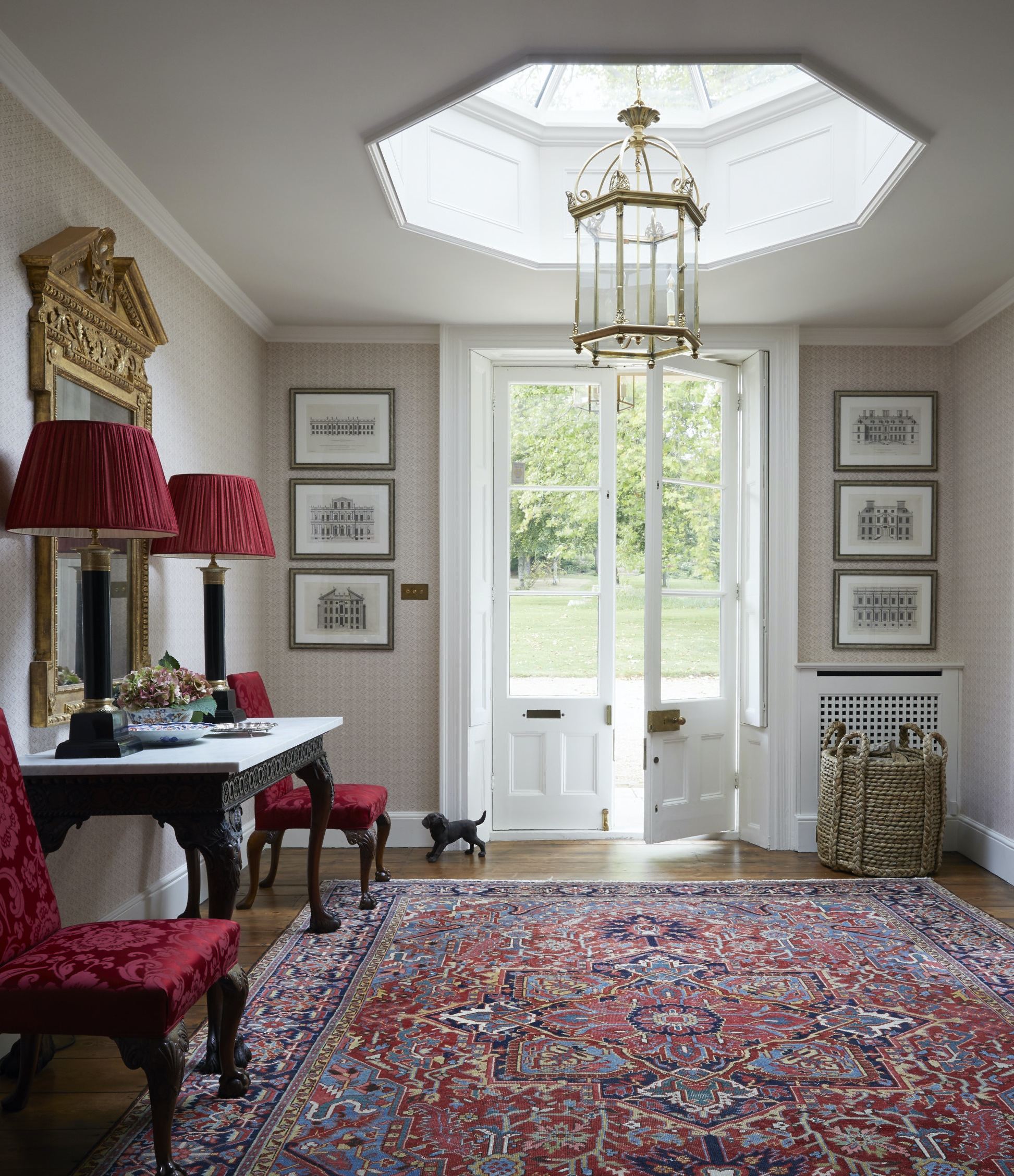
Robert Kime Wallpaper
2. I choose purposefully between pattern and plain

Zardi & Zardi
As a general rule of thumb, I believe that a larger scale pattern is better suited to a large room but it’s not always the case and sometimes these judgements can only be made when standing in the room itself and taking note of the natural light.
I definitely don’t discount using patterns at all in small rooms. In a funny way, pattern can make a small space feel larger. I firmly believe you can’t go wrong with any of Robert Kime’s selections of small-scale designs – they are brilliant. These also look great in the backs of bookcases to add another layer of interest – providing they aren’t stuffed with books and are used more to display objects.
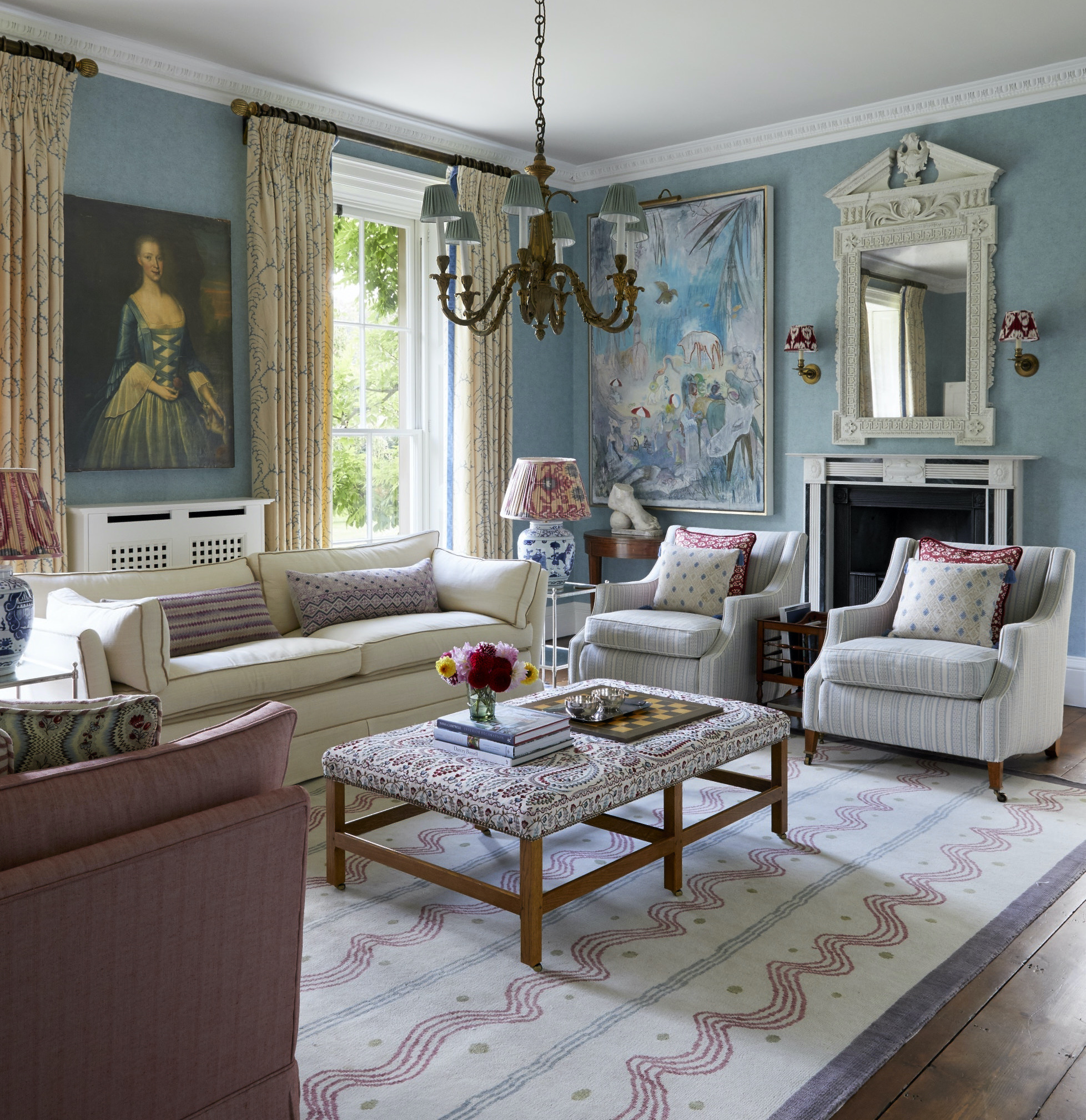
Paper by Ralph Lauren
Sometimes, I will opt for a plain design when what’s required is a bit of depth and movement in the walls. For those wanting a more lived-in look, I recommend Turners Textures by Lewis & Wood. It’s a wallpaper that gives the effect of a plastered wall or a specialist paint finish.
3. I go for all over pattern to create a distinct effect
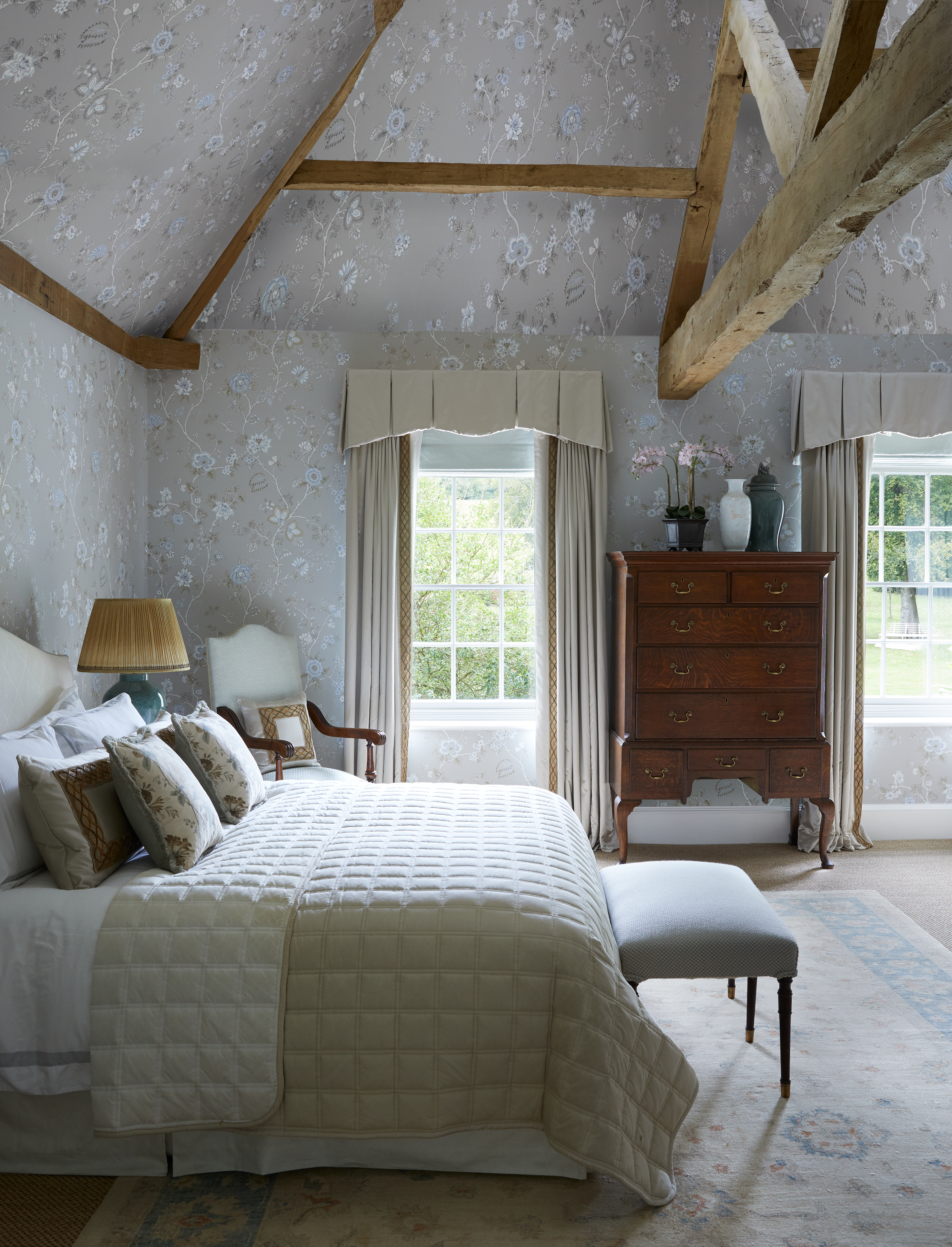
Indienne paper by Lewis & Wood
For small bedrooms ideas – and in particular those up in the eaves where it’s hard to delineate between the top of the wall and the start of the ceiling – I like to go for an all over look with everything from the curtains to the paper in the same pattern.
In smaller rooms, if there are too many disparate elements it can end up looking too cluttered. An all-over toile de jouy, or a small scale pattern, has the opposite effect as the pattern almost disappears because the eyes travel easily around the room.
The effect is to create a cosseting environment that is cozy and comfortable. What you want to avoid, however, is a pattern that’s too dense – this can end up feeling claustrophobic.
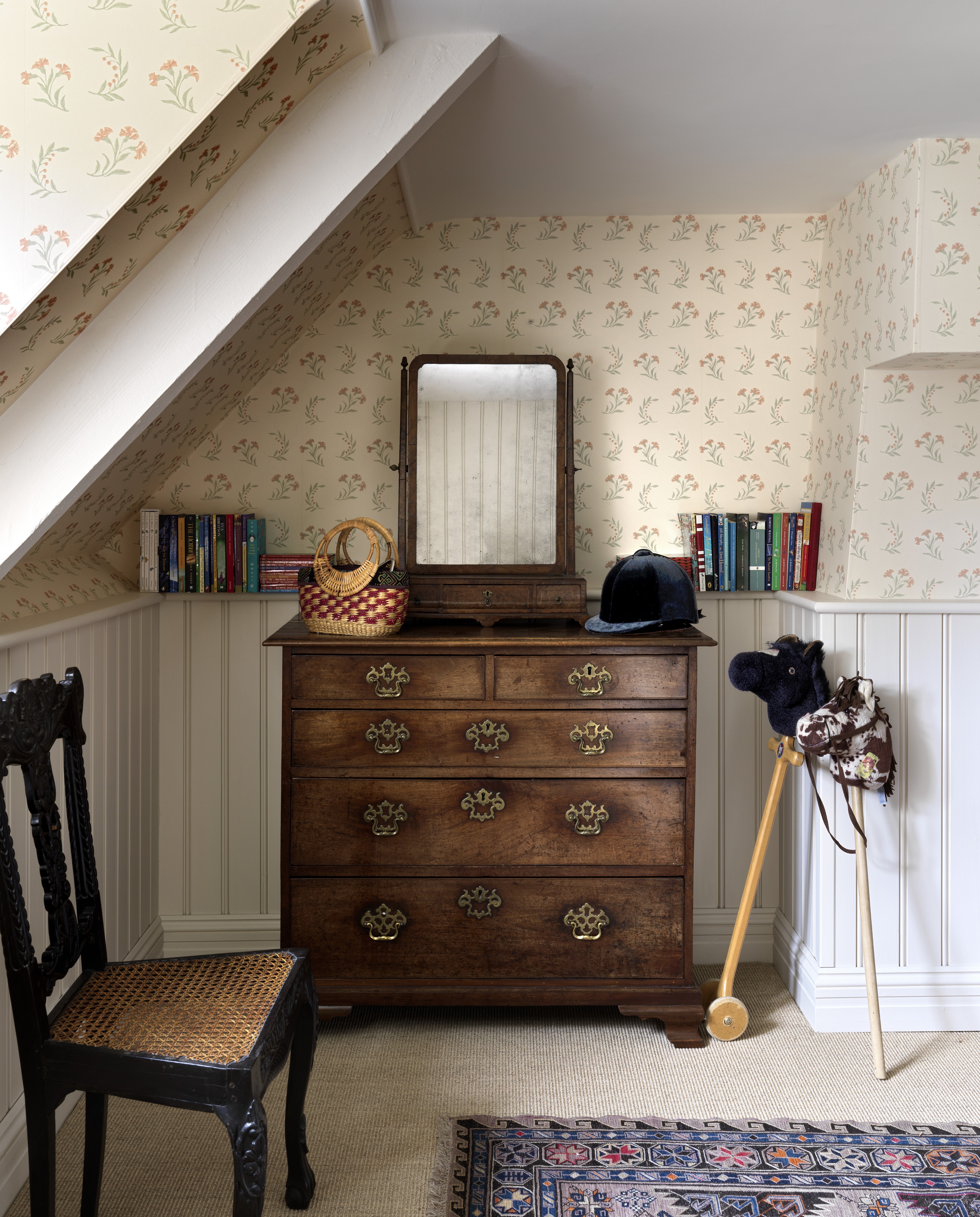
In larger rooms, such as sitting rooms, I like to use designs by Totty Lowther for all-over pattern. It makes a quiet but elegant backdrop for other patterns in the room.
4. I use different stripes in different ways
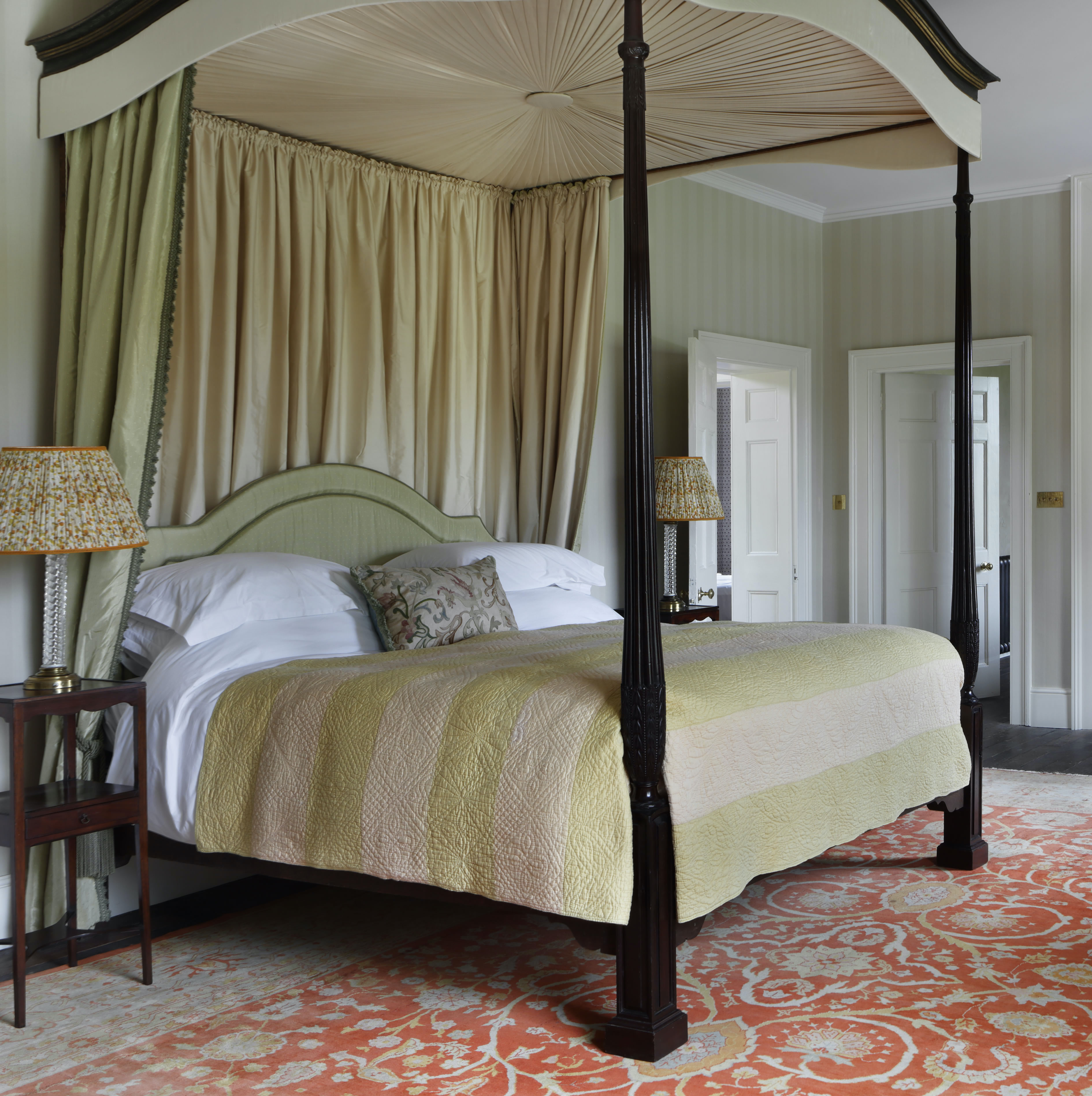
I like decorating with stripes on walls. You can go one of two ways: strong and bold in a space that you don’t spend much time in or gentle in a bedroom.
Stripes make something happen on the walls without too much of a pattern and are typical of period properties.
I like using them in bedrooms which have more of a masculine feel and they also have the effect of elongating a room, which can be useful.
The width of the stripe will depend on the room itself: a corridor could take something wider and bolder than you’d want to use in a bedroom, for example.
Ralph Lauren does some great shirting stripes that I’ve used in children’s rooms and bathrooms while Ian Mankin has a good selection of inexpensive ticking stripes in lots of good colors.
5. I go bold with wallpaper in certain spaces
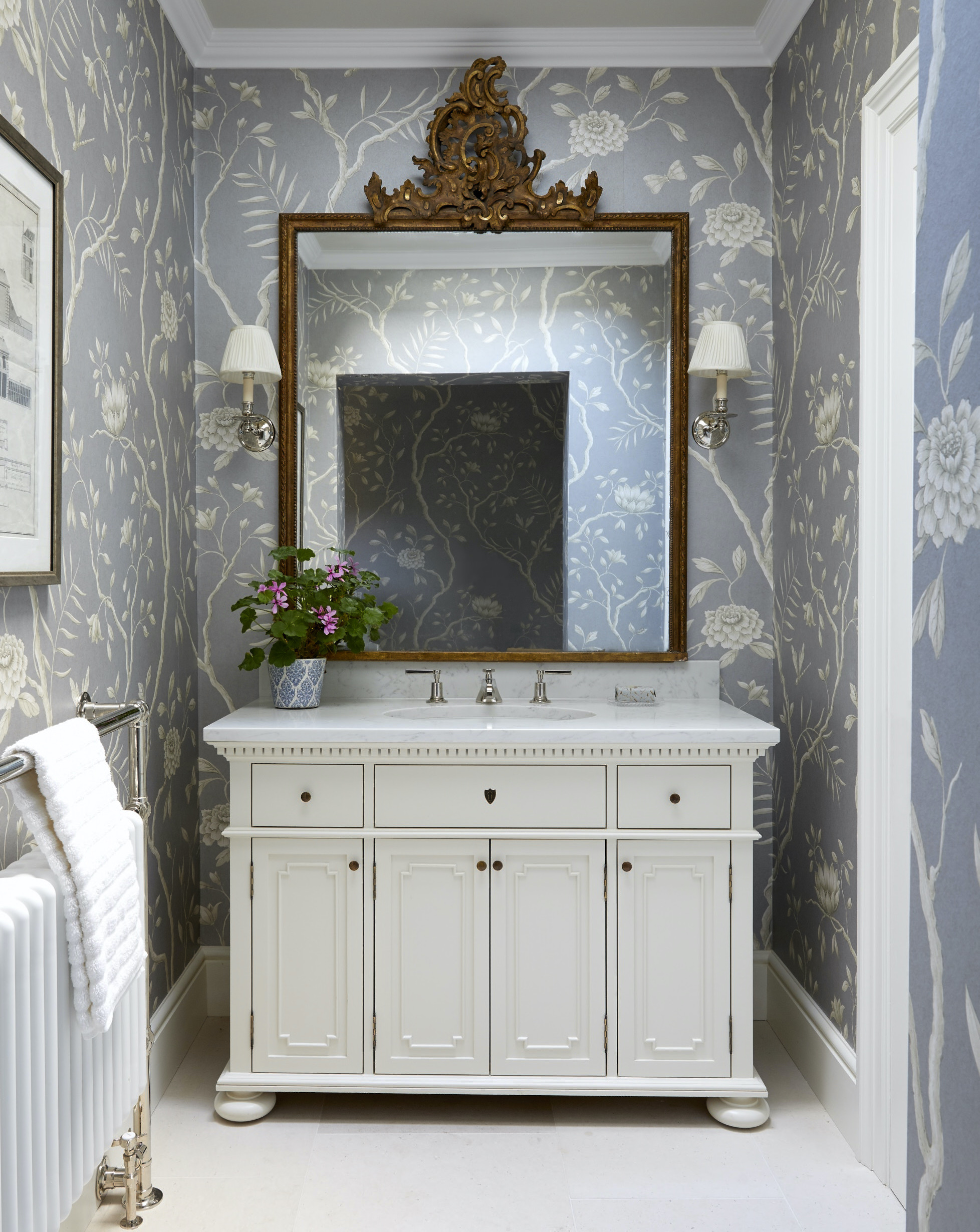
Lewis & Wood
Powder rooms are the ideal space to have a bit of fun, so I often encourage clients to stretch their comfort zones when it comes to choosing powder room wall decor.
Because of their size, this is the room where you might stretch to having a much longed-for de Gournay paper or choose a beautiful design that becomes something of a conversational piece for guests.
6. I spend more in special rooms
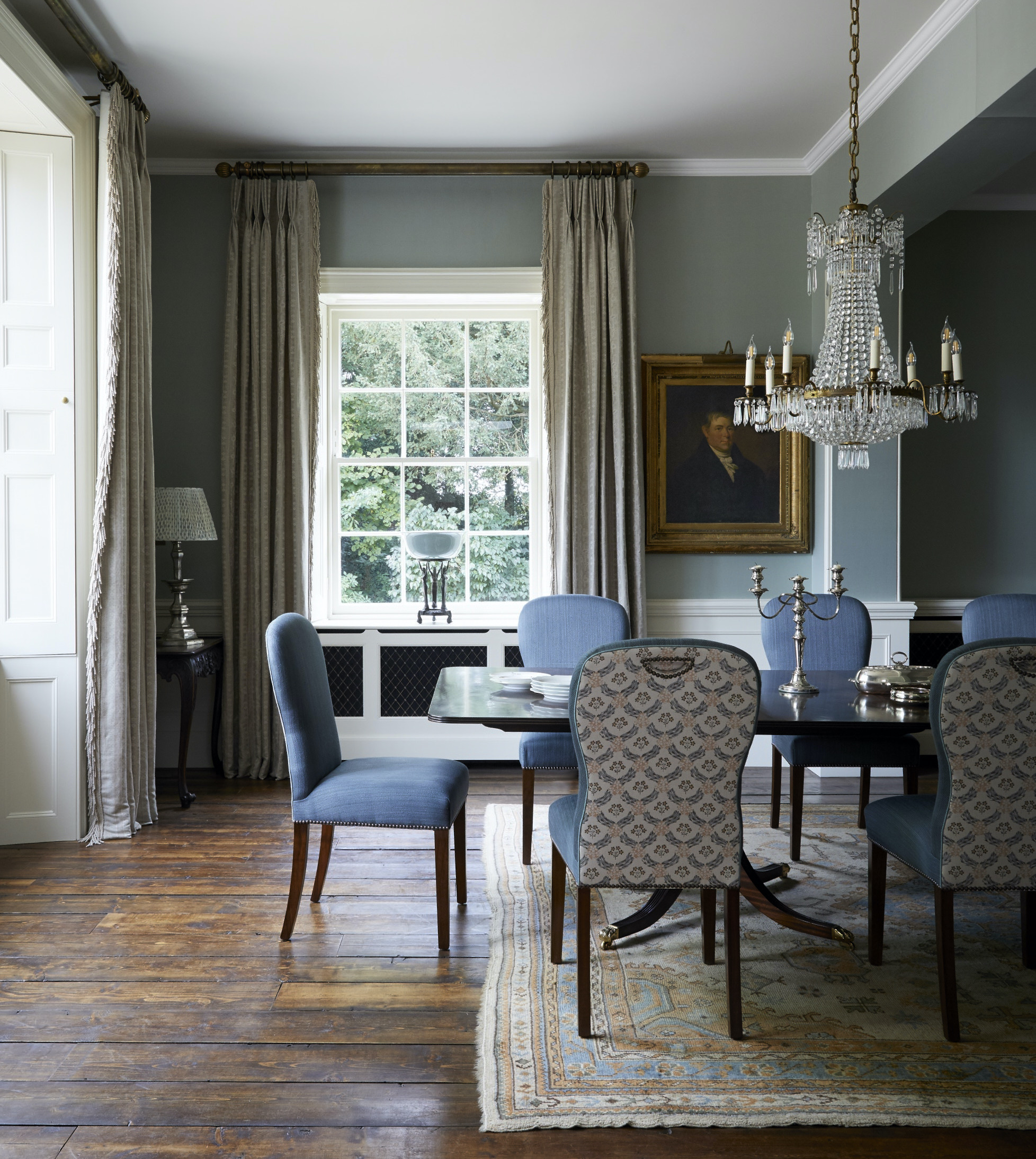
Dining rooms benefit from fabric walling and I’m particularly fond of using silk in this kind of environment. Pierre Frey does a lovely, slubby silk that changes color under candlelight and is wonderfully atmospheric. But not only that, it serves to absorb the acoustics and creates a cosy surrounding.
When the budget doesn’t stretch to fabric walling, I’ll use fabric backed wallpaper.
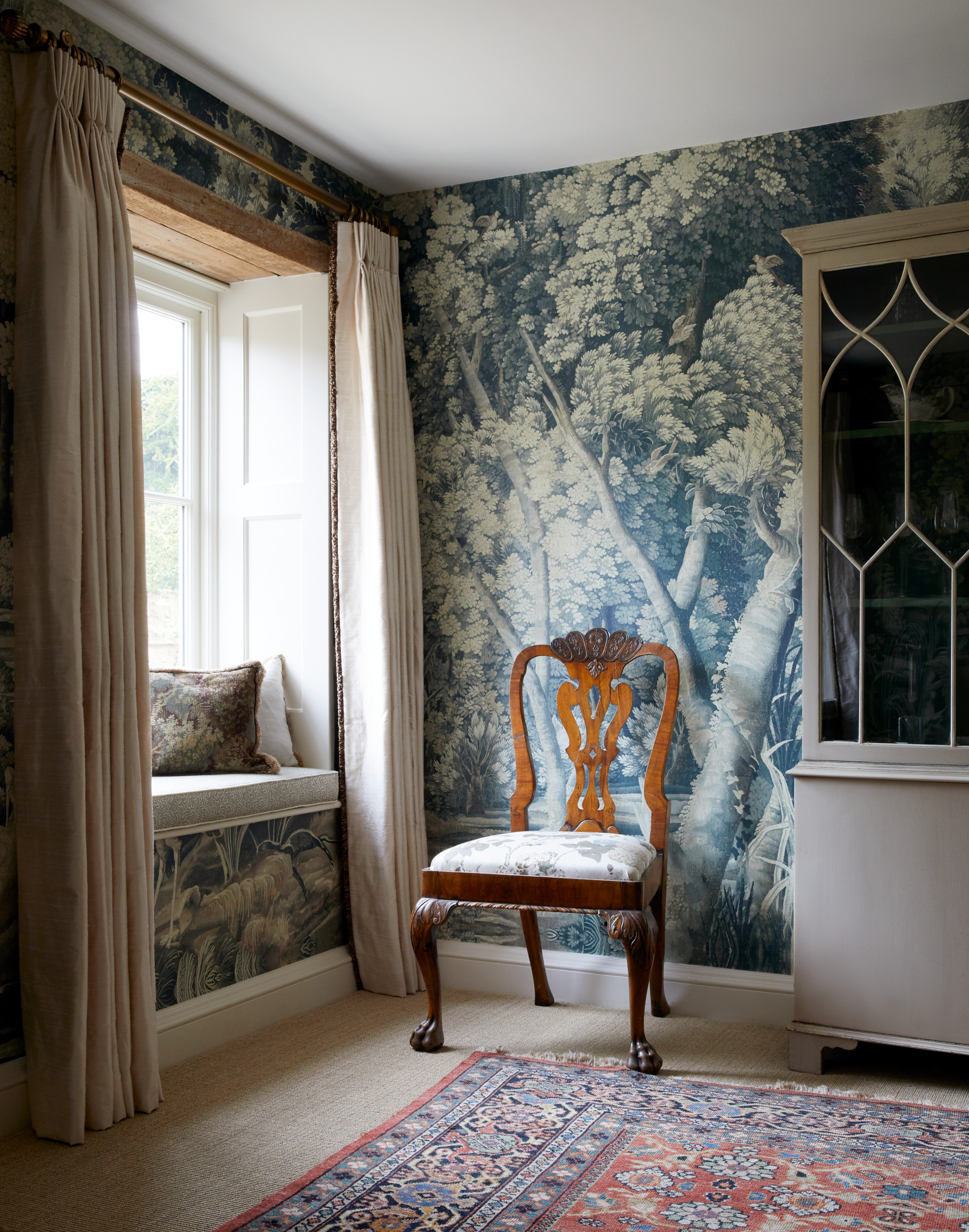
Both dining rooms and large-scale games rooms also lend themselves particularly well to panoramic designs or Chinoiserie; I really like Zardi & Zardi (above) which I’ve also used in a large Scottish billiards room. Remember you can still hang paintings over scenic wallpapers.
7. I save strategically
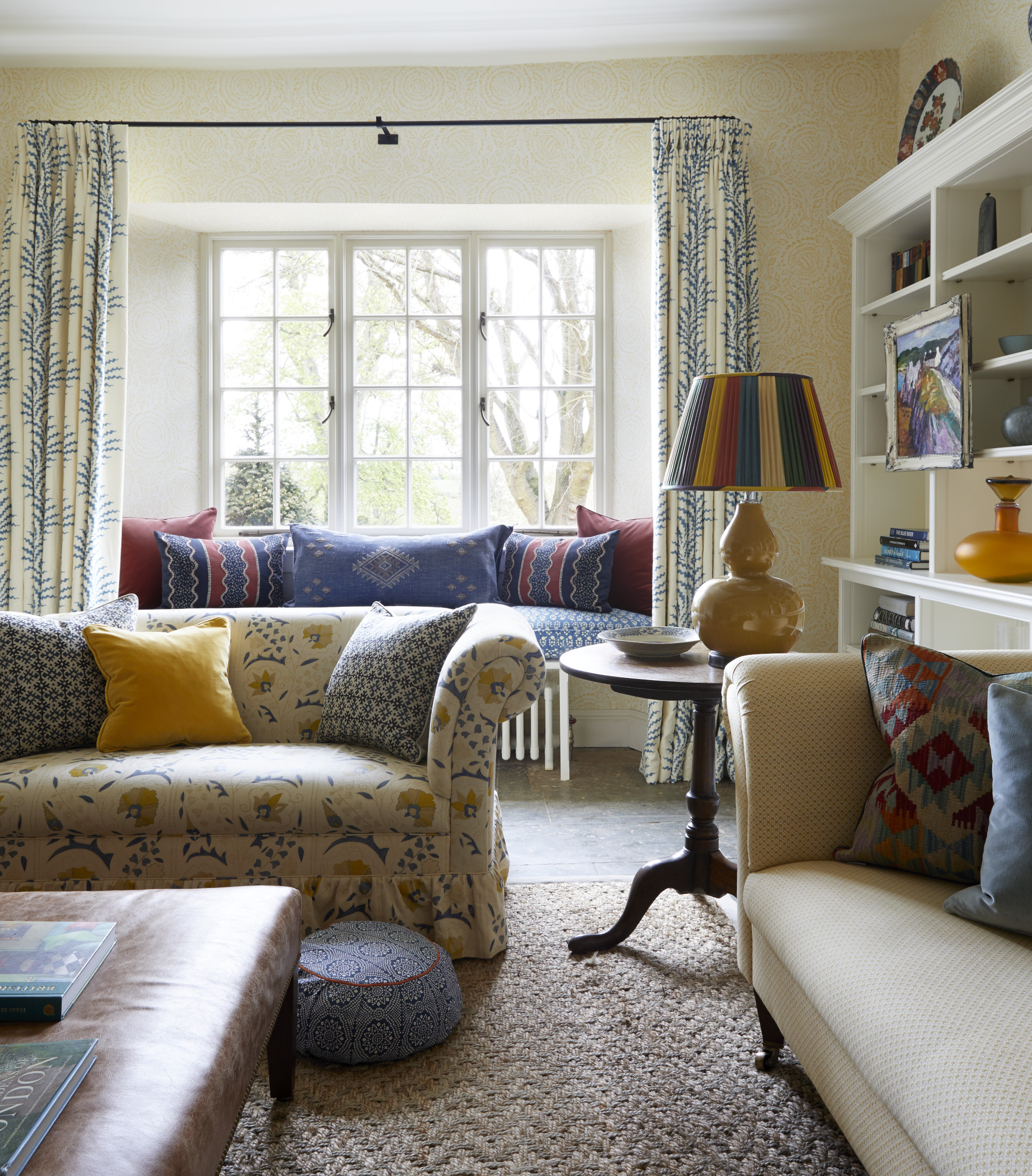
There are some tricks which will help to manage the budget when it comes to wallpaper. The first is choosing a small-scale pattern with a repeat of less than half an inch – this will limit the amount of waste created when it comes to pattern matching.
A stripe is ideal for this; have a look at Ian Mankin’s selection of tickings. I also use designs by GP&J Baker (above) with small repeats for this reason.
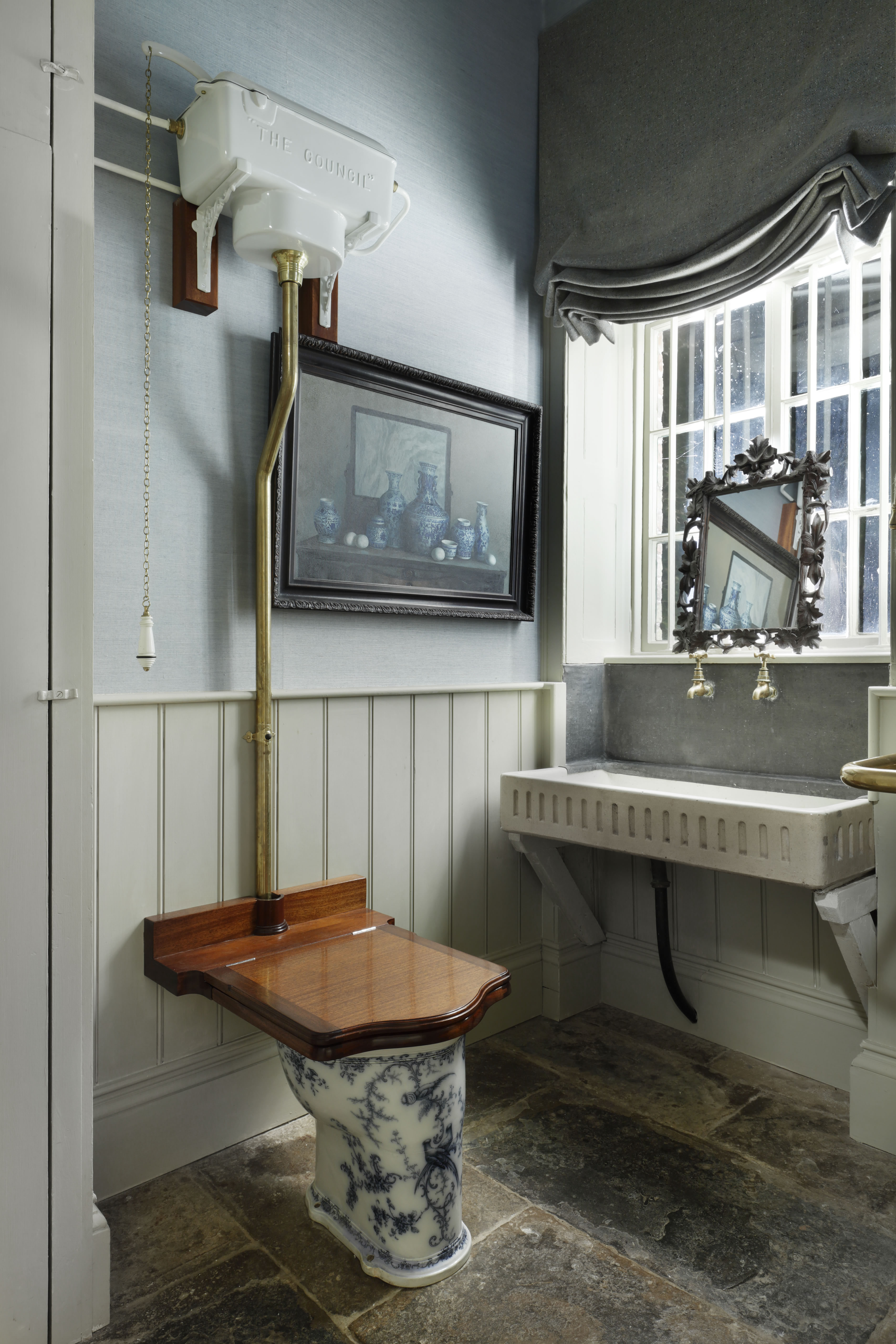
Another is only papering above the dado rail in a room (but do bear in mind, this will only work in rooms that have good ceiling heights – anything lower than 2.4m will look out of proportion).
It's also possible to ask a specialist painter to stencil on a pattern to painted walls.
And, finally, many designers are bringing out wallpaper borders – among them are Susie Atkinson and Jean Munro. These can make a big impact for a relatively small investment.
Sign up to the Homes & Gardens newsletter
Design expertise in your inbox – from inspiring decorating ideas and beautiful celebrity homes to practical gardening advice and shopping round-ups.

Henriette studied at City & Guild of London Art Schools and gained a master’s degree at Sotheby’s Institute where she honed her appreciation and love for antique furniture and decorative design from 17th Century through to 20th Century. Henriette studied at the prestigious Inchbald School of Design. On graduating she gained experience with leading interior designers including Stephen Ryan who had been head of David Hicks Design. She also had a spell in theatre design which enabled her to indulge her more flamboyant side and made her realise just how much she relishes any challenge.
-
 I tried the 50% decluttering rule, and it gave me the ruthless push to clear the clutter in my cramped kitchen cabinets
I can now find my dinnerware much more easily
By Rebecca Shepherd
-
 Andrew Walker's wooden cabinets have made me rethink the concept of a classic neutral kitchen – they're simple without feeling overly minimal
Raw, pared-back cabinetry has never felt so sophisticated – designers say they're a 'smart, long-term investment with lasting style'
By Megan Slack