12 vignette ideas that make for a collected, curated arrangement in any home
Transform dusty, underused corners into something lovely with these designer-approved tips for styling vignettes
- 1. Transform an underused corner
- 2. Begin with more than you need
- 3. Use a console table for the foundation
- 4. Start with a tray and layer
- 5. Think of your display like a mountain
- 6. Keep items personal and stick with vintage
- 7. Create a cohesive color story
- 8. Follow the rule of thirds
- 9. Arrange from different angles
- 10. Don't forget about the backdrop
- 11. Allow some negative space
- 12. Incorporate plants and greenery

Creating a vignette is a tried-and-true way to make your space look a bit more chic, combining traditional design rules with personalized style. Whether you have an empty entryway table that could do with a refresh or a dusty, underused corner you'd like to bring back to life, styling a vignette is a fast track to aesthetic perfection.
Vignettes come in all shapes and sizes, but interior designers stick with some general guidelines to ensure their creations are up to par. We spoke with several about how to elevate everyday objects in your home with vignette design, and they shared 12 ideas that'll ensure each alcove of your home – no matter how big or small – gets the designer treatment. This is what they had to say.
What is a vignette?
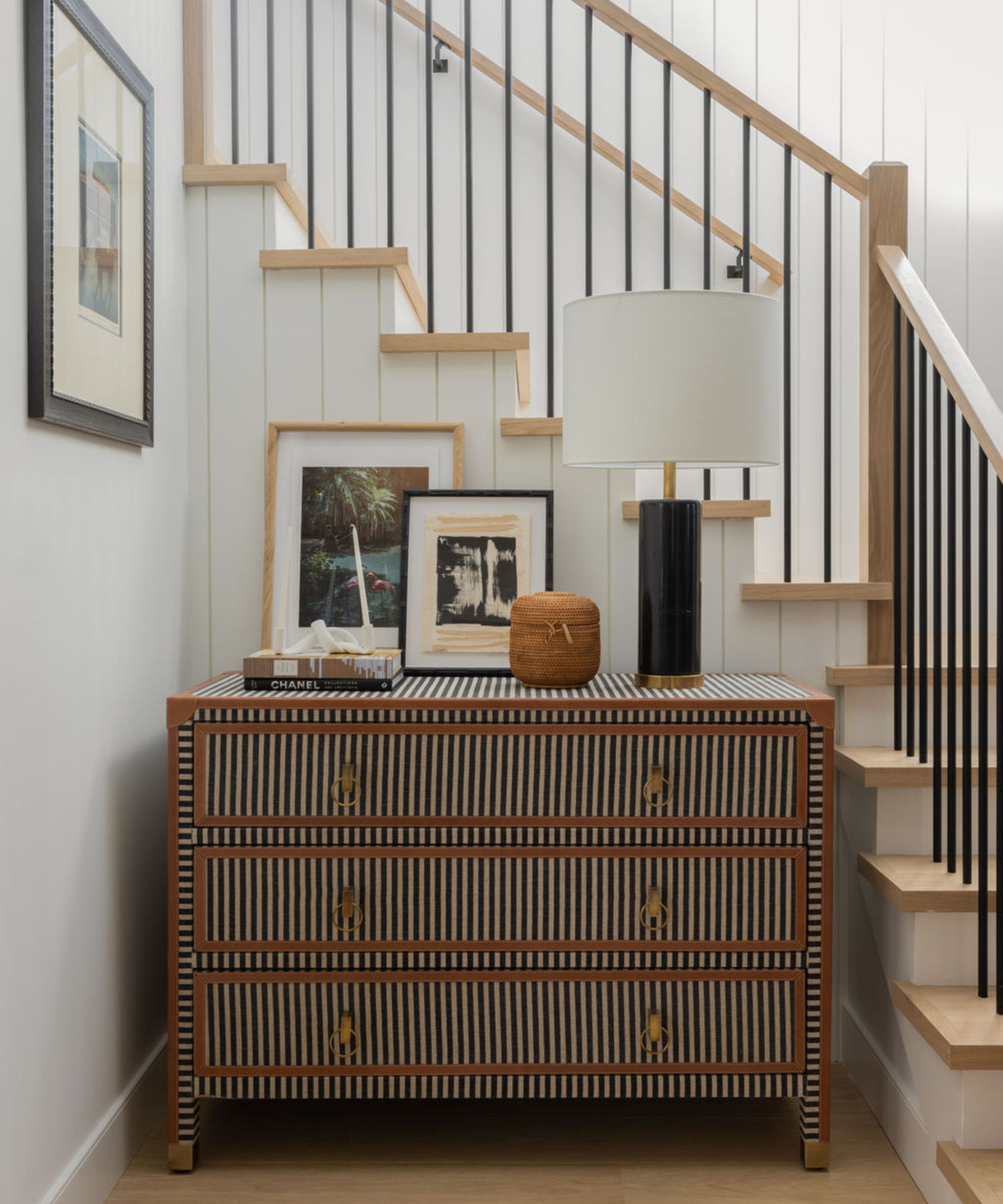
'Vignettes are a perfect opportunity to gather and put together a grouping of decorative objects. Think of this display as a mini-story where one can include pieces from their travels, sentimental objects, or even personal photos or meaningful works of art,' says Paul Corrie, founder of Washington, D.C.-based Paul Corrie Interiors.
Once you're familiar with what is a vignette, a whole new world of interior design inspiration opens up to you. These thoughtful, personalized placements can be found throughout the whole home, in small, forgotten spaces or full-length arrangements.
'We don’t consider vignettes to be just about accessorizing small spaces. It can be an entire floor-to-ceiling effort. Examples are tucking stools under a console table for extra seating, accent lighting considerations, mirrors and art,' adds Caroline Brackett, principal designer of South Carolina-based Caroline Brackett Studio of Design.
12 vignette ideas that breathe life into any arrangement
From interior designers who craft considered, characterful vignettes daily, here are 12 ideas you'll want to replicate in your own home. With attention to color stories, the rule of thirds and negative space, there's quite a bit to keep in mind.
1. Transform an underused corner
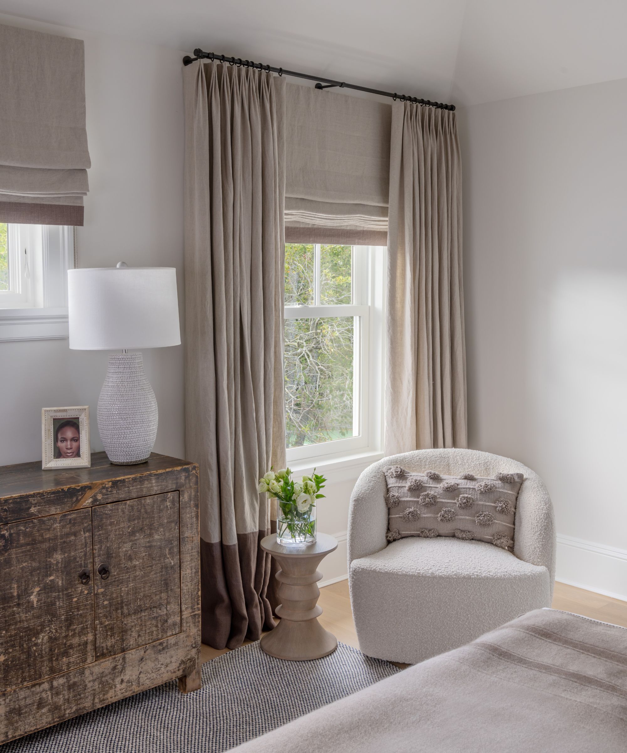
'Our approach to vignettes is to make what may be an otherwise unused or overlooked corner feel inviting and cozy, which is achieved by creating layers in the space,' says Gale Sitomer, founder of New York City-based Gale Sitomer Designs.
Especially in smaller spaces, letting any corner fall out of use proves a detriment to the entire room. Be sure to make the most of each alcove by creating cozy corners or reading nooks in these otherwise empty spaces. Gale suggests arranging lush seating and a 'space to place your things down, whether that be your phone, coffee or a book.'
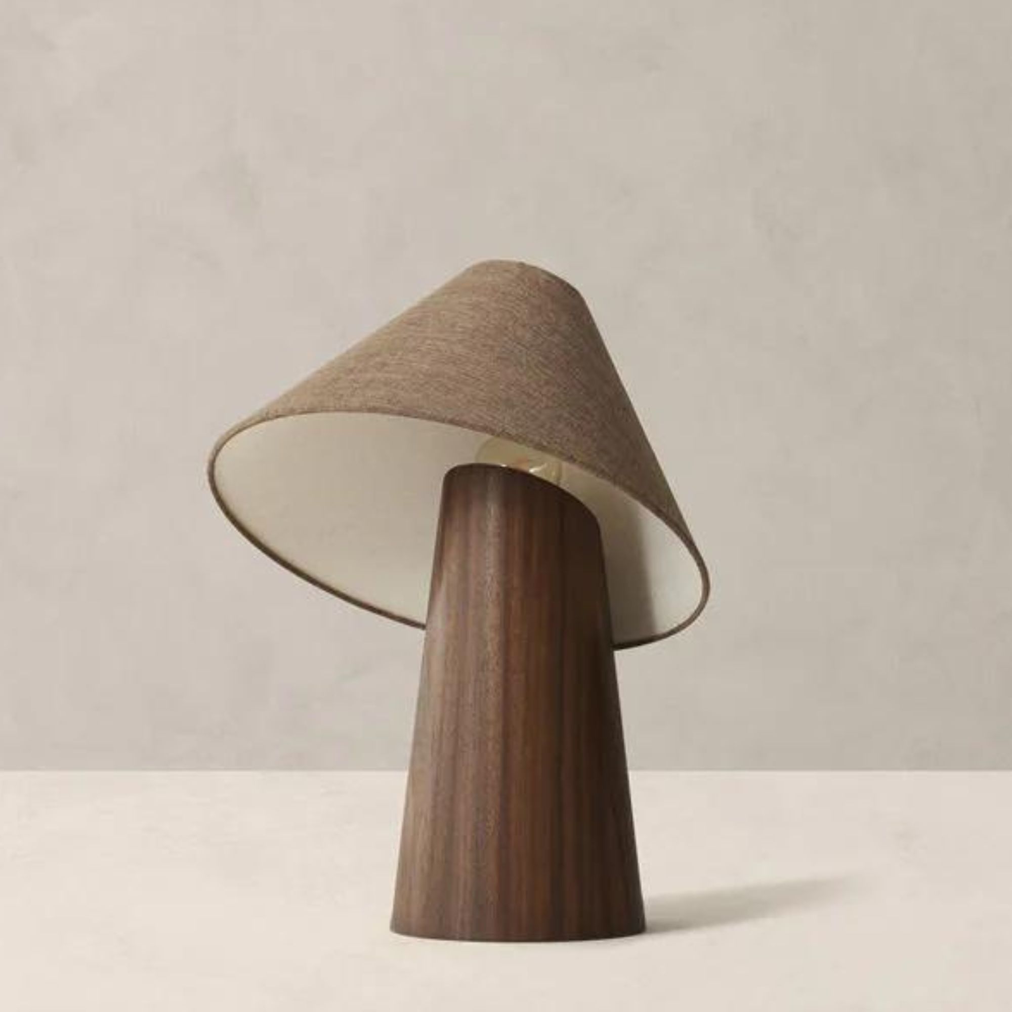
'If the space is by a window, drapery softens the space. If it is in a windowless corner, a lamp and or artwork work to draw your eye to the space and make it feel more inviting,' she adds.
2. Begin with more than you need
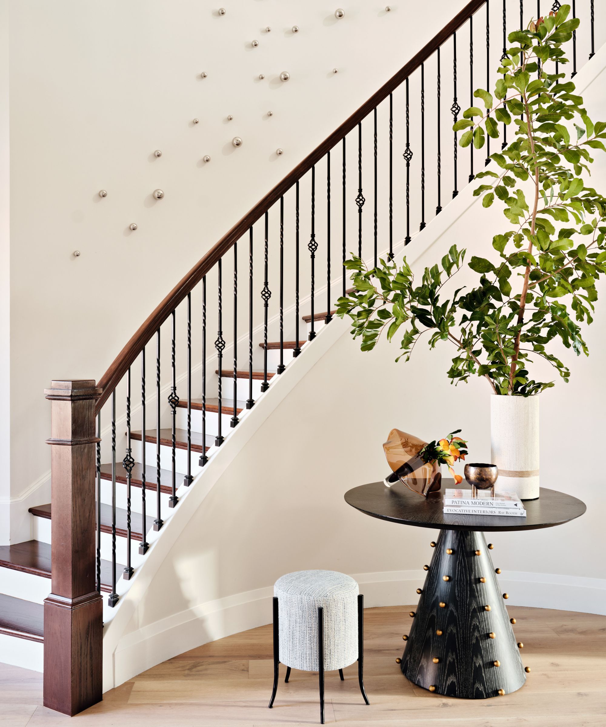
Like any good design scheme, a successful vignette starts with big ideas and is thoughtfully edited down to pared-back perfection. Rayana Schmitz, founder and principal designer of Florida-based Firefinish Interiors, suggests collecting a generous assortment of design accessories before putting your vignette together.
'My first advice is an often overlooked one: buy more than you think you will need and set aside enough time to play with the placement. The reason I say that is because sometimes what seems perfect in the store might not quite fit the vision once you're arranging them in the space, and creating a vignette is a process. Place an item, step back, analyze how it feels, go back to add or edit until it's just right – rinse and repeat,' says Rayana.
This general design process 'applies to every space, whether it's a shelf, a tabletop or a mantel,' she adds. Starting with more than you might need ensures that you won't end up stumped during the editing process – and from there, you can get designing.
'Once you have these in place, it's about balancing visual elements, mixing textures, heights, and shapes, following the "rule of threes," and avoiding overcrowding to create a visually appealing and cohesive vignette. It's important to pay attention to the backdrop and we always try to incorporate personal items to add character and uniqueness to the vignette, making it truly memorable,' says Rayana.
3. Use a console table for the foundation

When faced with an empty living room corner, it can be difficult to know where to start – should you invest in something stately like a bookshelf, or stick with something smaller? One classic way to kick a put-together vignette design off is with a styled console table. Layer on the accessories and place the table amidst artwork for a curated and personalized final look.
'I'm all about the layers with a vignette. I love a console with ottomans or a chest tucked underneath, lamps or a lamp, art or a mirror on the wall, and accessories on the console. That is a go-to layout. I ask myself if I am going for symmetry or asymmetry – an example is if I have two ottomans, do I have two lamps too, or is it one trunk and two lamps, or one trunk and one lamp? Proportions are important and overlapping the layers,' says Elizabeth Krueger, principal designer of Elizabeth Krueger Design.
4. Start with a tray and layer
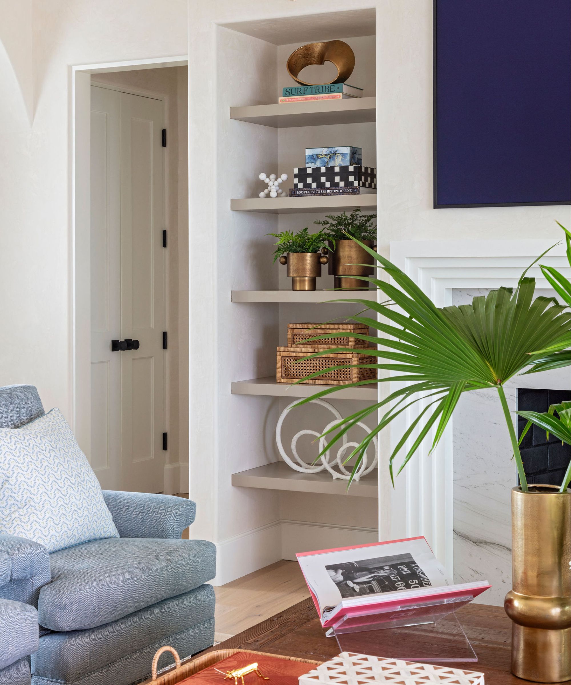
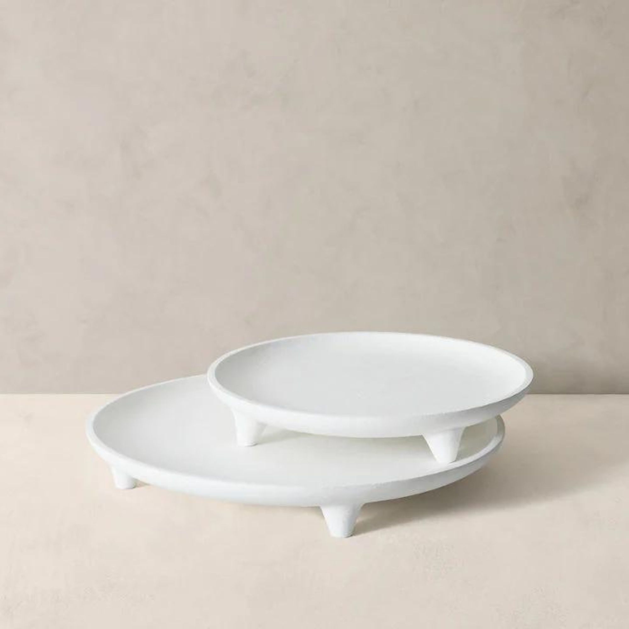
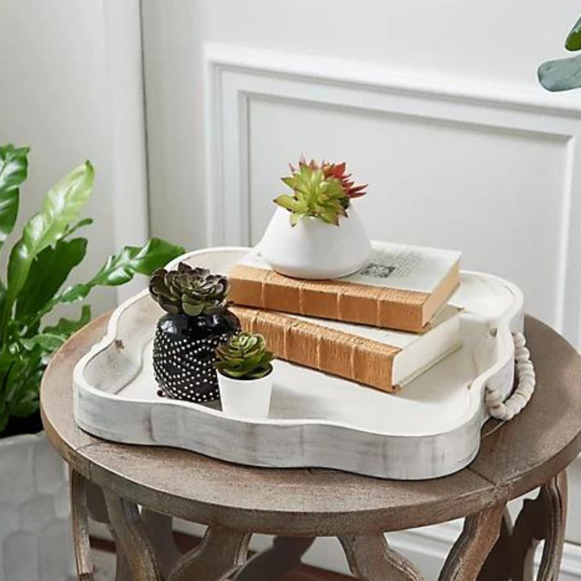
Trays also serve as worthy foundations for stunning vignettes – organizational tools that are also visually pleasing, they pull the whole look together. Caroline says this trick is a classic, and works with a wide array of decorative accessories. Pick out a tray that matches your home's aesthetic, and layer on items you love.
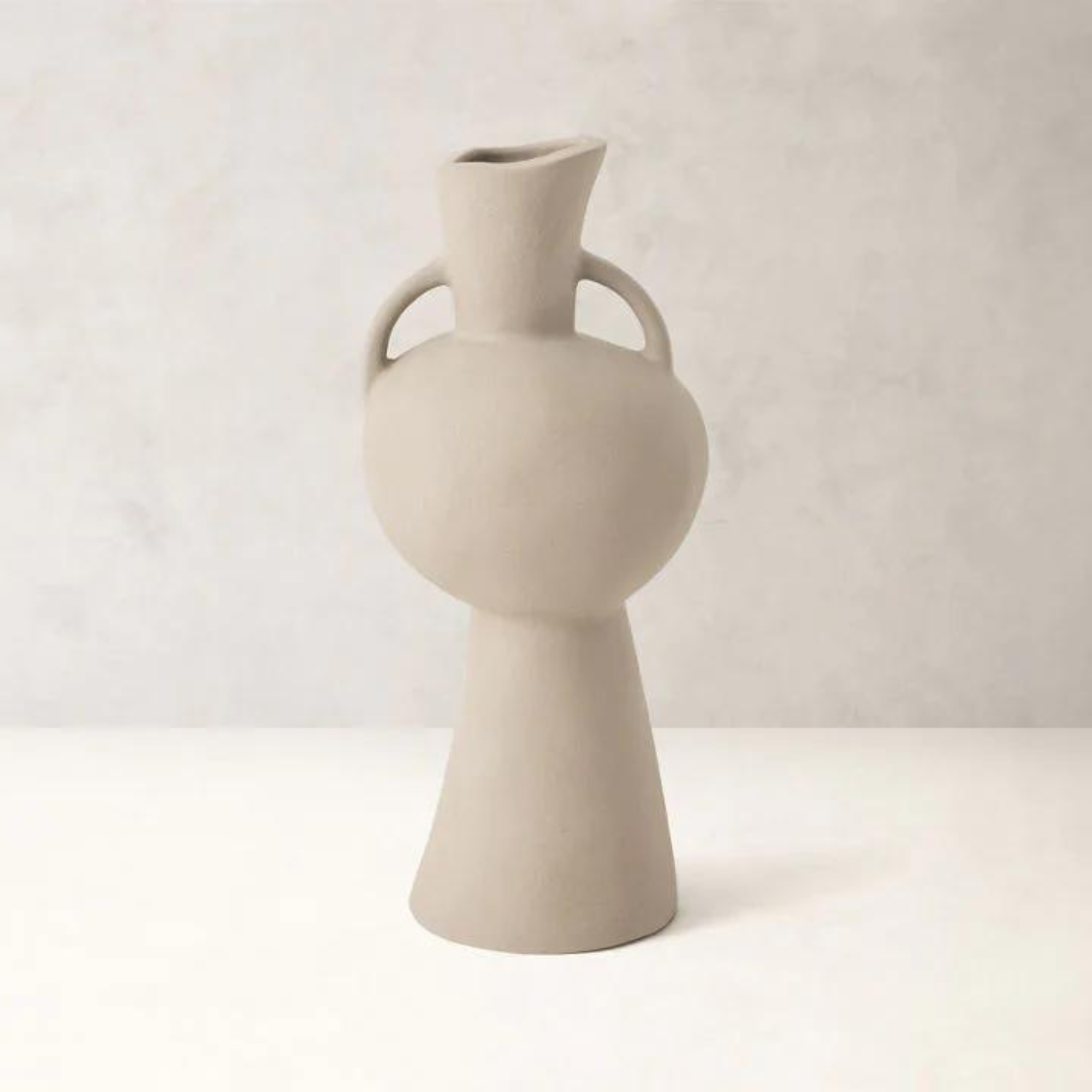
'This works beautifully on coffee tables, side tables, or even a kitchen counter. Of course, you start with a tray – wood, metal, acrylic, stone or woven – and add any of the following: a stack of stylish and colorful books, a small vase or interesting pitcher with flowers or greenery, a sculptural bowl or object, and a candle or diffuser,' says Caroline.
5. Think of your display like a mountain
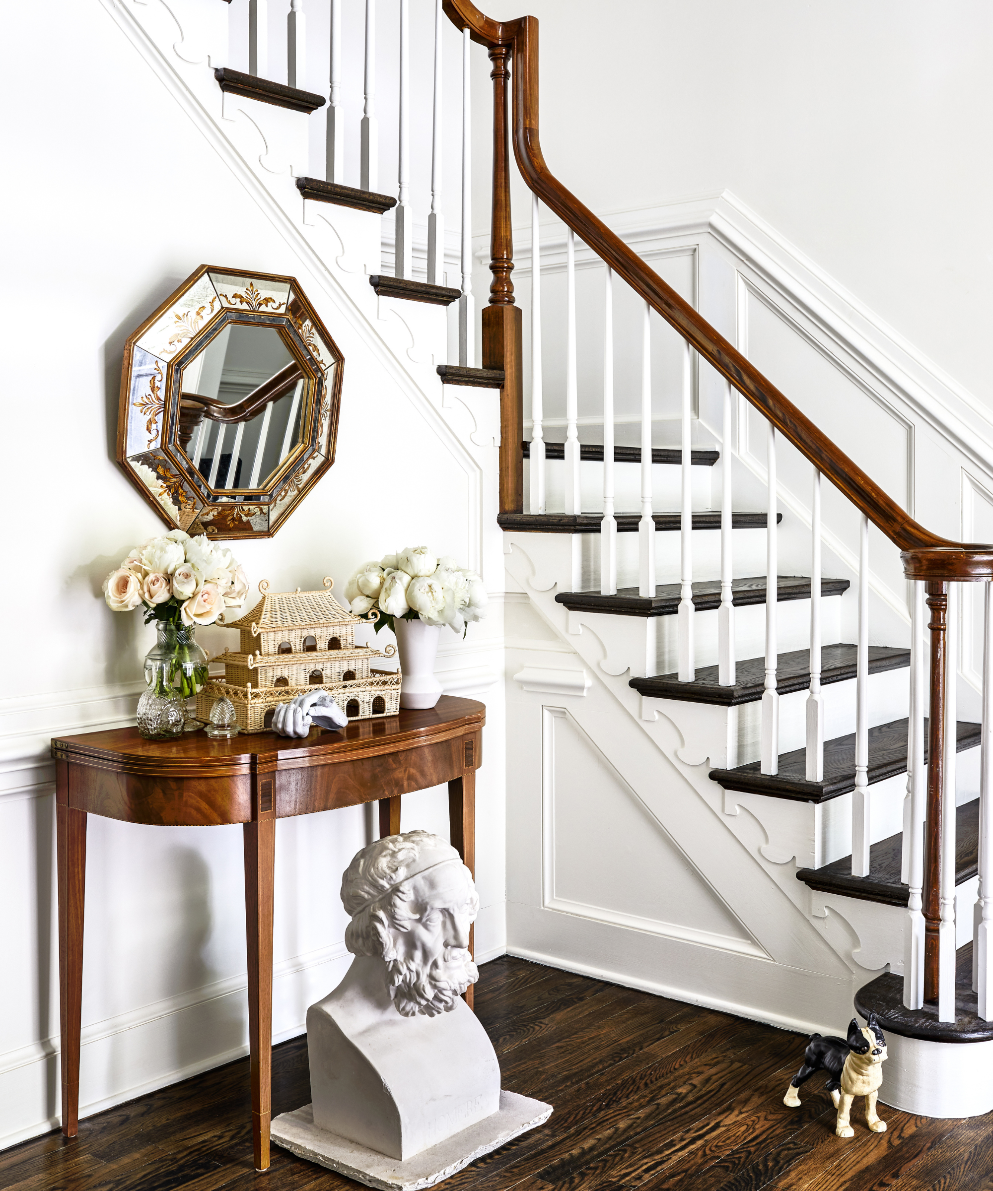
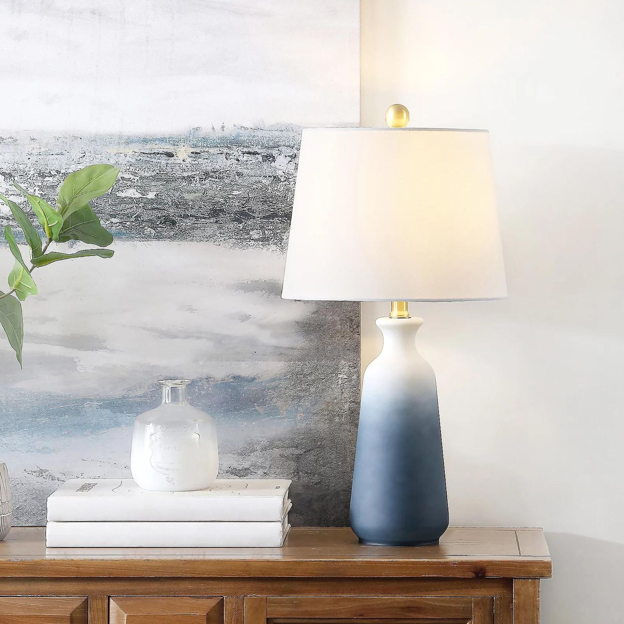
'When creating a vignette, we encourage you to think of your display like a mountaintop, where there is a peak (that doesn’t necessarily need to be centered) but then trickles down on both sides. The object relationship shouldn’t be jarring, but comfortably, and steadily, make its way towards a unified foundation,' says Paul.
Introduce one or two tall items to your vignette first to add height and visual interest, then work your way down to small accessories. This method will give your vignette a natural flow that's easy on the eyes yet still captivating.
Paul suggests lamps, candles and stacks of books, as well as 'curiosities and various other collected objects' to complete the look. 'They also usually include personal items, such as photos, meaningful heirlooms or art displayed in various mediums,' he adds.
6. Keep items personal and stick with vintage
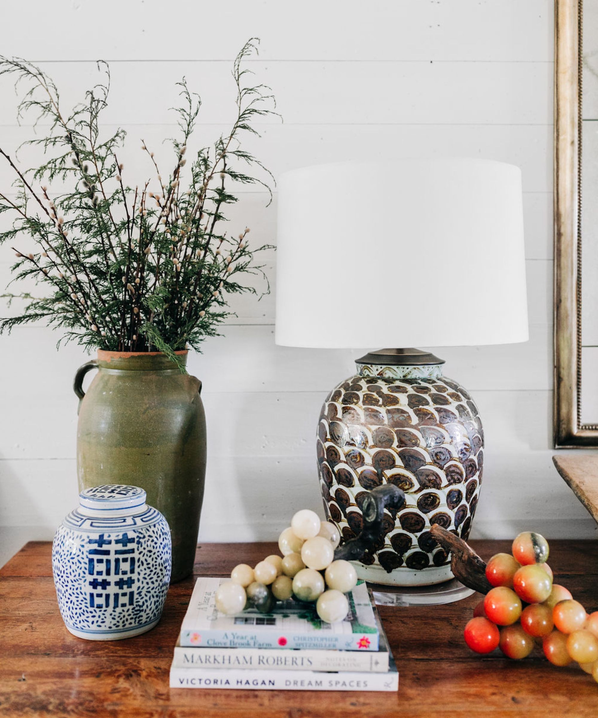
Decorating with family heirlooms and decorating with antiques are two surefire ways to achieve a comfortable, joyful home that exudes timeless style. And when these items are thoughtfully placed to create a vignette, the impact is even greater.
'I love something old, inherited, found, collected… those things are so much more special than random new accessory finds. I am constantly collecting for this very reason. And back to vintage… vintage accessories and books all day long!' says Jennie Bishop, co-founder of Studio Gild – a design firm with offices in New York, Chicago, and Los Angeles.
The most beautiful homes are full of meaningful, storied items that spark joy, and vignettes are the perfect places to introduce your favorite finds. Caroline says that 'vintage black and white photographs in sterling or silver-plated frames, family heirlooms and antique objects' as well as 'stacked historical or leather-bound books' 'create a sense of history' and contribute to this collected, eclectic final product.
'Reflect your personality – a vignette should feel like you. Infuse it with colors you love, meaningful objects, and a unique sense of style,' she says.
7. Create a cohesive color story
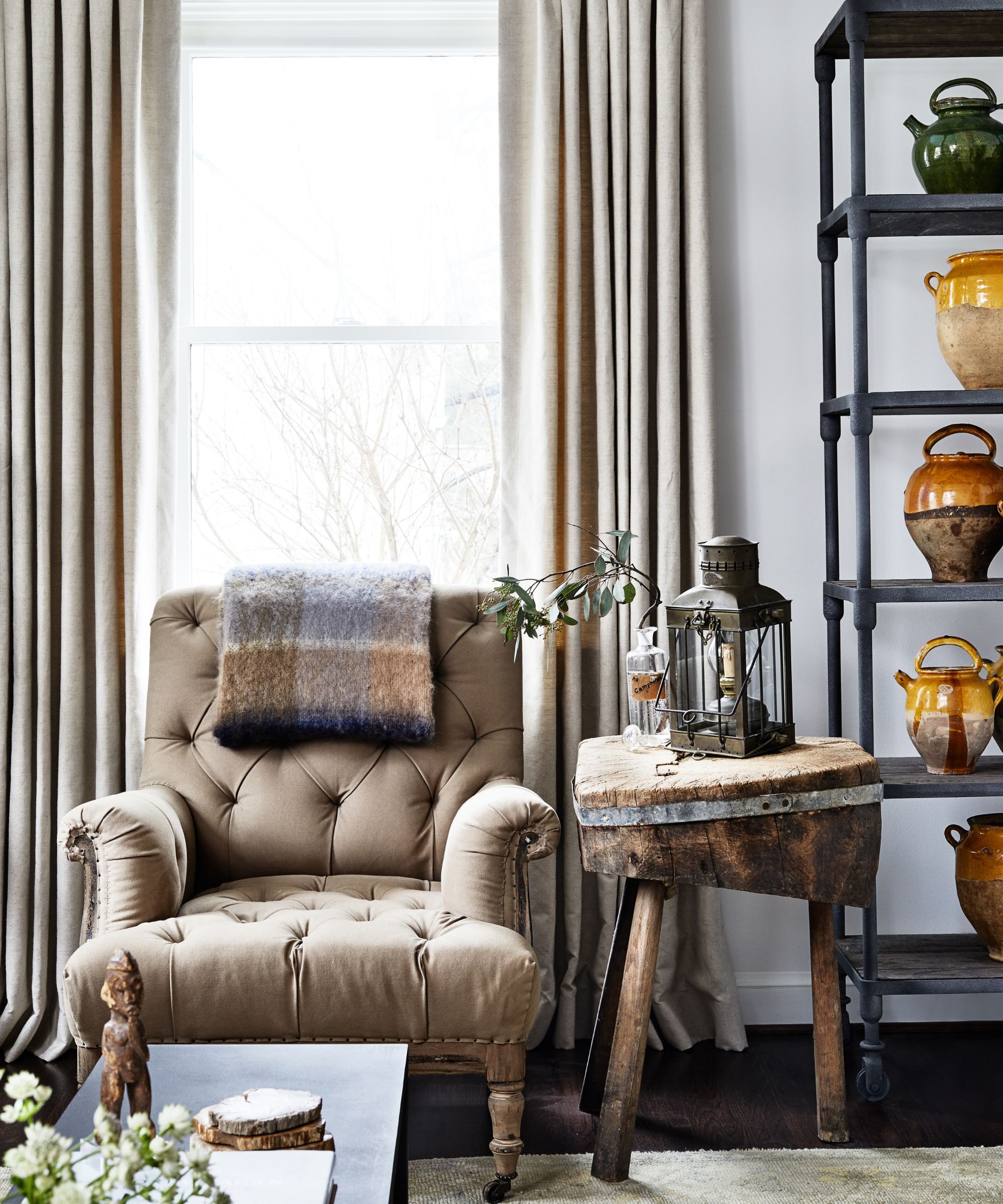
'Color relationships are also important. Think of the colors and mediums you’re considering for your vignette so to avoid a chaotic mess that doesn’t relate. And always take your time in editing as the finished product will be much stronger with a thoughtful and creative eye,' says Paul.
As in any successful design, the color palette matters – sticking with a cohesive grouping of shades makes for a put-together, considered space. Whether you prefer going all-out with bold hues and graphic patterns or sticking with something neutral, ensure there's a common thread that ties the selection together.
'You can make quite a visual impact with a single color palette by mixing up textures and materials for interest. Consider all-white ceramic pieces of different shapes and sizes or go the blue-and-white route with beautiful chinoiserie ginger jars. We are fans of monochromatic paper-covered books – Juniper Custom Books is a great source for books by the foot,' adds Caroline.
8. Follow the rule of thirds
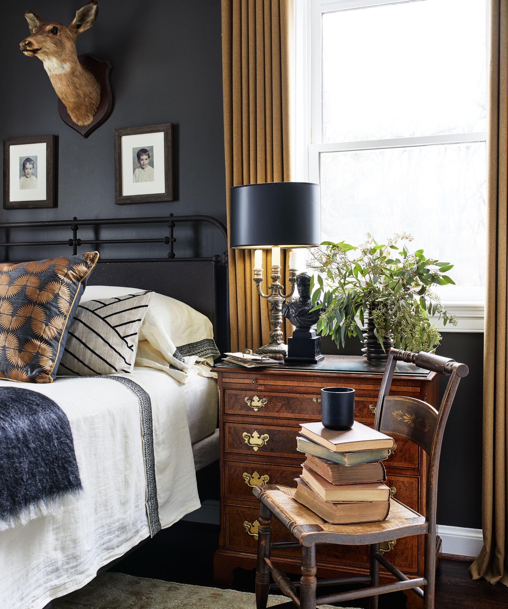
The rule of thirds, a method of dividing a space and designing accordingly, is well-respected across artistic professions, and for good reason. In photography, this rule applies to the framing of an image, and in interior design it's all about how objects coexist alongside one another in a space of any size. When creating a vignette, it's a helpful rule to keep in mind, as it allows you to easily find balance and symmetry (or considered asymmetry) with your arrangement.
'Objects grouped in odd numbers (usually threes) tend to be visually appealing. Imagine dividing your display space into a grid and place your focal point at one of the intersections for balanced composition,' says Caroline.
If you're running with an odd amount of accessories, it's smart to mix up the shapes, sizes and textures to ensure visual interest and depth. Kathy Kuo, interior designer and founder of homeware brand, Kathy Kuo Home, says she has a simple formula that often does the trick.
'When I create a styled decor vignette, I always try to stick to the rule of threes – use one vertical item, one horizontal, and one sculptural. Try to stay within a cohesive color palette and design style, but there are also no hard rules about mixing and matching. I love adding a piece of art made by my kids or a fun piece collected from my travels alongside my modern classic photo frames, flower vases and coffee table books,' says Kathy.
9. Arrange from different angles
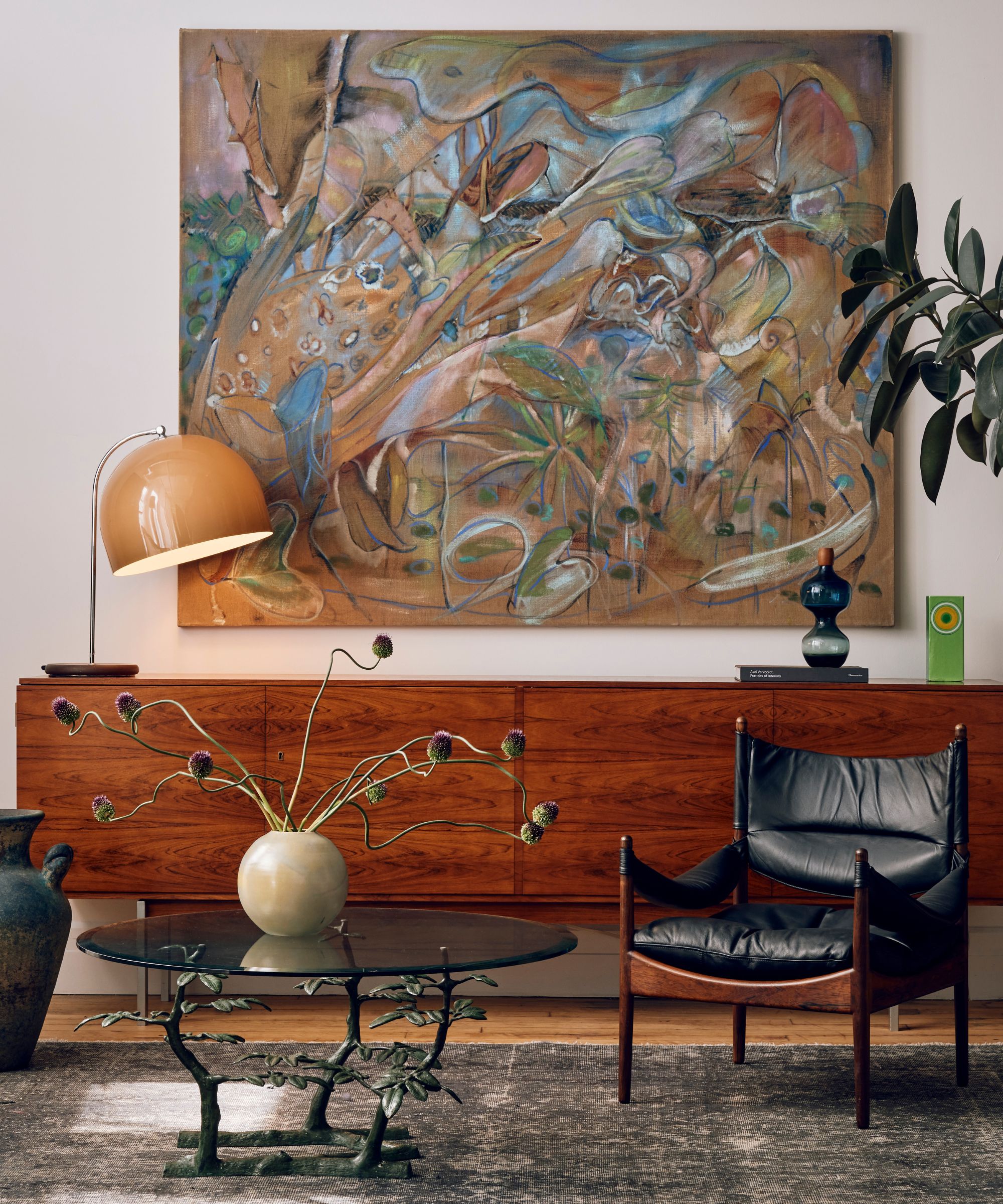
'Play with color, texture, and scale, mix different styles of furniture, and be sure to thoughtfully incorporate accessories. Try to use a fresh eye as well; look for a good focal point, and consider how everything looks from different angles or vantage points, say Joe McGuier and Megan Prime, co-founders of JAM – a Brooklyn-based architecture and design studio.
By examining your vignette from different angles during the arranging and editing processes, you'll be able to make the display look just so, no matter how you approach it. Styling an entryway table with the view from the front door in mind is smart, but a more successful arrangement will also look lovely in a glance from the hallway or a bird's eye view from the banister.
'Consider basic design principles, but be sure to have fun with it! Our favorite vignettes usually feature an organic element – flowers or dried florals – as well as something offbeat or a little unexpected in some way,' say Joe and Megan.
10. Don't forget about the backdrop
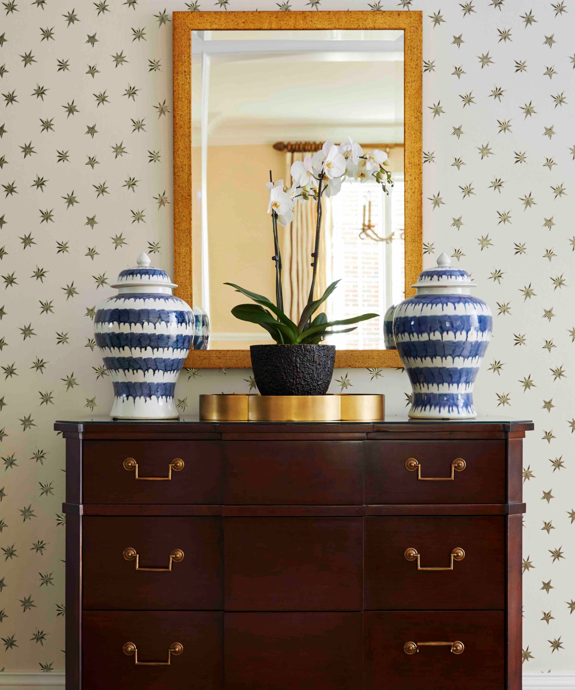
'Consider the backdrop – the wall of surface behind your vignette matters! Consider a contrasting color or texture or pattern,' says Caroline.
Don't forget that the color or pattern of your vignette's background will come into play just as much as the accessories it's composed of. Pick out a complementary color, or get experimental with pattern, to level-up the entire look.
In this vignette, designed by Caroline Brackett Studio of Design, a vintage console table topped with stately vases and an orchid are grounded by a large mirror and star-studded wallpaper. Contributing to the overall color scheme and adding visual interest, the wallpaper plays a large role in this vignette design.
11. Allow some negative space
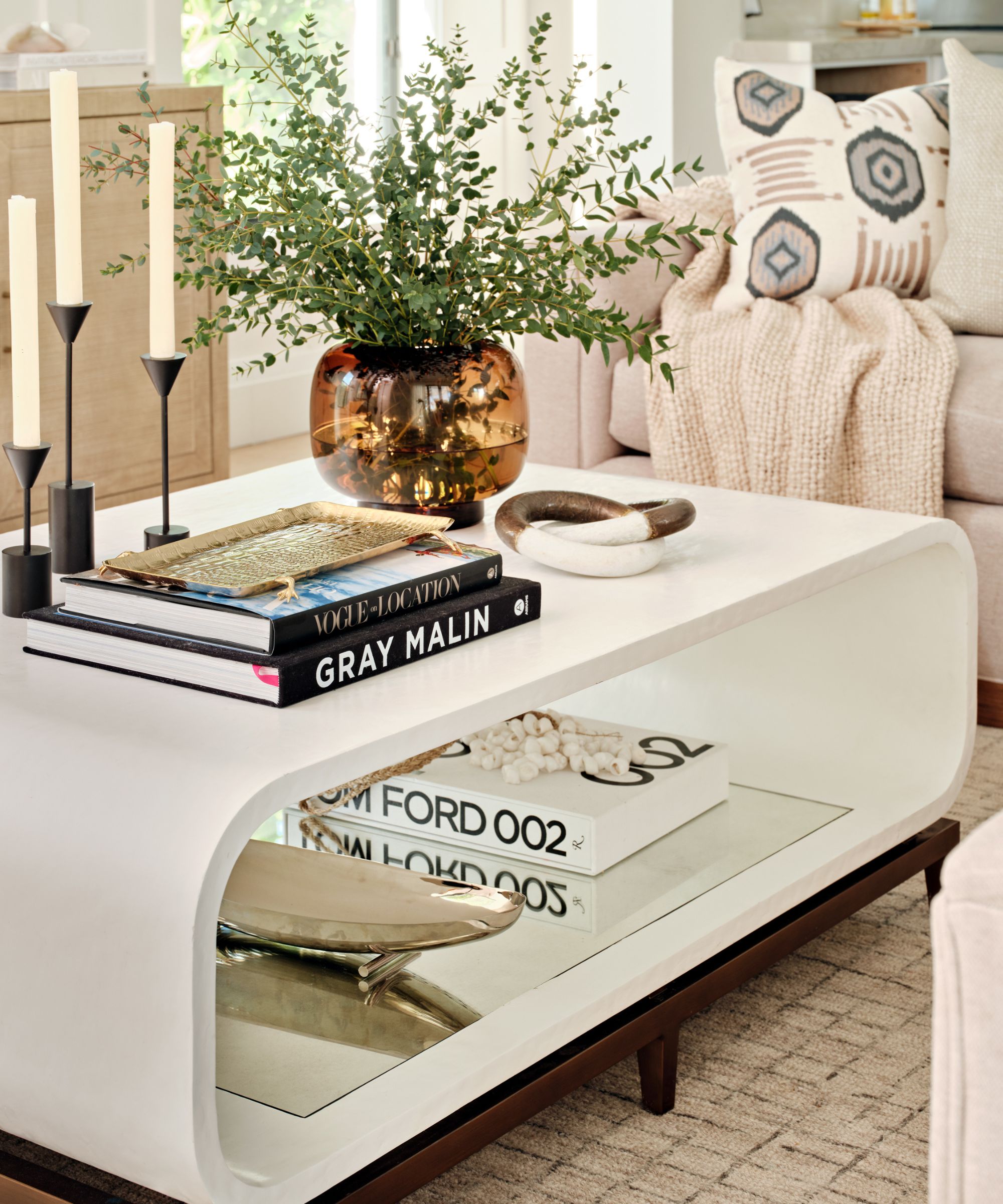
Vignettes are all about layering, but you won't want to go overboard – be sure to leave some room for negative space. Allow each item to stand for itself by giving it space to breathe. This way, you'll be able to appreciate each and every selection within the vignette just as much as the full arrangement.
'My personal favorite vignette ideas include layering textures, mixing heights, and incorporating personal items. When putting a vignette together, common mistakes to avoid include overcrowding, neglecting balance, and lacking cohesion. Following rules of thumb such as adhering to a color scheme, incorporating a variety of shapes and sizes, and leaving room for negative space can help create a visually appealing vignette that tells a story and draws the eye,' says Nick Cryer, founder of Berkeley Place.
12. Incorporate plants and greenery
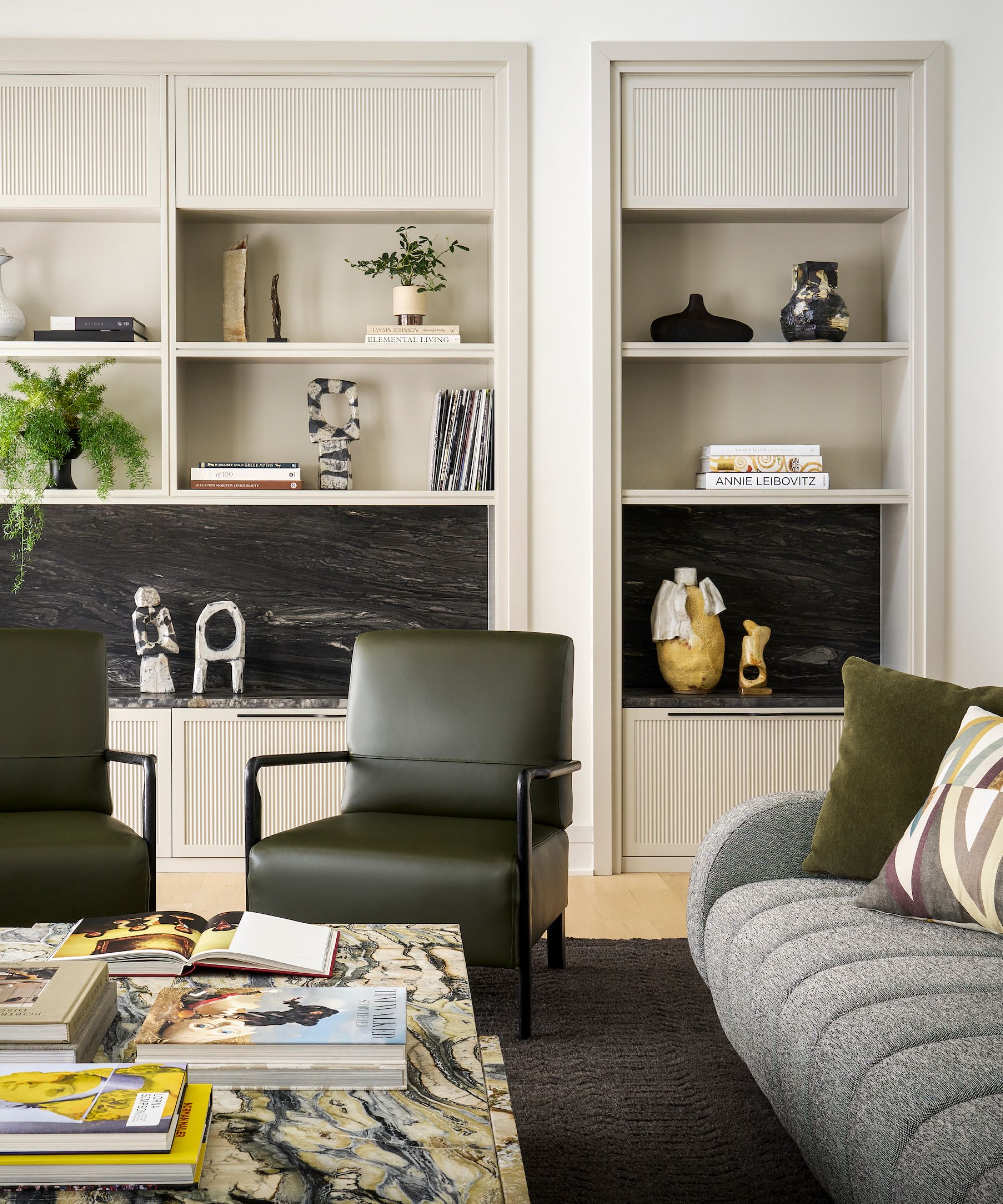
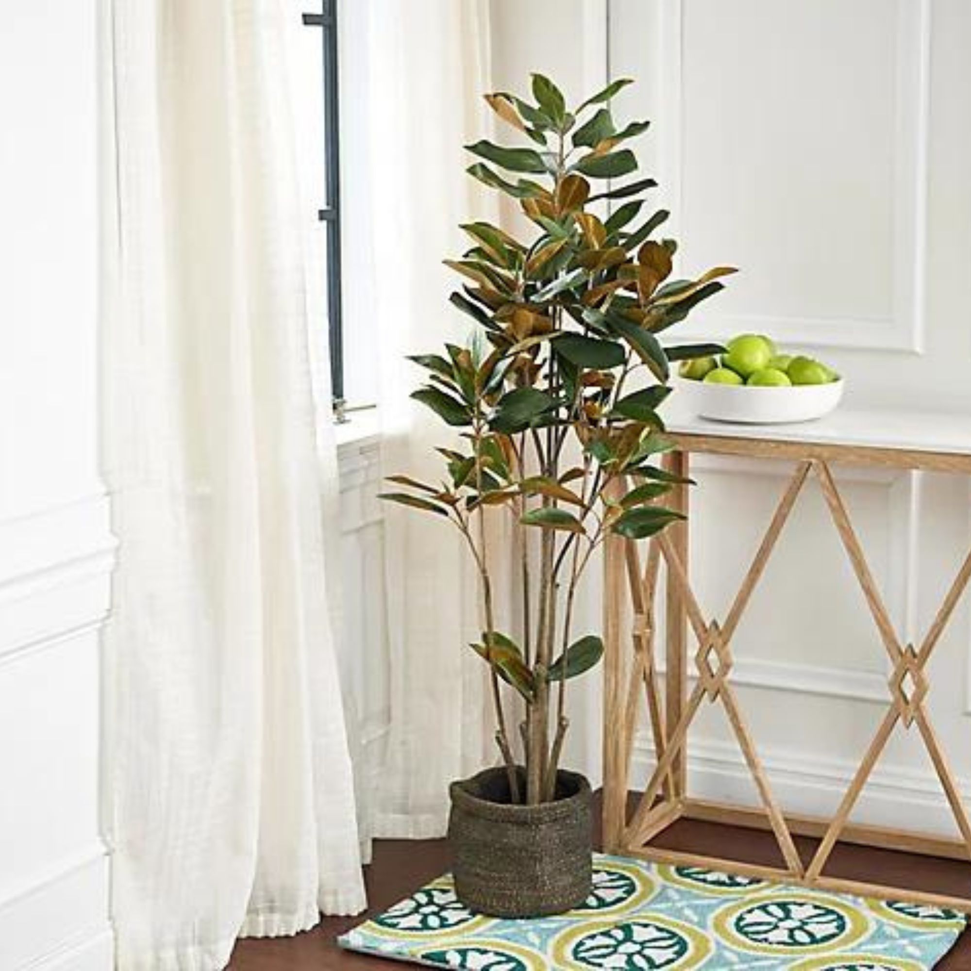
Finally, bring some greenery into your vignette for a fresh, lively look that'll never date. A potted indoor plant or two, or a small tree to accompany a console, will breathe life into any forgotten corner of the house.
'I pray for clients who love plants and greenery. It’s my favorite accessory and you should be afraid to move them around and replace them if you don’t have a green thumb. I love using plants to layer up the books and interesting accessory finds,' says Jennie.
These vignette ideas should help you along your arranging journey, but the most important rule to remember is to make the vignette yours. Create it using items that are meaningful to you, and have fun with colors, shapes and styles along the way. With a careful eye for editing, you'll be well on your way to a stylish, chic vignette – and you'll forget that corner was ever dark and dusty.
Sign up to the Homes & Gardens newsletter
Design expertise in your inbox – from inspiring decorating ideas and beautiful celebrity homes to practical gardening advice and shopping round-ups.

Abby was the Interior Design News Editor at Homes & Gardens and is now studying for her Master's degree in Journalism at City University, London. Prior to joining our team, she worked with Better Homes & Gardens, where she wrote and edited content about home decor, gardening tips, food news, and more. She studied Journalism and English Literature at New York University and moved to London to pursue her love of writing in 2023.
-
 Martha Stewart's tips for arranging daffodils are unbelievably simple and effective – it's the only flower advice you need this springtime
Martha shows us that we can create gorgeous bouquets of this seasonal flower by simply trimming the stems and placing them in specific vases
By Hannah Ziegler Published
-
 Designers share how to make your outdoor living room look more expensive – and the affordable products to get you there
From layered lighting to luxe-looking textiles, these simple swaps made all the difference
By Charlotte Olby Published
