The subtle 'vertical decorating' technique designers use to make small rooms look bigger and brighter
A twist on the classic stripe, these vertical decorating ideas are the chicest ways to make a small space look loftier
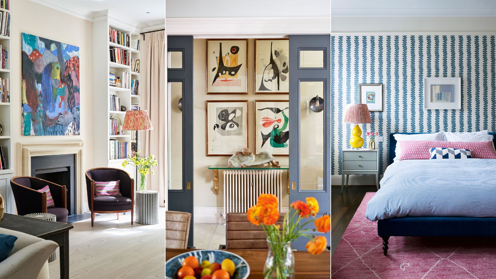

It's hardly a big design secret that using stripes within decor is going to give a small room the illusion of more height and space. However, what we often think of with this technique is just the obvious – striped wallpaper. And while we are partial to a simple stripe taken over every wall, we are seeing designers starting to do far more exciting things with vertical decorating. Far more exciting and far more subtle.
And by subtle, we don't mean you have to play it safe. We just mean the approach to the interior design concept is less obvious – you don't walk into the space and immediately notice that your eye is being drawn upwards by a bold stripe, the room just naturally feels loftier. Paneling, fluting, tiles, prints, shelving, and even pieces of furniture can all be used to create that illusion of openness and space. Of course, we have included plenty of ways with wallpaper too, but a twist on the classic.
'People often overlook the importance of verticality in a room when what you really want is to emphasize it in order to amplify more elegant proportions,' explains designer Joanna Plant. 'An obvious route is to use a striped wallpaper which will visually push the ceiling up but you can also use furniture such as a tall bookcase to do the same.'
So if you are tackling a small room, here's how interior designers suggest using this timeless trend to make the space feel larger...
Vertical decorating ideas to make a room look larger
There are so many simple ways to add height to a room just with your decor. It goes beyond just decorating with stripes...
'Vertical decorating is one of my favorite techniques for making a room appear larger!' says designer Kathy Kuo. 'I love using larger pieces of vertically oriented wall art to visually extend the height of a wall. I’d also advise using wall-mounted shelves for books and decorative objects – vertical rows of wall shelves help open up the surface area of a room for seating and coffee tables instead of taking it up with consoles or bookcases.'
Here are some of our favorite vertical decorating tips and tricks.
1. Create clear lines within the whole room
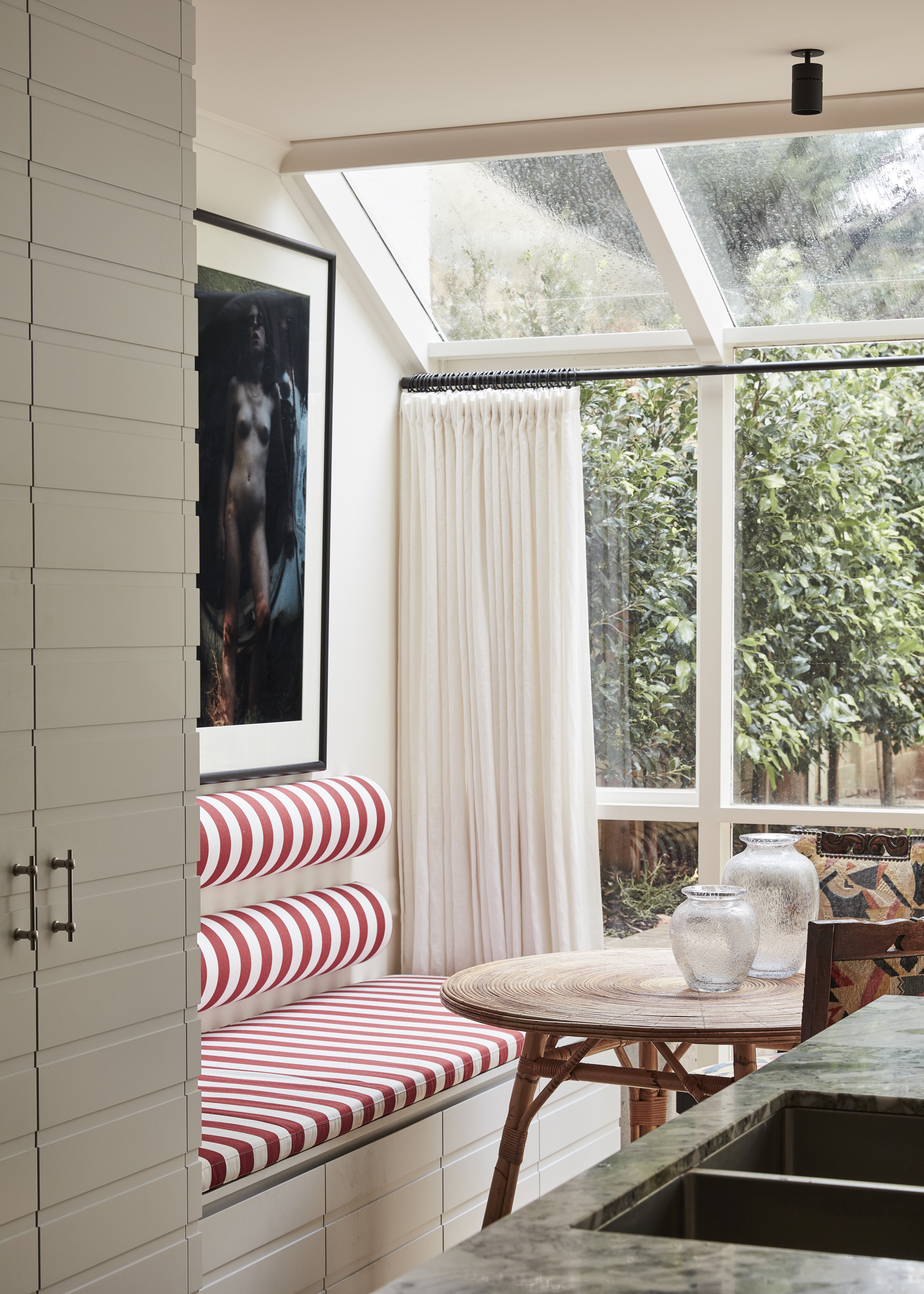
Everything in this beautiful dining nook creates an illusion of height and space. Of course, it has all that natural light on its side that's giving the room a real leg up, but all the vertical details are contributing too. The most obvious being the upholstered bench, but the long drapes, the simple boldly framed artwork, and even that contrast with the horizontal lines of the cabinetry that makes the vertical elements of his space even more clear, they are all working to draw the eye upwards.
'The South Yarra residence is a compact 1990’s build townhouse on a long and narrow block,' explains designer Tamsin Johnson. 'The architect was obviously conscious of capturing the maximum amount of light as it is quite closed in. Creating a sensation of height and space was really important.'
'I used vertical striped upholstery on the banquette adjacent to the windows to create a vertical accent, the oldest trompe l’oeil in the book it could be argued! I used drapes instead of blinds on the windows to create elongated folded lines. I have also forced a large artwork (Bill Henson) into a small space above the banquette which is paradoxical but helps explode the space.'
2. Use books as vertical decoration
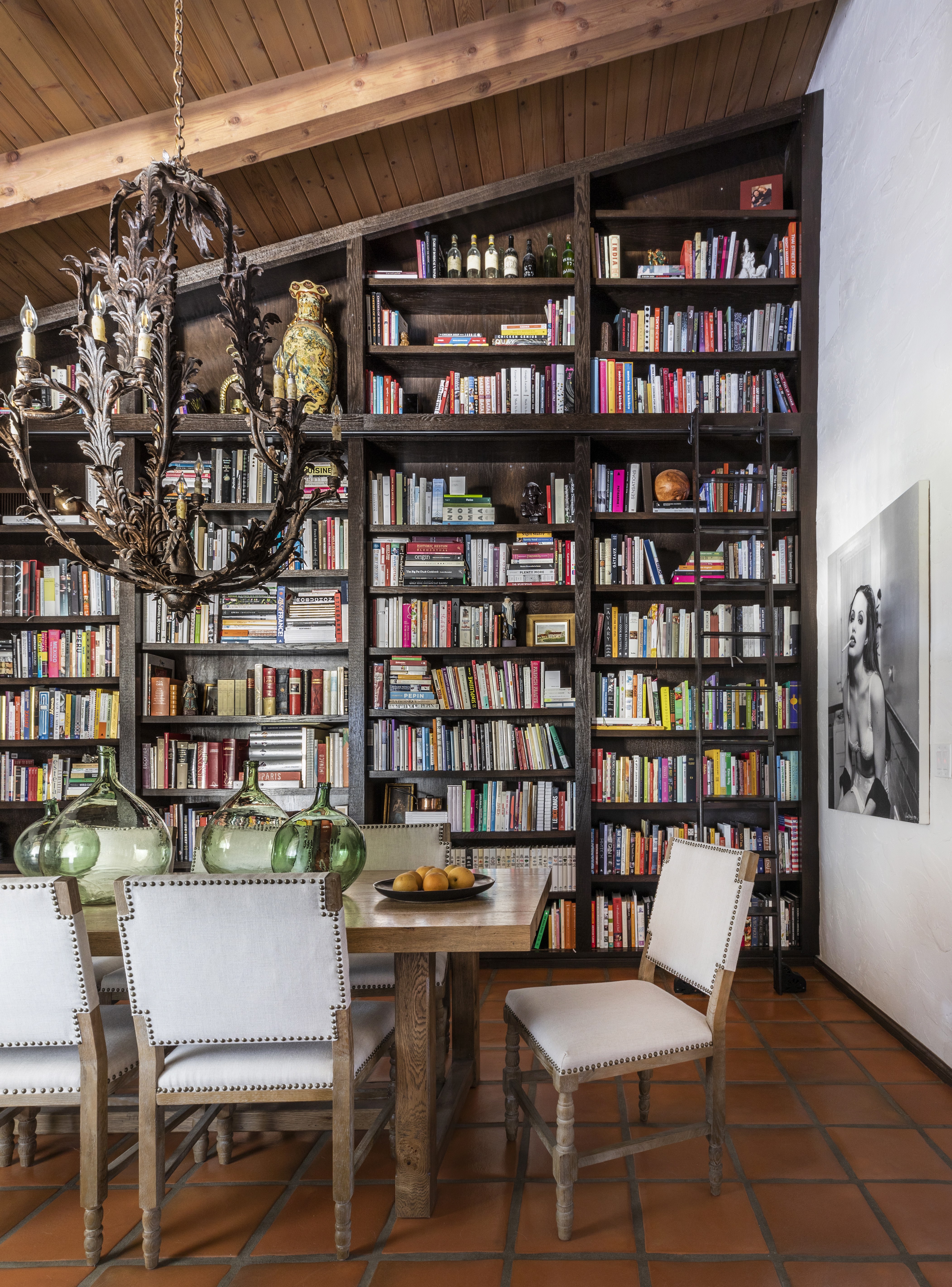
'When decorating your space always use your room’s height,' suggests designer Marie Flanigan. 'I love giving visitors a reason to look up. Look for architectural details that can be highlighted and use meaningful pieces to highlight them.
'For Chef Ludo’s home, we knew we had interesting architectural details like the bookcase and sloped ceiling, which we wanted to bring attention to. Chef Ludo has 1,000s of cookbooks and we thought this would be a great spot to display them and make the entire wall like a piece of art. However, there are plenty of ways to decorate vertically, like using a beautiful wall covering across the or adding statement artwork.'
3. Go high with wall decor and low with furniture
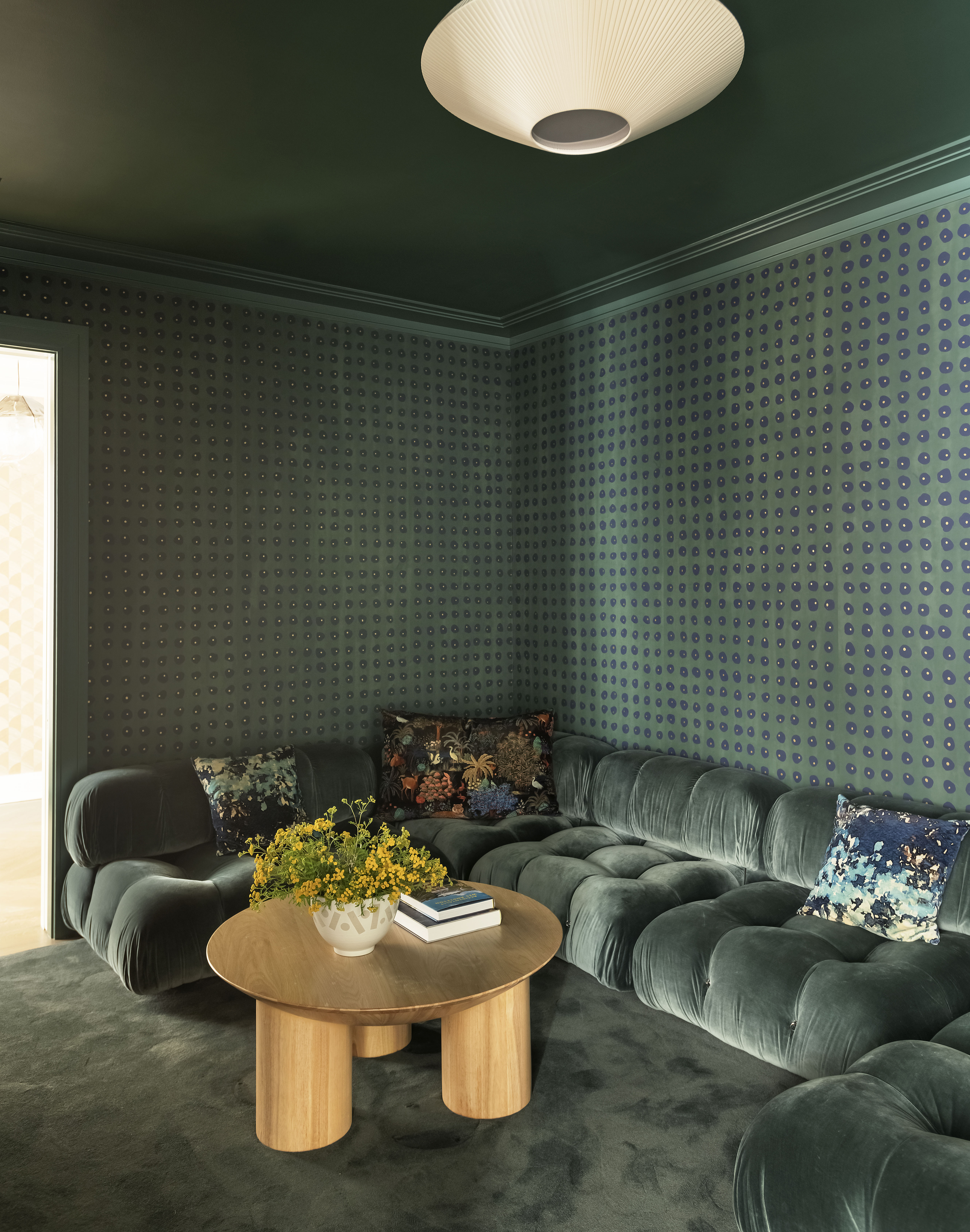
The height of the furniture in a room can have a big impact on the effect of vertical decorating. Everything in this bijoux green living room is working together to make those ceilings seem higher, the low coffee table and sofa create acres of wall space, and despite the deep colors the room feels really open. The wallpaper isn't technically a stripe but you can see a verticality there, right?
'We painted this room a dark color so there would be no definition between the ceiling, walls, and floors, allowing the color to bleed from one space to the next. Additionally, we chose to keep the sofa and coffee table low.' explains Britt Zunino, Principal of Studio DB.
4. Mount shelving slightly higher than eye level
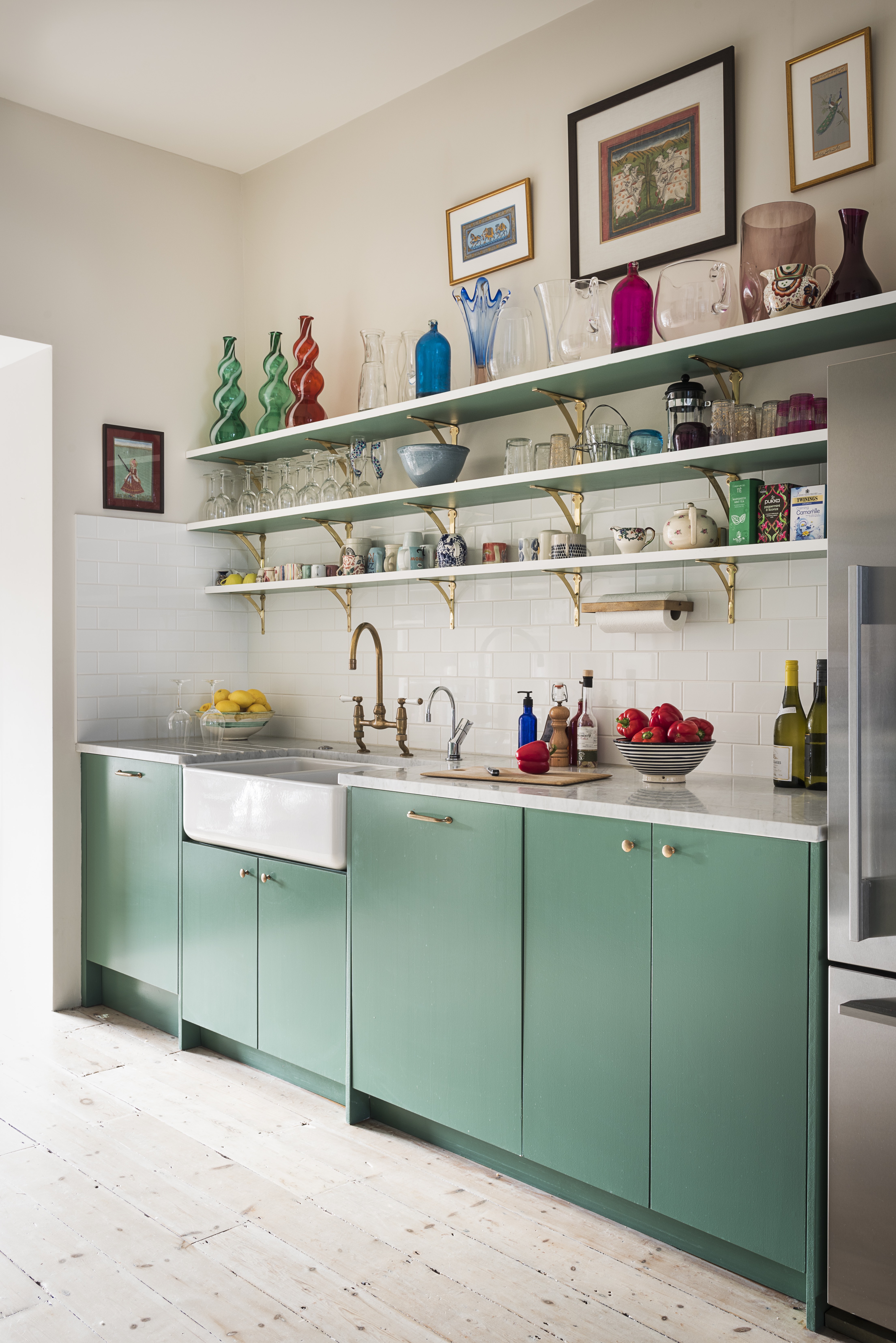
Shelving is a simple way to draw the eye upwards and make a space feel taller. Just be clever with your positioning. Keep them just above eye level and, as seen in this glorious green kitchen, use the decor on the shelves to create height too. The collection of tall vases not only adds color and texture but creates more of those all-important vertical lines we talked of earlier.
'Decorating vertically can make a room look higher than it actually is. In this west London family house, we decided to add three long and relatively high kitchen shelves adorned with colorful decorative kitchen objects to emphasize and enhance the height of the space.' explains designer Katie Guinness.
'Other ways you can add height to a room is by using vertical wood paneling, fabric and/or wallpaper with vertical stripes, gallery walls that go up to the ceiling, and decoratively adorned shelving as seen here – all of which draw the eye upwards and make a room look bigger.' she adds.
5. Run floorboards up the walls
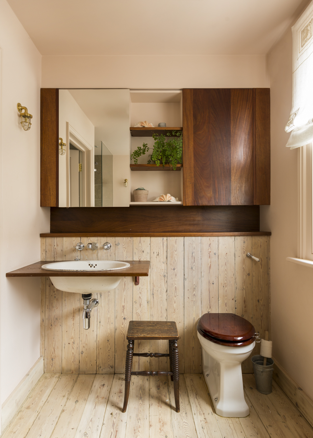
Much like a striped wallpaper, paneling is going to give you that illusion of height, however, this country bathroom takes it a step further. The floorboards seamlessly flow up the built-in cabinetry, blurring the line between floor and wall.
'In this bathroom design taking the pine floor up as wall cladding creates a visual flow of the material and the illusion of more space,' explains designer Anthi Grapsa. 'Bathrooms are more confined spaces so anything to make them look larger helps. The use of the vertical cabinetry above in timber again provides the much-needed storage but again without overcrowding the space creates continuity and makes the room feel taller.'
6. Take a headboard to the ceiling
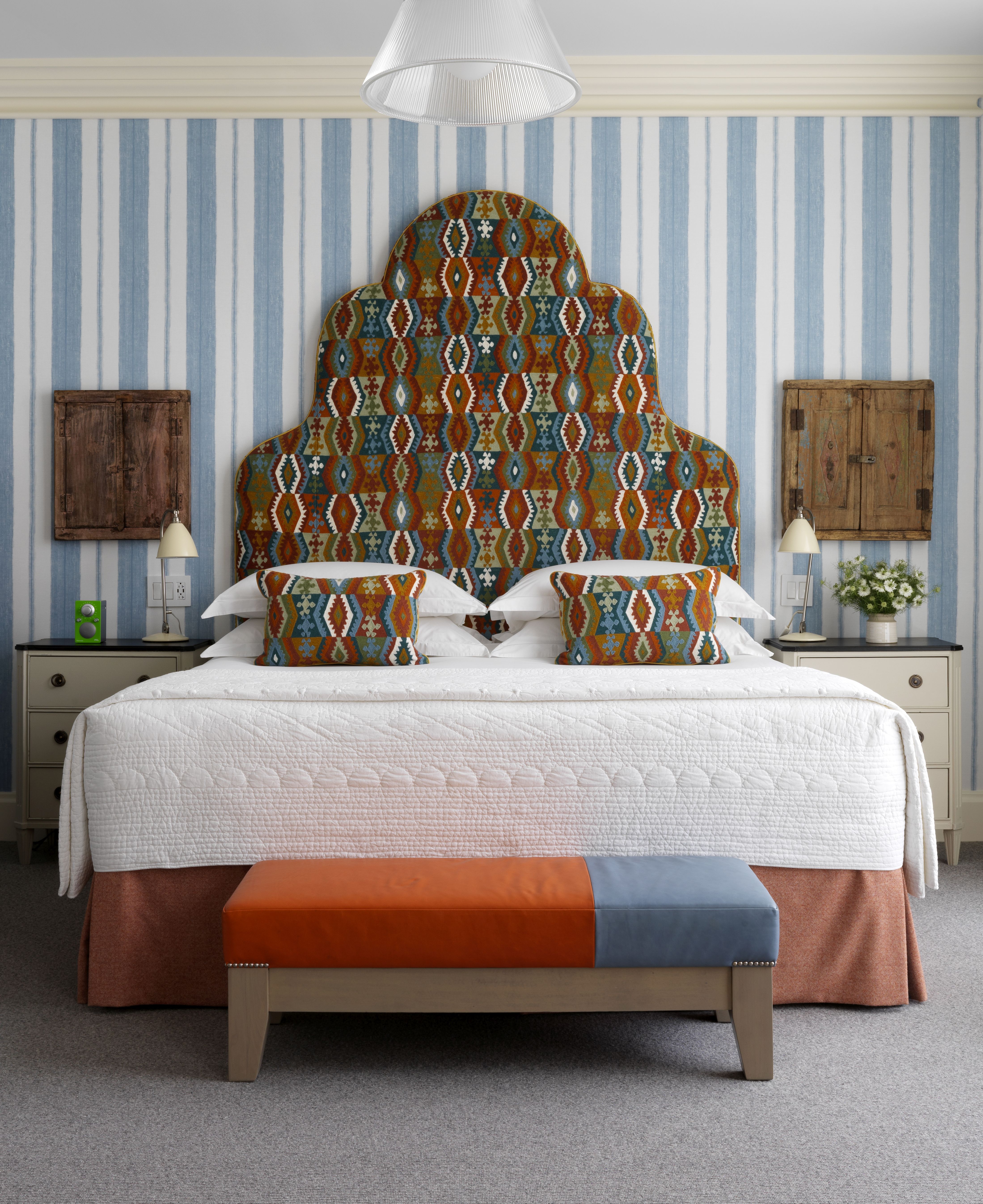
With vertical decor, it's not all about the walls. The furniture you choose can contribute to making a room feel larger too. A headboard is a perfect example, why have it stop at eye level when you can extend it to the ceiling and turn it into a real feature (and make a room feel bigger too)?
'For rooms with lower ceilings, a vertical stripe on the walls will add height to the space. Vertical lines draw the eye up to the ceiling, making the room visually taller,' explains designer Kit Kemp.
'In Room 609 at Crosby Street Hotel, the walls go on for miles! A tall statement headboard covered in a bold pattern by Pierre Frey, coupled with a classic William Yeoward light blue vertical striped wallpaper creates the illusion of height.'
7. Give a bathroom more height with a striped shower curtain
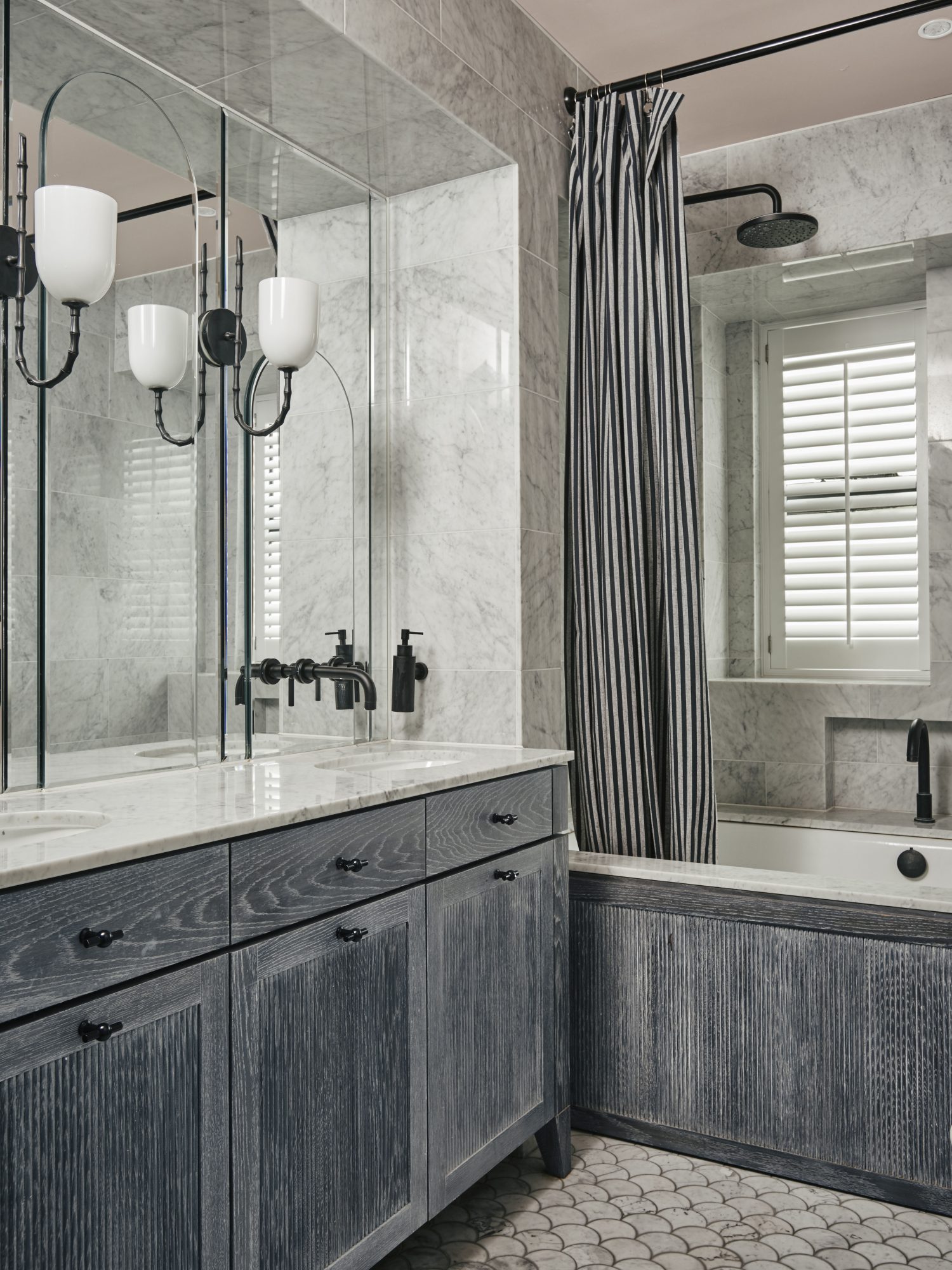
Shower curtains are making a huge comeback, and they are far chicer than the ever-moldy, always-in-the-way, shower curtains of the past. We love how they can soften a room that is usually made up of lots of hard lines and surfaces. Plus, they offer an easy way to add in some space expanding vertical prints to a bathroom.
'Geometry is such an important part of any design scheme and the negative space, or form and ground as I visualize it, are another way of thinking about layering but in the context of hard finishes,' explains Deborah Bass founder of Base Interiors.
'Vertical layering is what we have tried to achieve in this playful yet timeless family bathroom space; elongated and rhythmically shaped mirrors are punctuated by tall, playful wall lights. The reeded timber detail on the joinery elements draws the eye and this is echoed by the vertical stripe in the shower curtain.'
8. Heighten a ceiling with a wood slat panelling
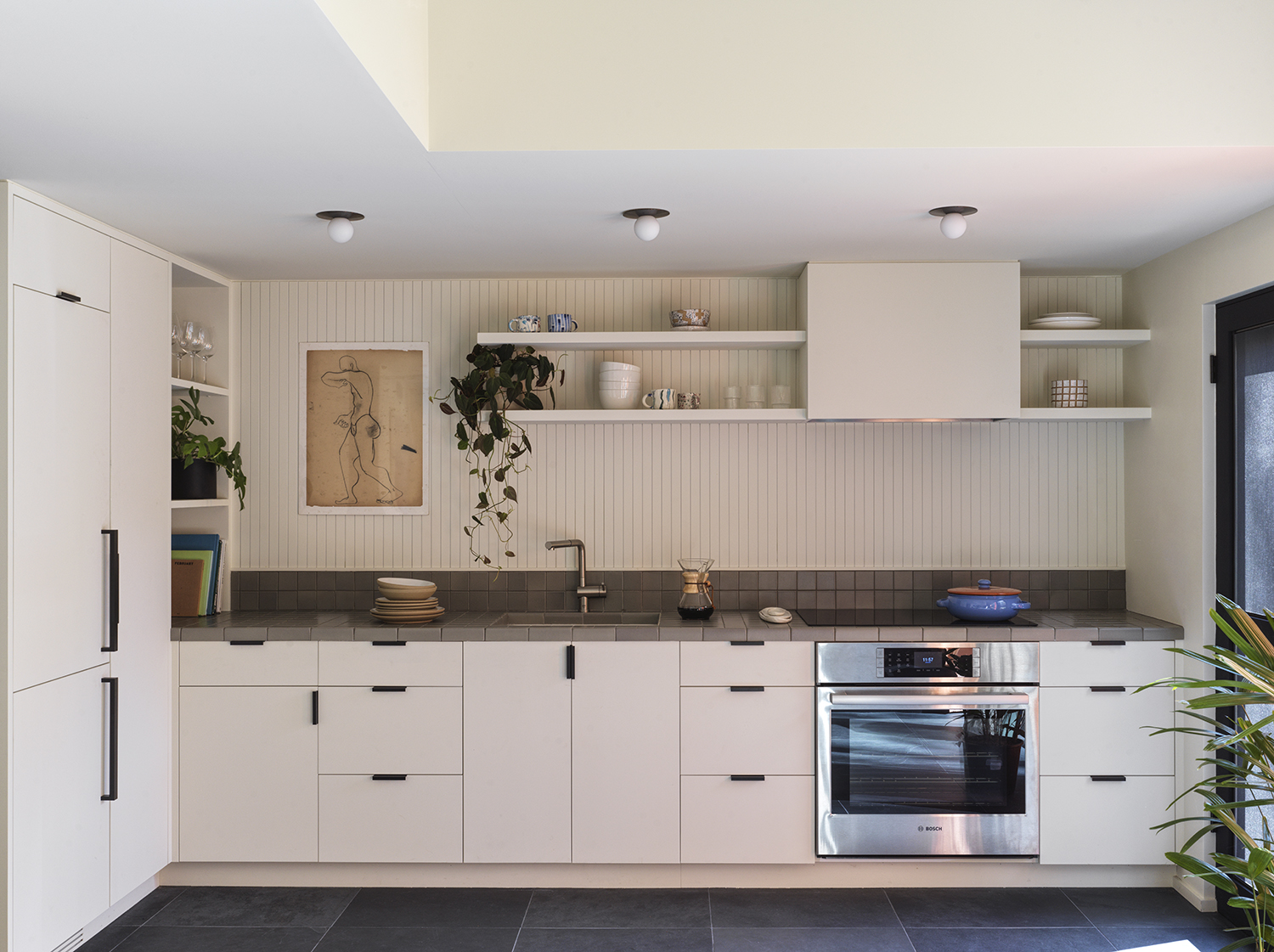
'For spaces with low ceiling heights, using a vertical element like tile or wood paneling helps elongate the space and moves the eye up and down. The same goes for horizontal elements in tight spaces that you're trying to make feel wider.' says Sarah Zames, Principal of General Assembly.
'The kitchen in this guest house sits adjacent to a dramatic, double-height space that exposes the open living space on the second floor. The vertical paneling draws your eye up toward the second floor while providing an aesthetic connection to the rest of the space.'
And if wood isn't a sensible choice for your space, you could create a similar look with a simple narrow tile. Don't stop at just the splashback, take those tiles all the way up to the ceiling – practical and pretty.
9. Add a rustic feel (while also creating height) with shiplap
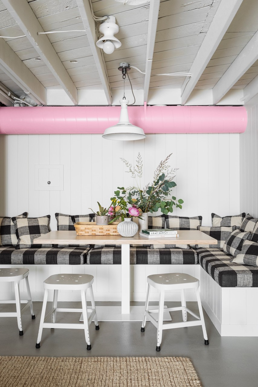
Wall paneling comes in so many formats, there's something to suit all styles. Whether you are after a very formal, traditional look or something more country and rustic like in this cute little dining area. Whatever the vibe, any paneling is going to do the trick of making ceilings look loftier and rooms look larger.
'A trick for making low-ceiling rooms taller is to add vertical floor-to-ceiling paneling, which draws your eye up,' explains designer Max Humphrey. 'I usually use tongue & groove or shiplap. In my project here in Oregon, we removed the drywall from the ceiling and left the joists exposed, which gave an extra 6 inches of headroom too.'
10. Or opt for half height panelling
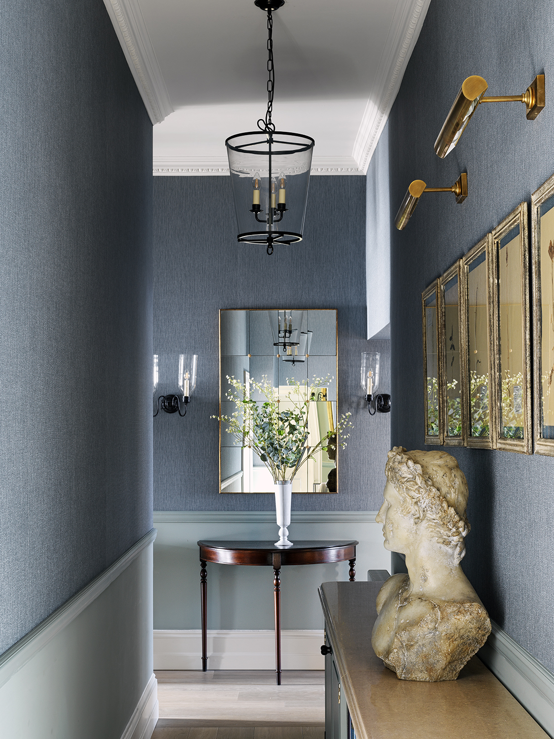
And for a more elegant take, half-height paneling has a less rustic feel and can work wonders in small or narrow spaces like hallways. It's a practical choice too, panelling the lower half of the walls in high-traffic areas makes it far more resilient to everyday wear and tear.
'Paneling can be a great way to make a small space look bigger. Consider the height of the ceiling when planning how tall your half-height paneling should be. If you have a fairly low ceiling then correspondingly, the paneling might be lower. It is also worth considering painting the paneling in a lighter color if the wall color is fairly dark - this will break up the enclosed, cocooned effect.' explains Louise Wicksteed, Design Director of Sims Hilditch.
11. Don't be afraid to go below eye level
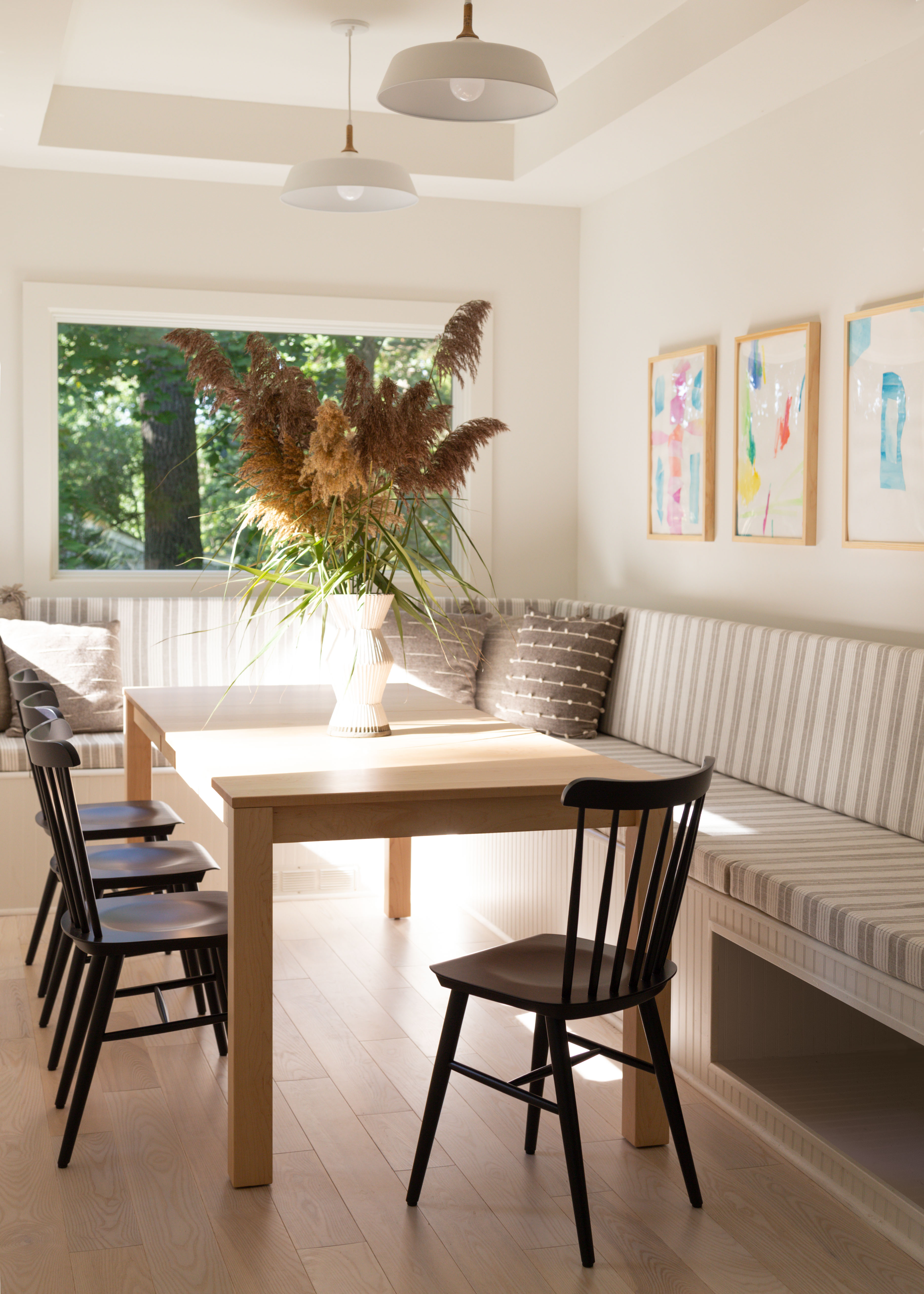
We've talked a lot about drawing the focus upwards, and decorating above eye level, but using vertical decorating at lower levels can have just as much of an impact. It's more about ensuring the eye has somewhere to travel, and different places around the room to focus on so you aren't drawn immediately to corners.
In this dining room, naturally, the stripes of the bench draw the eye upwards, but it also leads your eye around the space. And the artwork sits at the perfect point. 'We like using large-scale artwork to let the eye travel — we love landscape formatted works of art or pieces in a series like a diptych or a triptych. Stripes or geometric prints and color blocking (or picking colors or accent furniture in a bold color) can further accentuate movement and emphasize direction and give your eye a focal point to travel to.' explains Keren Richter, co-founder of White Arrow.
'Sometimes fixtures and artworks placed a little lower, at a more ‘human’ level leaves the apparent ceiling level higher,' explains Tamsin Johnson. 'Some objects placed too high collapse the room inward, in other cases, they stretch the room height upwardly. There is no fixed rule or technique here, it simply requires experimentation.'
12. Hang prints in bold symmetrical layouts
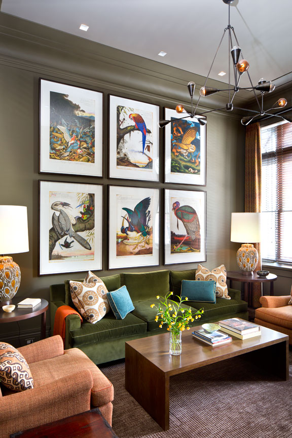
When it comes to vertical decorating, prints are a really easy approach. It's just about choosing the right layout, the right frame, and the right size for your space. As Tamsin said there's no solid rule for what works and what doesn't it just depends on the room. But as a general rule, we think fewer, large-scale prints work better in a smaller space as you want to avoid the room feeling too busy. And stick to a simple symmetrical layout that's going to draw the eye away from the floor.
With this living room designed by Glenn Gissler Design, the floor space may not have been huge, but there was endless height, so that has been accentuated even more with the large-scale prints that perfectly fill the space. The room feels both elegant and cozy.
'This sitting room in a West Village maisonette apartment had tall ceilings so we used a wonderful set of prints by artist Walton Ford, three-over-three, to command the wall. The walls are painted a rich color that creates a frame for the st of prints and brings depth to the room.' explains Glenn.
13. Pick a subtle vertical pattern for a wallpaper
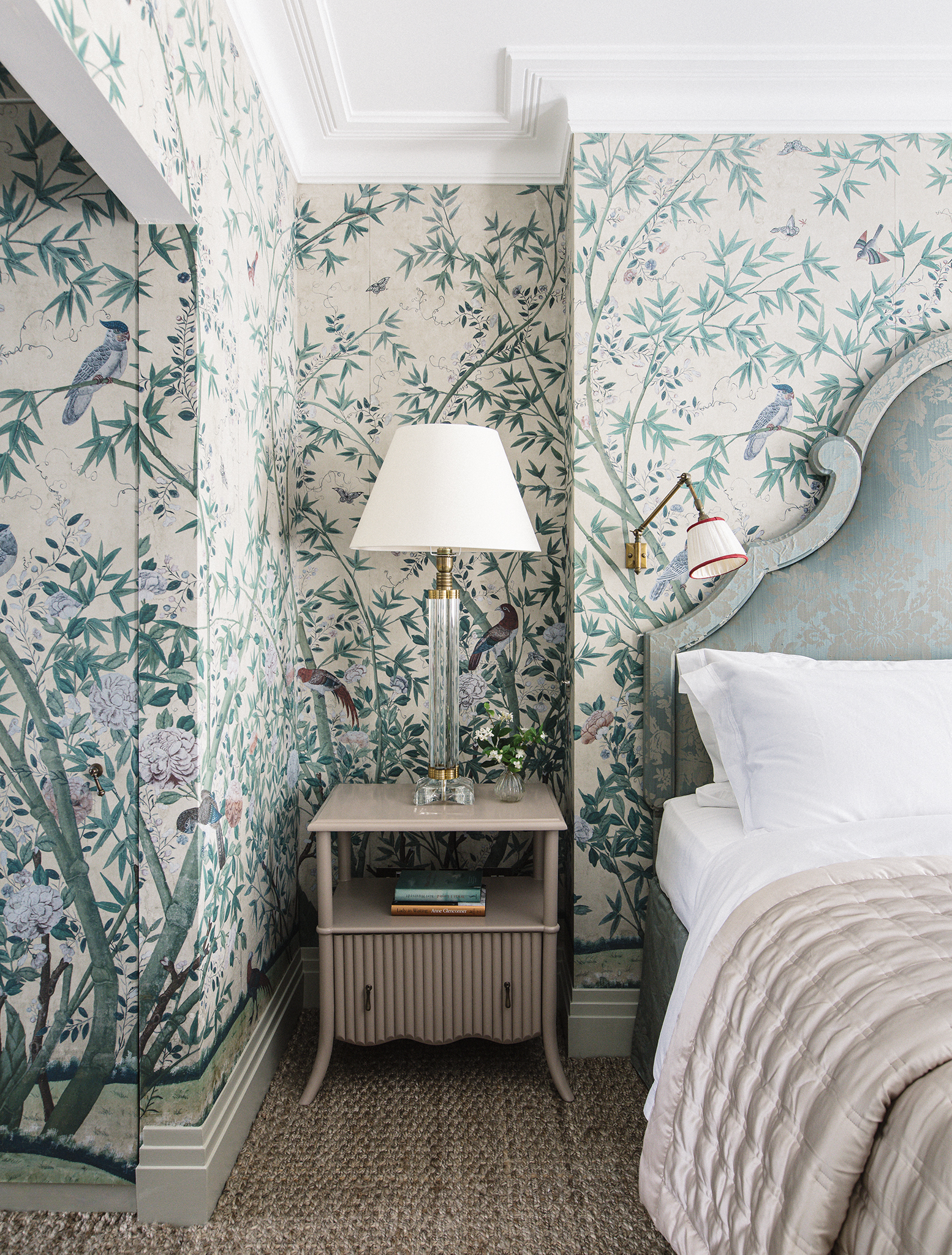
'People often overlook the importance of verticality in a room when what you really want is to emphasize it in order to amplify more elegant proportions. An obvious route is to use a striped wallpaper which will visually push the ceiling up but you can also use furniture such as a tall bookcase to do the same.' suggests designer Joanna Plant.
'In this bedroom, we have used a densely patterned wallpaper which makes the room seem much bigger than it really is as you see through the pattern and beyond giving a greater sense of perspective. The over-scale headboard pushes the eye up rather than out and therefore gives a greater sense of height.'
14. Take a wallpaper over the ceiling
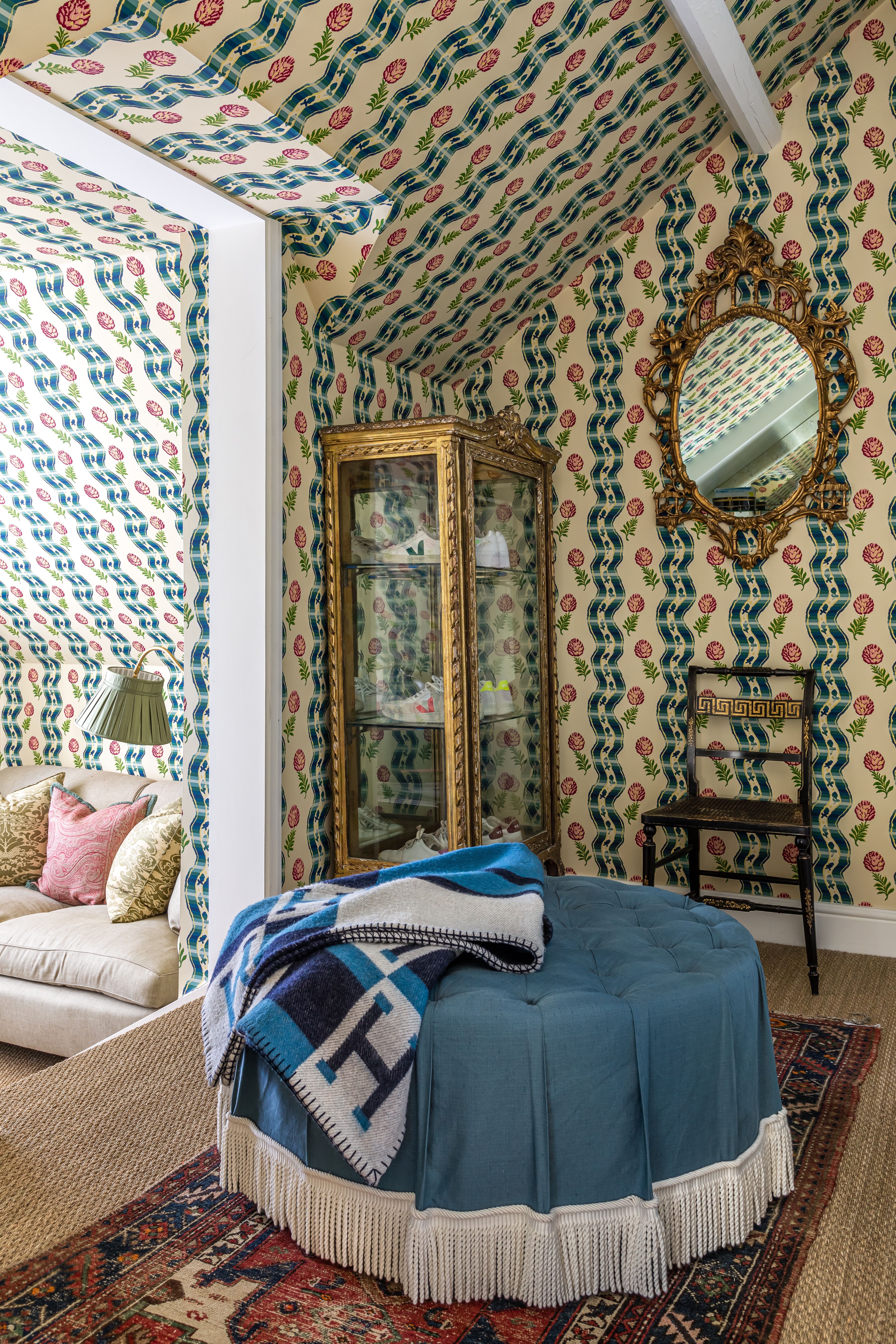
And in really tiny rooms or awkward spaces like attic rooms, don't stop where the walls meet the ceiling. All that will do is make the edges of the room even clearer. So take the same print up and cover the ceiling too. Note how in this dressing room you don't instantly notice the small proportions or the slanted ceilings, the wallpaper takes up all the focus and blurs the edges of the room.
'I like to throw as much as I can at a small space, and I think this definitely adds dimension and volume,' says designer Samantha Todhunter. 'I think that people are traditionally frightened of small spaces and so just paint them white and leave it at that. I come at it from a different tack; I actually like to overload a small space, painting it a darker color, building walls of books, and adding lots of layers. This gives it more depth and makes it feel that there is more to it than meets the eye, all of which actually makes it feel bigger.'
15. Create interesting texture with fluting
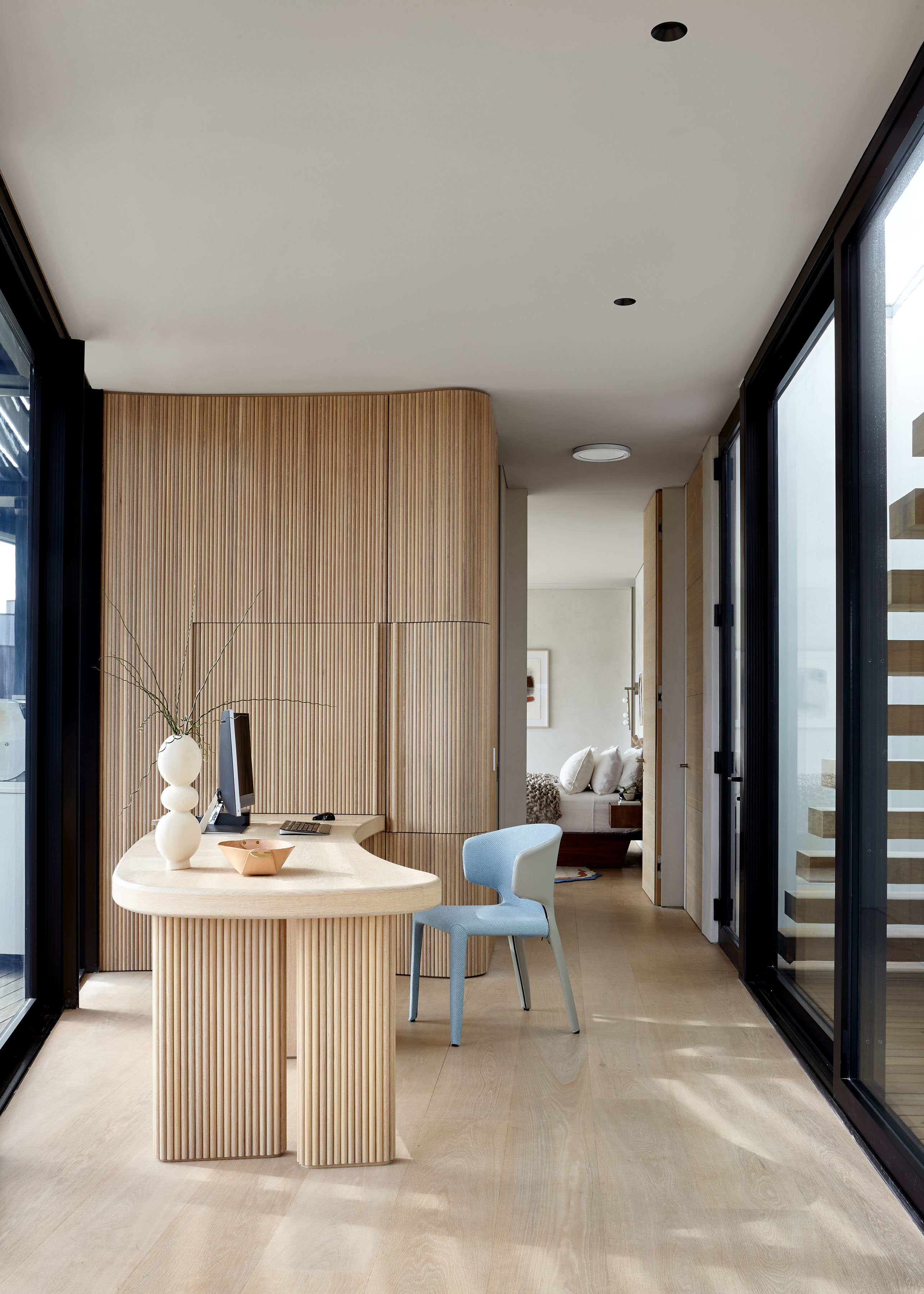
It's like a sleek more modern version of paneling – fluting has the same space-expanding effects and is great for adding some texture and depth to minimalist spaces.
'Emphasizing vertical space is all about drawing the eye upward. We often do this with tall drapery panels, architectural moldings, or cabinetry. For this work-from-home area, we designed vertical fluting that heightens the space and adds warmth to the modern architecture.' explains Elena Frampton, Principal at Frampton Co.
Note the desk too. Vertical decorating doesn't just apply to walls, furniture can help make a space seem larger too. The desk in this home office almost blends into the fluted wall, meaning it doesn't add too much visual bulk or draw focus to the center of the room, your eye still looks up.
16. Play with proportion
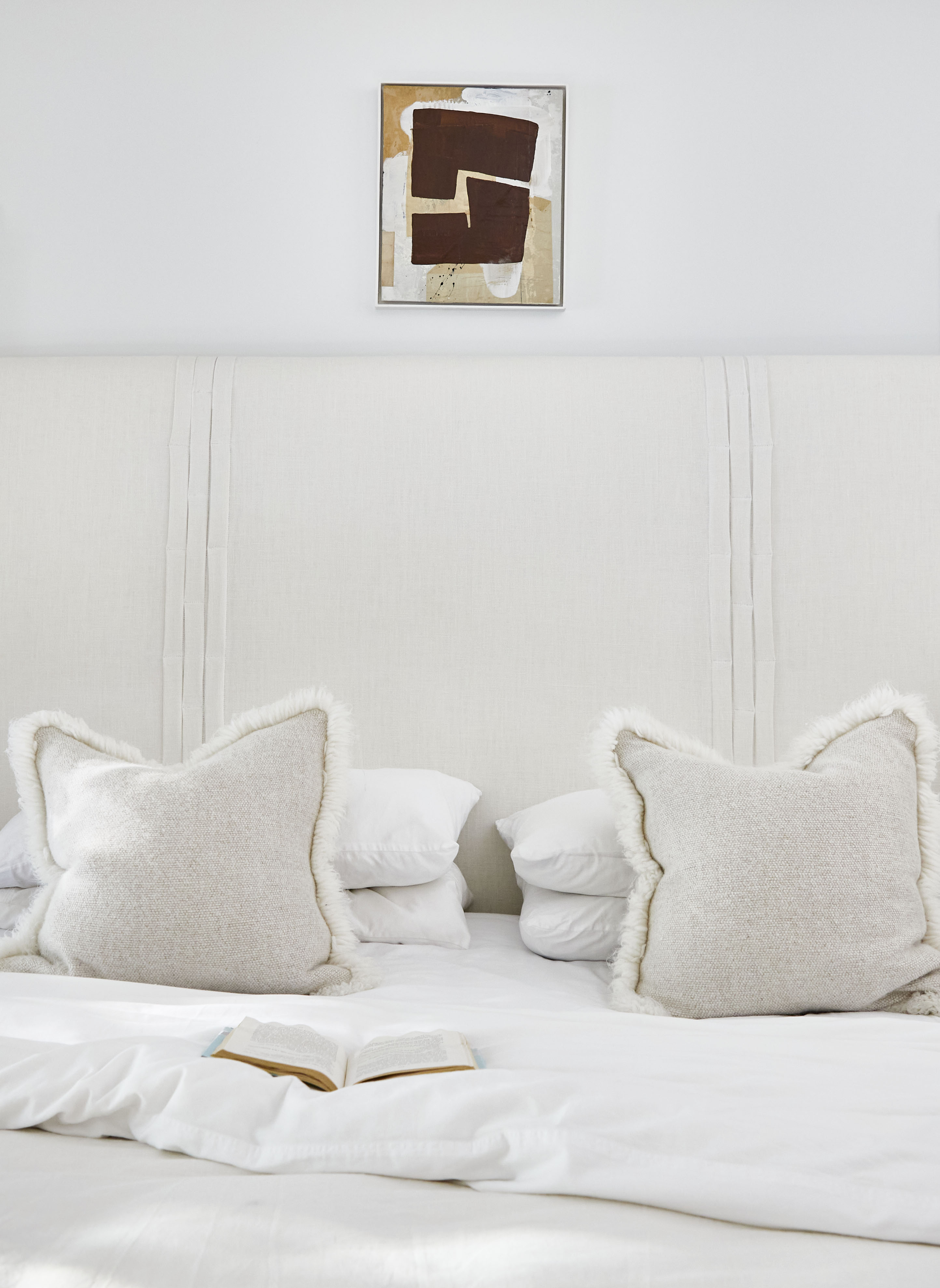
Often in a small space, it makes sense to play it safe. Stick with light hues, keep patterns simple and add interest with shapes and textures instead. That was designer Lisa Sherry's approach to this smaller bedroom. However, it's always important to then add in some contrast – just a pop of it so there's a focus to the room. In this space, a small print, that still works with the soft, boho vibe of the room does just that.
'Play with proportion. Here, the modest space above a tall headboard is punctuated with a small, contrasting piece of art. It gently draws the eye up, without competing with the overall experience of the space.' explains Lisa.
What patterns make a room look bigger?
It goes without saying that stripes will help to make a room look larger – either vertical or horizontal, depending on where your room needs the most help. If you don't want to go as obvious as stripes, look for prints that have striped-like patterns within, they will have a similar effect, just in a more subtle way.
How can you decorate walls to make a room look bigger?
In most spaces (unless to are dealing with a really narrow room like a hallway), you want to accentuate the height of the room in order to make it look bigger. So consider how your wall decor is going to guide the eye – ideally you want to focus to be just slightly above eye level or be drawing the eye upwards, hence why vertical decorating can really help 'expand' a room.
'Decorating vertically allows you to utilize different levels and is a great way to make use of empty space in a scheme,' says designer Natalia Miyar. 'Adding in shelves, storage or artwork helps to draw the eye upwards, creating a larger sense of space which in turn makes your room feel bigger.'
Sign up to the Homes & Gardens newsletter
Design expertise in your inbox – from inspiring decorating ideas and beautiful celebrity homes to practical gardening advice and shopping round-ups.

I am the Head of Interiors at Homes & Gardens. I started off in the world of journalism in fashion and luxury travel and then landed my first interiors role at Real Homes and have been in the world of interior design ever since. Prior to my role at H&G I was the digital editor at Livingetc, from which I took a sabbatical to travel in my self-converted van (not as glamorous as decorating a home, but very satisfying). A year later, and with lots of technical DIY lessons learned I am back to writing and editing, sometimes even from the comfort of my home on wheels.
-
 Jennifer Aniston’s bedroom is a ‘goldmine of simple sumptuousness’ – it’s 2025’s version of quiet luxury and so easy to recreate
The actress's unique space features James Mont-designed lamps and a raised bed inside a walnut plinth – but you can recreate its understated sophistication
By Megan Slack Published
-
 How to keep chickens out of flower beds – 6 tried and tested methods that homesteaders swear by
Give your flower beds a fighting chance by implementing these preventative measures
By Ciéra Cree Published