I'm an interior designer and this is how I use blue as an accent color
Whether you’re looking to achieve a soothing space, or a smart and sophisticated look, there are so many ways to make your home pop with blue
Adding color to a room is the perfect way to transform a space, adding some visual contrast with charismatic charm. Considered the most stress relieving color, from bright and bold to ‘beach vibes’, blue remains a perennial favorite when it comes to home decorating.
An endless crowd pleaser thanks to its versatility and timelessness, blue remains one of my favorite shades to decorate with. While a brave choice, it’s very easy to work with and can be layered with so many other colors. At a time when maximalist decor trends are on the rise this is the perfect time to begin experimenting with decorating with blue.
Here, I share my top tips on how to freshen up your interiors by inviting this charismatic accent color into the home.

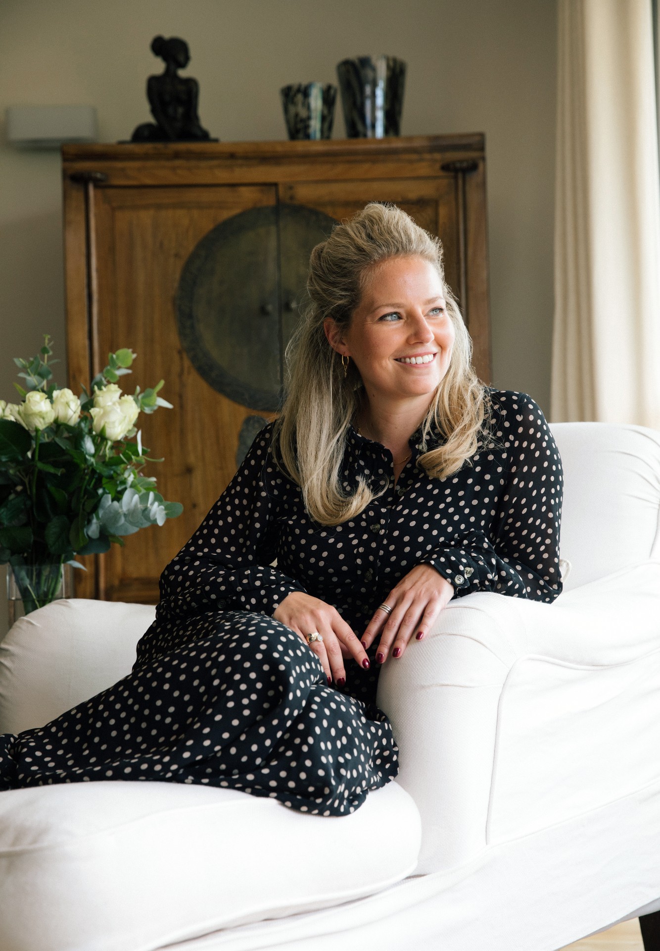
Rosie Ward is the creative director of Ward & Co, a London-based interior design firm started by her mother, Sarah Ward, in 1986. The award-winning studio develops interiors for city apartments, countryside homes, historic estates, restaurants, bars and more, in London, Suffolk, and beyond.
Why use blue? It's visually calming and versatile. Psychologically linked to calmness and serenity, blue rooms are known for having a visually calming impact. It also may just be one of the most versatile shades on the color wheel.
Many people looking to freshen up their interiors are choosing to incorporate blues to create an oasis of calm. Its versatility and timelessness makes it one of the most functional colors to complement your interior decor.
We love the beauty of blue and the calmness it evokes in a room. Despite people often thinking the contrary, there are many tones of it that are not too vibrant. Reminiscent of the sea and the sky, the color is easy on the eye. Said to never go out of style, it’s also very easy to work with and suits many styles. Even for an amateur designer, it’s hard to go wrong with this color.
1. Choose the shade based on the room
Shades of blue can vary and serve different purposes depending on the size, shape, and functionality of the room.
The perfect shade of blue really depends on the room, and the effect you want to create. Warmer tones are welcoming, and work better with soft whites, taupes and warm gray.
Darker tones from the winter spectrum create a more intimate and moody atmosphere, for example dark navy and sky blue are great at creating a cocooning effect. However, if you choose to work with darker shades, it’s important to balance the colors out with the rest of the interior to avoid a harsh look.
2. Factor in sunlight
Choosing the right shade of blue depends a lot on the natural lighting and sun exposure in the room.
Colors and tones change a lot depending on where they are situated. In a recent Caribbean project, we used a strong turquoise accent color which pops against the surrounding natural tones. Blues in sunny climates work well when quite vibrant. However, you do need to be carefully balanced about this or it can be rather distracting.
It’s also important to consider whether the room is north or south-facing. Blessed with all day natural daylight, south-facing rooms lend themselves to all shades of blue. If you’re decorating a north facing room, we would suggest choosing lighter, softer blues to avoid an oppressive look.
3. Start in living spaces
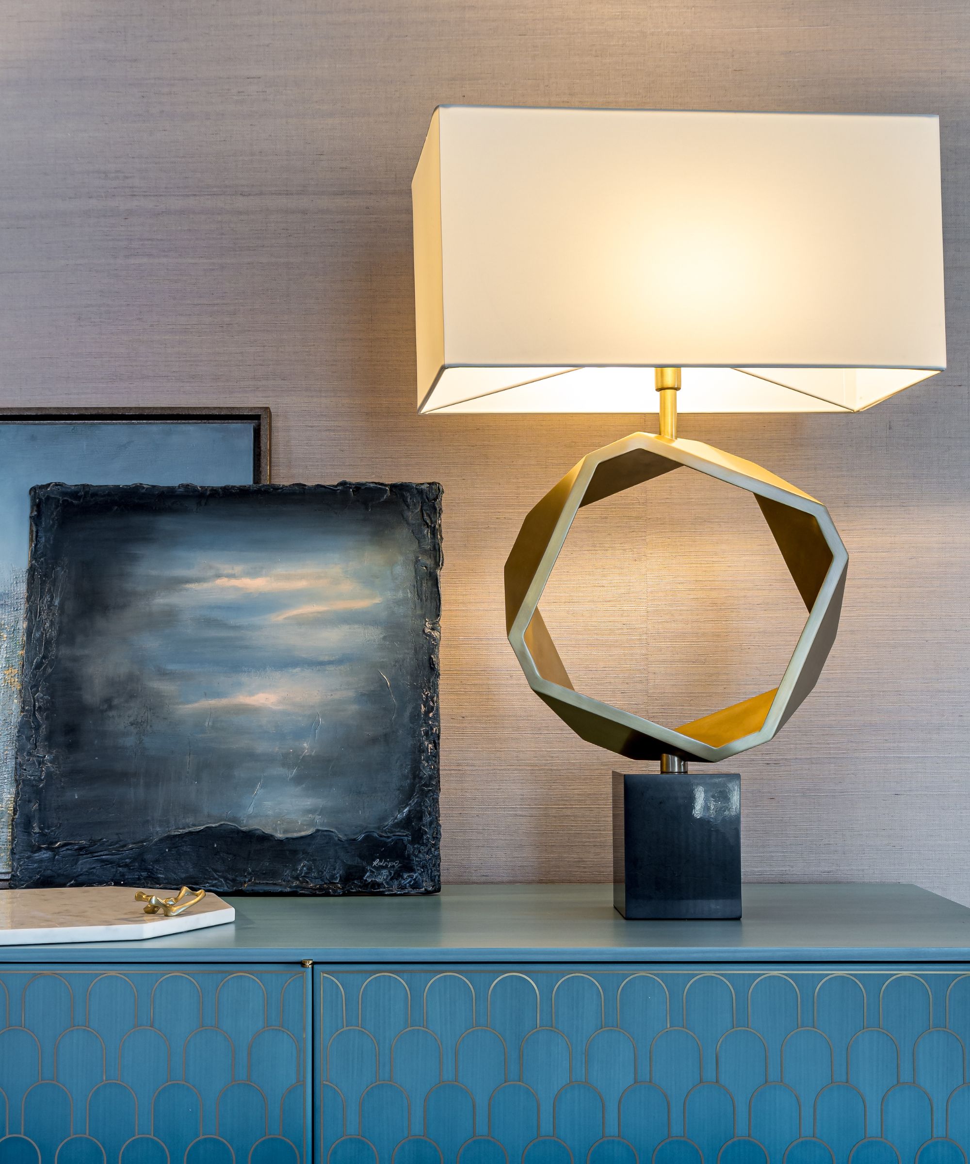
Various shades of blue offer different meanings, and you should select a shade that will work to enhance the mood you’re aiming for. If you’re unsure where to start, the living area is always a great place to experiment.
Due to its versatile nature and plethora of tones, you really can use the color blue anywhere. We are often a little braver with the color in living spaces, so perhaps try the color in there first and then you can become more elaborate.
We also love using blues in the bedroom. A favorite design trick of ours is to paint a feature wall in striking blue behind the headboard. This really brings the wow factor, and adds a touch of drama.
4. Mix and match shades
Working with different shades of blue can be endlessly interesting. With so many complementary shades, it’s the perfect color to be playful with and make a splash.
The great thing about working with blue hues is that most of the tones sit particularly well together. A versatile colour that pairs beautifully with so many others, the complementary tones are great for mixing throughout patterns and textures. This leads to endlessly interesting design possibilities.
Most other colors pair well with blue too, so there are few limitations when it comes to decorating with the color. Although, we do tend to stick to just one additional colour in a single space. This avoids an overpowering look in the room and provides a place for the eye to rest.
5. Use blue for decor accents
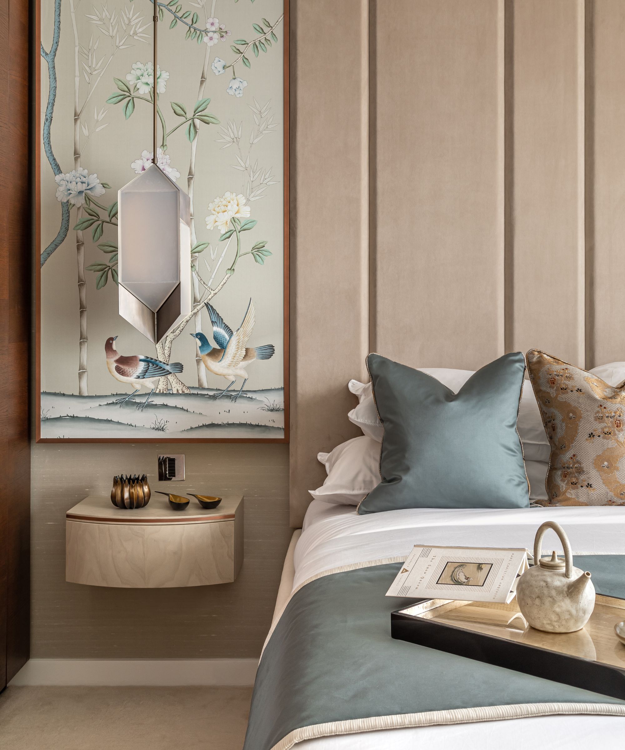
For those who are a little more color conscious, an effective way of introducing blue to a room without making any permanent decisions is through decor accents.
Different surfaces such as lighting, wall coverings and headboard are a great place to begin. Often during the design process, one item kickstarts our vision and inspires us to experiment with a mix of shades.
In a recent project we layered cushions woven with subtle shades of teal, navy and turquoise against a bespoke headboard, upholstered in an eye-catching ‘Les Dames’ fabric by Zoffany, containing hints of blue. We completed the scene with stunning blue wood veneer wallpaper by Fameed Khalique. The muted tones woven throughout the layers pulled the set-up together, adding dimension whilst achieving a cohesive look.
6. Work with neutrals
Complementing neutrals such as paler woodwork, rattan pieces, or neutral joinery with moments of expressive color is the perfect way to bring a more muted blue color scheme together.
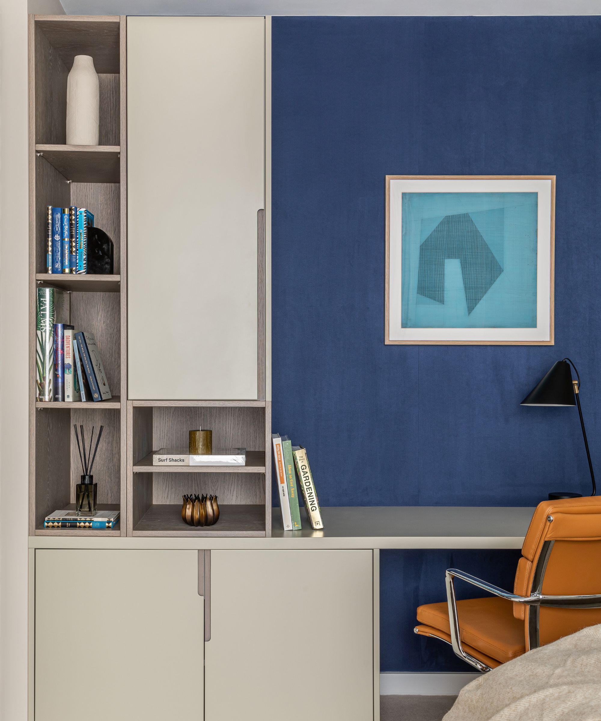
We love to pair dramatic blues with neutral hues and panelling to bring balance. Blue panelling works well in say a study or library, or perhaps on half height panelling in a hallway. We used the hague blue tone from Farrow & Ball in a recent project which was broken up by a walnut library, books and accessories.
In another project, we contrasted a statement blue bedroom wall with cleverly designed bespoke neutral joinery incorporating a desk, open storage and closet running the entire length of the wall.
7. Know that opposites attract
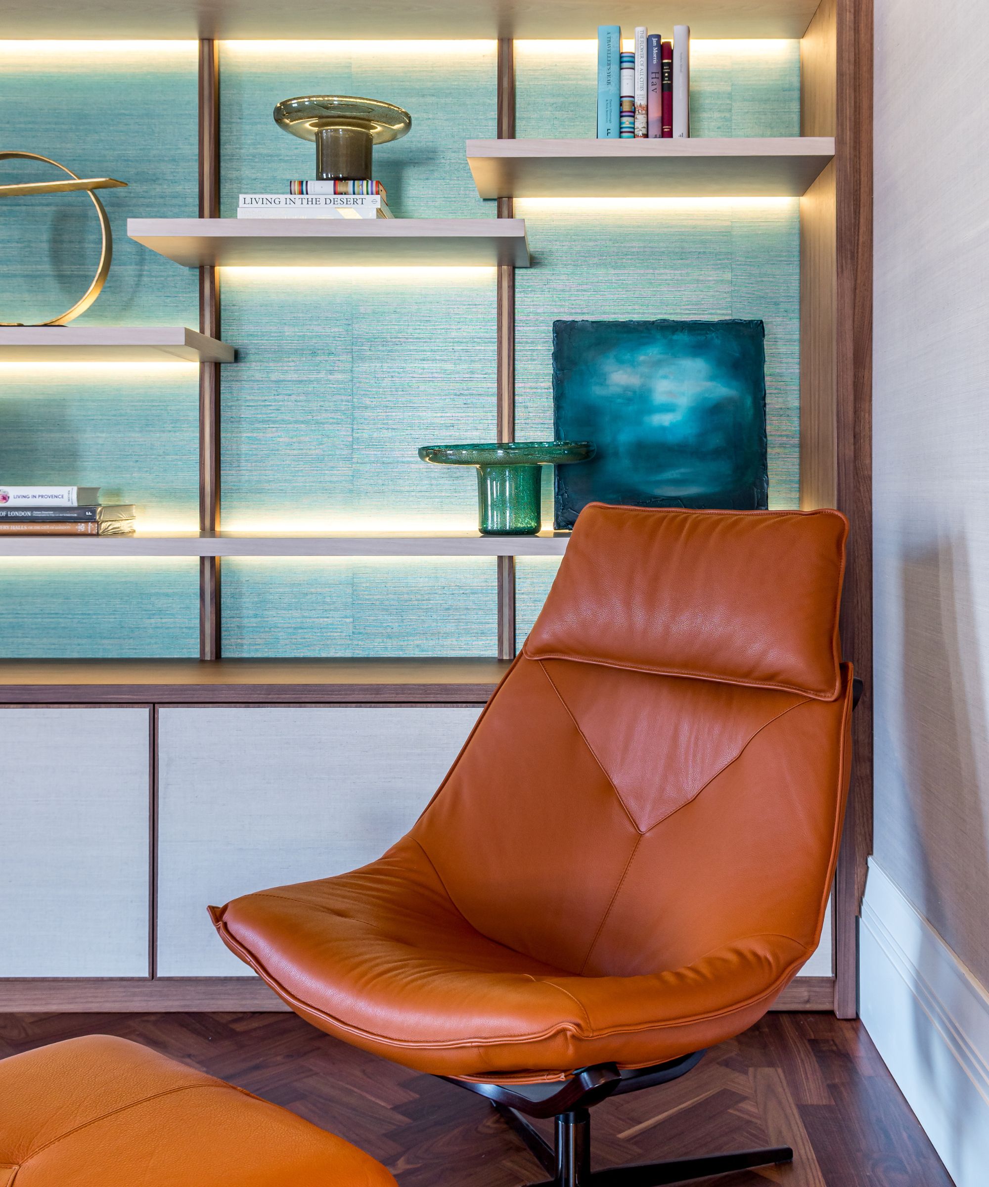
Sitting opposite blue on the color wheel, orange is a great contrasting color to add warmth to an interior scheme, where it might otherwise be lacking.
We love a mustard yellow tone with blues and gold colors. Directly opposite from each other on the color wheel, blue tones are a natural fit for orange. When working with warm blue tones we tend to stick to warm tone accent colors, and similarly with cool blue tones stick to cool grays and green tones.
8. Begin with lighter shades of blue
Decorating with blue is a task many people may be reluctant to throw themselves headfirst into. A great way of easing yourself in, is by starting to experiment with lighter shades of the color.
Decorating with primary colors can easily feel overwhelming for those who are not used to doing so. Starting with lighter shades of blue allows you to create a subtle statement without overpowering the space. Perhaps a barely-there or soft powder blue for a contemporary feel. We also love to use pale shades with gray undertones for the bedroom.
9. Layer up
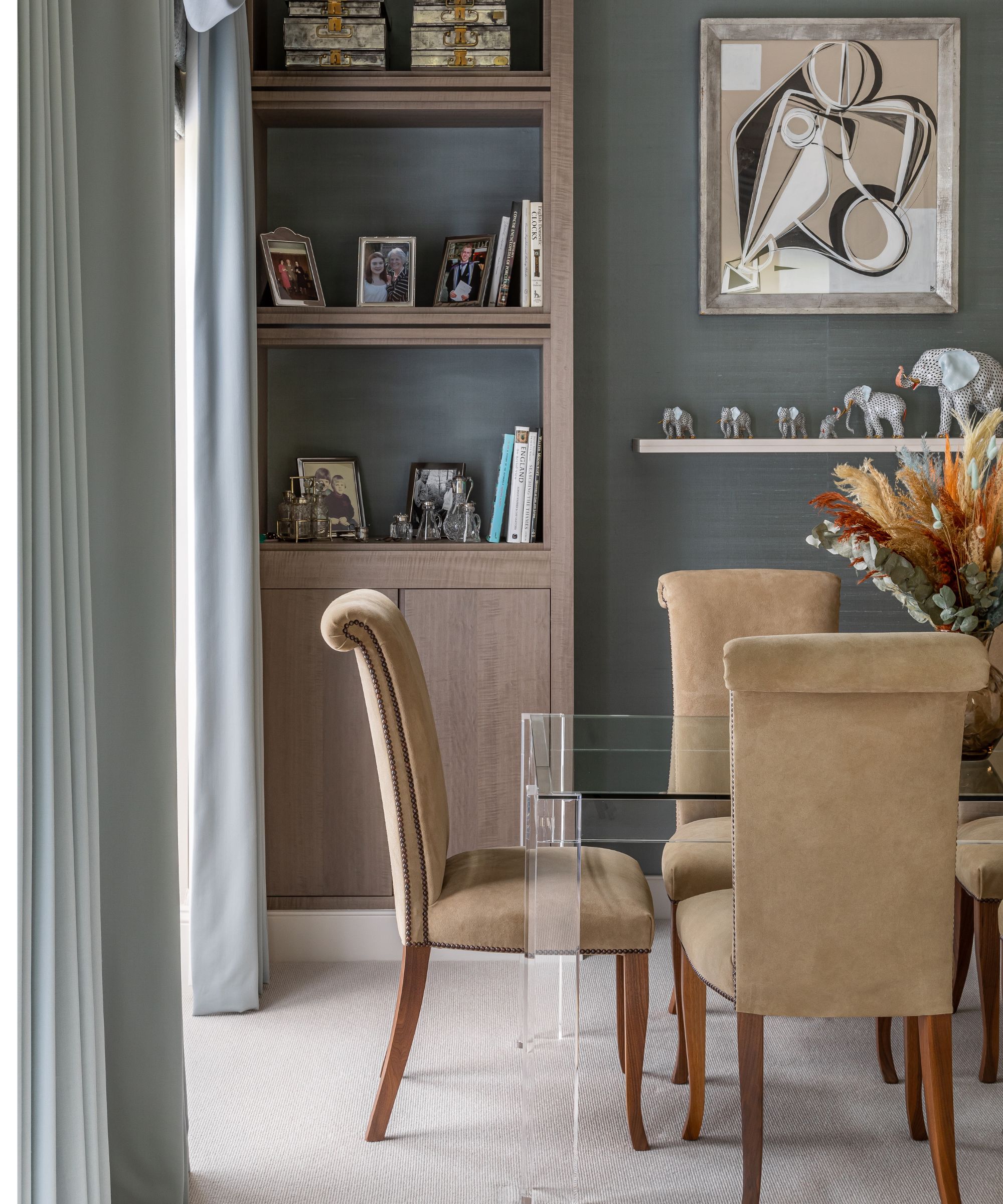
Whether you're a laidback minimalist, or a fearlessly bold decorator, print and pattern can have a place in any home. Subtly introduce through accessories such as throws, pillows, rugs or lampshades.
Blue looks great layered in various tones across the room, adding subtle personality. This doesn’t always have to involve paint. Varied patterns and textures in the same colour can provide a nice, seamless contrast.
To subtly introduce the color to a room, you can incorporate blue through a mix of prints on furniture draperies and accessories, for example the piping on a rug or cushion. Or, perhaps add a pillow or throw with a neutral pattern with some blue in it. A single statement furniture piece can also make a strong impression, such as a midnight blue armchair, or large piece of artwork.
11. Think beyond the four walls
Broadening your creative vision beyond the four walls of a room, can turn a simple space into a room bursting with character.
Don’t restrict your vision to the four walls of the room. Become even more adventurous and think bigger, towards dramatic exposed beams, doors and even the ceiling. Ceilings ideas can often be an afterthought, but are great for creating intimacy in small spaces and drama in larger spaces. Slightly more preparation is needed for working with woods and ceilings, but the payoff is worth it.
11. Cozy up with warmer tones
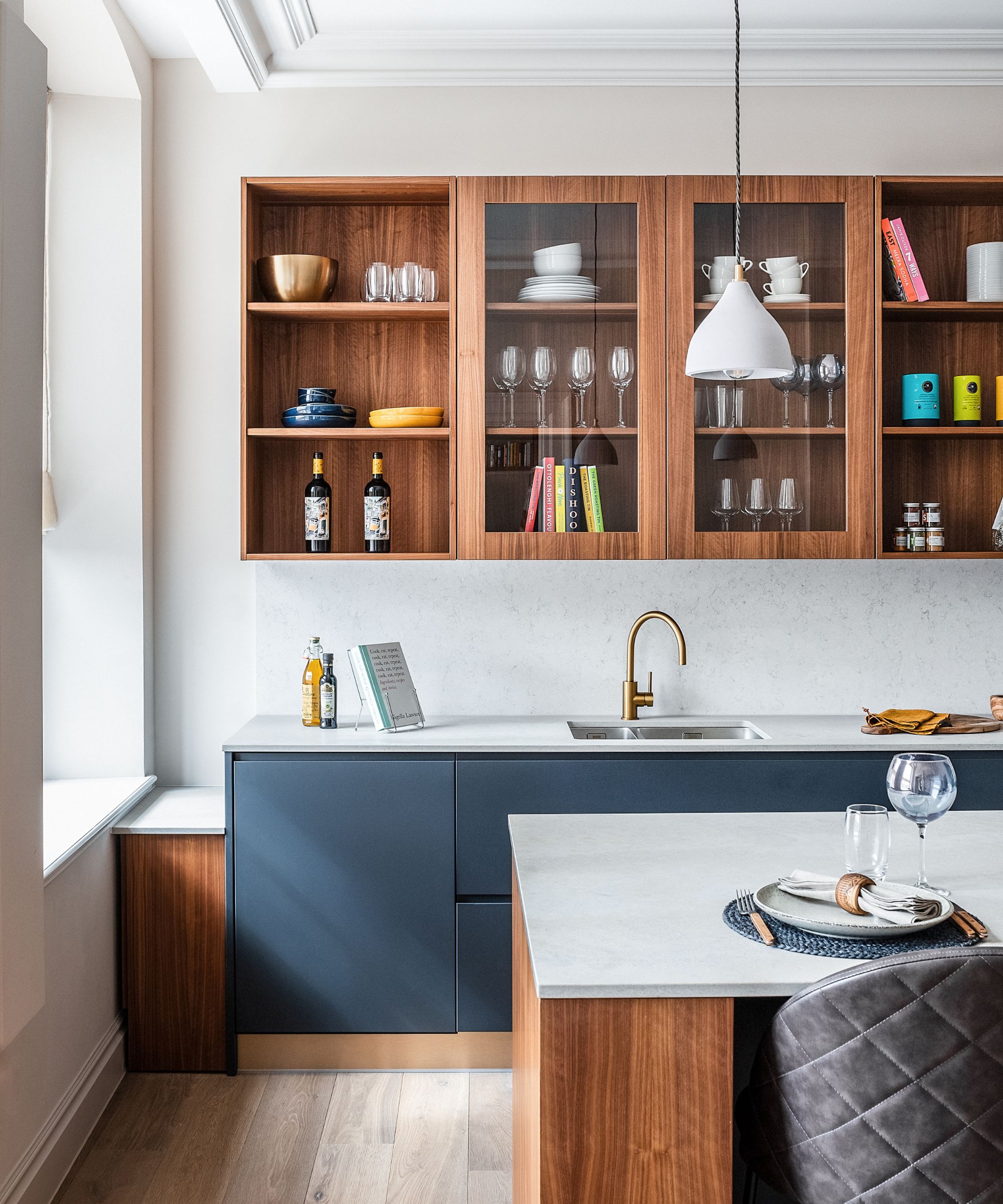
Often thought of as a cooler color, blue is a great way to warm up any room.
There is an abundance of warm blue tones to choose from such as cobalt blue, French navy, or teal. These all give a much softer look. In a recent project, we painted the guest bedroom a warmer mid blue, maintaining a fresh feel with a more classical vibe.
If you’re working with blue kitchen ideas, gold or brass fittings are a great addition to keep the warmth. We did this in a recent London project, pairing the blue beautifully with satin gold taps, bringing character and a touch of decadence. Blue also looks great on kitchen cabinets when broken up with timber and the stone countertops.
12. Don't over complicate it
Sometimes less is more. If you are unsure on how to balance blues in a room, or which shade to start with, the best tip is to start small.
There are no rules regarding the proportion of accent colors versus the rest of the room, just don’t over complicate it. Too many different wild patterns can throw it over. If you happen to go for a large pattern on a sofa, then tone this down with a neutral rug. You don’t want to have items competing with each other in the same room.
Sign up to the Homes & Gardens newsletter
Design expertise in your inbox – from inspiring decorating ideas and beautiful celebrity homes to practical gardening advice and shopping round-ups.

Rosie Ward is the Creative Director at Ward & Co., the London-based interior design firm founder by her mother, Sarah Ward, in 1986. The award-winning studio develops interiors for city apartments, countryside homes, historic estates, restaurants, bars and more, in London, Suffolk, and beyond.
-
 Zooey Deschanel and Jonathan Scott's breakfast nook is an innovative, effective use of kitchen space – it turns a 'dead area' into a cafe-style corner
Jonathan and Zooey have situated an eccentric yet elegant dining area in what may have been an otherwise underused corner
By Hannah Ziegler Published
-
 6 things you should never throw in the trash – and what to do for safe disposal instead
From batteries to space heaters, experts reveal what not to throw
By Andy van Terheyden Published