What are the least popular colors to decorate with? And why designers say we should be using them more in 2024
Think twice before writing off these hues
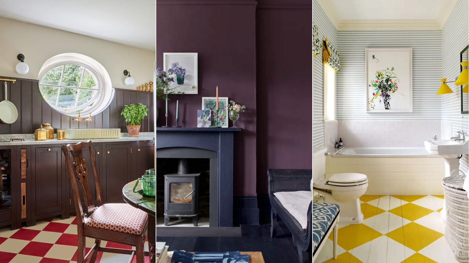
Colors play a hugely important role in the design of our homes. Not only do color trends dictate the aesthetic of a room, but they also impact the way we feel.
With this in mind, it can be tempting to stick to familiar color palettes. Decorating with neutrals is widely known for setting a calming feel and pared-back look while being easy to style across many design styles. On the other hand, saturated hues can be seen as a bold move and tricky to style, and are therefore less often reached for.
While there's no denying that some colors are riskier than others, when styled correctly, unexpected hues can be incredibly effective choices. These colors can go a long way in creating warming, uplifting schemes whilst also having a positive impact on our mood.
Below we've explored three different colors that experts say we should be using more of. For 2024, it's predicted that dopamine decor will lead the way, so there's no better time to get creative with your color schemes to curate an energetic and vibrant look.
1. Dark brown
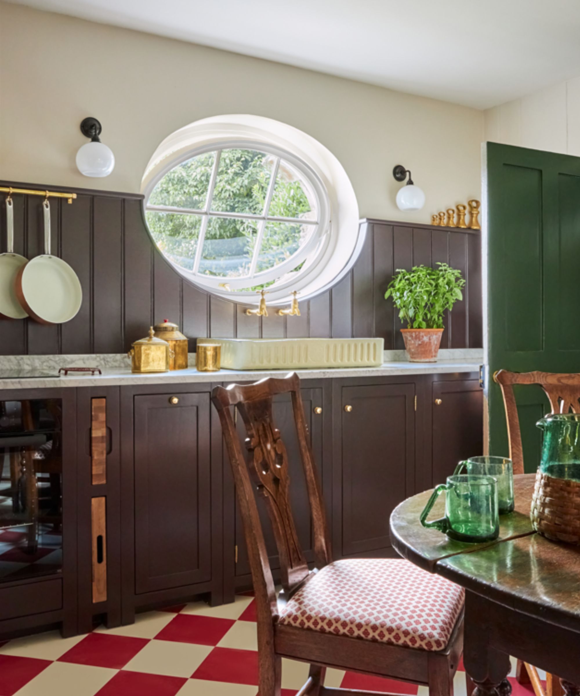
In recent months, decorating with light brown has been an interior design trend, acting as a neutral in the home yet with more depth than off-white or cream. While light browns may be on the rise, dark browns are less popular and can be seen as a bolder hue to embrace. However, experts say these hues can bring endless warmth to the home while pairing well with lots of interior design styles.
'Whilst we have all been playing with dark greens and moody blues for the last five years we are starting to notice the benefits of dark browns too,' says Patrick O'Donnell, color expert at Farrow & Ball. 'Where blue and greens can err towards the cooler side, browns can add warmth especially the elegant London Clay with its subtle dose of magenta.'

Patrick O’Donnell is Farrow & Ball's color consultant & brand ambassador and has been with the brand since 2012. Patrick works with designers in the UK and North America, helping to bring their projects alive with the iconic, F&B color palette.
Decorating with brown may feel daunting, but Patrick says it pairs easily with a wide range of colors, making it easy to integrate into your decor while working particularly well in low-light spaces: 'This color will give you great flexibility and will work effortlessly with a multitude of colors from pinks, greens, blues, and earthy neutrals, and it’s a great option for poorly lit spaces, giving you drama and warmth in equal measure. Try it on kitchen cabinetry with mid-neutral walls and add a splash of rose pink to a freestanding piece of furniture such as a kitchen island or larder cupboard, or paint bedroom walls for a truly cozy and elegantly relaxing feel.'
Ruth Mottershead, Creative Director Little Greene adds that styling plenty of natural materials works well in brown room ideas to complete the look: 'The earthy yet refined nature of brown shades makes them the perfect backdrop to natural materials currently being incorporated in contemporary interiors, including wicker, rattan, warm woods and stone finishes.'

Ruth Mottershead is a color and interior design expert who works as Creative Director at Little Greene, a brand renowned for its beautiful paint and wallpaper collections, many of which are inspired by nature.
2. Purple
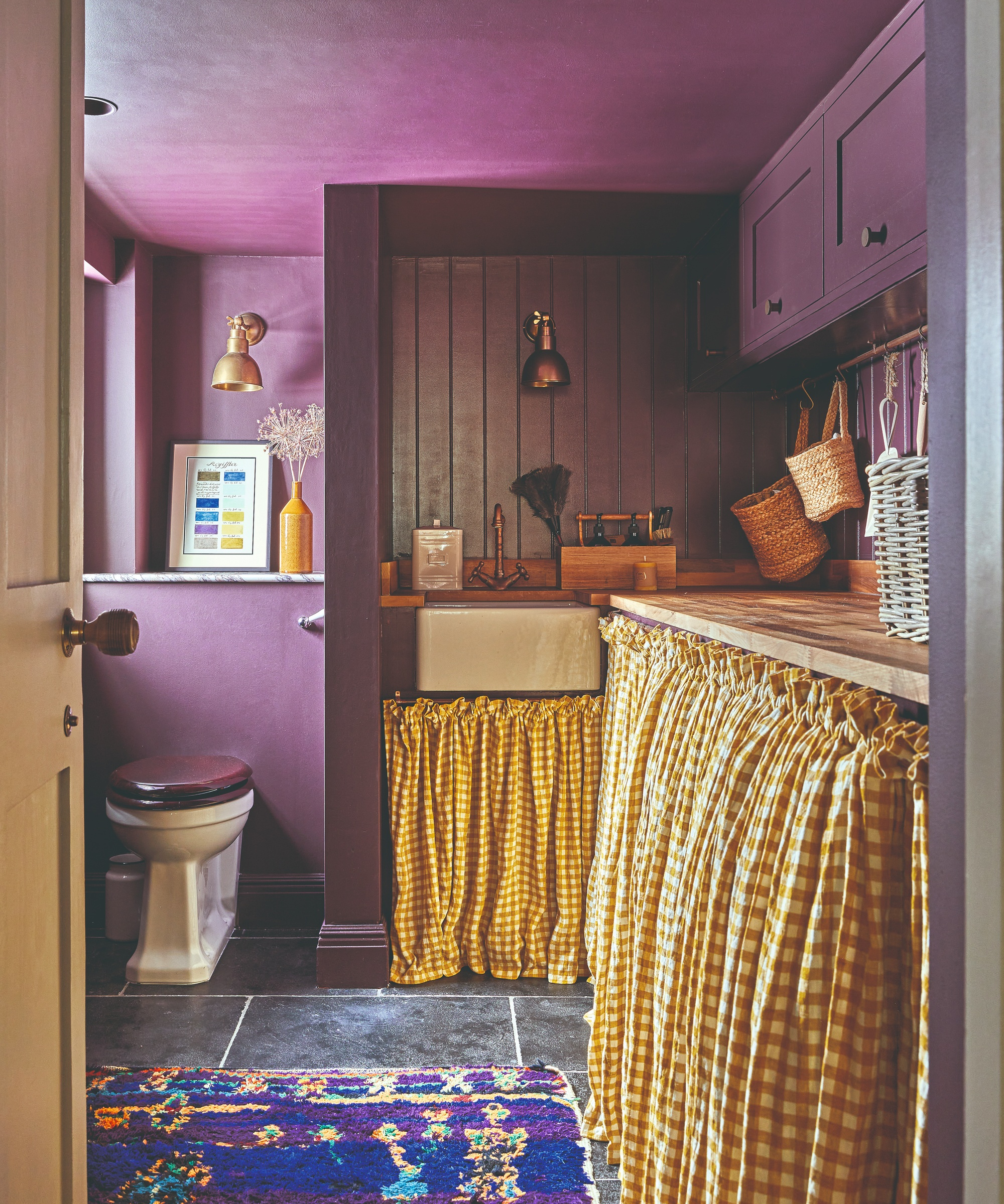
Decorating with purple is another decor idea that is less commonly embraced. While purple can certainly risk looking dated and garish, it can actually be an effective color choice. Purple is known for helping to create an uplifting mood, and when styled in the right way can bring a balanced feel to the home.
The key to achieving a successful look when decorating with purple is all about making sure you choose the right shade of this intense hue. In larger rooms such as the living room, opt for a rich and dark variation to create a sophisticated and cozy feel. Alternatively, lighter purple hues such as lilac are instantly uplifting and look great in small rooms such as powder rooms.
'We know that purples, currently, are less frequently chosen shades for spaces,' says Ashley McCollum, color expert at Glidden. If you are feeling inspired to make a statement and use purple in your home decor, Ashley recommends some of her favorite Glidden paint ideas to create the look: Tin Lizzie is a light shade of purple for a playful scheme whereas Blackberry is a much darker variation that adds a sense of opulence to any room.

Ashley McCollum is a Marketing Manager and color expert for PPG’s Architectural Coatings business in the U.S. and Canada. Prior to joining PPG in 2017, Ashley's career was heavily focused on color and visual merchandising for retail environments. Ashley earned her MBA in Marketing/Management from Slippery Rock University of Pennsylvania.
3. Yellow
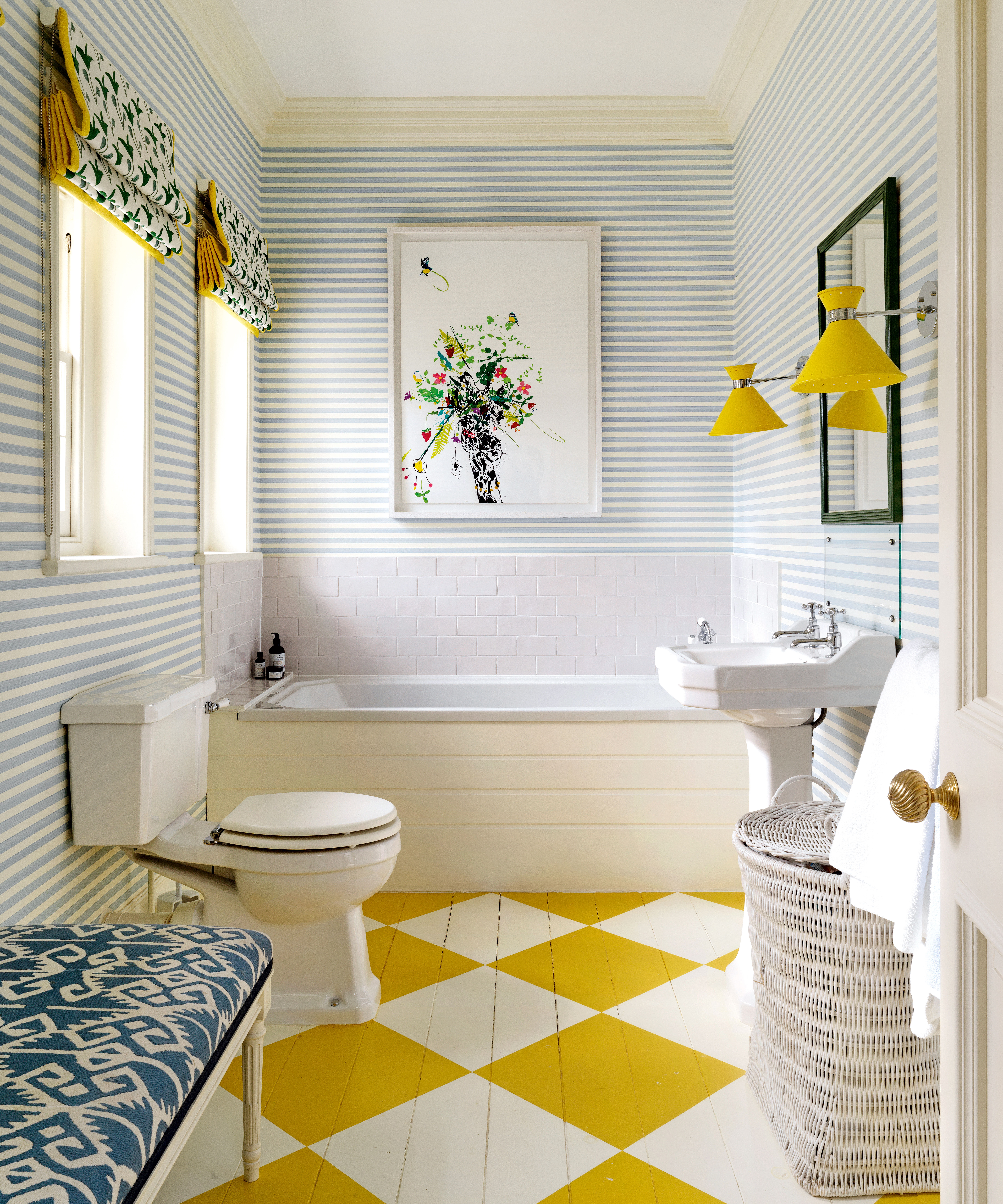
Lastly, decorating with yellow is often seen as an incredibly daring move in the world of interior design. Regarded as one of the most uplifting hues, yellow can be very intense and create a fun, dramatic look. While there's no question that yellow is a bold move, it can also lift the mood while adding a feeling of warmth.
'People are often more reserved when it comes to color schemes and opt for neutrals such as white, cream, or gray,' says Helen Shaw, Director of Color Marketing at Benjamin Moore. 'However, incorporating a rich, bold paint color will create instant character, taking a space from sterile to stylish.'

Helen Shaw is part of Benjamin Moore's UK division. Color expert and international marketing director, Helen and her husband Craig are founders of Shaw Paints, acquired by Benjamin Moore in 2020.
If you're looking to incorporate this bold hue into your home decor ideas, smaller rooms work best for this. 'Downstairs cloakrooms are the perfect place to embrace a more dramatic hue. It’s an easy way to add a little drama to what can be seen as a purely functional space.' As pictured above, you could also choose to get creative and style yellow in more unconventional ways, such as through flooring ideas, or for a slightly more understated look, opt for yellow accessories.
It can be easy to get stuck in a rut with color choices and opt for the same color palettes time and time again. Mixing things up however and embracing one of these more unexpected hues can be a great idea if you're looking to add character to your home with a refreshed feel for the year ahead.
Sign up to the Homes & Gardens newsletter
Design expertise in your inbox – from inspiring decorating ideas and beautiful celebrity homes to practical gardening advice and shopping round-ups.

Emily is a freelance interior design writer based in Scotland. Prior to going freelance in the spring of 2025, Emily was Homes & Gardens’ Paint & Color Editor, covering all things color across interiors and home decor for the Homes & Gardens website. Having gained specific expertise in this area, Emily is well-versed in writing about the latest color trends and is passionate about helping homeowners understand the importance of color psychology in home design. Her own interior design style reflects the simplicity of mid-century design and she loves sourcing vintage furniture finds for her tenement flat.
-
 Bryce Dallas Howard's bedroom is the most creative, social space in her entire home – she uses 'conversational seating' to create a multifunctional 'salon'
The actress's bedroom doubles as a home office thanks to its clever layout and furnishings, proving that this area is much more than a sleep space
By Hannah Ziegler
-
 7 questions to ask yourself before moving house – realtors promise answering these questions will prevent buyer's regret
Don’t make your move harder, ask these questions before moving to avoid mistakes
By Chiana Dickson