I am a style editor, and these 7 undesirable trends are dating your interiors – here's what to use instead
Once loved by many, these dated designs, colors, and materials have fallen out of favor. Here's why I am turning my back on these once-popular decorating trends
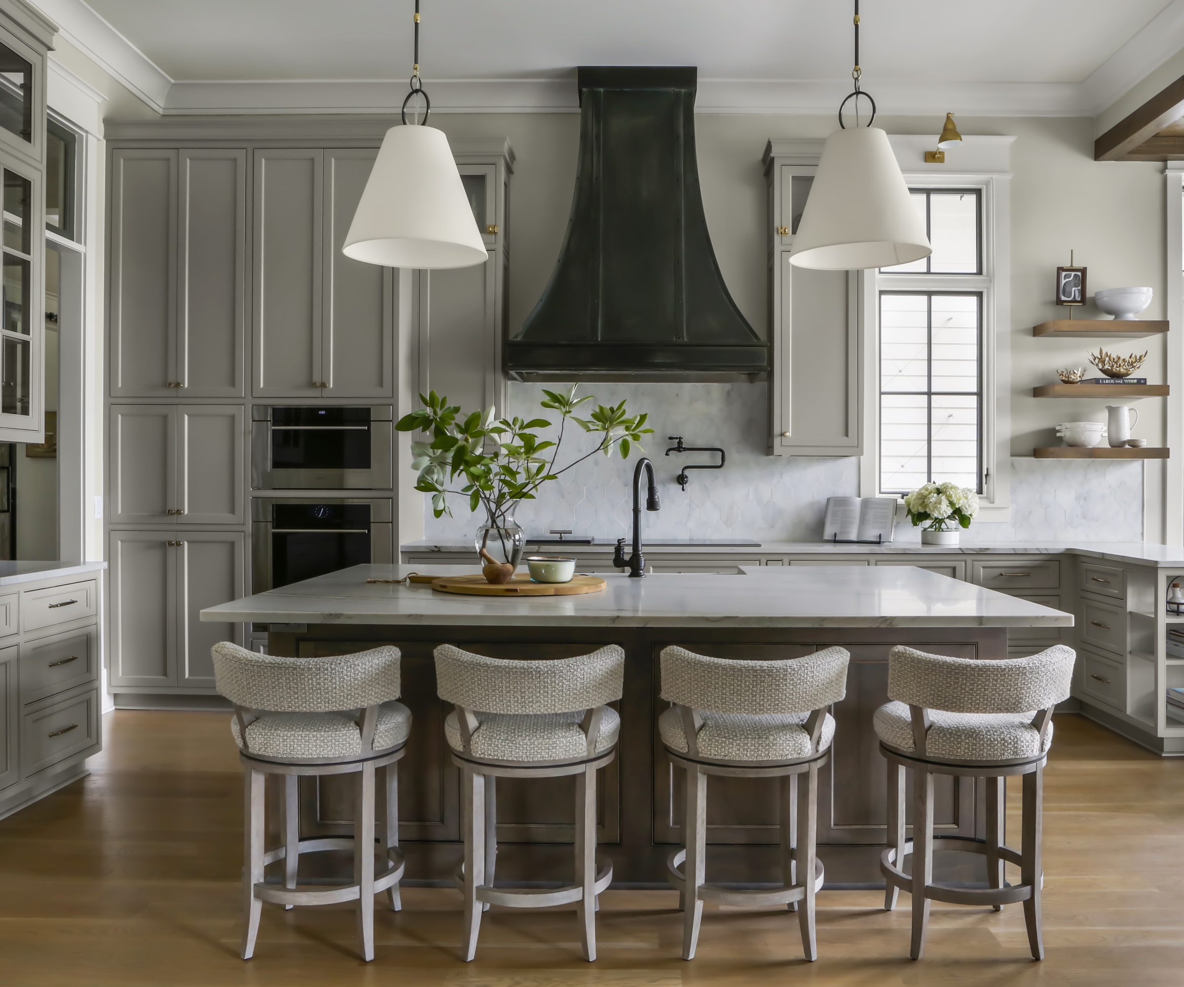

There are some home decor trends that are timeless, and then there are others that have past their expiration date. While there's certainly no one size fits all formula; trends are entirely subjective, after all. There are still a few, five decorating ideas to be precise, that should be resigned to the history books.
But that is not to say that you shouldn't have any of these home decor ideas if they truly bring you joy. Our affinity towards certain looks, materials, and colors has a lot to do with our personalities, environment, and experiences, so it is always important to choose decor that makes you happier at home, and take what the naysayers suggest with a pinch of salt.
Decorating trends that have fallen out of fashion
'Fashion fades, style is eternal' Yves Saint Laurent once said, and the same goes for interior trends, too. However, every so often it is fun to look back on the now outdated decorating trends that we once the height of fashion. But, if you still adore your fantastical feature wall, popcorn ceiling, or even your mirrored closet door, don't take my advice. A forever piece is a forever piece no matter what I, or anyone else, thinks.
Made for Living: Collected Interiors for All Sorts of Styles, Amber Lewis | From $24.58 at Amazon
This national best-seller is a success for a reason: within the pages, interior designer Amber Lewis shares her most loved design secrets and know-how.
1. All-grey interiors
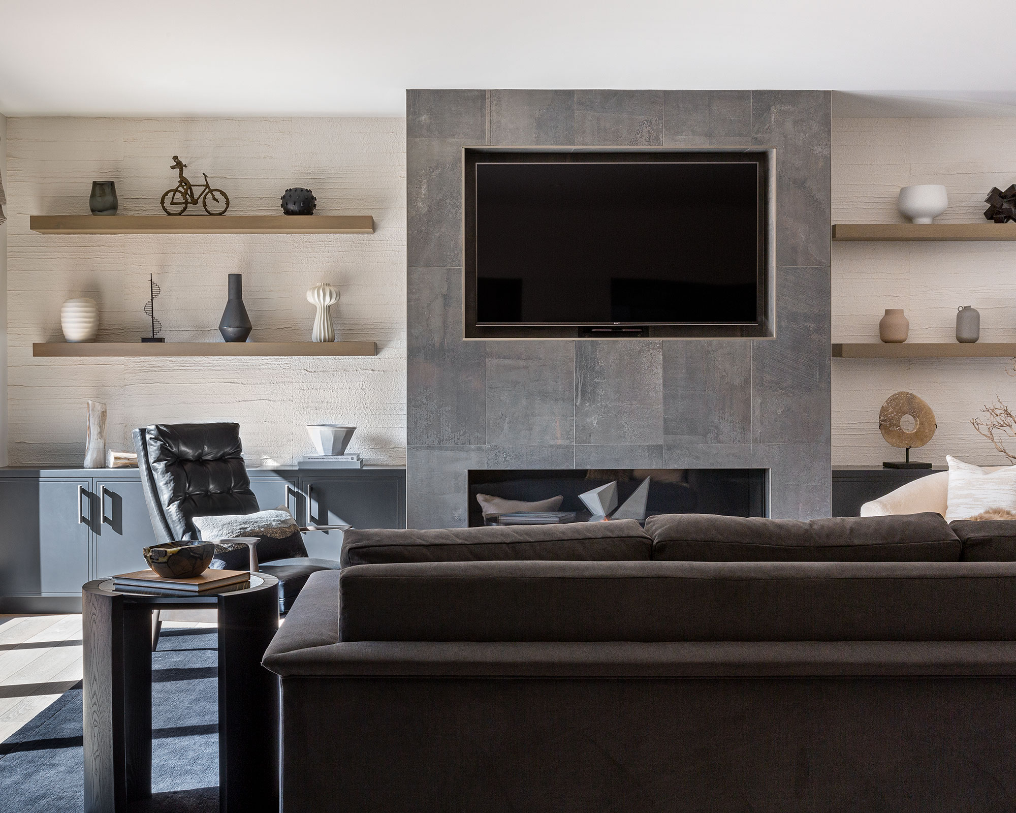
In the West, grey is associated with dullness, boredom, and old age, so it comes as no surprise that this 'trend' was never going to go the distance. Being surrounded by too much grey leaves me feeling drained and depleted of energy, and I am not the only one who is tired of the endless velvet grey sofas, carpets, walls, and decor that have graced homes over the past decade.
'The decline in all over grey color schemes reflects our ongoing desire to make our homes, in which we’ve all come to spend more time, feel special and layered,' says Anthony Barzilay Freund, 1stDibs’ editorial director. 'Patterns and colors, particularly those that evoke nature, are visually interesting and also feel emotionally reassuring.'
Having said that, I certainly don't despise decorating with grey entirely, in fact, there is an art to perfecting a pared-back palette. Using a grey or white palette is all about adding depth and contrast in different layers and textures
'The beauty of a neutral scheme is that it provides a wonderful scaffold upon which to hang accents of color,' says Kimberley Harrison Interior, the design studio that crafted the layered space above. 'To make a grey or neutral palette feel designed and considered it’s important to mix and match textures and create subtle color saturations, albeit neutral ones and occasional bursts of color. Just because something is grey doesn’t mean it has to be plain: think about the application too.'
2. The feature wall
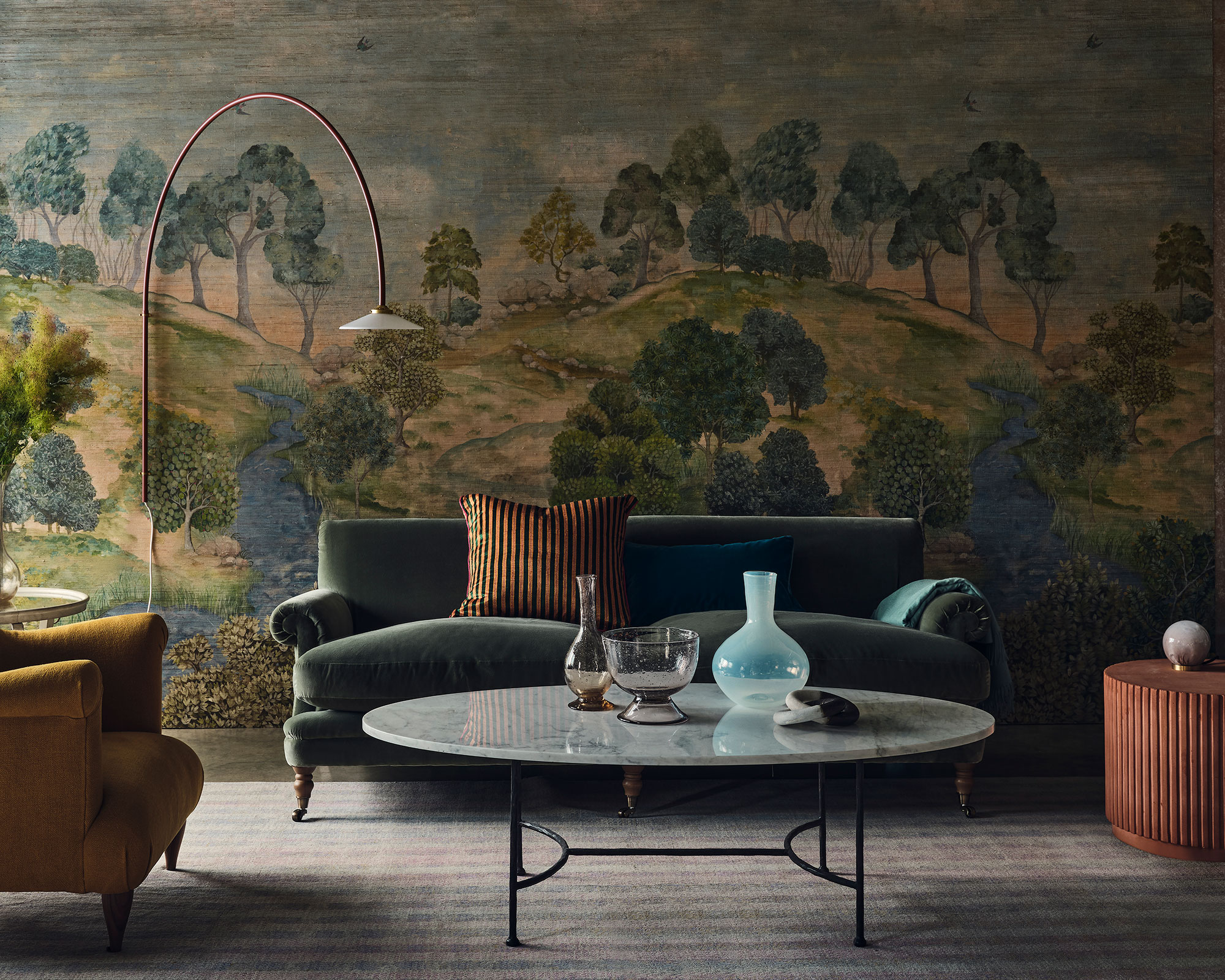
There is a lot to be said for a feature wall, but have we gone too far in our quest to add visual appeal? I believe so. There is something 'unfinished' about this dated trend. If you're going to paint one wall, paint them all. If you're going to wallpaper one wall, wallpaper them all. Alternatively, add decorative interest to your ceiling instead – it carries far more visual weight than a single wall ever could. I am all for being brave and bold when it comes to your interiors. No more half-measures; it is all or nothing from now on.
However, if you are going to do a feature or accent wall, then do it right. Scenic landscape murals are the biggest story in decorating today – wonderfully atmospheric and evocative, a feature wall mural will transform a space and capture the imagination.
Using wall mural ideas with a single dramatic image is a bold move, but it is a logical progression if you’ve already used patterned wallpapers. ‘A mural is a powerful tool for the adventurous,’ says Andy Greenall, head of design at Paint & Paper Library. Many mural designs are now available as wallpapers, making them easier to achieve. ‘Three drops of paper that create a whole panel give an instant uplift,’ says Andy. Try painting all the surrounding walls in a complementary color taken from the mural.
3. A popcorn ceiling
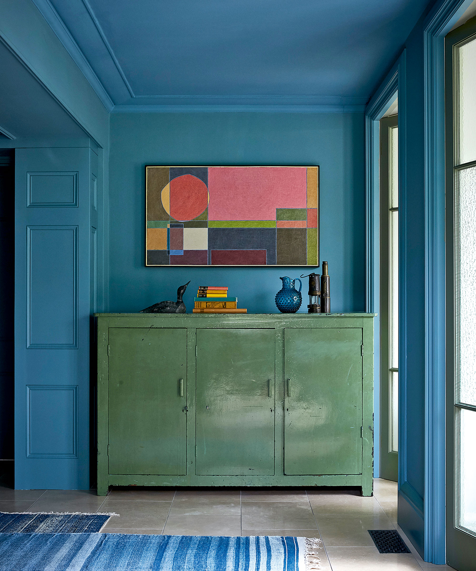
Is there a former 'popular' decorating trend more despised than a popcorn ceiling?
A favorite interior design trend in the '70s, popcorn ceilings are also known as acoustic ceilings or stucco ceilings. They were initially installed to help absorb sound from above or to cover up any pre-existing blemishes and imperfections in the ceiling. But like many trends from this time period, the popcorn ceiling has fallen out of favor and many homeowners are wondering how to remove a popcorn ceiling, or how to simply disguise this now loathed design feature. However, this is not to say that you should leave your ceiling completely bare – far from it.
As mentioned above, this fifth wall is ripe for rediscovery. The ceiling holds endless possibilities for creativity and should be treated with the same consideration as any other wall in your home.
‘Ceilings are a great way of adding another layer of interest and making a space feel cozier. All too often they are an afterthought but we make sure to consider their potential,’ confides interior designer Nicola Harding.
There is a multitude of ways to elevate your ceiling with materials, color, texture, and even wallpaper. ‘Ceilings have been overlooked in recent times,’ says interior designer Rachel Chudley, ‘but when you visit historic houses, the ceiling is often treated as a masterpiece.’
4. Mirrored closet doors
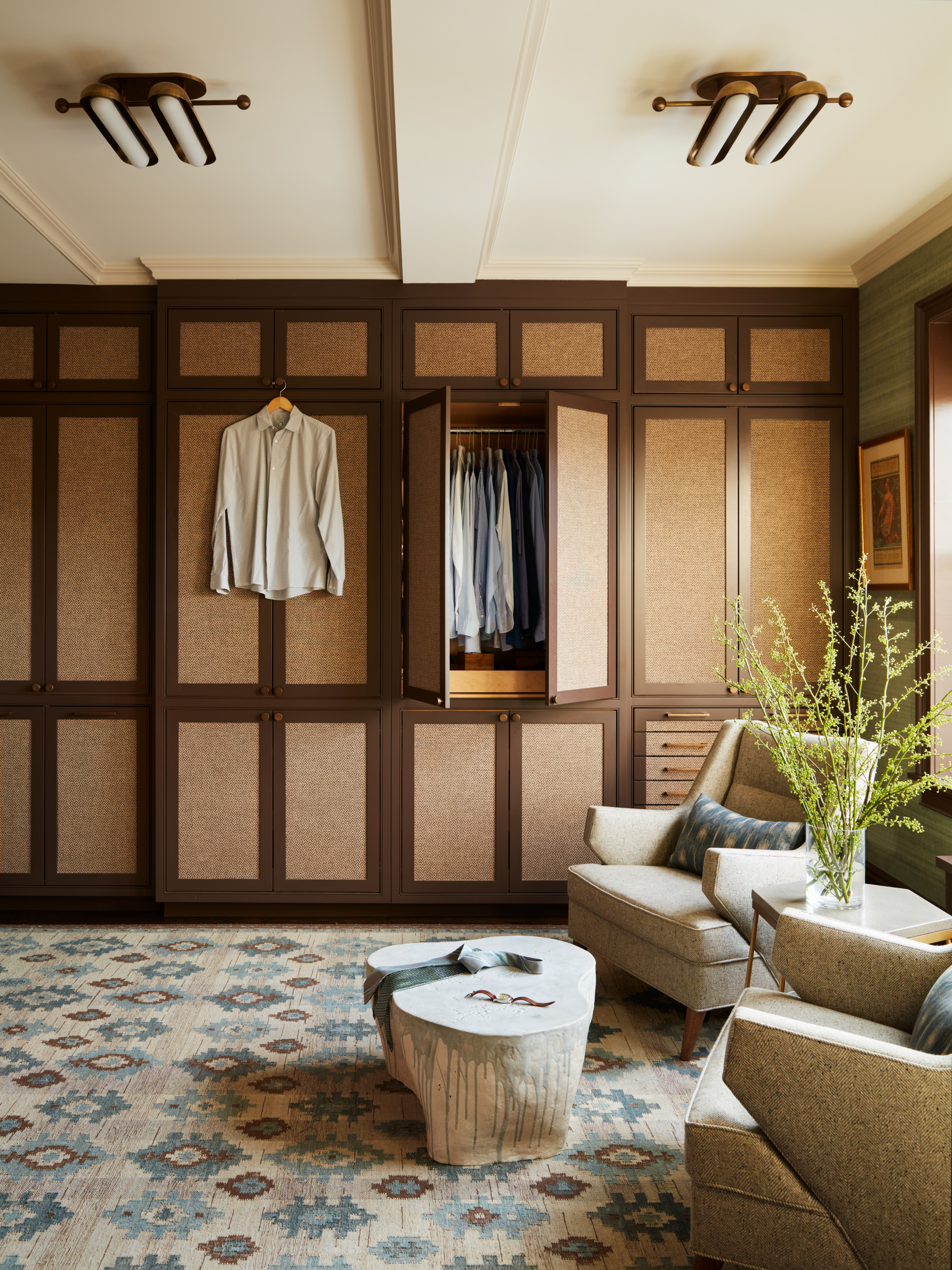
I have a confession, I still have my mirrored closet from college. It is on its last legs and I am counting down the days until I can make the switch to built-ins. Why do I still have this furniture faux pas, you ask? While I don't consider myself particularly sentimental, I couldn't justify doing away with a functional piece of furniture that saw me from childhood to my teenage years.
Mirrored closet doors, a beloved decorating must-have in the '80s and early ’90s known for adding glamor (or so we desperately wanted to believe), also made small spaces feel larger. But while decorating with mirrors has soared in popularity in recent years, mirrored furniture, especially closet doors have fallen out of favor.
In its place, beautiful French doors, bi-folds, and pocket doors are bringing our homes up-to-date. In my opinion, closet doors aren't always given the thought they deserve. Very often, we are far more invested in what's behind them and what they can offer us, but they can have an enormous impact on the space, making it feel cozier, brighter, richer in texture, and bigger even.
5. Mass-produced homeware
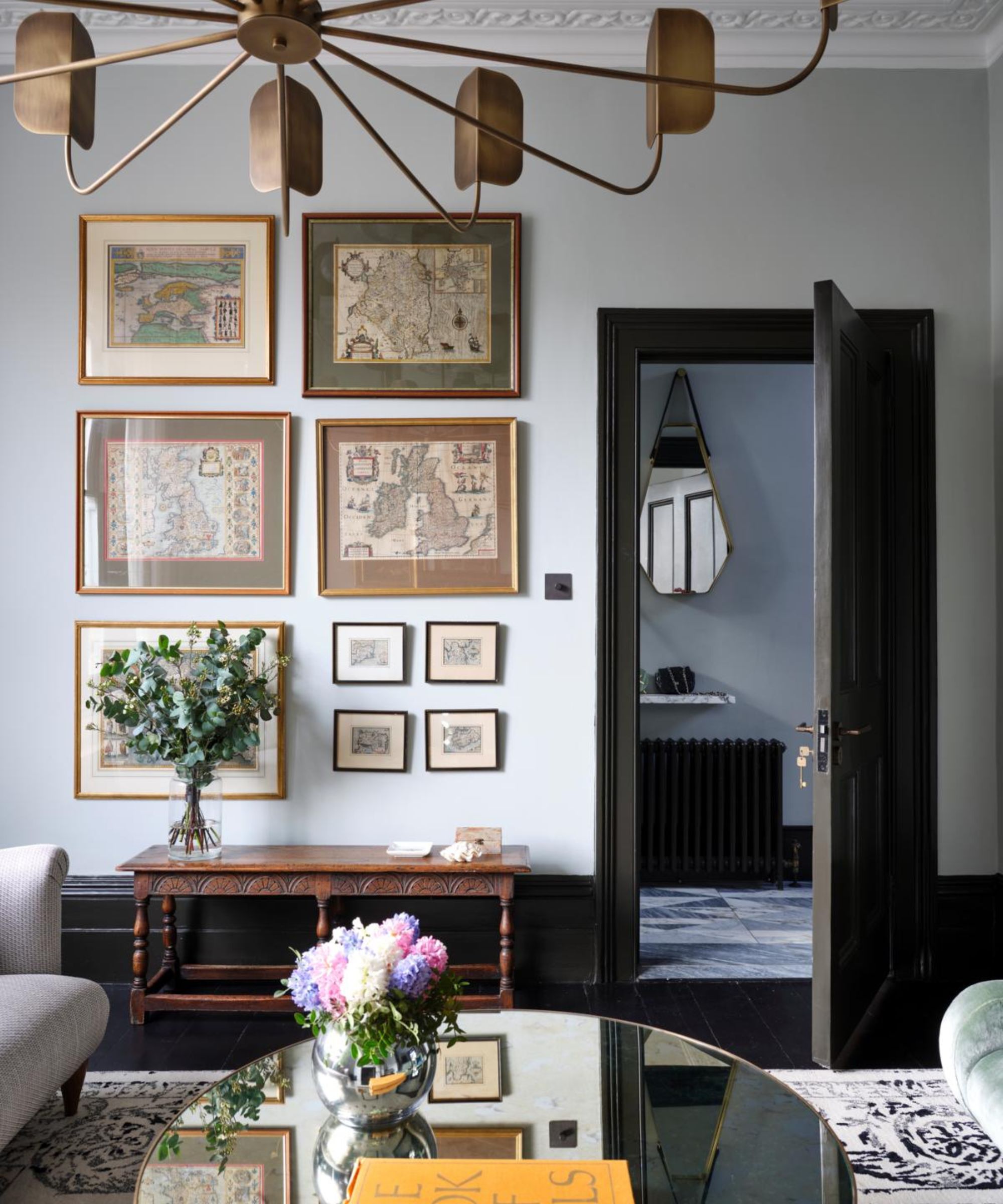
Interior design is an intricate and extremely personal process, therefore why do so many of us fall victim to the cookie-cutter aesthetic of mass-produced homewares?
The whole purpose of a home is to answer the needs of the individuals living in them whilst reflecting their personalities with good design, space, and functionality, which is why over-produced, impersonal purchases are making our homes look dated, and dare I say, cheap.
Thankfully, recent trends have shown a shift towards curating more sustainable, soulful spaces. 'If in doubt, be bold,' advises Tiffany Duggan, founder and director of Studio Duggan. 'Clients hardly ever regret investing in one-of-a-kind vintage pieces. Think of your space as a carefully curated Aladdin’s cave of treasures, with each item on display even more fascinating than the last.'
Undeniably, maximalism is back and it is better than ever. Not the big. blowsy florals from the '80s, but a much more refined maximalism that is not only fashionable but also liveable and unique.
Style mavens such as hotelier Kit Kemp are masters in the fine art of maximalism. But if you're new to this trend, you’d be wise to exercise caution, otherwise, your experimentation could end up one hot mess. So prefix maximalism with an adjective such as ‘considered’, ‘elegant’, or ‘curated’ and you can make it work. The trick to pulling off ‘elegant maximalism’ is finding a common hook off which everything else hangs. Leave matchy-matchy to the minimalists, you just go with whatever you love and it will work. Happy considered – and sustainable – gathering!

Jennifer Ebert is the digital of Homes & Gardens, overseeing all features for the website. Covering the popular interior design trends – and outdated trends – is her forte, as well as discovering the latest decorating rules to follow, and the ones to avoid.
6. Carpet in bathrooms
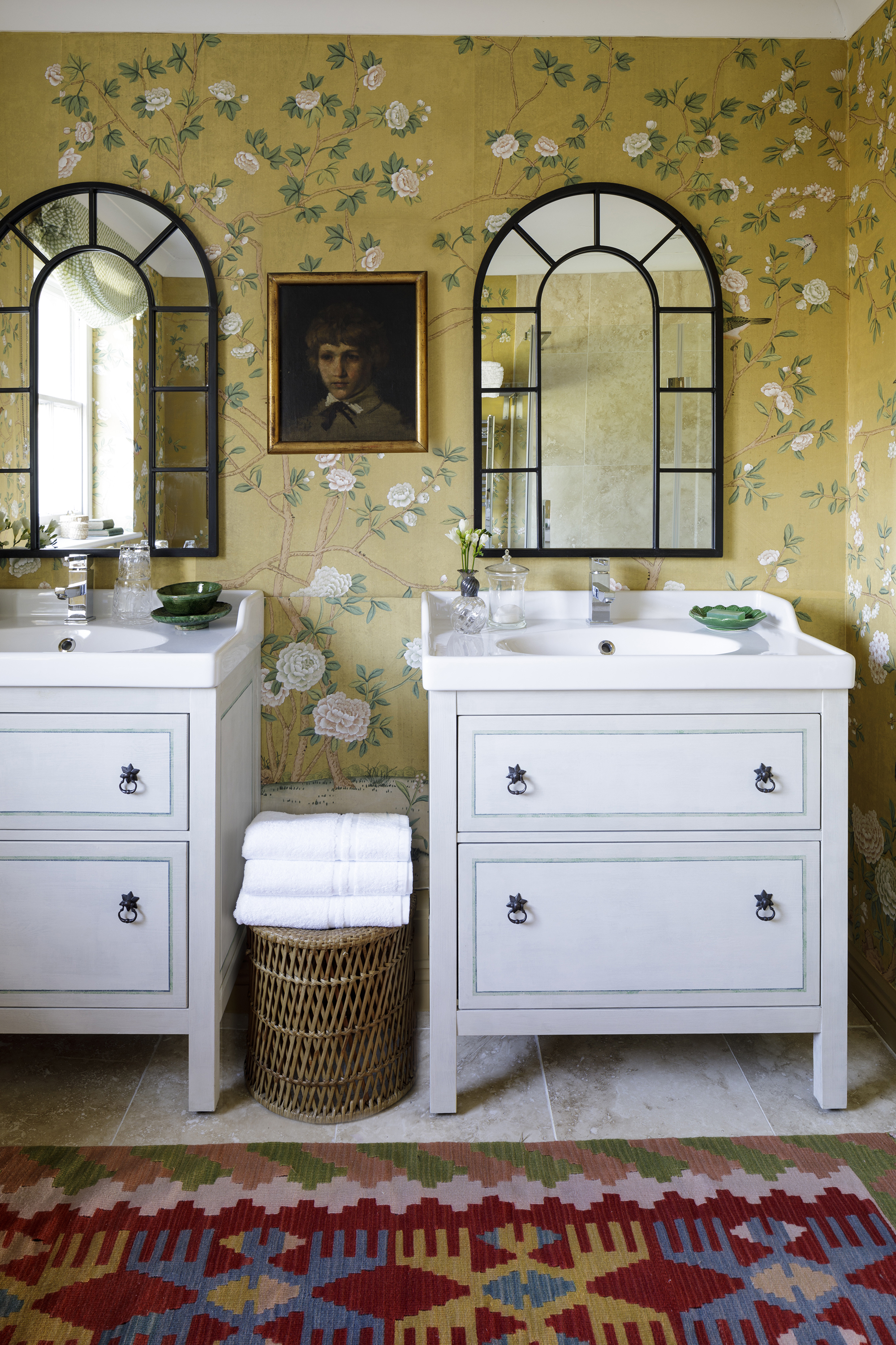
Rumors might suggest that this unsettling trend is back in vogue but proceed with caution before you entertain the thought. While it seems everything from the ’70s is making a comeback these days, this is one unhygienic trend I don’t want to see returning anytime soon, despite my love for over-the-top maximalist interiors. So why was this trend once so popular?
During the 1950s, wall-to-wall carpeting was considered a luxury, much admired by the average American family, so when the 1970s rolled around and changes to carpet-making technology and post-war property led to an economic boom, keeping up with the Joneses finally became a reality.
The reason I loathe this trend is not even because of aesthetics, it is purely hygiene. With enough water-damage situations, think mold spores and mildew, this unfashionable trend has surely had its day in the spotlight.
However, over the past decade, while many have opted for pared-back, easy-clean bathrooms, we've noticed a swerve towards decorative textiles in bathrooms that truly embrace decoration and layers.
‘Aesthetics are just as important as practical elements when it comes to creating a cozy and inviting bathroom,’ says interior designer Henriette von Stockhausen of VSP Interiors, who says she is wary of cold, hard finishes.
'In old or rural houses which have their original floorboards, my preference is to keep these in place and lay an antique rug on top, which instantly makes the room feel warmer.’
If you are concerned about water damage to your bathroom rug ideas, you may prefer to opt for a performance rug made from polypropylene or recycled plastic, designed to be water resistant, hardwearing, and easy to clean.
7. White kitchen appliances
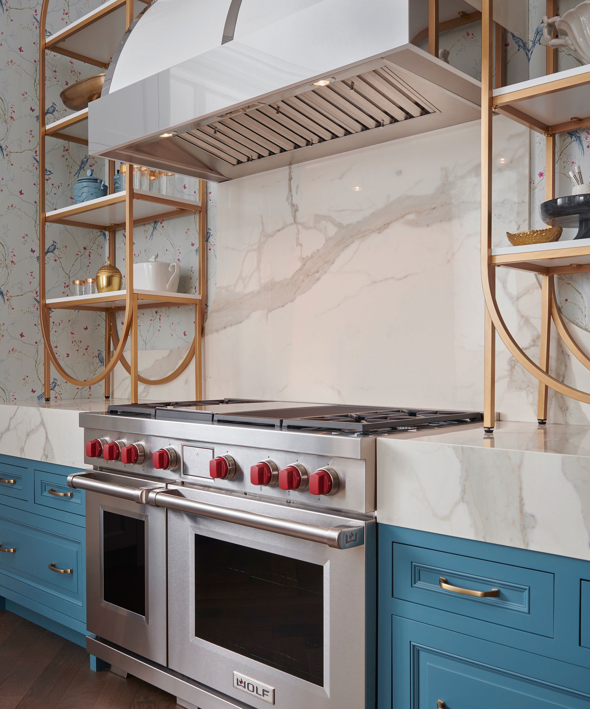
Kitchen appliances have come a long way in recent years, namely thanks to technological advances and globalization. But it is not just technology that has changed our kitchen decorating habits; modern materials and colors have evolved to incorporate both functionality and design too.
Now, this is something you may never have subconsciously noticed, but when was the last time you saw white appliances in a kitchen? I, personally, had to go back to the early '90s to remember a white microwave. So, while the microwave is still a kitchen staple, the color and materials used to build them have changed to adapt to our ever-evolving need to make our kitchen the heart of the home; a space to entertain, cook and work in.
When designing a chef's kitchen, Eggersmann Design’s creative director Gary Singer often includes high-tech appliances, and those are chosen to blend in with our design rather than stand out, as well as that all-important hygiene factor I mentioned previously.
'If you're looking for kitchen appliances and essentials that are hard-wearing, extremely heat-resistant, and ultra-hygienic, stainless-steel can withstand anything the busiest kitchen can throw at it.'
I, for one, will remember those retro white appliances with great fondness, but more often than not, change is for the better.
Sign up to the Homes & Gardens newsletter
Design expertise in your inbox – from inspiring decorating ideas and beautiful celebrity homes to practical gardening advice and shopping round-ups.

Jennifer is the Digital Editor at Homes & Gardens. Having worked in the interiors industry for several years in both the US and UK, spanning many publications, she now hones her digital prowess on the 'best interiors website' in the world. Multi-skilled, Jennifer has worked in PR and marketing and occasionally dabbles in the social media, commercial, and the e-commerce space. Over the years, she has written about every area of the home, from compiling houses designed by some of the best interior designers in the world to sourcing celebrity homes, reviewing appliances, and even writing a few news stories or two.
-
 5 things professional cleaners always do to overcome a cleaning roadblock – they're surefire ways to feel 'motivated and clear-headed' experts say
Get your cleaning schedule back on track
By Ottilie Blackhall
-
 Martha Stewart used this vintage-style pan to make cute bunny cakes for Easter – it's a real heirloom piece (and only $40 now)
It's not Easter without bunny-themed baked goods, and Martha set a precedent with a novel cake pan – it's American-made and has exceptional durability
By Megan Slack
