What is the 'Unexpected Red Theory'? Here's how I'm embracing this bold new design trend in my own home
Just as quickly as a TikTok trend fades, a new one is ushered in the door. So what is the latest 'unexpected red theory' trend? And why I am considering using it in my own home

If you know me, you'll know that I've been renovating my home for the entirety of the past year. And while to a lot of you that might sound like a journey nearing its end, you don't know the blessing and the curse of a slow renovation journey.
What this has meant, is that I'm currently at the stage where I'm researching color trends to help me begin to choose color schemes for my entire home. And while I'm somewhat of a muted color scheme girl at heart, there's a video I recently stumbled across on my daily rounds of TikTok that has me thinking outside the box. In fact, it's got me getting giddy for red.
Of course, it's no secret that TikTok interior design trends tend to be passing fads thought up by Gen Z and certainly not taken seriously by interior design experts. But, the latest 'Unexpected Red Theory' coined by creator Taylor Simon, seems to be the anomaly to that notion.
The perfect blend of a trend that sums up something we're all coveting and yet also a trend that has longevity, serious design kudos, and actually, science backing. Don't believe me? I've asked the experts to weigh in below.

What Is The 'Unexpected Red Theory'?
@intayriors ♬ original sound - Taylor Simon
As creator Taylor Simon of @intayriors, a Brooklyn-based interior designer known for her eclectic style, explains, the unexpected red theory is basically adding anything that's red, big or small, to a room where it seemingly doesn't match. It's like a color pop but less contrived.
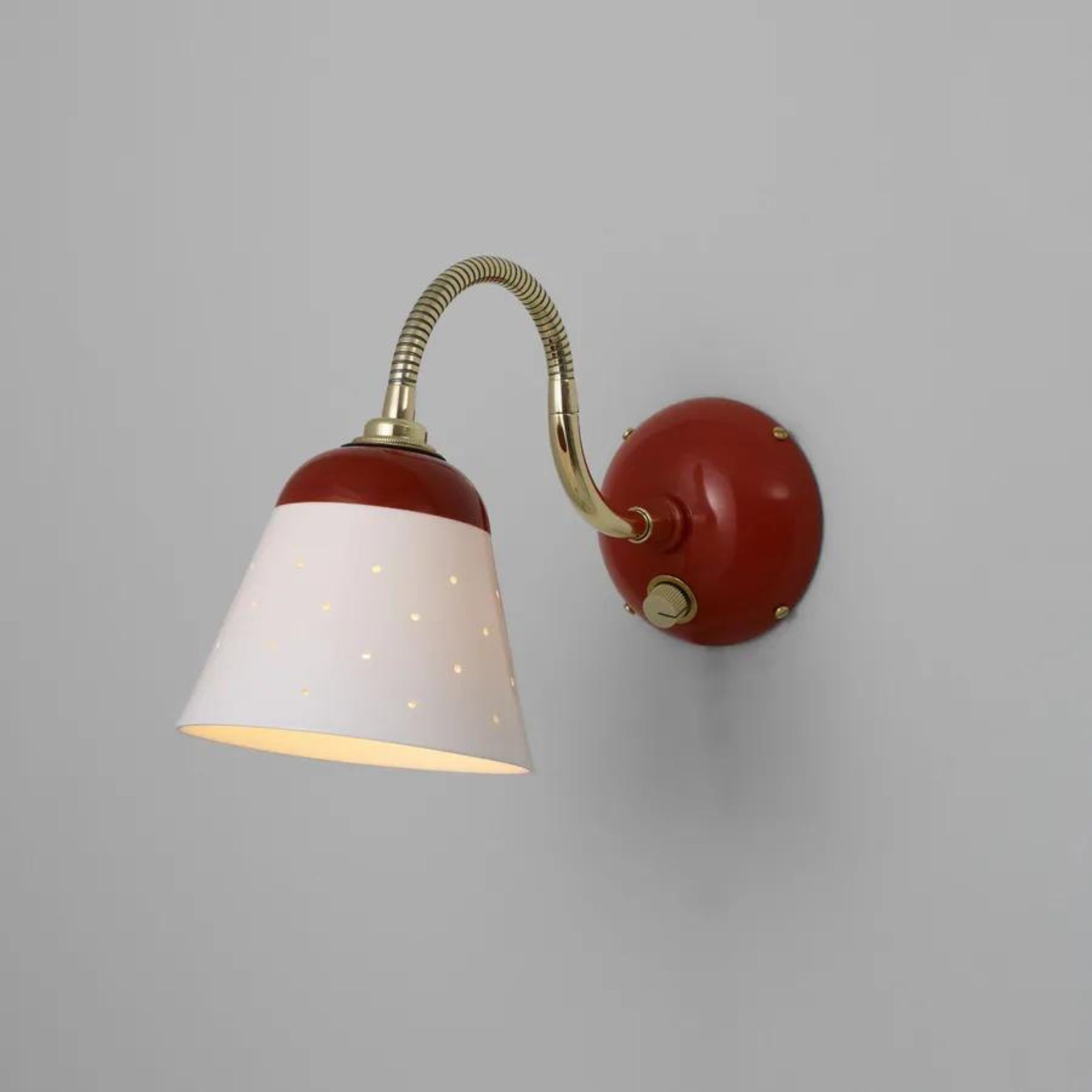
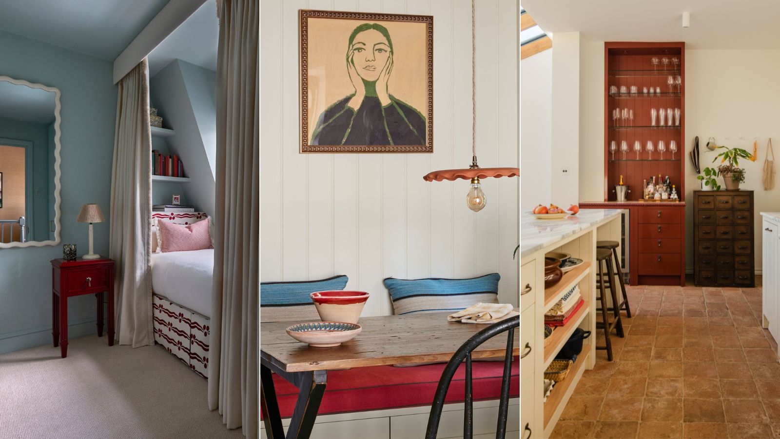
According to Taylor, once that red piece has been added to your room, it automatically looks better. It can be as simple as a red lamp or soft furnishing, scarlet a painted window trim or doorframe, or a completely random brick red cupboard that stands boldly in your otherwise neutral kitchen. I don't know about you, but I'm pretty sold.
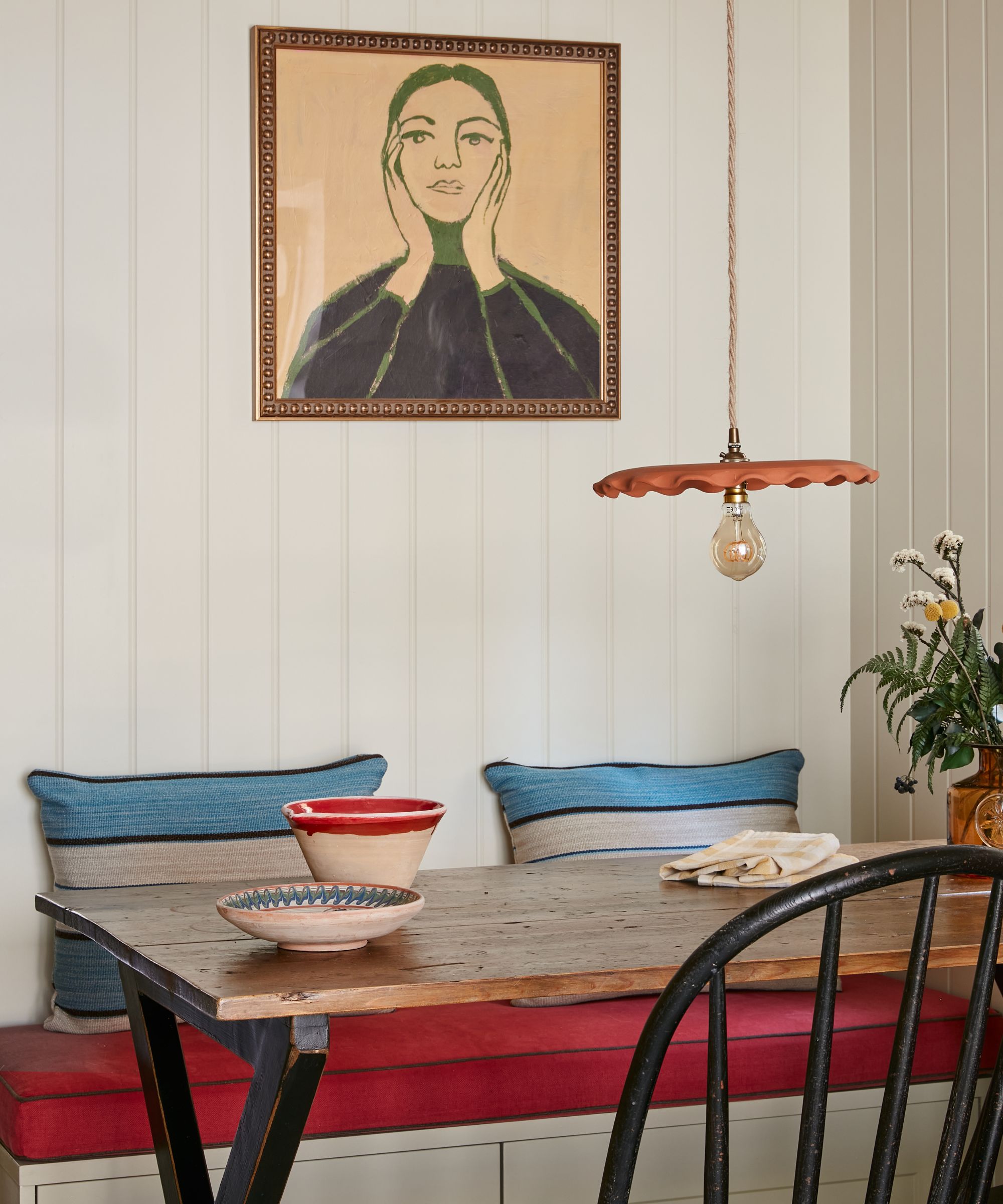
In one example, she shows a traditional corner of a home with a Victorian painting that 'has no business having a red frame, but it automatically updates it and makes it look so fresh.'
Sign up to the Homes & Gardens newsletter
Design expertise in your inbox – from inspiring decorating ideas and beautiful celebrity homes to practical gardening advice and shopping round-ups.
And I think that's the key to this trend, it's taking something mundane and giving it a rather surprising lick of red to really uplift that piece in a way that gives you a good dose of dopamine. In theory, it's a trend that really shouldn't work, but when done right, it can seriously pack a punch.
She even goes as far as to say: 'I'm petitioning for red to be a neutral color because it just looks good with everything.' But could red ever really be classed as a neutral, something to be found habitually in all of our homes? If you're not yet convinced, let's see what the experts have to say.
So is red on trend?
While pink might have been the color of 2023 thanks to interior design trends like Barbiecore, 2024 seems set to be a year dominated by red. Bright reds have been infiltrating my wardrobe of late, seen on everything from a sliver of red socks to all-out red knits, outerwear, and accessories.
This 'pop of red' styling trick, also stolen from TikTok, does exactly what it says on the tin: adding one item in a vibrant shade of red to an otherwise simple outfit in a fun or unexpected way. The result is a surprisingly quiet approach for such a bold hue. So it seems only right that I adopt this same styling hack in my home too.

The thought of decorating with red can be a daunting one, trust me I know, but with this clever way of introducing the shade, I think it might be something I can really lean into.
'Red has to be used in a considered way,' explains Victoria Barker, founder of interior design firm Studio Faeger. 'I tend to use more muddy, earthy reds, which doesn’t mean this makes them darker, it just takes the electric shine out of them.'
'I use reds in moderation and find they really manage to pull a scheme together – and everything else seems to then sit back and relax,' adds Victoria. 'For a more contemporary feel, I love to go the extra mile and use a lacquered finish on red, the gloss seems to sit so beautifully next to a matt, dusky wall color.'
Red is an energetic color and using it in an interior design brings excitement and enthusiasm into the space. Often considered an extroverted color – one that symbolizes danger, anger, and passion – this application of red in moderation not only takes the bite out of it but has turned red objects into a covetable symbol of style.

The key, I'm finding, lies with the color wheel and ensuring you're working to a complementary color scheme. 'Complementary colors are all about contrast,' explains H&G's Head of Interiors, Hebe Hatton. 'All you need to do is pick a color on the wheel, look to the color opposite, and those are your complementary pairings,' she explains.
Essentially I'm talking about groups of colors that greatly contrast, but when used together emphasize the other, such as greens and blues paired with red, to ground the scheme in color theory. For anyone who is not familiar, color theory is a science used by interior designers to understand how humans perceive different hues to seamlessly mix tones and patterns that look pleasing to the eye.
And while this doesn't sound quite as 'unexpected' and spontaneous as TikTok suggests, to guarantee this trend has longevity is to first, of course, ensure it actually does work in harmony with everything else in the room.
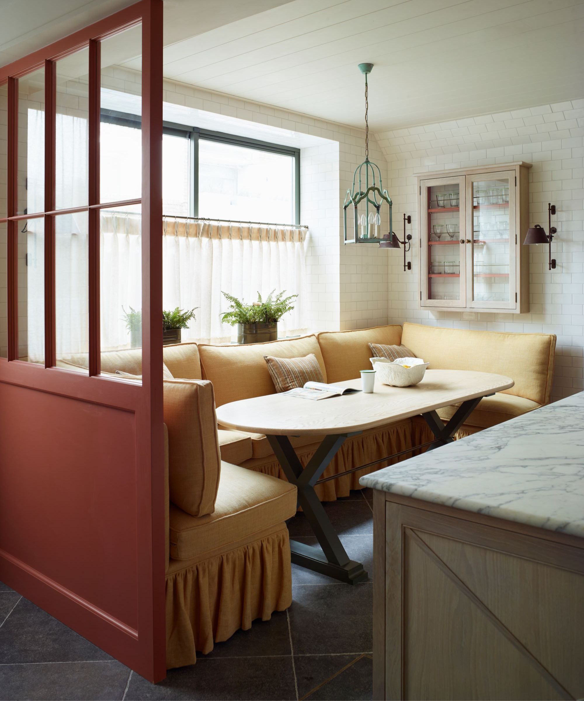
'Blue and red will never get old in a scheme,' suggests Tiffany Duggan, interior designer and founder of Studio Duggan. 'I also love buttery yellow with deep red too.' And that is where she got me thinking about my kitchen.

Hebe is the the Head of Interiors at Homes & Gardens. She has a background in lifestyle and interior journalism and a passion for renovating small spaces. You'll usually find her attempting DIY, whether it's spray painting her whole kitchen, don't try that at home, or ever-changing the wallpaper in her entryway.
How I'm Embracing 'Unexpected Red' In My Home

Admittedly it is half finished, but I have recently installed a neutral kitchen, Shaker-style, complete with green-veined marble backsplash and a green Rangemaster oven. The walls are painted in New White from Farrow & Ball which is subtle but undoubtedly buttery with yellow undertones.
In the corner stands a floor-to-ceiling cupboard that currently houses our gas meter and dog food, and is painted in an un-imaginative white at the moment (decision fatigue hit me hard at this point). But now, with thanks to TikTok's 'Unexpected Red Theory', and armed with the scientific fact that green and red can be seen together, I've just ordered myself a myriad of tester pots in various, tomatoey right through to burgundy-based shades of red.
My favorite thus far? Etruscan Red from Farrow & Ball. It's a deep, browned-based red that will sit atop my terracotta tiled floor with ease. Also in the running is Baked Cherry from Little Greene, Brick Red from Benjamin Moore and Picture Gallery Red from Farrow & Ball.
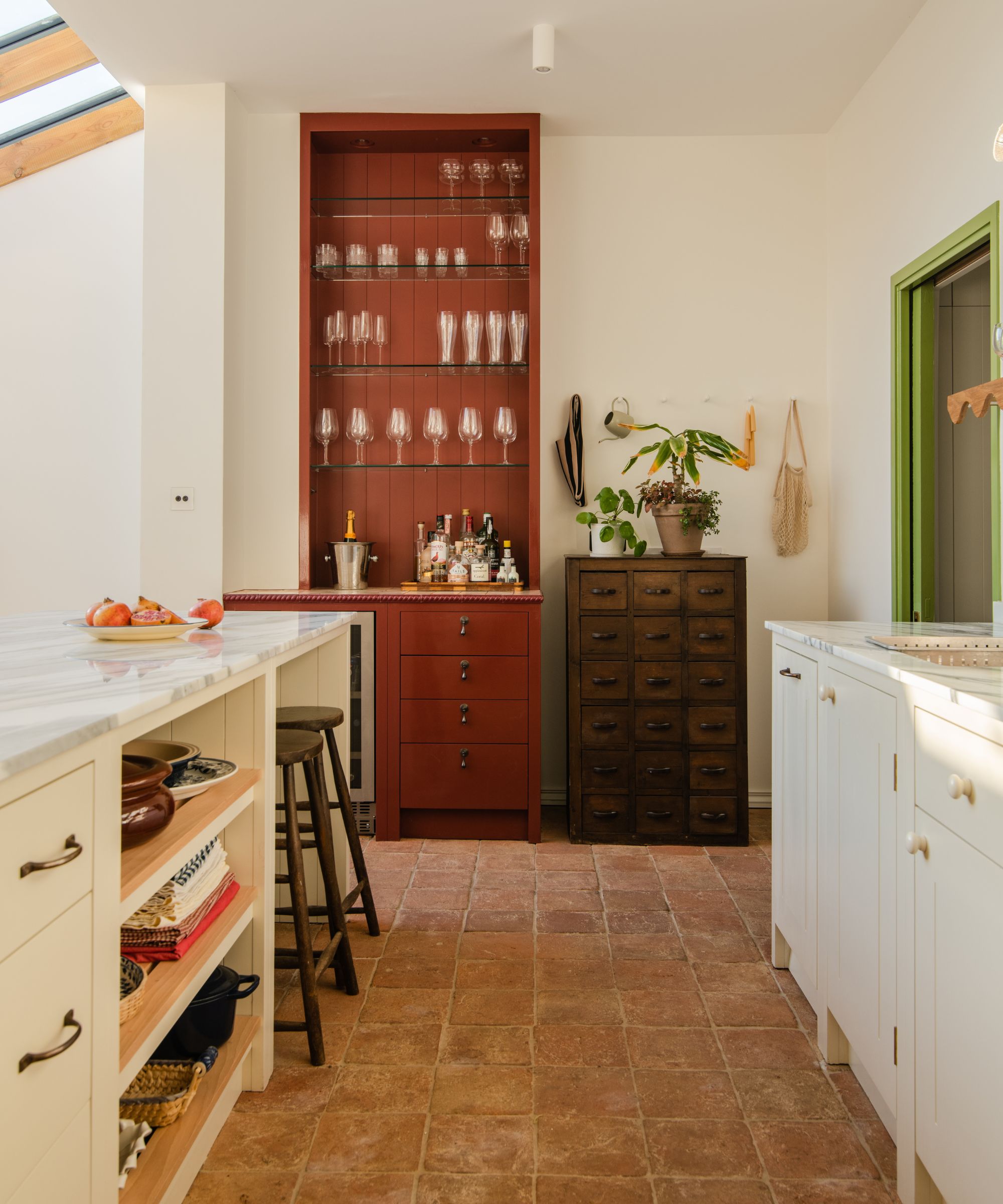
'We can confidently say, red has been a common theme in many kitchens of late,' agrees William Eaves, design and development Director at British Standard Cupboards, who created the kitchen seen above alongside The Home Reform. 'Whilst you might initially think red doesn’t particularly match with much, think again. Red is fast becoming the paint color for 2024 and will undoubtedly elevate your interior.'
'If you’re nervous about introducing the loud statement color into your home, opt for warmer, richer tones,' William adds. 'Stick to your maroons, burgundy, and wine shades and, if you don’t want to commit to splashing red paint across your walls and cupboards, start with accessories as a taste test.'

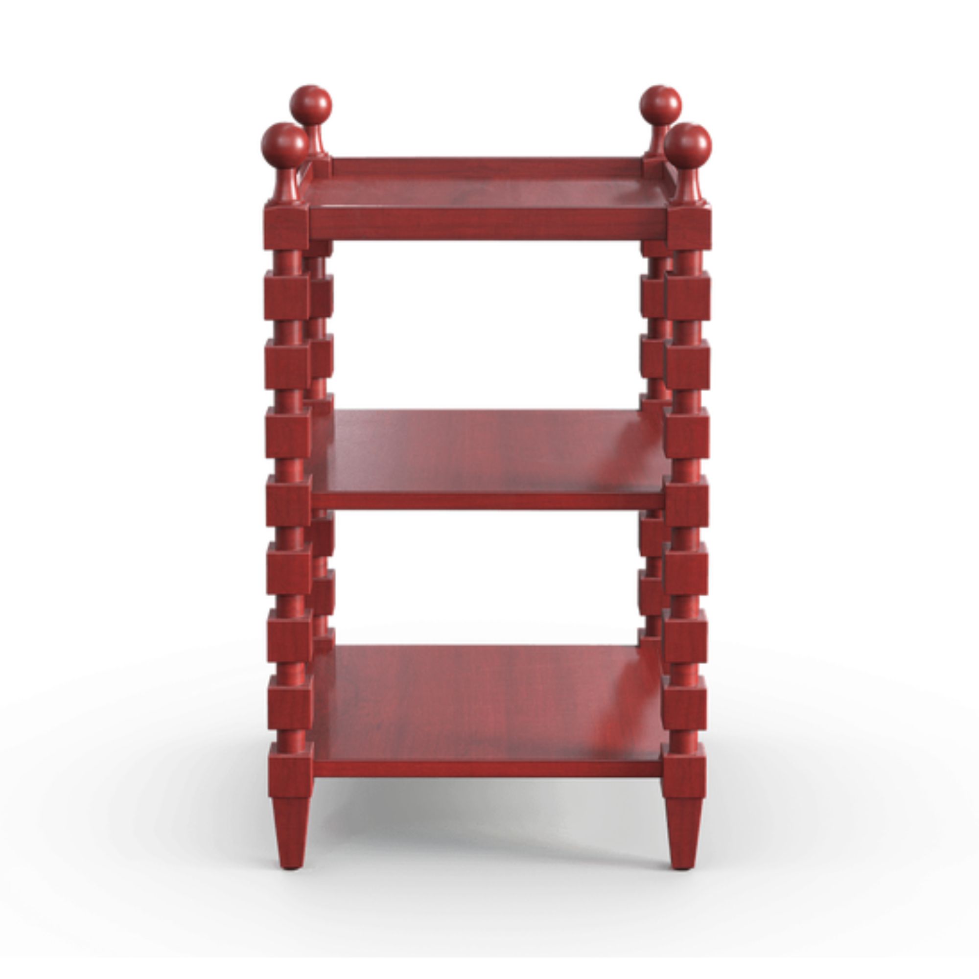
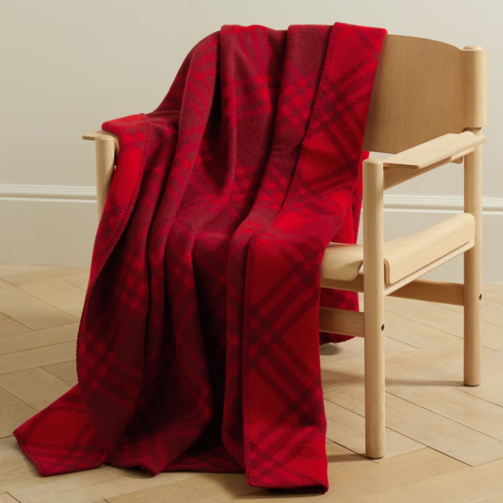
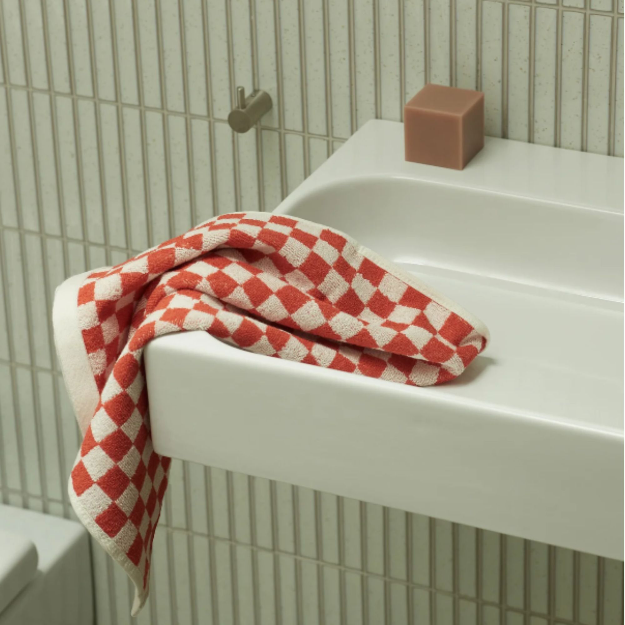
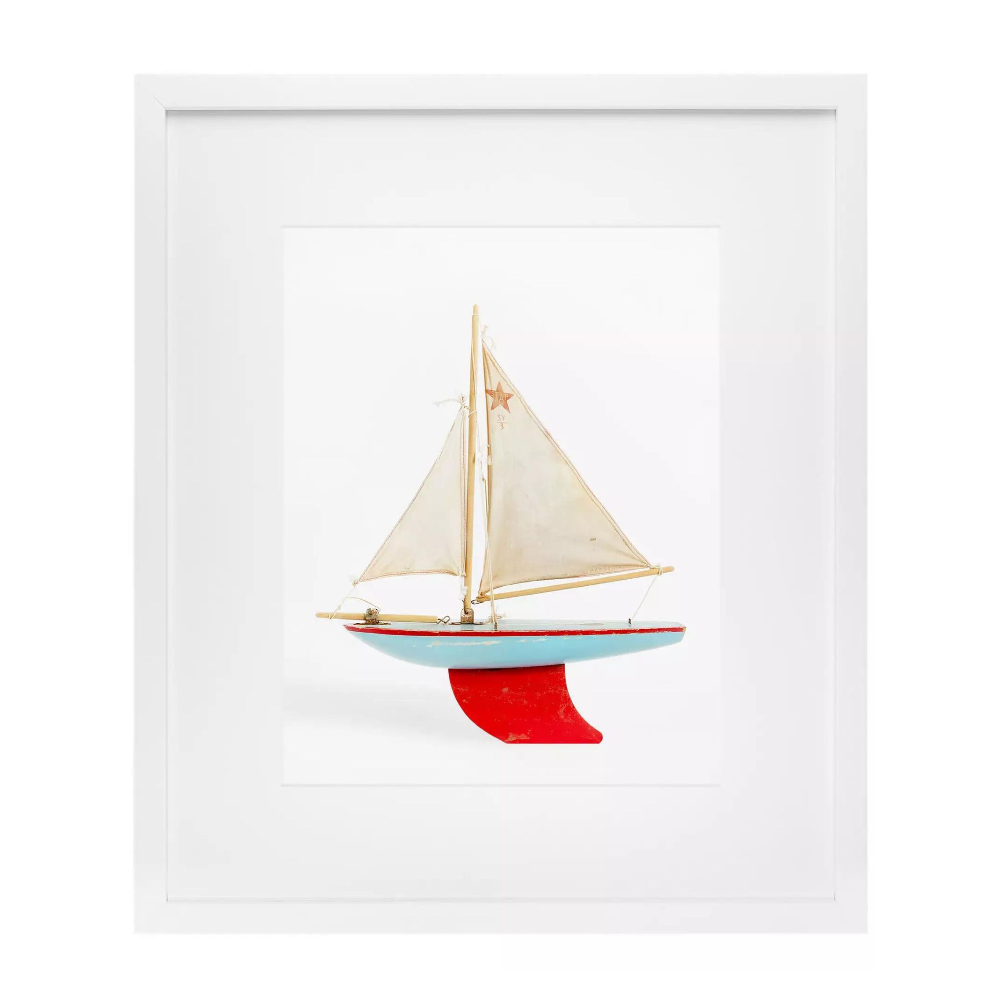
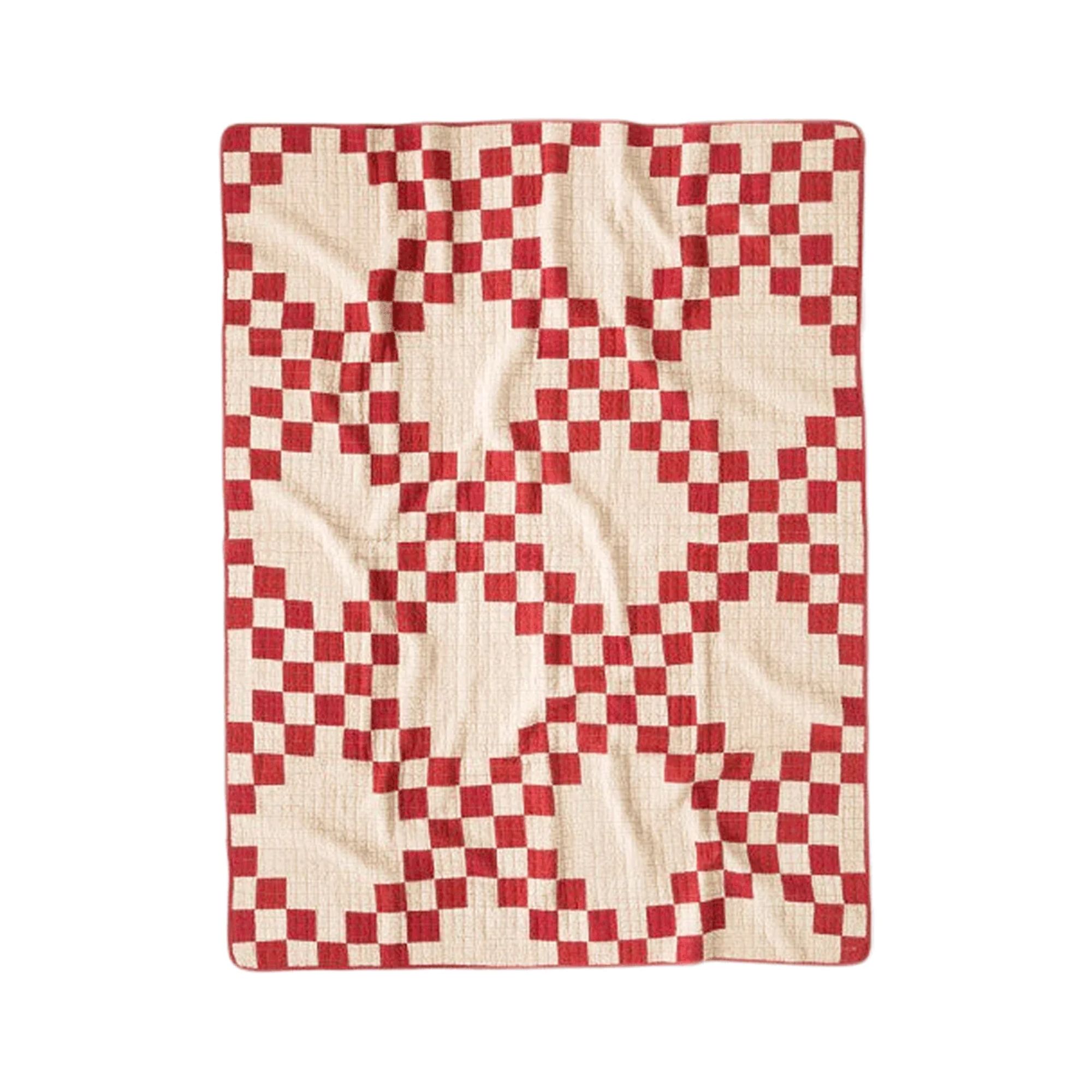
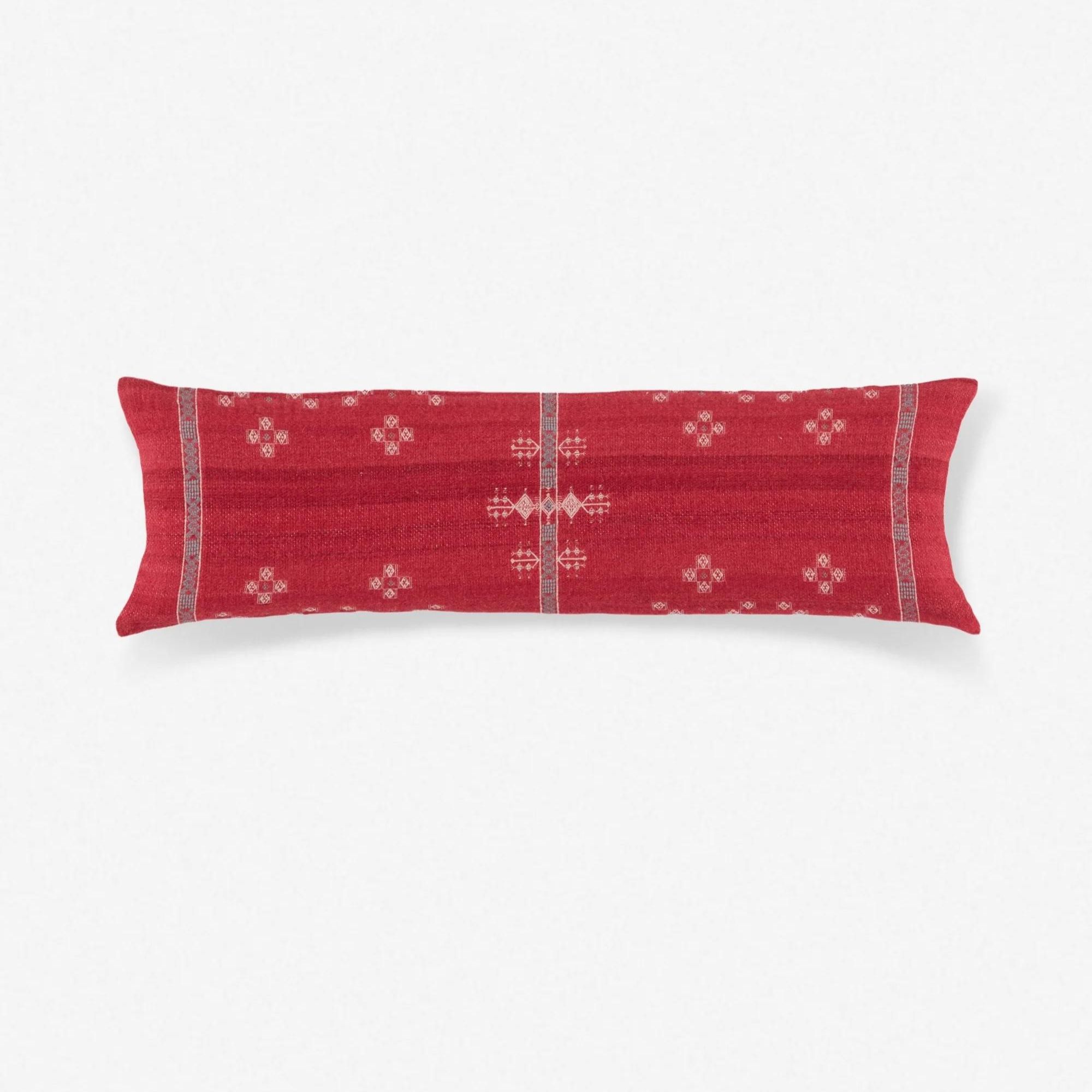
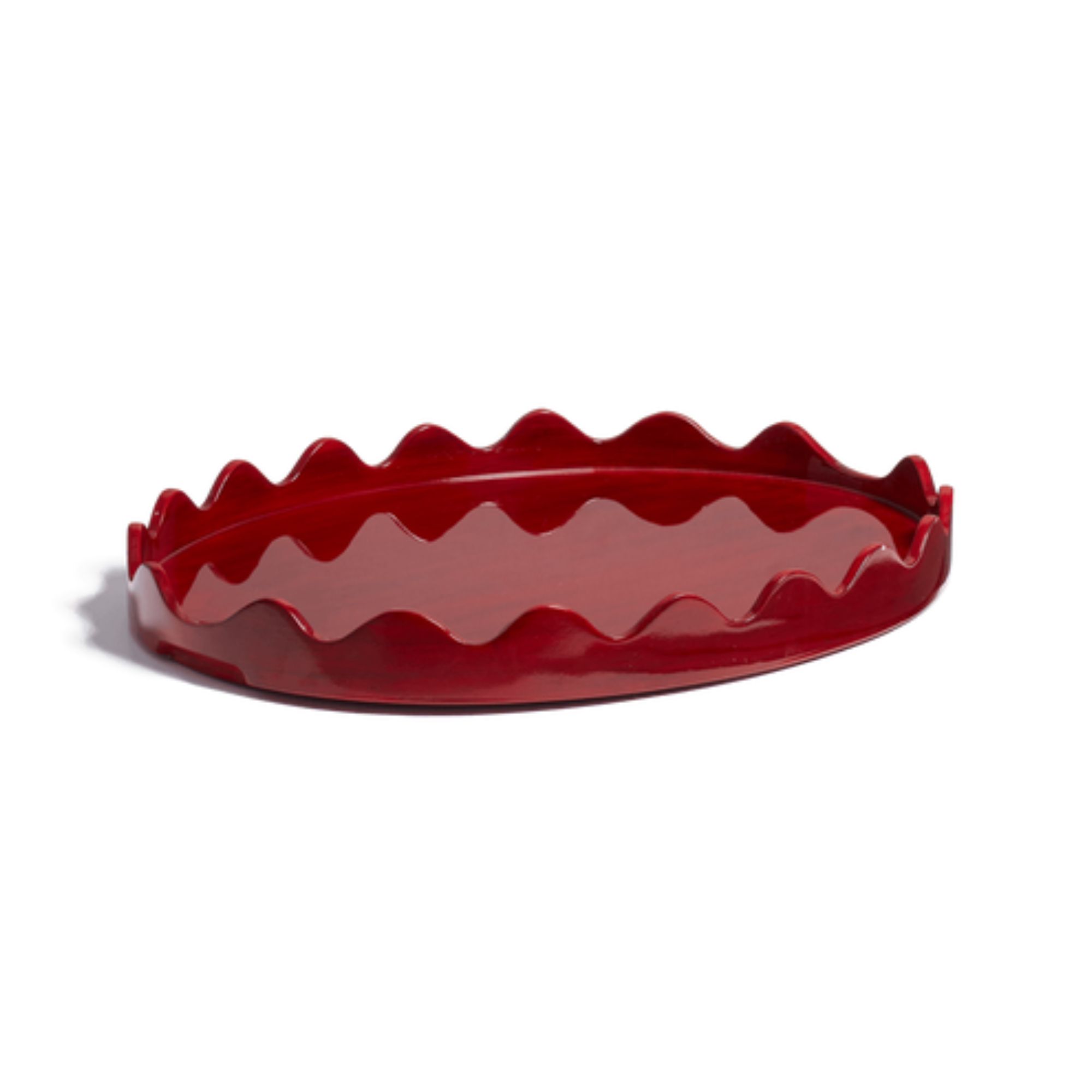
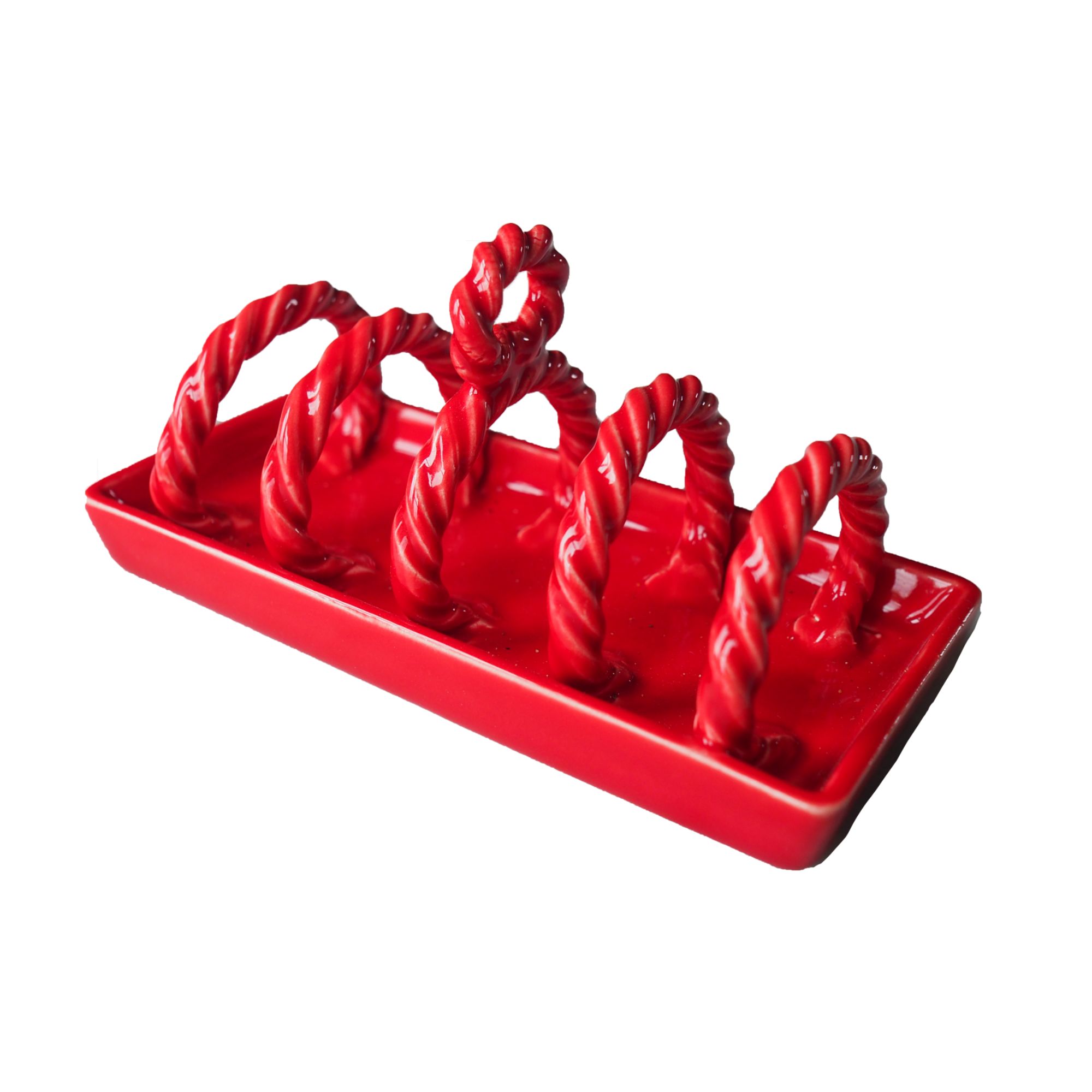
Shop my favourite red pieces
By embracing TikTok's aptly named 'Unexpected Red Theory' in my own home, I'm excited to dip my toe into bolder hues that I would otherwise have shied away from. Embracing a pop of red will bring a sense of energy into my kitchen that it so needs, and in turn will earn me some serious points from the Gen Z decorators – plus, red is known to help distract the eye and conceal ugly household items in the room that you might not want to focus on. It's a trick used in staging homes and one my renovation home could certainly do with mastering.
My top tip? Start with accessories if committing to paint feels too daunting, and just see how that little touch of red makes you feel about the space.

Charlotte is the style and trends editor at Homes and Gardens and has been with the team since Christmas 2023. Following a 5 year career in Fashion, she has worked at many women's glossy magazines including Grazia, Stylist, and Hello!, and as Interiors Editor for British heritage department store Liberty. Her role at H&G fuses her love of style with her passion for interior design, and she is currently undergoing her second home renovation - you can follow her journey over on @olbyhome
-
 6 things you should never throw in the trash – and what to do for safe disposal instead
From batteries to space heaters, experts reveal what not to throw
By Andy van Terheyden Published
-
 Worst-smelling plants to avoid – experts reveal 5 pungent species and suggest perfumed options to grow instead
These are some of the worst-smelling plants that can cause quite a stink
By Thomas Rutter Published
