5 unexpected color combinations that actually work – as approved by interior designers
Would you try these unique color pairings in your home?
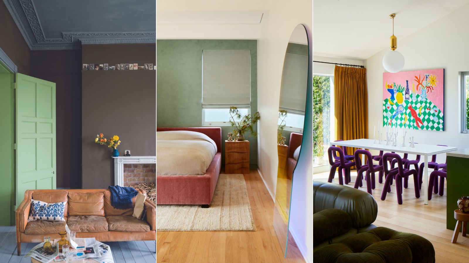

It is safe to say we've all moved on from our millennial gray and sad beige eras and are looking for more ways to bring color into our homes in 2024. But how do you start to create a joyful palette that still remains harmonious?
By pushing the boundaries of typical, tried-and-tested color schemes and embracing unique or overlooked pairings, you can create a home with more depth and personality. There are certain colors that we just know work together, like decorating with blue and white for instance, but what about the more 'unexpected' color trends?
To help you create some unexpected color combinations in your home, we've spoken to interior designers and color fanatics to create 5 stylish color pairings that think a little outside the box. From the subtle and sophisticated to bold and daring contrasts, look to these room color ideas to revitalize your decor.
5 Unexpected Color Combinations
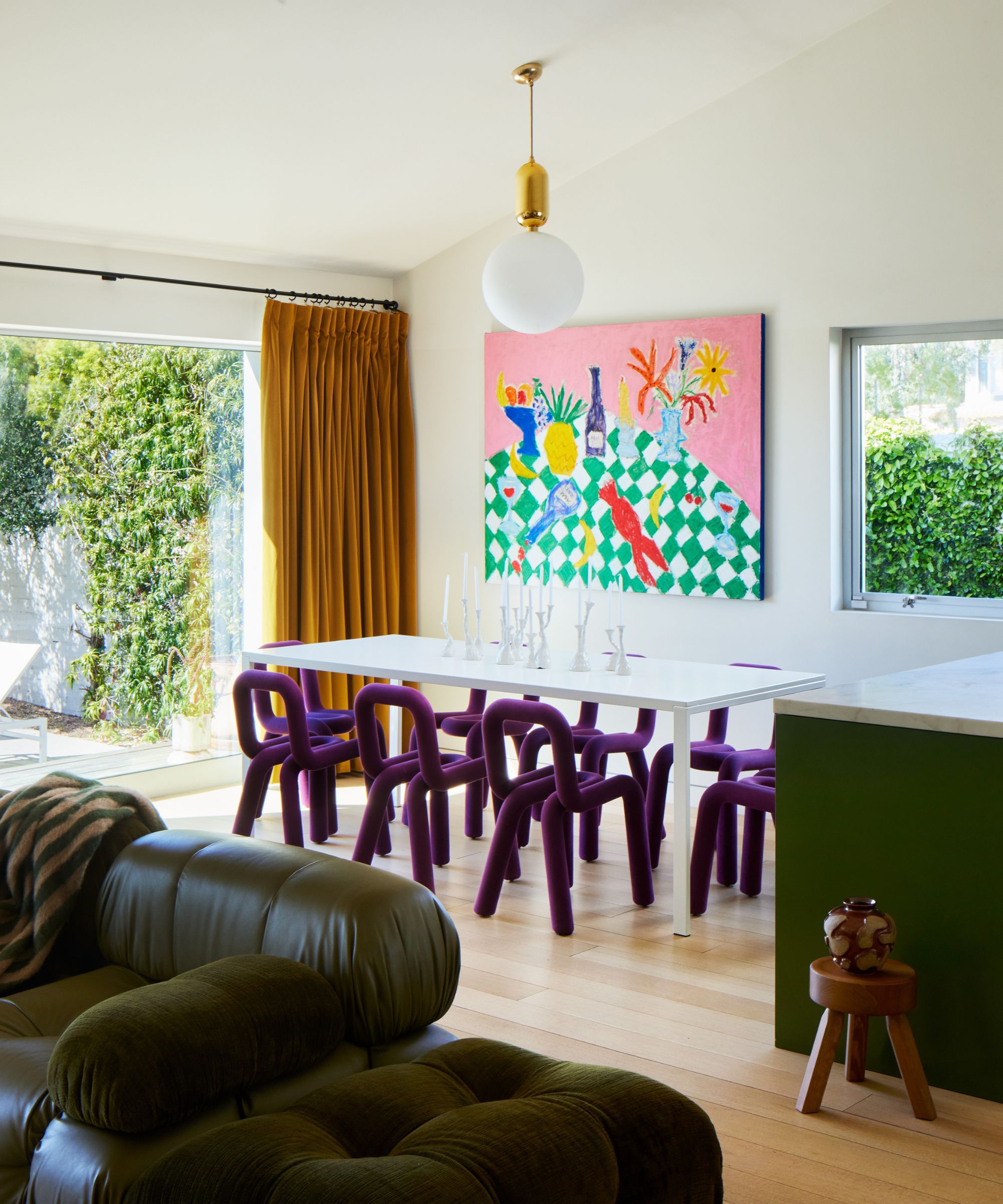
We know that the most calming color combinations are gentle, subtle, and derived from nature, so for something slightly more nuanced, where should we be looking? The answer is opposites do sometimes attract.
'Unexpected color schemes usually work if you include complimentary colors from opposite sides of the color wheel,' says Simon Temprell, interior design lead at Neptune. 'One of my personal favorites is to pair a soft, mid-blue with a bright tangerine. It works because it contrasts the cool blues on one side of the wheel with the warm oranges on the other.'
'The same would apply to red and green, teal and mustard, or purple and yellow,' he explains. 'Also look for color combinations that occur in nature: lichen & moss, aqua & sand, or sky blue & lime green,' adds Simon.
Here, we dive into 5 of our favorite ways to pair unexpected colors to create a color scheme for your whole home.
1. Blue and orange

A dynamic duo, blue and orange might seem like an unlikely pair at first thought. However, when used thoughtfully with just the right hue, these two colors can create a striking balance in a scheme.
As Simon from Neptune explained above, they're complementary colors meaning they sit opposite one another on the color wheel. Blue can provide a soothing backdrop, while orange, with its warmth and energy, adds a vibrant pop that energizes a space. Consider using softer shades of blue and muted tones of orange for a more subtle look. This approach can be particularly effective in spaces like living rooms or bedrooms where you want to create a tranquil yet inviting atmosphere.
'We normally see navy blues or deep blues matched with bright colors, but a color combination that isn't typically seen is ice blue paired with mustard, rust, or orange,' suggests designer Linda Hayslett of LH.Designs. 'You may see these colors with ice blue in places like a hotel space or a cafe but, in homes, you don't often see ice blue with pops of orange. It can be a great combo for spaces and homes with a whimsical feel – ice blue and rust would be great in any dining room setting, for example. Rust paired with a light ice blue paint color could make even a bedroom fun and happy,' she adds.
2. Burgundy and yellow
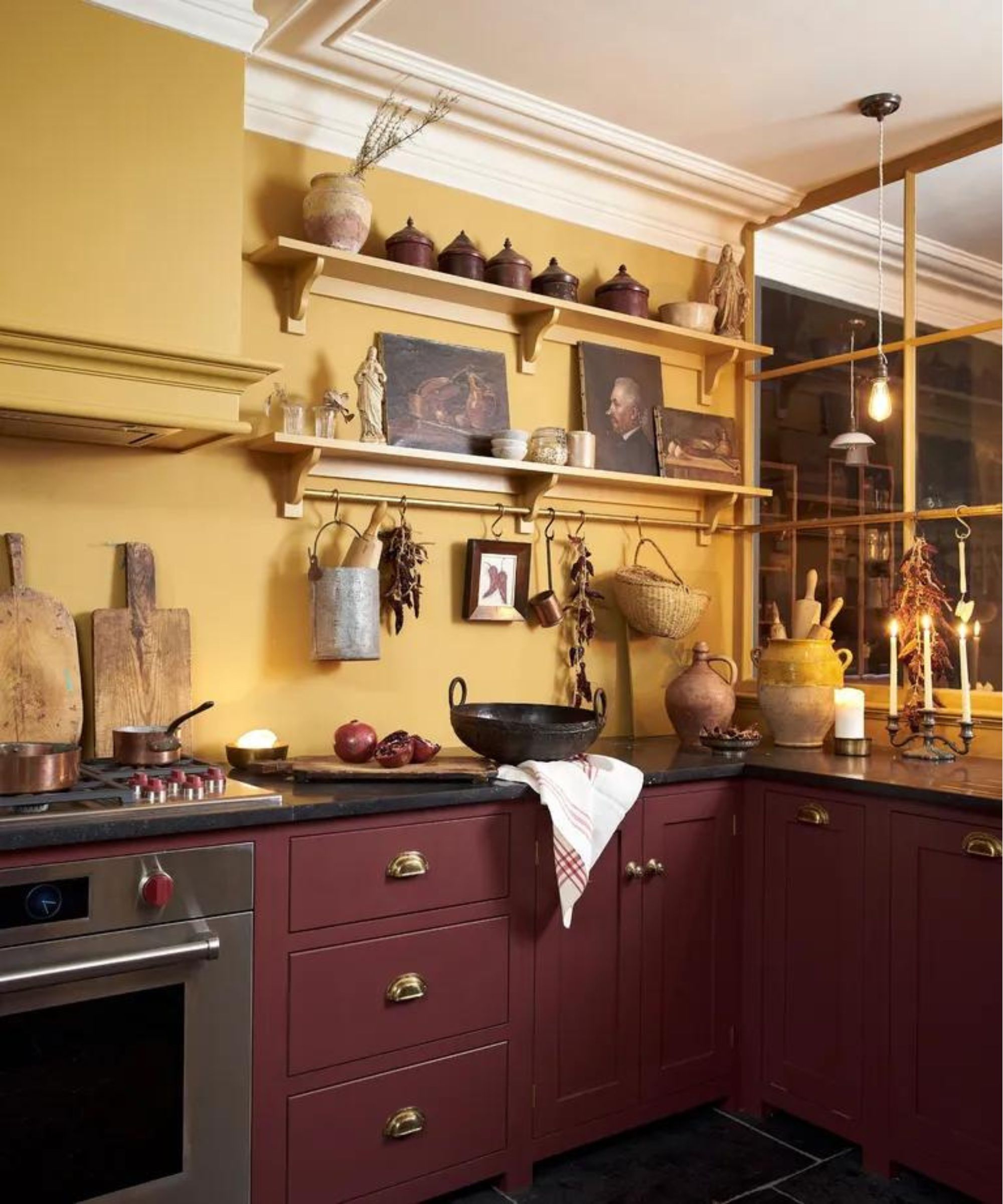
While deep dark burgundy reds and buttery, sandy yellows is a color combination that befits a classic English kitchen, like the one designed by deVOL seen above, it isn't a typical scheme for more modern homes. Burgundy, a rich and elegant hue, exudes warmth, while yellow adds a vibrant touch that complements the deep tones of burgundy beautifully.
Contrast is key in design; it's what creates character and depth. 'I am a big fan of testing unexpected color combinations,' says designer Kathy Kuo. 'I love the idea of pairing jewel tones like emerald, sapphire, amethyst, and burgundy with warm neutrals like sand, terracotta, and goldenrod. The darker tones tend to feel more formal and the lighter ones more laidback so that combination creates a really lovely happy medium that you might not expect.'
And it's not all about paint choices. Mixing materials like velvet burgundy fabrics for drapery and window treatments, and brass or gold accents to introduce yellow tones can add a touch of glamour without feeling too bold.
3. Green and brown

When we talk about color palettes derived from nature, you typically think of decorating with neutrals like sandy earth tones, muted sage, and sky blues. But have you considered the more muddy combination of brown and green?
'Greens always exude calm, an essential state of mind for our busy lives,' says Patrick O'Donnell, international brand ambassador at Farrow & Ball. 'Be adventurous and consider pairing green with something unexpected like Broccoli Brown from Farrow & Ball to amplify the palette of nature and create a bold design statement.'
This combination is versatile and adaptable. They work together seamlessly to create a soothing and grounded atmosphere, making it suitable for various interior design styles, from rustic and organic to modern and classic. Whether you opt for a muted palette with soft greens and warm browns or a bolder combination with vibrant lime and deep chocolate browns, experimenting with various shades and textures can help you achieve a cohesive and inviting design.
4. Pink and green
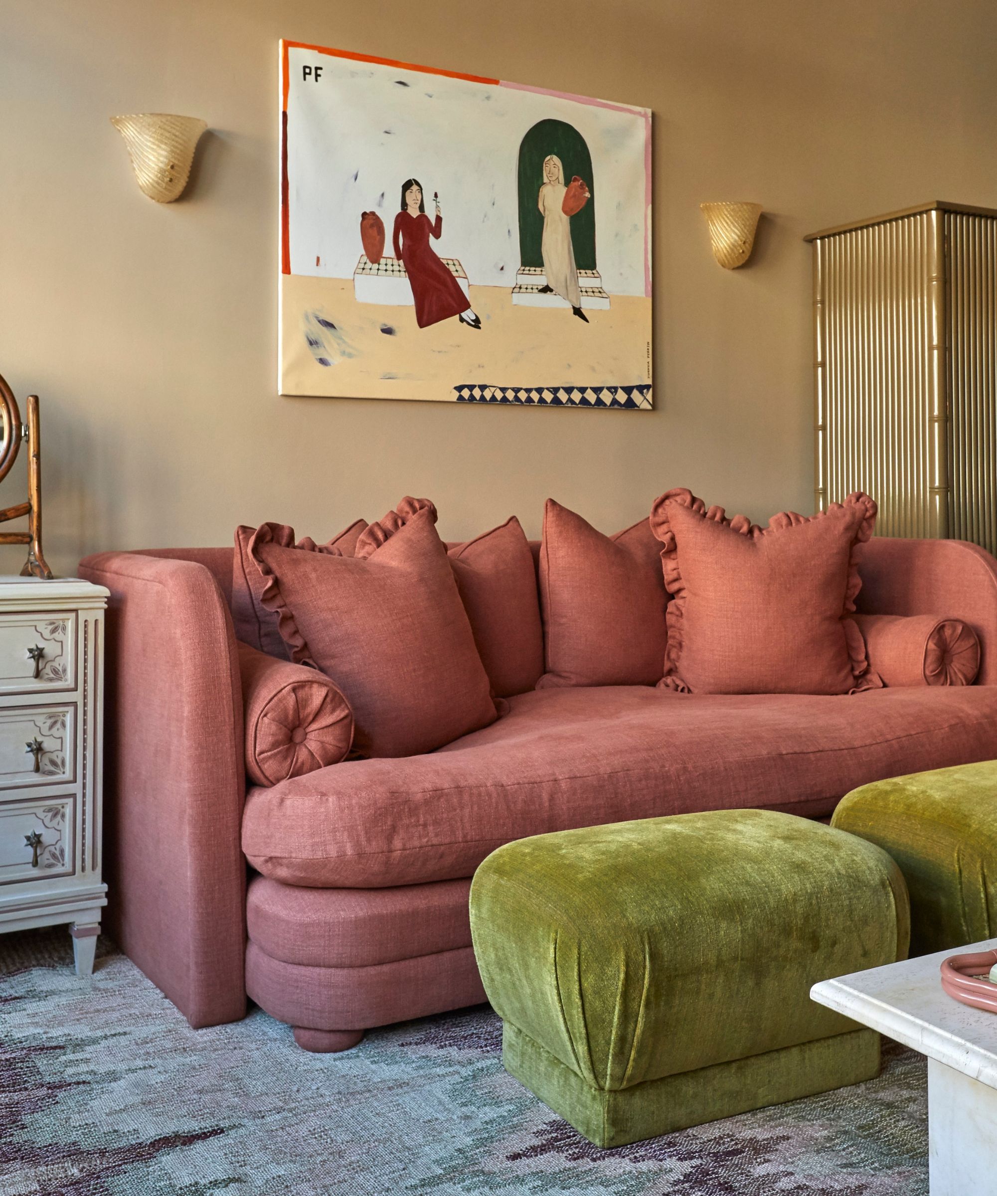
Sure, in spring and summer pink and green feel like an achievable color combination, but how do you make it feel design-led all year round? Or maybe you find these colors look more at home in a children's room and are wondering how to bring this fresh pairing into more grown-up spaces? The success lies in the tones and textures used.
The combination of pink and green might evoke thoughts of springtime and floral motifs, but this vibrant pairing can bring a playful yet sophisticated charm to any space. 'I love khaki and magenta,' suggests Bethany Adams. 'It's a combo I first discovered in design school when the professor urged us to find an 'ugly color' in a pile of color chips and make it beautiful by finding its perfect pairing. I've been obsessed ever since.'
Don't be afraid to experiment with different shades and tones to find the perfect balance. Pistachio and dark pinks through to burgundy reds also pair well, while lime greens and dusky pinks are a failsafe combo. Whether you prefer a soft and whimsical aesthetic or a more refined and understated vibe, the key is to find a blend that resonates with your personal style and complements your space.
5. Red and green

Red and green are not just for Christmas. But to avoid this pairing looking too festive, look to more muted iterations, like a mossy green or a mid-green/blue tone with wine reds, crimson, or an orange-based terracotta. Bold color combinations like red and green can create a sense of drama and excitement in a room, making it feel alive and energetic.
'Introducing contrasting colors into a scheme can be a brilliant way to add a touch of drama, make an instant design impact, and refresh a space, as well as highlight characterful, architectural features' says Ruth Mottershead, creative director at Little Greene. 'Look to introduce these color highlights in smaller ways by painting the woodwork and skirting, or perhaps adding a painted line as a detail. Or why not embrace a layered approach, adding two colors to the wall such as the deep evocative Cape Red from Little Greene with the jewel-toned Mid Azure Green from Little Greene. Adding a third layer of color like a joyful, sunny yellow will bring a sense of balance and contrast to the darker shades. These unexpected pairings can really work together in a room, creating a very considered and truly bespoke finish.’
When incorporating red and green into your interior design, consider balancing these vibrant hues with neutral tones and natural textures to avoid overwhelming the space. Using a mix of materials like wood, metal, and textiles can help to soften the impact of bold color choices like red and green, creating a more harmonious feel.
Whether you're drawn to the soothing harmony of green and brown or the contrast of burgundy and yellow, each of these seemingly unexpected color combinations offers its own unique charm and appeal. By embracing these unique pairings and experimenting with different shades, textures, and finishes, you can create rooms that are as vibrant, dynamic, and individual as you are.
Sign up to the Homes & Gardens newsletter
Design expertise in your inbox – from inspiring decorating ideas and beautiful celebrity homes to practical gardening advice and shopping round-ups.

Charlotte is the style and trends editor at Homes and Gardens and has been with the team since Christmas 2023. Following a 5 year career in Fashion, she has worked at many women's glossy magazines including Grazia, Stylist, and Hello!, and as Interiors Editor for British heritage department store Liberty. Her role at H&G fuses her love of style with her passion for interior design, and she is currently undergoing her second home renovation - you can follow her journey over on @olbyhome
-
 The 5 biggest design mistakes I have made in the last 20 years of decorating and renovating – and what I have learned from them
Life is all just trial and error, or at least, the way I've been decorating has been
-
 Diane Keaton's former Lloyd Wright-designed home is a mid-century modern treasure trove – it's listed for $12.8 million
The actress purchased an iconic property in the Pacific Palisades, which she lovingly renovated – today, it's as timeless as ever (and in need of a new owner)