This 'transitional' Austin home blends the indoors and outdoors with ease – have a look inside
Sara Malek Barney of BANDD/DESIGN overhauled the home's outdated exterior, and gave the interior a stunning nature-inspired refresh

The most impressive homes blend functionality and aesthetic appeal with ease, and this Austin, Texas retreat fits the bill. Designed for a young family of four, the five-bed, six-bath home now features nearly 5,500 square feet of style.
But when Sara Malek Barney, founder and principal designer of Austin- and Los Angeles-based BANDD/DESIGN, was tasked with giving this outdated Tuscan-style home an overhaul, the end result felt a world away. With structural issues and outmoded design, this resulting masterclass in transitional style was no easy feat.
Now featuring characterful architectural details, a nature-inspired color palette, and family-friendly designs, the Texas home is stunning from the front entrance to the laundry room. To hear more about the renovation process and the inspiration behind the design, we sat down with Sara – here's what she had to say about the transitional-style space.
Take the tour
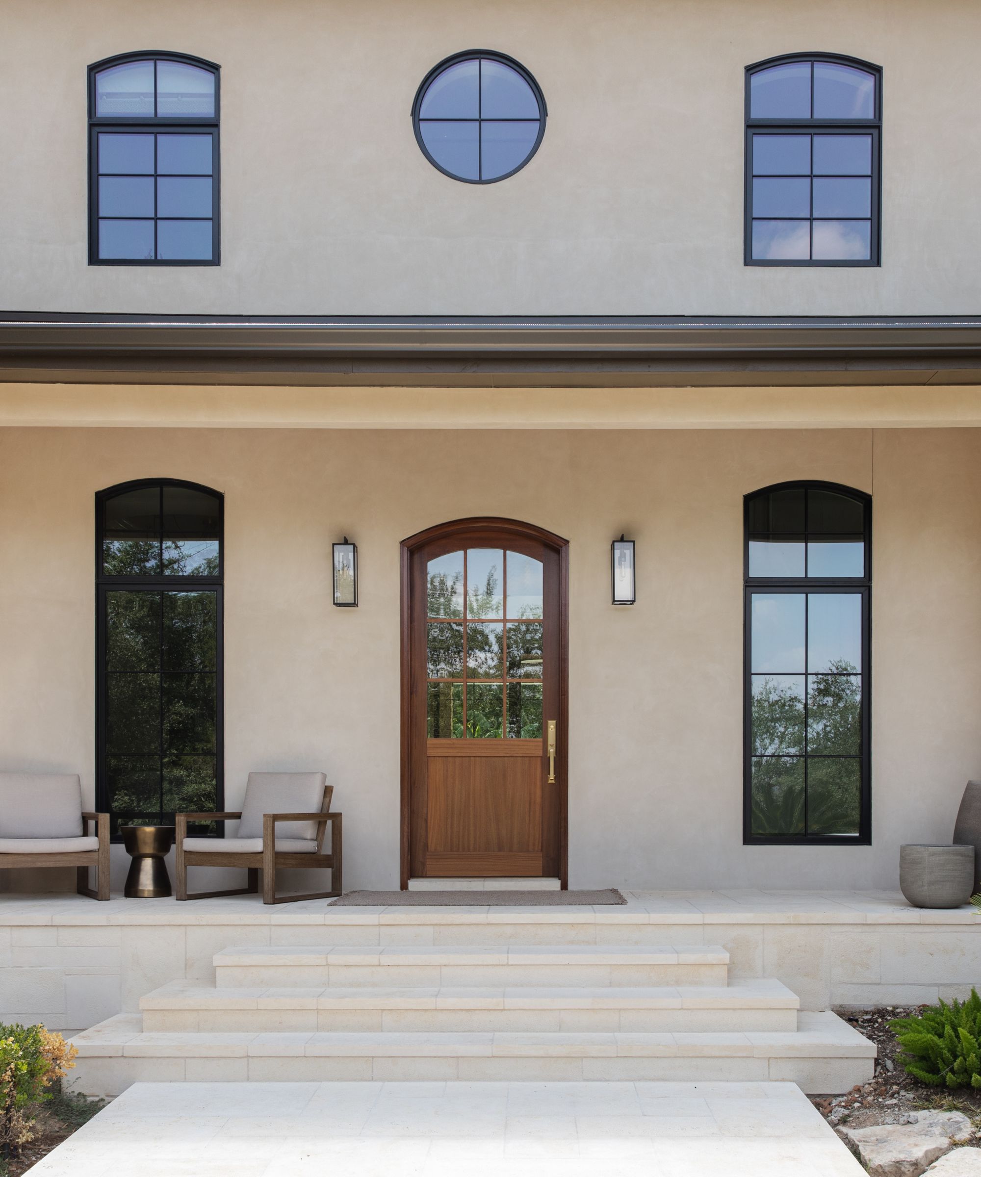
Both Sara and the homeowners agreed: this Austin home's original exterior was due for an upgrade. But when the BANDD/DESIGN team started to 'make somewhat minor changes,' they discovered a problem. The home had never been water-sealed, meaning that the entirety of the stone façade had to be replaced.
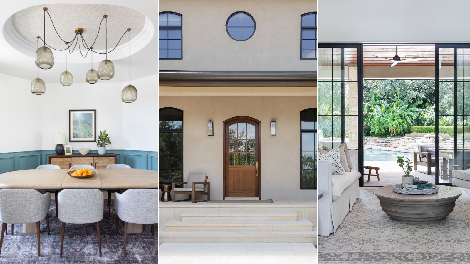
Because they were replacing the pre-existing stone, Sara and the team were able to give the exterior a true overhaul, and the end result is stunning. With a neutral, limewash-textured finish, a comfortable lounge area, and a grand wooden front door, this home impresses before guests step inside.
'This massive discovery led us to redesign the front a bit more to allow for a small seating area and a more traditional, yet welcoming front porch,' Sara tells H&G. 'The original exterior felt dated and dingy, but this new one is much brighter.'
The home's construction shortcomings certainly proved frustrating during the design process for everyone involved, but they opened up a world of possibilities. Not only did Sara upgrade the furniture and finishes inside the home, but many areas received structural and architectural upgrades as well.
'I think it is so important to remember to be flexible when remodeling a home. You never know what will come up once walls are opened up!' says Sara. 'That said, I think the bathrooms became much more functional, the new windows brought in a lot more natural light and now the exterior of the home has been modernized in a way that still stays true to the original architecture.'
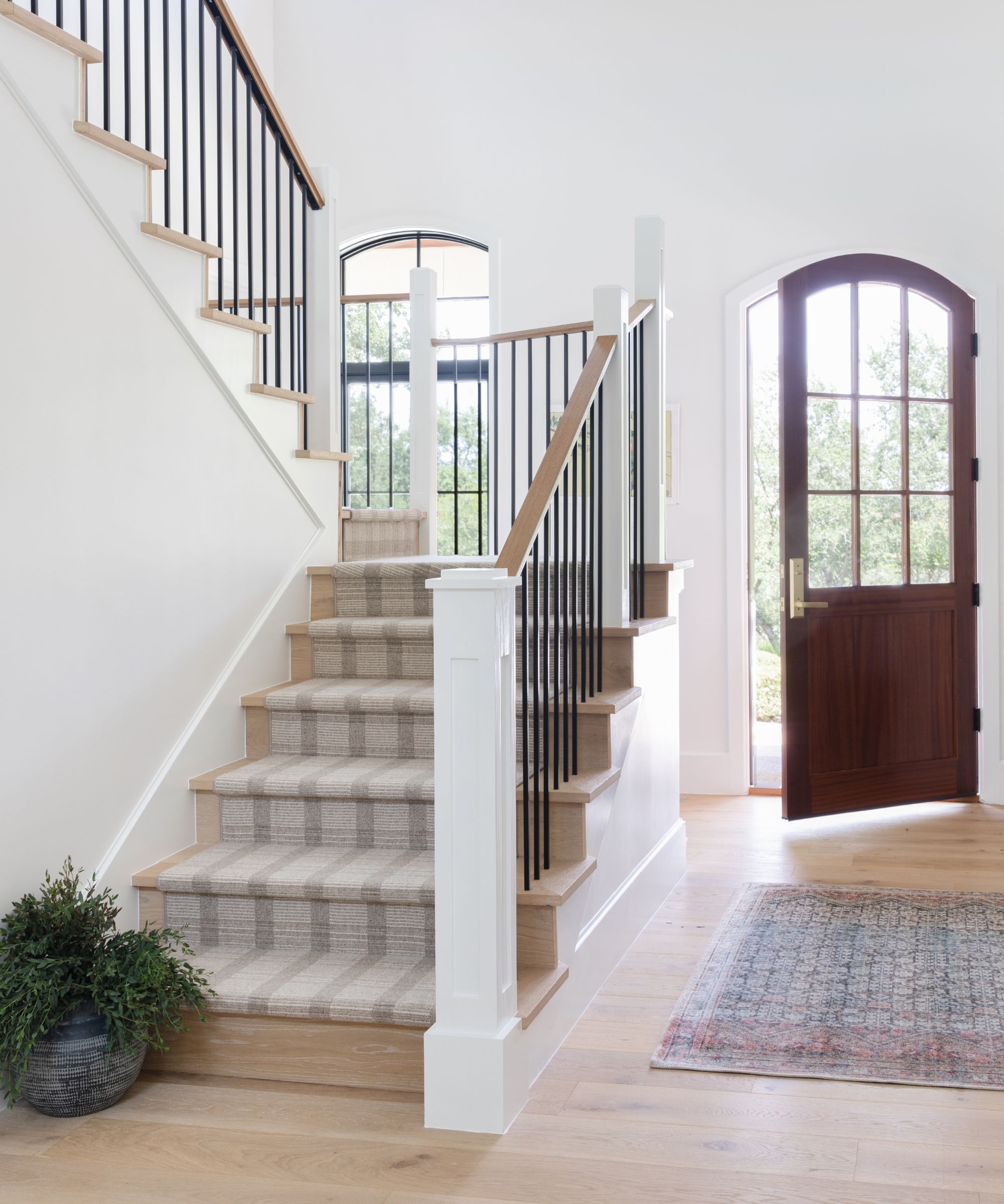
The entryway is one area where the original structure largely stayed intact, though the railings, runner, and paint all underwent a refresh. With high, expansive ceilings, an elegant staircase, and loads of natural light, it's a breathtaking introduction to the Austin abode.
Architectural features often add value to a home, but they always add charm and eye-catching interest. Sara says that this home 'lacked a lot of architectural detail' at the beginning of the design process, so adding in bespoke character was at the top of her priority list throughout.
'The client’s preference leaned transitional with a touch of traditional. I felt the added details helped lean towards that traditional side without going all the way in,' she says. 'Overall, I think it gives it a much more tailored, finished look.'
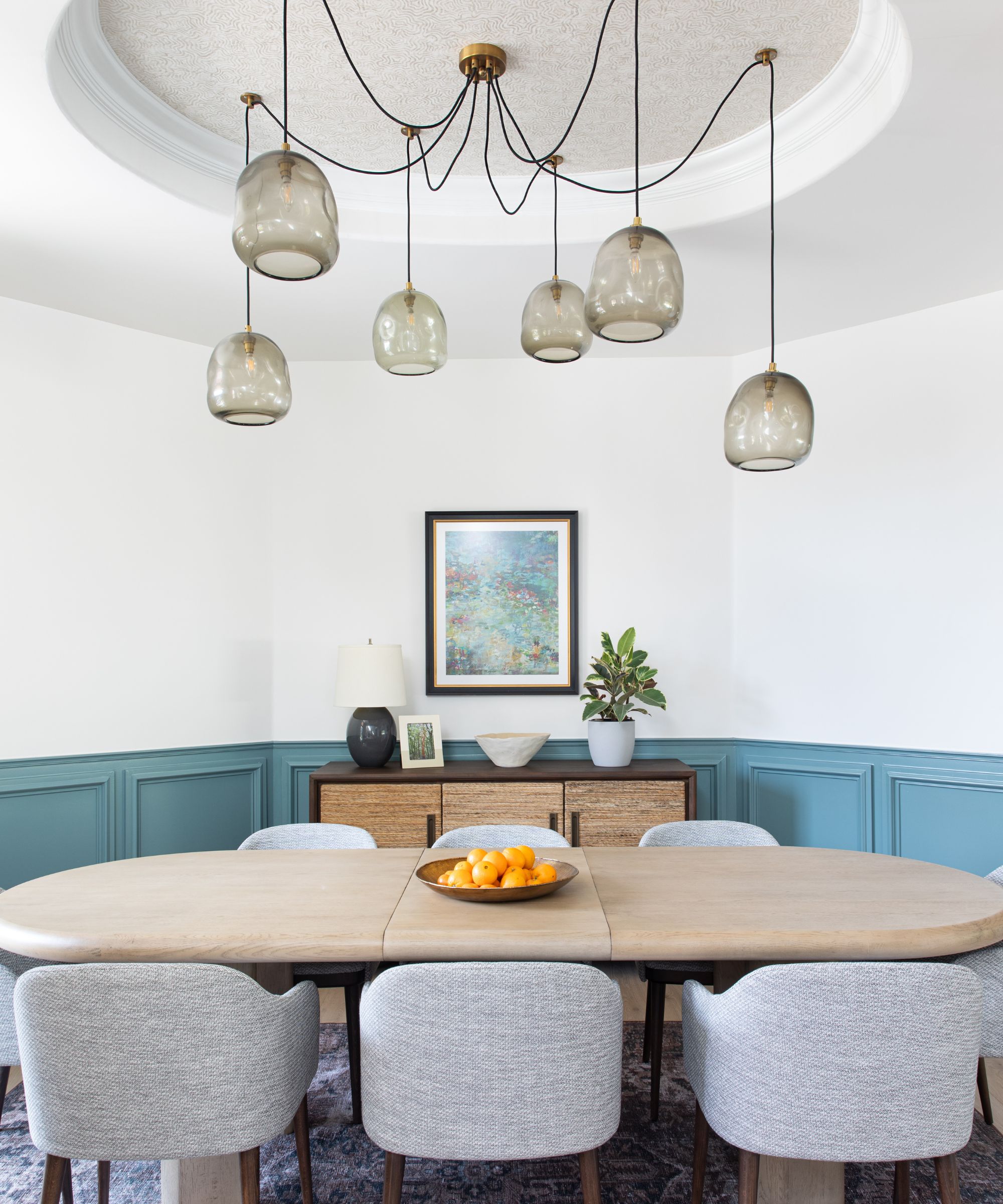
The dining room, pictured above, already featured a sculptural alcove in the ceiling, and it housed a pendant light fixture. For the finished look, Sara kept the alcove around, but opted for a statement chandelier with six glass pendants in a spider-like arrangement. She also added half-wall paneling in a calming blue tone for a bit of extra architectural interest.
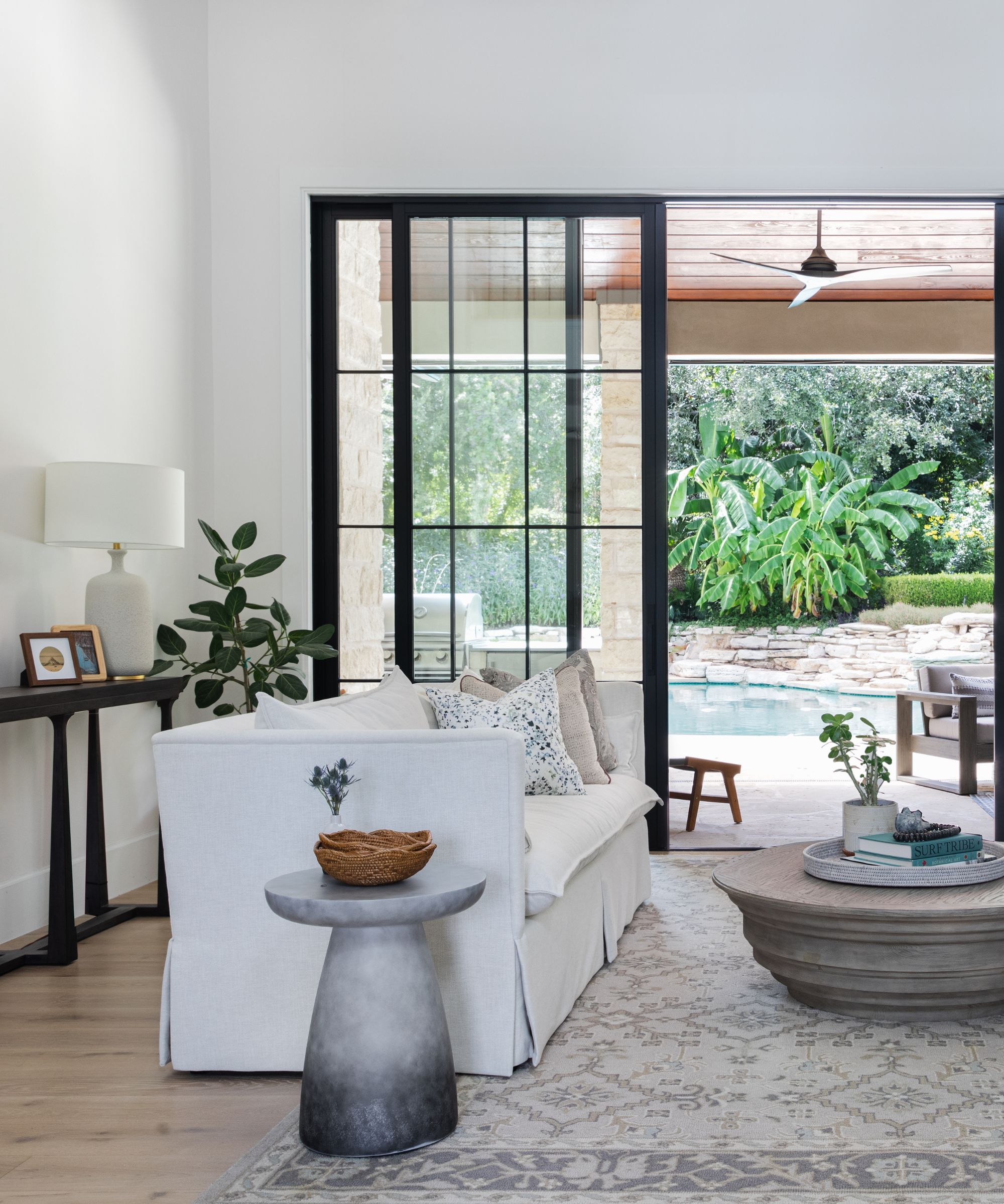
Taking inspiration from nature was key in this home renovation, especially given its sunny environment and stunning outdoor pool.
Although expansive windows contribute plenty of natural light, and larger-than-life sliding glass doors open directly into the backyard, nature's influence can be found throughout the space's furnishings and details too.
'Using natural materials and organic forms in the furnishings helped blend the outdoors with the indoors. Overall, because the home sits on such a stunning piece of land, we definitely want the two spaces to marry into one another. Lots of natural wood tones, an earthy color palette, and various shapes throughout, I think lend to that indoor-outdoor feel,' says Sara.
Sara says that 'functionality is always the most important part' of her firm's designs, and this five-bed, six-bath home for a family of four was no exception. The space needed to be suitable for a busy family's on-the-go lifestyle, and every detail was selected with this fact in mind.
'If the space cannot be used to its full potential then we are not doing our jobs!' says Sara. 'A space can be beautiful and high-end but still be approachable and functional. I honestly could never design something so precious that it could not be properly enjoyed! This is the cornerstone of our design work.'
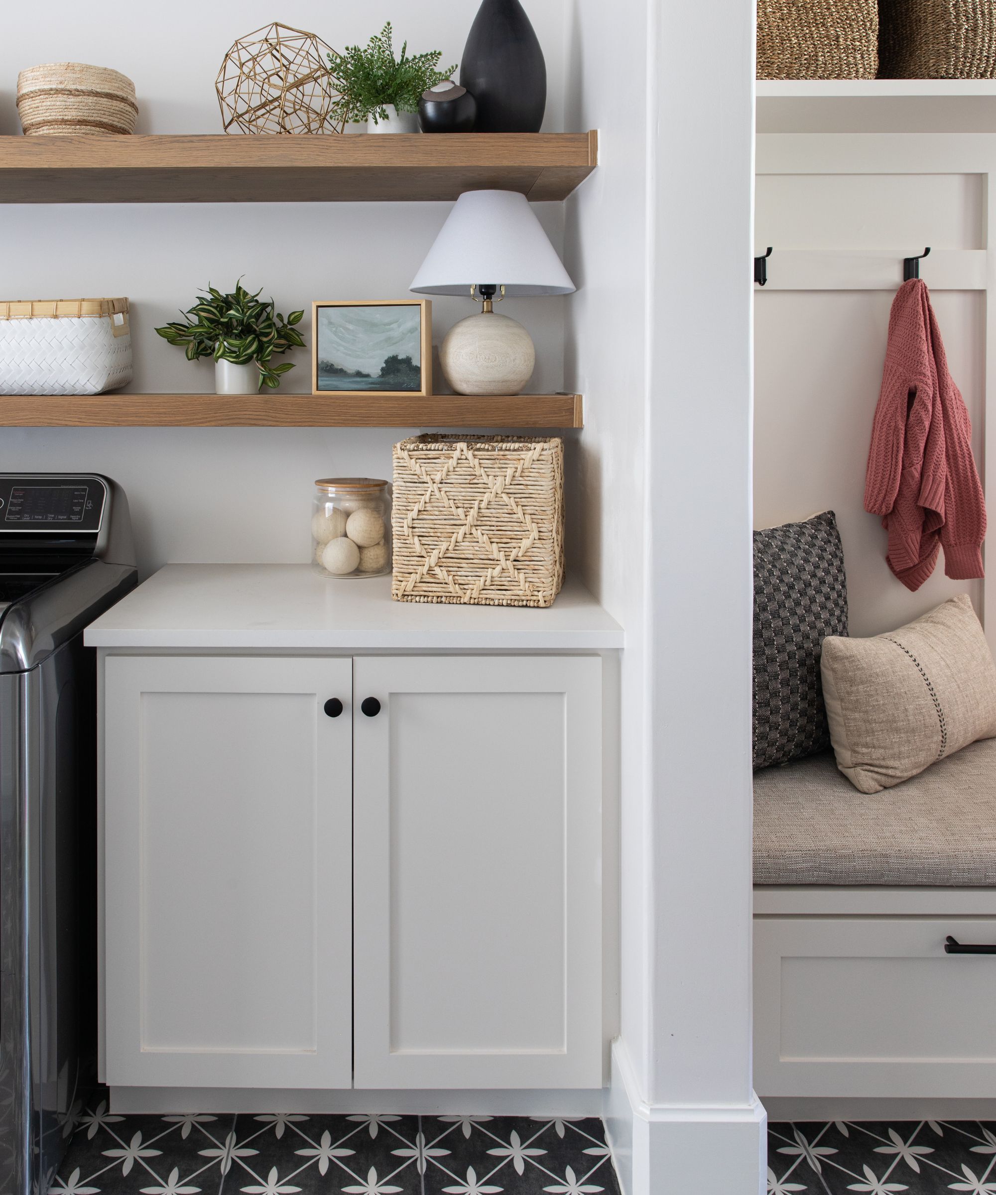
Prioritizing functionality doesn't mean letting the design style slip, though, and this home's laundry room is the perfect example. Though a function-forward space at its core, this laundry room features organic open shelving, statement black-and-white tile on the floors, and a cozy bench with heaps of sleek storage.
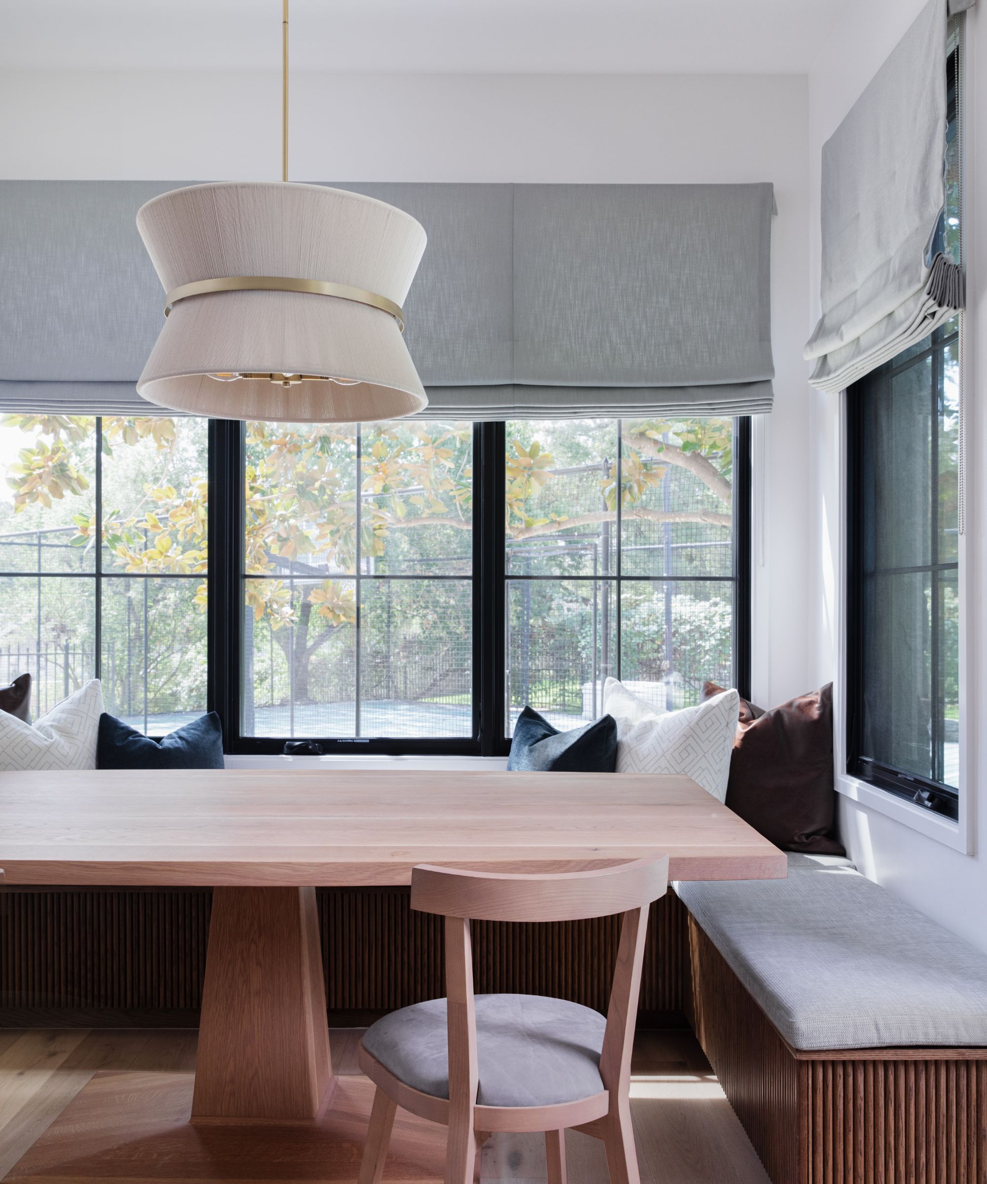
'In several areas, we opted to take the custom route so that the clients' needs were matched perfectly. Again, functionality was of utmost importance, but because they are also a young family, I wanted them to feel approachable and comfortable for years to come,' says Sara.
In the kitchen, a custom breakfast nook allows for casual meals and gatherings, with plenty of space for the whole family. Though it's a cozy, contained space, black-framed windows open up to the yard, letting in views of the great outdoors.
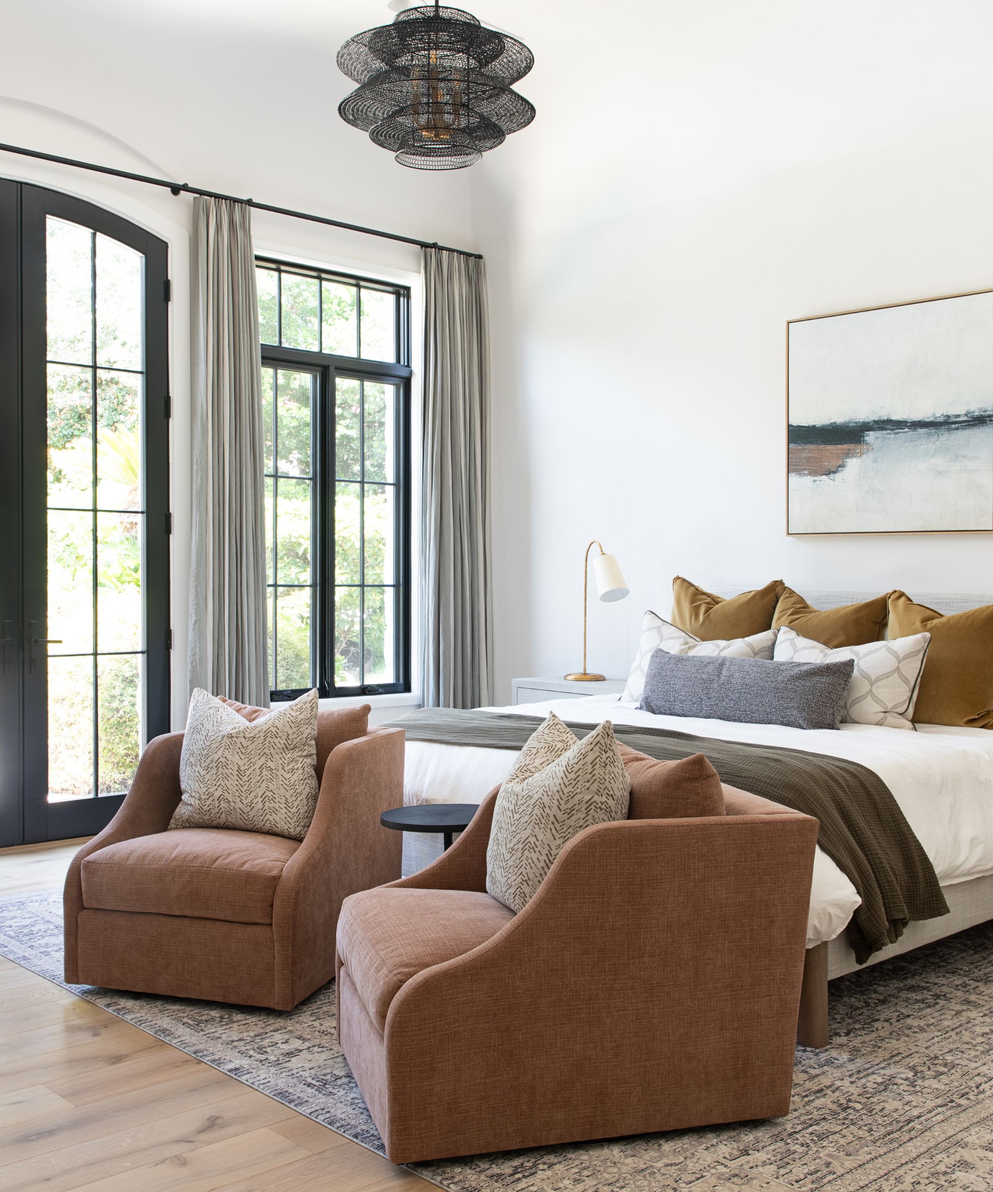
Choosing a whole-home color scheme can be tricky, but this home features a gorgeous blend of pared-back shades with pops of bold hues. Sara says that the home's color palette played into the nature-inspired aesthetic the team was after.
'We knew we wanted to stick with a colorful yet muted color palette throughout. This would help with the overall organic modern feel and bring some personality to the overall vibe,' says Sara.
'I think it’s very important when designing a home that the rooms all feel harmonious to one another but not matchy-matchy. Reintroducing shapes, colors and finishes in small doses helps achieve this,' she continues.
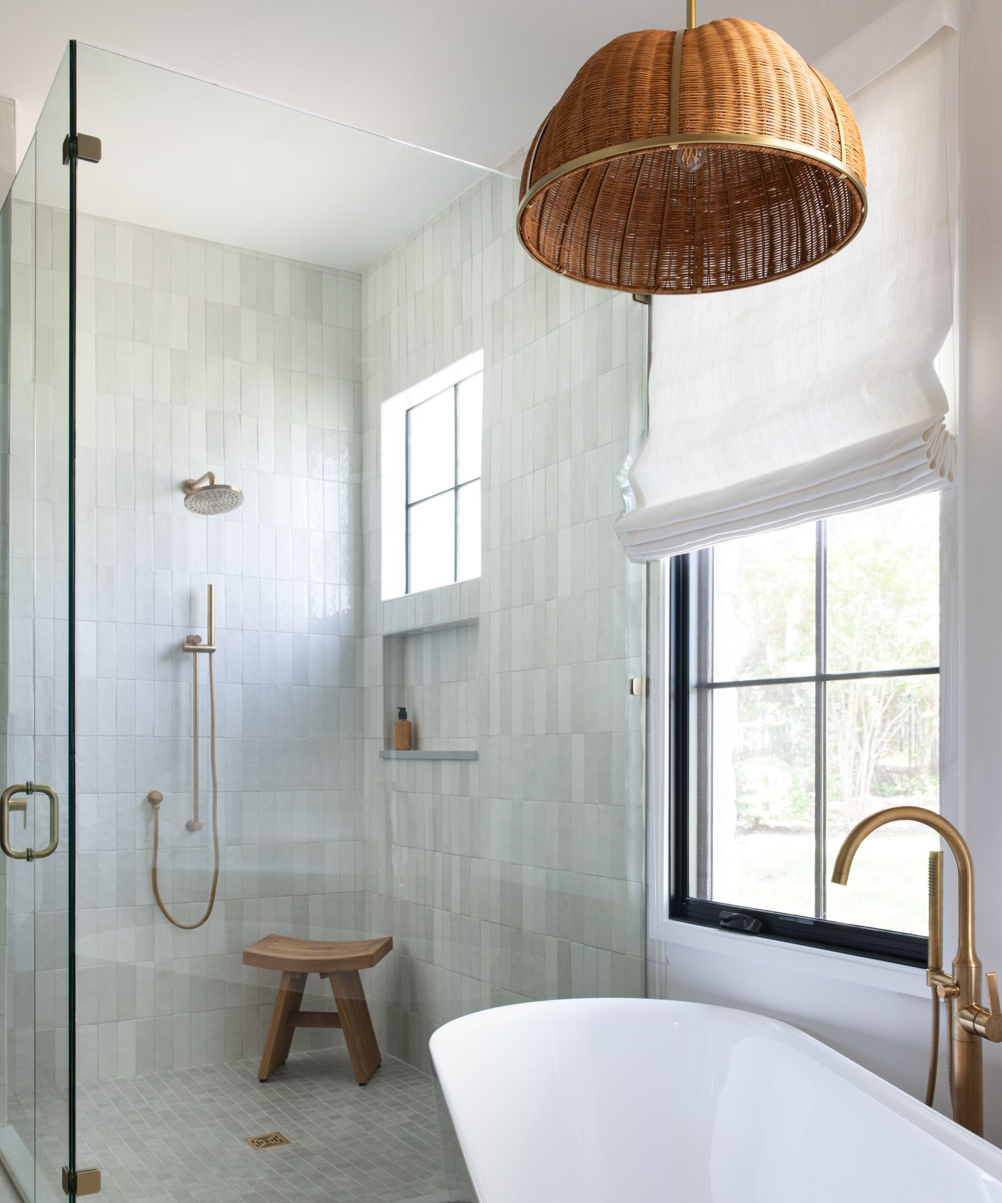
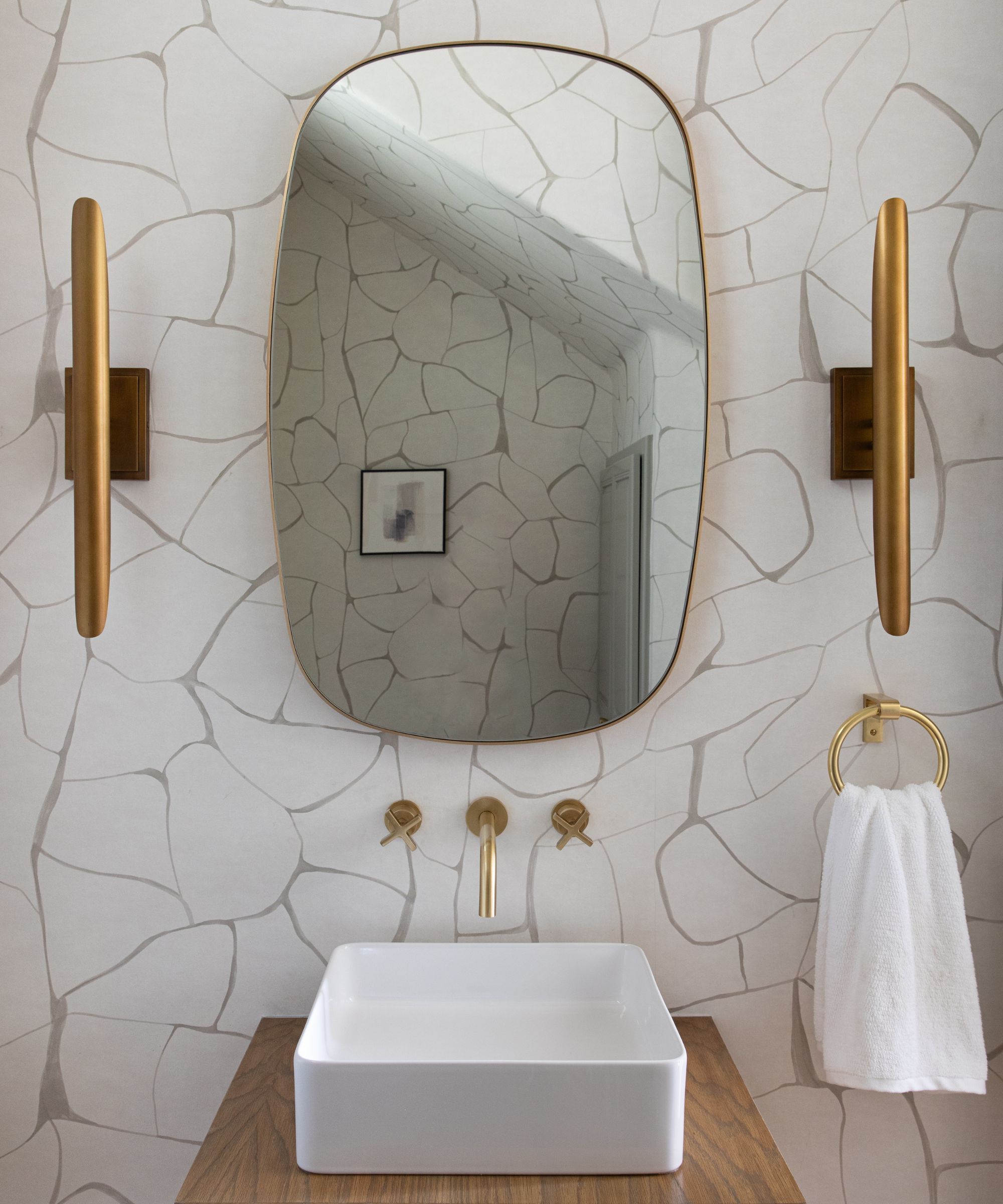
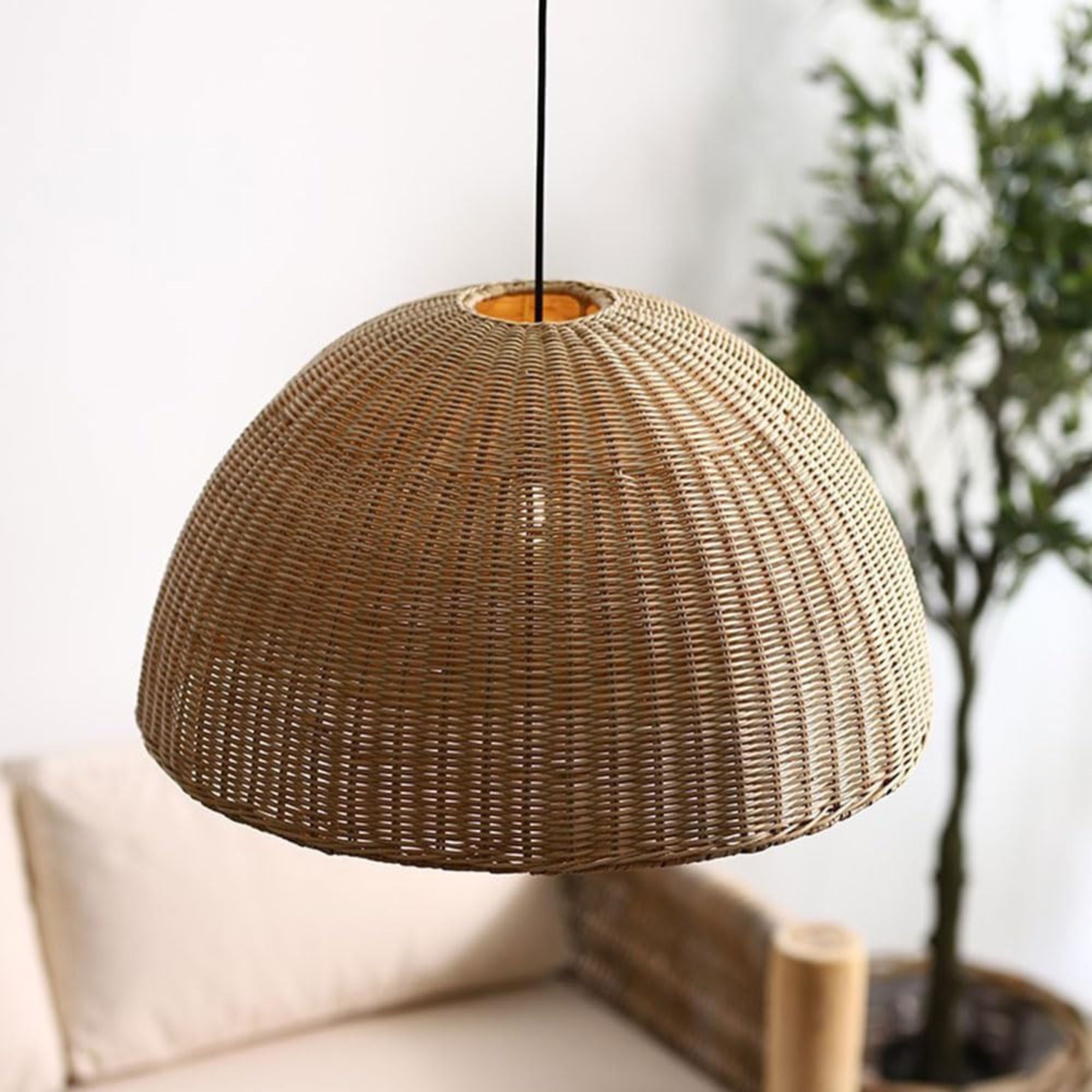
Even the home's bathrooms feel organic and fresh. In the primary suite, a standalone tub, tiled corner shower, and rattan light fixture accentuate the light and airy space, while the powder room features bold gold sconces and eye-catching neutral wallpaper. Each has a character of its own, but ties in beautifully with the home's overall aesthetic.
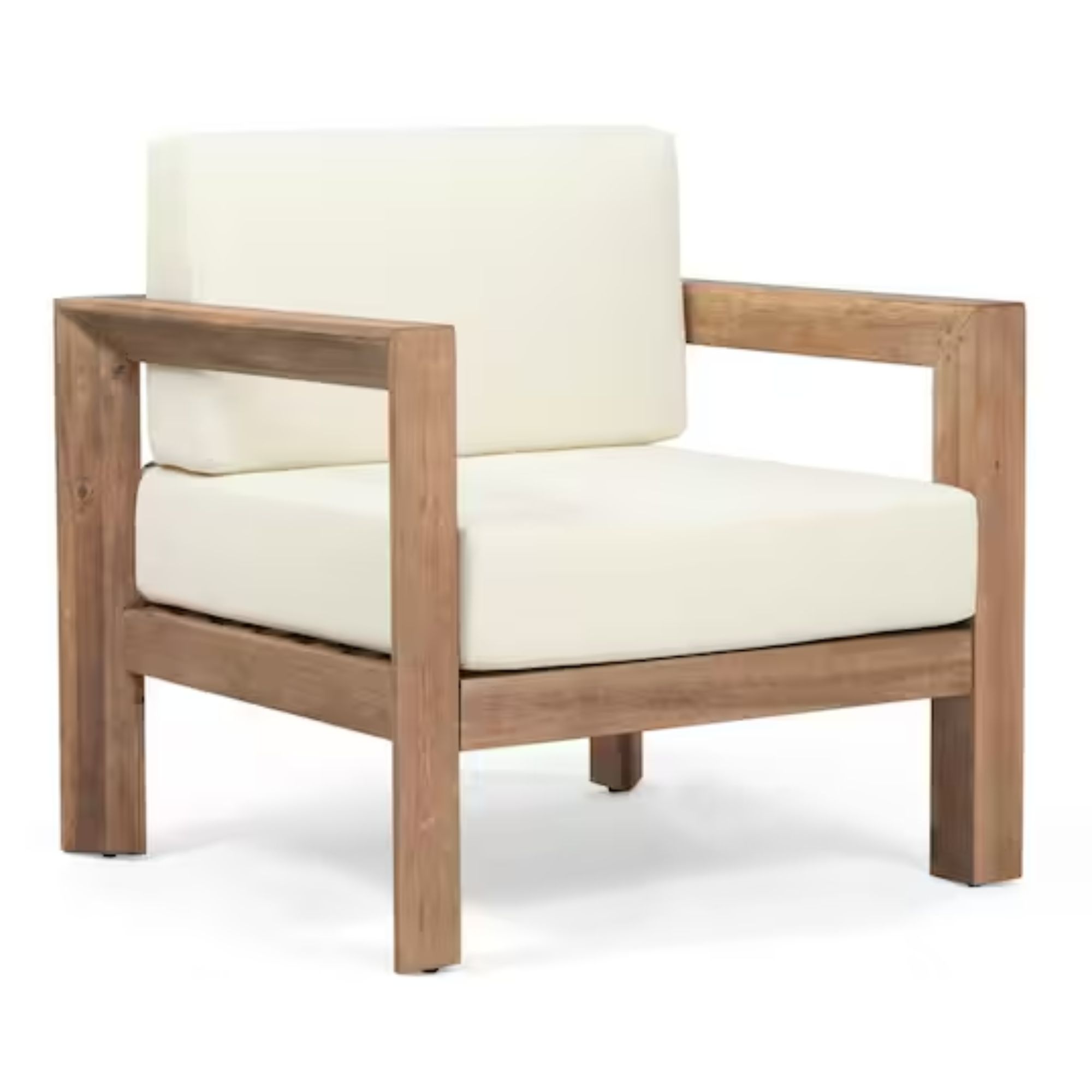
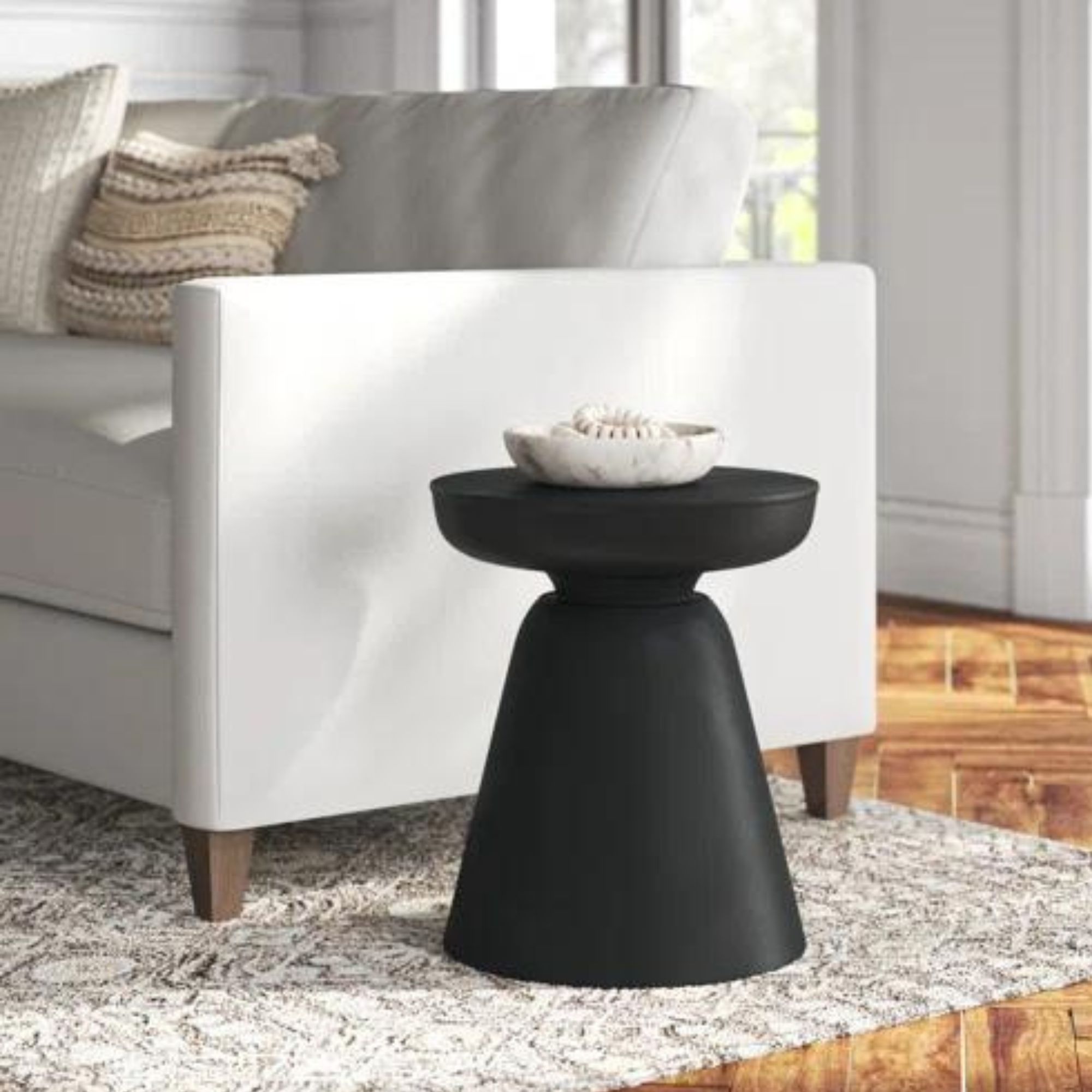
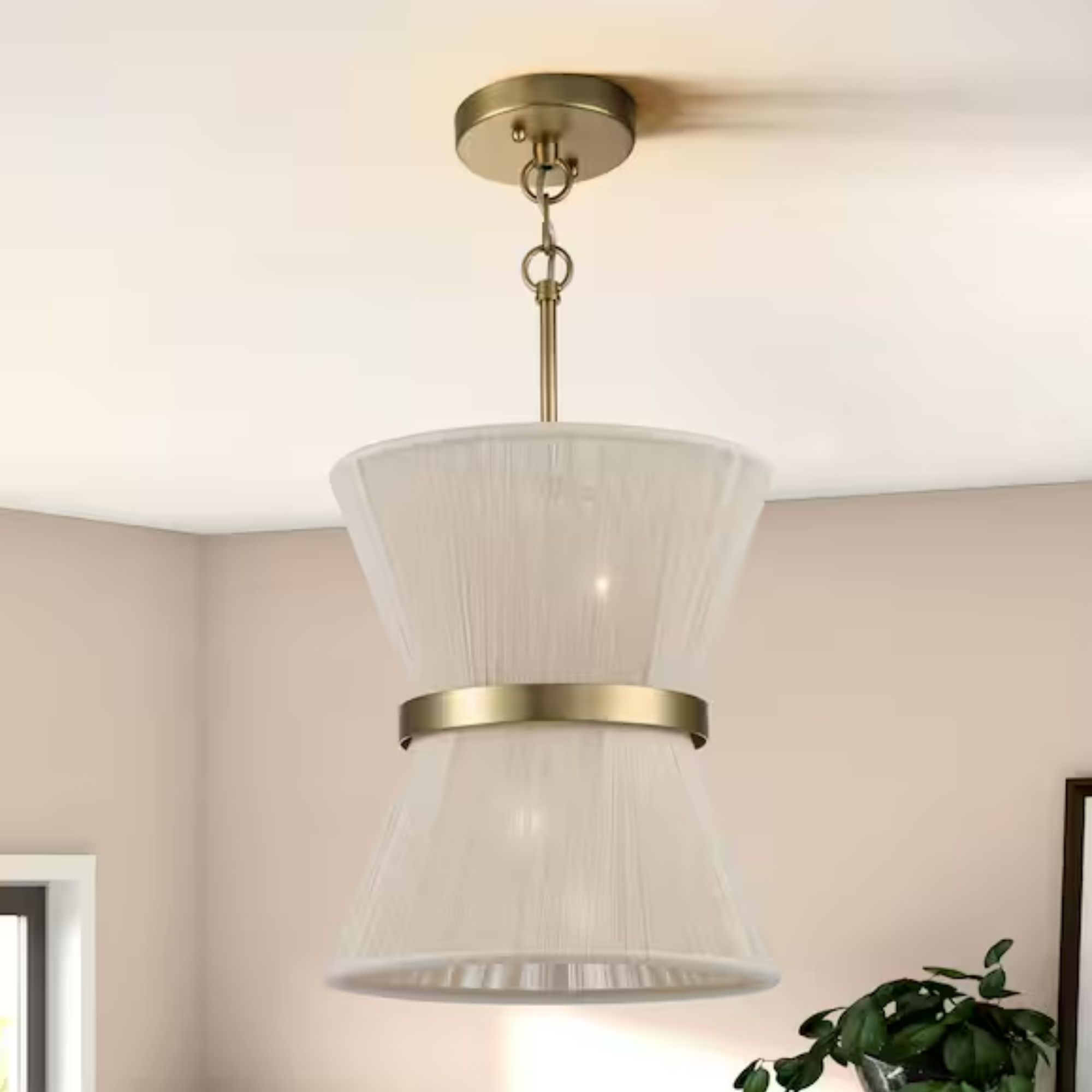
Shop the look
The Austin home's reveal is comforting and refreshing, blending natural influence with transitional charm. 'These clients were an absolute dream to work with. They shared their needs and trusted our vision, and I think it shows!' says Sara.
Sign up to the Homes & Gardens newsletter
Design expertise in your inbox – from inspiring decorating ideas and beautiful celebrity homes to practical gardening advice and shopping round-ups.

Abby was the Interior Design News Editor at Homes & Gardens and is now studying for her Master's degree in Journalism at City University, London. Prior to joining our team, she worked with Better Homes & Gardens, where she wrote and edited content about home decor, gardening tips, food news, and more. She studied Journalism and English Literature at New York University and moved to London to pursue her love of writing in 2023.
-
 Martha Stewart's intelligent cabinets 'take every inch into consideration' – their 'visually light' style will solve your small kitchen storage problems
'Every kitchen can be beautiful and functional, no matter what the size': 9 years since sharing her clever storage, Martha's cabinets are just as beautiful
By Megan Slack Published
-
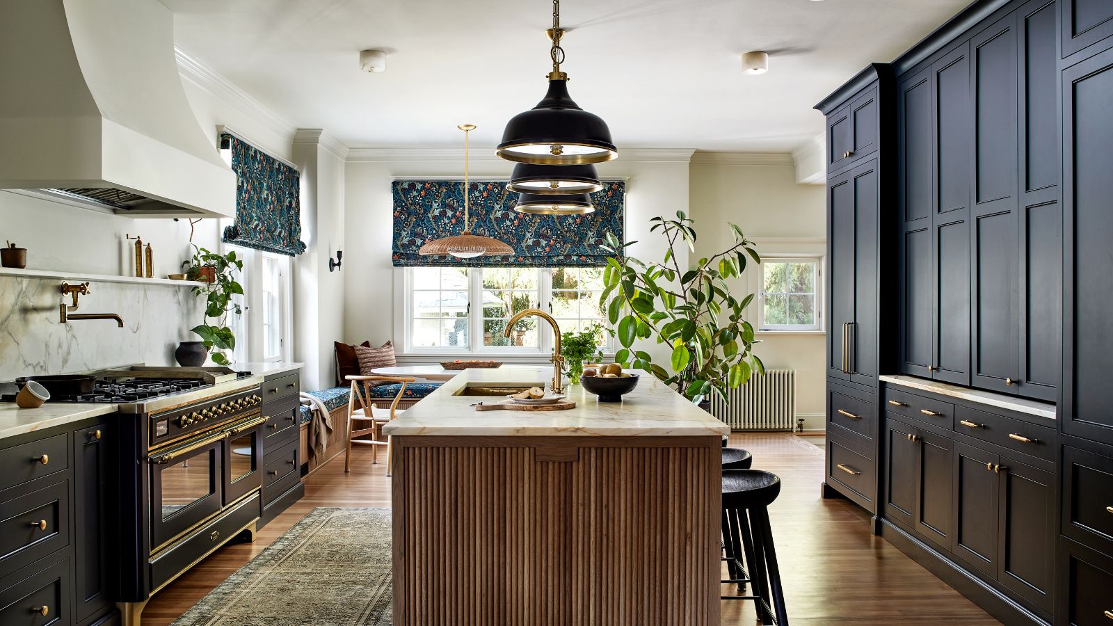 This once-dated kitchen is now a timeless space with the coziest details – and its the classic color palette that's made it a chic, welcoming space
Warming colors and natural materials combine to create this enduringly classic kitchen scheme
By Molly Malsom Published
