Hollywood glamour with a contemporary twist – tour the LA home of singer-songwriter and actor Joey McIntyre
This French Normandy revival home has original 1940s Hollywood wow factor and we're loving the updates in this family-friendly sequel


Design expertise in your inbox – from inspiring decorating ideas and beautiful celebrity homes to practical gardening advice and shopping round-ups.
You are now subscribed
Your newsletter sign-up was successful
Want to add more newsletters?
If there's a little stardust sprinkled around this elegant home, well it's not surprising. It's in the Hancock Park neighborhood of Los Angeles, California, home to many a celebrity, and was built in 1939, during the golden age of Hollywood.
Designed by renowned architect Arthur Kelly, the French Normandy revival property is now home to singer-songwriter and actor Joey McIntyre, and his wife Barrett and their family. Joey works in film, television, and on stage, and is best known as the youngest member of 1980s boy band New Kids on the Block.
Making the move from a New York City apartment to the historic Hancock Park home was a big step, involving not just a change of neighborhood but a change of lifestyle, and a very different style of house design, too. To help the family settle into their new surroundings, they called on the design team at Ward + Gray, who had previously worked with them in their New York home.
Article continues belowDesigners Christie Ward and Staver Gray show us round, explaining how they brought the elegant residence up to date, while at the same time preserving and enhancing its 1930s Hollywood glamour.

Joey and Barrett wanted to keep the character and charm of the house, but make it a functional, livable space for their family.
'The scope of the renovation included furniture layouts, hard finishes, selecting paint colors, new furniture and lighting throughout, art and wall finishes such as wallpaper (and in some cases upholstered walls),' says Christie Ward.
The skill lay in doing all this but maintaining that sense of movie star magic.
Design expertise in your inbox – from inspiring decorating ideas and beautiful celebrity homes to practical gardening advice and shopping round-ups.
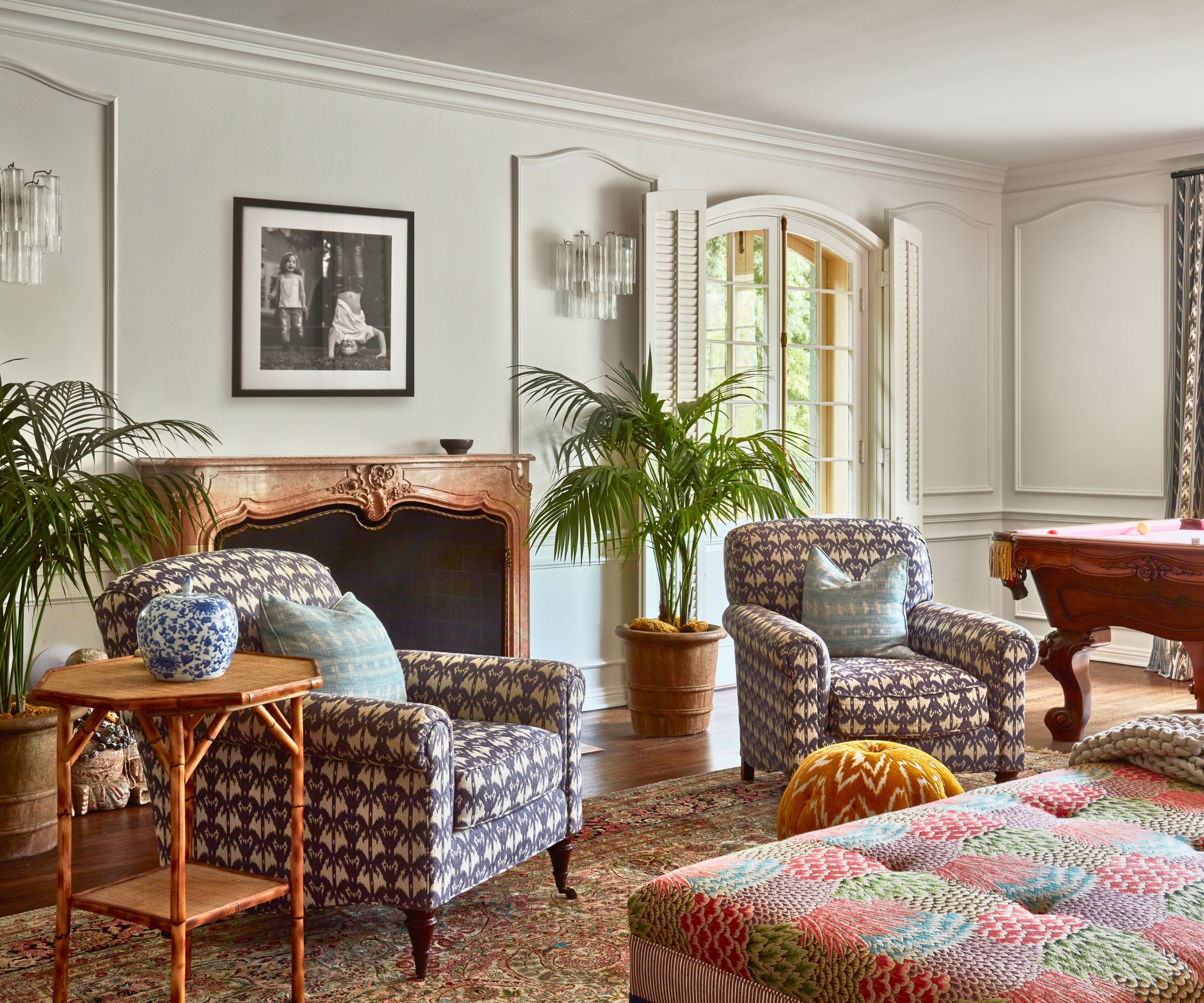
The refreshed living room ideas really do capture the golden age of the movies. 'We wanted the interior style to reflect the glamorous Hollywood Regency style,' says designer Staver Gray. 'We found antiques from this time, like the antique burnished brass and glass Mastercraft side tables in the living room, and used those items as a subtle nod to that time.
'We selected classic shaped sofas and chairs but in more modern fabrics to keep the house feeling light and fresh. The house wants to have the right balance of formal and playful, so we lean into this. After all, this is a young family and we wanted to be sure the space reflected them.'
'We left the original paneling throughout the room to be the main focus. It has stunning shell details to it and felt so original, we really fell in love with it,' adds Christie. 'We found a way to make the furniture complement the architecture, rather than stealing the show. So a sofa we had made for their New York City apartment is paired with a custom ottoman upholstered in Clarence House, Fermoie and Samuel & Sons fabrics and trim. We love how the mix of patterns created a very vibrant space. The wall sconces are handblown Murano glass.'

No prizes for guessing that this house belonging to a singer-songwriter contains a dedicated music room. With over one million worldwide record sales as a solo artist, Joey is no longer the new kid in the music business.
'The bookshelves/millwork are all original to the house and we all thought it best to keep it exactly as it was,' adds Christie. 'The client styled this room to perfection with their belongings and guitars and we added this oversized chaise to the corner of the room and upholstered it in a vibrant Pierre Frey fabric (the specific print is called Stella).'
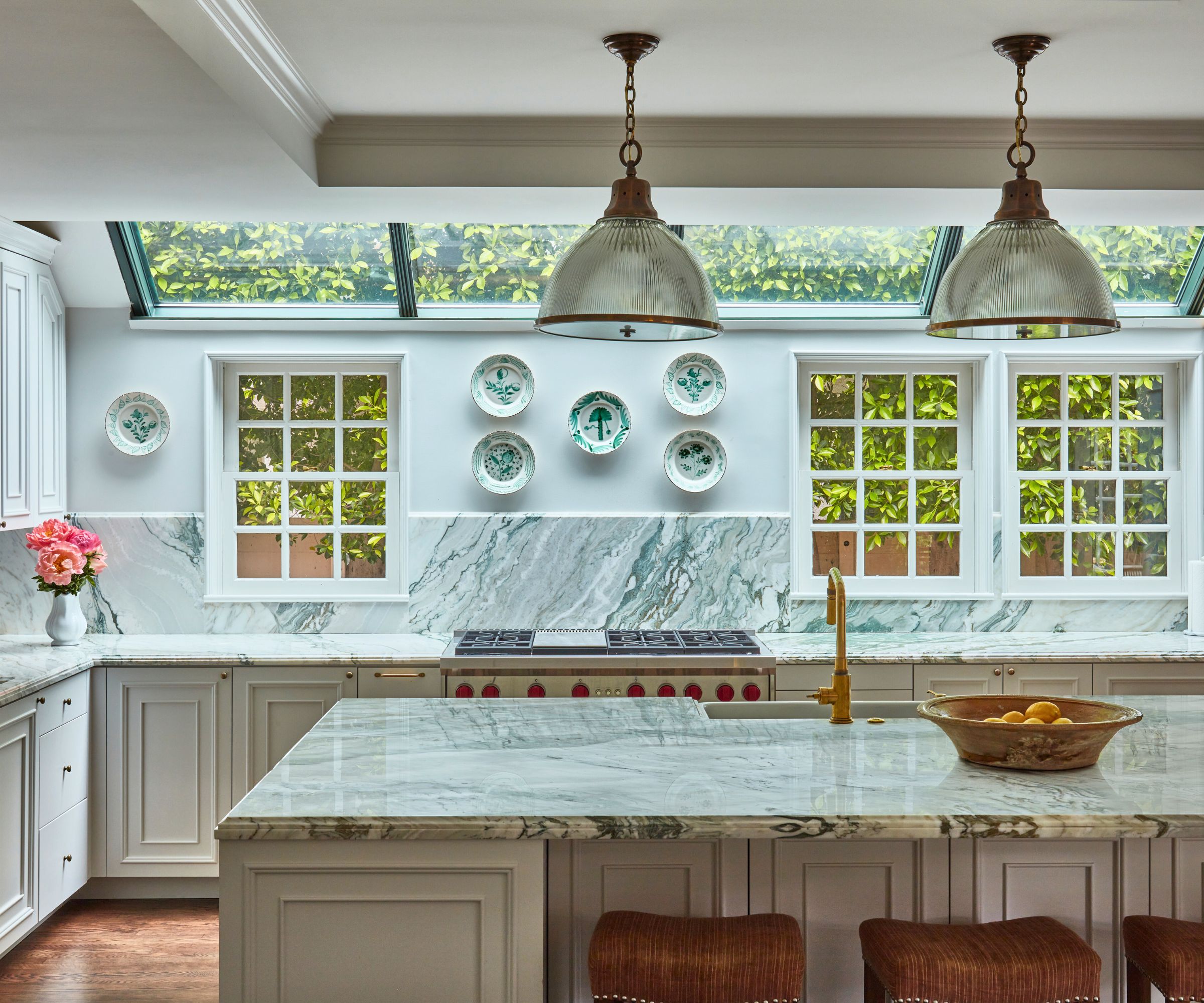
Staver and Christie fully renovated the kitchen, designing the cabinetry and layout and selecting the finishes, hardware and plumbing fixtures.
'We wanted the updated kitchen ideas in this historical home to not feel too divorced from its time,' says Staver. 'So the bones and any millwork we added had to remain in keeping with the 1930s/40s when the house was built. While we entirely updated the home, the furnishings were to feel like a connected element of the house.'
Among the room's most striking architectural features are the sloping roof windows, added as part of a previous addition.
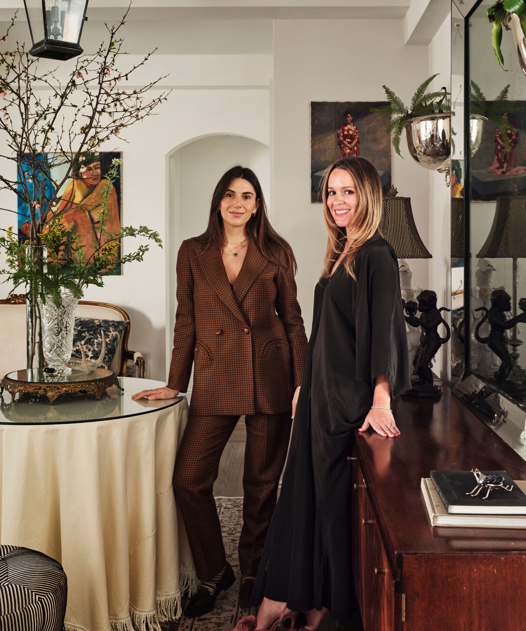
Ward + Gray are an interior design firm based in New York City, Miami, and London. Principals Christie Ward (left) and Staver Gray focus on boutique hotel and residential projects with an emphasis on collected and considered interiors. For this project in the historic Hancock Park area of LA, they wanted to capture the essence of what it would have been like to live there in the 1930s and 40s when the home was built, and to reflect the Hollywood glamour of the neighborhood.
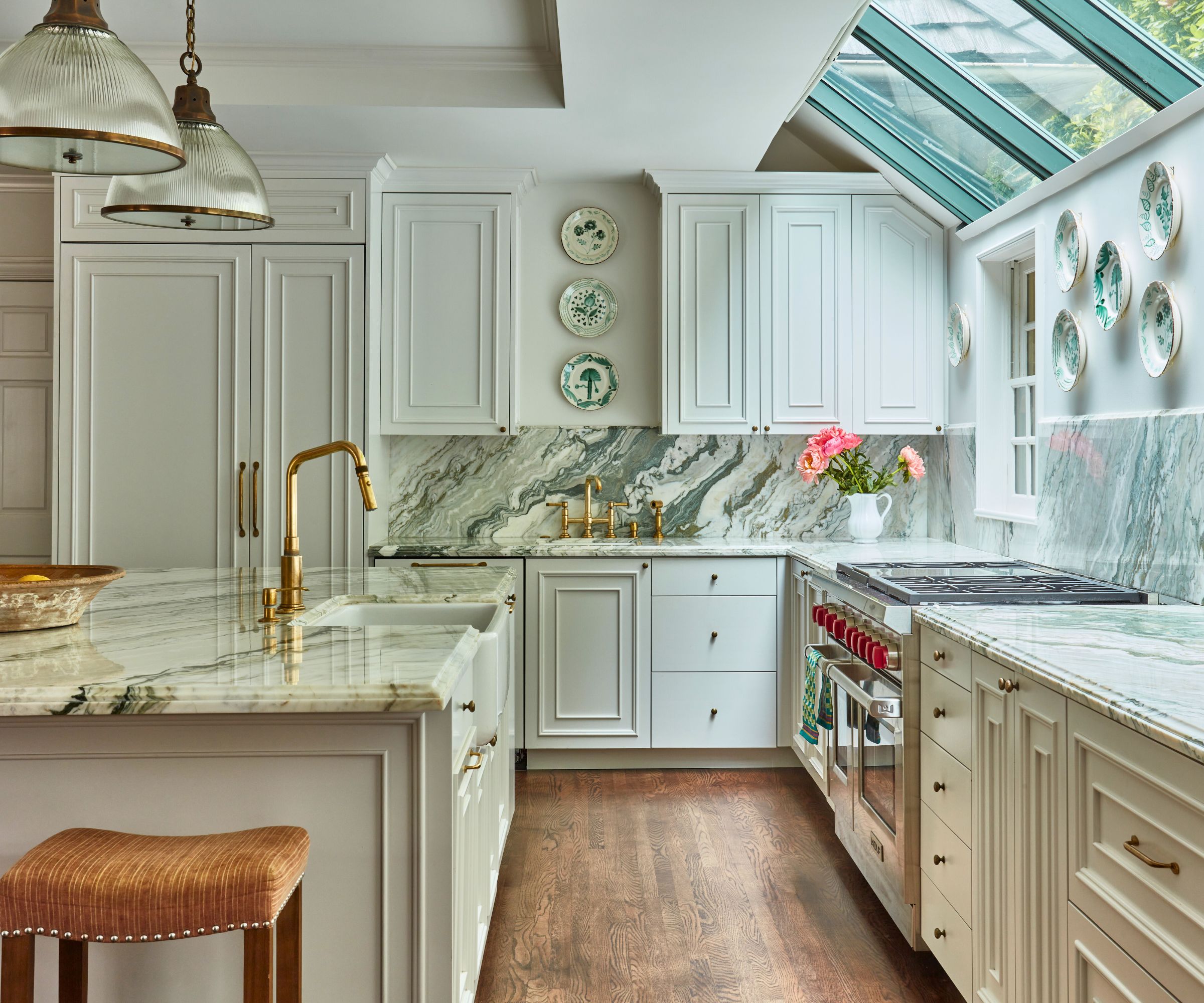
The Ward+Gray team worked with the family to recreate the kitchen layout and design.
'We found a beautiful antique from the 30s which has this double bead paneling profile and thought to borrow that detailing idea as a wonderful subtle nod to the 30s for the kitchen cabinets,' says Christie. 'We used Farrow & Ball Strong White on the cabinets and paired it with Verde Cipollino marble countertops to tie in the green of the nearby solarium.'
The stools are upholstered in a Rose Tarlow stripe linen fabric, pulling in the oranges to pick up on the unlacquered brass plumbing fixtures.
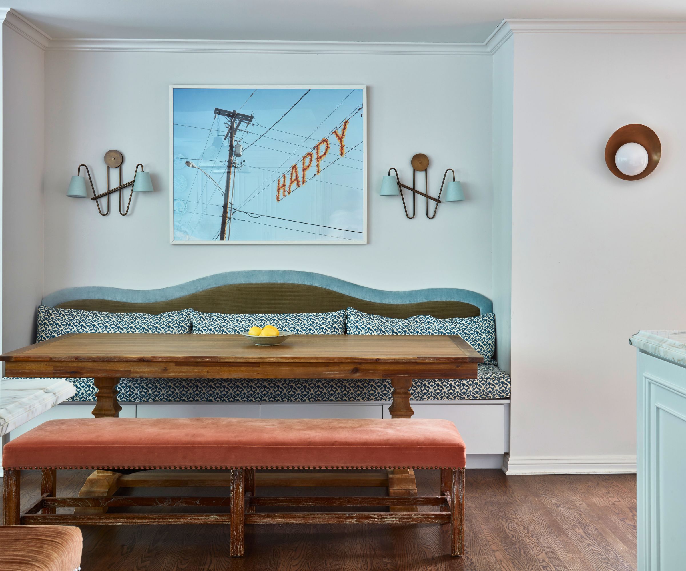
Even the breakfast nook has a nostalgic old-world atmosphere, and makes a cozy, relaxed eat-in kitchen where the family can eat together.
'The sconces that flank the ‘happy’ artwork were found vintage and we made custom lampshades in a light blue silk to pick up on the velvet in the banquette,' adds Christie.
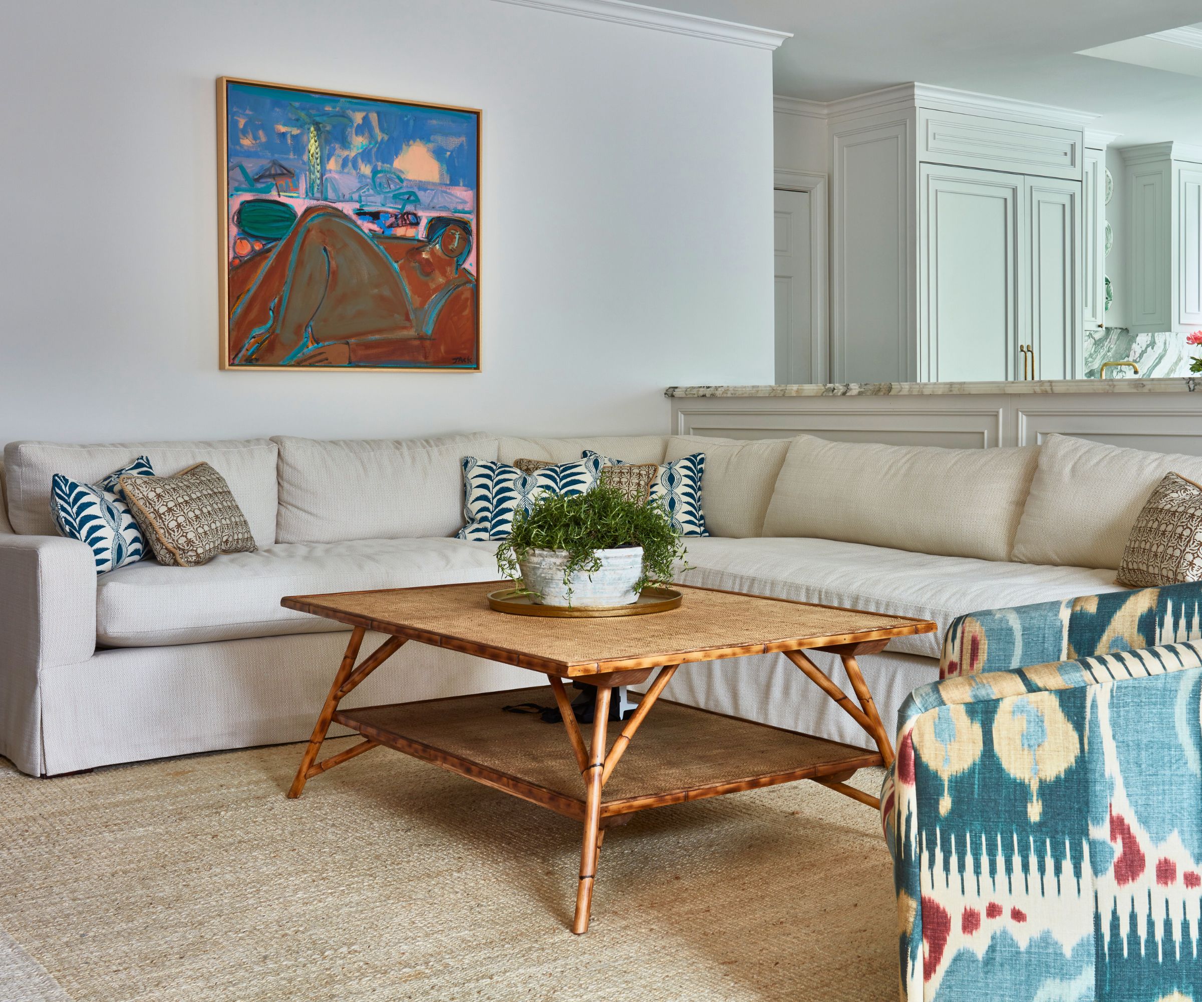
Family living room ideas for this space adjoining the kitchen, were all about designing a casual and comfortable place for the family to gather and spend time and watch TV together. Furniture and fabrics have been carefully curated to give a fresh twist to the home's golden age vibes.
'We found a vintage 1960s swivel chair for the room which we reupholstered in a Carlton V ikat,' says Staver. 'And we sourced an original Rebecca Jack painting for the wall to bring in a happy feel. The table was made custom for the room with a bamboo wood and caning detail throughout the top.'
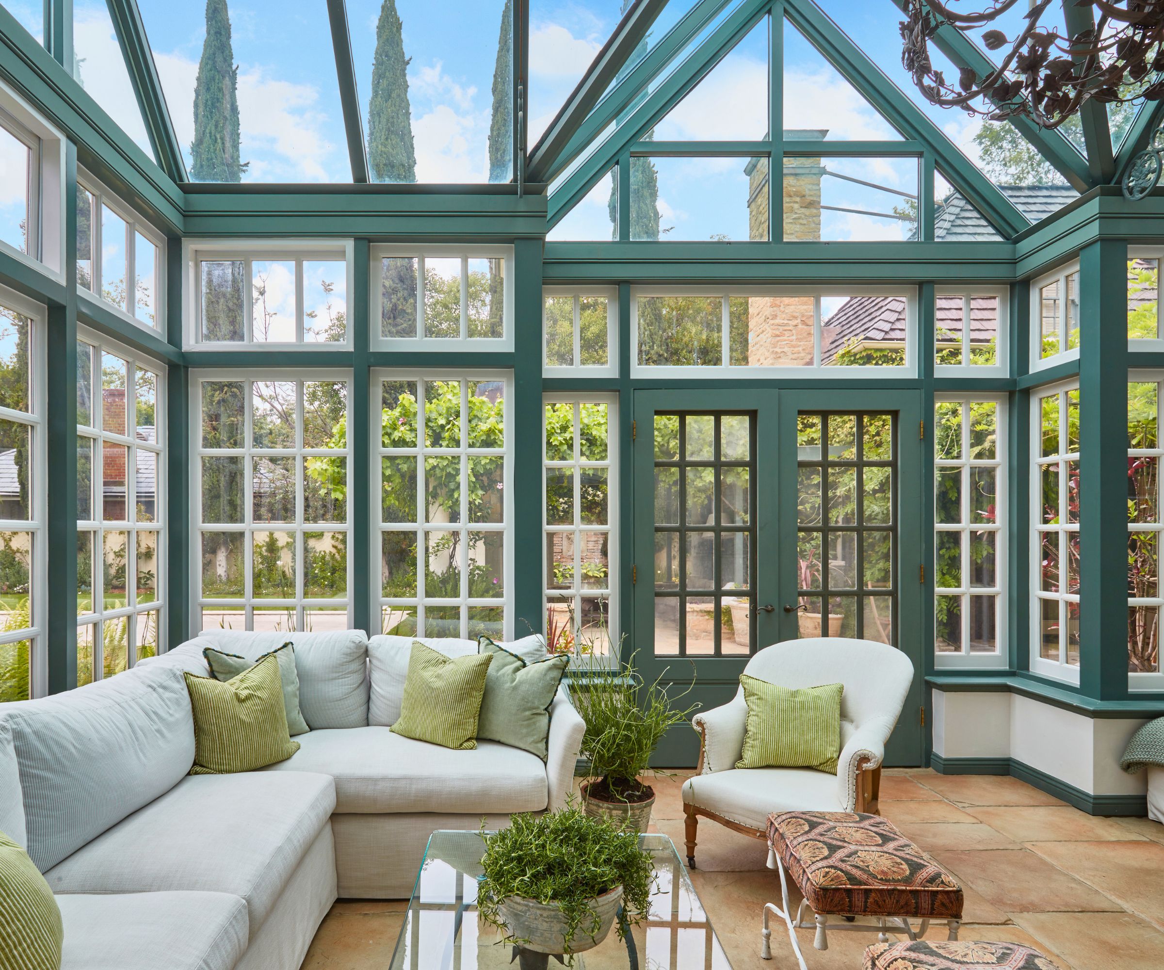
The solarium was designed to be multi purpose, with both a formal dining room at one end, as well as this comfortable sunroom just off the outdoor pool.
'We used outdoor fabrics for the sofa and throw pillows so that the family can run in wet from the pool,' says Christie. 'The coffee table and ottoman are vintage pieces, with Robert Kime’s Ottoman Lampas as the fabric on the ottoman. We painted the trim and doors around the room in Farrow & Ball Green Smoke to pick up on the original shutters on the façade of the home.'
The chandelier came from an antique store in New Jersey and was driven across the country. 'We knew it was right for this room the moment we saw it,' says Staver.
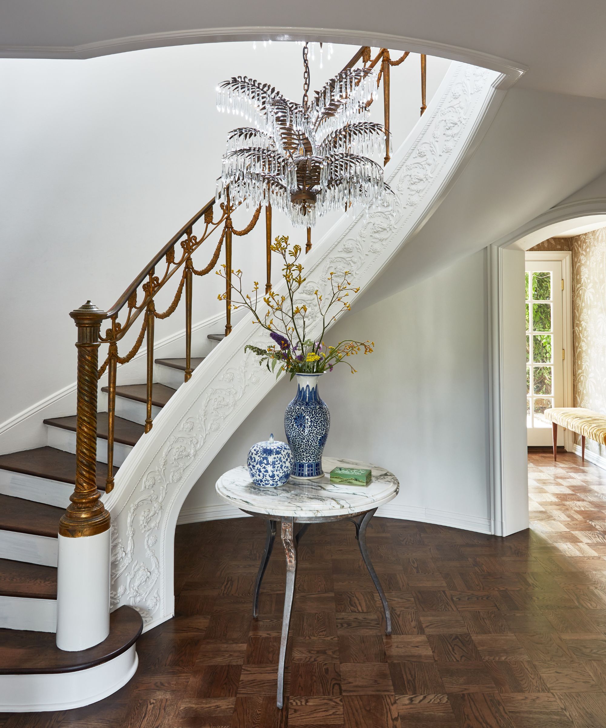
While we're talking chandeliers and statement lighting, take a look at the hallway and staircase ideas. The elegant original staircase would make Fred Astaire and Ginger Rogers dance for joy, and for staircase lighting with extra Hollywood wow factor, the four-tiered custom-made palm tree chandelier is reminiscent of 1930s designs and perfect for the home.
'This was very much the golden age of Hollywood and we felt the furniture and lighting should have a playful storytelling ability to them. The pendant's aged brass details reflect nicely off the original balustrades,' adds Staver. 'We found an antique French iron table base for the foyer which has floral details throughout to bring out the staircase moldings. We stained the original parquet wood flooring to a rich, deep brown to create a high contrast with the light and fresh ivory walls throughout.'

Since Joey and Barrett had decided to repurpose the bed and chair from their New York home here, the bedroom ideas were about finding ways to tie in the pink hues as well as preserving and enhancing the beautiful period details in this space.
'We found a gorgeous Le Manache fabric for the drapery – which felt very Hollywood Regency to us with the fan details – and it pulled the colors in this room together,' says designer Christie. 'The matching French side tables, used for the bedside tables, were found on auction.'

On the opposite wall of the bedroom, is yet another of this home's remarkable original features, the fireplace and its mirrored surround. 'We fell in love with that mirrored wall and marble mantle with shell detail, and it's pink in coloring too, which felt so right with our fabric scheme,' says Staver.
The wall sconces are also original to the house with stunning beaded florals throughout.
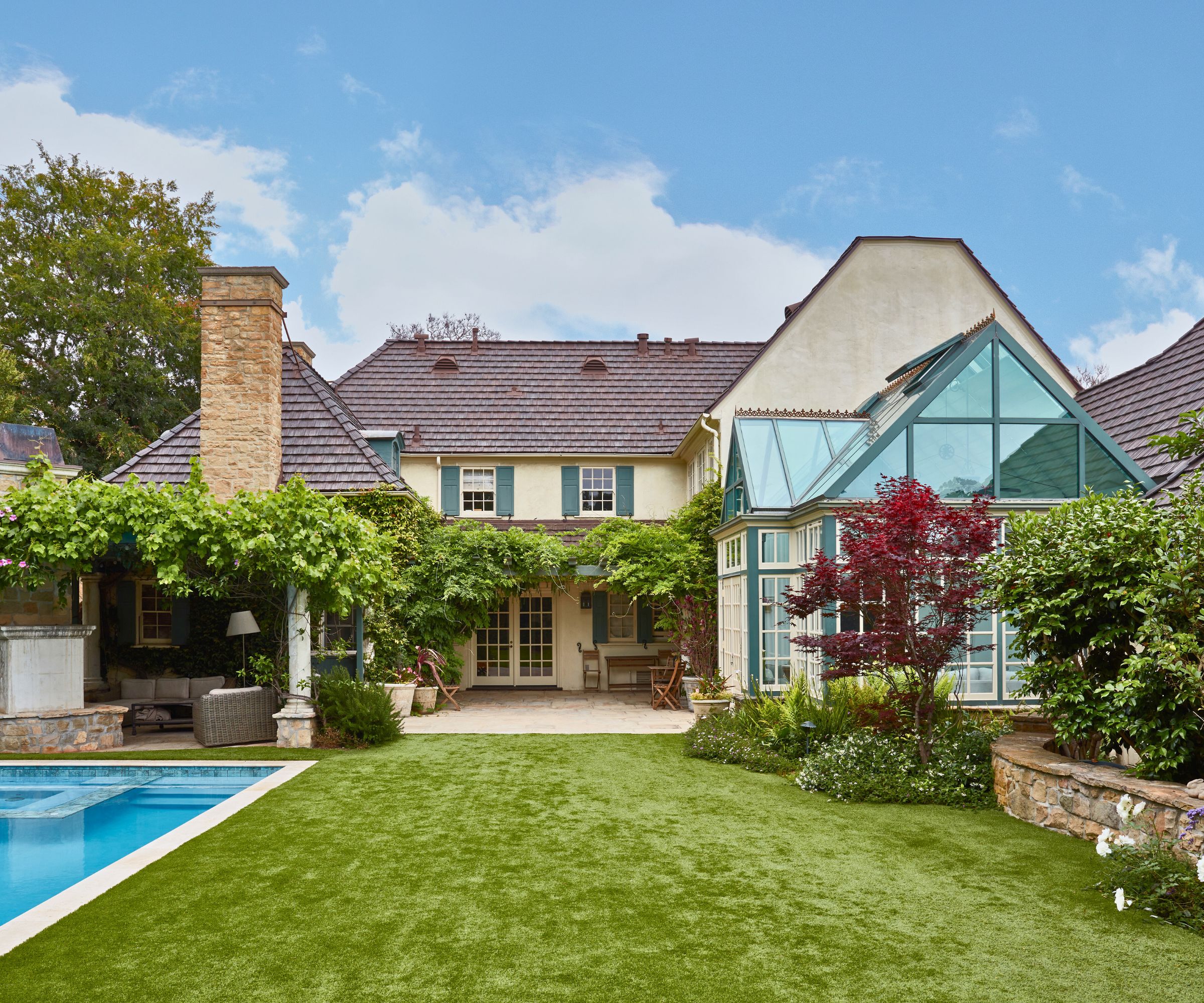
The French Normandy revival property dates from 1939, and was originally designed by renowned architect Arthur Kelly. The outdoor spaces have been updated, as part of the whole house refresh, to feel effortless and casual.
'We wanted the family to feel as if they could plop down on the furniture after a long swim and felt it was important to not have the furniture feel too precious,' says Christie. 'The home has these gorgeous exterior shutters that frame the windows and we picked up on that sage green inside the home as well. The marble we selected for the kitchen has the same sage greens running through it, and sits just off the solarium in which we had painted the trims to match.'
Welcoming and family friendly, with fresh, contemporary fabrics and an enduring homage to Hollywood's golden age – this home's story looks set to be a long-running blockbuster.
Interior design: Ward + Gray
Photographs: Michael Clifford
Karen sources beautiful homes to feature on the Homes & Gardens website. She loves visiting historic houses in particular and working with photographers to capture all shapes and sizes of properties. Karen began her career as a sub-editor at Hi-Fi News and Record Review magazine. Her move to women’s magazines came soon after, in the shape of Living magazine, which covered cookery, fashion, beauty, homes and gardening. From Living Karen moved to Ideal Home magazine, where as deputy chief sub, then chief sub, she started to really take an interest in properties, architecture, interior design and gardening.
