

'We wanted the house to retain its period heart with a pared-back period look,’ says the new owner of this Grade II-listed 19th-century townhouse in a Knightsbridge garden square that had been stripped of its features in the 1990s.
Stairs, fire grates, mantels, wooden floors, cornicing, and joinery were selected to ensure that the house design was authentically Georgian, ‘and communicated the early 1880s’ quality and distinctive elegance,’ explains the client.

Cabinetry, Blakes London. Pendant light, The Urban Electric Company. Bespoke table, Christian Bense, with tiles, Freyja Lee. Red bar stools, Ochre. Cactus silk rug, Knots Rugs.
‘We wished to create the feeling that the home had been lived in from then by one family, who had collected the best of the interiors and art through time to now. This developed an eclectic mix of the most special enduring pieces.’
Tasked with bringing this ambitious vision to life were renowned firm BLDA Architects and interior designer Christian Bense. Key to the inspiration was the square’s location. Although a mere stone’s throw from Harrods, the square feels like an oasis in the city.

Cabinetry, Blakes London. Walls in Sand I, Paint & Paper Library. Ceiling light, Miles de Lange.
‘The trees look like they are growing into the bedrooms so, at the height of summer, you really feel like you are completely enclosed in this garden space with views of gardens on two sides. That was our main reference point and that informed our design narrative,’ explains Christian.
The Garden of Eden inspired the upper ground level of the house, with the room that celebrates nature the most being the sumptuous main bathroom, the favorite space of both the client and Christian. ‘We agreed that the bathrooms should feel like lived-in rooms, not modern-styled, tiled bathrooms,’ says the client.

Walls in Peignoir, Farrow & Ball. Sofa, Lorfords Contemporary; covered in fabric, George Spencer Designs. Custom chandelier, Cox London. Rug, Luke Irwin.
Dark flooring, a Georgian-style fireplace, and a copper bath introduce period verve but the real impact is created by the Tuscanesque landscape grasscloth walls.
‘The bath is centered in the room surrounded by a rich landscape scene from a 17th-century tapestry,’ says the client. ‘The room has an intimacy and a sense of indulgence. As though you are bathing in the forest.’ Pocket doors open to reveal the vanity and basin for a further 'wow' moment.

Cabinetry, Blakes London. Walls in Sand I, Paint & Paper Library. Ceiling light, Miles de Lange.
With the upper floor focusing on the tree canopy, the lower ground floor then became the Earth with a slightly more moody aesthetic. ‘We leaned into that with the use of materials, pippy oaks, and wooden joinery,’ says Christian.
In the dining room, the green rug represents grass, with an olive branch chandelier drawing the eye upwards. ’We had a lot of botanical elements that were at a high level,’ says Christian. The sitting room, too, features botanical motifs overhead with its statement oak branch chandelier.

Table designed by Christian Bense/Treeslounge. Theatre chair, Rose Uniacke. Curtains, Zoffany. Rug, Hadeda. Wallpaper, Tatiana Tafur.
The soft lilac palette was inspired by a colour in the National Portrait Gallery and it imbues the space with a delicate sophistication. Period furnishings are juxtaposed with contemporary pieces, such as the brutalist coffee table and the playful zebra stools.
A two-story extension housing the kitchen on the upper ground floor with a garden room below was built to replace what Christian describes as ‘a James Bond, villain-esque, glass extension’ at the back of the house. ‘We wanted to create an extension that felt sympathetic to the original building, rather than being a new modern addition.’

Custom-made cabinets, Treeslounge. Legacy table, Matthew Cox. Walls, Argile Peinture. Curtain fabric, Jennifer Shorto.
The solution was a lightweight conservatory, which seamlessly merges with the house. It showcases a pill-shaped roof light in the kitchen, a shape that is repeated in multiple places throughout the house, for example, the dining room table and the backs of the joinery in the study.
‘The idea was to create a kitchen that had enough kitchen as you needed, but then felt like it was furnished,’ says Christian. ‘Because the space isn’t wide enough for a built-in island and it’s also a quite contemporary element, a narrow table was chosen and it, too, features botanical motifs. ‘We had an artist paint the tiled surface with petals and leaves and they look like they’ve been strewn on the island.’

Bespoke joinery by Christian Bense, made by Yorick Bespoke. Pendant, Porta Romana. Curtains in fabric by Mark Alexander. Marble fireplace, Jamb.
The end result is a thoughtful home that blends old and new beautifully. ‘The design was about keeping the architectural elements and highlighting them,’ explains Christian, ‘but then juxtaposing them with slightly more eclectic-led furniture and different time frames, creating more of a layered, curated narrative.’

Bath, Drummonds. Pendant, Vaughan. Wallcovering, Watts 1874. Zellige tiles, Mosaic Factory. Joinery, Yorick Bespoke.
The 4 rules of simplicity
Christian Bense on how to keep a decorative period look pared-back and beautiful
- Proportion is key to achieving a pared-back interior. It means everything is the perfect size to start with, and nothing needs to be added, allowing styling to be simple yet effective.
- Intrinsic depth is important. Nothing should be flat or one-dimensional. Wallpapers: woven. Materials: mixed. Fabrics: lived in.
- Antiques are key. Not only does this help fill the ‘period’ quota, but there is a humility in creating a pared-back interior that only antiques can provide.
- Light but never white. Layer neutrals, but stay away from anything bright white.

-
 I’m an HVAC technician, and this is when I turn my AC on each year – plus 5 checks I always do beforehand
Save yourself an AC hassle by running my checks and turning it on before big heat hits
-
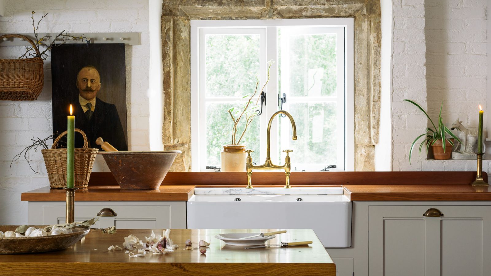 This simple marble hack elevates my budget-friendly wooden kitchen countertops and prevents the dreaded water damage for way less than you’d think
This design trick looks expensive, solves a problem, and was the easiest decision I made during my kitchen reno

