Tour this luxurious redesigned New England family home built in the 1880s
Interior designer Robin Gannon has given the property a contemporary refresh where art takes center stage against a backdrop of jewel tones
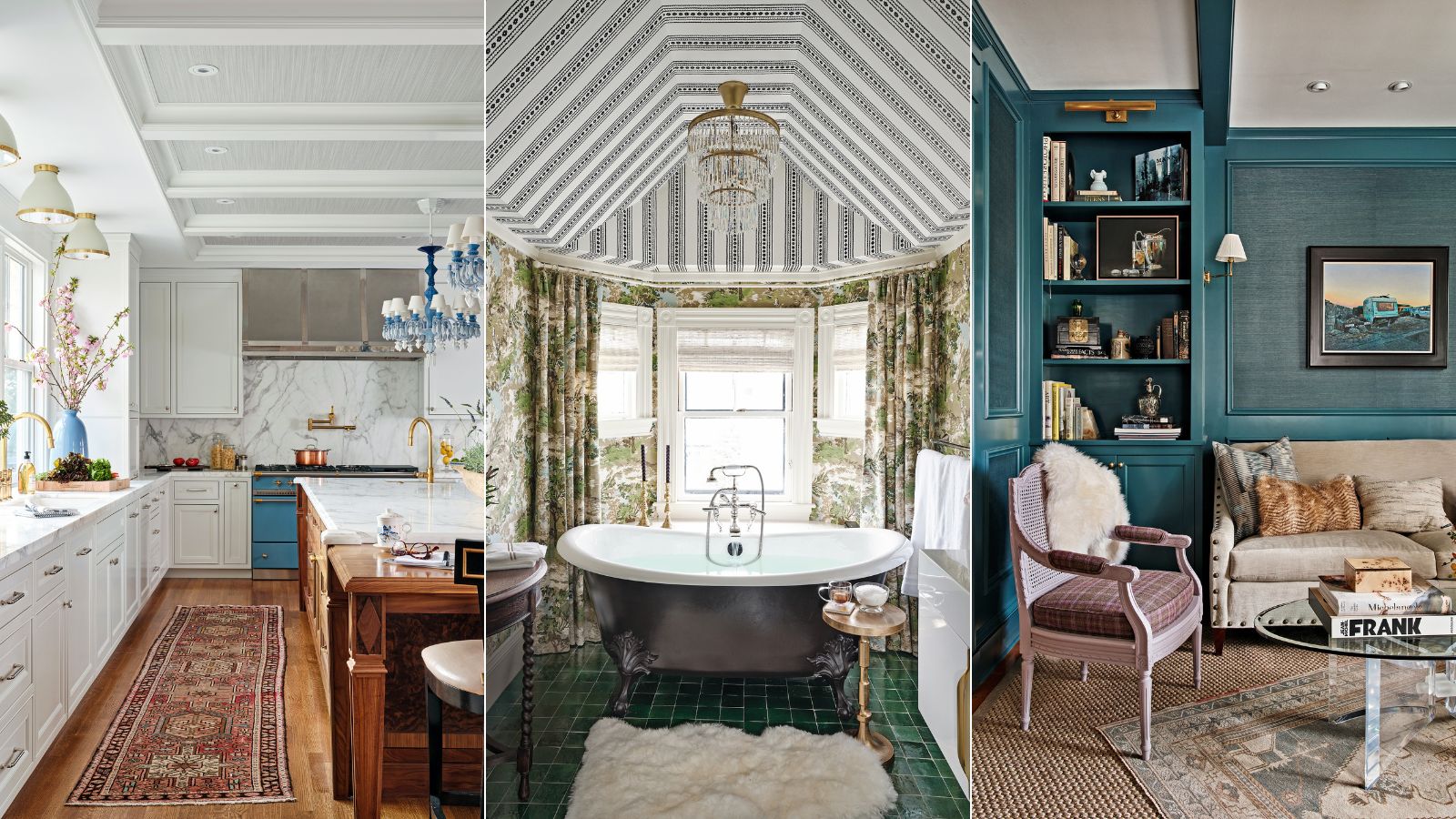
Behind the relaxed, layered house design of this New England property lies an eye for detail that is forensic in its approach. Perhaps that’s no surprise given that the interior designer at the helm of its renovation is a former criminal defense attorney – career paths that seem wildly different on the face of it, but in fact, share key elements.
‘Both professions require a great deal of emotional investment, consistency of approach, and the need to do your homework,’ says designer Robin Gannon, who set up her practice 15 years ago after having a family. Since then, she’s become known for her strongly decorative aesthetic, underpinned by the principles of robust interior architecture.
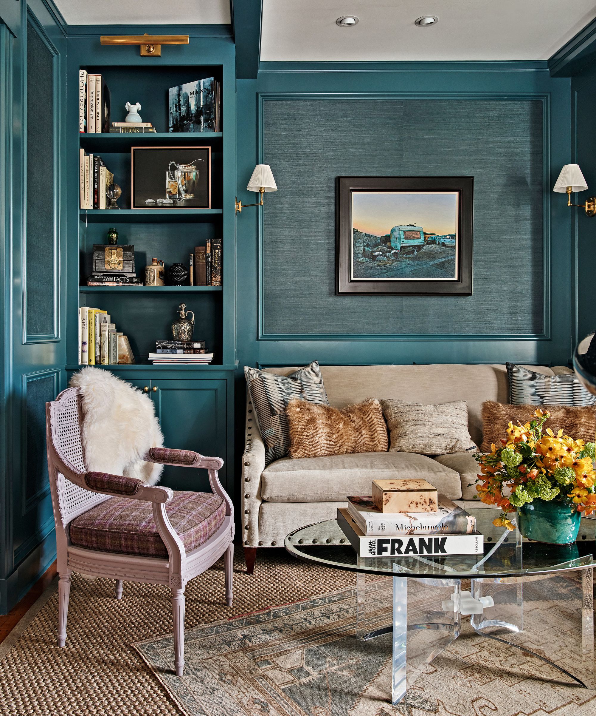
Grasscloth wallcovering in Amalfi, Serena & Lily. Artwork (on wall) by Henk Serfontein. Sofa, Hickory Chair. Antique French side chair, Chairish; covered in Kinloch, Osborne & Little. Classic No 1 sconces, Hudson Valley Lighting.
For the owners of this timber-fronted family home in the historic town of Lexington, close to Boston, the aim was to respect its 1880s roots while updating it for modern living. Inspired by the schemes that Robin had produced for the nearby hotel The Inn at Hastings Park, as well as their own eclectic collection of artwork, the clients initially asked her to rework the living spaces.
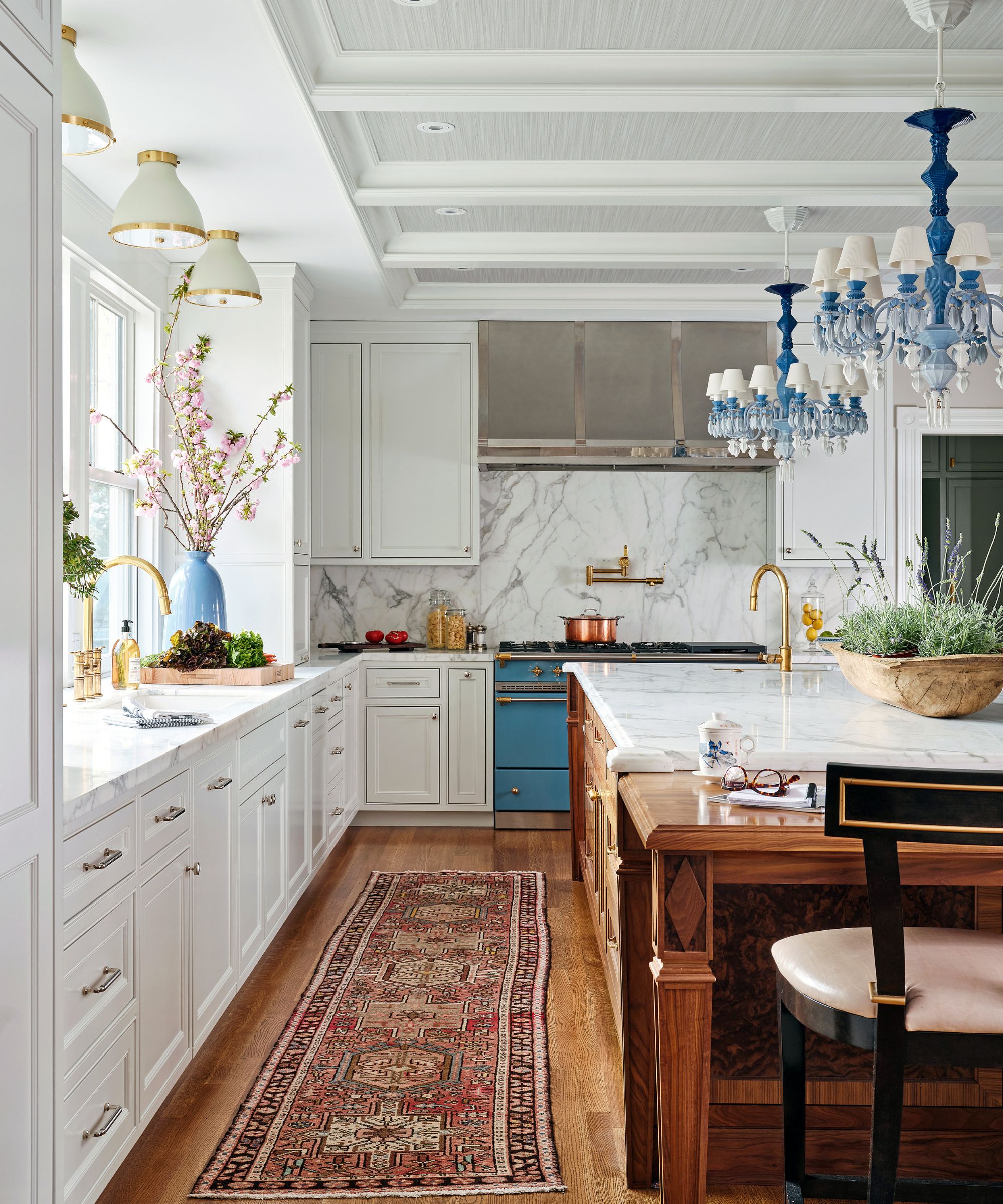
Belle de Nuit 12 light chandeliers in Blue, Lladró.
‘They are keen entertainers, foodies, and wine collectors, so our focus was very much around that,’ says Robin. ‘But before long, we knew we wanted to improve the small galley kitchen, connect front to back with an easy transition to the garden, and reconfigure bedrooms and bathrooms on the first floor to make room for a home office, dressing room, and laundry.’
The solution was to integrate what was formerly an outdoor porch and a separate butler’s pantry into the footprint of the kitchen, creating a larger, open-plan space featuring a generous island and a cozy informal dining spot.
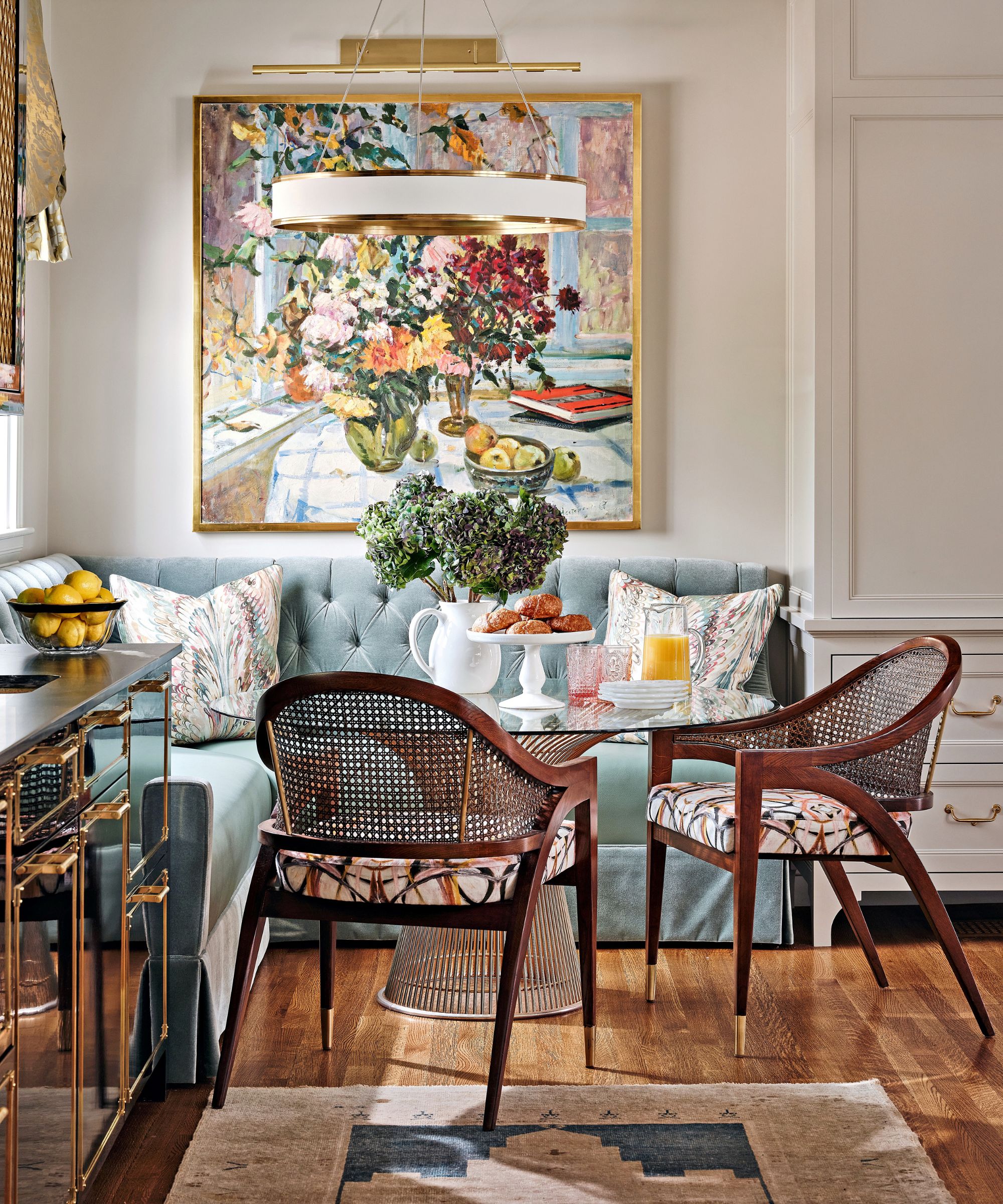
Custom banquette in Matara in Celadon, Designers Guild. Artwork by Boris Nesterenko. Platner table, Knoll. Panama chairs, Hickory White; seats in fabric by Lindsay Cowles. Pendant light, Visual Comfort & Co.
‘What’s interesting about this home is that although it has a large footprint, it has quite a few relatively compact rooms,’ says Robin. ‘So our challenge was to make it suitable for large gatherings of family and friends, while simultaneously playing to the intimate moments that the architecture naturally offers.’
That fine balance has been struck via clever furniture configuration. In the sitting room, with its curved five window corners, two chaises are intimately placed to enjoy the view.
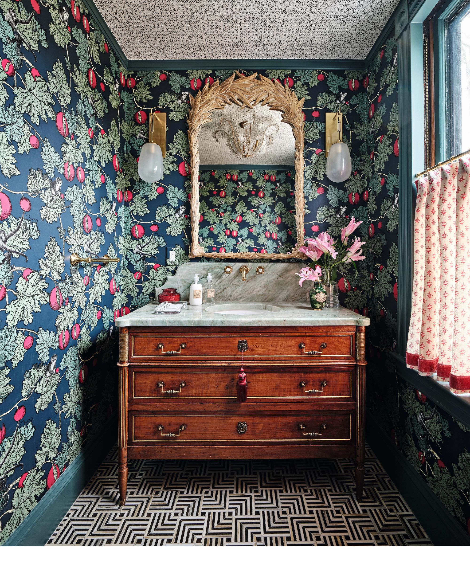
Frutto Proibito wallpaper in Ink & Magenta, Cole & Son. Woodwork in Inchyra Blue, Farrow & Ball. Liaison floor tiles, Kelly Wearstler at Ann Sacks. Bruckner wall lights, Hudson Valley Lighting. Mirror, 1stDibs.
Directly opposite, two cozy built-in corner banquettes have been designed to host gatherings for Christmas drinks. ‘The room is really a tale of two cities, but we made it work with zoning and a cohesive color and textural palette,’ says Robin.
Likewise, the kitchen island features a walnut end counter – a spot that’s ideal for two to perch at informally. ‘It lends natural warmth. We tried to create beautifully intimate moments throughout.’
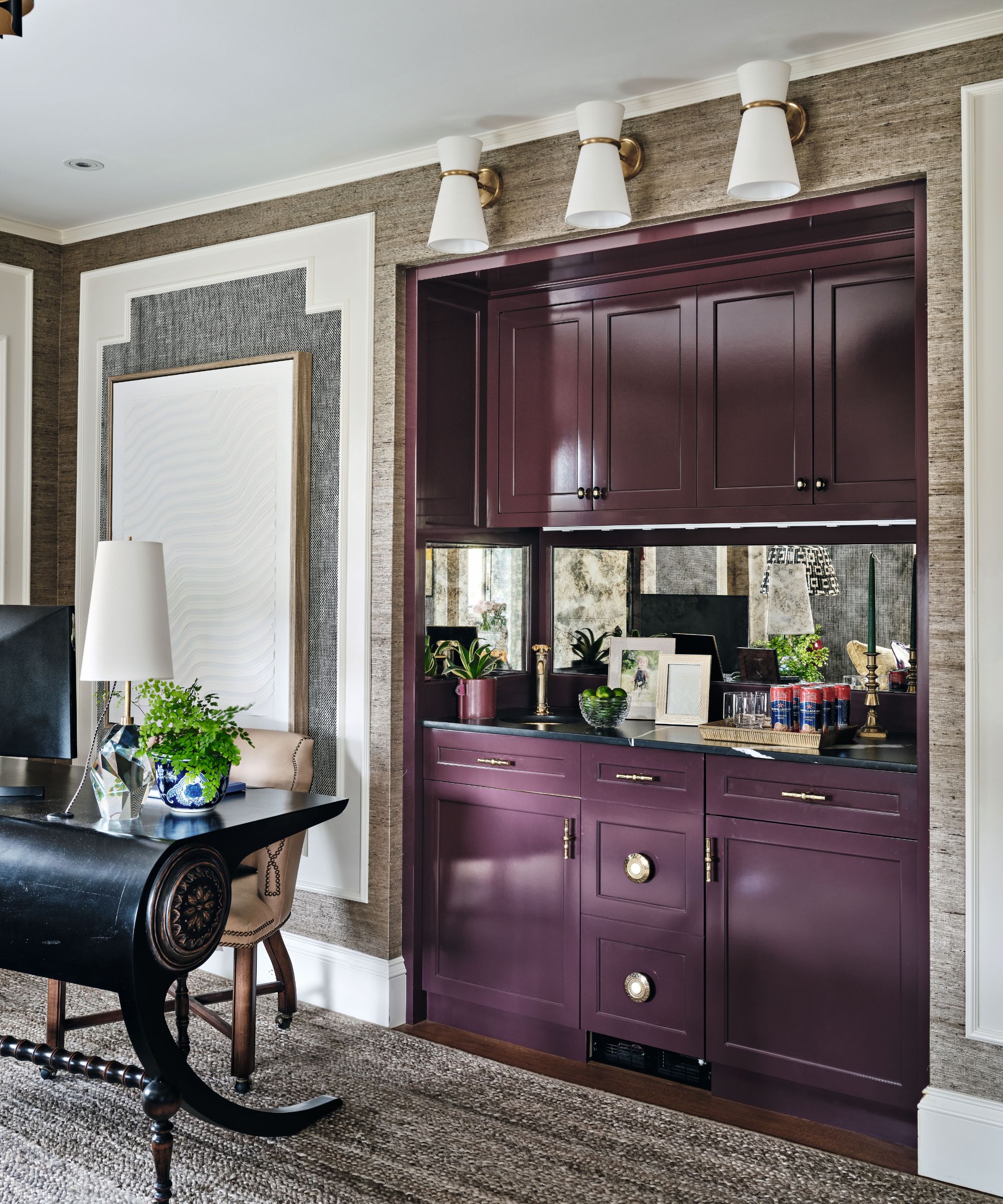
Bar in Brinjal, Farrow & Ball. Extra Fine Arrowroot wallcovering in Elephant, Phillip Jeffries. Clarkson wall sconces, Visual Comfort & Co.
Taking her cue from the owners’ love of jewel tones, a recurring motif is a combination of soft pastels and florals with deep mulberry and teal, plus geometrics and monochromes to lend bite.
A perfect example is the showstopping black lacquered bar with brass inlay in the kitchen. ‘My goal is to push my clients to the edge, but never over,’ smiles Robin, referring to the statement piece. ‘I like to create a talking point, a star of the show, where other items in the scheme act as supporting cast.’
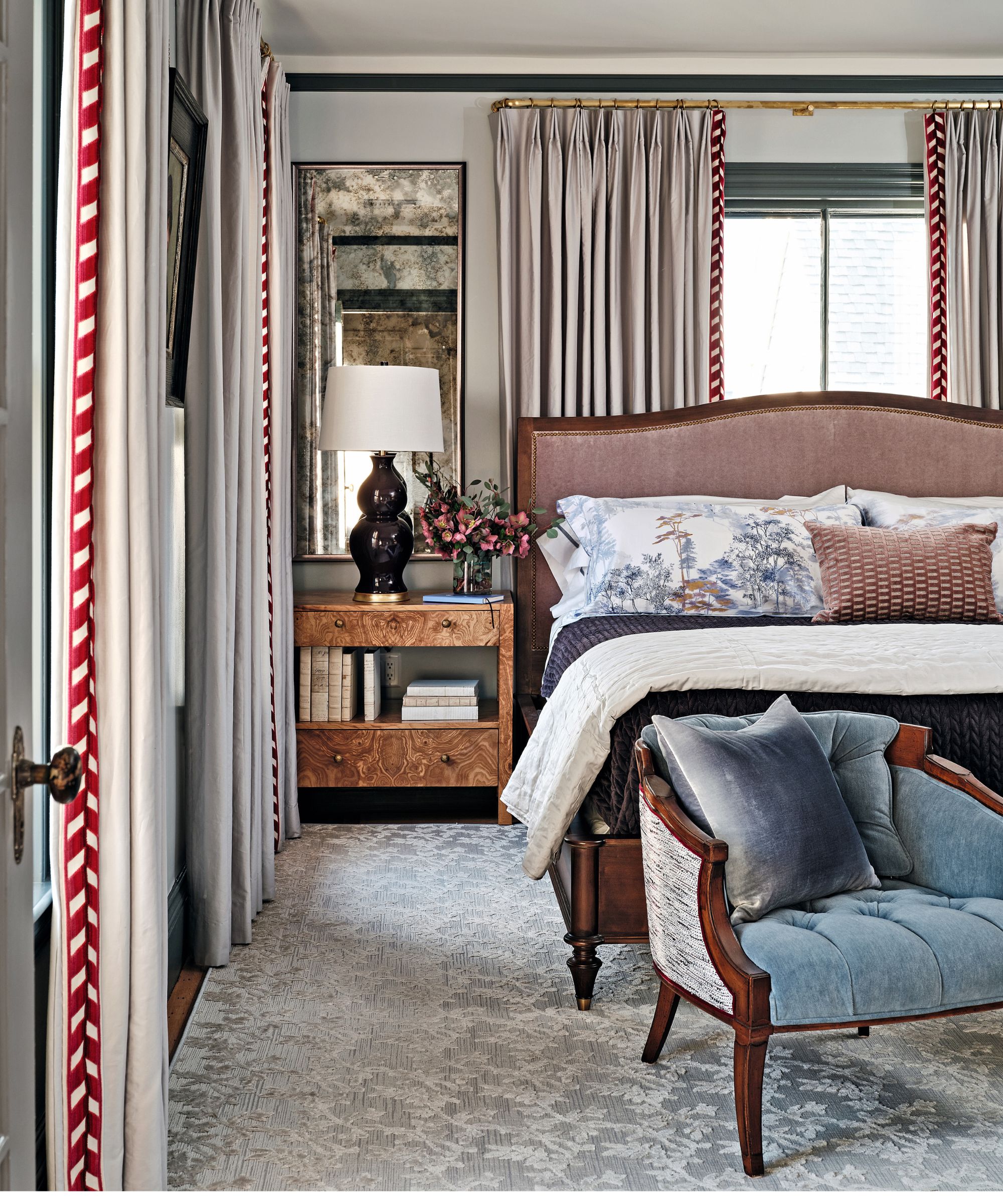
Antique chair upholstered in fabric by Holland & Sherry with back in fabric by Osborne & Little. Lindsey nightstand, Made Goods. Empire table lamp, Hwang Bishop. Curtain tape, Schumacher.
That imaginative approach shows up in bathrooms too, where Robin uses the ceiling as a fifth wall so that every surface is finished in paper, fabric, and tiling – often all three for a decorative result that celebrates softly clashing color and pattern.
The building’s age did present some complications, which is where that eye for detail came in. In the main bedroom, for example, the walls and ceilings were not level. ‘We needed to find a way to throw the eye off,’ says Robin who landed upon the installation of a black-painted picture rail to counteract the crookedness.
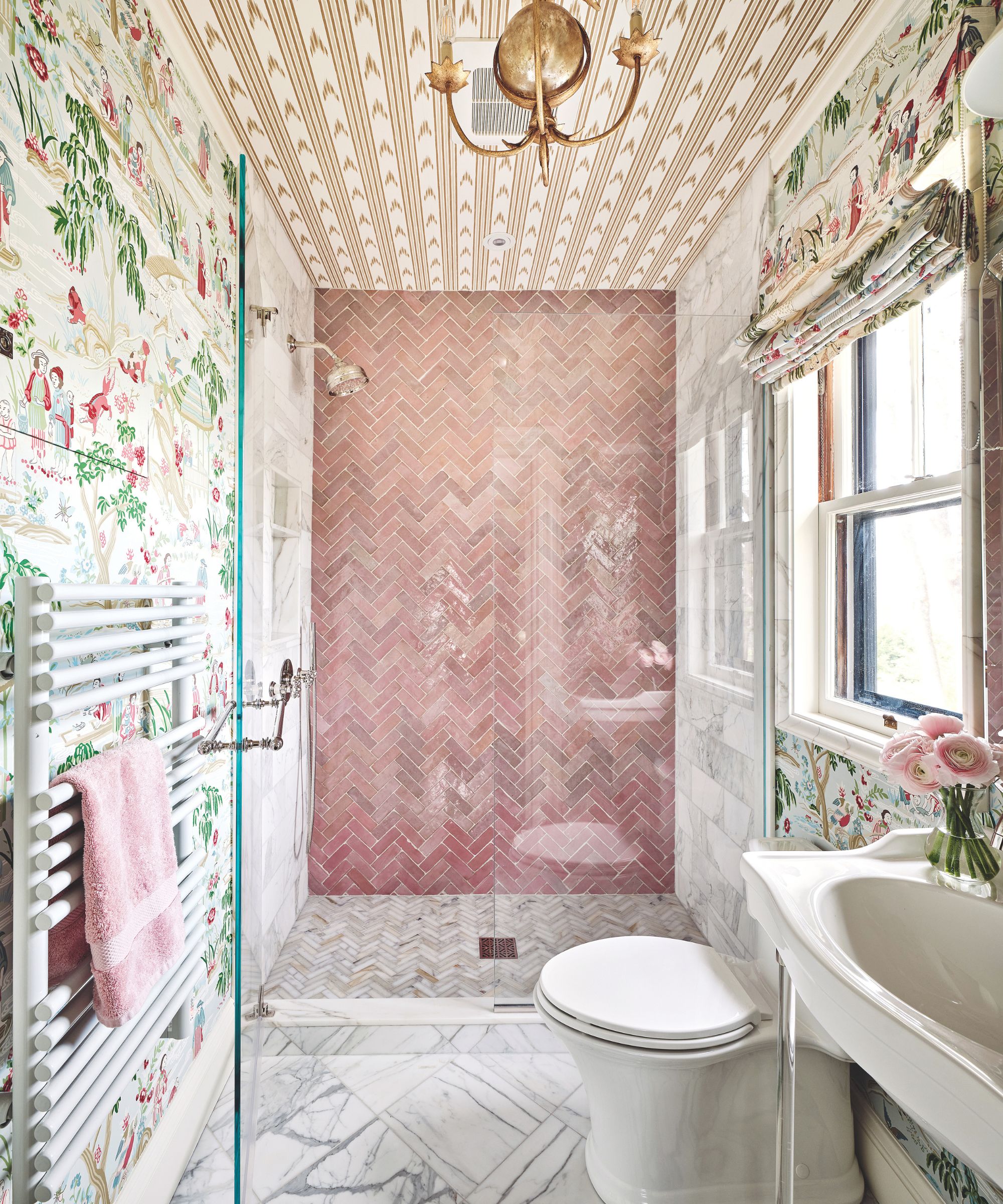
Walls and blinds, Schumacher. Gramercy chandelier, Visual Comfort & Co. For similar wall tiles, try Mandarin Stone. Cierra basin, Signature Hardware.
Touches like these – perfect for the couple’s artwork – have added the personality they craved. ‘We wanted to make the most out of all the nooks and crannies,’ says Robin. ‘They needed to tell the story. Where does Sunday morning coffee happen? Where do you read the paper and where are Friday night cocktails? Now there’s a perfect place for all of those moments.’
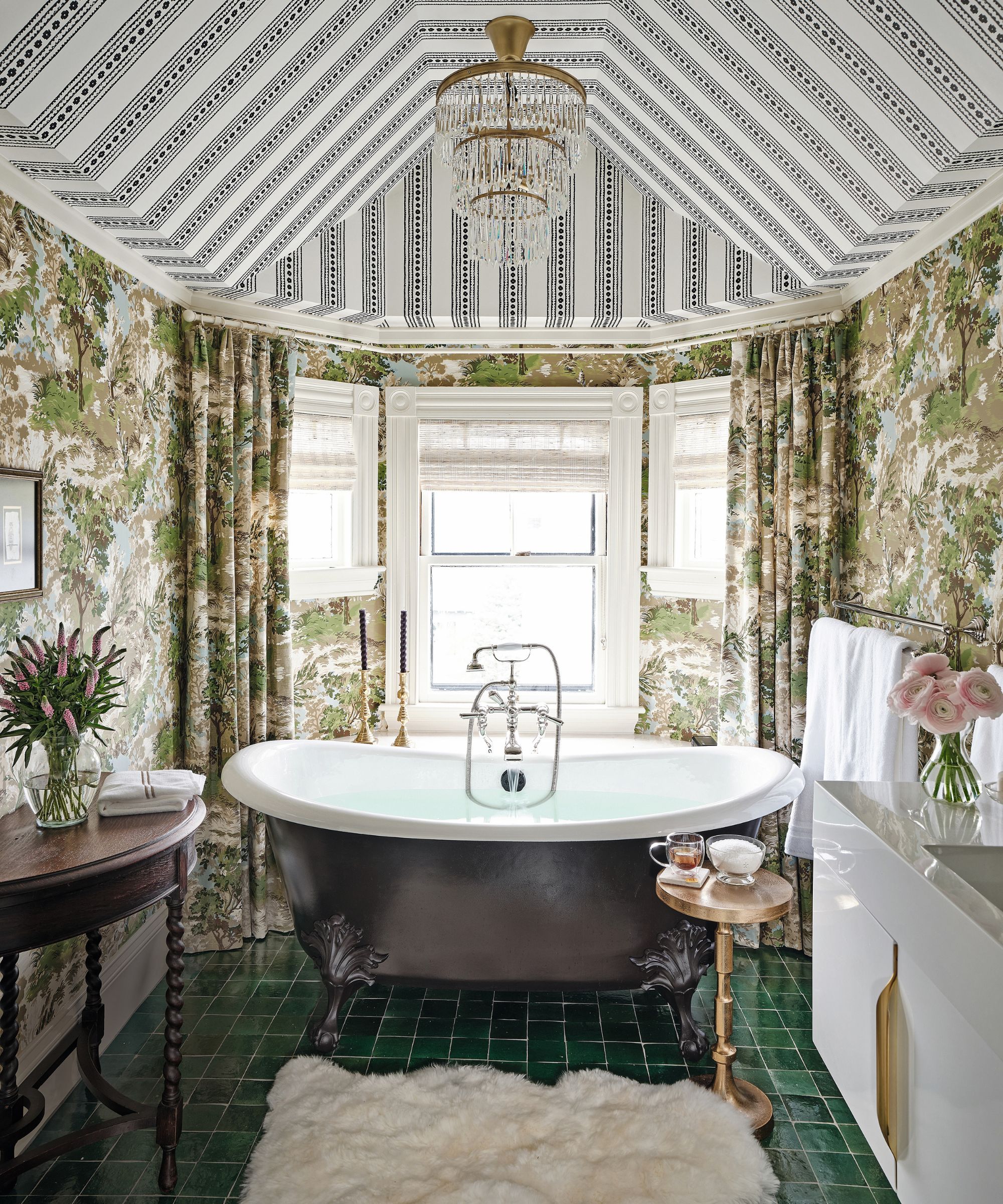
Ceiling, walls, and blind; all Thibault. For a similar bath, try Aston Matthews. Zellige floor tiles, Clé.
Meet the designer
Robin Gannon shares her style inspiration
SMALL CHANGE, BIG IMPACT
Adding wallpaper.
GO-TO DESIGN DETAIL
Contrast painted doors.
YOUR STYLE IN THREE WORDS
Layered, lived-in, unexpected.
INSPIRATION
Respecting the past, but bringing it into the present.
I KNOW I’M A CREATIVE BECAUSE
I visualize design in my head – I don’t need to see it physically.
HOME MAKES ME FEEL
Like I need to declutter!
WHAT’S ON YOUR COFFEE TABLE
Probably 20 or so books, a plant, a tray with remote controls, candles, a glass leftover from last night, and usually a game in progress. It’s a big coffee table…
Sign up to the Homes & Gardens newsletter
Design expertise in your inbox – from inspiring decorating ideas and beautiful celebrity homes to practical gardening advice and shopping round-ups.
-
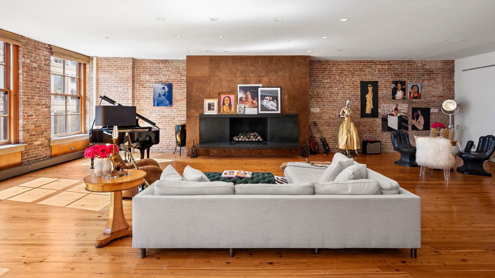 Courtney Love's historic loft combines rock star luxury with raw New York bones – it's on the market for almost $9.5 million
The singer's former SoHo home features exposed brick walls, original wooden columns, a gas fireplace, and high ceilings – take the tour
By Hannah Ziegler
-
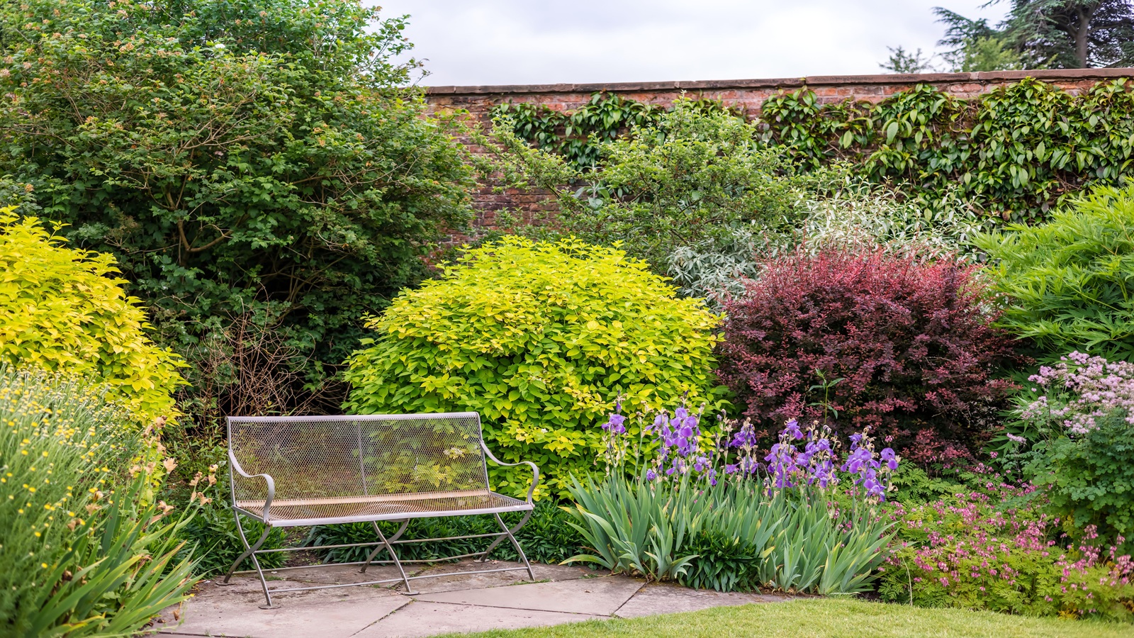 Triangular shaped garden ideas – landscape designers share 9 ingenious ways to redesign your corner plot
Expert tips for planning, planting and finessing a triangular shaped plot, so you can savour the space year round
By Jill Morgan