How to design a house perfect for parties – tour the stylish London home created for a couple who host infamous festive gatherings
Interior design firm Pringle & Pringle was instructed to ensure the new layout of this property was conducive to housing guests and get togethers
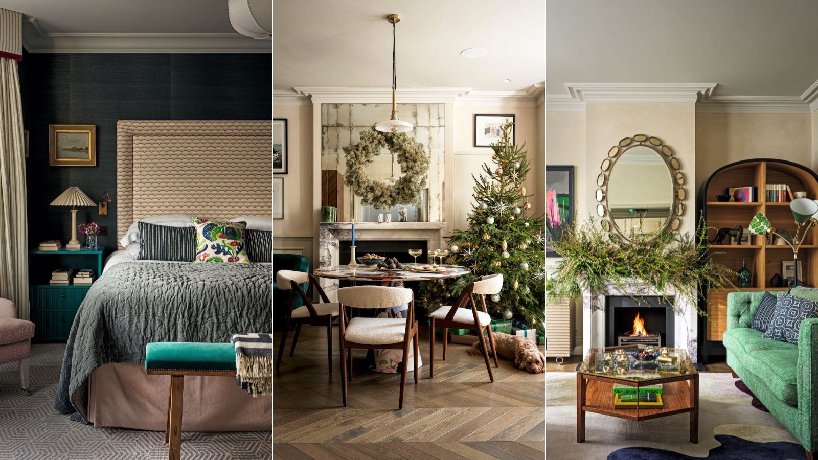
Step across the threshold of Charles and Alice Holt’s west London home over the festive period and you know you’re in for a good time. The couple love nothing more than hosting an evening of champagne, cocktails, and carols, complete with a resident piano player, in a tradition passed down from Alice’s mother. ‘It brings together every generation and lots of friends,’ says the literary agent. ‘It’s our biggest yearly ritual.’
The couple moved here in 2020 with their children Freddie, now 14, Isabella, 12, and Olivia, 8, and soon realized that to strike a balance between form and function, a full reconfiguration was required. So they turned to Sophie Pringle, who’d also worked with them on the house design of their last place.
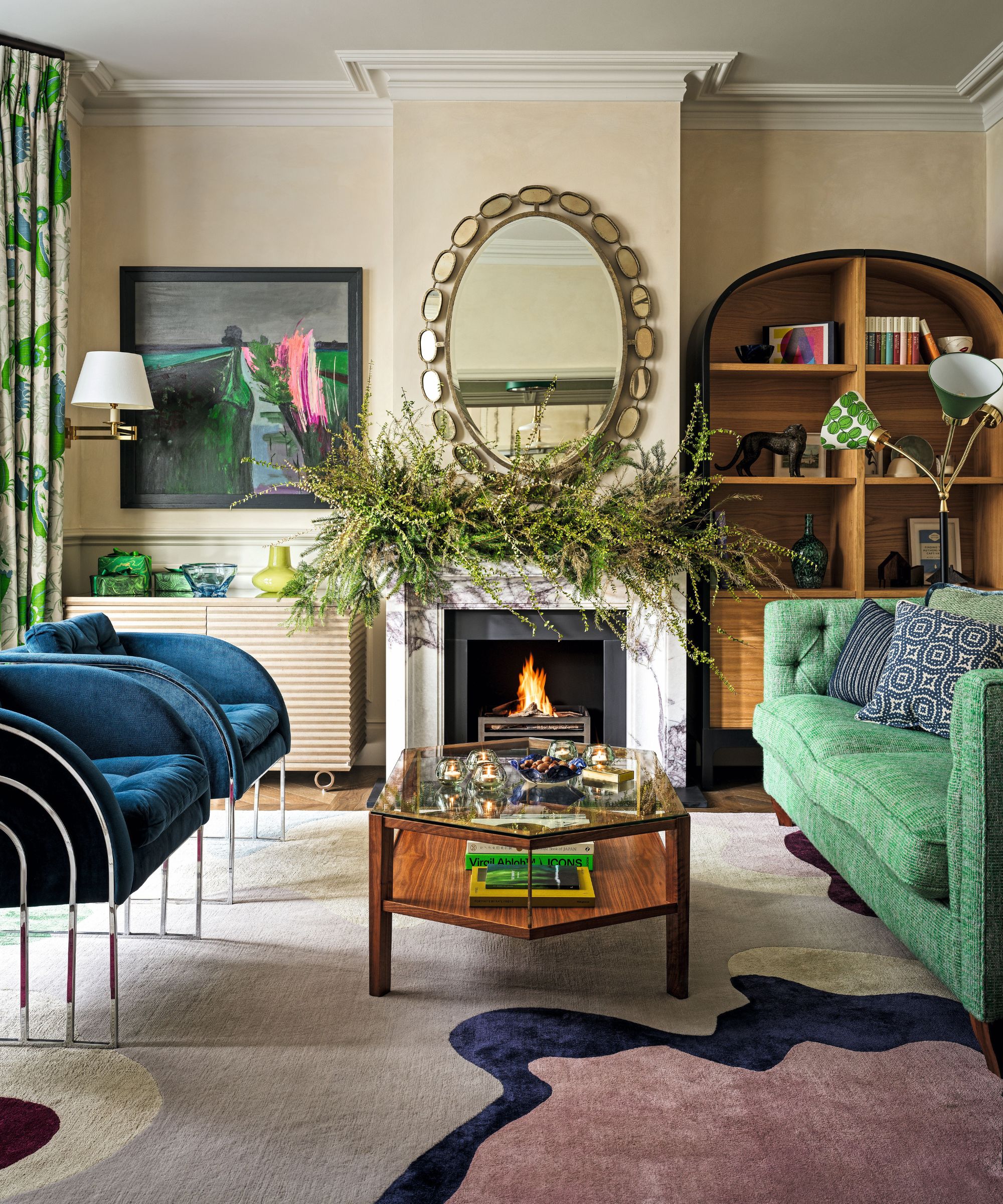
Chairs, Vinterior; covered in Loop Loop in Avorio, Dedar. Holt pendant, Holloways of Ludlow. Walls in Hoar Frost and Stone, both Bauwerk Colour. Rug, Mary Katrantzou. Dresser, Pinch.
‘From the first viewing, we could sense the bones were right,’ says the designer and creative director of Pringle & Pringle. ‘It was a home the family could grow into and it had plenty of space for guests, which was important since Charles’ relatives regularly visit from South Africa.’
As well as playing to the couple’s spirit of adventure, the key was to rationalize the layout, reworking a warren of rooms on the first floor to create bedrooms and bathrooms for all the family, each branching out of the central staircase.
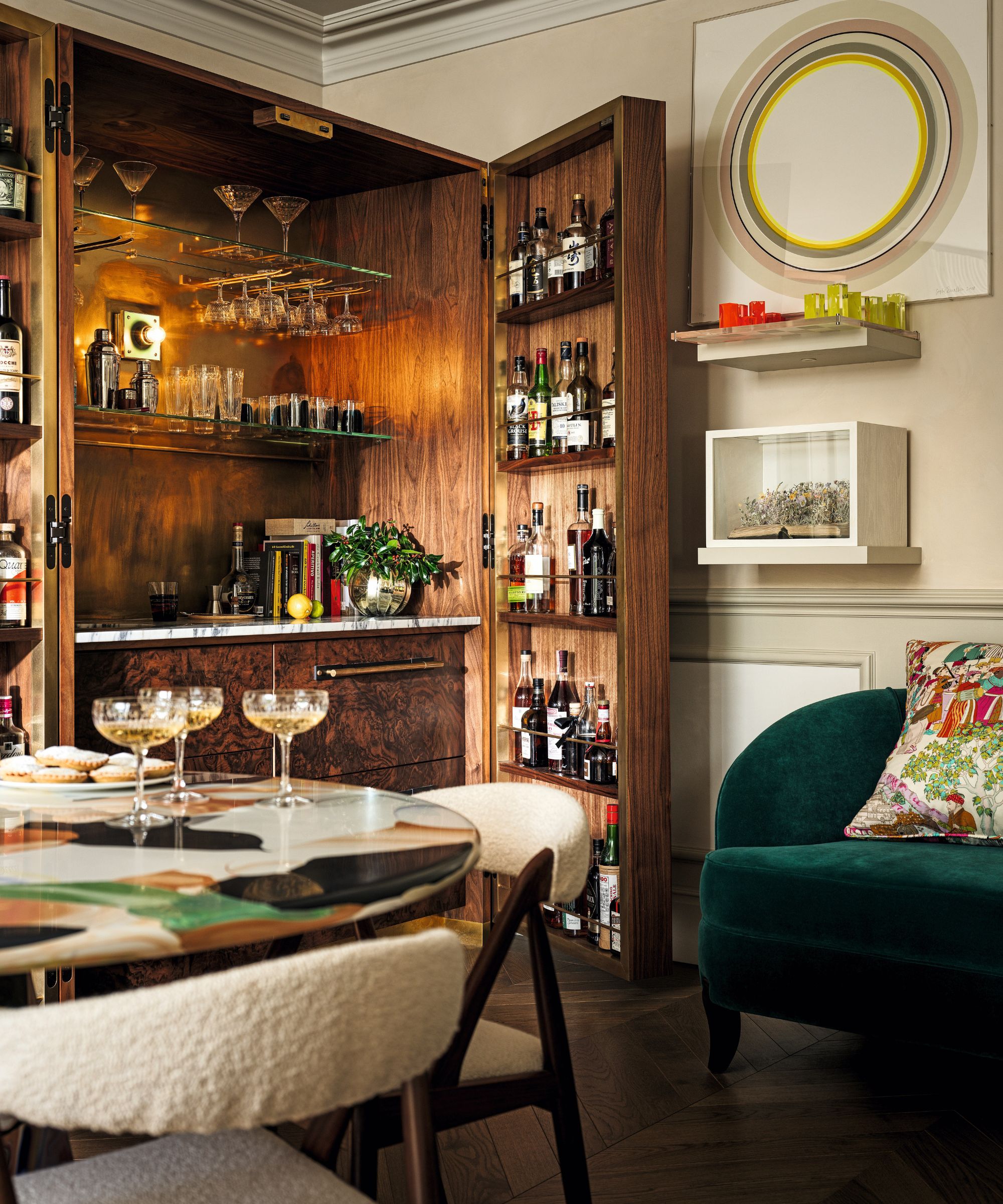
Cabinet, designed by Pringle & Pringle; made by Guy Sturgess at Quantock Woodworks. Sofa in Jane Churchill’s Emile, Colefax and Fowler. Circle artwork by Sophie Smallhorn.
‘Sight lines were particularly important,’ Sophie says. ‘Alice is deaf, so it’s helpful that she can now see into all the rooms at a glance from the landing, enabling her to keep an eye on the children.’
In addition, the ground floor was reworked to allow for a library space at the heart of the house; a spacious yet cozy kitchen with a convivial round table in one corner, and also a series of utility spaces running along the side of the building, including a boot room (complete with an extra-large sink for washing Coco, their cavapoo), craft space, laundry and pantry.

Pantry in RAL 6011 Reseda Green; Island in Theatre Red; both Little Greene. Aerin Charlton task lights in hand-rubbed antique brass, Visual Comfort & Co.
That all-important party atmosphere comes into its own thanks to two sitting rooms on either side of the staircase, designed for Alice and Charles respectively, both reflective of their individual passions while complementing one another. ‘They are distinctive spaces, but can easily be opened up for entertaining,’ says Sophie.
‘We also reinstated a wall between Alice’s sitting room and the snug to ensure a level of coziness and to avoid that transient middle room syndrome, which so many period homes succumb to.’
Alice’s sitting room, anchored by a punchy rug complete with two vintage cinema chairs and an elegantly curved oak dresser, is an ode to color and, in her view, ‘the most beautiful room in the house, with really comfortable ensconcing furniture and our favorite art.’
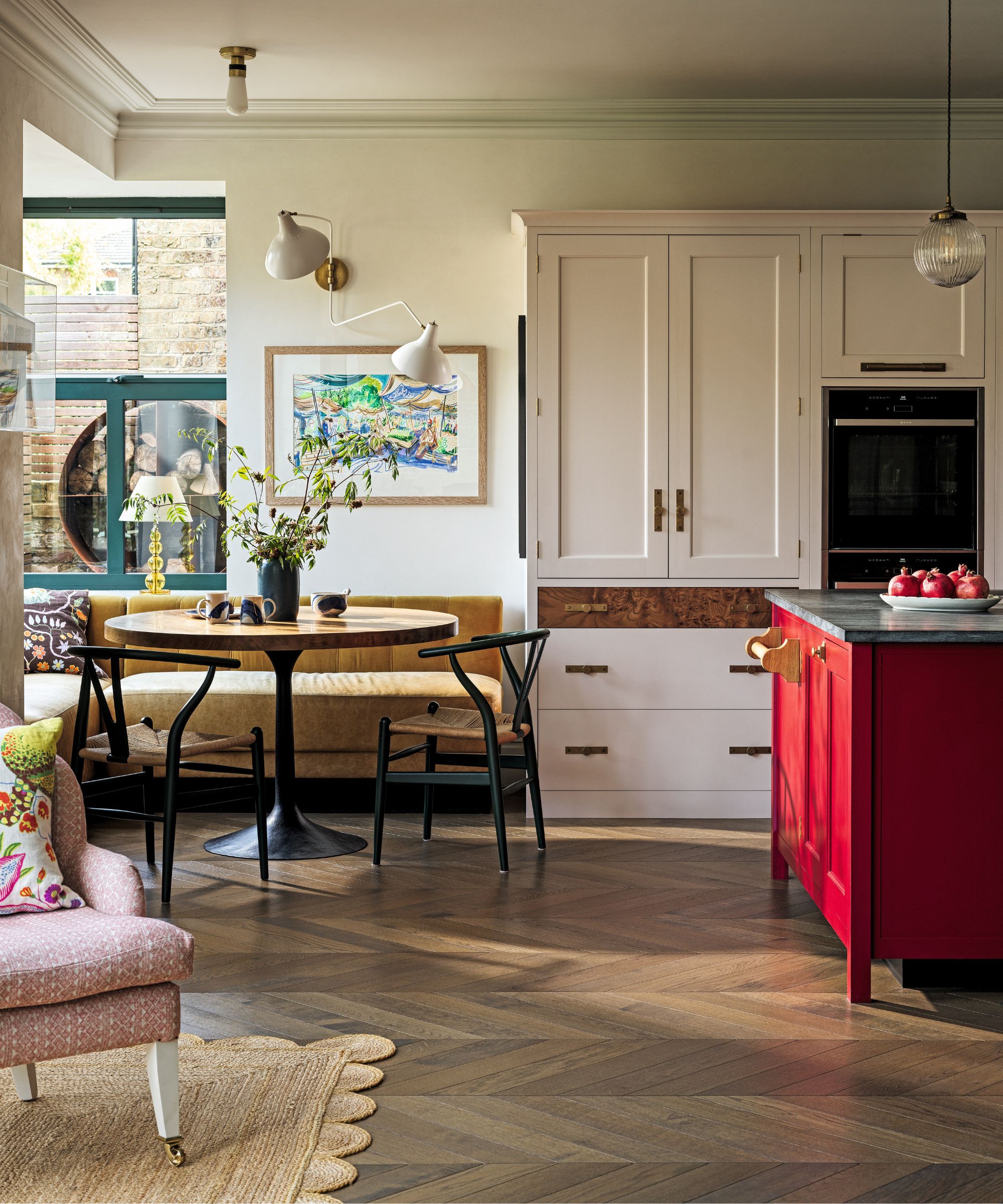
Dakota table base by Julian Chichester. Custom-made banquette, George Smith; leather seat in Trento Arcadia, Whistler Leather; velvet back in Java, Rose Uniacke. Aerin Charlton double wall light, Visual Comfort & Co. Artwork by Nicholas Hely Hutchinson.
Charles’ space, meanwhile, amplifies textured neutrals. At its heart is a walnut home bar cabinet, fronted with a shield design to celebrate his South African heritage. A table for playing cards as well as a smaller table made by a family member complete the picture.
Although the couple say they are ‘adventurous’, some of Sophie’s suggestions took them out of their comfort zone, including the kitchen’s bold colors. ‘The red kitchen island combined with pink elements and green pantry doors were a big “oooh, errr” moment,’ says Alice, ‘But Sophie’s instinct was right and it’s now one of our favorite features.’

Ghia headboard, The Headboard Workshop; upholstered in Scallops in Pink, Ottoline.
Other irreverent elements include a pink mohair carpet in the snug, mezzanine floors in two of the children’s rooms and a cinema room with mountain-studded wallpaper in the basement. ‘All these things invite people to touch and sit and enjoy, which is how we are as a family,’ says Alice. ‘We love to hang out with friends and be welcoming.’
Above all, this is a home that is truly reflective of its inhabitants. ‘Our brief was that it should feature lots of color and a comfortable mixture of old and new, but above all, it must feel totally “us” and I think that’s exactly what we’ve achieved,’ says Alice. ‘We didn’t want it to look contrived in any way. This home feels safe and encompassing, but it’s also a space to entertain in,’ reflects Alice. ‘And that’s just how we like it.’
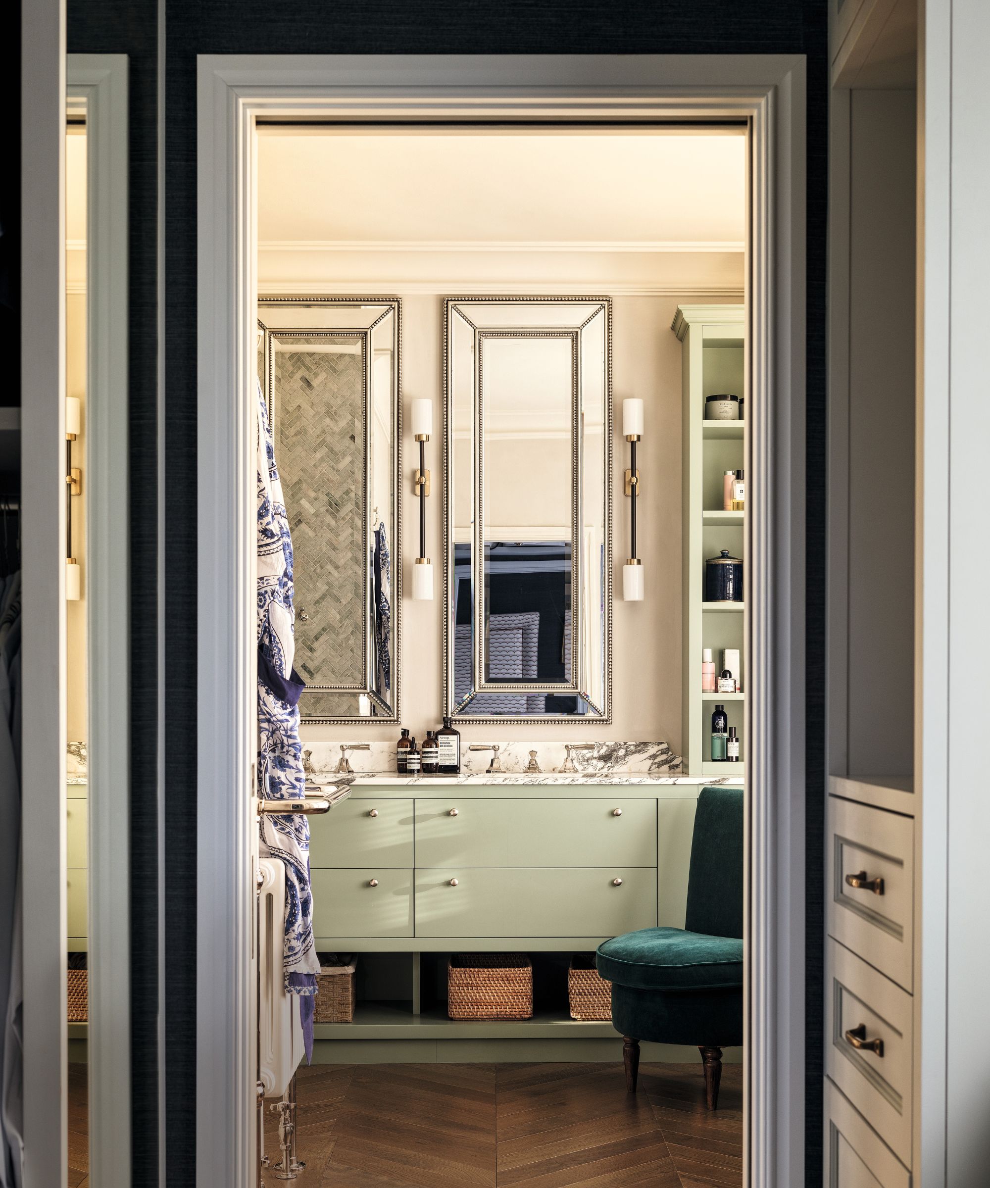
Joinery in Salvia, Paint & Paper Library. Farol wall lights, Bert Frank. Vanity, Aldous Lamont Joinery.
Meet the designer
Sophie Pringle shares her style inspiration
SMALL CHANGE, BIG IMPACT
We love to add a fabric or an item that is unpredictable. For example, on this project we painted the kitchen island red.
GO-TO DECORATIVE MOTIF
There isn’t a style of interior that doesn’t suit a stripe and they work with all other patterns to create layers.
YOUR STYLE IN THREE WORDS
Fun, comfortable, personal.
INSPIRATION
Magazines, hotels, restaurants, travel and nature. A recent stay at Heckfield Place was a great example of effortless comfort.
HOME MAKES ME FEEL…
Everything! Home should make you feel relaxed but it can also be energising and fun. If a house is making you feel stressed you need to start with the basics and streamline storage.
WINTER MEANS…
Snuggling up on the sofa, walks, Sunday roasts with family. Coming home to lamps on in the window is such a cozy feeling. Making sure your home is beautifully lit helps combat the gloom
Sign up to the Homes & Gardens newsletter
Design expertise in your inbox – from inspiring decorating ideas and beautiful celebrity homes to practical gardening advice and shopping round-ups.
-
 Isabella Rossellini's European-designed chef's knives are currently $65 off – and these luxury cooking tools have been around for over 200 years
These stunning German-made knives have a rich history, including being used in the Conclave actress's kitchen – and they're now on sale at Wayfair
By Sophie Edwards
-
 This is one of the worst things you can do to your vacuum cleaner – experts warn it will slash its lifespan by years and damage the motor
Overfilling your vacuum can cause real, long-term damage and is best avoided
By Dan Fauzi