‘My whole concept was this mixture of ugly and pretty' – tour an exuberant cottage in the city filled with character
This designer wanted to embrace the traditional bones of a London period property whilst stamping it with her signature style
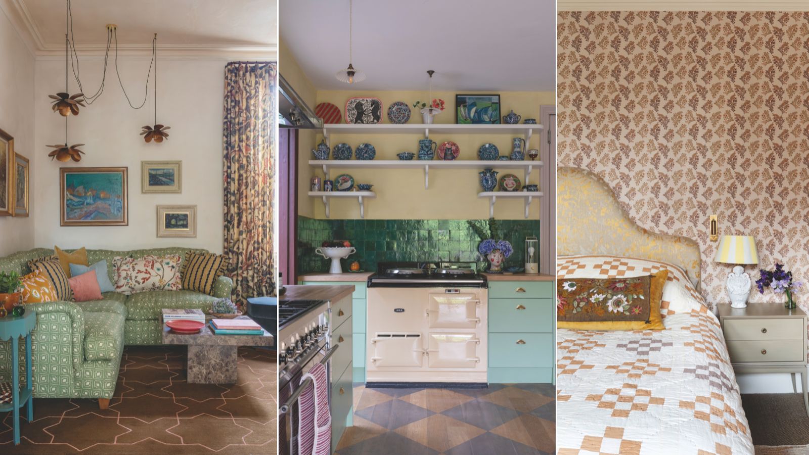

'Cottage in the City' sums up the Edwardian terraced home of Jules O’Carroll, co-founder with Nancy Parker of Parker & Jules. The brand’s signature printed textiles and wallpapers embrace timeless patterns that are infused with modern color, so it’s no surprise that Jules celebrates them in her west London house with an alluring, verging-on-the-maximalist, country-style interior.
The house's period charm won over Jules and her husband Dero when they first viewed it. ‘Everything was white, but there was still a coziness to it,’ says Jules. ‘It hadn’t been hugely modernized and a lot of the features were still there.
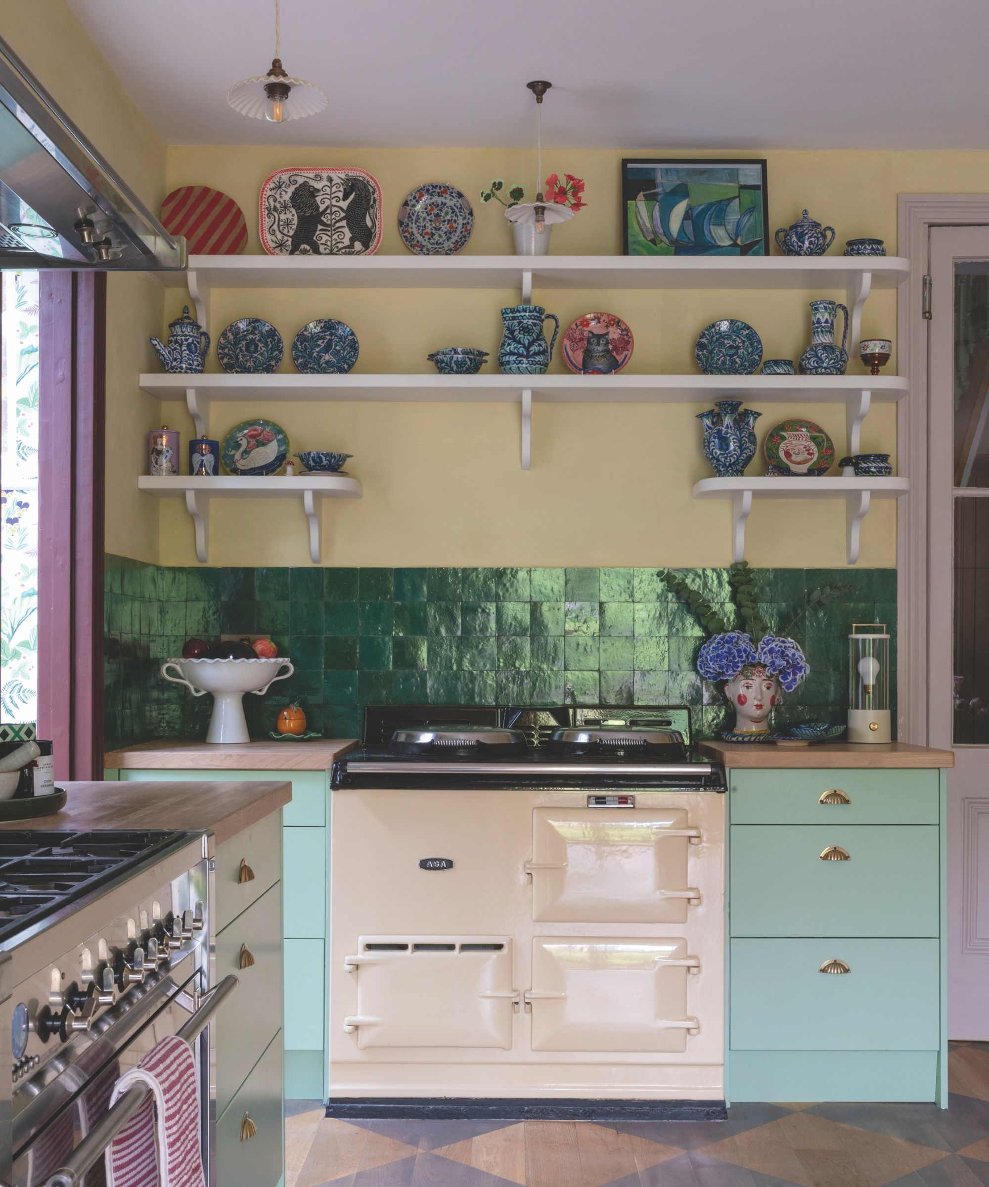
Cabinetry in Pea Green, Little Greene. Zellige tiles, Habibi Interiors.
Jules continues, 'Our house in the country is very modern, so to have something that was period and to be able to work with the architecture and create a charming and quirky look was very appealing.'
The interior required ‘a decorative overhaul’ rather than structural work. ‘We kept the layout throughout and worked with it,’ explains Jules. ‘We had a house renovation before that took about 10 years of our lives. I wanted this house to work for us, rather than us work for it.’
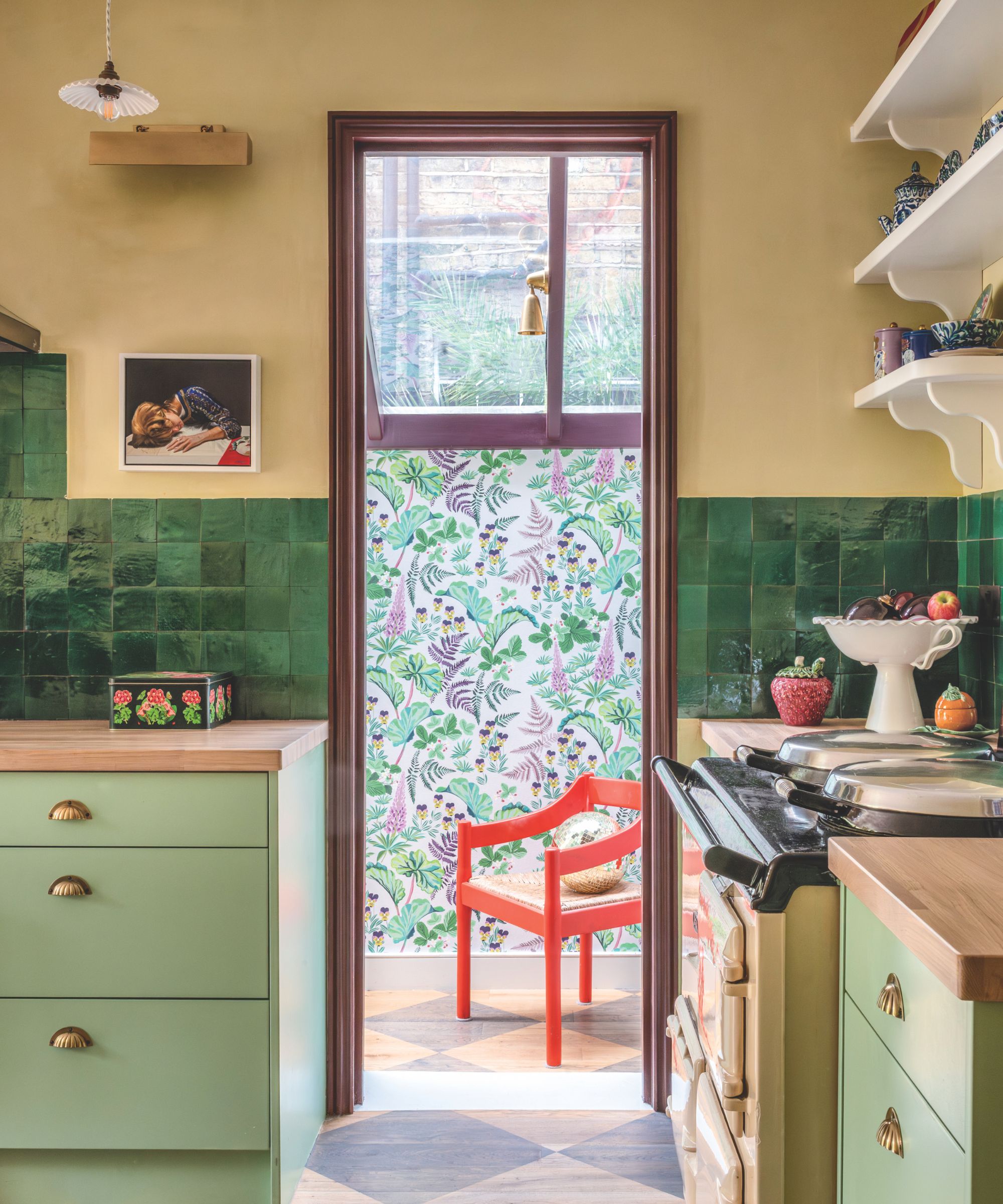
Strawberry Fields wallpaper, Parker & Jules. Carimate chair by Vico Magistretti, Scene by Chloe.
The greatest upheaval came with replacing the bathrooms and installing air-conditioning in the main bedrooms and sitting room. A combined pantry and utility was also built. Particular attention was paid to the floors, with the hall tackled first.
‘I wanted to replace the hall tiles because they set the tone and it was a 1980s black and white scheme that wasn’t in keeping with the property,’ explains Jules. ‘We chose bold patterned tiles as the space needed to be colorful.’
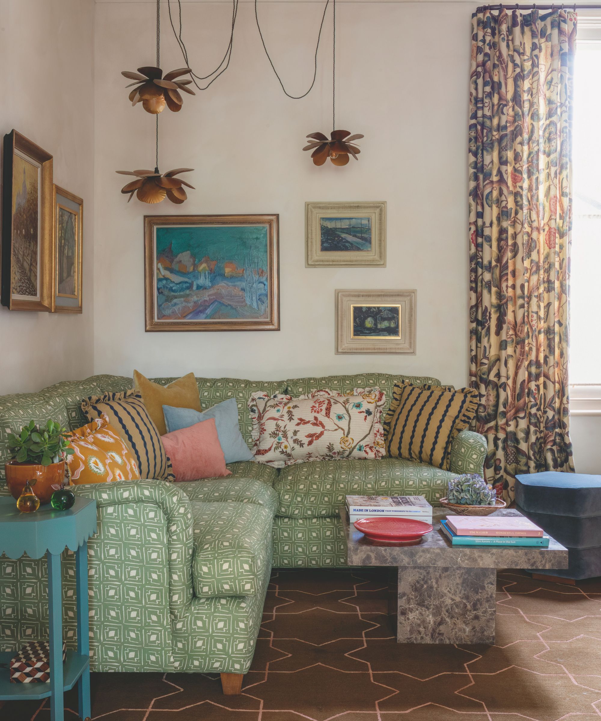
Sofa, Susan Osbourne; in a Parker & Jules fabric. Coffee table, Soho Home. Blue table, Camilla Hampton. Rug, Amy Kent. Flower pendants, Caravane. Curtains in Tree of Life, Claremont.
Diamonds were painted on the kitchen floor to inject character. ‘I love how the space now feels more unified and connected,’ says Jules. Since working with color and pattern is her bread and butter, she was confident in what she wanted to be surrounded by.
The biscuit-hued walls throughout the rooms downstairs provide a warm backdrop against the carefully curated bold hues. ‘My whole concept was this mixture of ugly and pretty colors, so we had a palette range that incorporated a khaki green, lilac, and an almost granny reddy-pink, but those three colors on repeat hold things together through the interior.’
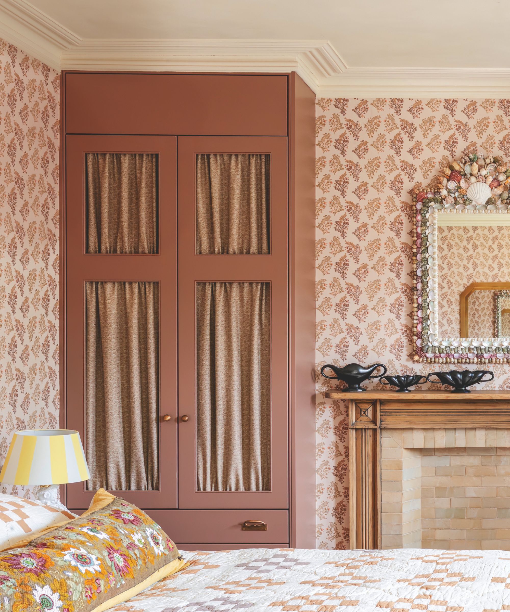
Baby Coromandel Flower Coral Moss wallpaper, Parker & Jules. Wardrobes in Nether Red, Little Greene.
The kitchen stands out for its colorful eclectic cottage decor. Fresh green cabinetry sings against the diamond-painted floor, emerald zellige tiles, rich brown banquette, and punchy reds of the kitchen chairs. ‘The colors are slightly unexpected.'
I wanted to try things out because your home is your laboratory,’ says Jules. The utility in the side return features dark purple cupboards and Parker & Jules Strawberry Fields on the curtain fabric and pantry wallpaper. ‘The space is playful, fun and colorful,’ says Jules. ‘The house stretched my color palette.’
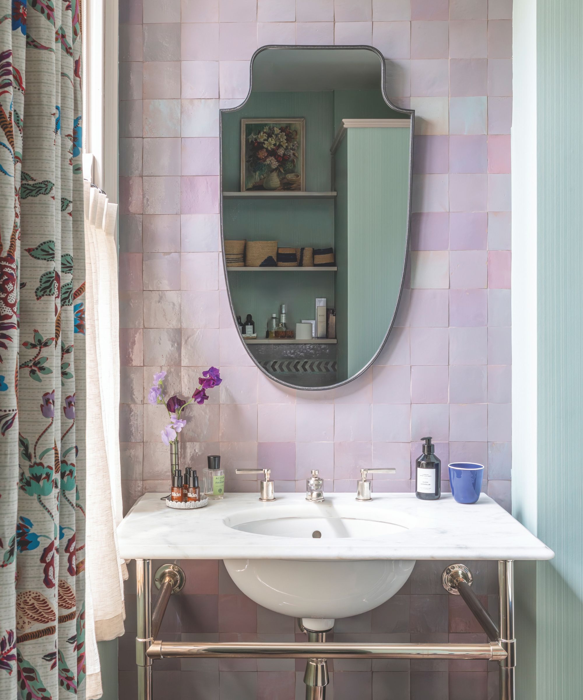
Curtain in Eversley, Parker & Jules. Vanity, Edwins. Mirror, Vaughan. Zellige tiles, Habibi Interiors.
Jules relished the opportunity to incorporate much-loved fabrics, of course. ‘There were moments where I got to use favorite fabrics that I’d lusted after,’ she says. One of these was the Claremont Tree of Life fabric in the sitting room, where Jules designed a much more sophisticated and grown-up space.
Lime paint gives the walls and ceiling depth, while earthy khaki and saffron tones were introduced. ‘The shades are lighter in the bigger main room, then as you retreat to the smaller TV area behind with its modern wrap-around sofa, everything is a little more jewel box and cozy.’
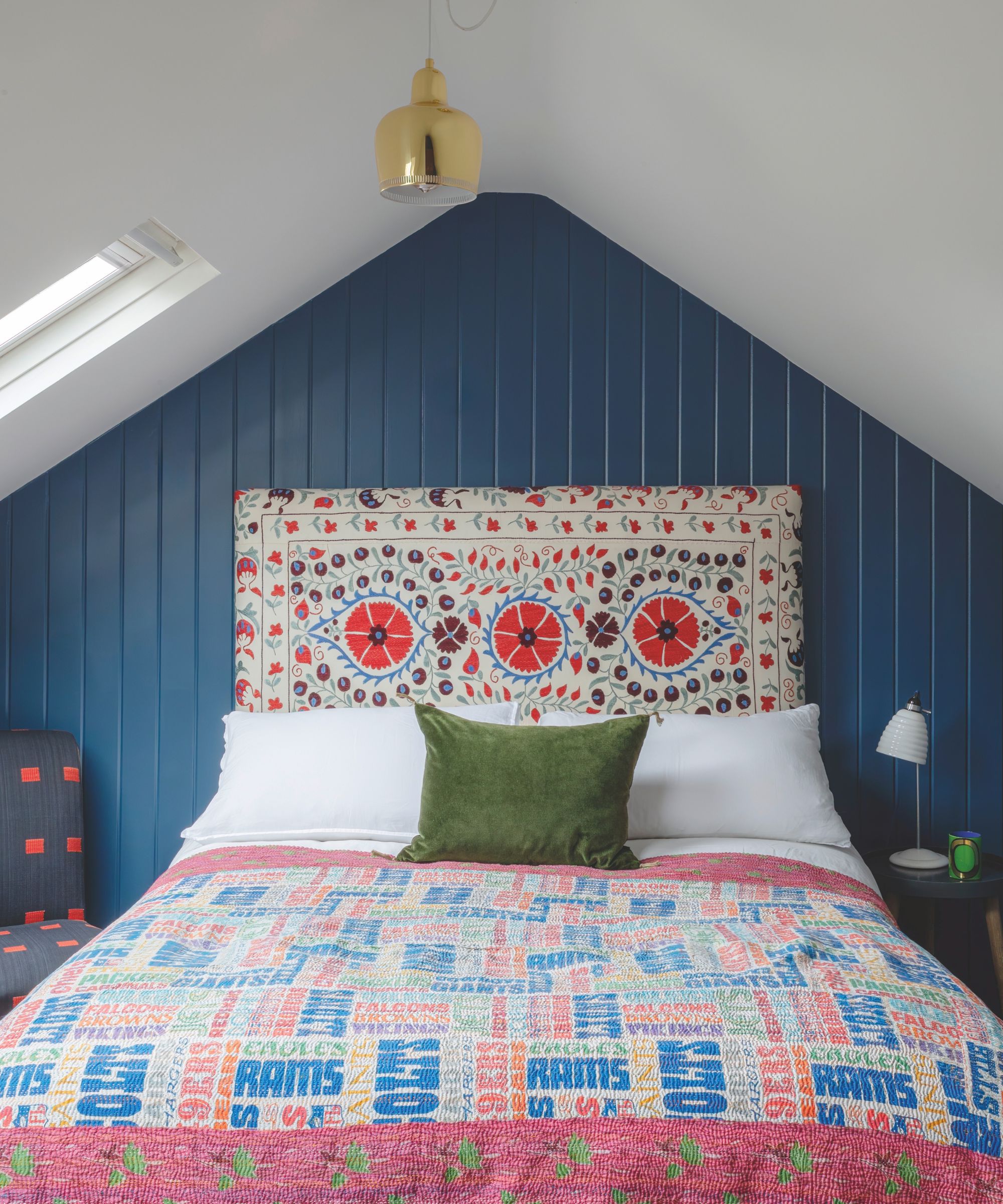
Paneling in Stiffkey Blue, Farrow & Ball. Vintage suzani, Chloe Jonason Interiors. Throw, Warris Vianni & Co. Pendant, The Conran Shop.
Upstairs, the main bedroom has a cozy and eclectic feel. ‘The pink paint on the wardrobes is one we used repeatedly throughout the house,’ says Jules. She teamed it with a Parker & Jules wallpaper and a gold fabric by Jennifer Shorto used in reverse on the headboard. ‘I wanted something that was almost bad taste so it wasn’t too “granny’s favorite bedroom”!’
Mid-century pieces inject a modern touch. A maximalist look is created throughout the house with layers of fabrics, artwork, and rugs. ‘It’s the layering that makes the place feel like a home,’ says Jules. ‘The look is about mixing the charming and the unexpected with moments of grown-up sophistication so there are elements of surprise as you walk through the house.'
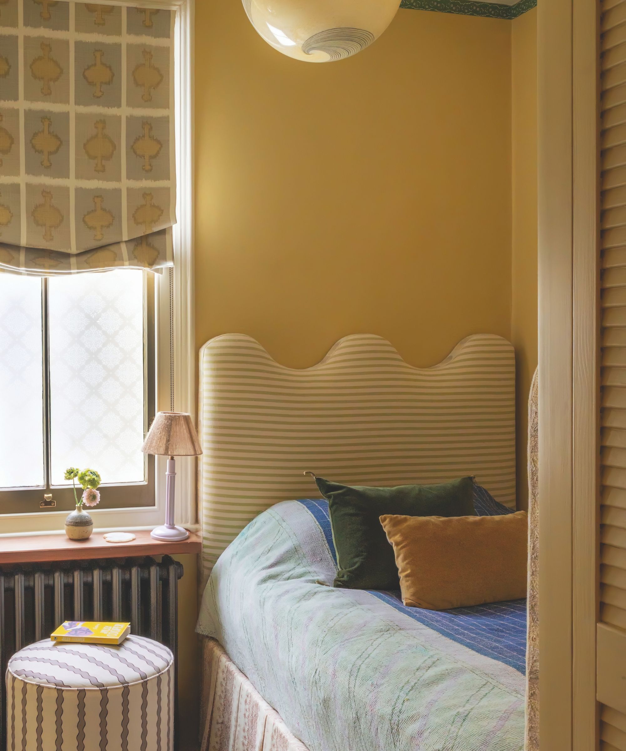
Headboard in Olive Sacking, Guy Goodfellow Collection. Stool in Scroll Stripe, Parker & Jules. Blind in Ozone, Kit Kemp for Christopher Farr Cloth.
Meet the designer
The Parker & Jules co-founder shares her style inspiration
BIGGEST INDULGENCE
Our bathroom.
GREATEST SUCCESS
The kitchen, which felt narrow and disconnected. It’s now really welcoming and a proper hang-out space.
SMALL CHANGE, BIG IMPACT
The patterned hall floor tiles in the entry.
GO-TO COLOR
Light bronze green – an ‘ugly color’ to work against pretty colors.
YOUR STYLE IN THREE WORDS
Colorful, layered, confident.
SECRET ADDRESS
Nushka on Golborne Road, which sells lovely vintage textiles.
I KNOW I’M A CREATIVE BECAUSE...
I lie awake, doing mental jigsaws in color and pattern!
HOME MAKES ME FEEL
Happy.
WHAT’S NEXT
Parker & Jules is five years old and to celebrate this we have evolved our color palette.
Sign up to the Homes & Gardens newsletter
Design expertise in your inbox – from inspiring decorating ideas and beautiful celebrity homes to practical gardening advice and shopping round-ups.

Interiors have always been Vivienne's passion – from bold and bright to Scandi white. After studying at Leeds University, she worked at the Financial Times, before moving to Radio Times. She did an interior design course and then worked for Homes & Gardens, Country Living and House Beautiful. Vivienne’s always enjoyed reader homes and loves to spot a house she knows is perfect for a magazine (she has even knocked on the doors of houses with curb appeal!), so she became a houses editor, commissioning reader homes, writing features and styling and art directing photo shoots. She worked on Country Homes & Interiors for 15 years, before returning to Homes & Gardens as houses editor four years ago.
-
 'Sexy disco-era Italy meets Japanese farmhouse in the Brazilian jungle' was the description the interior designer gave this glass-walled modernist home
Offering a warm welcome that defies its stark, modernist lines, this archictectural gem is full of surprises
By Karen Darlow
-
 Are you making the most out of the estate sales in your area? These are the 5 most valuable items you should be shopping for
Vintage lovers and antique experts share the objects you should always look out for when you're exploring an estate sale
By Eleanor Richardson