

When dealing with small spaces, astute planning is key; this was certainly the case for Studio Squire who were called on to redesign this exquisite two-bedroom apartment, located in a Grade-II listed Georgian building in Belgravia. Angelica, who founded the design studio along with her husband Richard, tells us: 'We travel on a journey with our clients to find out what they want from a space'.
‘Then we go away and come up with all the ideas that we hope gives them a home that they love forever.’ This London apartment was the property of a couple with grown-up children who had owned it for some time, but never before managed to put their stamp on it.

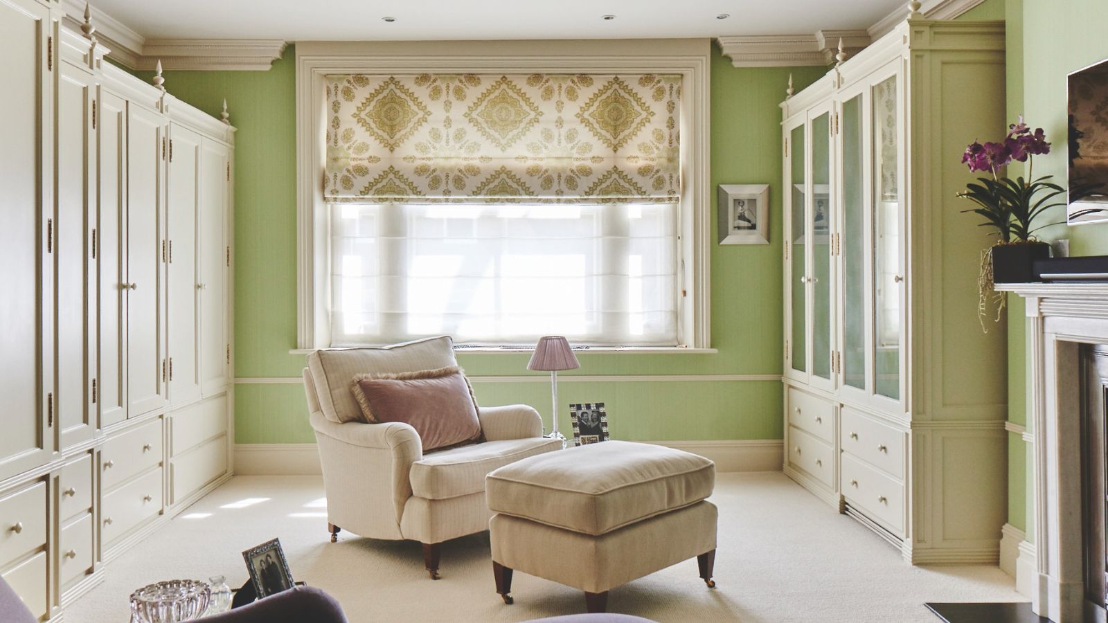
Sofas in Dolly wool in Honeycomb, Tissus d’Hélène; with Samuel & Sons' piping. Fireside stools, David Seyfried; covered in Palmyra in Ochre, Paolo Moschino. Jute rug, Peter Page. Artwork by Bianca Smith.
Angelica says ‘It’s a beautiful property. The minute you step in, you see those amazing Georgian proportions and beautiful windows. We were really aware of what a lovely location and building it was, so we didn’t want the interiors to be too bold.
She expands, 'We wanted it to feel quite timeless and elegant and an easy space to be in. And the clients really hoped to make it their own.’ For Angelica, it was a bonus that the owners were particularly interested in interiors.

Sofas in Dolly wool in Honeycomb, Tissus d’Hélène; with Samuel & Sons' piping. Fireside stools, David Seyfried; covered in Palmyra in Ochre, Paolo Moschino. Jute rug, Peter Page. Artwork by Bianca Smith.
Angelica tells us that the homeowners ‘had a very strong idea of the colors and palettes they liked. In addition, they also had some quite significant paintings, notably by Australian artist Bianca Smith – decorating with artworks within the schemes became a cornerstone of certain spaces.
‘They are tonal, slightly figurative works, quite contemporary with brown and caramel hues, and they were key from the beginning.’ Although the preference was for an earthy palette, rather than eclectic and colorful, punchy pops of blue, the client’s favorite color, were interjected at significant points.

Cabinetry in Rice Pudding, Plain English Design with Calacatta marble worktops. Walls in Pointing, Farrow & Ball.
The existing layout of the apartment didn’t work for the owners’ needs, so Richard reconfigured it, working with listed building consultants. On the first floor, there was an open plan-kitchen and sitting room. The couple wanted a separate kitchen so a wall was reinstated.
‘Although it’s a small apartment, the clients preferred to have clearly defined spaces so that when they were in the sitting room, they couldn’t see what was going on in the kitchen,’ explains Angelica. In addition, an upstairs ensuite bathroom was on their wish list, so a little space was teased from the main bedroom and the guest bedroom to provide a tiny shower room off the main room.

Blind in Bergamot Leaf in Azure and Indigo, Soane Britain. Custom banquette in Marvel vegan leather in Teal Ocean, Brentano. Oak breakfast table, Ed Keyser. Cabinetry, Plain English. Pendant, Hector Finch.
The apartment’s compact size meant that each decision required careful consideration. The kitchen, for instance, needed to be a really hard-working space with a washing machine and as much storage as possible, so two runs of cabinetry provided the solution.
A petite breakfast table and custom leather fluted banquette with storage drawers beneath were squeezed in so the couple had a cozy space to have coffee and read. Angelica debated whether or not to include a third chair at the table, but settled on the option of a stool instead.

Walls in Cabrieres in Glacier, Pierre Frey. Artwork by Bianca Smith. Cushions in Benjelloun, Bennison Fabrics.
The challenge with the sitting room, meanwhile, was ensuring that the space wasn’t filled with furniture, yet possessed enough seating for family and friends. Rather than opting for pairs of armchairs, the client selected two bespoke wool sofas that sit on either side of the room, while two dainty slipper chairs flank the fireplace, ensuring a balanced, symmetrical scheme. To one side, a small home bar provides a go-to for drinks without having to visit the kitchen next door.
Upstairs in the main bedroom, the bedside tables and the bed were made to a slightly smaller bespoke size. ‘By the time we had taken a chunk out to form the en suite, we had to be quite careful about the rest of the space we were left with, so reduced proportions were key,’ says Angelica.

Headboard and cushion in Via Krupp Bis in Navy, Paolo Moschino. Cabinetry in Stiffkey Blue, Farrow & Ball. Spotlight, Vaughan.
The nod to space-saving was continued in the guest room, part of which had been requisitioned to form the en suite. ‘We had to be clever and careful with the design,’ says Angelica. Adding cupboards on either side of the bed not only frames it elegantly but was key to incorporating bedroom storage.
‘We didn’t have space for bedsides, so we added small recessed shelf nooks at the sides of the wardrobes, with sockets and USB ports. They are only big enough for a novel and a glass of water.’ However, Angelica’s astute design proves that small can be beautiful – and practical – too

Carrara honed marble tiles, Mandarin Stone. Bespoke vanity in Stone Blue, Farrow & Ball. Shower curtain in Seaweed Lace in Azure, Soane Britain. Lucia L bracket wall light, Hector Finch.
Four rules for using artwork in a home
If you’re finding it tricky to incorporate your favorite pieces, try these tips from designer Angelica Squire.
1. Every room needs a starting point to work from when putting together a scheme and what could be better than a beautiful painting? Find the key colors within the artwork and use those to form the basis of your decor.
2. Break up the styles of art you have across a room, so, for example, try mixing paintings with photographs or smaller watercolors and etchings.
3. Consider the sizes of the artworks you have in a space. A large central painting above a fireplace or on your main wall creates a statement, but smaller frames and pairs of little pictures are also lovely on slimmer sections of walls or near windows if space allows.
4. Don’t forget sculptural artworks, too. Adding a beautiful bronze or ceramic piece on a side table or bookshelf will bring another layer to the room.

You must confirm your public display name before commenting
Please logout and then login again, you will then be prompted to enter your display name.
-
 7 expert-approved painting hacks to minimize clean up – to make an already exhausting task easier
Avoid a backbreaking clean-up after your next painting project with advice from the professionals
-
 Gwyneth Paltrow's quiet luxury kitchen is so beautiful, we almost overlooked her ultra-smart cabinets – they make the use of 'every inch' of storage space
The Goop founder makes use of dead space in her kitchen with customized cabinetry that reaches to the ceiling, providing ample storage

