5 tips for making living room shelves look more expensive on a budget
Your shelving can make a big difference to your home's overall aesthetic – here's how I make sure they elevate and intrigue
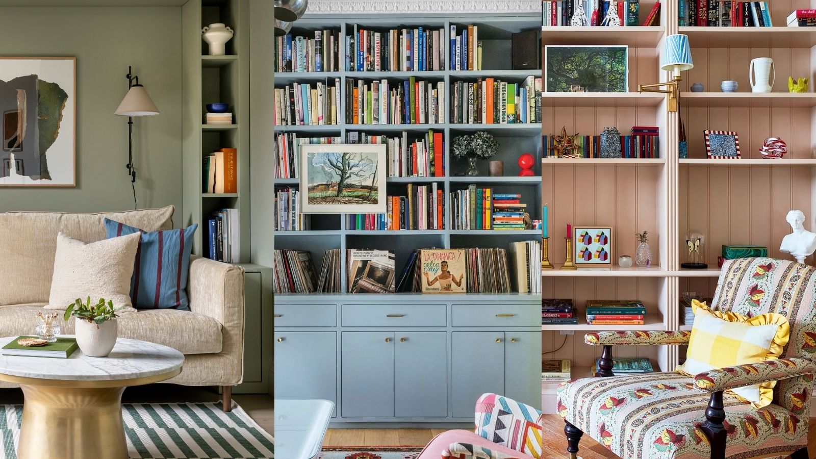

Putting up shelves is the moment when a living room project really comes together, especially if they take up a large amount of wall space. Whether you have shelving flanking a window or chimney breast, simply covering the majority of one wall, or perhaps dividing up an open-plan space, it always makes a living room feel more 'finished' and homely.
Living room shelving is a key feature as it provides somewhere to display a client's prized possessions and tell their story. As well as bringing a ton of character, visual intrigue, and conversation starters, shelving gives practical storage space for books, artwork, storage baskets and boxes, and decorative objects picked up on our travels. It can also soften the acoustics in echoey spaces and visually warms things up.
Your shelving even has the power to make your living room look expensive. Below, I have rounded up my five top tips to give your shelves a high-end look on a budget, DIY-friendly basis.
Ways to make living room shelves look expensive
Generally, if the goal is to make a home look expensive, we want to borrow elements from the 'quiet luxury' trend and make the shelves look like they are part of the room's architecture. They need to look like they have always been there, and there should also be a sense that not everything the client owns is out on display.
You may want to consider a DIY approach to achieve this bespoke, built-in look for less.
1. Go bespoke
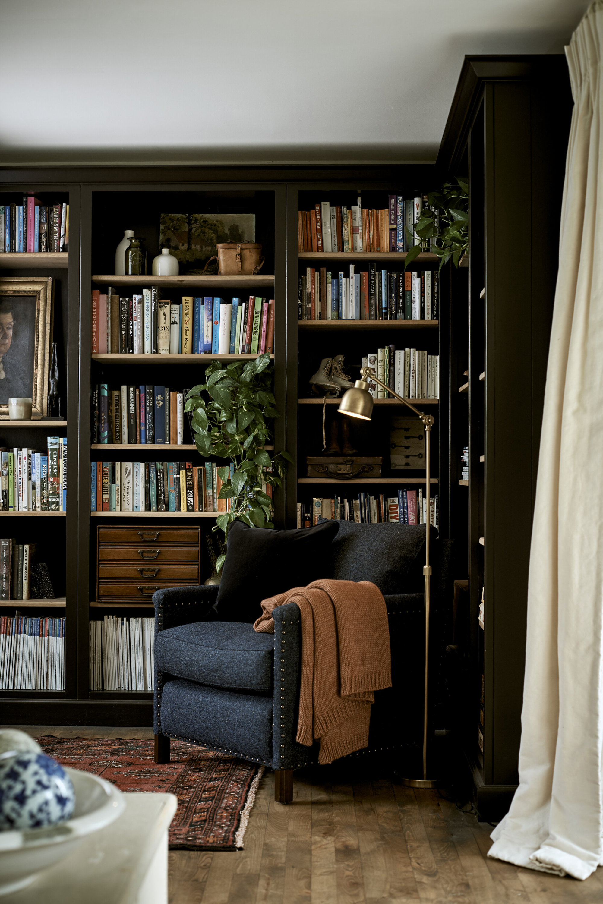
Bespoke shelving is a good example of storage that makes a house look expensive, and it's worth the time and investment. In a recent living room project, we used old scaffolding boards to create bespoke shelves on either side of a chimney breast. These can be bought cheaply, sanded down, and painted if you prefer. As well as being cost-effective and sustainable, upcycled scaffolding boards can add an industrial flavor when left a little rough and used.
You might prefer to paint them to match the color of your walls for a seamless look (Farrow & Ball's Off-White works well), but the key is to take the shelves all the way across your wall or living room alcoves without leaving any gaps.
For a high-end look, always work with the architecture of your room rather than against it. So, maximize the space in nooks and awkward corners and create a made-to-measure look that gives a high-end first impression. If there is space, you could also add a bookshelf above a doorway.
2. Think about spacing
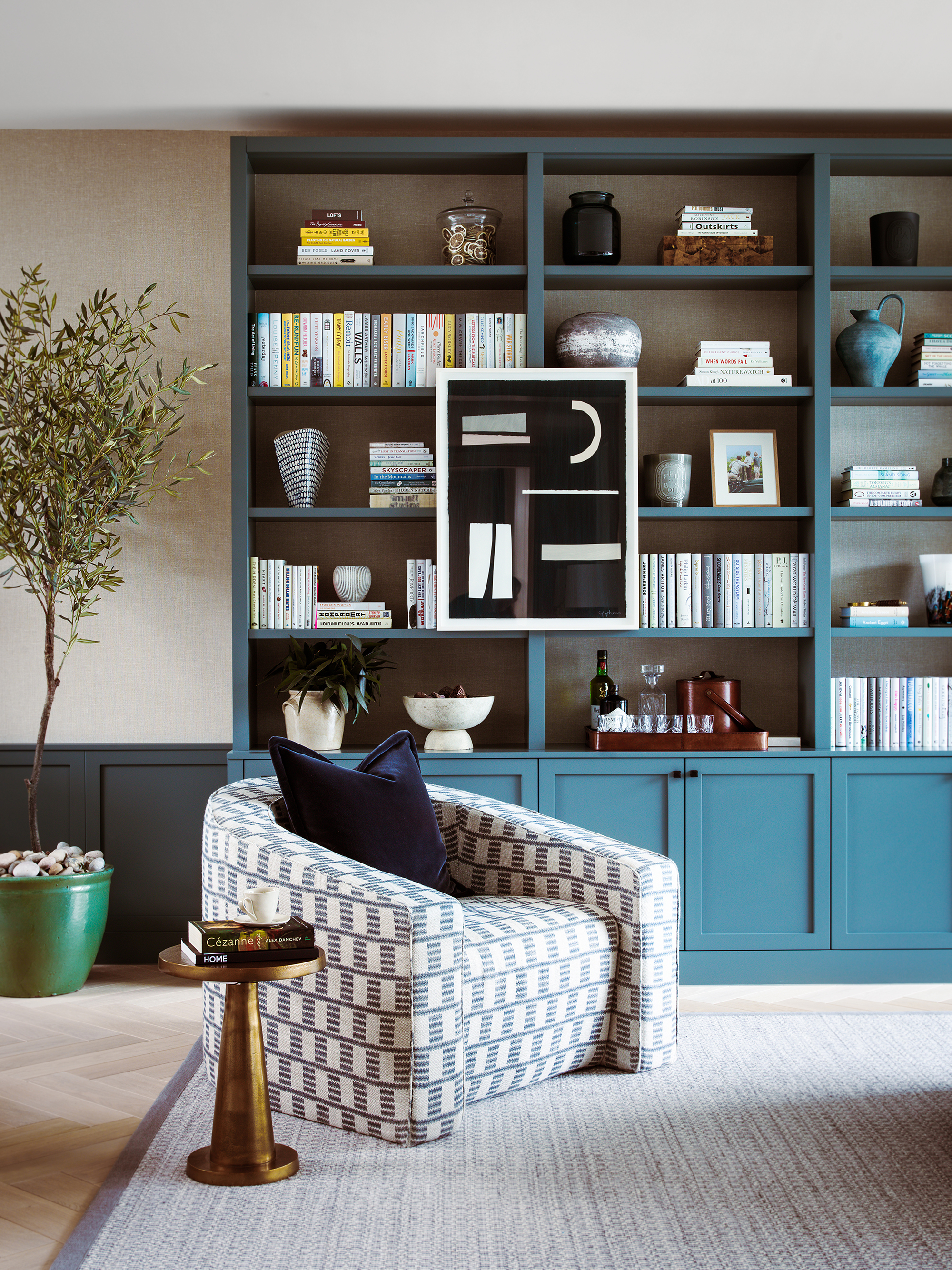
The luxury living rooms we see online always have carefully decorated shelves with plenty of empty space. So, give decorative pieces room to breathe by leaving a couple of inches of extra space between the shelves. By creating negative space around your living room decor and accommodating taller vases, sculptures, and so on, you give each item the space to shine while making living room shelves look less cluttered.
You may like to have a couple of shelves positioned closer together, for example, you might choose to hang a top shelf close to the ceiling so that there is only enough space to fit a row of your books. This can create a colorful and characterful border that draws the eye up, although it does make reaching for one of your favorite paperbacks a little harder.
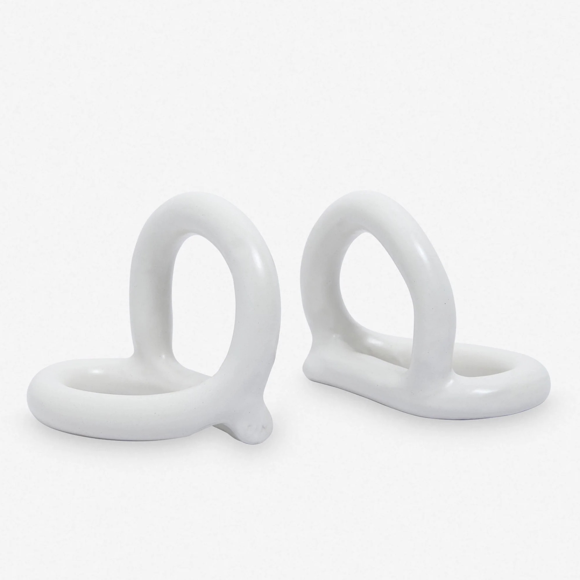
Overcrowding shelves is one of the common open shelving mistakes I see people make, but there are lots of ways to get around this, such as making several groups or 'vignettes' of items. Use stylish bookends to make books easier to group together, while adding another element of texture and color.
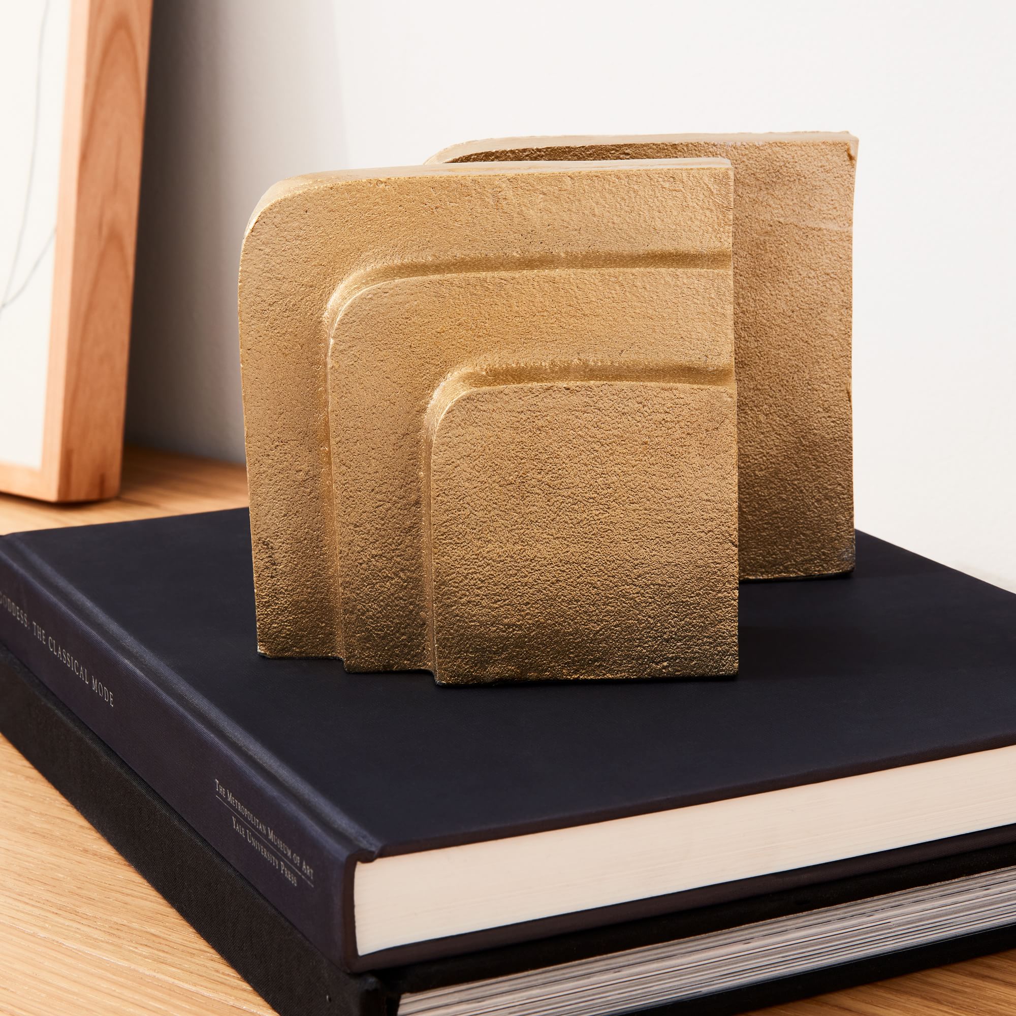
Even though they’re made of brass, the striated slab cut on these bookends give a natural finish to them, almost like they’ve been cut out of stone. If your bookshelf is on the darker side, they’ll really stand out.
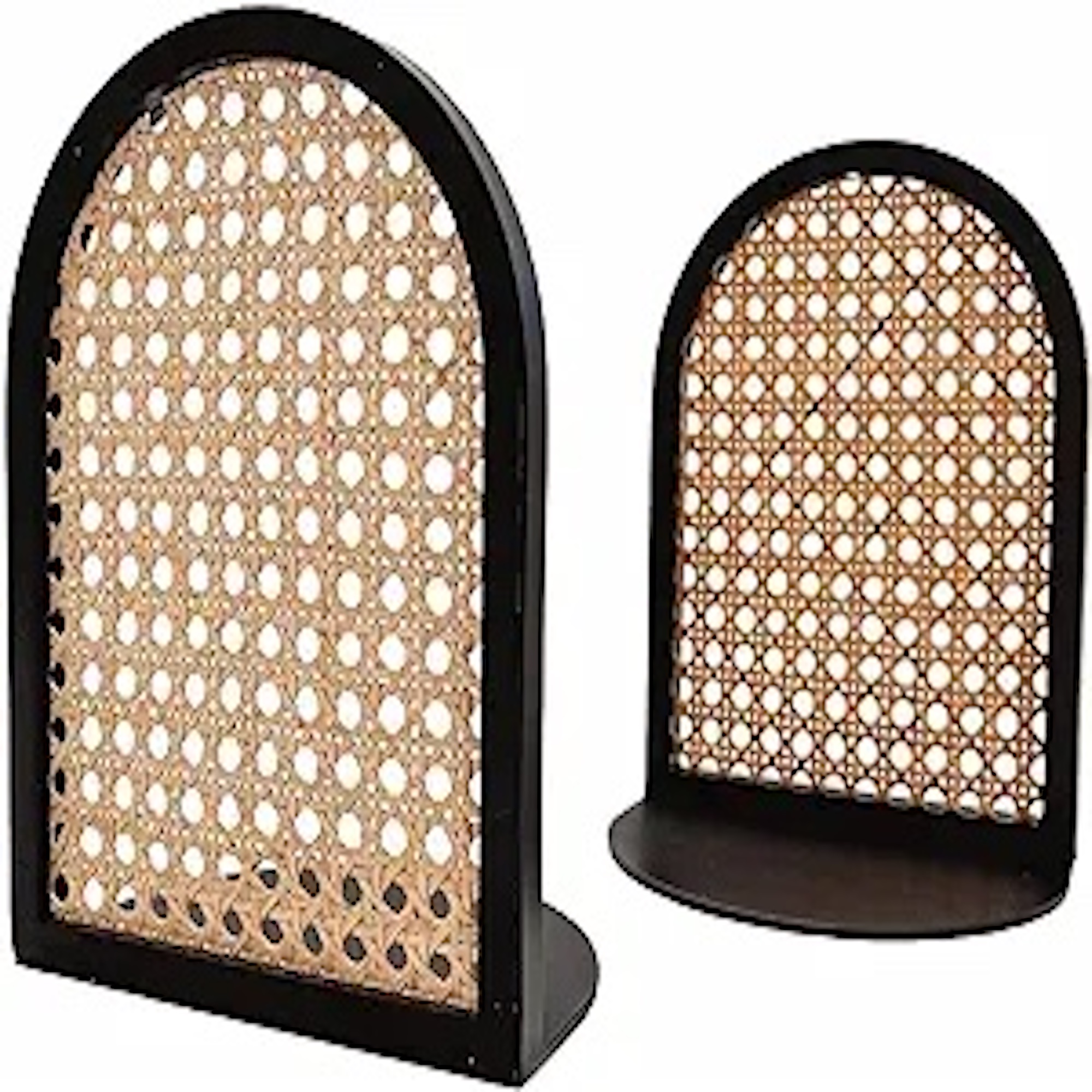
Rattan lovers, rejoice! This decorative set of bookends takes the trend and makes it micro. The set is made of both bamboo and steel – bamboo to make it feel more authentic and akin to windows, while the steel ensures it’s heavy-duty enough to keep your books in place.
3. Go floor to ceiling
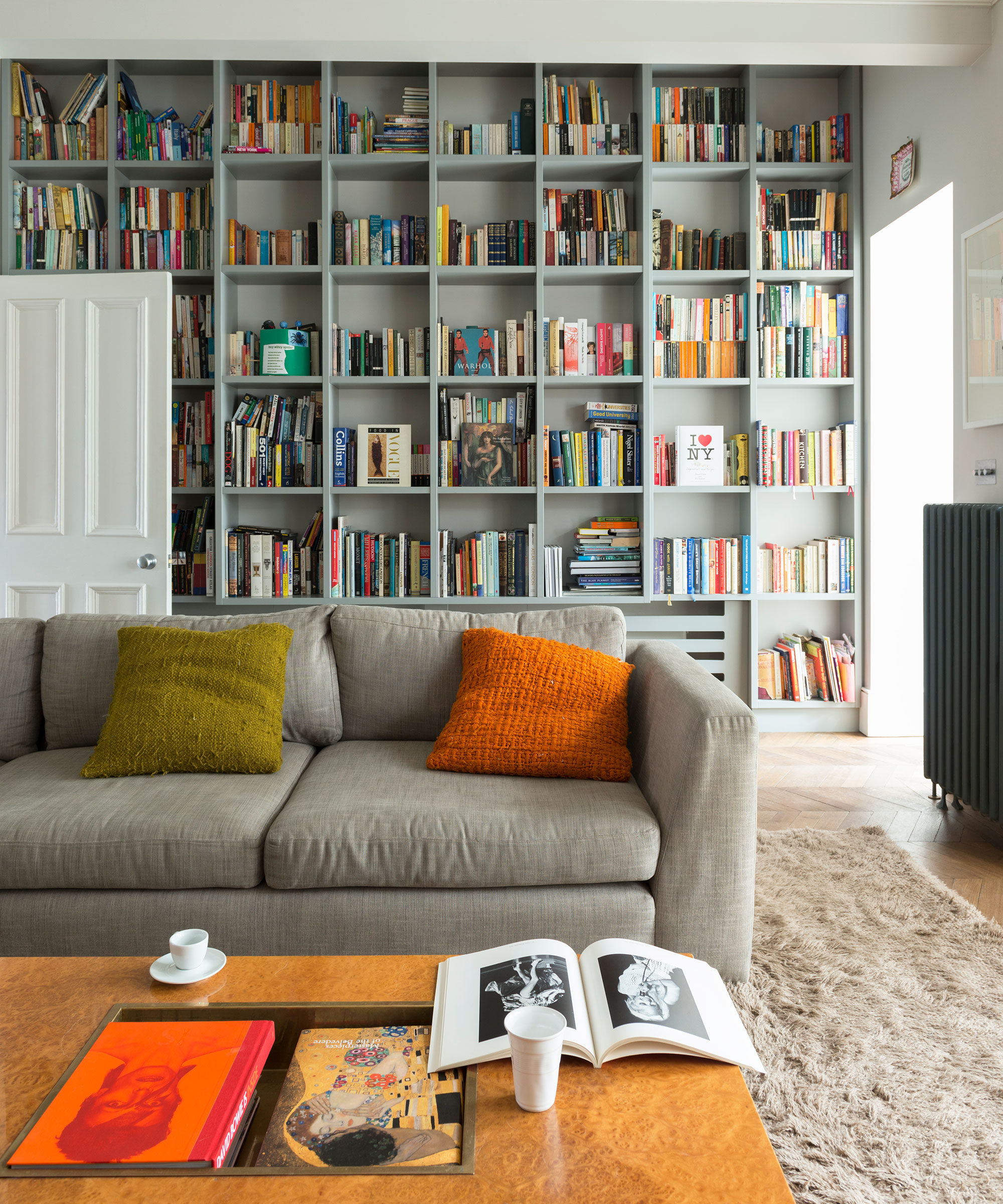
If the layout of your space allows, take the shelves from floor to ceiling to create a lofty library feel with shelving that's perfectly tailored to your space. In an alcove with seating next to it, you could also position a shelf at a natural 'side table height' to give you somewhere to rest your drink and to keep a table lamp for reading.
Below it, you can place two high-quality storage baskets (I always recommend these woven baskets from La Redoute), for keeping the less visually pleasing living room items hidden but accessible, from chargers and cables to gaming controllers.
As a rule, I think elegant and slim shelves, such as those pictured above, look more expensive than those with a more bulky or heavy appearance. But it all depends on the design styles you lean towards. Thick wooden shelves would look at home in a more rustic, farmhouse or industrial space, and will often give a more 'masculine' feel. Whatever you choose, the key is to be consistent with the material or paint color.
4. Add arches
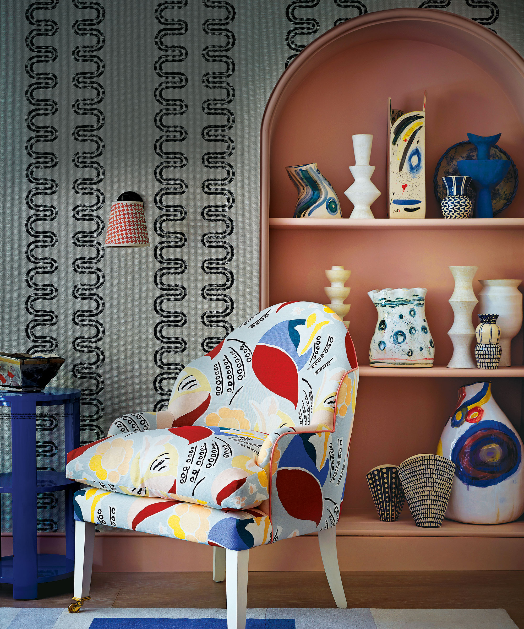
Arches are an elegant way to give your shelves a more expensive and traditional feel, and they can be DIYed with MDF. Arched shelves look best if they feel in keeping with the style and history of your property, for instance, if you have some other European style references in your home or live in an older building. Arches bring soft shape and rhythm to your living room, and there are lots of tutorials online to help you DIY it.
You can also add decorative bobbin beading or corbels, at Amazon, to give the shelves a more ornate appearance, but this needs to be done to a high quality or it can make shelves look less expensive.
5. Create a bench seat
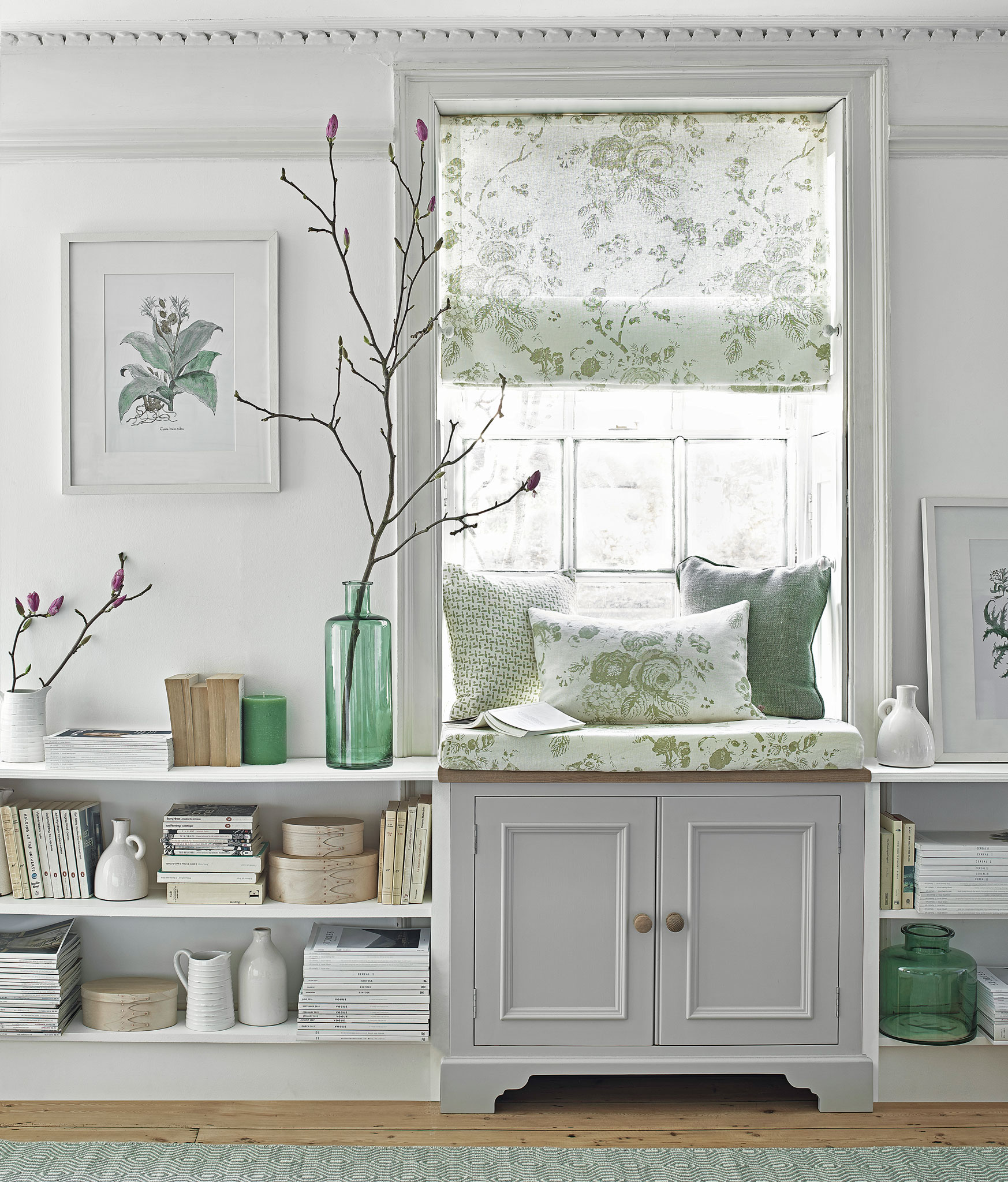
Alternatively, you can add a bench seat at the bottom of the shelves, and make it cozy and comfortable with an upholstered cushion that fits the space snugly. Additional throw pillows and wall sconces will help to create a cozy reading nook moment.
Practicality-wise, adding a lift-up lid can also give you more storage for blankets, games, and other living room paraphernalia. Alternatively, you could create a window seat with shelving on either side.
Wall lights will give useful task lighting, but it's also worth adding accent lighting within the shelves in the form of LED strips or additional spotlights. DIY lighting ideas like these will accentuate special pieces and put them under the spotlight, making your shelves look curatorial.
We naturally gravitate towards light sources, so any extra lighting in your shelves – a stylish wireless table lamp, a candle, or built-in options will all draw the eye and make your shelves into a focal point while adding warmth.
FAQs
Should you paint shelves to match the wall?
'I recommend painting the shelves in a color that complements the walls, but with a slightly lighter or darker shade,' says realtor Alex Locklear from NC Cash Homebuyers. 'This will create a subtle contrast that adds depth and interest to your living room.
'You can also leave the shelves natural if they are made of a beautiful wood grain or marble. In this case, it's important to ensure they are well-maintained and polished to maintain their luxurious appearance.'
Other ways to give shelves a more curated vibe are to paint or wallpaper the back of the shelves in a darker color or pattern, and to use display stands for books. Take inspiration from the 'bookshelf wealth' trend when curating your belongings to create an intentional display that looks balanced.
Sign up to the Homes & Gardens newsletter
Design expertise in your inbox – from inspiring decorating ideas and beautiful celebrity homes to practical gardening advice and shopping round-ups.

Millie Hurst is a freelance lifestyle writer with over six years of experience in digital journalism. Having previously worked as Solved Section Editor at Homes & Gardens and Senior SEO Editor at News UK in London and New York, Millie has written for an array of homes brands including Livingetc and Real Homes and was formerly Senior Content Editor at Ideal Home. She has written and edited countless features on home organization, decluttering and interior design and always hopes to inspire readers with new ways to enjoy their homes. She loves to weave nature-inspired decor and nods to time spent in Italy into her own home.
-
 Kris Jenner's favorite air fryer, the Ninja Crispi, is the perfect small kitchen solution – it deserves a place on the most compact of countertops
Kris approves of this compact yet powerful air fryer, and so do our own kitchen appliance experts, praising it for its multifunctionality
By Hannah Ziegler Published
-
 Ina Garten's storage pantry is an insightful window into all of the best cookware used by the chef – and it's easy to recreate on your kitchen shelves from $48
The beautiful dishware in The Barefoot Contessa's Hamptons pantry showcases the tools she uses most often to cook – this is exactly how you replicate it
By Sophie Edwards Published
