This tiny Victorian apartment in London is a lesson in how you can still go big in a small space
By playing with scale and fine-tuning the balance between form and function, this interior designer gives a lesson in designing a home that feels grand despite cozy proportions

Design expertise in your inbox – from inspiring decorating ideas and beautiful celebrity homes to practical gardening advice and shopping round-ups.
You are now subscribed
Your newsletter sign-up was successful
Want to add more newsletters?
The idea of ‘going big or going home’ might seem counterintuitive when working with small rooms, but interior designer Christian Bense knows better than most when it comes to creating a sense of generosity and scale within conservative proportions.
When reworking this compact city maisonette, he had plenty of tricks in his tool kit, not least because his own London flat is also on the diminutive side. ‘I love apartment living, but I find there are a few rules when it comes to doing it well,’ he says.
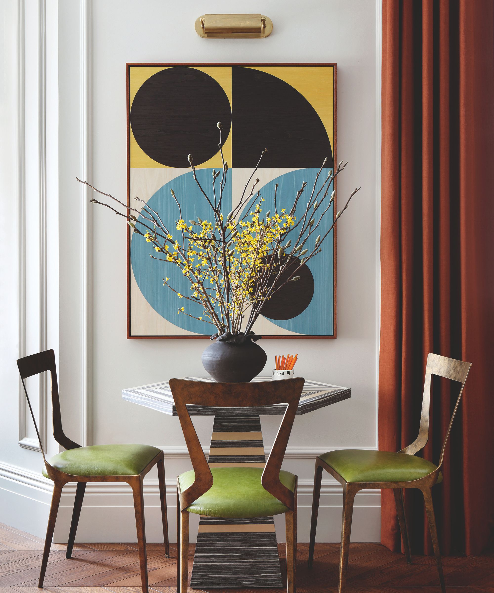
Animatic table, Amy Somerville. Lennox dining chairs, Iluka London. Curtains in Adelphi in Canyon, Dedar. Artwork by Olly Fathers.
Christian explains his first rule; ‘One is to avoid limiting the use of a room to a single purpose just because it is smaller. The key is to create multifunctional spaces instead, otherwise, you’ll feel the home is lacking in some way and it won’t seem like a grown-up home.’
Article continues belowThat’s exactly the approach that the South African designer took to the renovation of this first and second-floor Victorian apartment. Fortunately, he had worked on another home in the same Grade II-listed building a few years before, though its proportions and style were different.
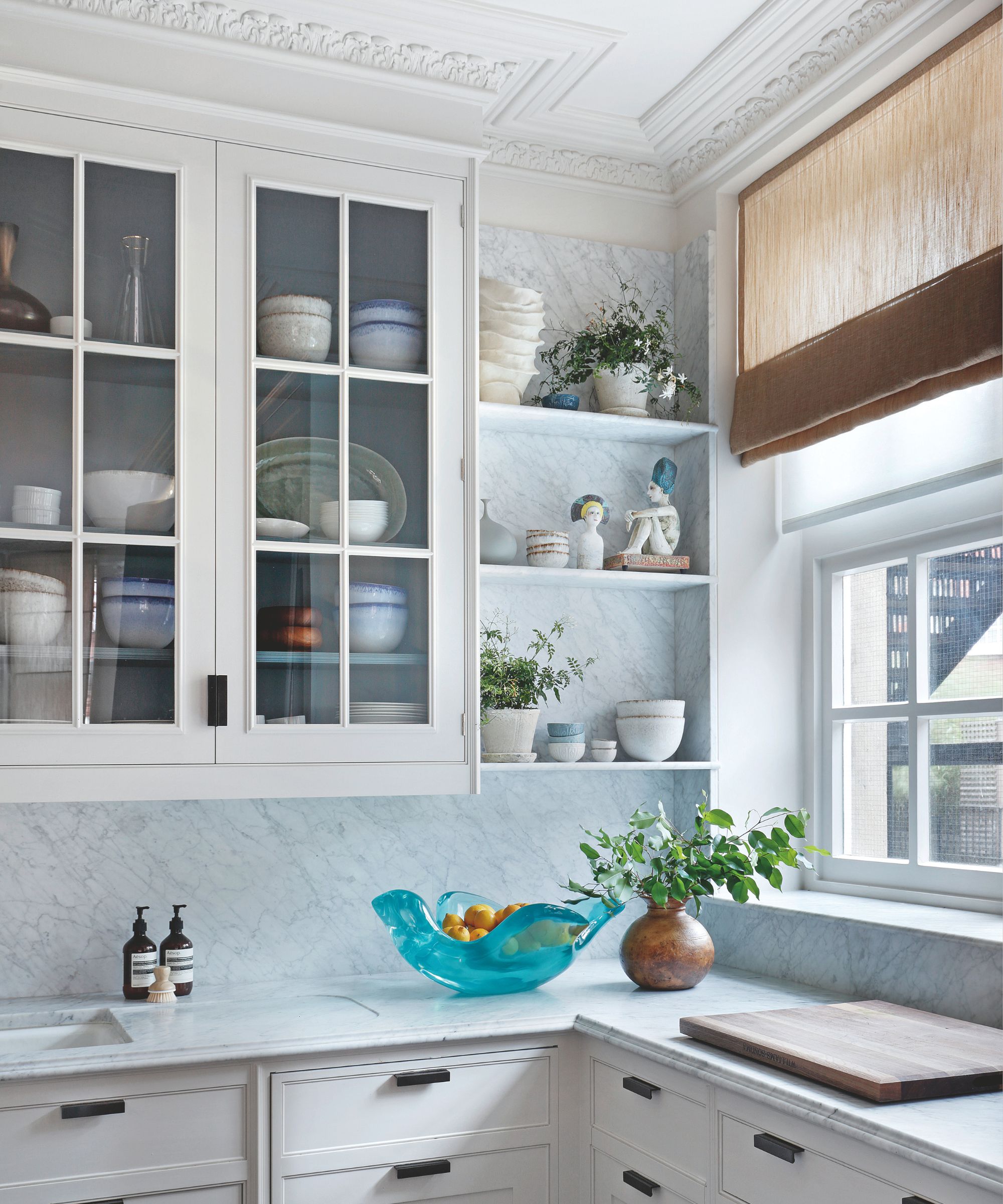
Units in Paint & Paper Library’s Stone II and Farrow & Ball’s De Nimes. Blind in Madison Sheer in Harvest, Rose Tarlow. Handles, Joseph Giles.
‘Many of the apartments were renovated in the 1990s and early 2000s,’ says Christian. ‘Some retained their period features and some did not.’ In the case of this home, owned by a couple with adult children – the bones were good, characterized, says Christian, by high ceilings, big windows, and high-quality fixtures and fittings.
He continues, ‘But in a way, it was too perfect. The walls were whitewashed; there was an overkill on moldings and paneling, which had been retrospectively fitted, and a sense that it had not been designed for everyday life. In essence, it needed soul.’

Dining table, Heerenhuis. Jak chairs, Tom Faulkner. Symmetry rug, Knots Rugs. Flotilla chandelier, Blueprint Lighting.
Working to the principle that successful schemes take their cue from their setting first, followed by the needs of the owners, Christian and the couple opted to create a sense of playful sophistication that riffed on the building’s genteel roots while incorporating a touch of nature-inspired design.
Design expertise in your inbox – from inspiring decorating ideas and beautiful celebrity homes to practical gardening advice and shopping round-ups.
Conversely, that meant stripping back in some places (removing paneling and beading) and adding contemporary touches in others (an orange stair runner or geometric rug), offsetting the rigor of the more formal architectural details. ‘Swapping out brilliant white paintwork for an off-white and staining the timber floors in a richer hue were easy wins,’ says Christian. 'At the studio, our mantra is light but never white.'
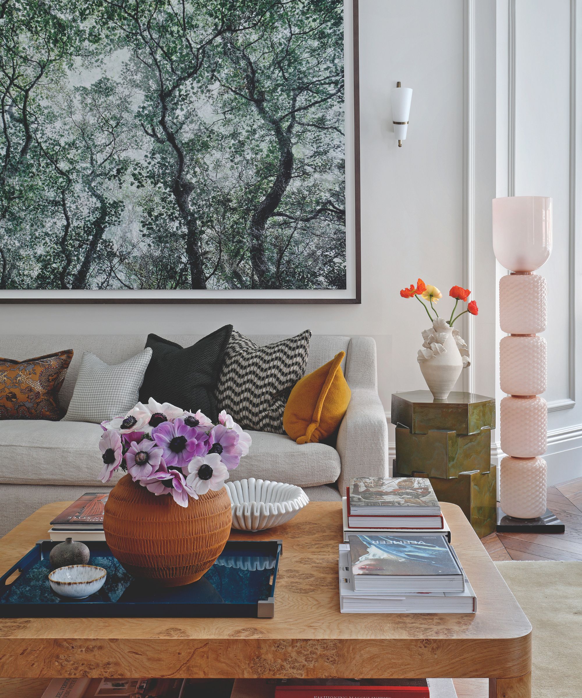
Vintage sconce, Stilnovo. Sofa, Rose Uniacke. Cassina floor lamp, Chaplins. Art by Santeri Tuori. Bari Ziperstein table, 1stDibs. Burr oak coffee table, Treeslounge.
More complex was the question of balancing form and function. Though there was plenty of existing joinery, much of it needed to be reworked – such as in the study-dressing room, where the floor-to-ceiling cabinetry meant that upper hanging rails were out of reach, or in the kitchen where a built-in drinks cabinet left little room for essential utilities.
Christian explains, ‘I’m a great believer that freestanding storage can lend layers of character, as well as being immensely practical’. As a result, he introduced sculptural pieces, such as a walnut cabinet on the landing to accommodate shoe storage, while an impressive drinks cupboard in the dining area is adorned with chinoiserie detailing by artist Tess Newall, answering the owners’ brief for naturalistic elements, while freeing up space in the kitchen for built-in utility storage.
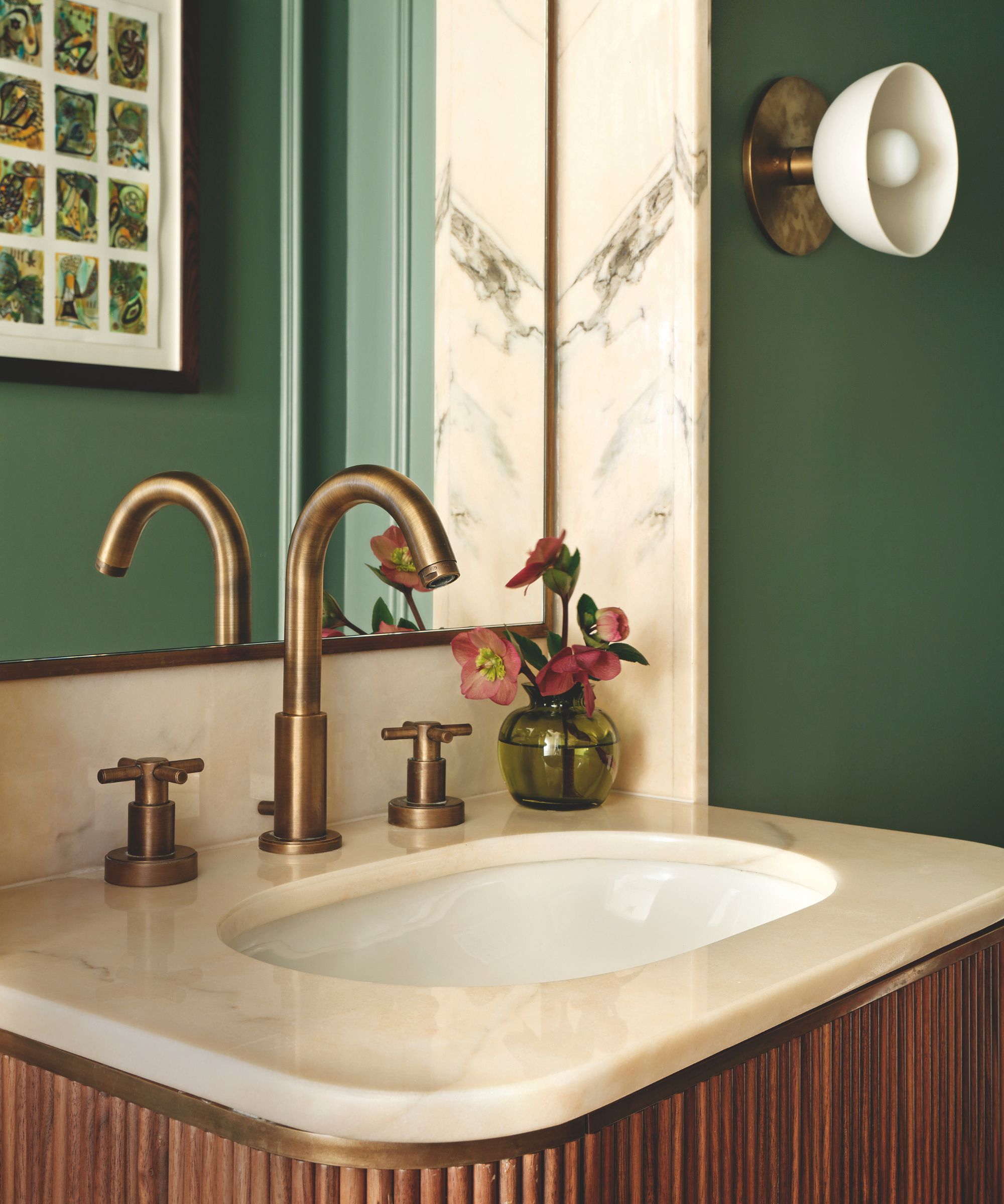
Walls in Green Smoke, Farrow & Ball. Vanity with marble top by Kudos Design & Build. Trapeze wall light, Apparatus.
That marriage of form and function is most creatively executed in the living room. ‘The couple and their friends love kicking back to watch the football, but they also like to entertain more formally, read or play games, so the room needed to deliver on all fronts,’ says Christian.
To further complicate matters, an off-center square bay threw off the room’s proportions. This was solved with a generous L-shaped sofa in one corner, offset by more formal seating elsewhere. ‘The danger of an L-shaped piece is that it can create the feeling of a laid-back snug or a den,’ says Christian. ‘But we added finesse and backbone with other more graphic items, such as footstools and armchairs.’
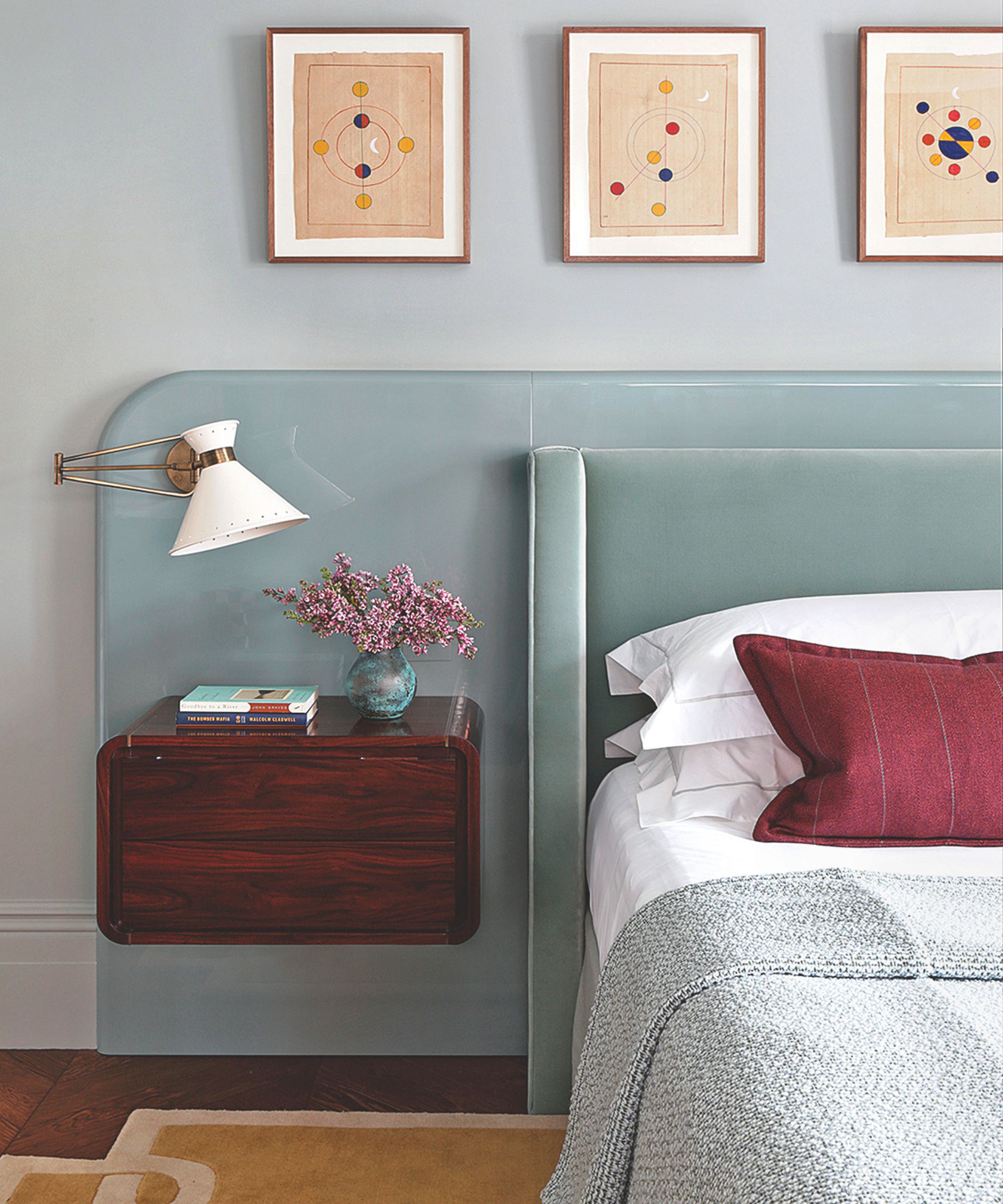
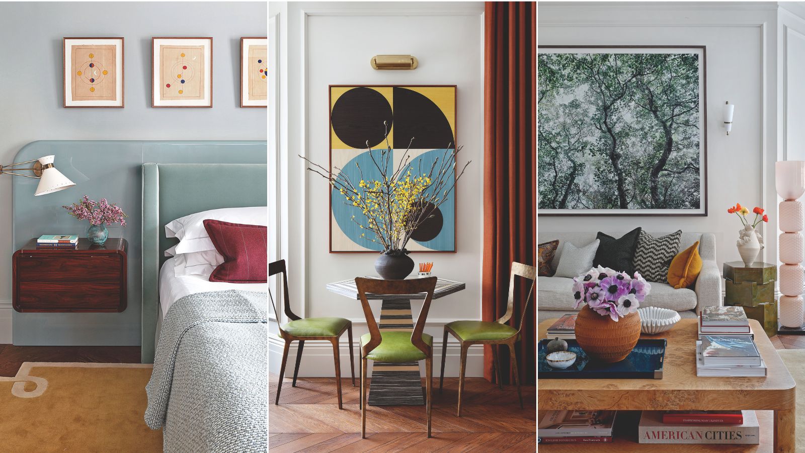
Velvet headboard by Robert Langford. Floating wall cabinet, Fiona McDonald. Tom swing arm wall light, Hector Finch.
Little went to waste during the renovation. A floating marble shelf in the entrance hall and a built-in version in the study-cum-dressing room were salvaged from the reworking of the guest bathroom – hand-selected touches that, says Christian, make a house a home.
Slubby linens, woven textiles, leather, velvet, and stone each combine to strike just the right balance between smart and comfortable. We’ve ended up with the kind of schemes that don’t need styling to look good,’ he reflects. ‘This home might not have the largest footprint but it certainly has ample soul.’
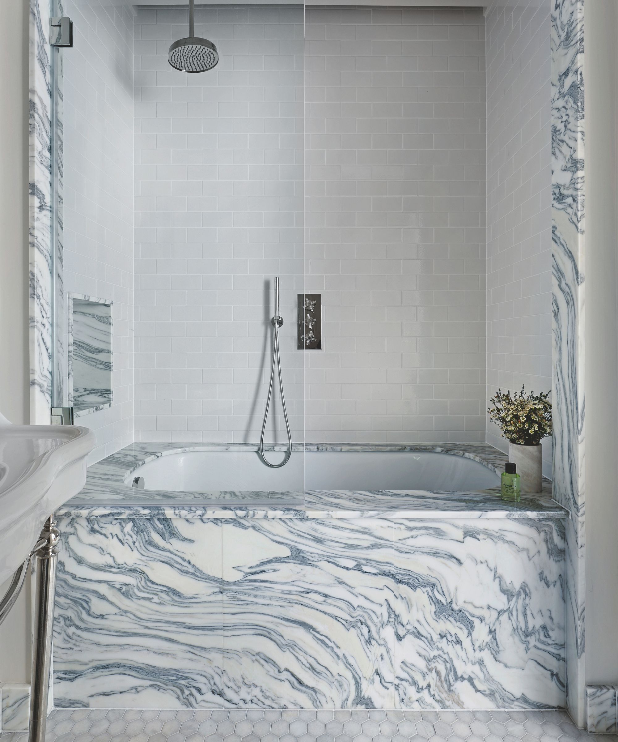
White honed marble hexagon floor tiles, Starel Stones. Metro Deco wall tiles, Claybrook.
The 5 rules of making the most of a compact space
Designer Christian Bense shares his tips on creating a feeling of generosity and scale in small homes.
1. Less is not more when it comes to a compact space. Rather, focus on proportion and balance, ensuring a room doesn’t feel lacking.
2. Design with intent. If there is an intention behind the items you are adding to a room, and there is a clear rationale as to why an item is used or a purpose served, you’ll be amazed at how much you can add to a small space before it feels cluttered.
3. Include multiple focal points. A small room with just one, such as a fireplace, will force the eye to one area only, drawing attention to the fact that the room is compact. Multiple areas of focus lend a room variety.
4. Don’t underestimate the power of a mirror; every room should include at least one. In addition, light-reflective materials also create another dimension, ensuring a space feels interesting and layered.
5. Play into the vertical. A small space that only occupies the X axis will feel cramped, so play into the Y too – whether through art, window treatments, walls, or picture lights. The eye should track up as well as left to right.

Emma writes across interiors, design, lifestyle, and travel for a number of titles, from The Times Magazine to Living Etc. A born and bred Londoner, she has written two books that celebrate her passion for architecture and design in the capital, including London Shopfronts and London Interiors.